This page has all the content from the different class pages in on place. Since the semester varies in what content is taught in which class, this will put everything in one long page so it can be cut up if need be.
We no longer require checking in to the lab or filling out lab hours time sheets. But you're still on the hook for spending time working on this class.
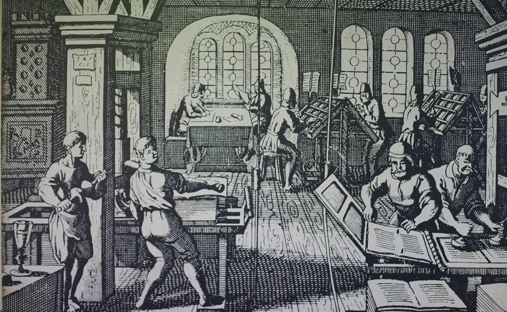
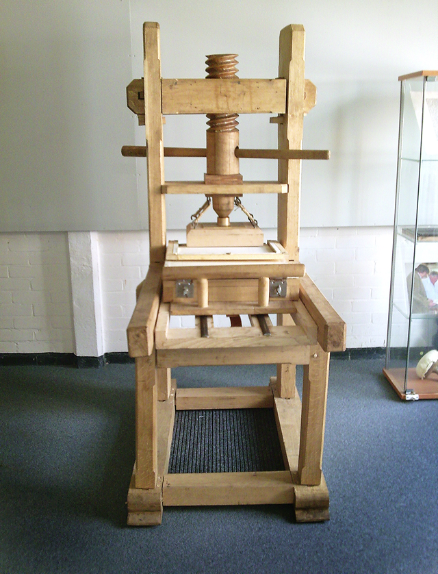
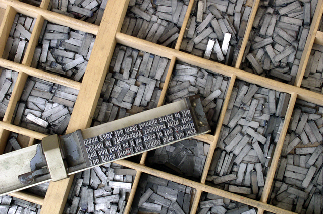
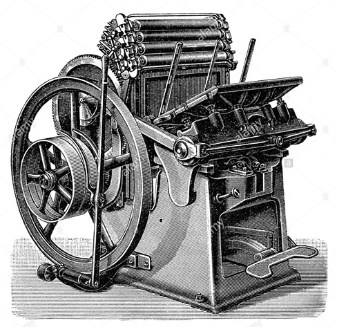
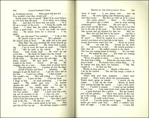
Photo-Typesetting
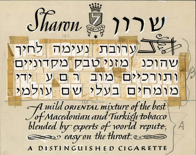
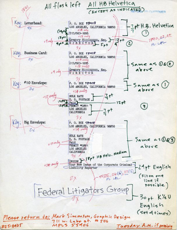
Example of mark-up for typesetting and a good article .
The world of: Inking
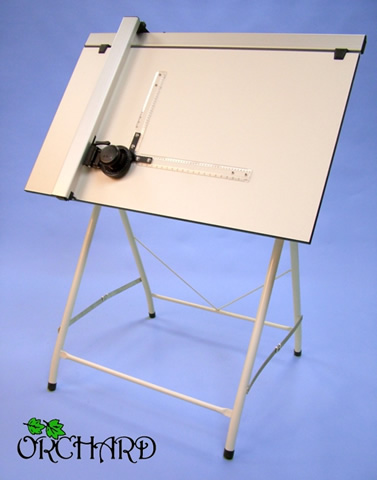
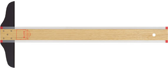
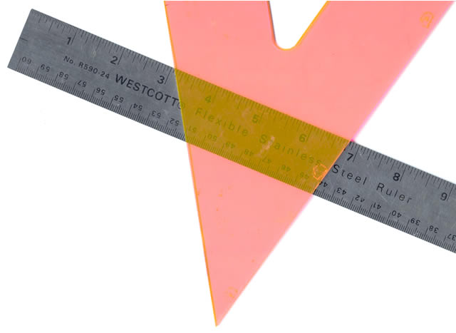
Straight-Edges & Triangles
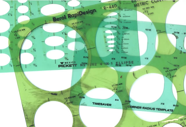
Templates
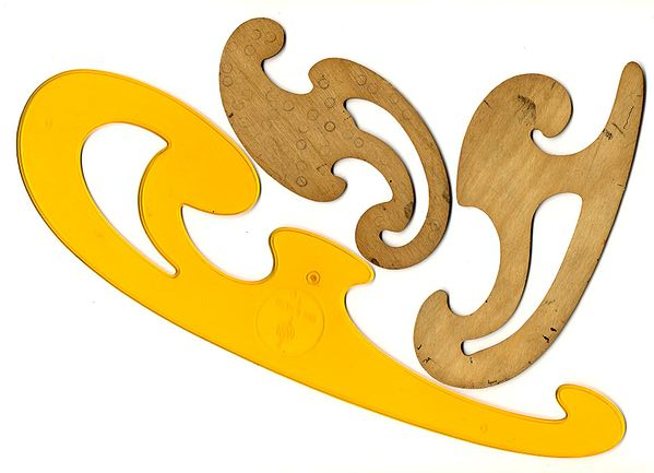
French Curve Sets
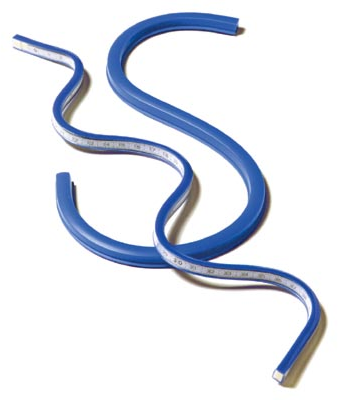
Flexible Curves
Ruling Pens
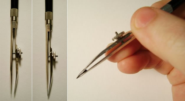
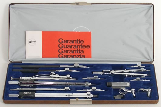
Instrument sets
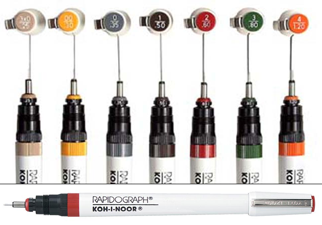
Rapidograph Pens
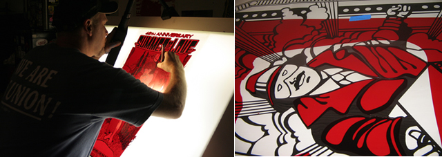
Hand Mask-Cutting
Rubylith
Camera Sizing
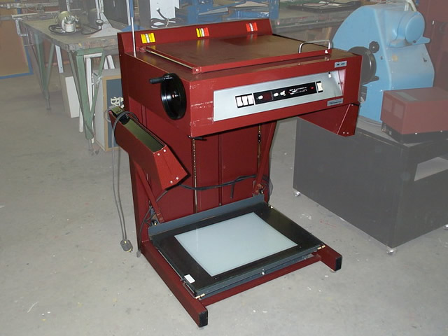
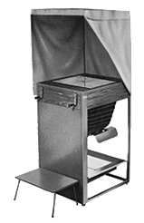
Photostat Camera
& Processor
Luci Camera
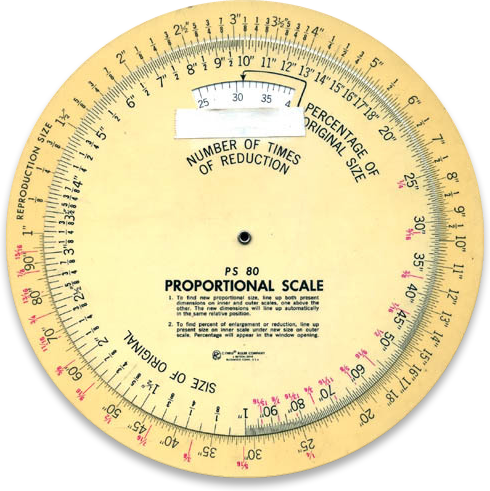
Proportion Wheel
Weird Types of Measurement
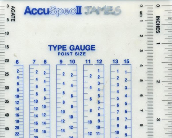
Typesetting is measured in Points, Picas and Agates
Points invented by French printers in the early 18th Century
Agates used by newspapers (about 5.5 points in one agate)
72 points (pt.) per inch (.01386 inch)
1 pica = 12 points, 6 picas per inch
Don't worry, the only one that matters anymore in points...
Separate Design and Production Departments
Probably the biggest single change to the design industry by the invention of digital desktop publishing, designers no longer had to send out for type or depend on the production dept. to make camera-ready artwork.
And speaking of "Desktop Publishing"...
History of Desktop Publishing
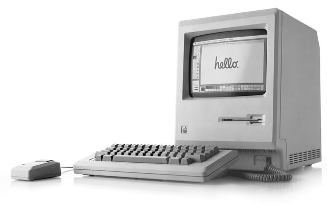
1984
Apple introduces the Apple Macintosh and creates "Desktop Publishing".
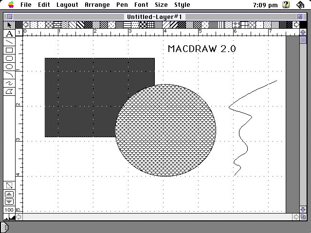
The introduction of MacDraw introduces vector drawing for the masses
New-ish kid on the block, getting a lot of traction as alternative to Adobe Cloud
No subscription. $54.99 for Windows & OSX, $21.99 for iPad (but don't get that version for this class)
Sketch
Another new kid on the block
No subscription. $99.99 (1/2 off for students)
There are more, the above are just a few of the options, listed by popularity. For more on the various tools and their differences check this Wikipedia article
What To Use In This Class
Top Recommendation
Buy an Adobe Cloud subscription. $80/Yr or $40/Semester, cheaper than most textbooks
2nd Choice
Buy Affinity Designer. $54.99 for Windows or OS X. Don't use the iPad version for this class.
3rd Choice
Use the on campus machines through VMware Horizon.
What is Illustrator for?
Adobe Illustrator CS5 is the industry-standard illustration application for print, multimedia, and online graphics. Whether you are a designer or a technical illustrator producing artwork for print publishing, an artist producing multimedia graphics, or a creator of web pages or online content, Adobe Illustrator offers you the tools you need to get professional-quality results.
Adobe Illustrator CS5 Classroom In A Book
Create without boundaries: Create distinctive vector artwork for any project. Used by design professionals worldwide, Adobe Illustrator CS5 software provides precision and power with sophisticated drawing tools, expressive natural brushes, a host of time-savers, and integration with Adobe CS Live online services.
Adobe's web site - which is from an earlier version. They're so set in their monopoly that they don't even try to describe the product anymore, they just talk about new features.
Types of Graphics: Vector vs. Bitmaps
What is a Vector?
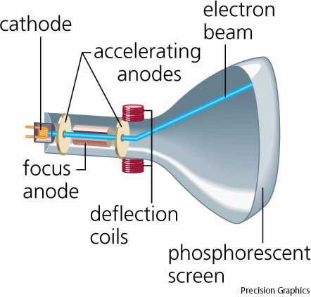
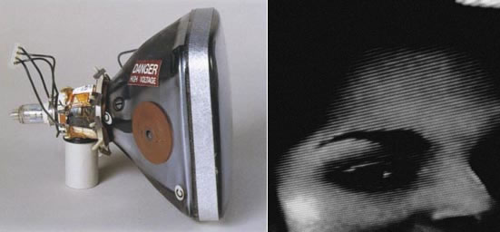
First, a word about Cathode Ray Tubes (CRTs).
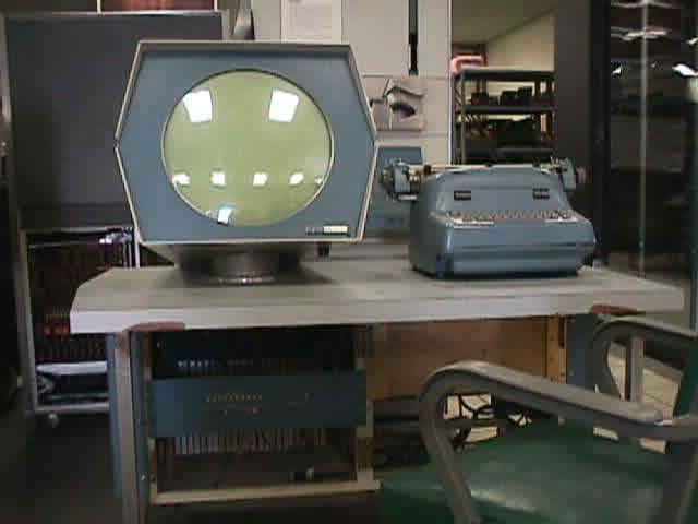
Early Raster Graphics
Early CRT
Watch from 1:30 +
Calligraphic or Vector-Drawing CRTs
Vector displays literally used vector math to move the electron beam across the front of the tube
Raster (like Black and White TV). From the Latin rastrum for rake
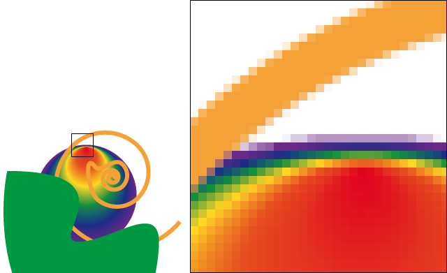
A Vector is geometrical primitive such as a point, line, curve or polygon which can be described by a mathematical formula, and formulas can be infinitely scaled.
Some examples of vector type stuff
Typesetting
Things with crisp, smooth edges and solid colors
Things with smooth gradients of colors
Scalability
Small file size
Highly editable
What is a Raster Image (aka Bitmap)?
From the Raster-style CRT's
Rather than a formula, a set of grid picture elements, or pixels, each with a designated color stored in the computers memory
Bitmaps cannot be infinitely scaled
When you turn a vector into a bitmap the process is called "Rasterization"
Some examples of bitmap stuff
Photography
Blurry images
Noisy or grainy images
Images with lots of texture
Computer Graphics Images (CGI) or 3D images
Now, to add to the confusion!
Illustrator works with both Vectors and Bitmaps
Photoshop works with both Bitmaps and Vectors
But: The majority of Illustrator's tool are for vectors, and the majority of Photoshop's tools are for bitmaps
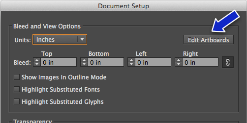
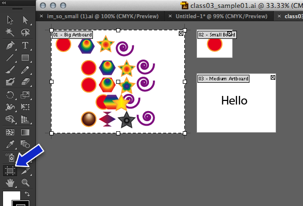
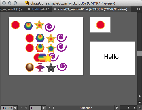
A white rectangle in the document window that will be a printed area. You can have more than one, and they can be any physical size (like 8 1/2 by 11) or digital size (link 64 pixels by 64 pixels)
How to navigate between Artboards...
How to add a new Artboard...
Or Shift-o (letter o)
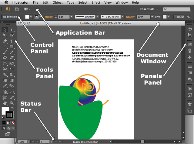
Control Panel
Tool Panel
"Escape" key or any tool to exit Artboard mode...
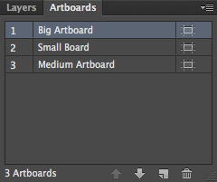
Three different artboards in the Artboard panel
Working with Multiple Documents
Any one document can have more than one artboard, but you can also have multiple documents open at the same time.
Clicking on any part of an artboard or an object on the artboard sets that artboard to the current artboard. You can tell because it will have a black outline around it.
Selecting & Aligning
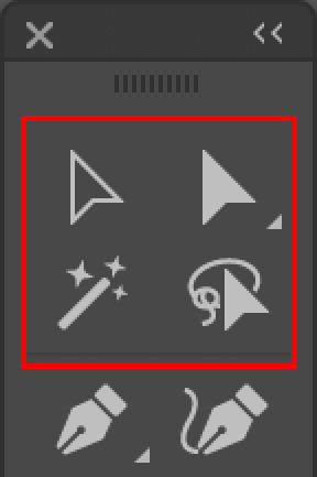
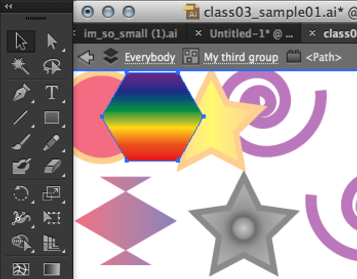
The Selection Tool Gallery
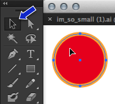
Selection Tool (V)
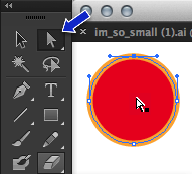
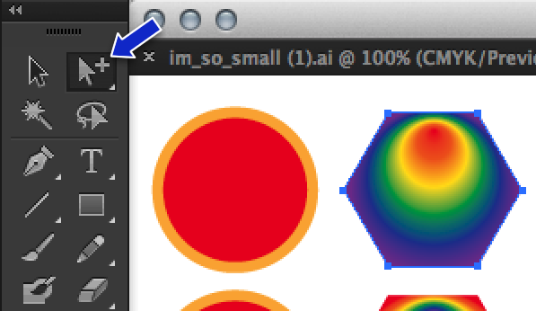
Direct Selection Tool (A)
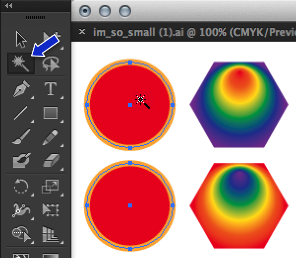
Magic Wand Tool (Y)
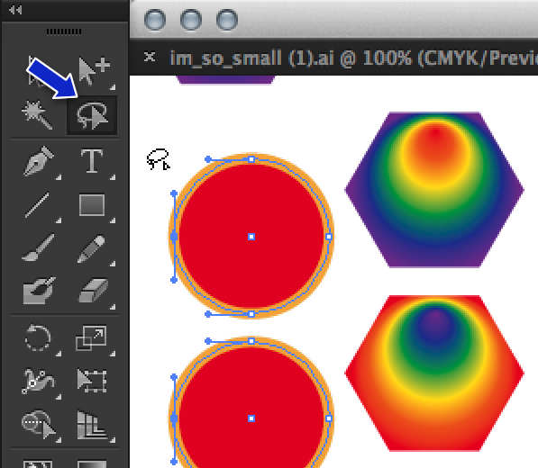
Lasso Tool (Q)
Using the Selection Tools
Single click to select one object
Shift-click for multiple objects
Click-drag over an area to select all the objects in the dragged area
Selection Tool (V)
Single click on an object to select it.
Direct Selection Tool (A)
Selects only the control point directly clicked on or within the dragged area
Allows direct manipulation of control points
Group
selection tool
Selects objects within groups
Magic Wand
selection tool
Selects all objects with similar attributes
Lasso
selection tool
Selects multiple control points
Layers Panel
selection gesture
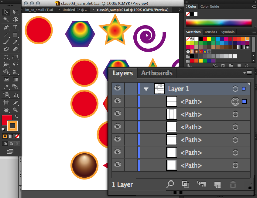
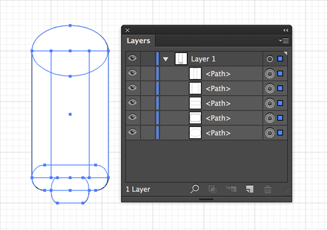
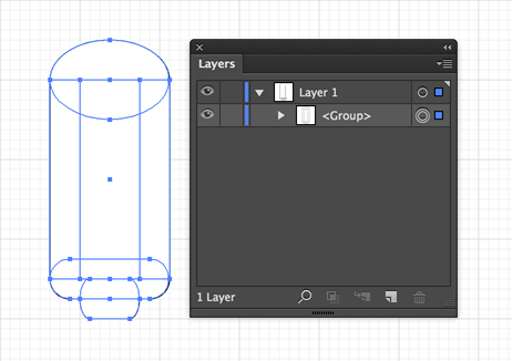
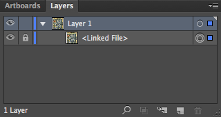
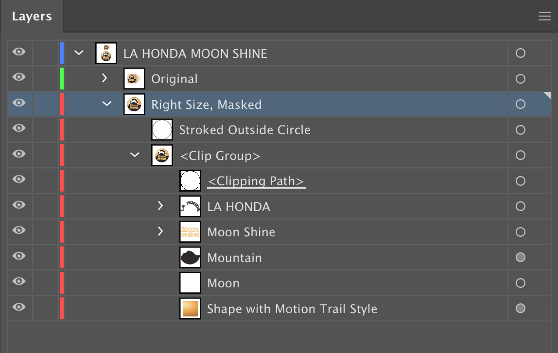
Select with the Layers Panel
Double circle shows object as selected
Blue tint on layer shows layer as current layer but not current selection
Colored box in layer shows object selected in that layer
Select-drag top, left, bottom or right center-handles
None
None
Enlarges or shrinks object from that side
Select-drag corner handle
None
None
Enlarges or shrinks object from that corner
Select-drag object
Shift
Shift
Constrains object's movement to horizontal, vertical or 45 degree axis
Select-drag top, left, bottom or right center-handles
Shift
Shift
Proportionately expands or shrinks object from that side
Select-drag corner handle
Shift
Shift
Proportionately expands or shrinks object from that corner
Select-drag object
Option
Alt
Leaves original object behind and moves a copy
Select-drag top, left, bottom or right center-handles
Option
Alt
Expands or contracts object from its center-point only on horizontal axis (for left and right handles), or only vertical axis (for top and bottom handles)
Select-drag corner handle
Option
Alt
Expands or contracts object from it center-point on horizontal and vertical axis
Select-drag object
Option & Shift
Alt & Shift
Leaves original object behind and moves a copy constrained to horizontal, vertical or 45degree axis
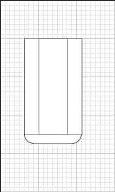
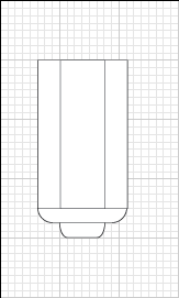
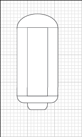
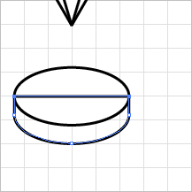
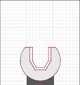
Building the wrench shape with the Shape Builder tool
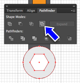
Sadly, there is no equivalent tool to the Shape Builder tool in Illustrator. Instead, you have to do multiple add and subtract shapes with the Path Editing tool at the top right of the UI
First, let's make a some shapes to shape the socket
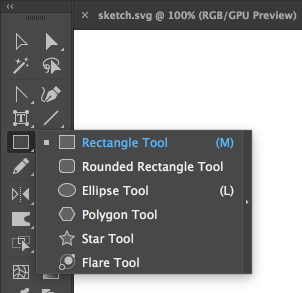
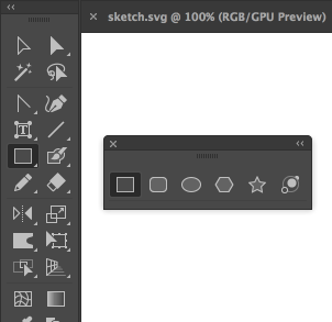
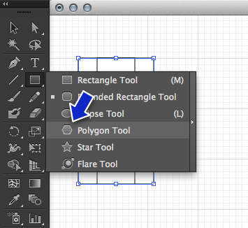
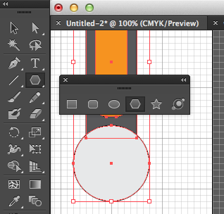
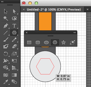
Choose the polygon tool. Clicking anywhere, Polygon Tool: Click/Hold >
Shift >
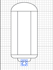
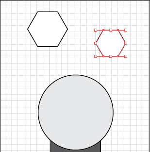
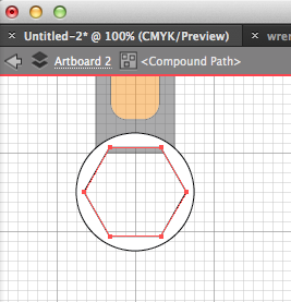
Drag to make two hexagons with the polygon tool, first one that's 1 in. wide then one that's .75 in. Be sure to hold down the shift key to make the hexagon parallel to the artboard
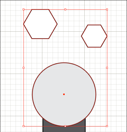
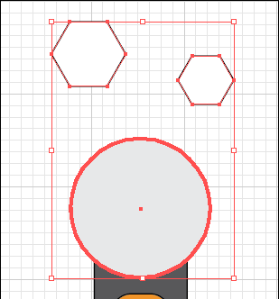
Select the two hexagons and the top circle of the wrench Selection Tool: Shift/Hold >
Click/Release hexagon object 1 >
Click/Release hexagon object 2 >
Click/Release circle object > Release/Shift
Release the mouse, release the shift key, then click once on the top circle and release the mouse. Selection Tool: Click/Release circle object
This makes the top circle the "key object"
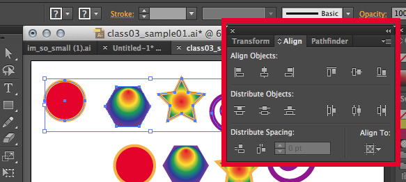
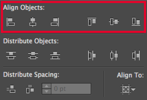
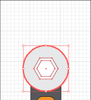
Use the alignment tools to center everyone in the top circle Selection Tool: Align Panel >
Click/Release Vertical Align Center >
Click/Release Horizontal Align Center
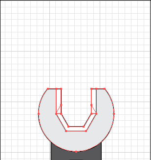
End result.
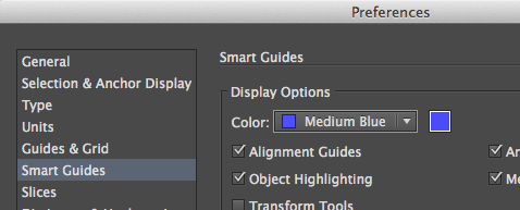
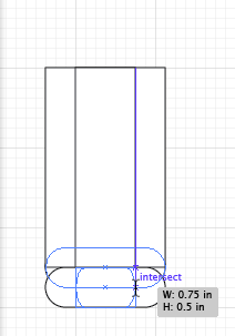
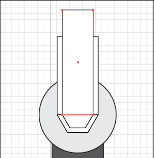
Taking advantage of Smart Guides, draw two rectangles that align with the outer anchor points of the two hexagons
Rectangle Tool: Click/Hold on "Anchor" SmartGuide at larger hexagon's leftmost anchor >
Drag up & right >
Snap to right side of larger hexagon >
Release
Rectangle Tool: Click/Hold on "Intersect" SmartGuide at smaller hexagon's leftmost anchor >
Drag up & right >
Snap to right side of smaller hexagon >
Release
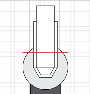
Add a line to chop off the top of the wrench
Line Segment Tool: Click/Hold >
Shift >
Drag >
Release
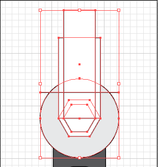
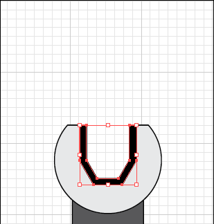
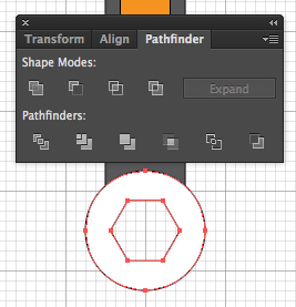
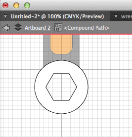
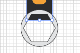
Now start using the Shape Builder tool to subtract and combine shapes.
And finally, Shape Builder Tool: Click/Hold >
Drag to add parts together
Switch to the Selection tool
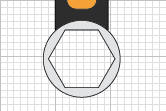
Click off to deselect the wrench head Selection Tool: Click/Release on blank area of Artboard
Re-select the inner part of the wrench and give it some color Shape Builder Tool: Click/Release inner wrench object >
Select color in Swatches panel >
Click on blank artboard
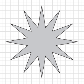
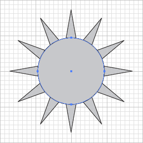
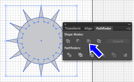
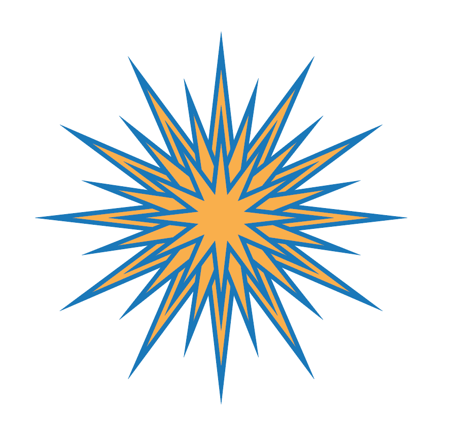
Draw a star shape with the Star tool and use the up/down arrow keys to give it 12 points. Make sure it's aligned to the Artboard by holding the Shift key. Click/Hold >
Shift/Hold >
Drag >
Arrow Key (up or down to get 12 points) >
Control/Command/Hold >
Drag (to get desired pointyness) >
Release (all)
Draw a circle out from the center of the star Click/Hold >
Alt/Option/Hold >
Shift/Hold >
Drag >
Release (all)
Select them both with a selection rectangle Click/Hold >
Drag >
Release
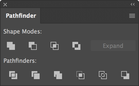
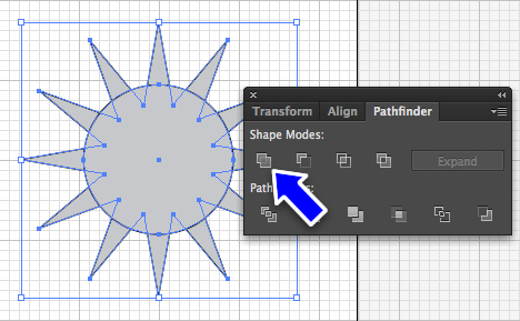
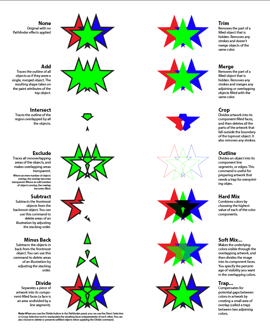
Use the Unite button in the Pathfinder Panel Pathfinder Panel >
Click/Release Unite
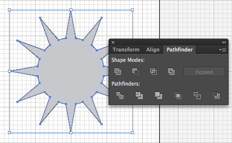
Action complete...
Draw another circle, a bit larger than the first Click/Hold >
Alt/Option/Hold >
Shift/Hold >
Drag
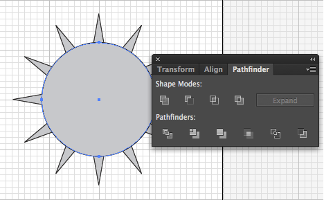
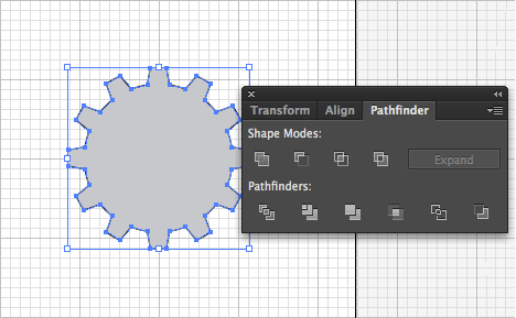
Select the two objects and click the Intersect button Click/Hold >
Drag >
Release Pathfinder Panel >
Click/Release Intersect
Action complete...
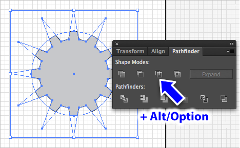
Another way: Do it again, but with the Alt/Option key held down when you click on Merge Pathfinder Panel >
Alt/Option/Hold >
Click/Release Intersect
Use Isolation Mode on the previous two version to see the difference it makes:
When no Alt/Option key, you can't edit the star shape in Isolation Mode
With the Alt/Option key, you can still edit the star shape
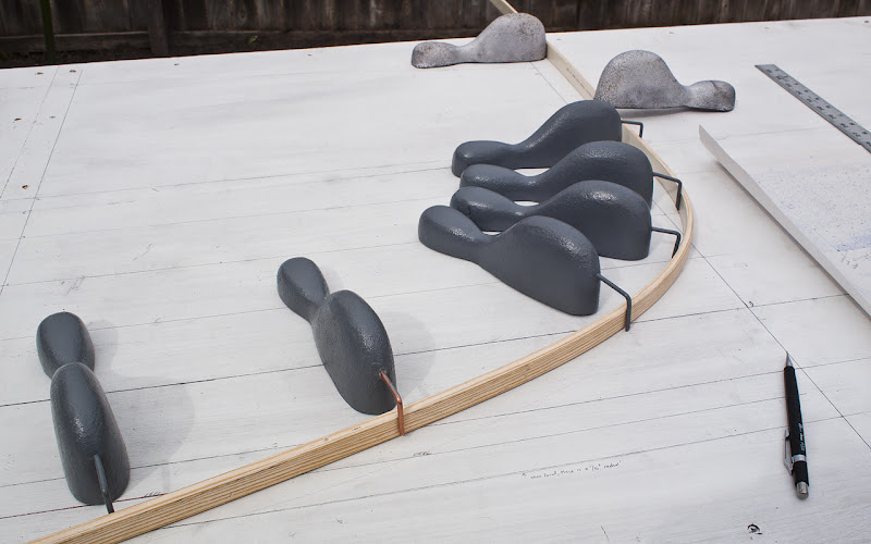
From the world of Bézier math, invented in 1962 by Pierre Bézier to design automobile bodies for Renault. Based, in part, on an old technique of drawing curves mechanically with long flexible rulers and anchors to hold the rulers at specific points to the drafting table.
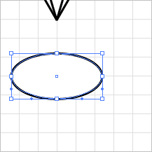
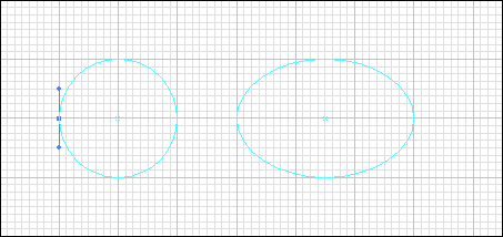
It's an interesting exercise to make an ellipse with the path tool. It may help in getting a "feel" for how anchor points and direction handles work.
Start fresh
Make a new artboard or a new file, make sure Grid is on Menu >
New >
New Document Dialog >
Size:Letter >
Click:OK
Menu >
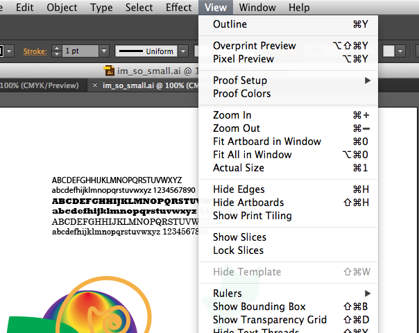
View >
Show Grid
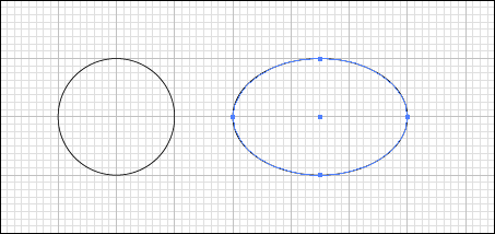
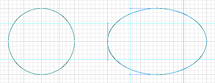
Draw a 2 inch circle with the ellipse tool, then another ellipse that 2 inches tall and 3 inches wide
Tool Panel >
Click/Hold Rectangle Toll until popup menu >
Drag to Ellipse Tool>
Release Shift/Hold >
Click/Drag 2in left + 2in down >
Release Shift/Hold >
Click/Drag 3in left + 2in down >
Release
Select both ellipses Tool Panel >
Click/Release Selection Tool >
Shift/Hold >
Click/Release first circle/ Release Shift
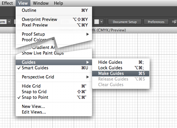
Add some guides: Menu >
View >
Guides >
Make Guides
Select them both and use Menu >
View >
Guides >
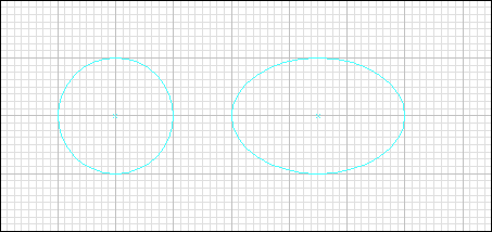
Make Guides to turn the ellipses into guides
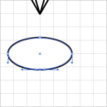
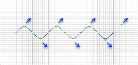
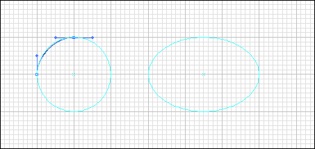
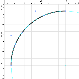
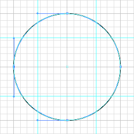
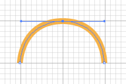
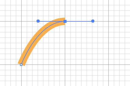
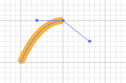
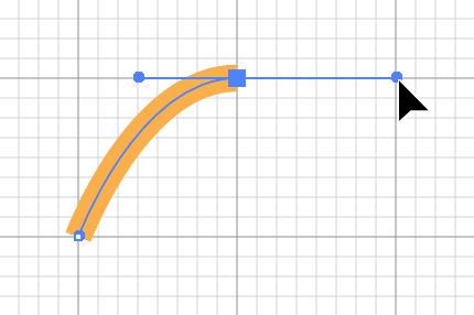
Use the Path Tool to re-create the four anchor points and distance handles of Illustrator's Ellipse Basic Shape Tool
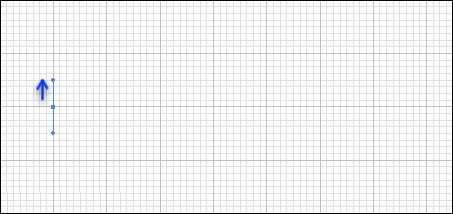
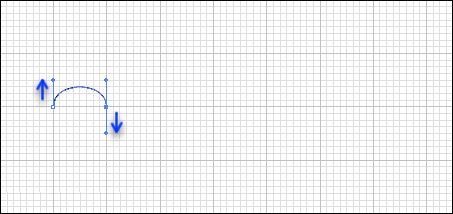
Start on the left side, drag up about 1/2 inch
Click on the top side, drag right about the same
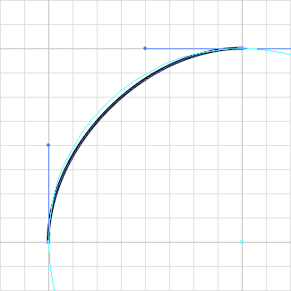
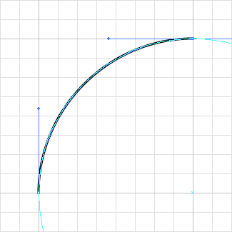
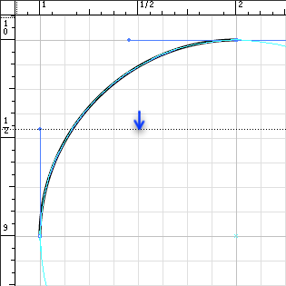
Zoom in. Turn Snap to Grid off. Use the Direct Selection tool to tweak the handles until the curve matches the circle as closely as possible.
Choose Menu >
View >
Show Rulers.
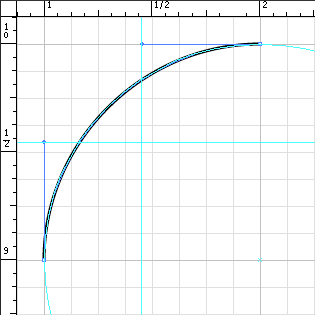
Click on the top ruler and drag the cursor down. A horizontal line appears with the cursor. Drag down until you intersect the line with the end of the left-side anchor point's handle's top. Release.
Re-select the path so the handles show. Do the same from the left ruler and drag the cursor to the right. A vertical line appears, etc.
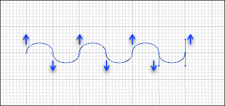
Use these new horizontal and vertical guides (and two additional guides) to align the other handles as you complete the circle.
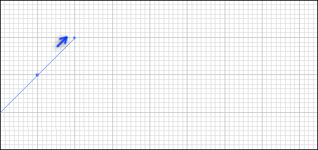
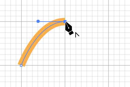
NOTE: To continue a path, choose the path tool and bring the cursor to the end-anchor of the path you want to continue. You'll see this icon:
Use the same techniques to create the 2x3 ellipse
How Long To Make The Handle & How Many Anchor Points?
The "distance handle" controls the shape of the curve along with the anchor point. Let's examine how the length and angle of the handles affect the curve, and how the number of anchor points also affects it.
A basic rule of thumb:
The fewer anchor points, the smoother the curve
Make a new document or add a new artboard to the current doc
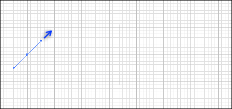
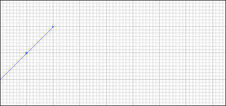
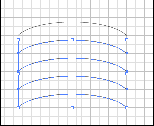
With Snap to Grid on, create a simple curve with 45º handles, 6 inches wide
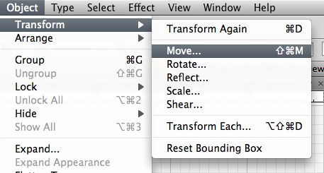
Select it, then use Menu >
Object >
Transform >
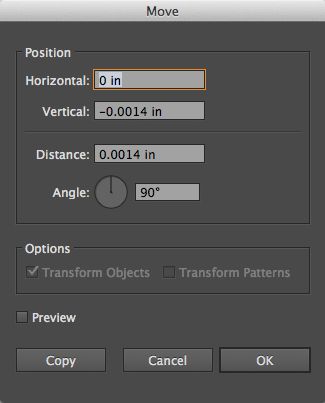
Move...
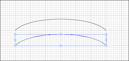
And use the dialog to make a copy of it 1 inch down
The result
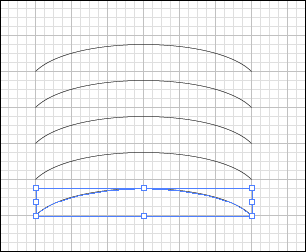
Repeat the move with Transform Again, or better yet, Control/Command-D, 3 times
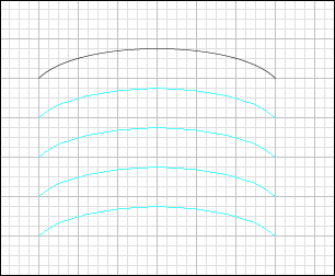
Now select the 4 lower curves and convert them to Guides with Menu >
View >
Guides >
Make Guides
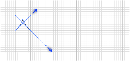
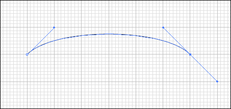
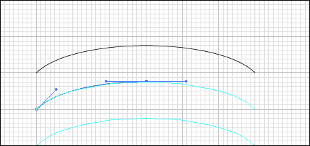
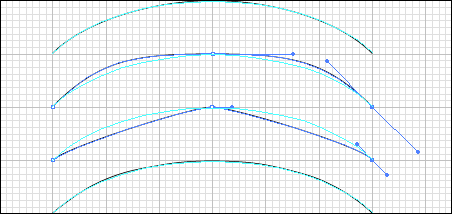
Zoom into the top guide. Let's define a curve with three anchor points that fits the guide
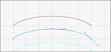
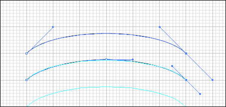
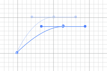
Compare the original curve's two anchor points and handles to the new three anchor pointed curve's. Note that the two point curve has longer handles
Try with the next two curves with handles that are too long and too short
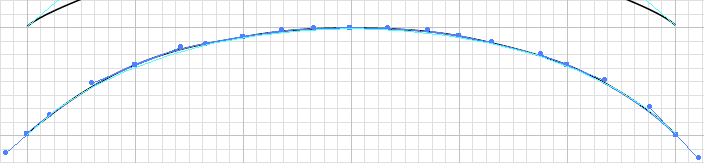
Try the last curve with a bunch of anchor points. Notice how much tweaking is required to make the curve look smooth.
Here (Again) Is The paths-symmetry.ai. With All The Curves In It So Far.
Types of Anchor Points
End Anchor
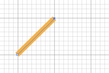
Every line has at least two anchors
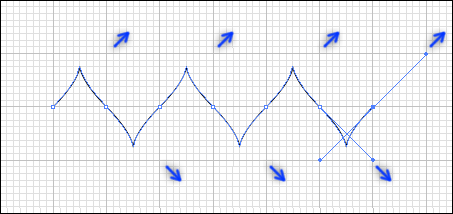
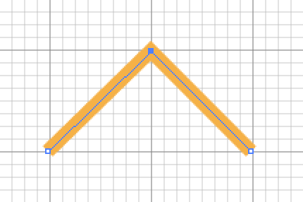
Corner Anchor Point
Has no handles
Created with click-release
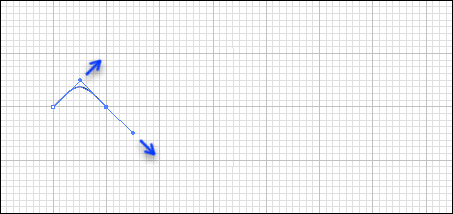
Smooth Anchor Point
Has two handles, equidistant from the anchor, in alignment with each other
Created with click-drag-release
Combination Smooth Anchor Point
Smooth on both sides, with two handles, but handles are not aligned
Created with click-drag-option/alt-drag-release
Combination Anchor Point
Curved on one side, smooth on the other, with one handle for the smooth side
Created by click-drag-release then click again on anchor
Some Important Pen Tool Keyboard/Mouse Gestures To Remember:
Gesture
Result
Click-release
Corner point
Click-drag-release
Smooth point
Click-spacebar or click-drag-spacebar followed by release
Moves point while spacebar is down, then fixes point on release
Click-drag then hold Alt/Option
De-couple handle from other handle
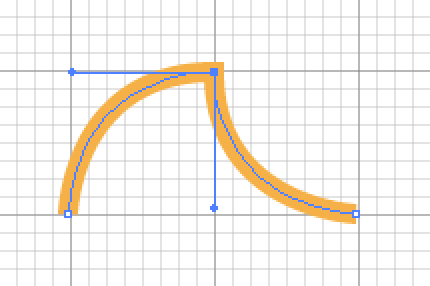
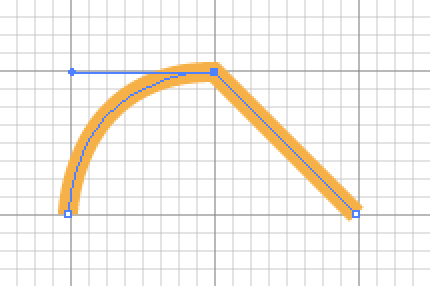
Click-drag-release then click-release on anchor point
Change leading handle to straight-line corner anchor
Click-drag-release then click-drag-release on anchor point
Change leading handle to straight-line corner anchor
Truth is, I almost never can remember all of these. Instead, I just rough out the curves I want and go back in and edit them until I get the effect I want.
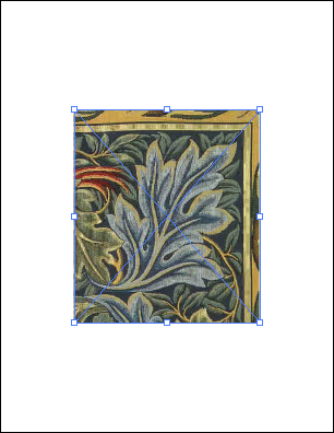
Place the acanthusleaf.jpg file in the middle of the artboard
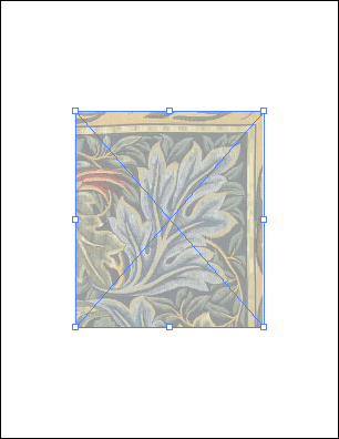
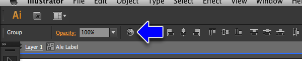
Use the opacity slider in the Control Panel to set the opacity to 50%
Use the Layers Panel to lock the acanthus leaf image
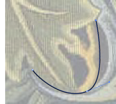
Start tracing the leaf with as few anchor points as possible. Just rough it out, we'll refine it later. The key is to look for the outer edges of curves and drag out a handle that's tangent to the curve
Remember tangents from Geometry? Here's a refresher:
A tangent line is a line which sits perpendicular (at a right angle) to the point on a curve
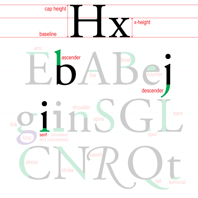
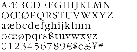
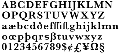
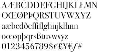
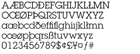
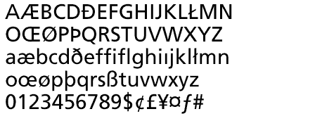
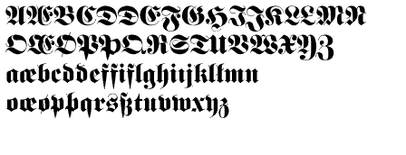
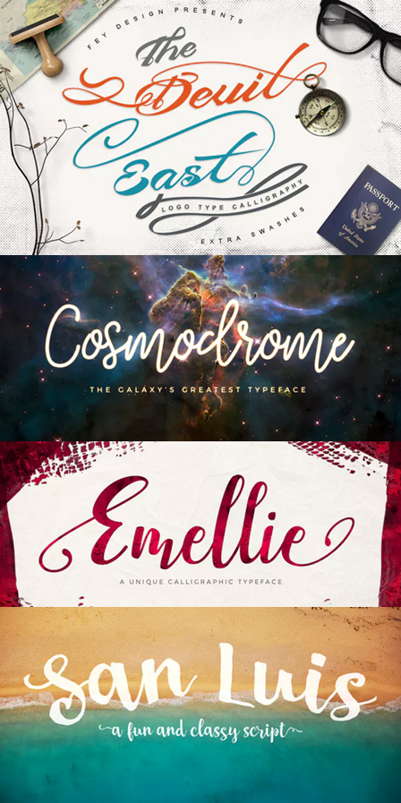
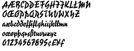
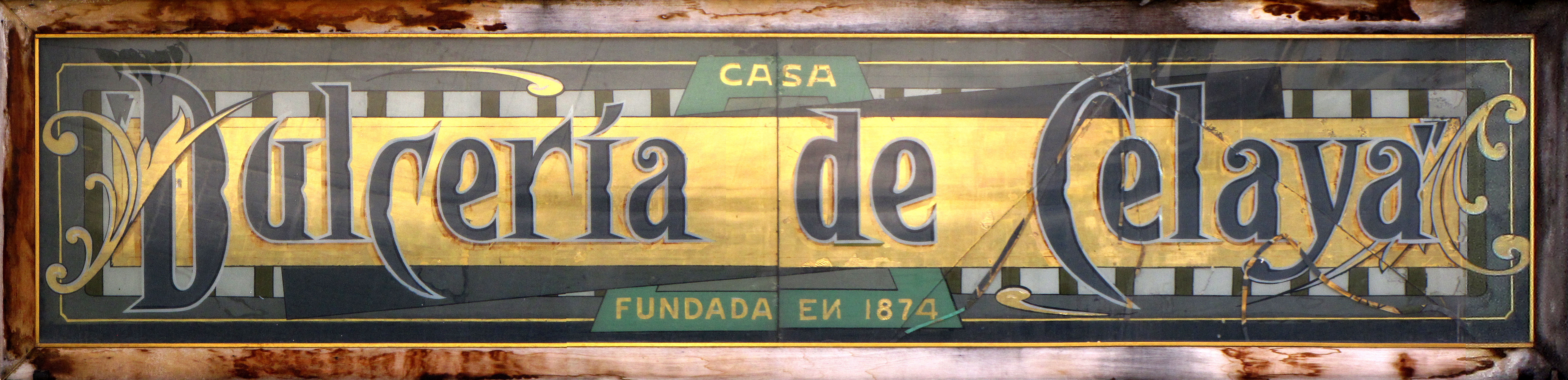
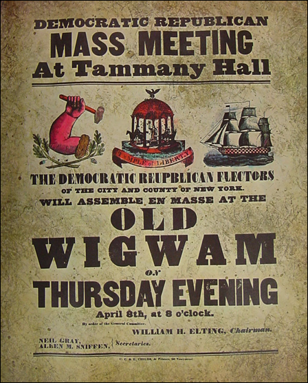
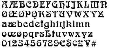
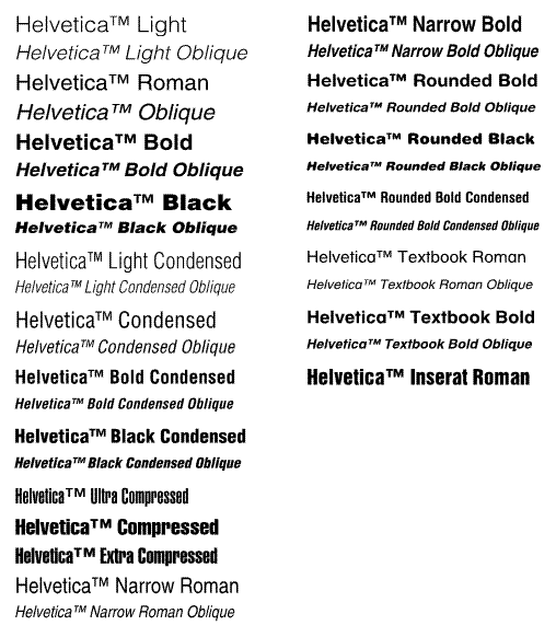
Font's can be broken down into various categories or classifications. Many individual fonts can overlap classifications, like Sans Serif and Decorative, but by and large, most fonts can be classified based on their history.
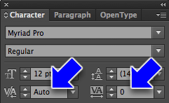
In Illustrator, you can kern individual spaces between letters or kern more than one space with 'tracking'
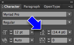
Leading
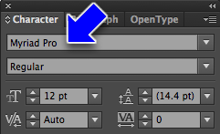
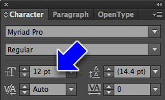
This is 12pt leading for a 12pt block of type. A little too tight, I think. Lorem ipsum dolor sit amet, consectetuer adipiscing elit. Suspendisse eget diam. Morbi in risus. Morbi nibh. Sed cursus urna. Nunc vitae nisl eu arcu vulputate pharetra. Nullam euismod.
This is normal leading for a 12pt block of type, which is usually about 14.4pts. Lorem ipsum dolor sit amet, consectetuer adipiscing elit. Suspendisse eget diam. Morbi in risus. Morbi nibh. Sed cursus urna. Nunc vitae nisl eu arcu vulputate pharetra. Nullam euismod.
This is 16pt leading for a 12pt block of type. Lorem ipsum dolor sit amet, consectetuer adipiscing elit. Suspendisse eget diam. Morbi in risus. Morbi nibh. Sed cursus urna. Nunc vitae nisl eu arcu vulputate pharetra. Nullam euismod.
This is 18pt leading for a 12pt block of type. Lorem ipsum dolor sit amet, consectetuer adipiscing elit. Suspendisse eget diam. Morbi in risus. Morbi nibh. Sed cursus urna. Nunc vitae nisl eu arcu vulputate pharetra. Nullam euismod.
The name comes from the thin pieces of lead which would be placed between lines of type in a metal type shop
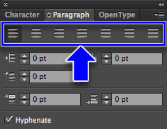
This paragraph is aligned left. Lorem ipsum dolor sit amet, consectetuer adipiscing elit. Suspendisse eget diam. Morbi in risus. Morbi nibh. Sed cursus urna. Nunc vitae nisl eu arcu vulputate pharetra. Nullam euismod. Fusce pharetra. Aliquam non ante. Ut porta, neque at porta viverra, eros nulla sollicitudin sapien, sed tempus tellus risus, vivamus sed.
This paragraph is aligned right. Lorem ipsum dolor sit amet, consectetuer adipiscing elit. Suspendisse eget diam. Morbi in risus. Morbi nibh. Sed cursus urna. Nunc vitae nisl eu arcu vulputate pharetra. Nullam euismod. Fusce pharetra. Aliquam non ante. Ut porta, neque at porta viverra, eros nulla sollicitudin sapien, sed tempus tellus risus, vivamus sed.
This paragraph is aligned center. Lorem ipsum dolor sit amet, consectetuer adipiscing elit. Suspendisse eget diam. Morbi in risus. Morbi nibh. Sed cursus urna. Nunc vitae nisl eu arcu vulputate pharetra. Nullam euismod. Fusce pharetra. Aliquam non ante. Ut porta, neque at porta viverra, eros nulla sollicitudin sapien, sed tempus tellus risus, vivamus sed.
This paragraph is aligned justified. Lorem ipsum dolor sit amet, consectetuer adipiscing elit. Suspendisse eget diam. Morbi in risus. Morbi nibh. Sed cursus urna. Nunc vitae nisl eu arcu vulputate pharetra. Nullam euismod. Fusce pharetra. Aliquam non ante. Ut porta, neque at porta viverra, eros nulla sollicitudin sapien, sed tempus tellus risus, vivamus sed.
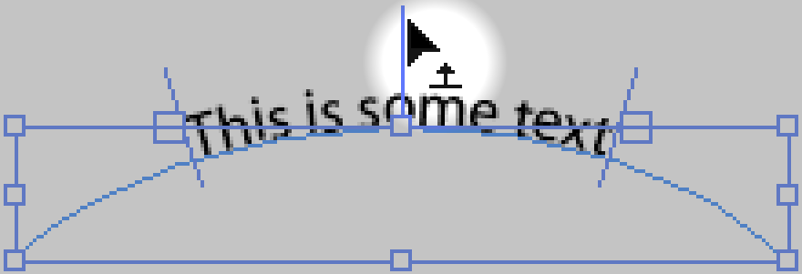
Uses very small and hard to see cursors to indicate editing mode:
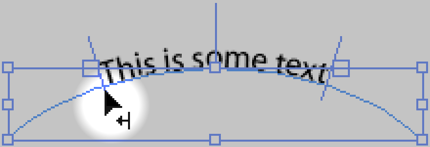
Adjust Type on Path: Left Margin
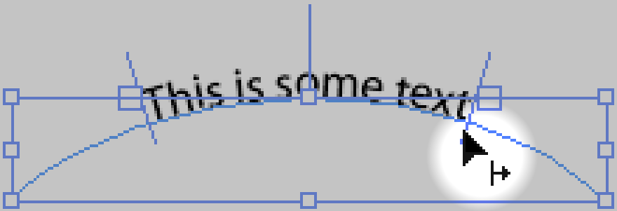
Adjust Type on Path: Right Margin
Adjust Type on Path: Center Align and Flip Sides
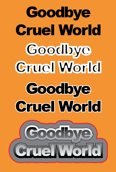
Adding Strokes To Type
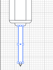
screwdriver-complete.ai
NOTE: There is a bug in Illustrator CC that will sometimes cause this to fail. I'm still working on figuring out how to reproduce this bug
reliably, and in the meantime if you run into it, convert your text to outlines instead of using this technique.
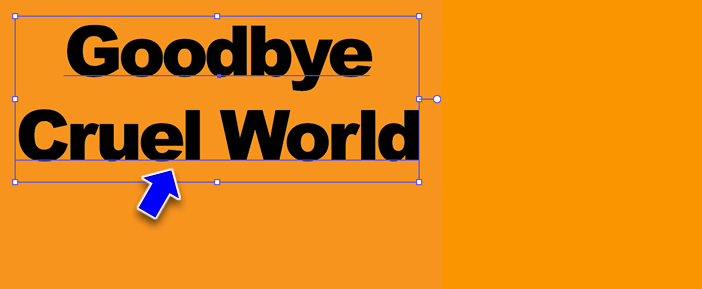
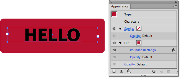
After youv'e created the text object, select it with the Selection tool.
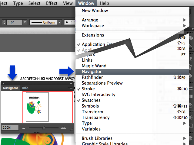
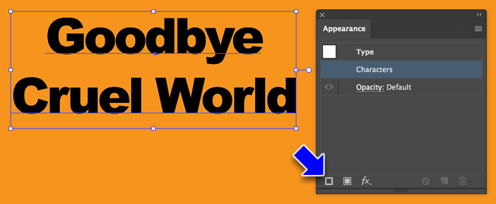
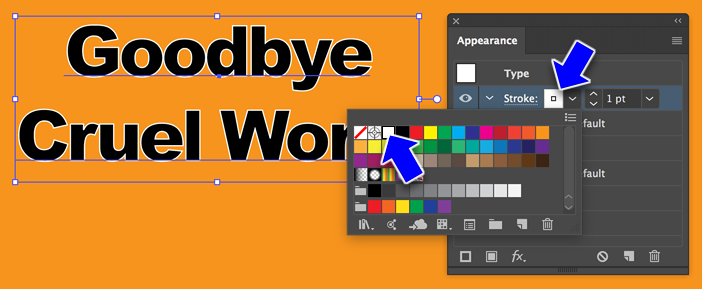
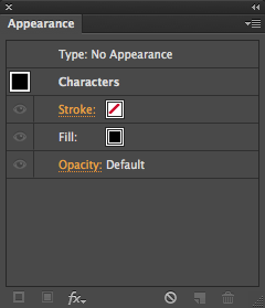
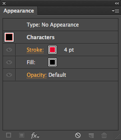
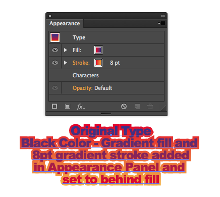
Open the Appearance Panel (Menu > Window > Appearance). Note that the layer 'Characters' is highlightd in the panel.
This will add a stroke (and an empty fill) above the Characters layer.
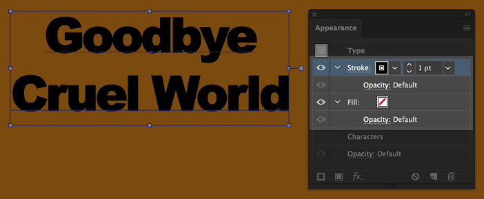
From the Stroke layer, pick a color...
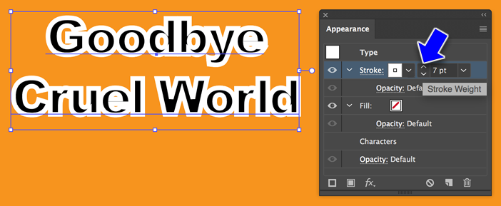
Then set the stroke to twice as wide as you want it to be.
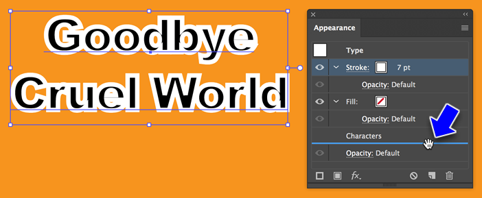
Click on the Stroke layer and drag it down to below the Characters layer.
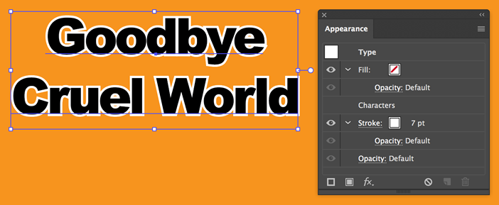
Release and the stroke is now behind the text. And, the text is still editable!
Here's some variations on what you can do with adding strokes to text through the appearance panel...(strokes02.ai)
Every non-bitmapped object in Illustrator has a path with some kind of "stroke" and "fill" (even if it's "no stroke" and "no fill")
An open path is any path with with a beginning and ending set of anchors that aren't connected to each other.
A closed path is any path in which all the anchors are connected to other anchors on both sides.
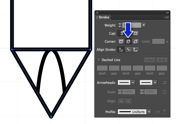
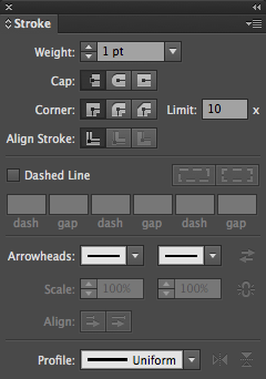
The stroke window gives control over the general aspects of a stroke, such as:
Weight
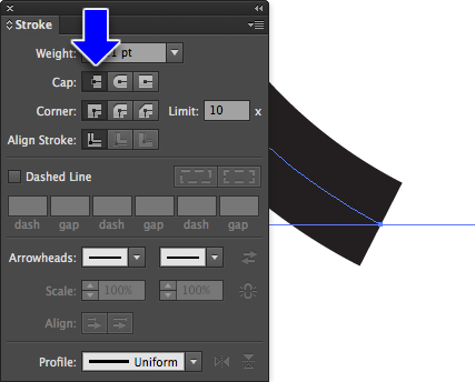
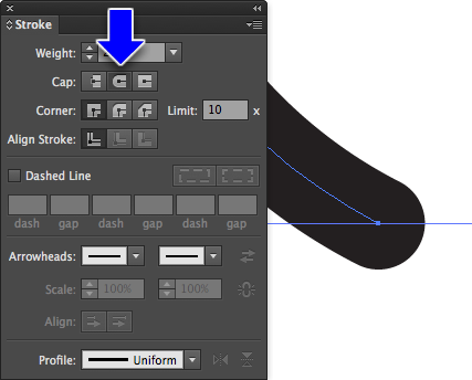
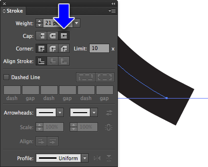
Cap
Corner
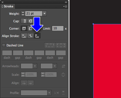
Alignment
Dashed Line settings
Arrowheads
Profile
Stroke: Caps
No Cap
Round Cap
Square Cap
Stroke: Corners
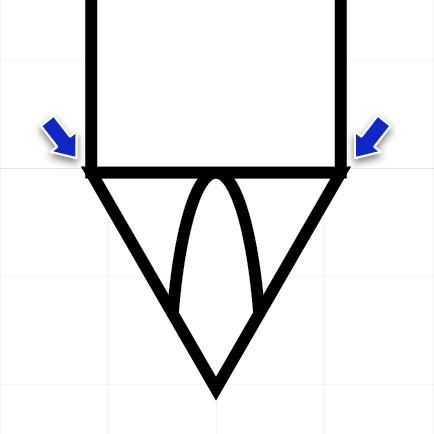
Miter Join (default)
Round Join
Bevel Join
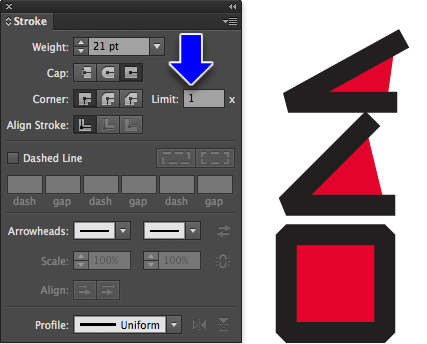
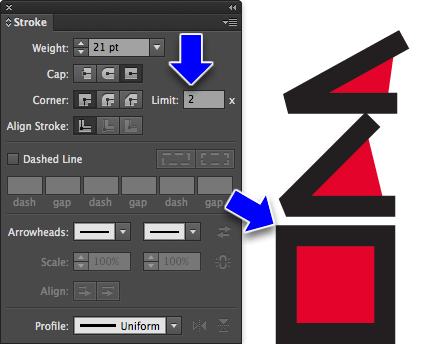
Corner Miter Limt
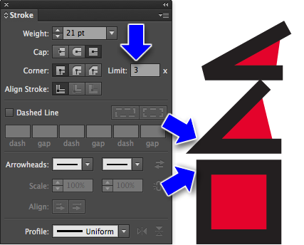
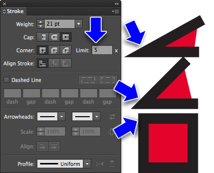
Corner miters control the appearance of to path segments coming together at a corner. The limit value ranges from 0 to 500, with 0 giving a chopped-off appearance to the miter (technically know as a chamfered edge), and a high value giving a pointed connection, much like the miter made by a carpenter on a wooden frame.
1 will make any angle corner a bevel
2 will turn 90° into a miter (or round) join
3 will turn 45° into a miter (or round) join
Greater than 3 will set more acute angles to miter (or round) joins
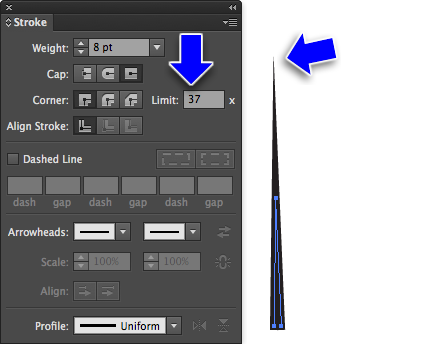
Very acute angles may need numbers over 10
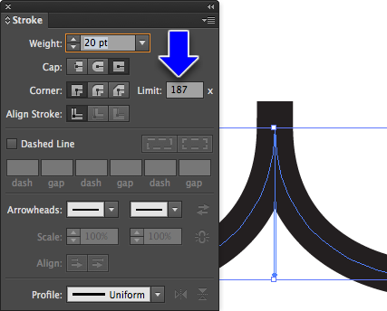
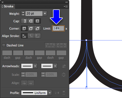
500 is an outrageously high number, mostly you're less then 10. Sometimes you need a big number for curves coming together into a point:
189 limit for this example
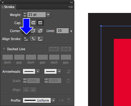
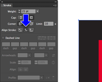
Stroke: Alignment
Centered (default)
Inside
Outside
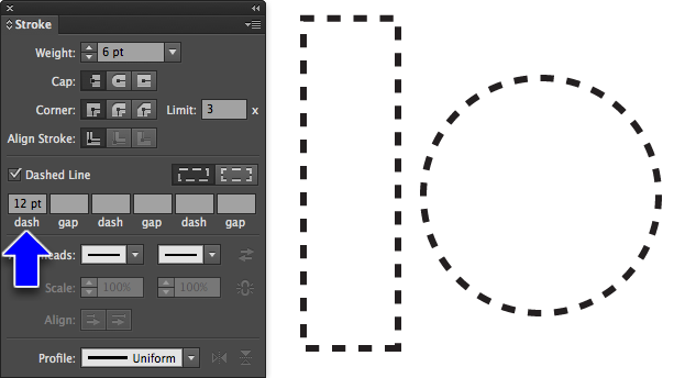
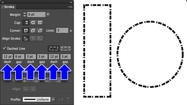
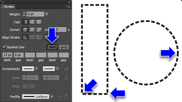
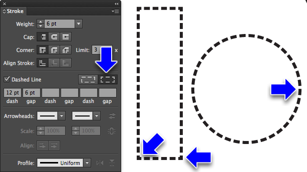
Stroke: Dashed Lines
12pt dash (default). No value for the gap matches the dash size.
You can make up to 3 dash and gap sizes that repeat
Labeled Preserves exact dash and gap lengths can lead to misaligned corners and sides. Useful mostly for open objects
Labeled Aligns dashes to corners and path ends, adjusting lengths to fit keeps corners and side looking neat. This used to be really hard to do by hand. Added in CS 4 or 5
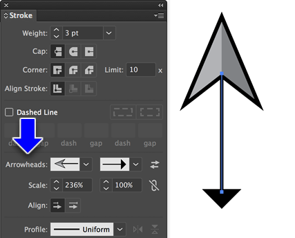
Arrowheads
Handy for charts, graphics and technical illustrations.
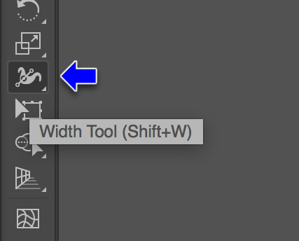
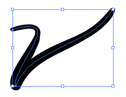
The Width Tool
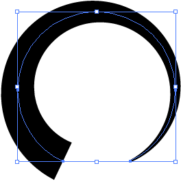
The Width tool in the Toolbar lets you modify the width of a stroke at any point on a path.
You can change the width of a stroke at any point along the stroke with the Width Tool
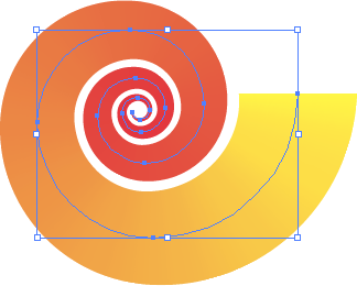
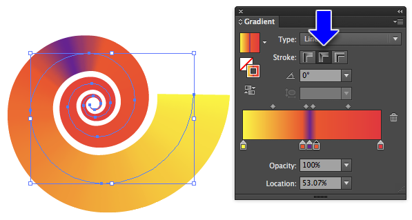
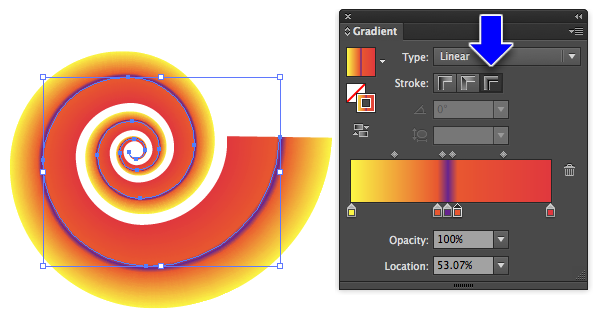
And you can put gradients on paths
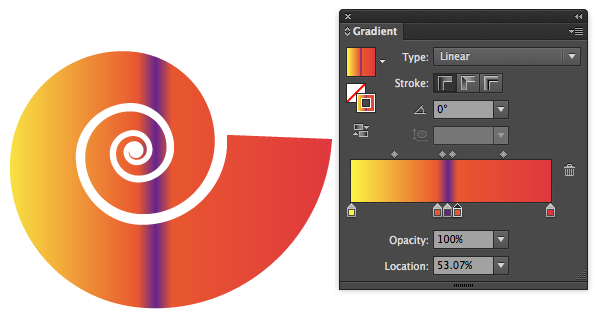
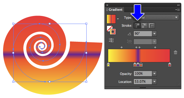
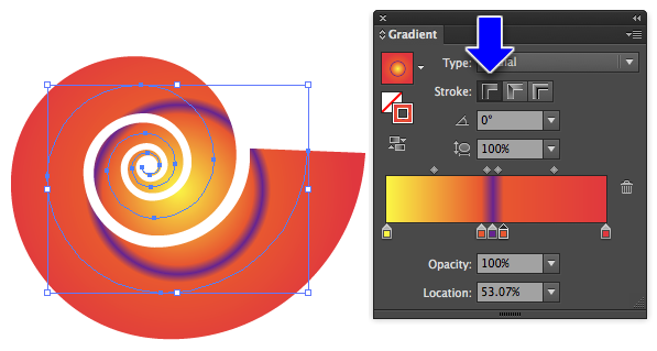
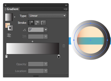
Use the gradient panel to control the way the stroke works on the path:
Buying advice: Buy the largest format you can afford.
Apple's iPad Pro and Microsoft Surface computers are kind of changing the game, but touch UI doesn't lend itself very well to vector drawing (I think).
Working With The Paint Brush Tool
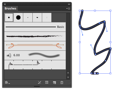
Makes editable paths similar to the Pen tool (demo)
The Paint Brush Vs The Pen Tool
vs.
Brushes
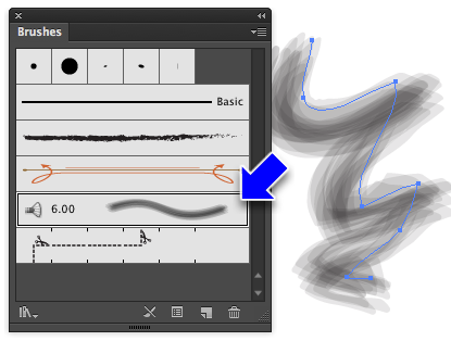
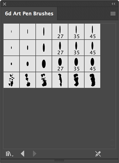
The Brushes Panel
Same path, different brush
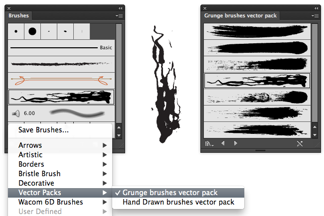
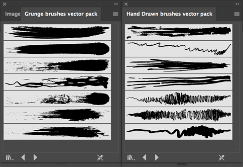
Load brushes from the popup menu in the lower left of the brushes panel
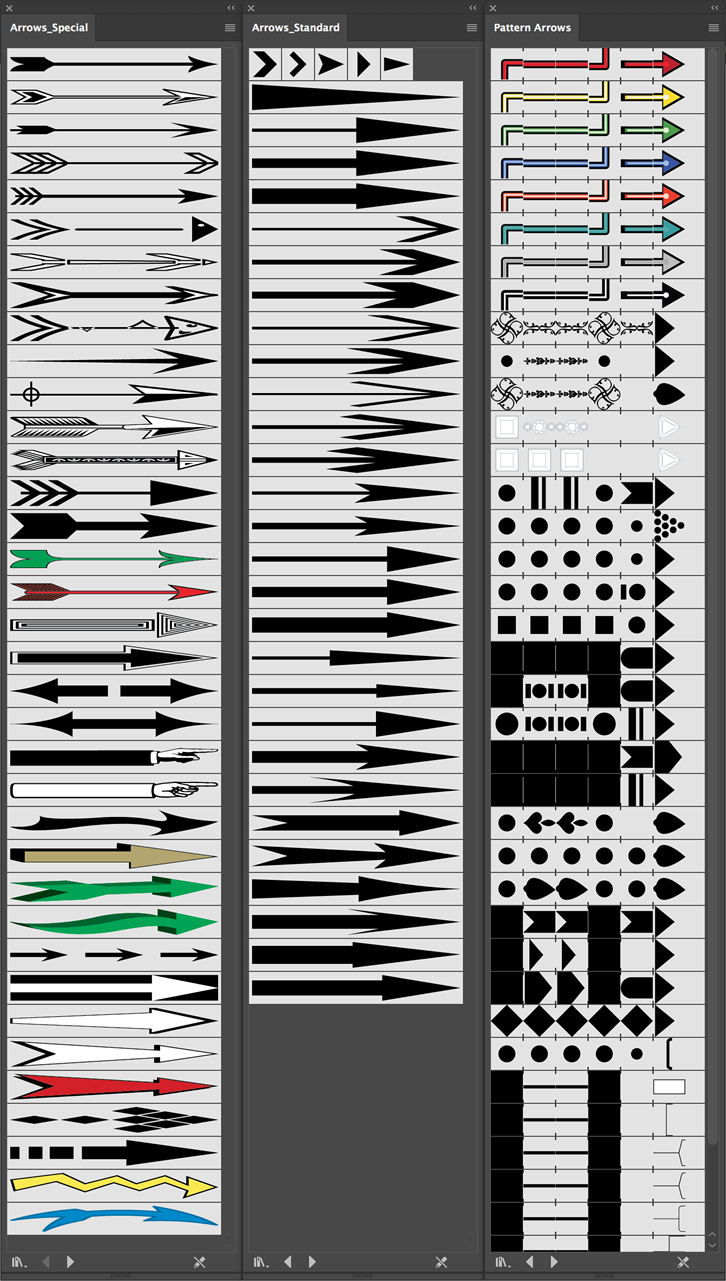
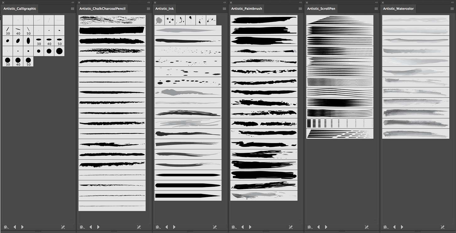
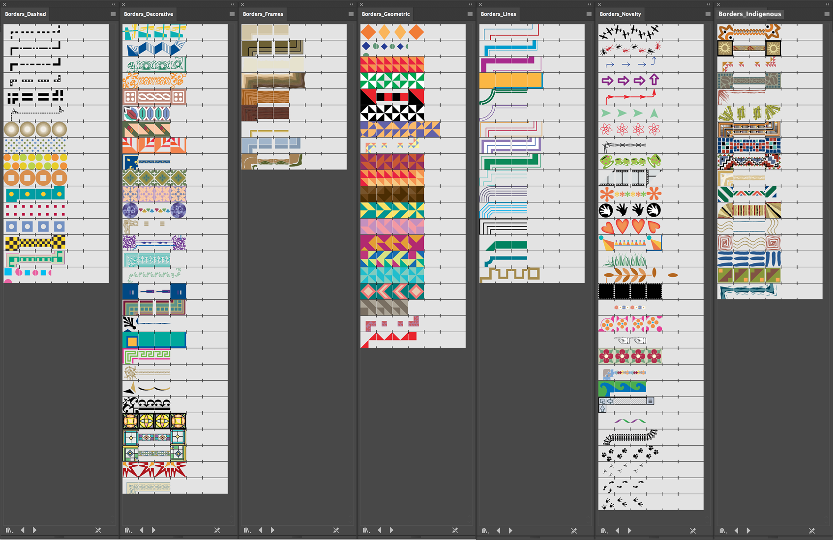
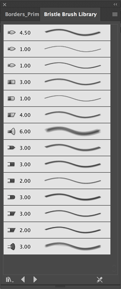
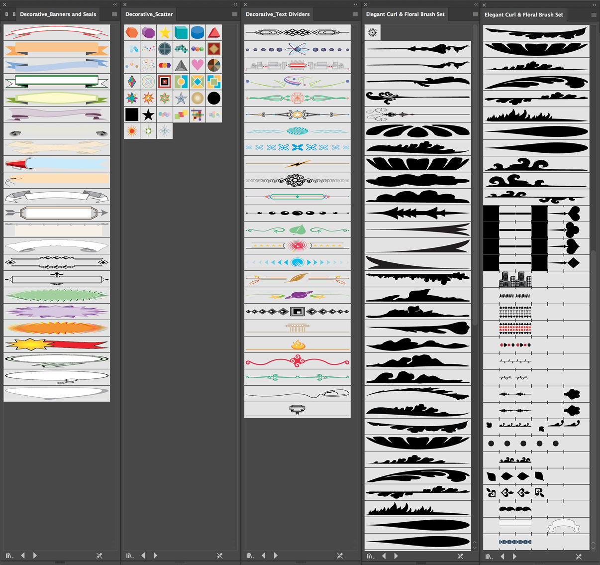
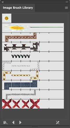
Click on the above to see at full size. NOTE: Even though they're listed here, you're not allowed to use them in this class! However, you're welcome to build your own.
Brush Categories
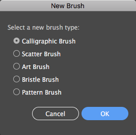
Illustrator has five categories of brushes, which you'll see when you choose Create New Brush from the brush panel. Each brush category has its own dialog to control its behavior.
Brush Options by Brush Type
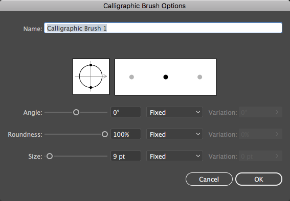
Brush Options: Calligraphic
Calligraphic brushes are based on elliptical shapes of various sizes. You can use a graphics tablet to vary the Angle, Roundness, and/or Size of the brush based on the pressure applied to the stylus (but don't forget to set the variability or it won't work).
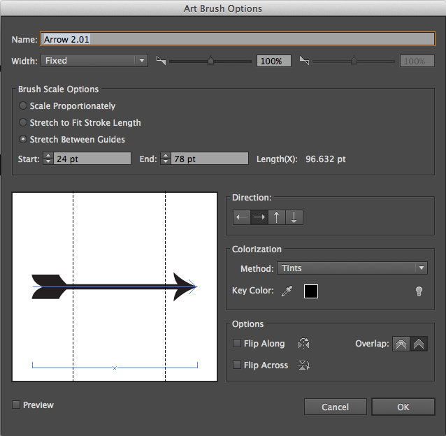
Brush Options: Art Brushes
Art brushes are made from existing vector graphics. Setup is fairly complicated, we'll look at some examples later in the semester.
In fact, brush design is hard. We'll cover more on custom brushes later...
Working With The Blob Tool
Blob Vs. Paint Brush
Paint Brush makes editable paths without fills and strokes defined by Brushes
Blob makes contiguous areas of color with fills and invisible strokes
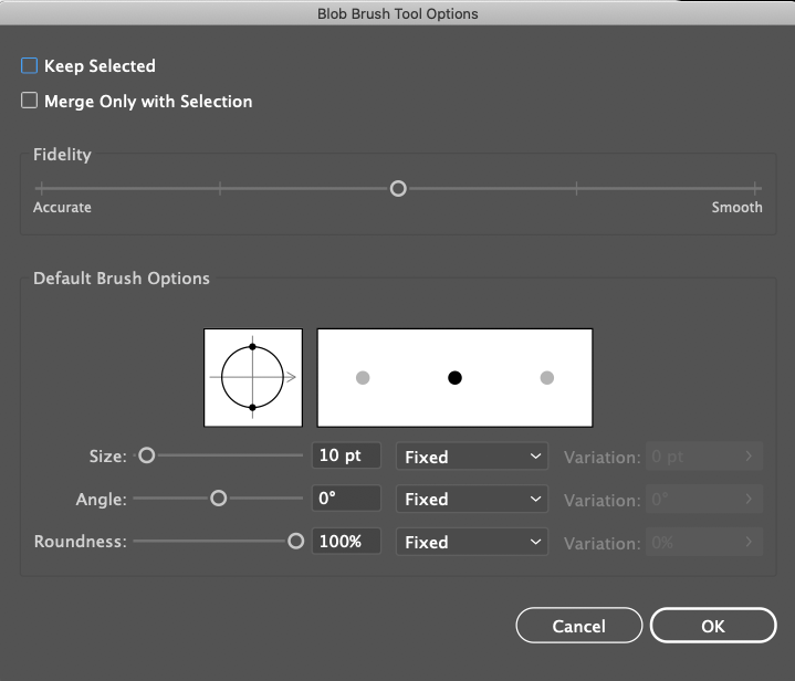
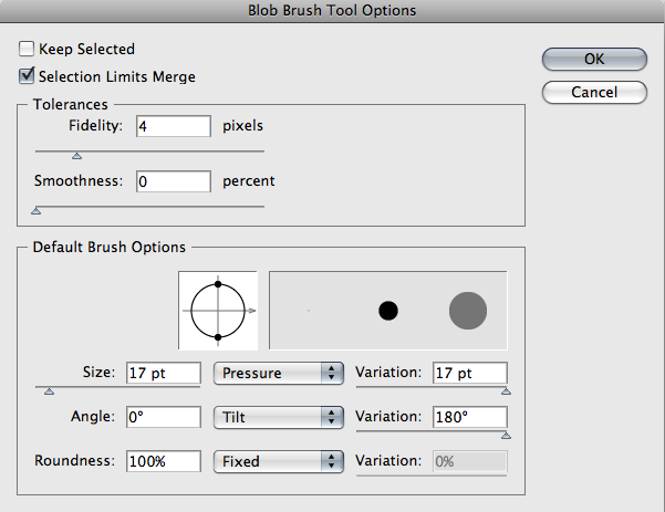
The Blob Options Dialog
Double-Click the tool icon to access
Keep Selected
Keeps blob gestures selected. Default is off.
Merge Only With Selection
Off by default. If Keep Selected is off, and Merge Only is on, then each blob gesture remains a separate entity
This and Keep Selected are the most frequently modified settings of the blob tool
Tolerances
No vector tool can capture every nuance of input gestures - these setting adjust how closely the tool imitates the original gesture
Fidelity
Higher values have less detail
Smoothness
Higher values do more smoothing
Default Brush Options
Changes the shape and size of the brush, and allows stylus pressure from a graphics tablet to control things like the size of the brush
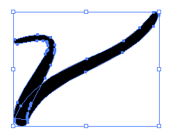
Since the Paint Brush tool makes only strokes/paths without fills, it's often useful to turn it into an object whose outer visual boundary is a stroke and interior is a fill.
Use Menu>Object>Expand Appearance
Why? Useful for creating Live Paint objects
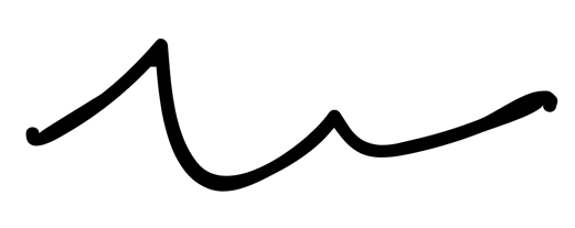
Hand-drawn thing from paintbrush tool
Thing expanded into filled objects with no stroke
Thing filled with Live Paint after being converted to Live Paint object with Menu > Object > Live Paint > Make
Fun With Brushes
The Scatter Brush
For interesting effects!
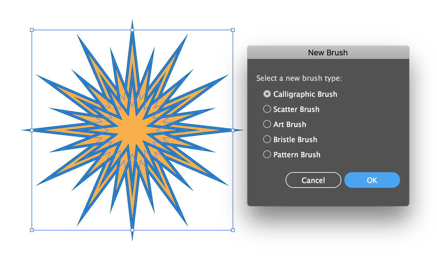
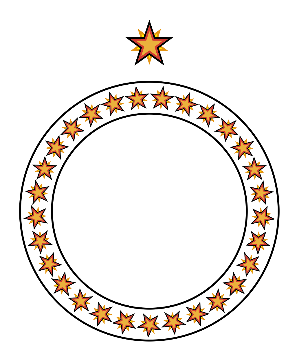
13point star, radius 1 .8 in, radius 2 .25 in. 2pt stroke. Rotate each about 18.85 degrees (13/360/2) and scale down
First, create an object, or group of objects (without gradients, brushes or other fancy stuff)
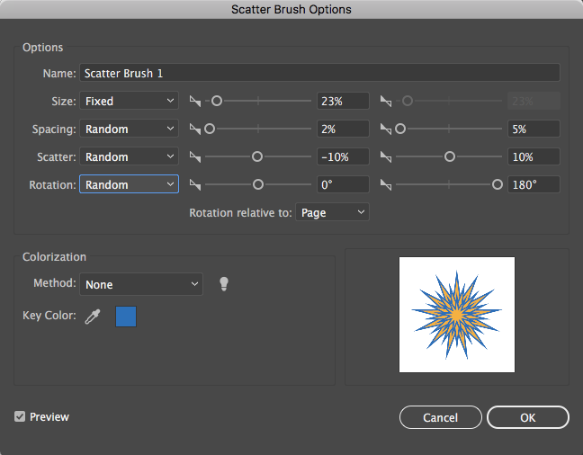
Choose New Brush from the bottom of the Brush Panel
Set some settings, we can tweak latter...
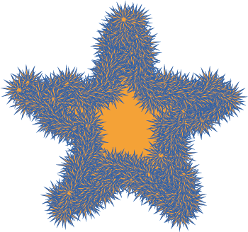
The Scatter Star brush applied to a star
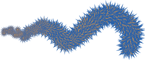
Scatter Star applied to a paintbrush path with pressure controlling size
Working With The Blob Tool Part II
Selections limits merge in Blob Options
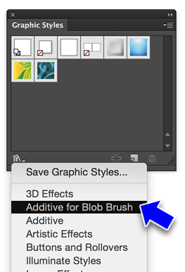
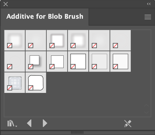
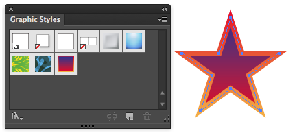
Graphic Styles Panel: Lower corner menu: Additive for Blob Brush
Cool effects, which brings us to...
Working With The Appearance Panel
Changing parameters
Adding effects
Adding Strokes & Fills (brief coverage-things to come)
Working With The Pencil/Smooth Tools
Demo
The Curvature Tool
Object to trace with curvature tool (right click to download)
Borrowed from 'Yes I'm a Designer' YouTube
Gesture
Result
First click/release
Drop and anchor for start of curvature line
Following clicks/releases
Draw a curved line from previous anchor and drop a smooth anchor
Following clicks/drags
Create a moving smooth anchor. Releasing the mouse drops the anchor
Option/Alt click/release or double-click/release
Drop a corner anchor
Esc
Stop drawing line
Click/drag on an existing line segment
Add a smooth anchor to that point. Drops the anchor on release.
Option/Alt click/release or double-click/release on existing anchor
Convert the anchor from smooth to corner or visa versa
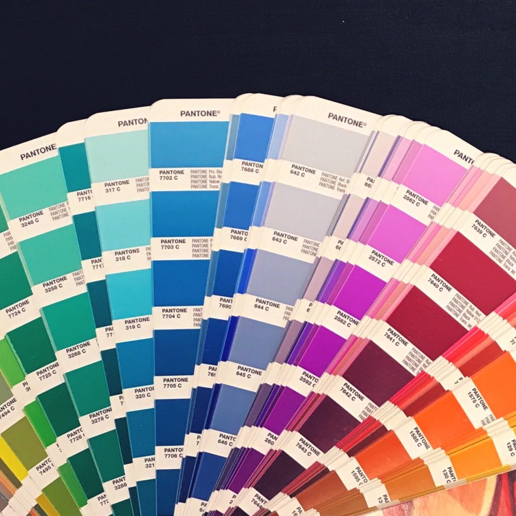
PMS colors are chosen from a color book, which also is represented in Illustrator
Our Tattoo assignment is in CMYK with PMS colors
How to setup colors for the tattoo assignment
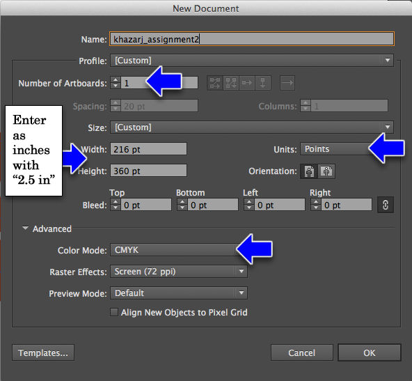
Create Your Project Document
Set artboards to 1
Units to Points
Use points because you want to keep an eye on line weights: nothing less than 1 point allowed
Size to whatever predetermined size you have for your tattoo + 1 inch
Type in the inch value followed by "in" and it will automatically convert to points
No Bleed
Color Mode: CMYK
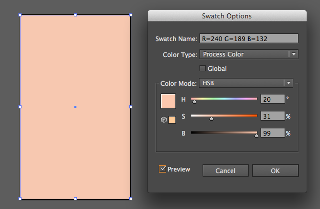
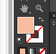
Create a background color for your target skin-tone
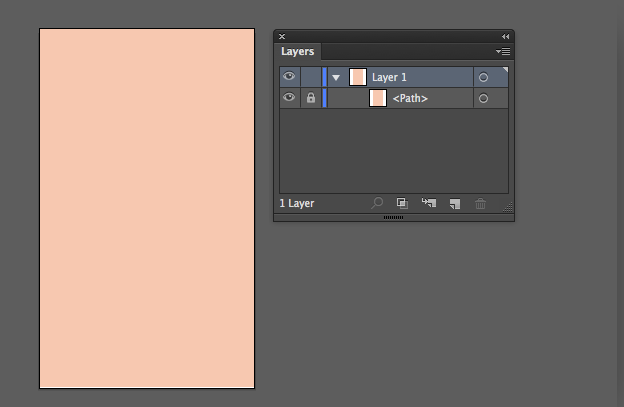
Fill the artboard with a color rectangle, no stroke
Make sure that the Fill tab is the active tab
Pick something from the Swatches, then double-click on it
HSB color mode is the most intuitive
Hue: the "tint" of the color
Saturation: the "brilliance" of the color (gray=no brightness)
Brightness: the relative light or darkness
Lock the layer
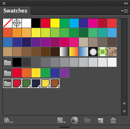
Create Your Tattoo Color Swatches
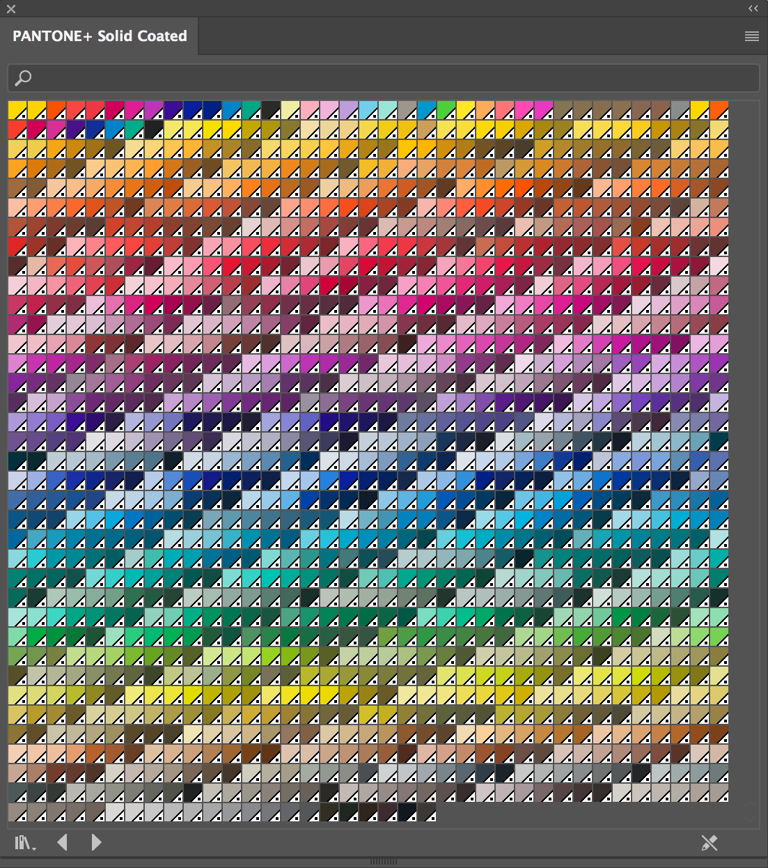
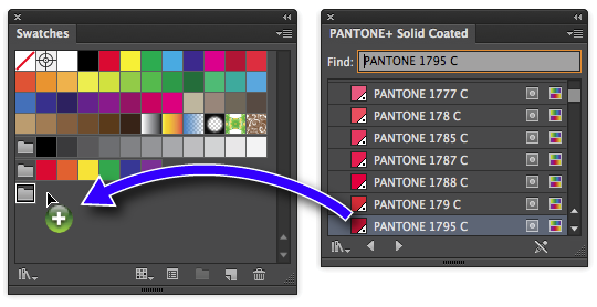
You need to drag colors from the Pantone Color Book (Solid Coated) over to your document's color swatches panel. You get to the Pantone Color book through the menu in the lower left corner of the Swatches panel.
The color's needed are black and white, plus:
PANTONE 1795 C (Red)
PANTONE 7742 C (Green)
PANTONE 533 C (Blue)
PANTONE 114 C (Yellow)
PANTONE 7516 C (Brown)
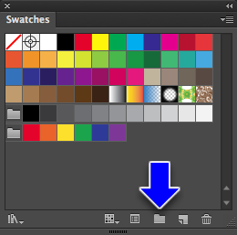
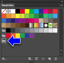
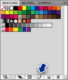
Open the Swatches Panel and click on the New Folder button
Name the folder
Result
From the menu at the bottom left of the Swatches Panel, choose Color Books > Pantone+ Solid Coated
The Pantone Solid Coated Color Book Swatches set
Choose Small List View
Type in the color number in the find field, in this case 1795, and PANTONE 1795 C will appear
Drag the swatch from the Color Book set to your Tattoo Colors Folder
Repeat until you get the Pantone colors into your Tattoo Colors folder
Illustrator & CMYK Color
Let's Look Closer At The Default CMYK Swatches
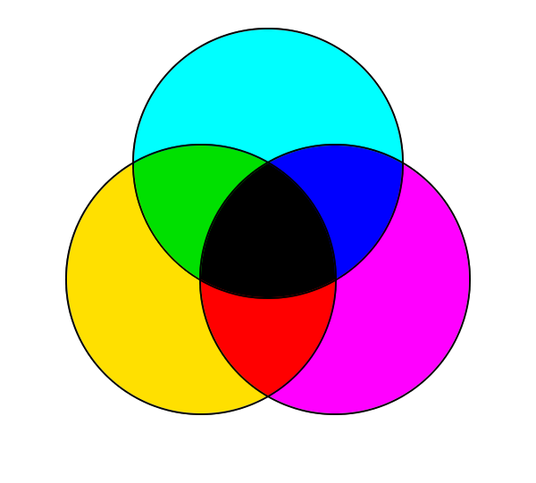
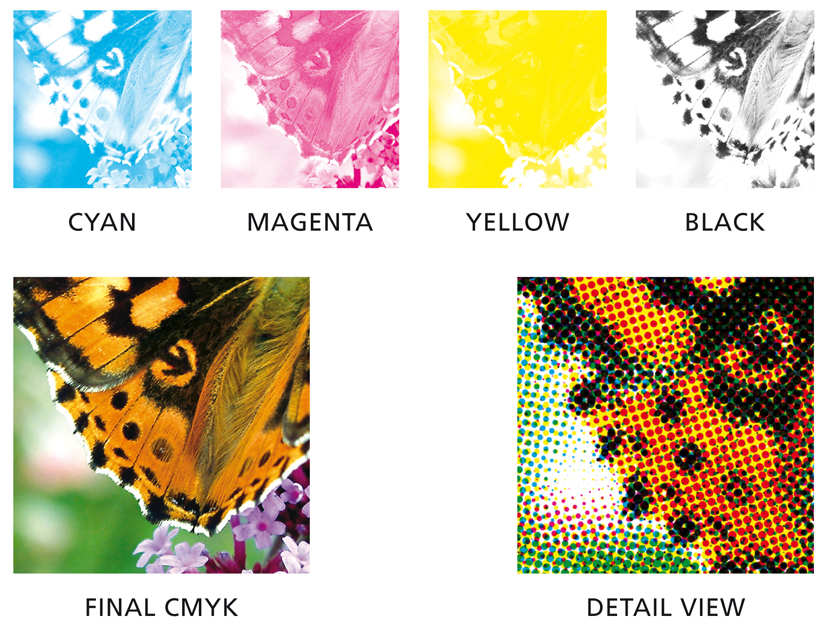
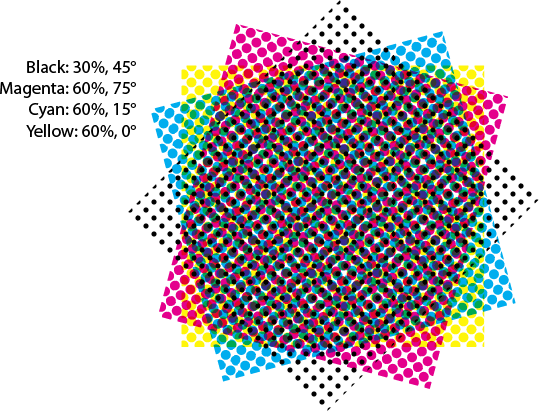
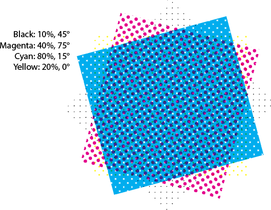
CMYK represents 4 colors of ink, printed on top of each other at angles (0°, 15°, 45°, 75°) to create different colors:
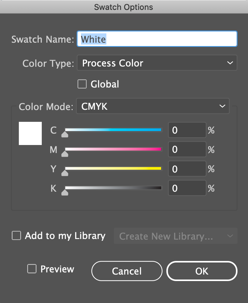
Double-click a swatch for it's options dialog
Note the Color Type: Process Color
The alternative is Spot Color, which is what we just talked about
Note the Color Mode: CMYK
The sliders adjust the amount of ink of each color, Cyan, Magenta, Yellow and Black
It's through these variations that all 4-color printed work is rendered
You can mix and save your own...
A word about CMYK vs. Spot color and the "Global" setting
Spot colors are Global by default
Changing a global color will change all instances of that color in the document
How To Mix Your Own Colors
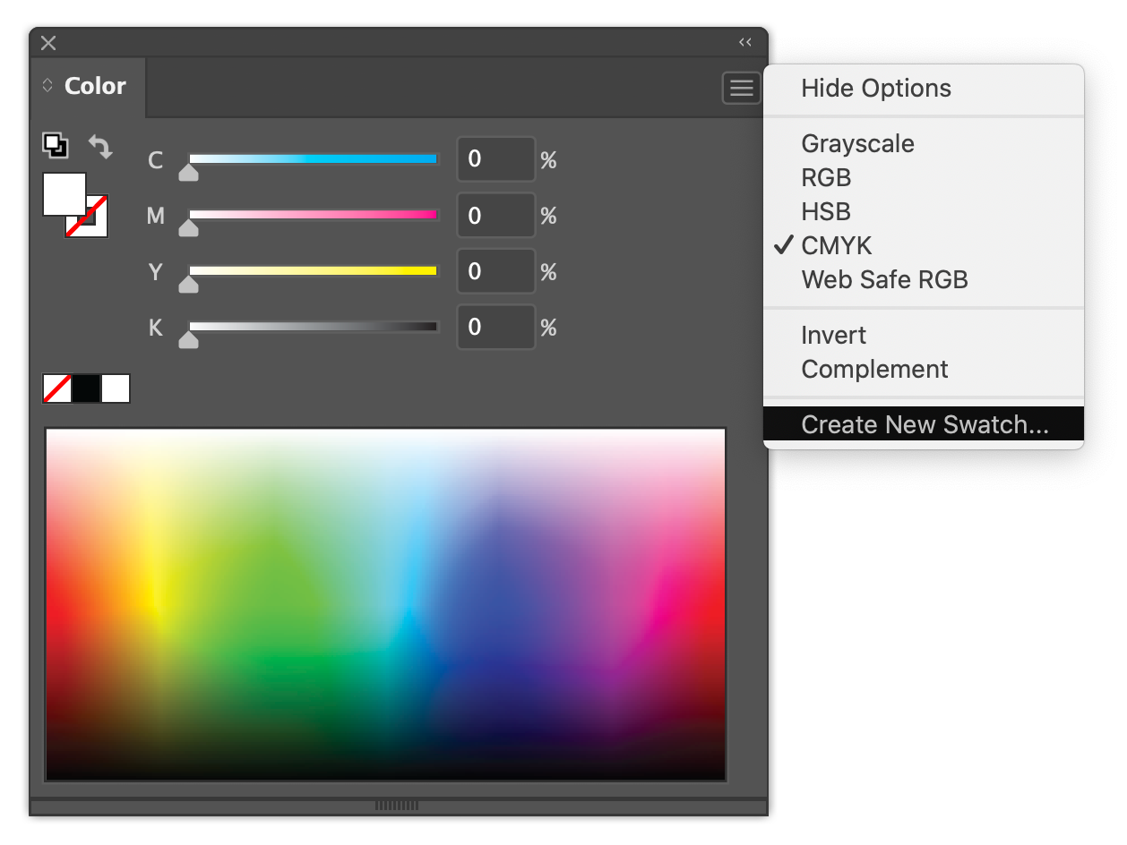
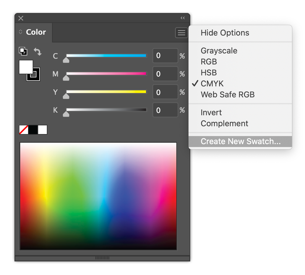
Use the Create New Swatch menu item in the Color Panel, or the Create New Swatch button in the Swatch Panel. Set the Color panel to Show Options to view sliders.
Mix with the slider (which is kind of clunky)
Mix with the rainbow thingy in the Color Panel (also kind of clunky)
Use the Color Guide (more on this next time...)
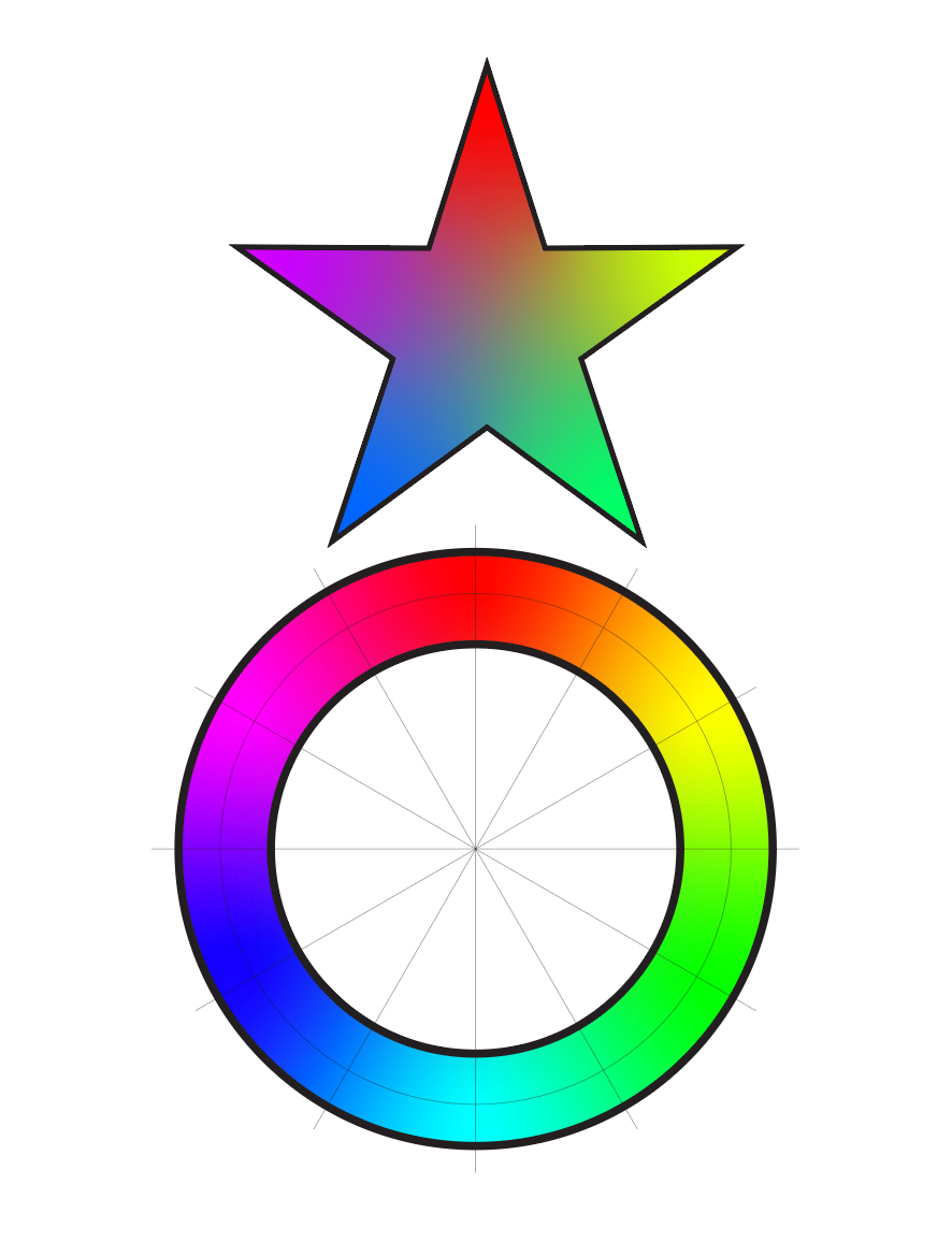
Color basics: HSB = Hue, Saturation, Brightness
Hue: the "color" of a color, like red, blue, green, yellow
Saturation: the "intensity" of a color, like bright red (hi saturation), dull brown (low saturation)
Brightness (sometimes listed as "V" for Value): the amount of light or darkness in a color, like pink (light red), burgundy (dark red)
Use the H S B radio buttons to pick which color aspect you want to change in the vertical bar next to the buttons
Hue selected (in Degrees out of 360°)
Saturation selected (in percent out of 100%)
Brightness selected
Watch Out For Colors That Can't Be Printed!
The color picker will let you choose colors that can't be printed with CMYK inks. A warning icon will appear next to the color when you pick an illegal color
About Color Ranges, Or "Gamuts"
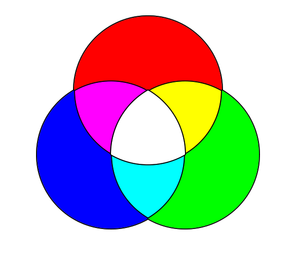
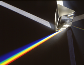
We see colors with lightwaves. When white light (which contains all colors of light - remember prisms and rainbows and Newton?) hits a red colored object, that object absorbs all the non-red colors of light and reflects only the red lightwaves. Our eyes can see a set of colors in what's called the Visible Spectrum. Certain media, like CMYK printing, can only create a limited subset of all the possible colors we can see. This subset is called a "Gamut"
When you go outside the gamut that CMYK can reproduce, Illustrator will tell you with that little ! icon
This is a graph of different gamuts
Why Does It Matter?
It matters because if you do something that looks great on-screen but is out of the CMYK gamut, you'll be really disappointed when it gets printed (and your client might refuse to pay you and you probably also get stuck with the printing bill).
Organizing Swatches
Swatches can be organized in Color Groups through the Add Color Group button
Drag a swatch to move it into a group
Watch out! Dragging from one group or the default colors moves that color without leaving a copy behind. To create a separate swatch of the same color in a group, click the swatch you want to copy, then drag if from the Color Panels color tab
Drag a color tab into a group
(make new example on the fly)
Create a new group with a selection and Add Color Group yields:
Creating Gradients
Using the Gradient Window
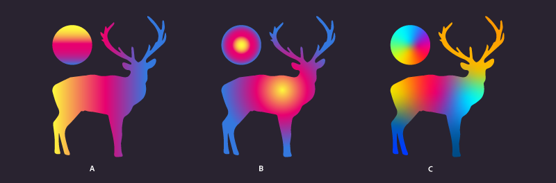
Gradient Types
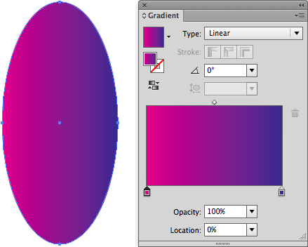
Linear
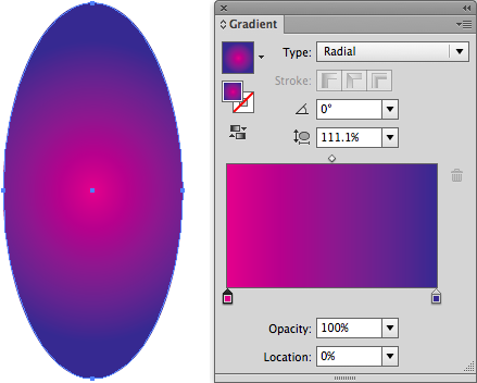
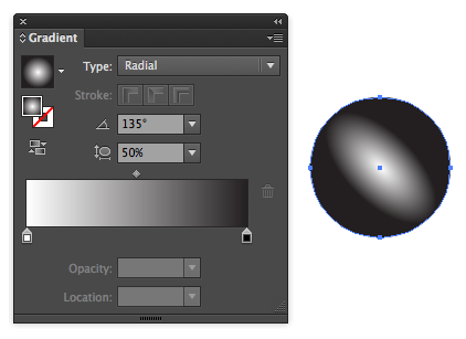
Radial
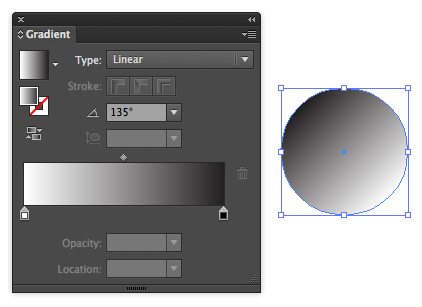
Linear Gradient Angle
Radial Gradient Angle and Aspect Ratio
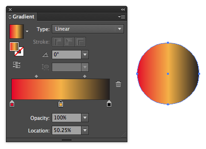
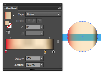
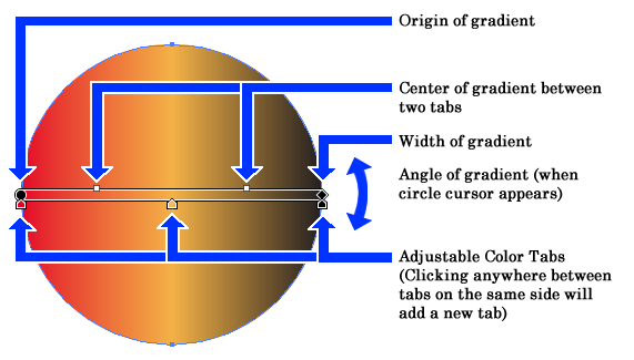
Changing Gradient Colors
Double-click on a tab to edit a color
Click below gradient band to add a new tab, click on an existing tab and drag it off the panel to delete it.
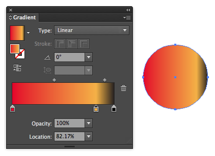
You can adjust the position of the tabs
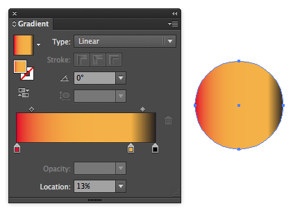
Adjust the center point of the point-to-point spread of the gradient
Adjust the Opacity of a color tab
And Strokes can have gradients too!
The gradient tool doesn't work with gradients in strokes, but you can use the Angle to set the stroke, or use Menu > Object > Expand with only strokes, then select the fill in the appearance panel
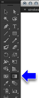
Using the Gradient Tool
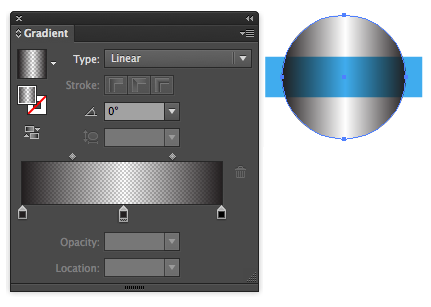
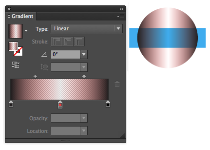
Important Trick: Gradients with Transparency
It's easy to mess up transparency in a gradient by making the transparent color different than the solid color. They should be the same.
The right way: black to black to black gradient, with the center black at 0% opacity
The wrong way: black to white to black gradient
"Freeform" Gradients
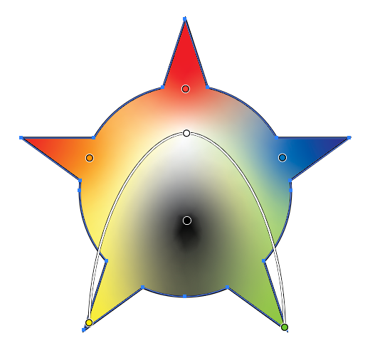
Only 2 years old, Freeform Gradients use points and/or lines to allow customization of a gradient within a shape.
To apply a freeform gradient to a shape:
Select the shape, then choose Menu > Window > Gradient to open the Gradient panel.
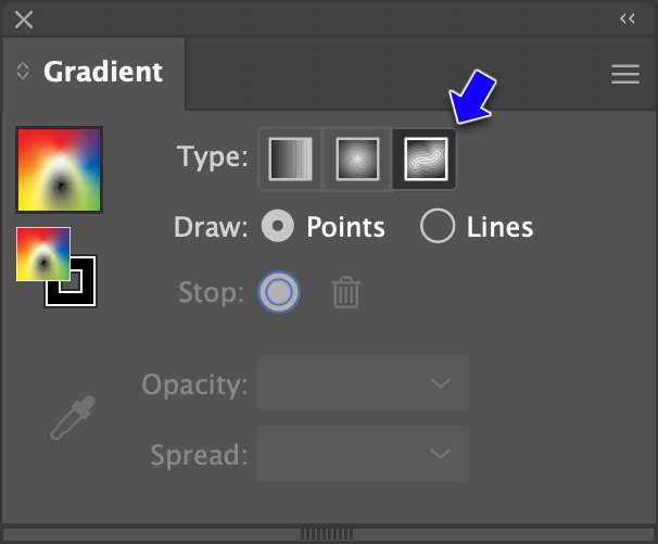
Click icon for Freeform Gradient next to "Type:"
The Gradient tool will be selected and points will appear on the shape icon for Freeform Gradient Color Steps (the number of default points varies by shape). Each point represents a color stop in the gradient. The colors will automatically blend from point to point, point to line, and or line to line within the shape.
To move a point within the shape, drag it.
To set a point's color, double click it.
To add additional points, click anywhere on the shape where there isn't currently a point.
To remove a point, click it then press Delete on a Mac or Backspace in Windows.
To expand or reduce the spread of the color from a point, click the point, then drag icon for Freeform Gradient Color Spread at the bottom of the dashed ring that appears around the point. The bigger the ring, the more the color spreads and vice versa.
To make the color from a point more or less transparent, click the point then set the number by OPACITY in the Gradient panel.
Freeform gradients can also be set using lines.
Click LINES in the Gradient panel.
Click in the shape to set the starting point for the line.
Click again to create another point and a line will automatically connect it to the previous point. Repeat until the line is complete. The line will automatically curve through the points.
The points in a line can be moved, added, deleted, and have their color and opacity set using the same steps as above.
Freeform gradients can be made using a combination of points and lines. Just click POINT or LINE in the gradient panel to switch between them. When finished, switch to another tool to set the gradient. To edit the gradient later, select the shape then either switch to the Gradient tool or click EDIT GRADIENT in the Gradient panel.
Working With The Appearance Panel
Changing parameters
Adding effects
Adding Strokes & Fills (brief coverage-things to come)
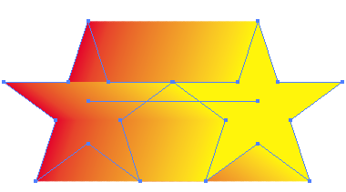
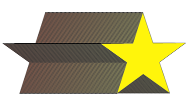
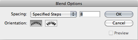
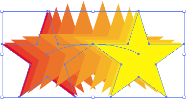
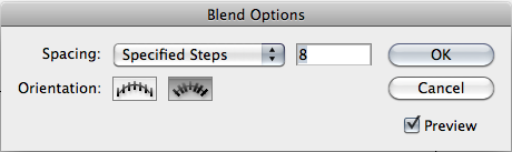
Blending Objects
Blends the stroke, fill and shape two or more objects together
Look out for strokes with blending filled objects...
Blending objects generates a path that can be edited
Blends the stroke, fill and shape two or more objects together
Three shapes blended. Note unpredictable transition between anchors
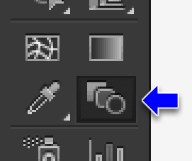
It can make a difference where you click with the blend tool
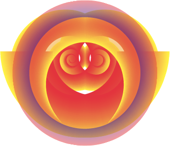
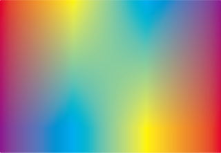
Blended Gradients
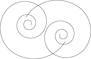
Blended Spiral Paths
Blended Paths
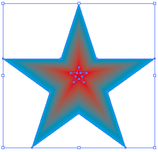
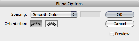
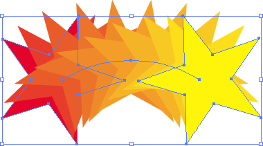
Blended stars on straight path with Menu > Object > Blend > Replaced Spline
Clipping Masks
Very important feature!
Select two or more objects
The top object must be a closed path
Menu > Object > Clipping Mask > Make
You can create clipping masks for objects within clipping masks
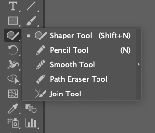
Working With The Shaper/Pencil/Smooth Tools/Path Erase/Join Tools
Shaper Tool
Leftover tool from Adobe Flash/Animate (circa 1993) originally developed for the Apple Newton. Turns objects roughlty drawn as ellipses and rects into acutal ellipses and rects. Really utterly useless...
Pencil Tool
Like a cheaper version of the Brush tool. Has no adjustability for Accurate vs Smooth and won't use brush shapes, only stroke widths.
Smooth Tool
Takes the currently selected path and sort of massages areas into being smoother. Really hard to predict how it will work. It's usually better to use Object > Path > Simplify (although it affects the entire path and not just a portion of it). There are also extensions to Illustrator that do this much better (like Astute Graphics VectorScribe).
Path Eraser Tool
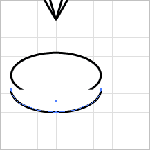
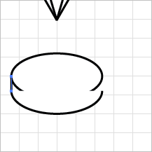
Erases part of a selected path. You have to drag along the actual path for it to work. Similar to the Eraser tool, but the Eraser tool will erase part of a closed-path object and keep the path closed, while the path eraser will turn the path into an open path or paths. The Eraser tool also has an adjustable size, while the Path Eraser tool is just a small point.
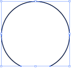
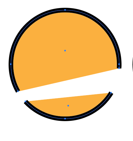
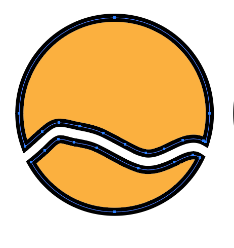
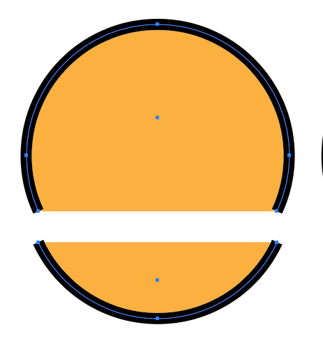
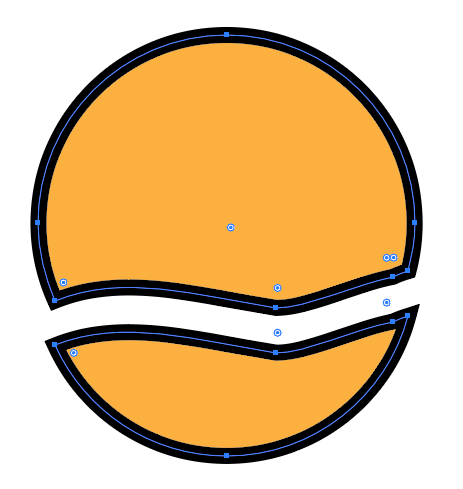
Circle with Path Eraser tool used on two sections.
Circle with Eraser tool drawn across it. Creates two closed paths with a gap between the size of the Eraser.
Circle with Scissor tool touched on right and left parts of the path, then moved down. Note that the path does not need to be selected.
Circle cut with Knife tool, then moved down. It creates two closed paths with no gap between the two parts.
Join Tool
Takes two paths and connects them together. Works best with overlapping paths. If you have two open paths that don't overlap, it's better to select the two points with the Direct Selection tool and use Menu > Objects > Path > Join.
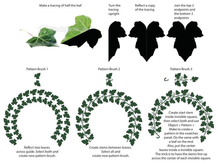
Pattern Brush
Really complicated, possibly too much for this course.
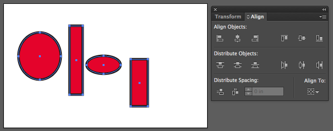
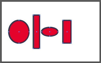
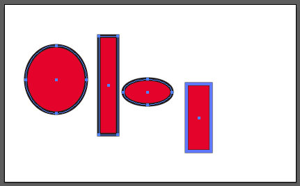
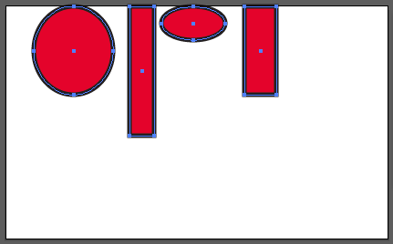
Shift-click to select multiple objects, then click again (without shift) on the object you want the other objects to align to. The Key object will get a heavy selection line on its path.
Key set
Align tops
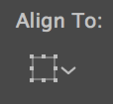
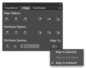
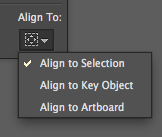
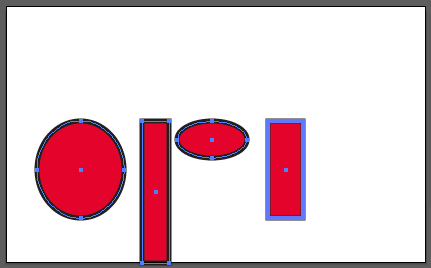
Align To Artboard (Align to Top above)
Tip: Use grouping to keep things from piling up on one another, then ungroup (if you need to)
Click on the “Recolor Artwork” button in the control panel
The Recolor Artwork dialog
First things first:
Click on the eyedropper icon to get the colors from the original art
Click on the file icon to make those colors a color group. This helps if you need to return to the original colors later on
Re-Assign Current Colors With:
Randomly change color order button
Randomly change saturation and brightness
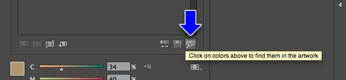
Find colors in your artwork, with the idea of locking them out or doing special processing on them
Select a color and click this button to lock it out from being recolored
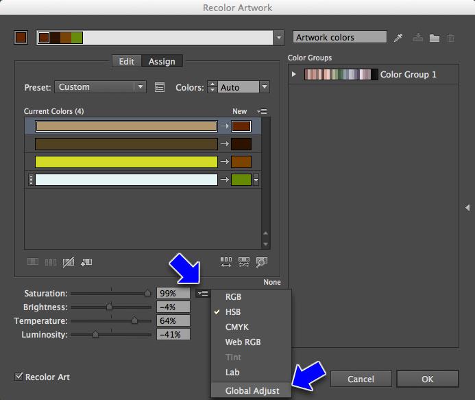
You can globally adjust colors too (very similar to the next process of Editing with locked harmonies)
Saturation
Brightness vs. Luminosity: I have no idea what the difference is. There is no consensus regarding this in the literature. It is likely a trick of mathematics in the way the R G and B values are calculated. They do look different. I thinks it's about luminosity maintaining saturation better than brightness.
Temperature: The only place (true for the previous as well) used in Illustrator. Warm vs Cool, basically
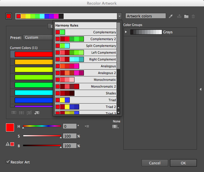
You can apply color harmonies to your existing colors as well
Edit Current Colors
Changing Colors, But Keeping The Same Relationships
Choose Edit at the top of the dialog
To maintain the color relationships, choose "Link harmony colors"
Let's walk through the options...
Save sets of colors you like
Recolor Artwork Videos
There used to be more of these but, unbelievably, Adobe pulled them down.
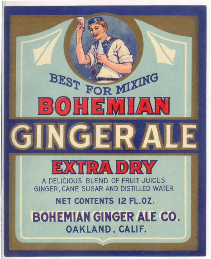
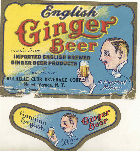
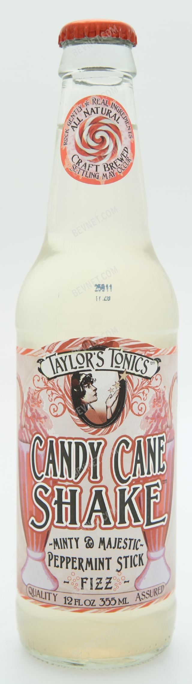
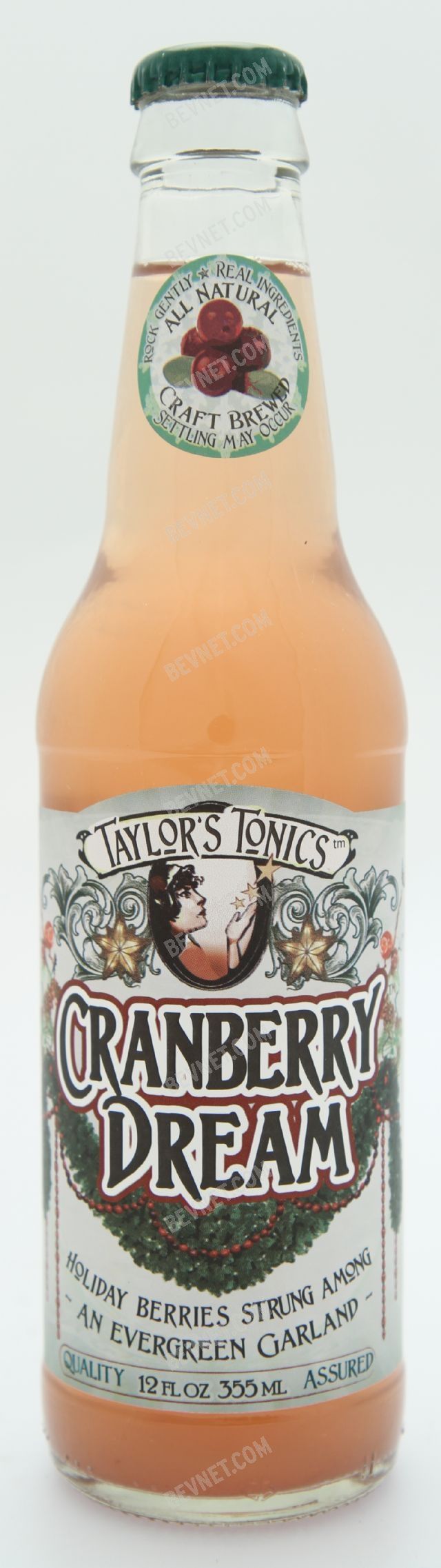
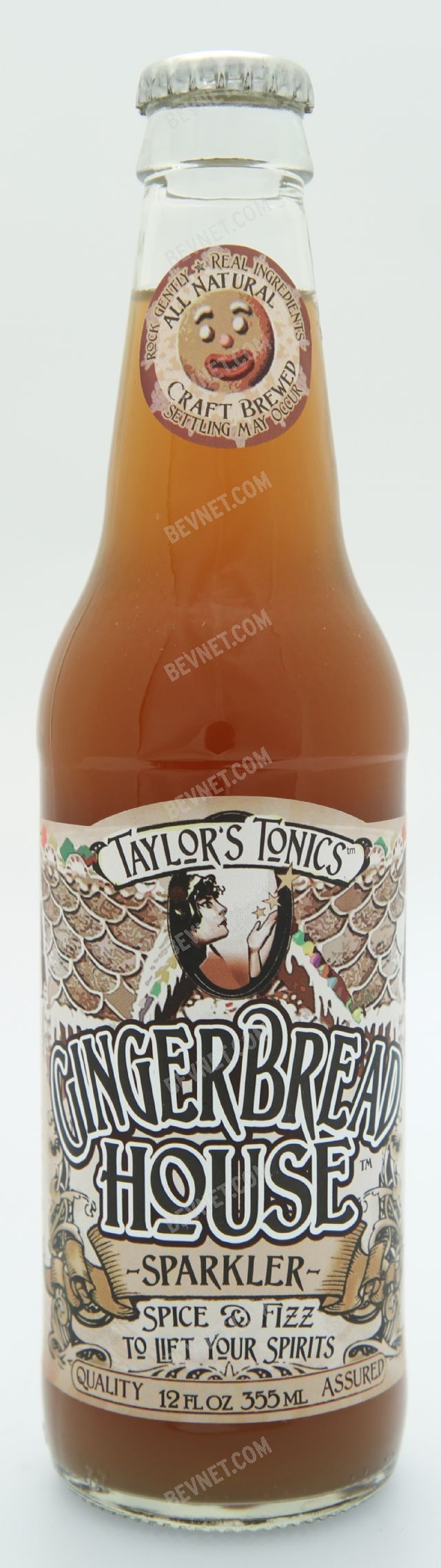
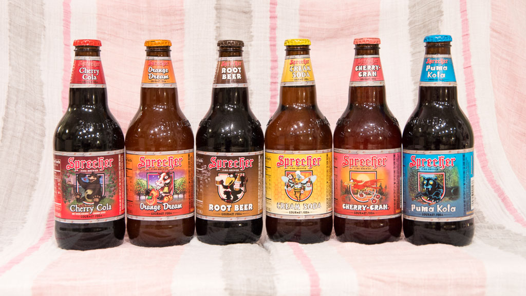
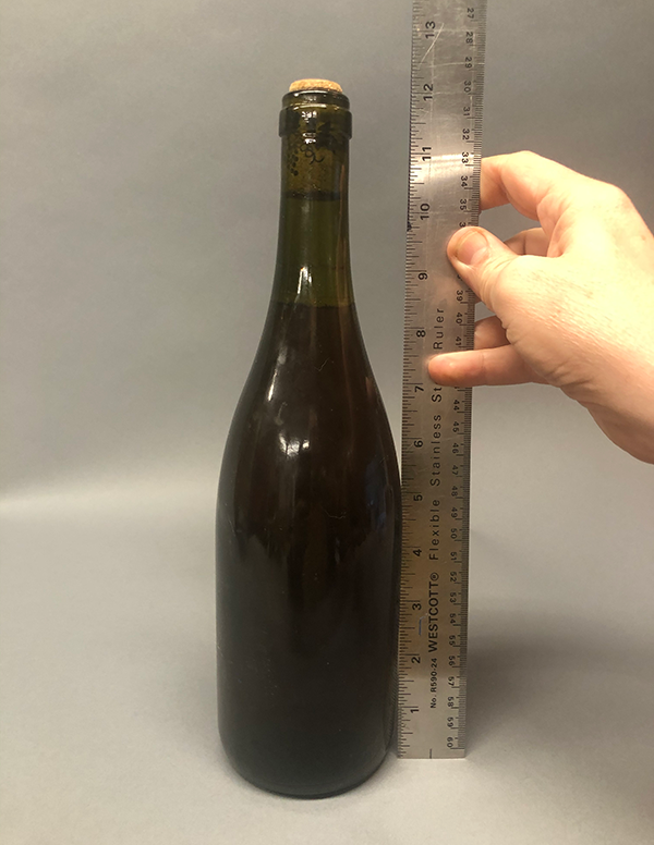
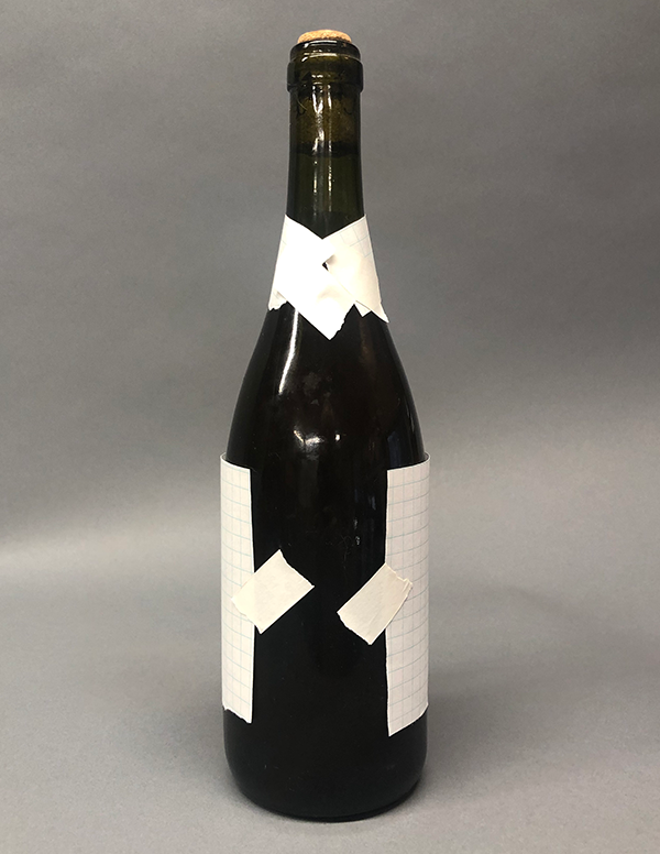
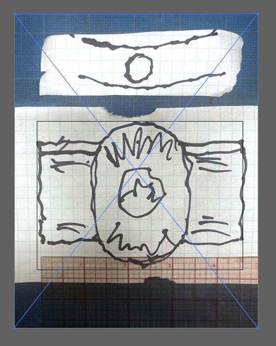
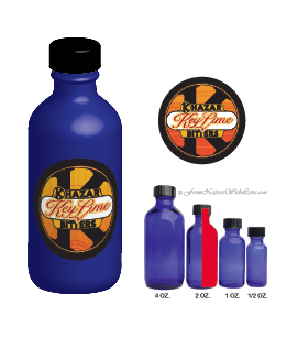
Find a bottle, take a photo of it next to a ruler to hand in with your assignment.
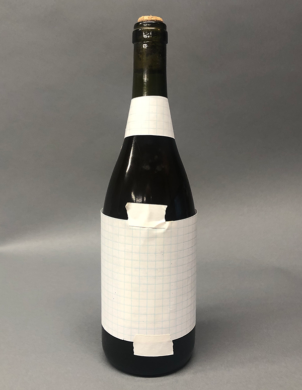
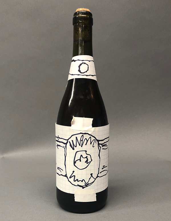
Tape some paper onto the bottle in roughly to position you want your label or labels. Gridded graph paper works best, but any paper will do. Tape it well enough so you can draw on it.
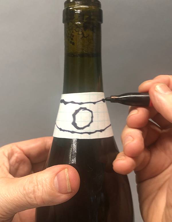
Do a rough sketch on the paper on the bottle of how you want your label to look on the bottle. Pay attention to how far your design can wrap around before the sides get obscured by the curve of the bottle.
Curved sections of the neck on some bottles can be tricky. Hold your pen still with one hand and rotate the bottle with your other hand
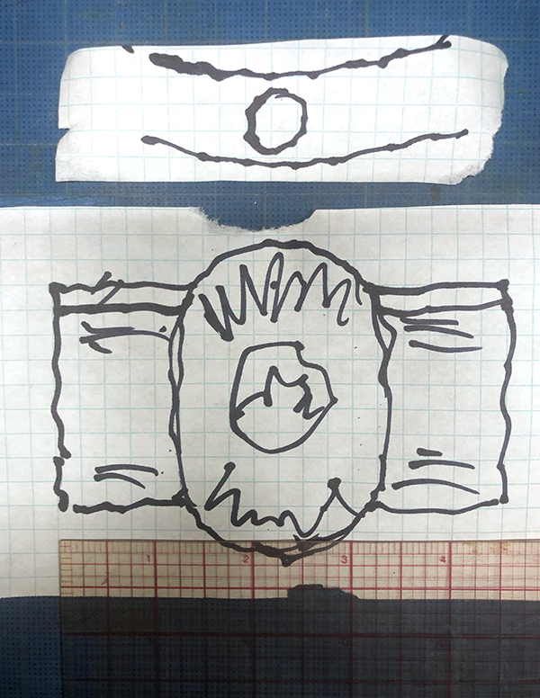
Remove the sketch, lay it flat, and photograph it. Measure it with a ruler for the correct sizing.
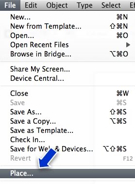
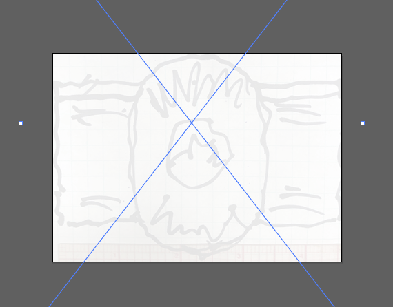
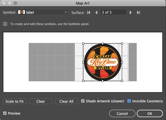
Use Menu > File > Place... to load the file into your already correctly sized Illustrator doc. Scale the image until it matches the width of the artboard. (In this case, the sketch was 4.5 inches wide and 3.25 tall, so I shrunk down the photo of the skecth to the width of the 4.5 x 3.25 artboard).
It's handy to put the place image into a Clipping Mask and set the opacity back, then lock the layer.
You will be graded on how well you design works on your specific bottle. Keep in mind that bottles are stacked next to each other on the store shelf, so the text and artwork on the bottle must be readable from the front - don't make the mistake of wrapping your artwork too far around the bottle to be read.
Other goodies
New Illustrator Gradient Type: Freeform Gradient (Adobe Help Page)
Sample File
This type of gradient was really hard to do before!
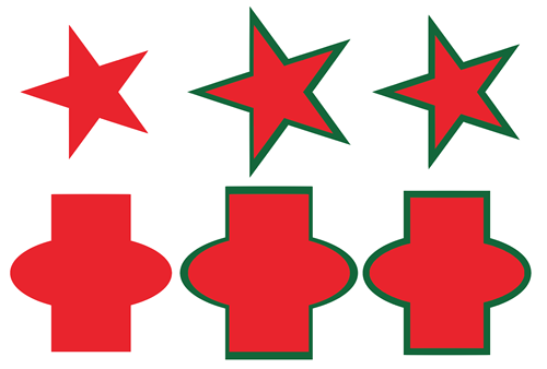
Stroke vs. Scale
Why its better to stroke a shape than scale it (sometimes) (stroke_vs_scale.ai)
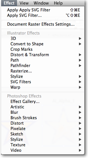
FX!
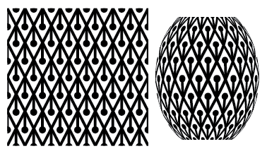
3D
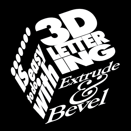
Extrude & Bevel
Revolve
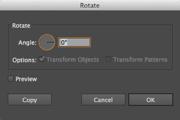
Rotate
Powerful, tricky to use. Not worth our time to try and figure out for the results. If you really want good 3D, use Maya. Although, you it can be useful for some things:
Scalable Vector Graphics (SVG) is a method of using vector graphics on the web as a file format. Cool stuff, but it's really about the saving something in an .svg file. The filters work in that format for use on the web.
Illustrator is a terrible painting tool. Sure it has a paint brush, but that doesn't mean you should use it. This is a tedious way to paint and can make for buggy files that crash and take forever to save. And, if you don't use a graphics tablet, really hard to get the results you'd get with real paint on real paper.
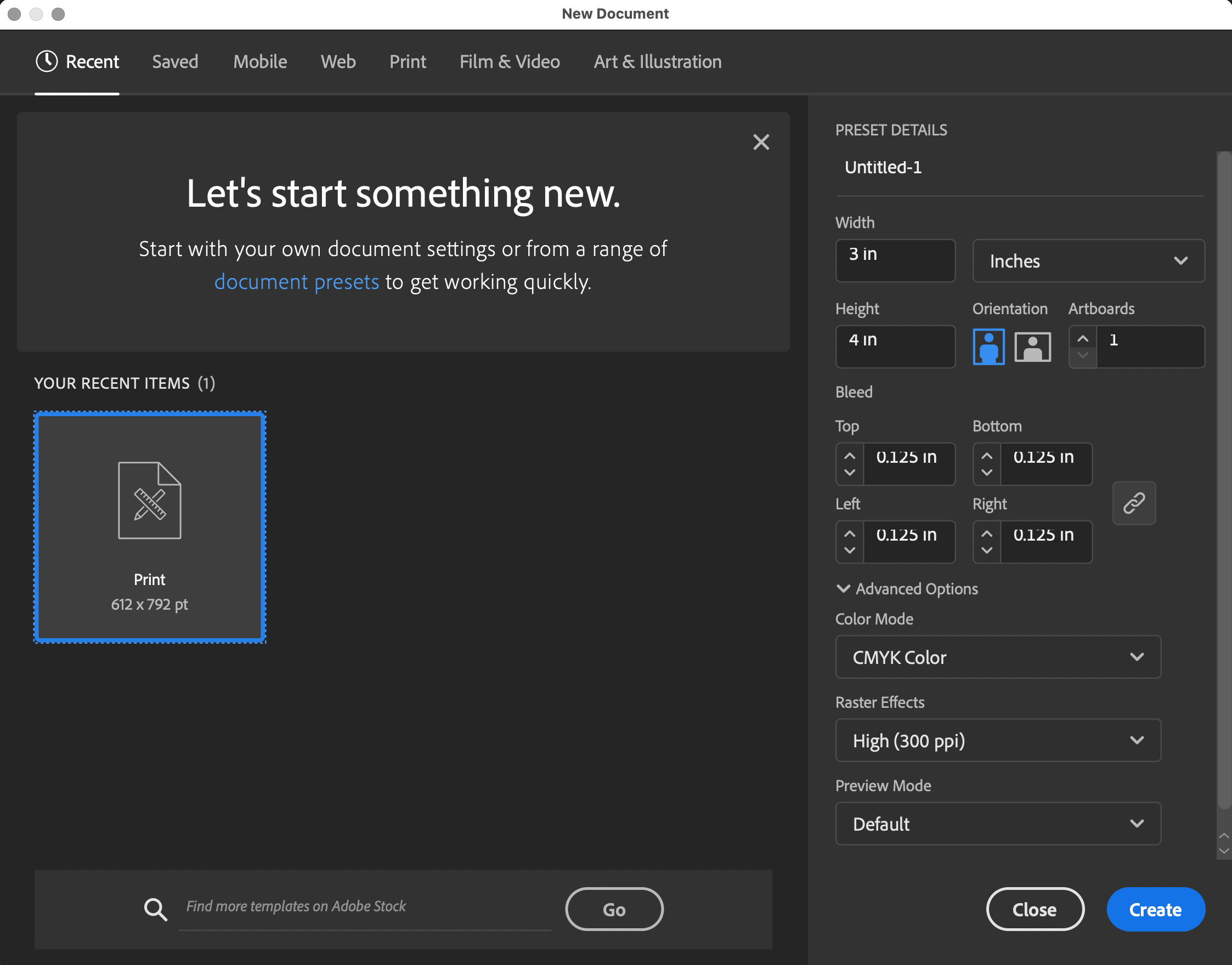
Our current project requires 1/8 inch bleed. This is required wherever ink touches the edge of the final label!
Create a new doc the size of your main label:
In the "Bleed" section, set it to .125 in.
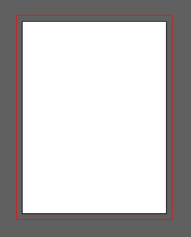
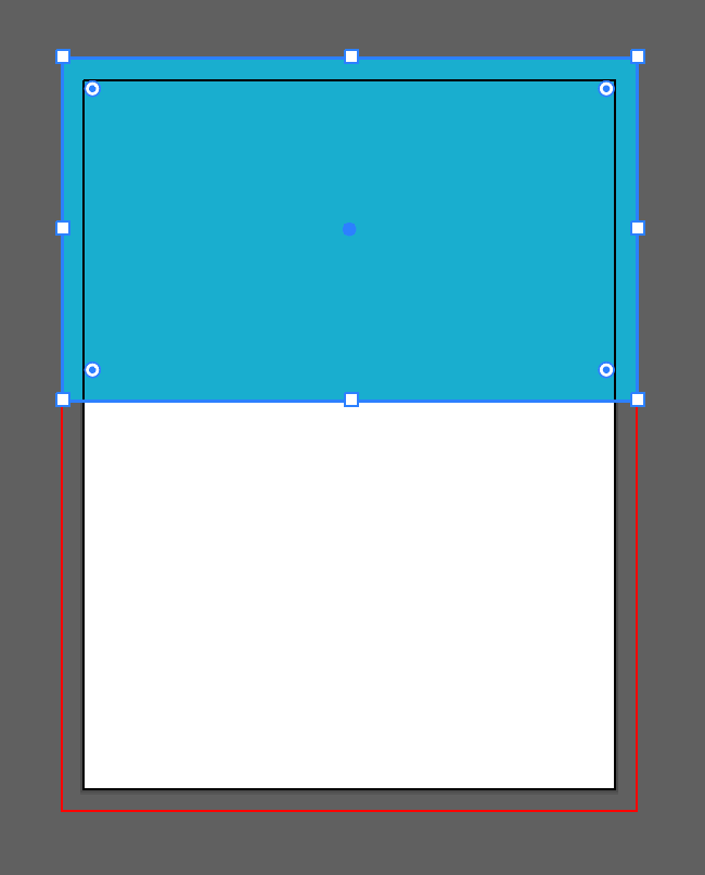
3in x 4in artboard with .125in bleed
(The red line)
Be certain that any artwork that goes the the edge of the label/artboard, goes past the edge to the red bleed line.
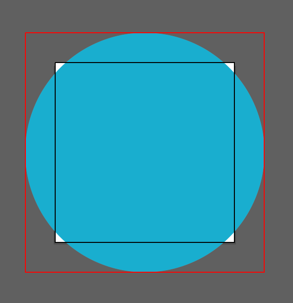
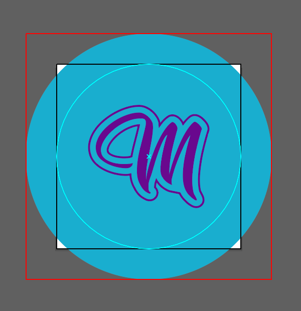
Now, to make an artboard for the bottle cap. Illustrator can't do non-rectangular artboards, so you have to adapt a square artboard with a circular guide or guides to indicate the edge of the cut and artwork.
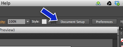
Choose the Artboard Tool near the bottom of the Tools panel
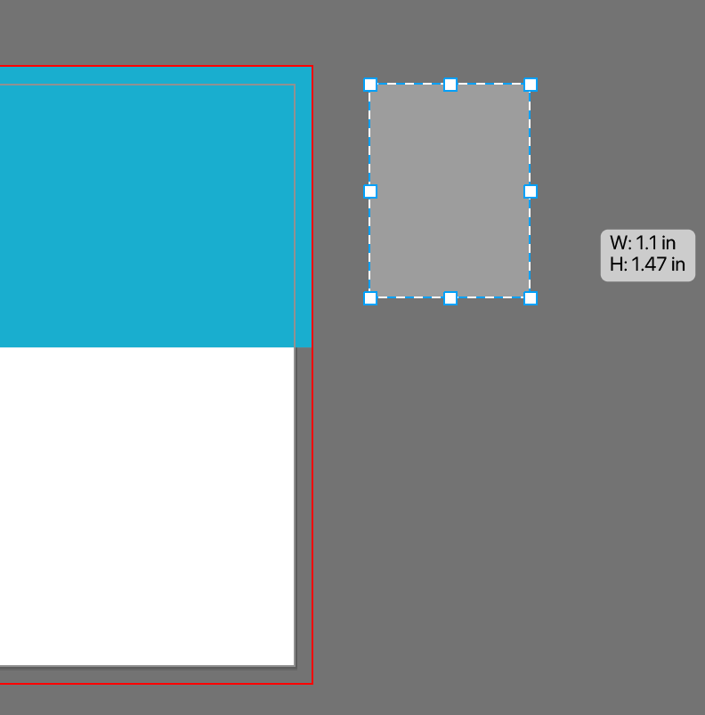
Draw out a new artboard roughly the right size (I'm targeting .75in)
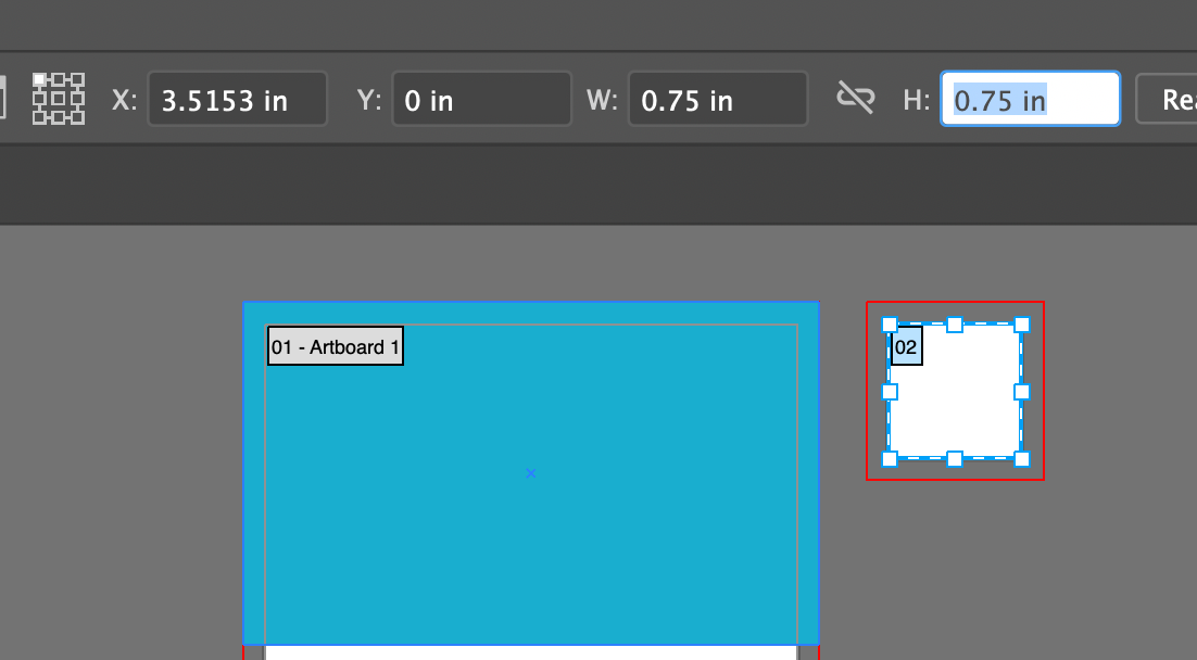
While still in the Artboard tool, with the new artboard selected, enter the size in the Control Panel at the top of the screen
Draw a circle of solid color (remember, the cap is two colors, a background color drawn here, and a color fo the logo) centered and out to the bleed line
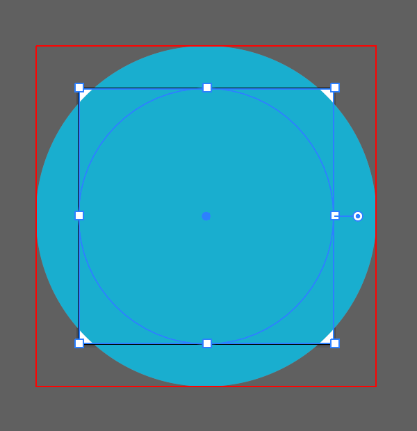
Draw another circle centered and out to edge of the artboard
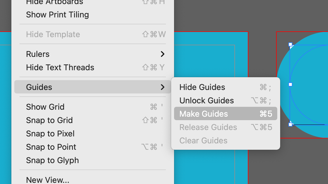
With the circle still selected, choose
Menu > View > Guides > Make Guides
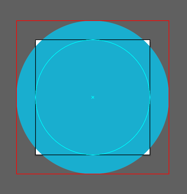
This turns the circle into a guide that accurately shows the edge of the printed bottle cap. Create your artwork for the cap taking the guide's edges into account.
Add your artwork. Remember that with the background is one solid color and the artwork is another, solid, color.
Die Cut Bleeds
Die cuts are special dies (a kind of special shaped knife) used to create non-rectangular print jobs. Here's a company that specializes in die cut stickers, Sticker Robot.
Say you want a label that looks like this
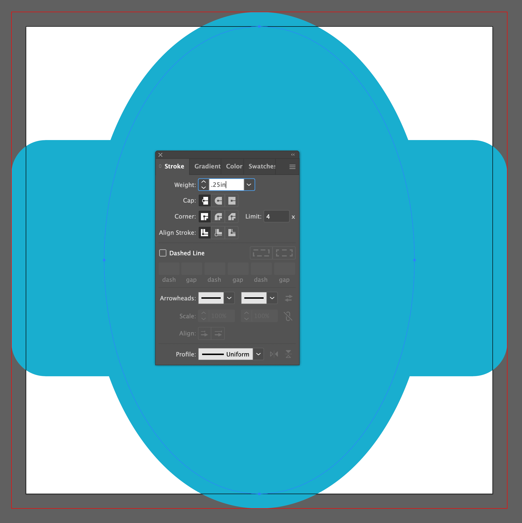
But this art doesn't include a bleed for the die to cut into
Take the bits that go past the edge of the cut and make a copy of them and paste in place. Then add a .25in stroke to the objects (enter the "in" as part of the measurement). This centers a 1/4 inch stroke so 1/8 inch goes past the edge of the cut line. Then move the stroked objects to the back of the layers.