The History of Typography
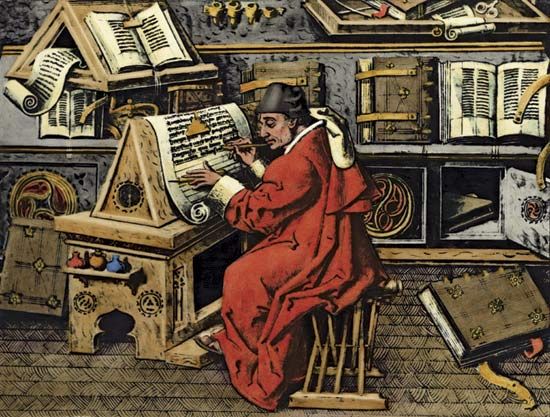
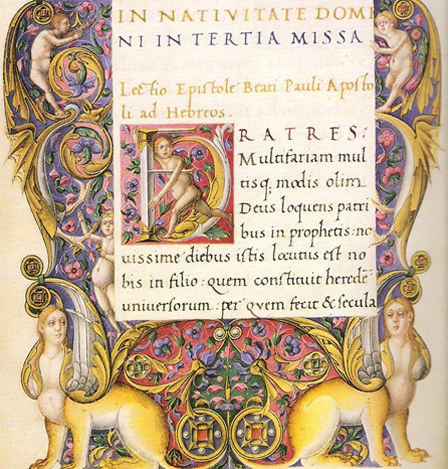
Typography in Western Civilization gets its start from Medieval Manuscripts. The majority of the world was illiterate, but monks in monasteries made it the life's work to copy the sacred scriptures by hand.
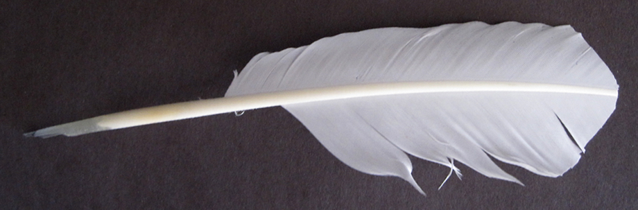
They used a pen made from a goose quill, whose tip was cut to create thick and thin lines seen in the manuscripts
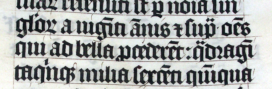
Then Gutenberg invented movable type in the 15th century, revolutionizing literary reproduction
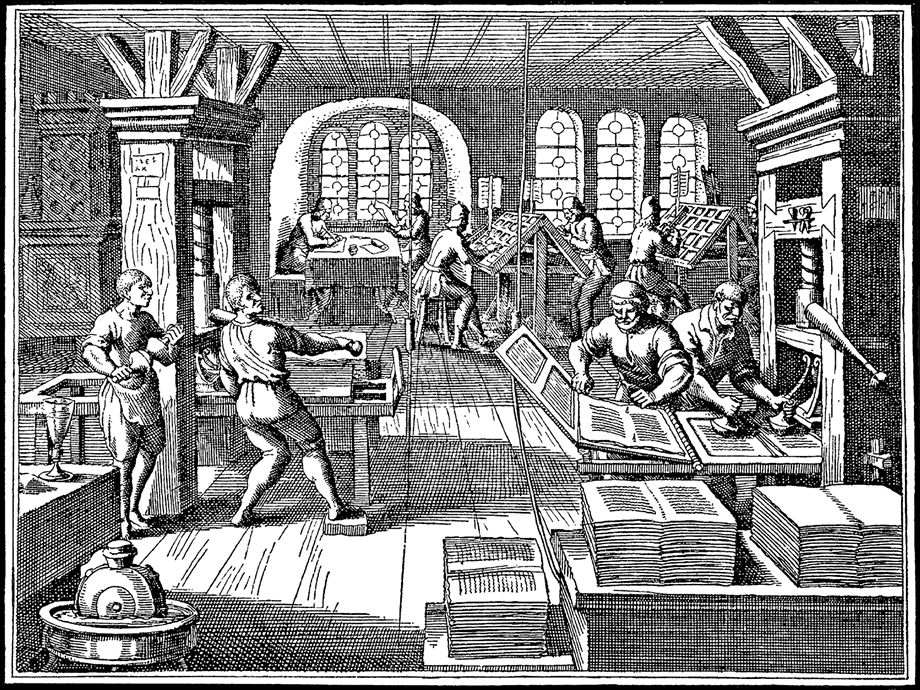
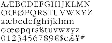
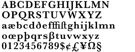
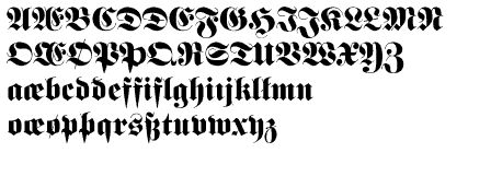
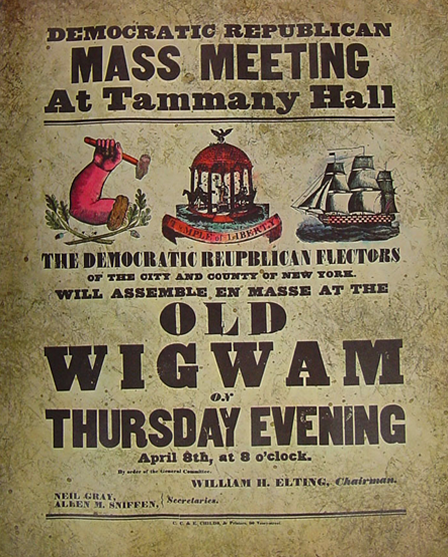
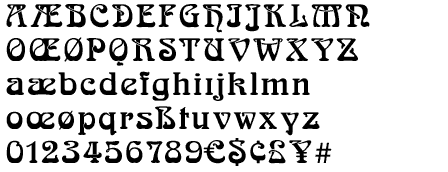
You can even get fonts based on Gutenberg and other medieval scripts.
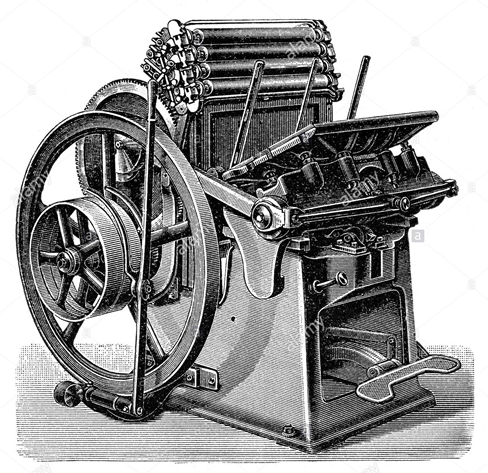
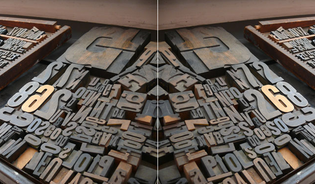
And for nearly 500 years, typography was all about characters on the head of, first wood, then metal, forms, strung together into lines and blocks of paragraphs.

Until the 1980's, when computers started outputting type (A history of one of the pioneers, Information International)
The Elements of Type
A typeface is the design of a single set of characters unified by consistent visual properties
Graphic Design Solutions
This is Times New Roman Typeface
<div style="font-family: 'times new roman';">This is Times New Roman Typeface</div>
This is Helvetica Typeface
<div style="font-family: helvetica;">This is Times New Roman Typeface</div>
This is Impact Typeface
<div style="font-family: impact;">This is Times New Roman Typeface</div>
The Type of Type
Type (as it is used in context) comes in two major flavors:
- Display
- Type in a composition used for headlines. Usually in a larger size, and usually short in length.
- Body Copy
- Type in a composition used for longer runs of text, like paragraphs.
Here's a typical Headline and Body Copy usage:

“WHAT GOES IN THE OCEAN GOES IN YOU.” Is the headline, “RECENT STUDIES...” is the Body Copy. The tiny type at the bottom is sometimes called Mouse-type.
Google search on Print Ad for more examples
The Measurement of Type
The units of measurement of type are different than other measuring units. Rather than inches or millimeters, type is measure in units left over from the days of metal type, when type was laid out with small pieces of metal, each one with a letter carved into the top of it (in reverse) and set into a form:
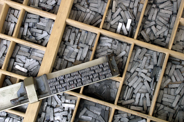
Hence, we still use these oddly named units when measuring out type:
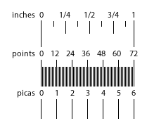
- Picas (there are 6 picas in 1 Inch)
- Points (there are 72 points in 1 Inch, 12 points in a Pica)
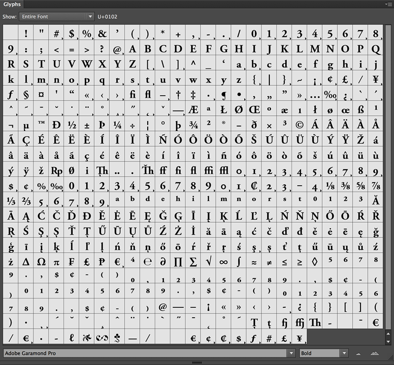
Fonts now live in the digital domain, and are considered to be a collection of characters (also known as glyphs) of a single font family and style. A font's glyphs are at least upper and lower case A thru Z, punctuation marks, and numerals, but they often contain more glyphs, like international characters (é, €, λ) and symbols (♠, ♥)
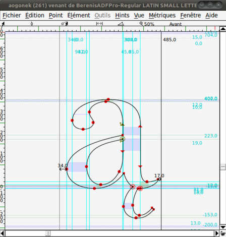
Font's live in the computer's operating system as a special kind of file format that stores information about how each character is made, and information about how it gets rendered to the screen in relation to other glyphs.
Your text mentions three file formats for fonts, Type 1 (.afm), TrueType (.otf), and OpenType (.ttf). For all practical purposes, OpenType is the format for most fonts these days. However, new formats are coming along for Web-based fonts (.eot, .woff, .svg, more on this later).
The Anatomy of Character
A Character is a single unit of a font, where a Font is a collection of Characters, and a Typeface Family is a collection of related fonts. Since typography is an art form that's 500 years old, it's not surprising that there is a lot of specialized nomenclature for the different parts of a glyph:
- Arm
- Ascender
- Axis
- Bar
- Baseline
- Bowl
- Cap height
- Character
- Counter
- Descender
- Ear
- Foot
- Hairline
- Head
- Italics
- Leg
- Ligature
- Link
- Loop
- Oblique
- Serif
- Shoulder
- Spine
- Spur
- Stress
- Stroke
- Swash
- Tail
- Terminal
- Text Type
- Thick/Thin contrast
- Vertex
- Weight
- x-Height
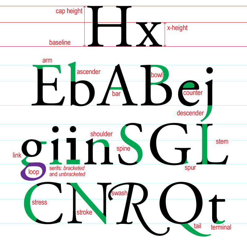
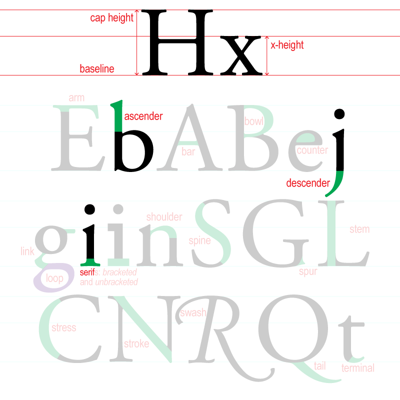
Don't worry, you don't have to remember them all, just know that there's a named for everything in typographic design. The ones you need to remember and that are the most useful are:
- Cap height
- x-height
- Baseline
- Ascender
- Descender
- Serif
Type Families
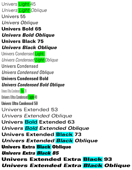
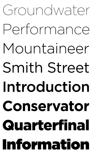
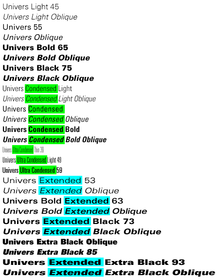
Variations of a typeface, called a type style, offer variety while retaining the essential visual character of the font face. Variations include:
Weight
Width
- Ultra Condensed
- Condensed
- Regular
- Extended
Angle/Style
abcdefg
abcdefg
abcdefg
abcdefg
A type family includes the style variations of a single typeface. They can add up to a lot of money if you buy the entire family of a given well known font,
like Helvetica ($999)