Class 14: Composition

Daily Doodle

National
Dessert Day

Chocolate Covered
Insects Day

SFMOMA Free Day

Take advantage if you can! The San Francisco Museum of Modern Art will offer a free day on Sunday, October 3rd, 10am-5pm. Normally it's $25, $19 if your under 24, and always free if you're under 18.

Free Family Day 2019.

Worth extra credit if you bring me back a ticket stub

Composition

The main goals of composition:

  1. Create visual interest
  2. Clarify the content of the idea to be communicated

Definitions

Composition

Composition is the form, the whole spatial property and structure resulting from the intentional visualization and arrangement of graphic elements—type and visuals—in relation to one another and to the format, meant to visually communicate, to be compelling and expressive.
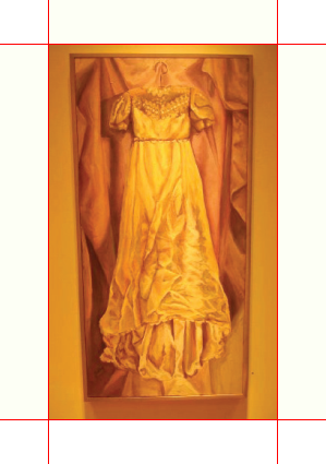
 
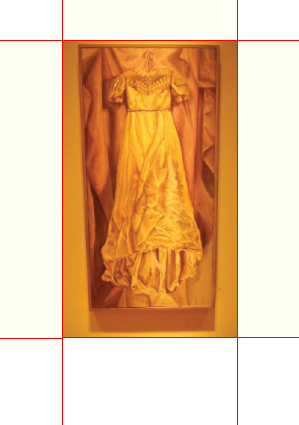
Margins 1

Even Margins

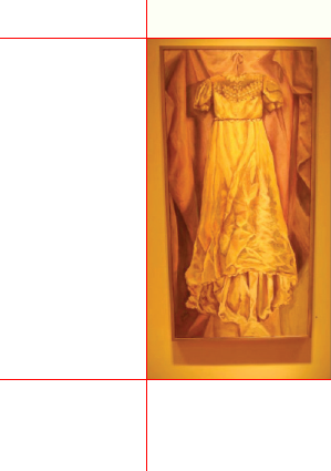
Margins 2

Larger Base Margin

Margins are the blank spaces on the left, right, top, and/or bottom edges of the rectangular space the composition lives inside of.
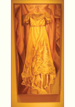
Margins 3

Side-Only Margins

Margins 4

Asymmetrical Margins

 
Composition

The Picture Plane is the flat surface plane of a print or digital single, static page.

In any case, it's important to think about how the composition relates to it's frame.
The Fundamentals of Composition

The Format

Almost all formats (books, billboards, business cards, website page, brochures, etc.) across media (print, smart phone, tablet, computer screen, outdoor screen) are rectangular.

Static Versus Active Composition

Static Composition

In static compositions, vertical and horizontal alignments are emphasized.

Active Composition

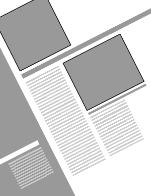
In active compositions, diagonal or curved movements—directions that contradict or are in counterpoint to the edges of the format—are emphasized.

Responding to the Edges of the Format

Edges

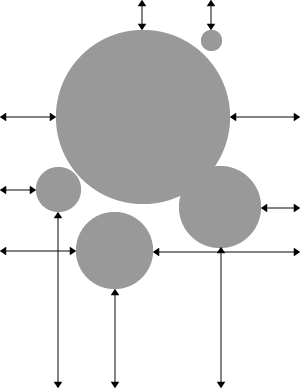
All visual elements must respond to (though not necessarily touch) the edges of the page.

The format is not merely the end of the picture plane, a format's boundaries fully participate in the compositional structure of the picture plane

Acknowledging the Midline

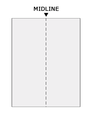
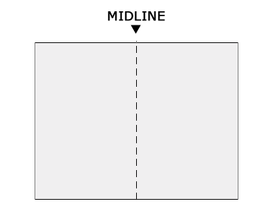
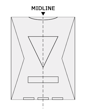
Envision an imaginary vertical line down the center of a page. As you position graphic elements, analyze how each element interacts with that midline

Midline Midline Midline

The Format: Closed Versus Open Composition

The terms closed and open refer to the way the graphic elements of a composition relate to the edges of a format.

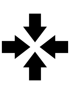
If the internal elements' directions and orientations echo the format's edges to a great extent and the viewer's focus is kept tightly within the format, that composition is considered closed

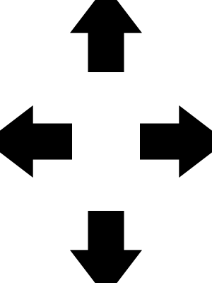
If the major directions and orientations within the composition oppose the edges or direct our eyes past the boundaries of the format, that composition is considered open

The Illusion of Spatial Depth

A plane is a flat surface, and the picture plane is the blank, flat surface plane of a print or digital single, static page.

Foreground, Middle Ground, Background

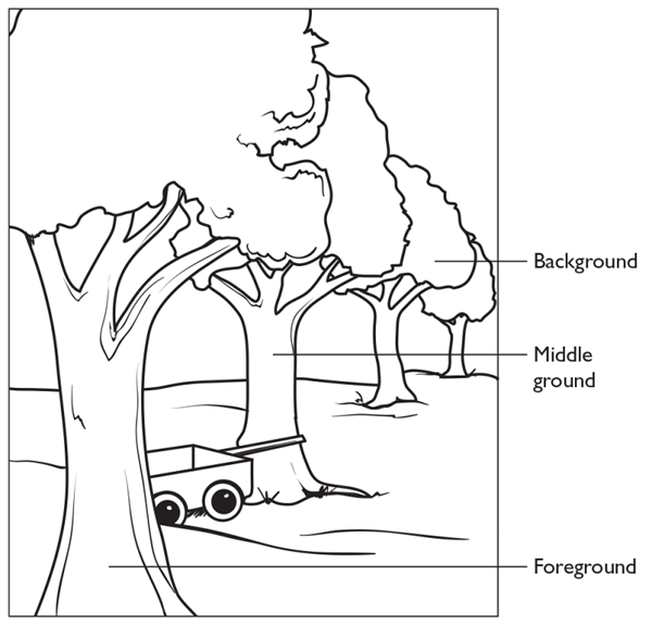
In pictorial space, the picture plane can be manipulated into the illusion of spatial planes. There are three main planes with many others in between:

Foreground, Middleground, and Background
  • The foreground (the part of a composition that appears nearest the viewer)
  • The middle ground (an intermediate position between the foreground and the background)
  • The background (the part of a composition that appears in the distance or behind the most important part)

Tilted Plane/Imitating the Recession of Space

Foreground, Middleground, and Background

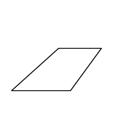
If you draw a tilted plane on a surface, you create the illusion of three-dimensional space. The viewer understands the longer side of the plane to be closer in space and perceives the plane as receding.

Perspective

Foreground, Middleground, and Background

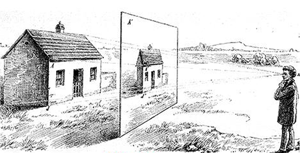
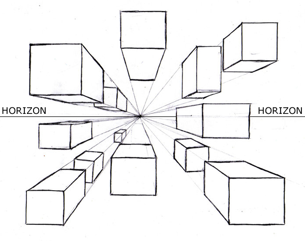
Perspective is based on the idea that diagonals moving toward a point on the horizon, called the vanishing point, will imitate the recession of space into the distance and create the illusion of spatial depth.

Perspective is a schematic way of translating three-dimensional space onto a two-dimensional surface

Depth Through Overlapping

When an opaque flat plane or form is placed in front of another, that overlap creates the illusion of spatial depth.

Depth Through Layering &Transparency

By overlapping parts of an image simultaneously or in a sequence, the illusion of space is created by layering.

Using transparency—making graphic elements transparent (see-through) and layering them or positioning a graphic element over or under another or between similar elements—can create the illusion of ambiguous spatial relationships, which tends to appear as shallow space.

Depth Through Volume

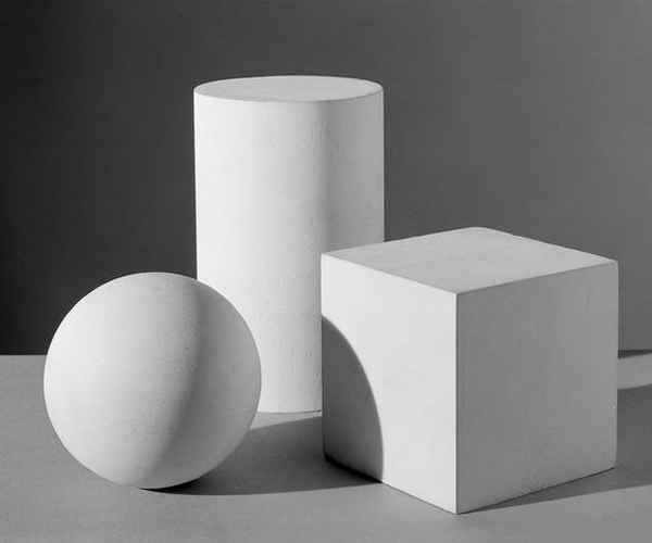
Volume on a two-dimensional surface can be defined as the illusion of a form with mass or weight, a shape with a back as well as a front.

Foreground, Middleground, and Background

Volume thru shading and contours.

Depth Through Value Modulation & Atmospheric Perspective

Foreground, Middleground, and Background

Depth Through Movement

Foreground, Middleground, and Background

In print and on any static digital page, motion is an illusion created through skillful manipulation. Giving an object apparent motion forces the object into a kind of three-dimensional space.

A composition can look still, suggest motion, or even suggest intervals of stillness and movement.

Depth Through Contrast

To differentiate between graphic elements in a design, you must establish a difference between two or more. You must make distinctions.

Foreground, Middleground, and Background

Differentiation Through Grouping

The Gestalt principles of perception—similarity, proximity, continuity, and closure—explain how people tend to understand what they see by grouping, by visually assembling images and how they relate to one another into groups.

The Compositional Process

Composing is a process where one achieves a desired result by repeating a sequence of steps and successively getting closer to that result.

You can get there by spontaneous means, by using proportional systems or compositional structures.

Spontaneous methods for composing (and visualization) include but are certainly not limited to:

Composing for a Single Static Surface Format

When composing for a single surface format such as a poster, book or magazine cover, mobile ad, or website landing page or ad (as opposed to multi-page formats, such as book interiors or websites), consider the roles and interrelationships of type and images as a whole.

Consider one of the following ways to drive the communication:

Our Poster Project will be built around these three concepts

Arranging Type & Image

Foreground, Middleground, and Background

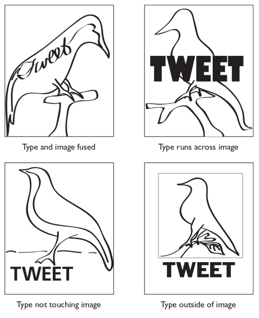
When you compose type and image (the two main graphic components), you arrange them to respond to one another and to the shape and edges of the format.

You can think of these juxtapositions in several broad categories:

Integrating Type And Image

A graphic design problem can be solved typographically or with images alone. But when type and images interact, then you have to determine how they will interact.

Supporting Partner Type and Image Relationships

Foreground, Middleground, and Background

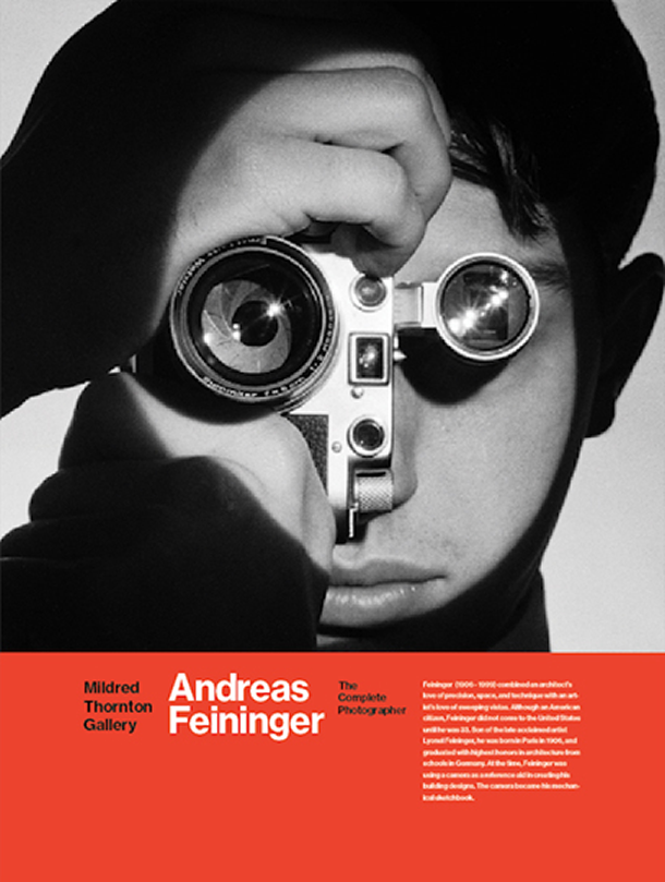
In the supporting partner relationship, a classic "neutral" typeface works cooperatively with the image, which has the starring role.

  • For the sake of clarity and visual interest, the tendency is to allow either type or image(s) to be the star, with the other component acting in a more neutral fashion.
  • If both type and image attract our attention due to equal prominence, then focus is diffused or lost. Here type is purposely understated in contrast to a strong visual statement, where the visual is the "big idea."

Lab

Start thinking about the Poster project.