Class Six: Design Principles III
Daily Doodle
National Collect
Rocks Day

National
Play-Doh Day

Design Principles
Now that we have our elements and properties, let's talk about the Principles of Design, or the principles you use when you compose a visual. Here we have an arbitrary set, some folks list more, some less. This is my own set, but it's based closely on the ones in Graphic Design the New Basics:
- Rhythm & Balance
- Figure & Ground
- Framing
- Visual Hierarchy
- Layers
- Transparency
- Unity
Design
Principle:
Framing
Framing is everywhere. A picture frame sets off a work of art from its surroundings, bringing attention to the work and lifting it apart from its setting. Cropping, borders, margins, and captions are key resources of graphic design

Margin

Bleed

Partial Bleed
Margins provide a protective frame around the contents of a composition. They also provide space for information such as page numbers and running heads. Wider margins can emphasize a picture or a field of text as an object, calling our attention to it. Narrower margins can make the content seem larger than life, bursting at its own seams
Bleeds An image "bleeds" when it runs off the edges of a page. The ground disappears, and the image seems larger and more active. An image can bleed off one, two, or three sides. The photograph reproduced here is the same scale in each instance, but its intimacy and impact change as it takes over more or less of the surrounding area.
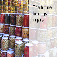
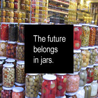
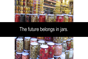
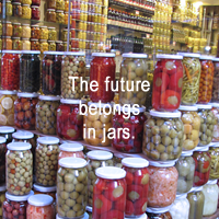
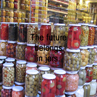
Image and Text An image seen alone, without any text, is open to interpretation.
Adding text to a picture changes its meaning. Text and image combine in endless ways.
Text can be subordinate or dominant to a picture; it can be large or small, inside or outside, opaque or transparent,
legible or obscure. Text can respect or ignore the borders of an image. Putting type on top of high–contrast image
poses legibility conflicts. Framing the text with boxes, bars, and transparent color fields are some of the ways
designers deal with the problem of separating text from image.
Design Principle: Visual Hierarchy
A primary purpose of Graphic Design is to communicate information, and visual hierarchy is the primary principle for organizing information
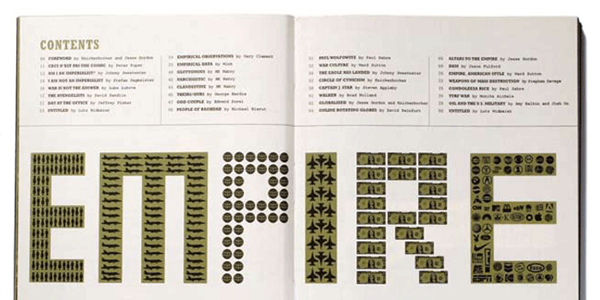
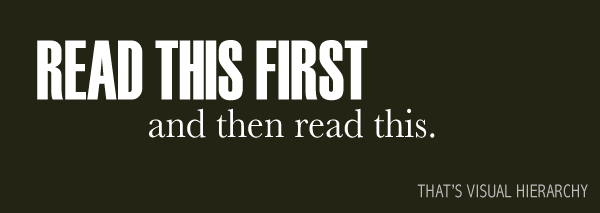
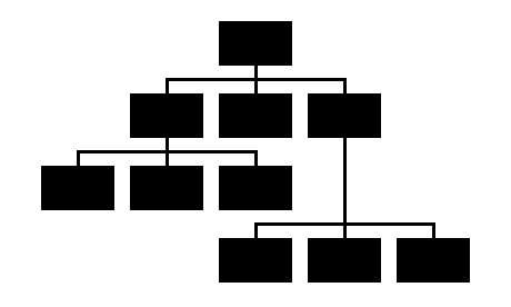
- Hierarchy is the order of importance within a group or composition. Hierarchical order exists in nearly everything we know, including the family unit, the workplace, politics, and religion.
- Hierarchy is expressed through naming systems: general, colonel, corporal, private, or first, second, third, or top, middle, bottom. Hierarchy is conveyed visually through variations in scale, value, color, spacing, placement, and other signals.
- Hierarchy can be simple or complex, rigorous or loose, flat or highly articulated. Regardless of approach, hierarchy employs clear marks of separation to signal a change from one level to another.
 Strong visual hierarchies guide visual and logical progression by showing what's important.
 Weak visual hierarchies provide little or no guidance about what is important.
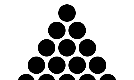
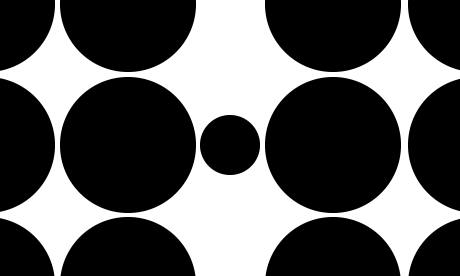
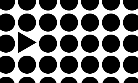
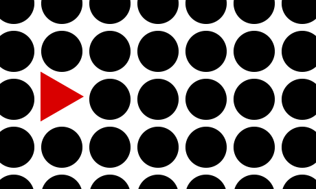
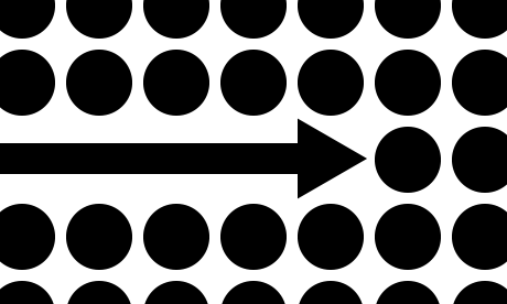
Emphasis is used to establish visual hierarchy. There are several means to achieve emphasis:

Design Principle: Transparency

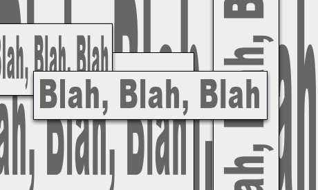
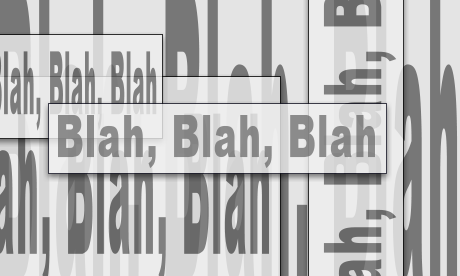
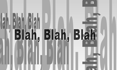
Any surface in the physical world is more or less transparent or opaque. In a composition transparency is only established by its context within layering.

- A transparent circle only appears transparent when it's layered over another object

Transparency is powerful design principle. Transparency can serve to emphasize values of directness and clarity through adjustments and juxtapositions that maintain the wholeness or legibility of elements. Transparency also can serve to build complexity by allowing layers to mix and merge together. Transparency can be used thematically to combine or contrast ideas, linking levels of content. When used in a conscious and deliberate way, transparency contributes to the meaning and visual intrigue of a work of design.
Design Principle: Unity
Design Unity is the conceptual framework that allows the individual elements of a design to be perceived as a whole. This is also sometimes known as gestalt, German for "form," which places an emphasis on the perception of forms as organized wholes. Our brains are programmed to think this way, to seek out order, make connections, and to seek a whole by grouping commonalities.

The Unifying Laws of Perceptual Organization
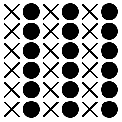 Similarity
Elements that share characteristics are perceived as belonging together.
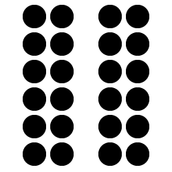 Proximity
Elements near each other are perceived as belonging together.
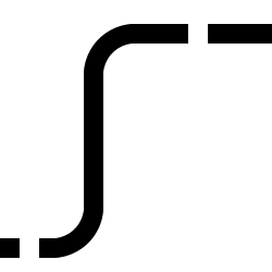 Continuity
Elements appear as a continuation of a previous element. Often implies motion.
 Closure
The mind's tendency to connect element to complete a form, unit, or pattern.
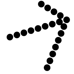 Common Fate
Elements are perceived as a unit if they move in the same direction.
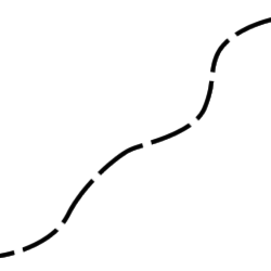 Continuing Line
Lines are perceived as following the simplest path. If two lines break, the viewer sees the overall movement rather than the break.
Visual Correspondence
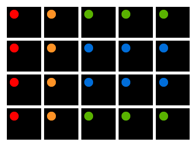
The repetition of a visual element across a composition or set of formats.
Correspondence is the handling of design elements to create similarities of form used to create a family resemblance in a given composition.
Structure and Unity
Grids & Alignment
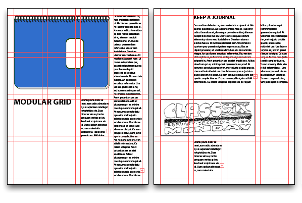
Probably the single most significant thing you can do to unify and clean up a design, is to make things line up.
Exercise02: Rythm & Balance
Read for next class: Typography
Read chapter 3 from 4th edition, pp43-60.