

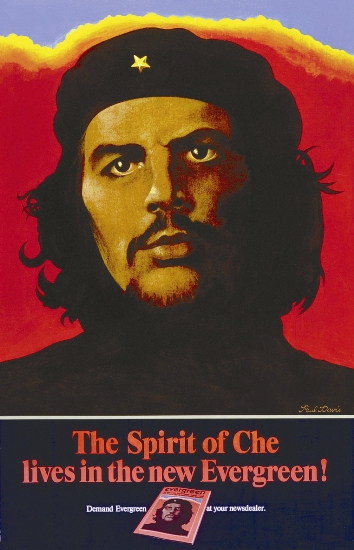


1970s


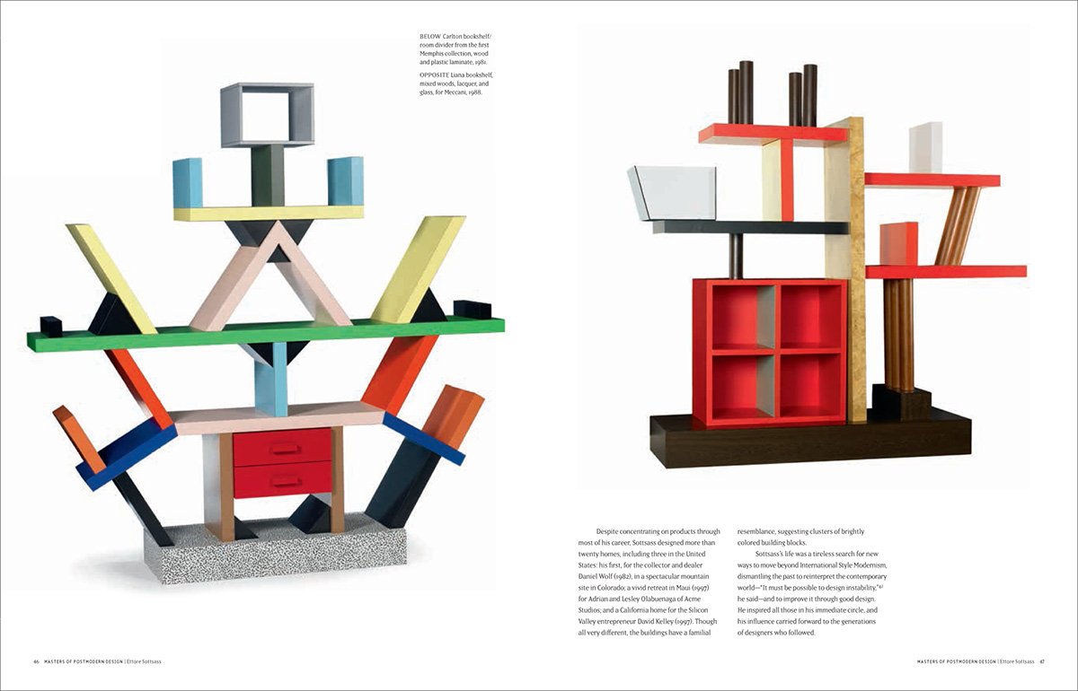
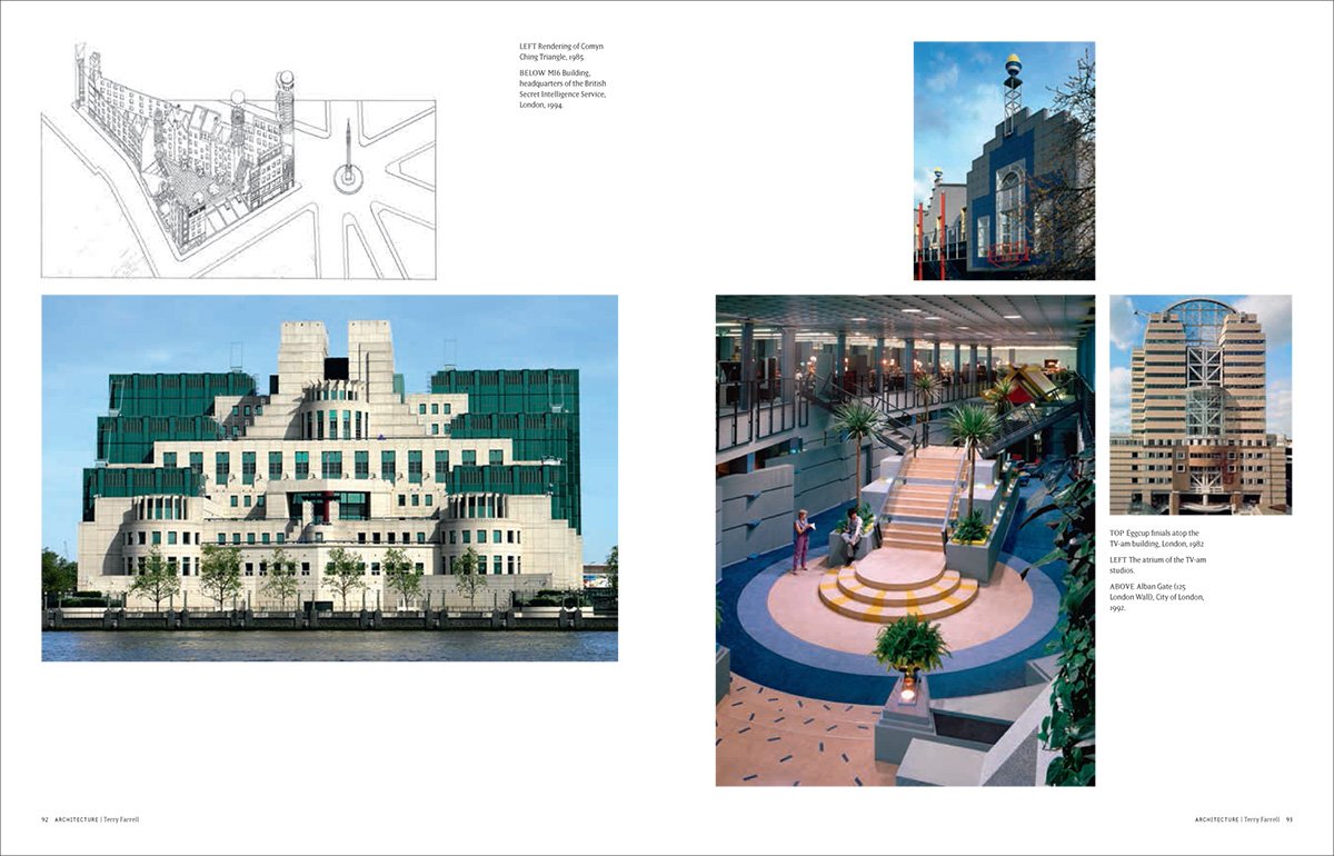
End of Modernism, beginning of Post-Modernism
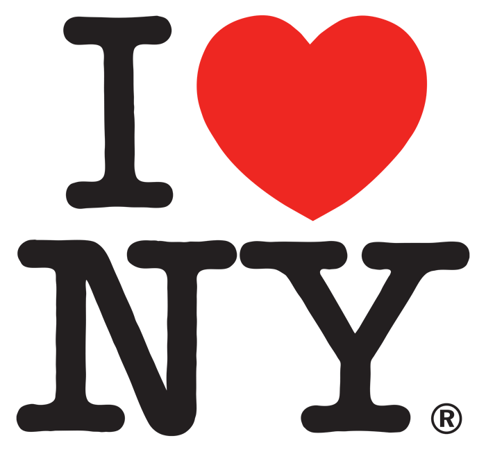
1975 Milton Glaser designs I Heart NY symbol
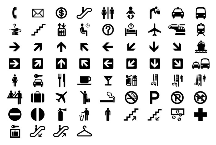
1975 AIGA Symbols Signs
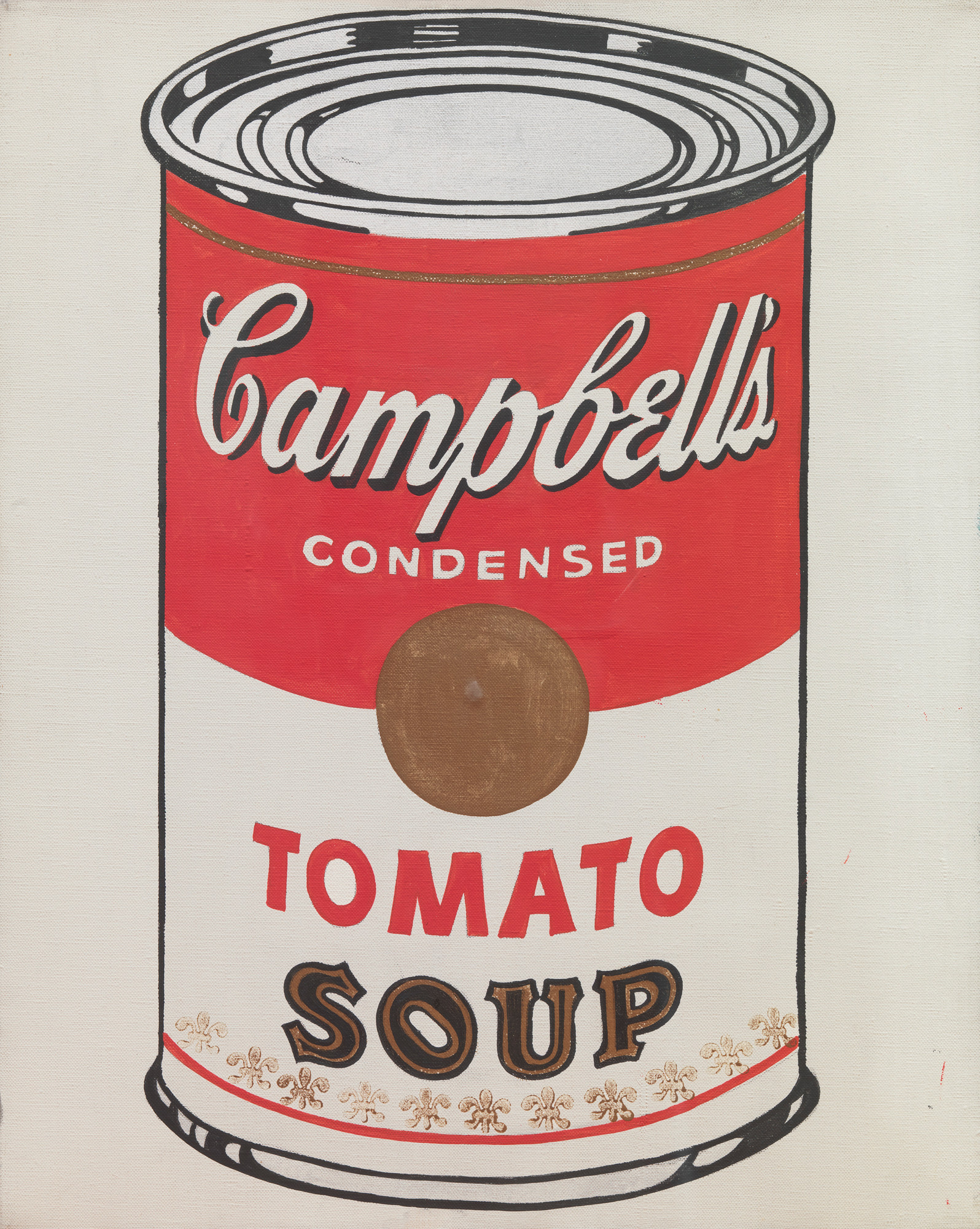
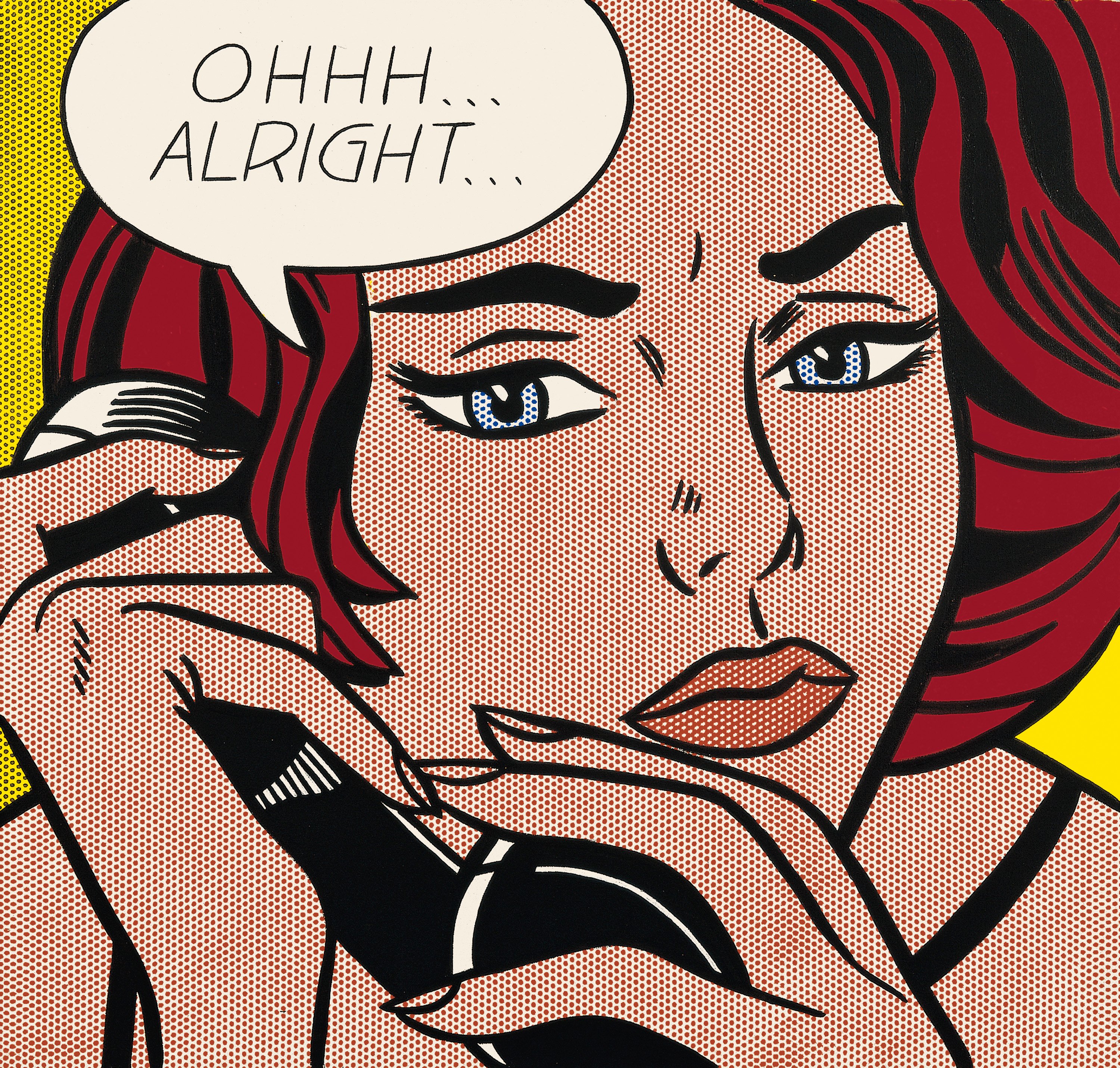
Pop Art ascends over Abstract Expressionism
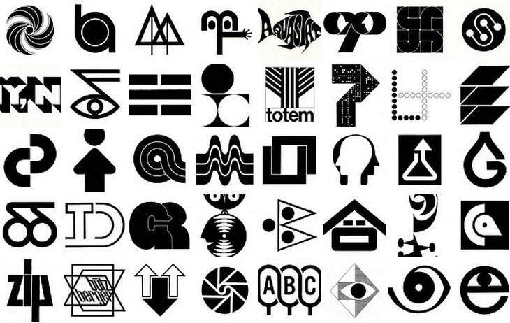
Corporate Identity modernization still a strong trend
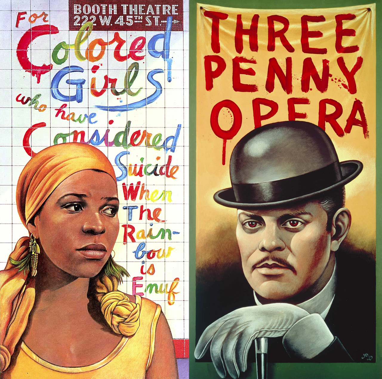
Push Pin Studios (website) in NY rises


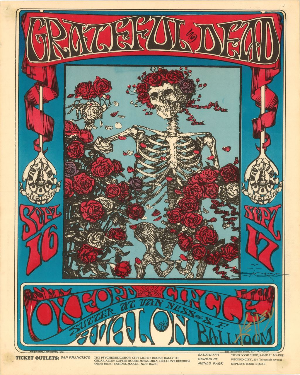

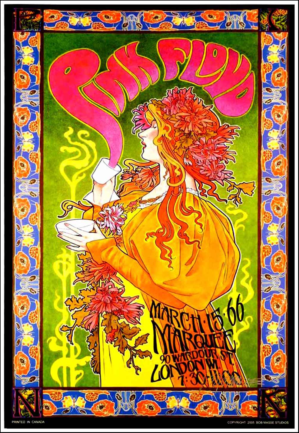


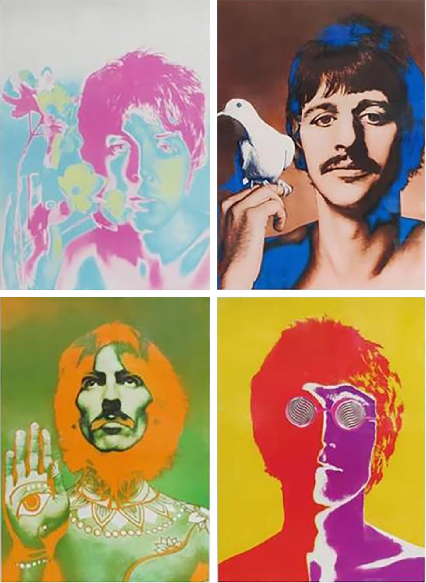
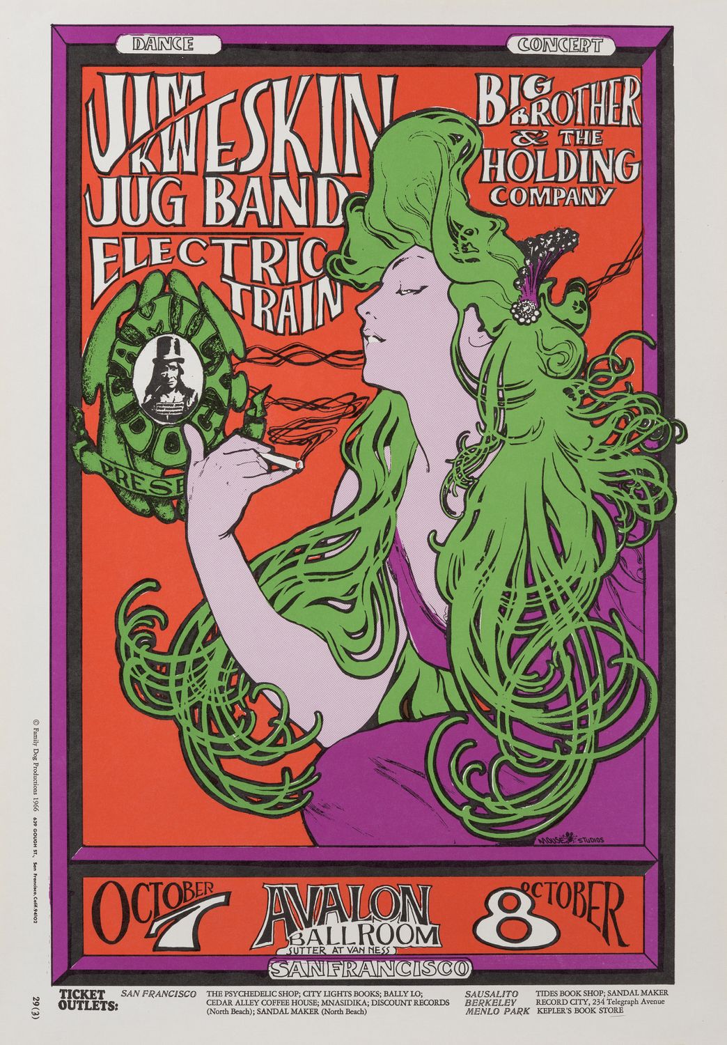


Haight-Ashbury Poster Designers in San Francisco
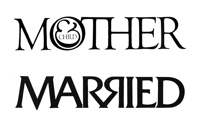
The great Herb Lubalin, typographer extraordinaire, is at the height of his career.
End of Modernism, beginning of Post-Modernism
1975 Milton Glaser designs I Heart NY symbol
1975 AIGA Symbols Signs

1980 IBM launches personal computer

1982 MTV logo
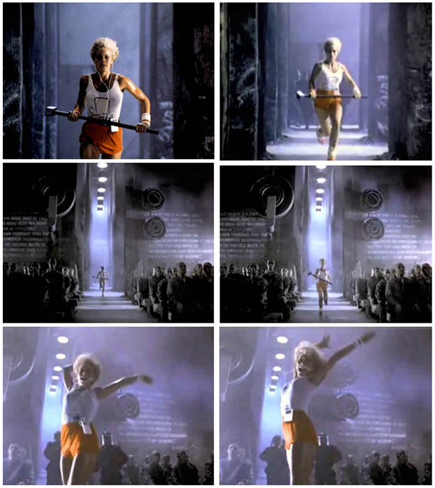
1984 Apple Macintosh “1984” TV ad
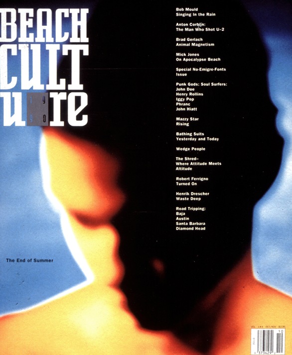
1988 David Carson designs “Beach Culture” magazine

1988 Damian Hirst and the Young British Artists show of 1988 change the world of modern art

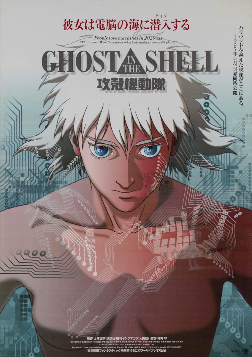


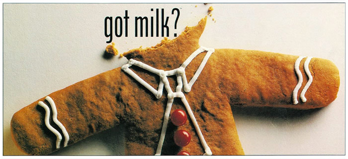
1994 Advertising Campaign: Got Milk
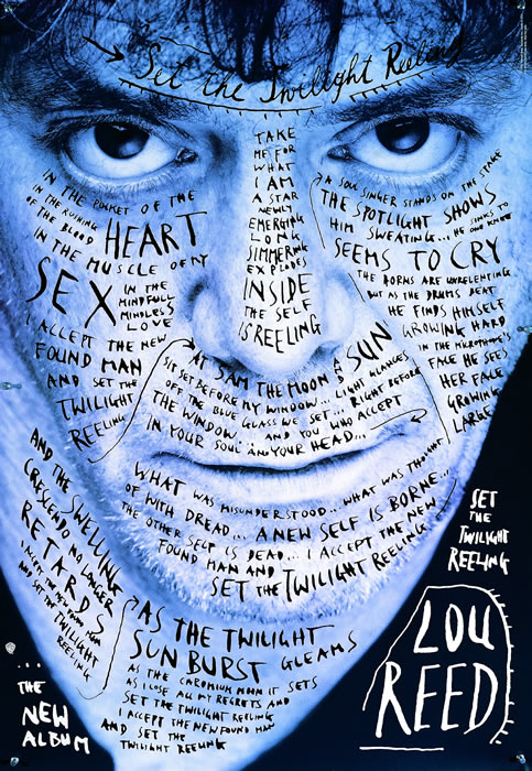
Stefan Sagmeister, Poster: Lou Reed, 1996
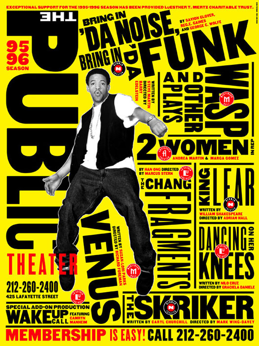
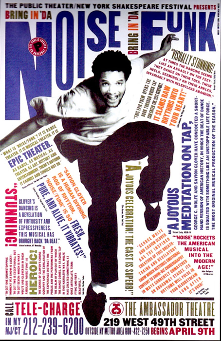
Paula Scher, Visual Identity: Public Theater, 1994-96
Technology and new platforms continue to reshape design
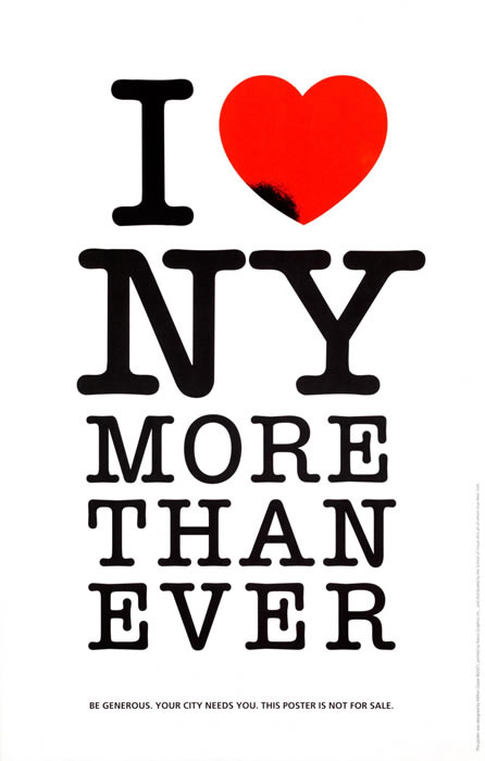
Poster: I Love NY More Than Ever!, 2001, Milton Glaser
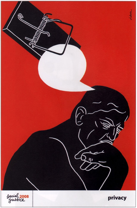
Poster: Privacy from The Social Justice Series, 2008, Luba Lukova
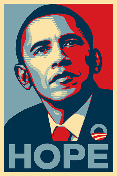
Poster: Hope, Shepard Fairey, 2008
The main places of employment for a communication design professional are:
A graphic designer almost always works in collaboration with other professionals:
Since graphic designers design visual stuff, here are the kind of stuff they work with
Almost any kind of design project can go across categories...
The ability to analyze complex issues and solve problems
The ability to think and produce things that have never been done before. To make stuff up, but make up the right stuff (based on critical thinking)
Flat out, you have to know how to:
...as never before, (design) is intimately attached to programming
- Laura Lejo, Showcased in Graphic Design Solutions, 5th edition, pp16-18.
Get your Bachelors if you can! Seriously.
How to get a Design Job! from AIGA, the "professional association for design", ebook by RitaSue Siegel Here
We will as we go along be talking about many of the different kinds of formal elements:
And organizing principles such as:
Let's start off with a basic basic, POINT, LINE and PLANE.

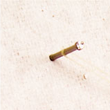
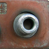
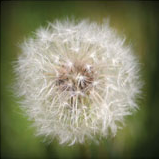
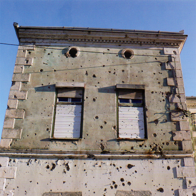
Think beyond just dots, holes, and periods!
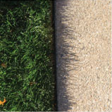
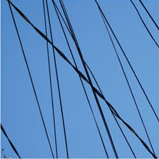
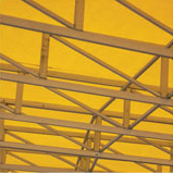
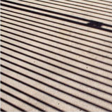
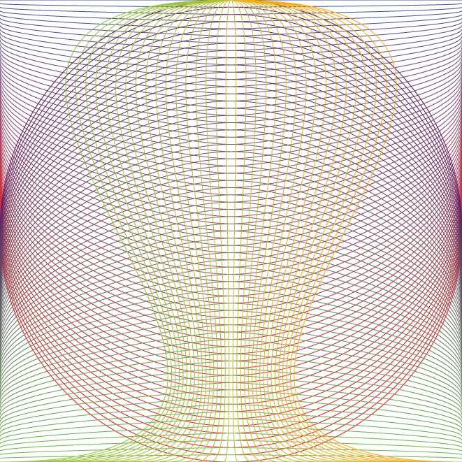
What can be seen as a line?

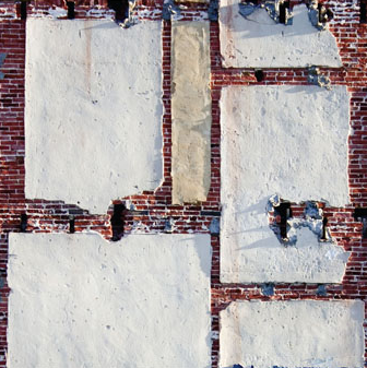
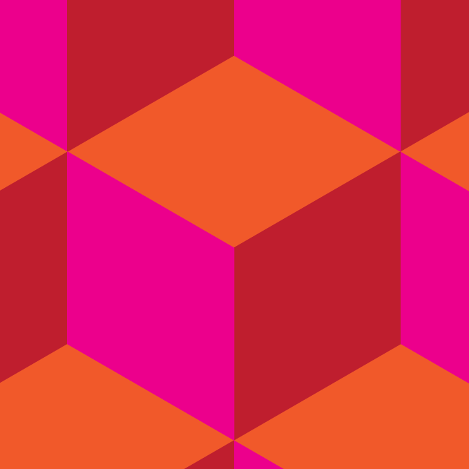
What makes up a plane?
If we're at or past 1:15, that is
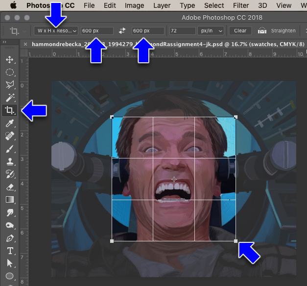
Demo of cropping and saving in Photoshop. Have photos ready to work on at beginning of next class
The trick in Photoshop is:
Points, lines, and planes can have various properties or aspects of how they are perceived. These are often listed out as:
Let's take them one by one...
Except for maybe points (because a point can be infinitely small), design elements have a shape.
The general outline of something is called a shape; it is a configured or delineated area on a two-dimensional surface created by line or by color, tone, or texture
We can categorize shapes as (many shape types can be in more than one category):
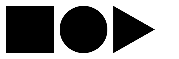 Geometric/Rigid
 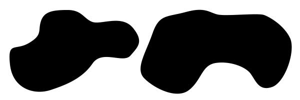 Curvilinear/Organic
 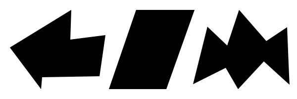 Rectilinear (also a kind of Geometric/Rigid shape)
 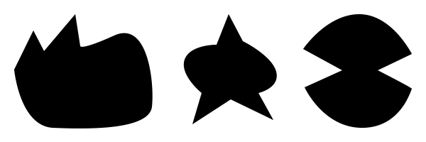 Irregular (can be a kind of Geometric/Rigid shape)
 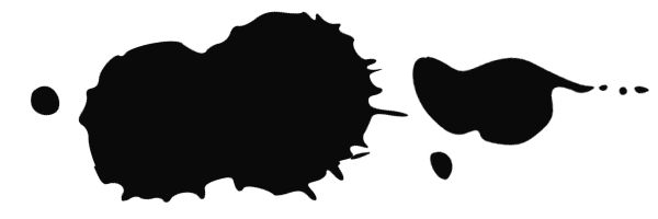 Accidental
 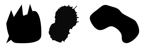 Nonobjective/nonrepresentational
 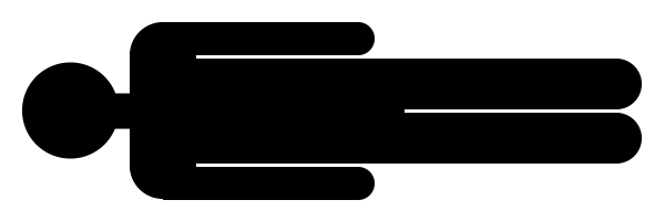 Representational
Our text makes a distinction between Representational and Abstract. I think it's an arbitrary and confusing distinction. Almost anything that could be categorized as Representational could also be categorized as Abstract
Color is a description of Light Energy.
https://www.youtube.com/watch?v=zv_E44hPafs
Four kinds of light-sensitive receptors are found in the retina
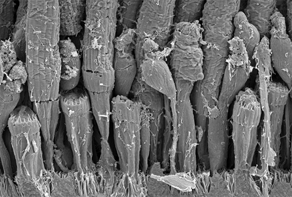

Fun fact: Turtles have more then three types of cones (5, in fact) and can see colors we cannot!
Paint, apples, and the printed page, all use colors that subtract light-waves when they reflect a color back into your retina. Smart Phones, TV sets, Computer Screens, all beam light-waves directly into your retina and don't subtract light-waves, but add different value combinations of Red, Green and Blue light (RBG).
(Side note: Great slide-show about color: everything-you-know-about-colour-is-wrong2)
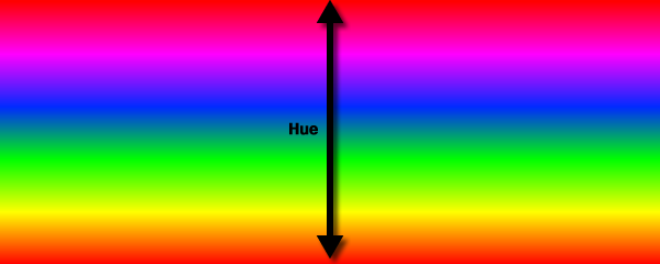
Hue: the name of a color, or the “color” of a color, usually measured in degrees (0-360)
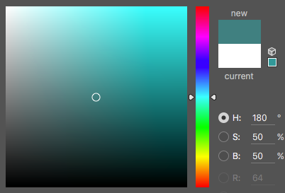
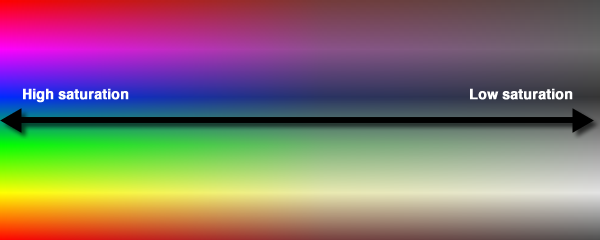
Saturation: Brightness to dullness of a color, AKA Chroma or Intensity

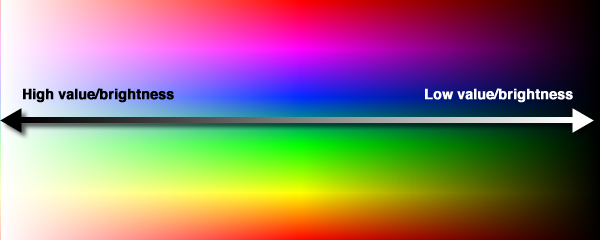
Value: The lightness to darkness of a color, AKA Luminosity

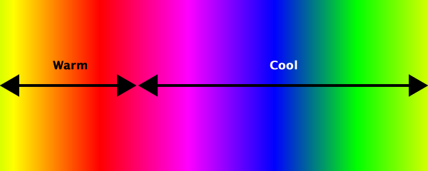

Warm: Red to orange to yellow Cool: green to blue to violet
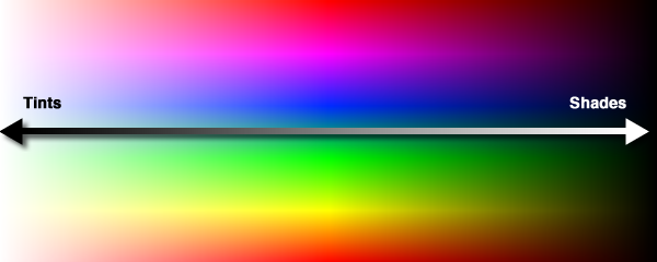
Tints and Shades: Add white for tints, black for shades
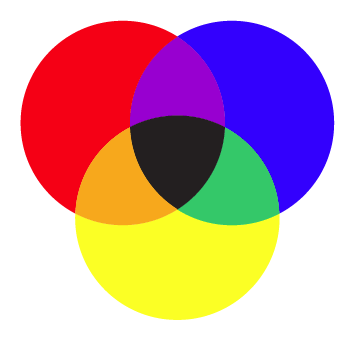
In Subtractive:
Red, Yellow and Blue
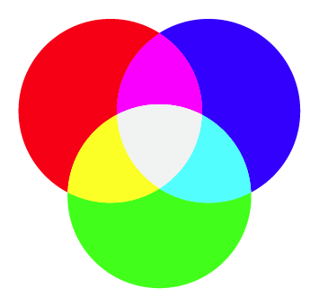
In Additive:
Red, Green, and Blue (RGB)
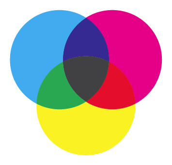
Other Color Models: Print:
Cyan, Magenta, Yellow and Black
(CYMK)
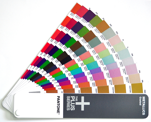
Other Color Models: Print: Pantone Colors
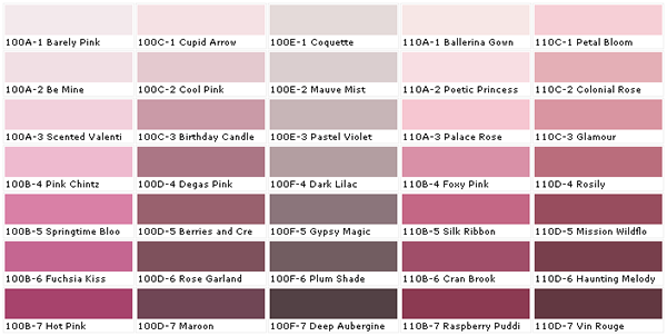
Other Color Models: Print: House Paint
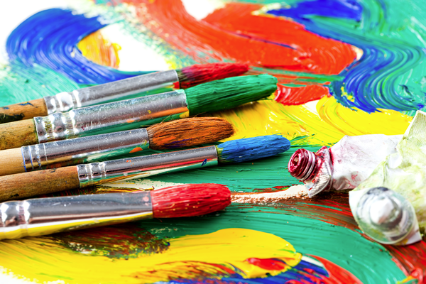
Other Color Models: Artist Paints
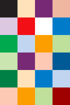
Any given color model has a finite range of colors it can express. This is known as the Color Gamut
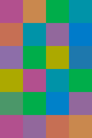
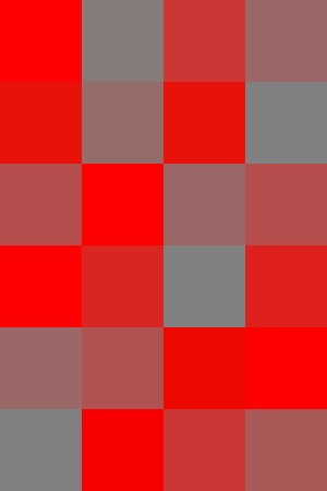
Color contrast of Hue, Saturation, and/or Value can be exploited as a means of Graphic Expression.
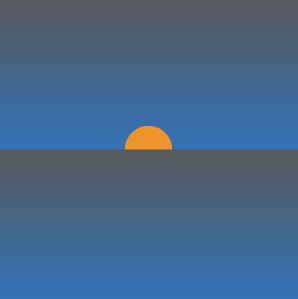
Create a focal point
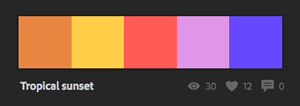
Be used symbolically (Adobe Color)
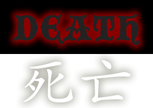
Contain cultural and emotional associations
Be part of a brand
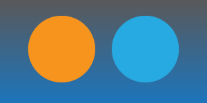
Create 3D effects
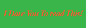
Make or break text legibility
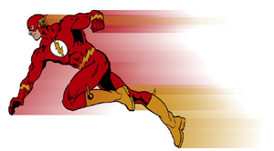
Can imply motion
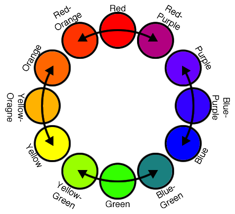
Analogous: Adjacent colors on the color wheel.
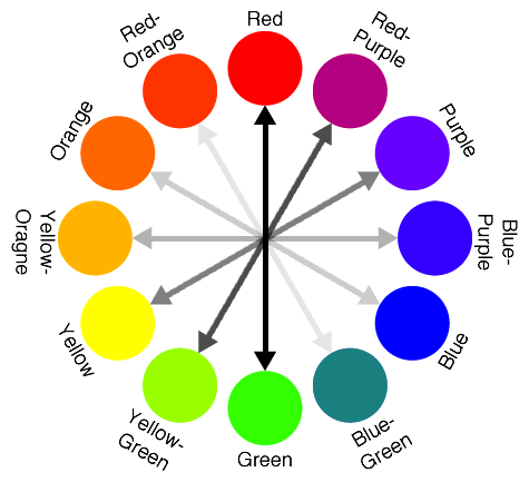
Complimentary: Opposite colors on the color wheel.
Earth Tones, Jewel Colors, Fluorescents, etc. There's tons of them, can you think of a few?
Color can be associated with techniques, historical periods, art movements, natural environments, etc
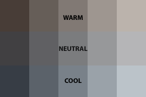
Color can have different temperatures, even grays

Color is always relative!
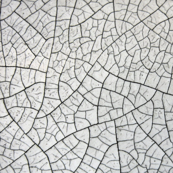
It's kind of hard to define, but you know it when you see it. If you can imagine what it might be like to feel with your fingers, it's probably a texture. One definition: Texture is the tactile grain of surfaces and substances.
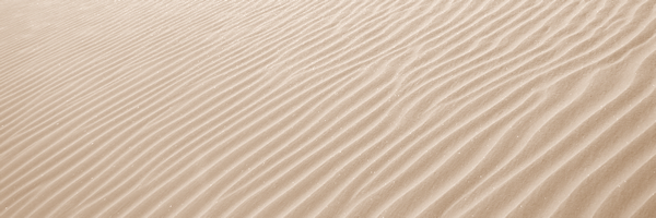
A velvety smooth printed surface might be appropriate for a Spa brochure
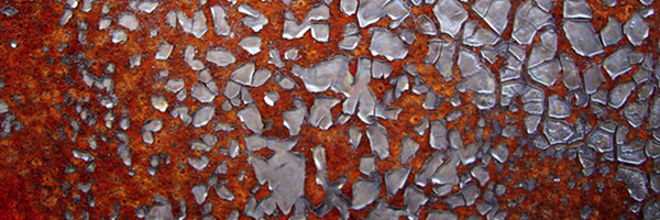
A rusty metallic image might be right for a garage punk metal band
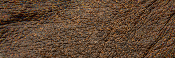
Leathery embossed paper for a Harley-Davidson catalog
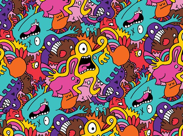
Pattern is a special type of texture that takes an element or elements and repeats them systematically.
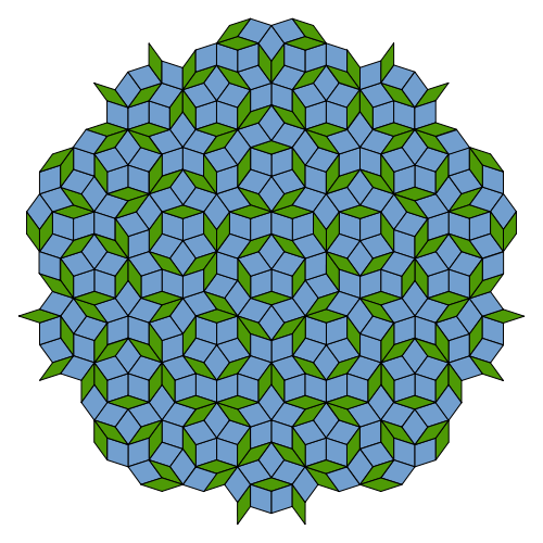
While our textbook says “there must be a systematic repetition with obvious directional movement,” but I disagree, there's an interesting mathematical expression of a pattern called Penrose tiling that doesn't do this, and in fact, never repeats itself while still appearing to be a pattern