Anatomy Of A Line Of Characters

- Cap-height
- X-height
- Ascender
- Descender
- Baseline
- Median/Mean Line
Typography is the art and technique of arranging letter-forms (type) to make written language legible, readable and appealing when displayed. The arrangement of type involves selecting typefaces (fonts), point sizes, line lengths, line-spacing (leading), and letter-spacing (tracking), as well as adjusting the space between pairs of letters (kerning). The term typography is also applied to the style, arrangement, and appearance of the letters, numbers, and symbols created by the process.
A font is the collection of letter-forms (glyphs) that make up a unique style, like Helvetica and Times New Roman.
| .OTF | OpenType | The most common and useful |
| .TTF | TrueType | A predecessor to OTF, depricated in InDesign |
| .SVG | Scalable Vector Graphic | Hot new kid on the block. Let's you include color and gradients in a font. OTF and TTF are strickly monochrome (one color). Not widely accepted, yet. |
creativefabrica.com/the-ultimate-font-guide/difference-between-font-formats
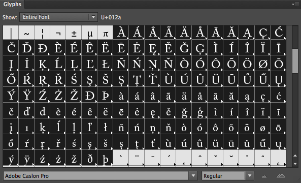
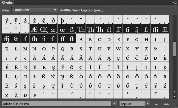
It's important to realze that these fonts on our computer are nothing more than a collection of individual characters, like "a" and "z" and "1" and "@". And each of the characters, technically known as "glyphs" are made up of...
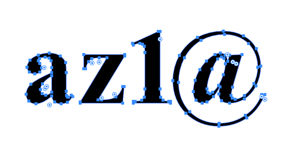
Anchor Points!
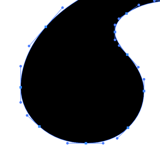
There's more tools available now than ever before. It used to be just a niche product, led by Fontographer, now upgraded to Fontlab 8 ($500). There's a list of 16 on a Reddit thread.
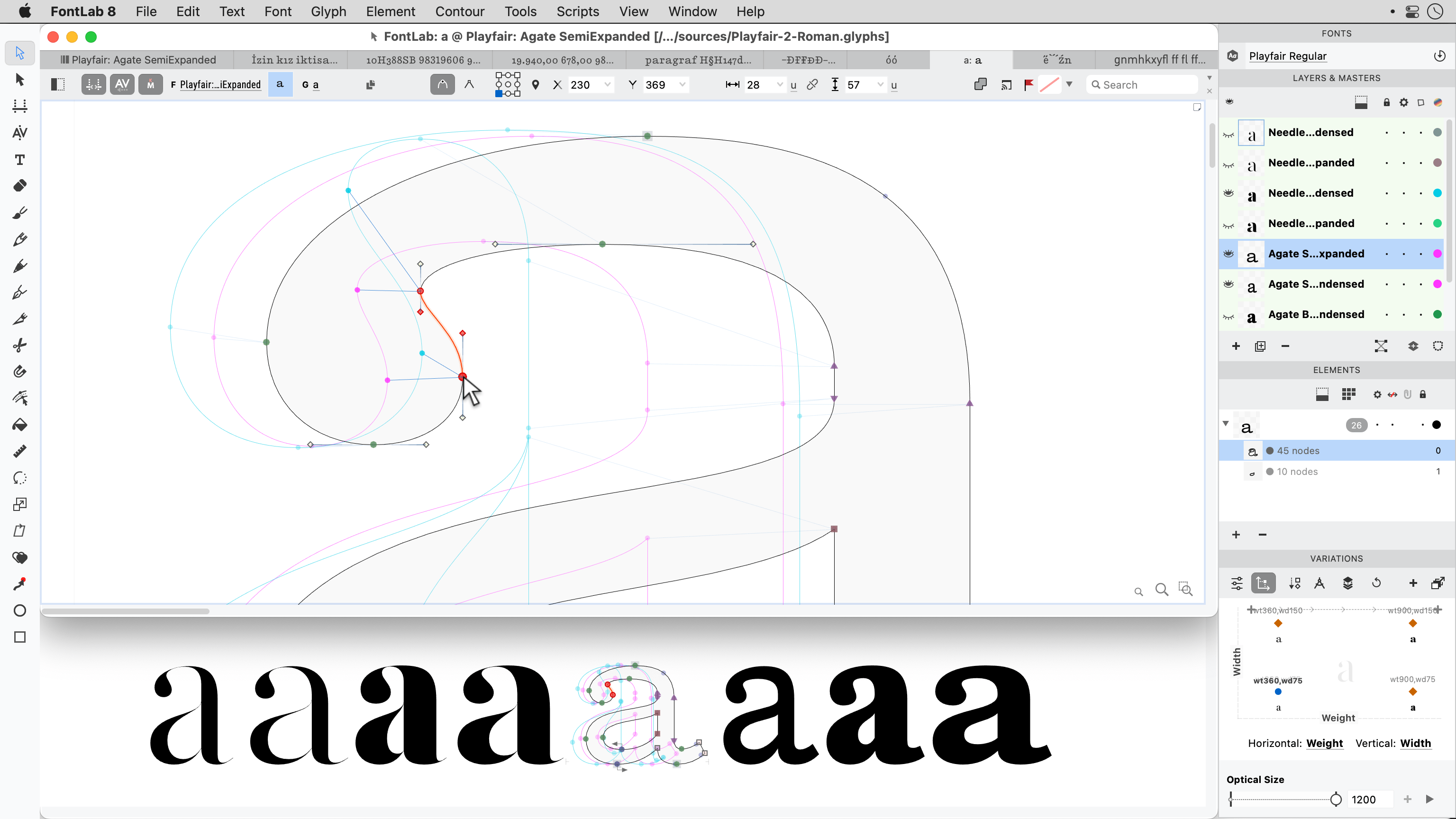
As you can see, it's using Anchor Points and curves.
(Most of the time)

The most important properties:
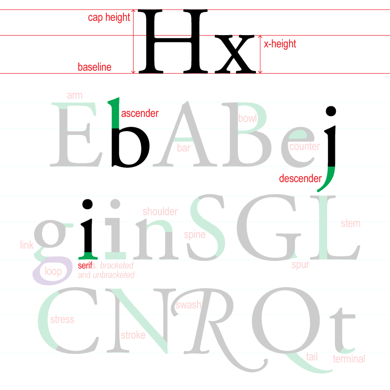
Anatomy of a Character @ ITCfonts
Font's can be broken down into various categories or classifications. There are many different ways of classifying fonts:
Adobe Online (practical)
The Association Typographique Internationale Vox-ATypI (un-adopted in 2021)
|
|
|
Useful (supercharge.design & procreator.design)
|
|
|
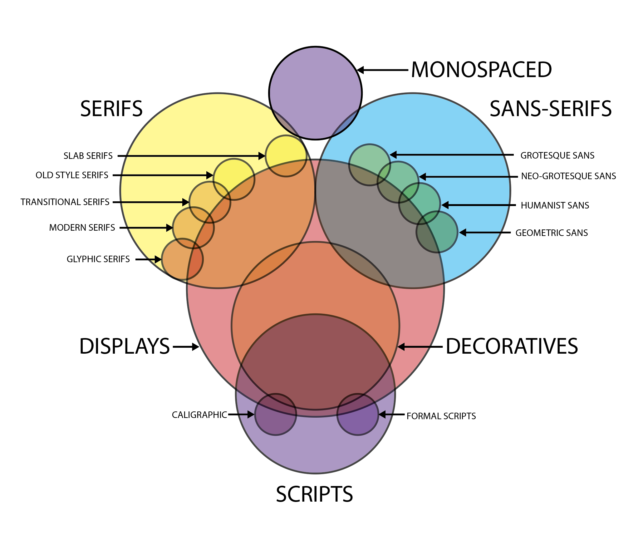
Here's a VIN diagram of the overlap of the various categories in the Useful version. Suffice it to say, most font exist in more than one category (althoug a Serif font can't be a Sans Serif and visa versa)
Let's put dive deeper into Useful version...
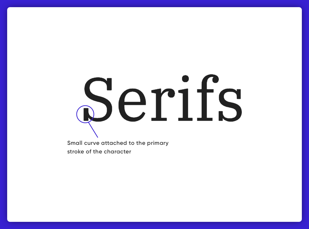
As the name suggests, the typefaces that have serifs, the small curves attached to the primary stroke of the character, are grouped under the Serifs category. They are often used in print media for both body and headlines. Serifs are further classified into sub categories: Old Sytle, Transitional, Modern, and Slab.

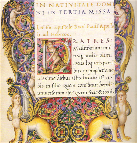
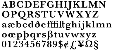
Developed in the late 15th and 16th centuries and based on books copied at Monasteries. There is an emphasis on the diagonal axis of the circular parts of letters. Their is a minimum contrast exists between the thick and thin strokes. The serifs are bracketed with the curve attaching the stem and the serif.
Examples: Palatin, Caslon, Hoefler, Jenson, Kennerley, Centaur, Stempel Schneidler
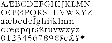

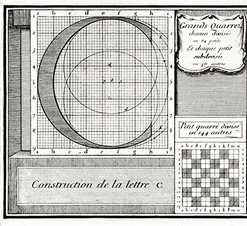
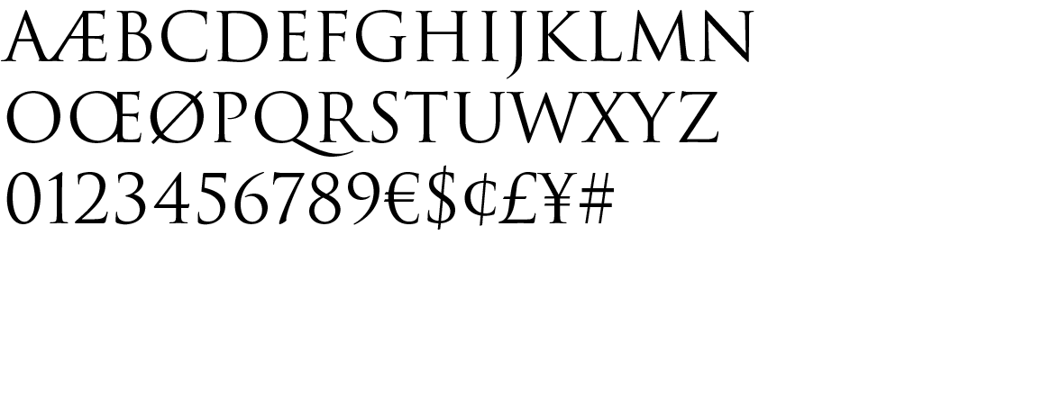
Evolved in the 18th century as a transition from the Old style to Modern. There is more emphasis on a vertical axis to the circular parts of letters. The ends of the serifs are vertical usually. There is more contrast between the thick and thin strokes. More pure geometric forms (i.e circles), conforming to the ideals of the Enlightenment.
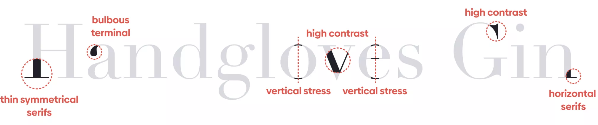
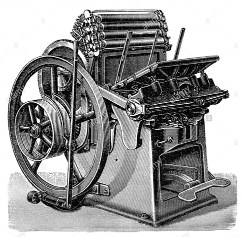
Refined and more delicate style, indicated by high or dramatic contrast between the thick and thin strokes, curved strokes on a vertical axis, and horizontal serifs with little or no bracketing. Enabled by new printing technoloties int the 18th and early 19th centuries allowing for finer lines.
Examples: Didot, Walbaum, Century Schoolbook
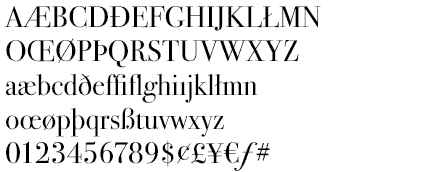
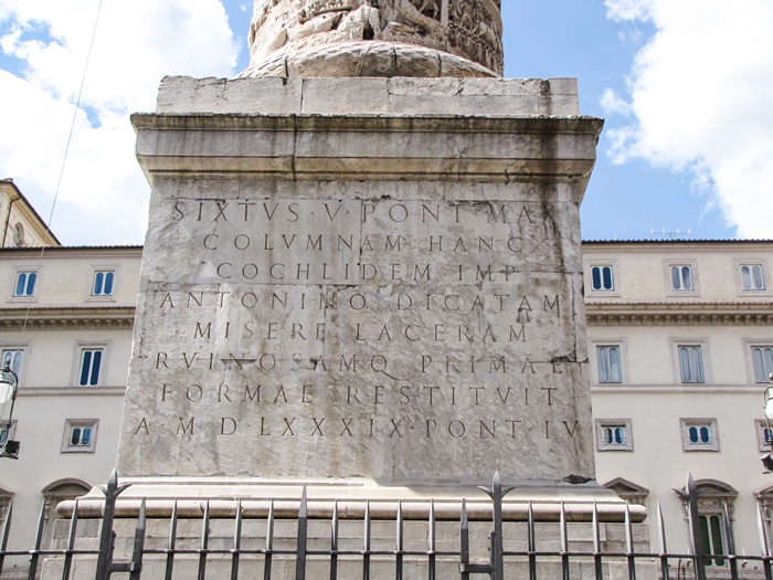
These serif type styles are lapidary (carved or engraved) rather than pen-drawn in nature. They contain a vertical axis, minimum stroke contrast, and often have triangular or flaring serifs.
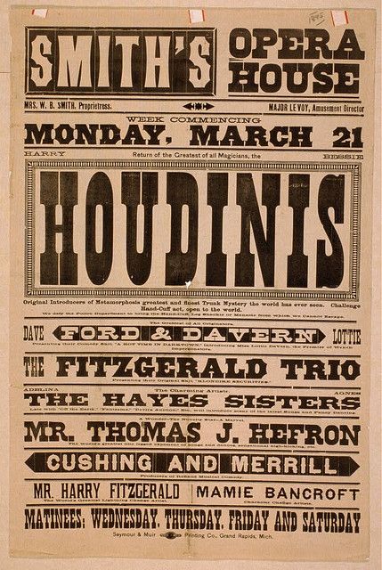
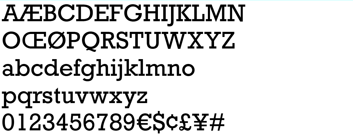
These typefaces have very heavy square serifs, with little or no bracketing and hardly any stroke contrast, appearing monostroke. These serifs are often geometric or square in style. Slab serifs emerged in the early nineteenth century when there was a need for more robust fonts for printing headlines and other advertising material to convey powerful and bold messaging.

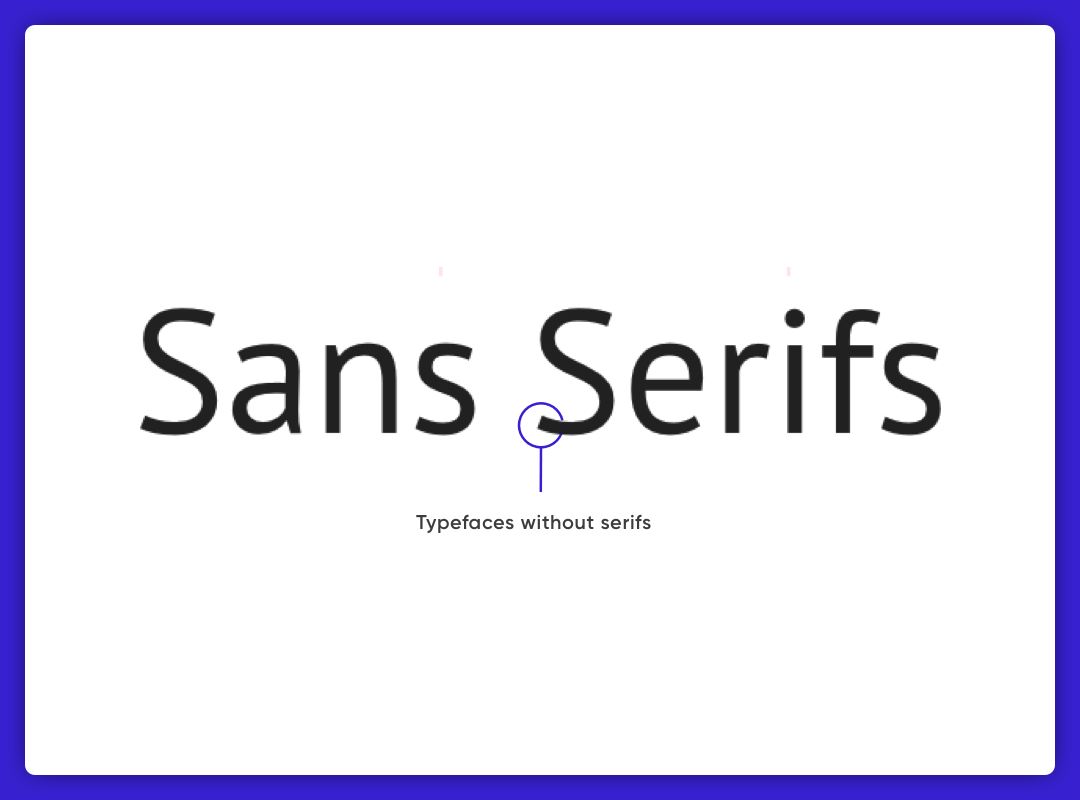
The name of this category stems from a combination of the French word “sans,” which means “without,” and serifs, which are lines that appear at the end of characters’ strokes. Sans-serifs (sans serifs, gothic, or simply sans) were some of the first styles cut in stone, and since then, they have had periodic popularity due to their simplicity and partially industrial look. People use Sans-serif typefaces to express simplicity, modernity, or minimalism.

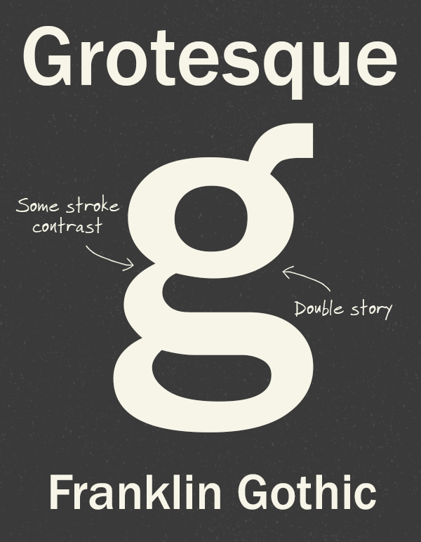
The first popular sans, developed in the early 18th century. It earned its name "Grotesque" as an insult commenting on it's uglieness. Its distinctive features contrast in stroke weight, a squared look to some curves, a “spurred” G, and a double-bowl (or two-story) lower-case g.
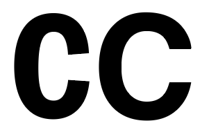
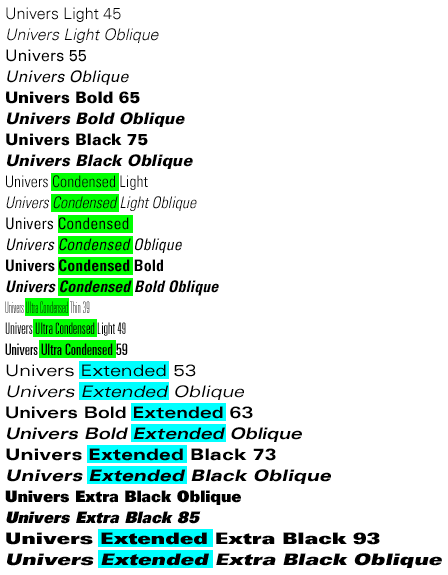
Examples: Univers,
Arial ($961 for 28 styles), Roboto (28 styles free)
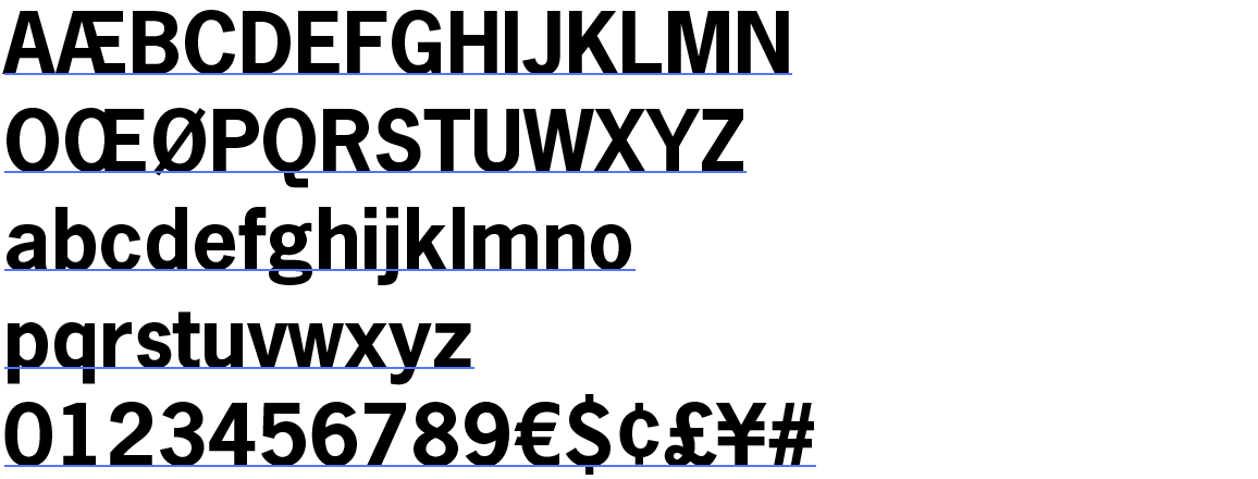
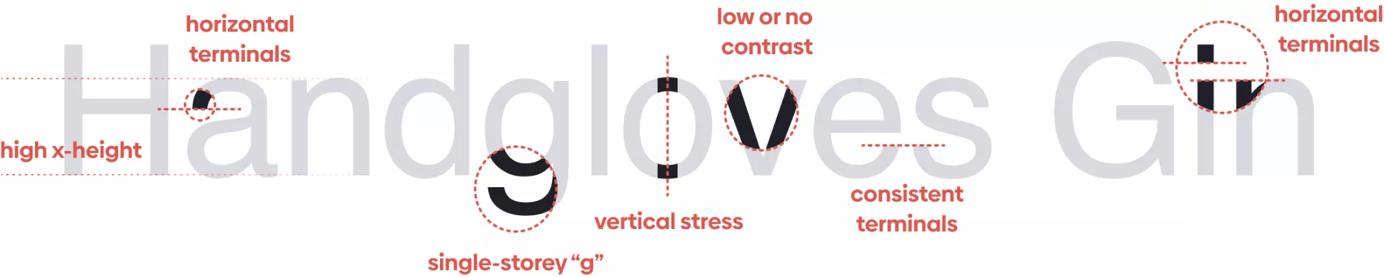
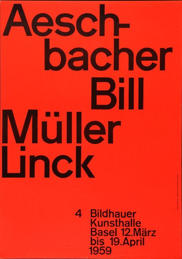
Another name is 20th Century Grotesque; this sans has less pronounced stroke contrast and is more refined in form than its ancestor. It has lost the squared curve and often has a single-bowl g. Neo-grotesque type appeared in the 1950s with the International Typographic Style or, more commonly known, the Swiss Style.
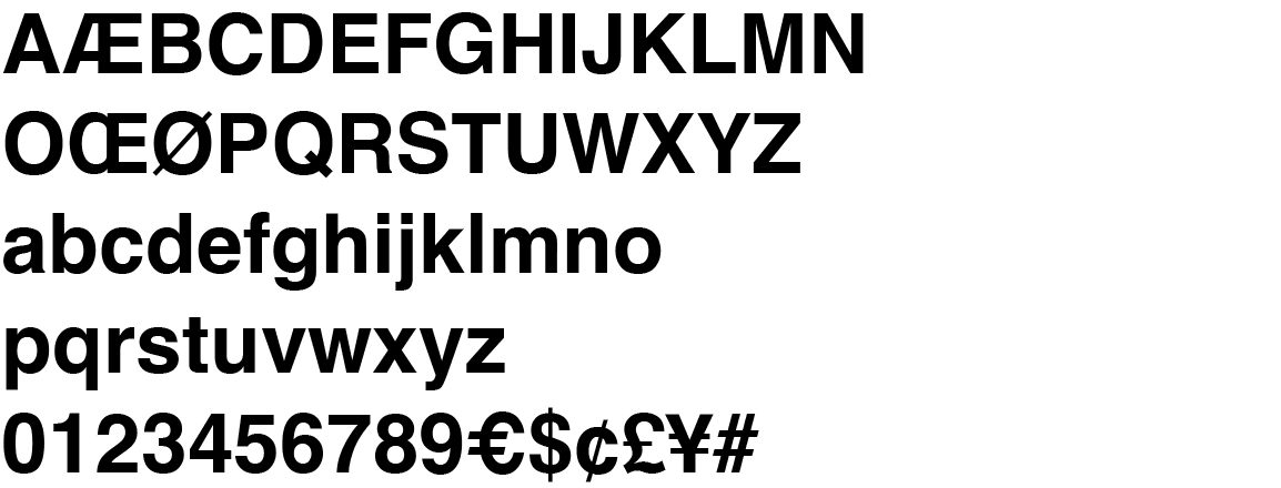

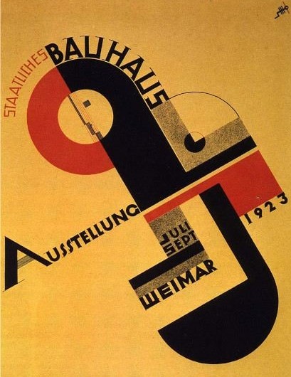
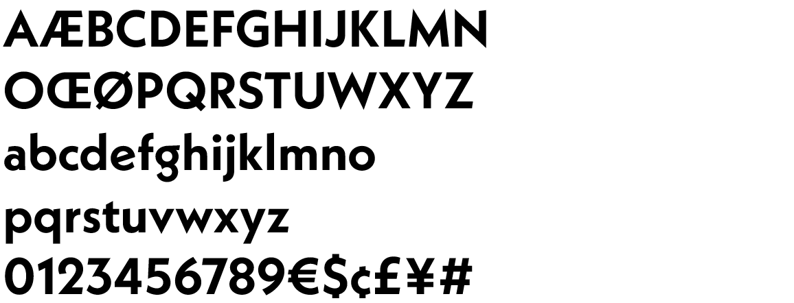
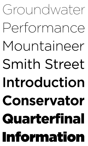
These typefaces have solid geometric shapes, such as the perfect circle letter O, sharp and pointed uppercase N vertices, and a “single-story” lowercase letter a. They usually have monotone strokes. It originated in Germany and is popularly connected to the Bauhaus movement.

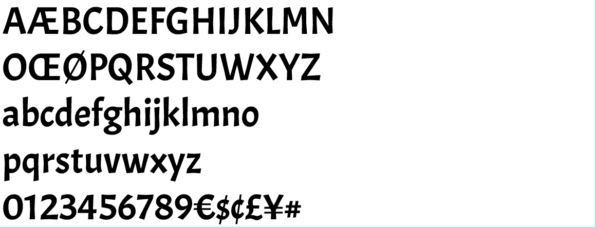
An attempt to improve the readability of sans serifs by giving a sans-serif structure to the classical Roman form; these sans-serifs base on the proportions of Roman capitals and old style lowercase, with a clear stroke contrast. Kind of looks like it was drawn with a pen.

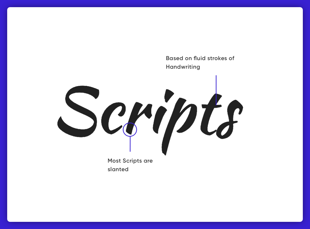
In typography classification, Scripts are a vast category of typefaces that imitate handwriting or calligraphy. Scripts include many styles and characteristics and are much more fluid than traditional styles. People generally use them for displays or trade printing rather than as an extended body text in the Latin alphabet.
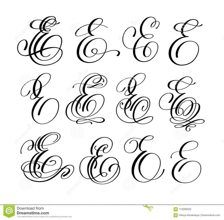
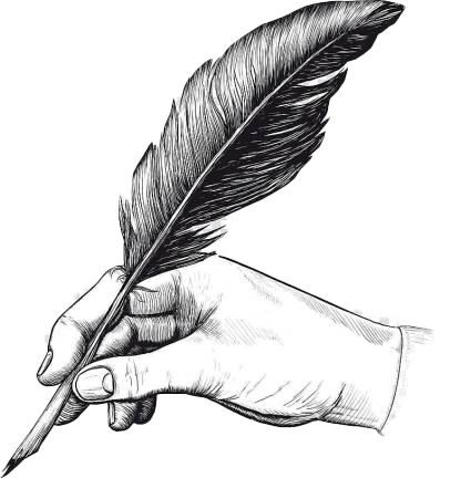
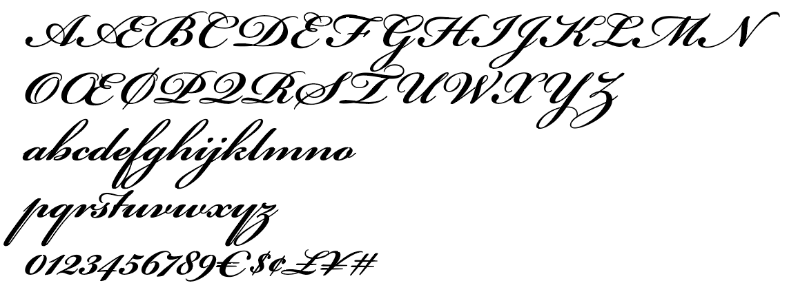
Flowing loops and flourishes characterize these elegant typestyles, along with graceful, rhythmic strokes. They would have been done by a pen (as opposed to a brush). These designs often connect characters and mimic the cursive handwriting of the nineteenth century. Today, people often use formal script typefaces for invitations and diplomas to induce a traditional and elegant feeling.
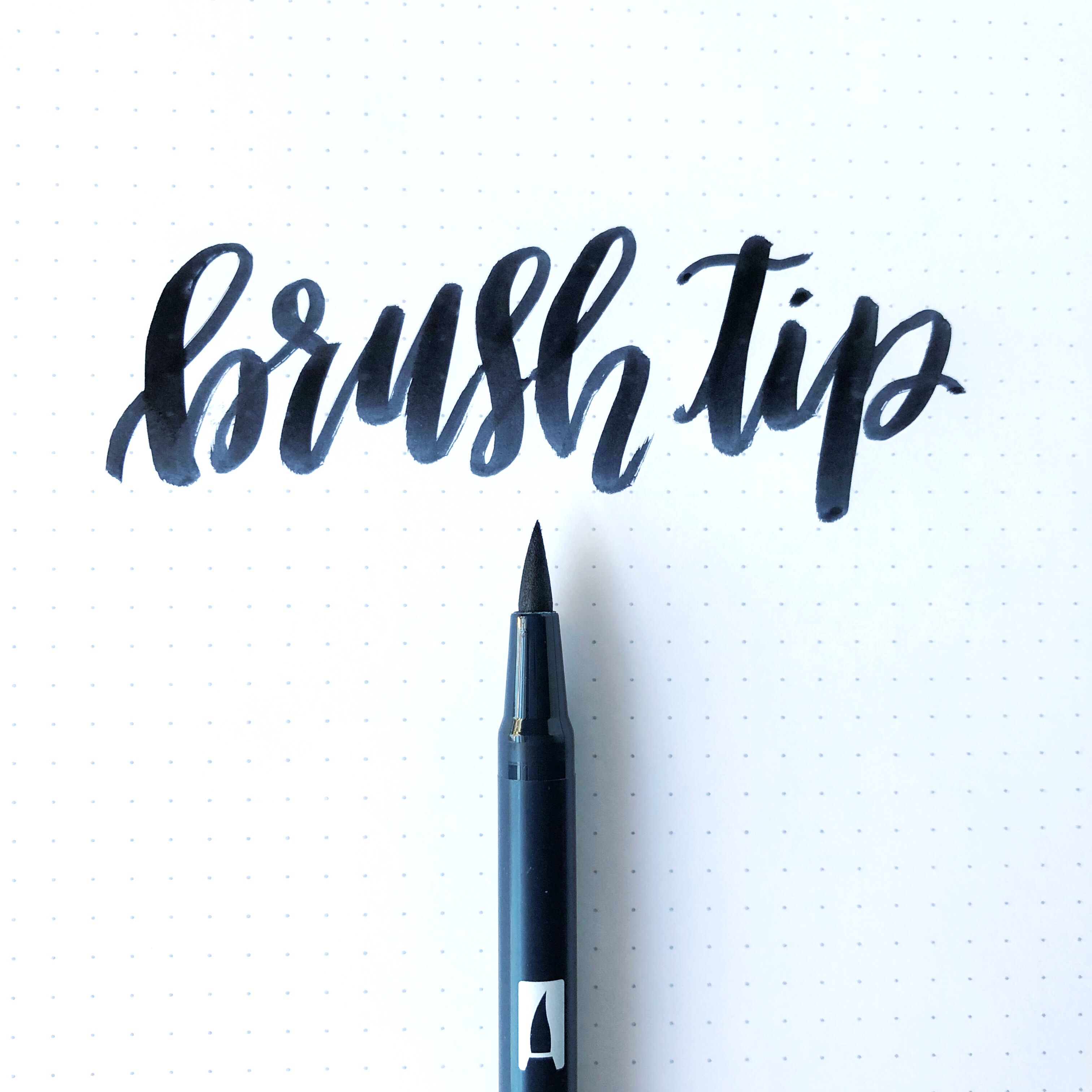
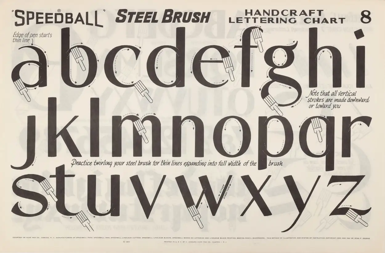
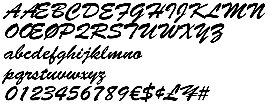
These scripts have an informal design and look like someone quickly drew them with a brush. Their strokes can be (but don’t have to be) connected, and they tend to convey a warm, friendly, and relaxed message. In truth, it is pretty much indestiguishable from Brush/Casual
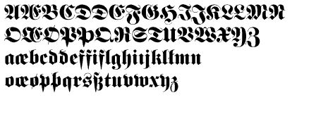
Other examples: Old English, Schwabacher, Gotisch
Based on 13th century medieval manuscript letter-forms. Sometimes called Gothic.
Despite being really hard to read, the Nazi's loved it because it harkened back to their supposed Arian roots.

Something that other fonts in other categories belong to as well as their own categories. These fonts should only be used in headlines, and never for body copy.
A catch-all category that, like Display, contains fonts from other categories. Basically means the font is too frilly and fancy to be used for anything other than headlines. Like Display, but more ornate.
Any font whose width is the same no matter the character. Comes from manual typewriters that struck a character on paper then moved a fixed distance to setup the next character
Not letterforms, but actual symbols like ⛾⛿☯☸ ⛩⛰⛱⛴
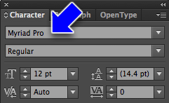
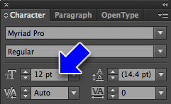
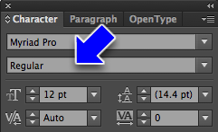
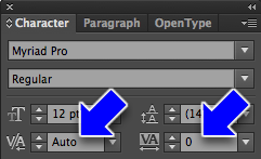
Actual settings you can set in Illustrator.
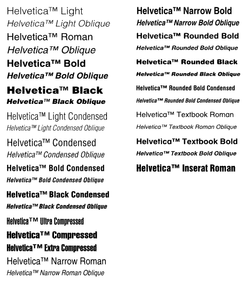
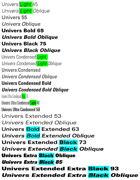
Example font: Helvetica Family
1pt 2pt 3pt 4pt 5pt 6pt 7pt 8pt 9pt 10pt 11pt 12pt 13pt 14pt 15pt 16pt 17pt 18pt 19pt 20pt 21pt 22pt 23pt 24pt 25pt 26pt 27pt 28pt 29pt 30pt 31pt 32pt 33pt 34pt 35pt 36pt 37pt 38pt 39pt 40pt 41pt 42pt 43pt 44pt 45pt 46pt 47pt 48pt 49pt 50pt 51pt 52pt 53pt 54pt 55pt 56pt 57pt 58pt 59pt 60pt 61pt 62pt 63pt 64pt 65pt 66pt 67pt 68pt 69pt 70pt 71pt 72pt
This is normal spacing
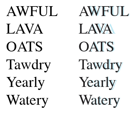
AB - Two letters with wide kerning
AB - Two letters with negative kerning
Sentence with wide tracking
Sentence with negative tracking
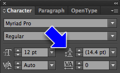
This is 12pt leading for a 12pt block of type. A little too tight, I think. Lorem ipsum dolor sit amet, consectetuer adipiscing elit. Suspendisse eget diam. Morbi in risus. Morbi nibh. Sed cursus urna. Nunc vitae nisl eu arcu vulputate pharetra. Nullam euismod.
This is normal leading for a 12pt block of type, which is usually about 14.4pts. Lorem ipsum dolor sit amet, consectetuer adipiscing elit. Suspendisse eget diam. Morbi in risus. Morbi nibh. Sed cursus urna. Nunc vitae nisl eu arcu vulputate pharetra. Nullam euismod.
This is 16pt leading for a 12pt block of type. Lorem ipsum dolor sit amet, consectetuer adipiscing elit. Suspendisse eget diam. Morbi in risus. Morbi nibh. Sed cursus urna. Nunc vitae nisl eu arcu vulputate pharetra. Nullam euismod.
This is 18pt leading for a 12pt block of type. Lorem ipsum dolor sit amet, consectetuer adipiscing elit. Suspendisse eget diam. Morbi in risus. Morbi nibh. Sed cursus urna. Nunc vitae nisl eu arcu vulputate pharetra. Nullam euismod.
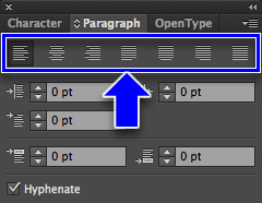
This paragraph is aligned left. Lorem ipsum dolor sit amet, consectetuer adipiscing elit. Suspendisse eget diam. Morbi in risus. Morbi nibh. Sed cursus urna. Nunc vitae nisl eu arcu vulputate pharetra. Nullam euismod. Fusce pharetra. Aliquam non ante. Ut porta, neque at porta viverra, eros nulla sollicitudin sapien, sed tempus tellus risus, vivamus sed.
This paragraph is aligned right. Lorem ipsum dolor sit amet, consectetuer adipiscing elit. Suspendisse eget diam. Morbi in risus. Morbi nibh. Sed cursus urna. Nunc vitae nisl eu arcu vulputate pharetra. Nullam euismod. Fusce pharetra. Aliquam non ante. Ut porta, neque at porta viverra, eros nulla sollicitudin sapien, sed tempus tellus risus, vivamus sed.
This paragraph is aligned center. Lorem ipsum dolor sit amet, consectetuer adipiscing elit. Suspendisse eget diam. Morbi in risus. Morbi nibh. Sed cursus urna. Nunc vitae nisl eu arcu vulputate pharetra. Nullam euismod. Fusce pharetra. Aliquam non ante. Ut porta, neque at porta viverra, eros nulla sollicitudin sapien, sed tempus tellus risus, vivamus sed.
This paragraph is aligned justified. Lorem ipsum dolor sit amet, consectetuer adipiscing elit. Suspendisse eget diam. Morbi in risus. Morbi nibh. Sed cursus urna. Nunc vitae nisl eu arcu vulputate pharetra. Nullam euismod. Fusce pharetra. Aliquam non ante. Ut porta, neque at porta viverra, eros nulla sollicitudin sapien, sed tempus tellus risus, vivamus sed.
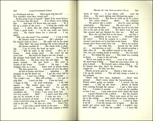
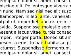
Rivers
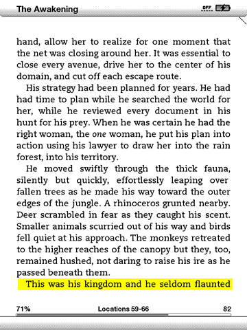
Orphans
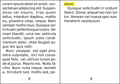
Widows
Demo... example file

Here's a good beginner's guide
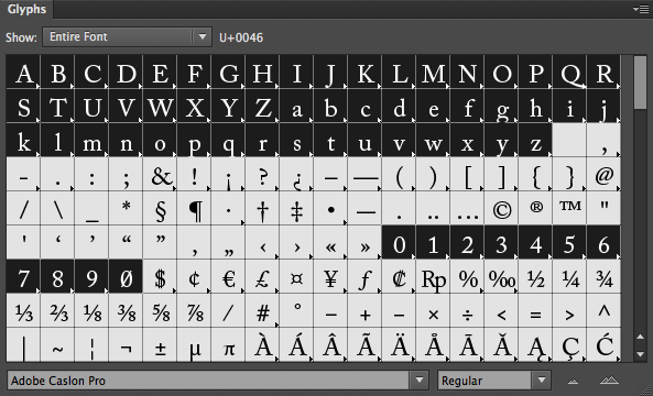
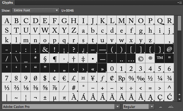
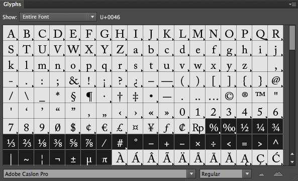
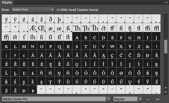
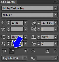
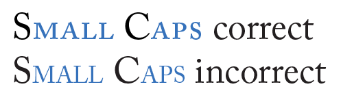
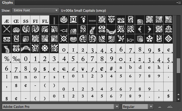
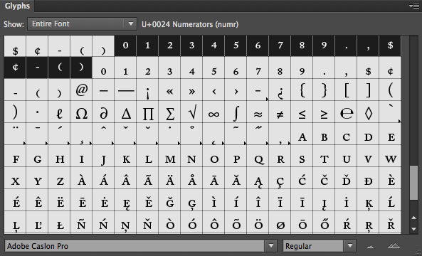
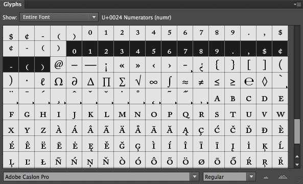
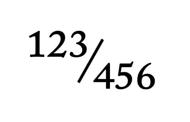
Demo...
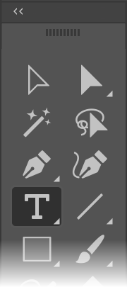

Normal text cursor
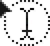
Text cursor over a closed shape
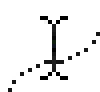
Text cursor over an open path


Area Type Tool

Path Type Tool
Demo... example file
Uses very small and hard to see cursors to indicate editing mode:
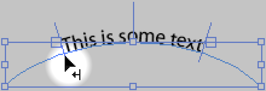
Adjust Type on Path: Left Margin
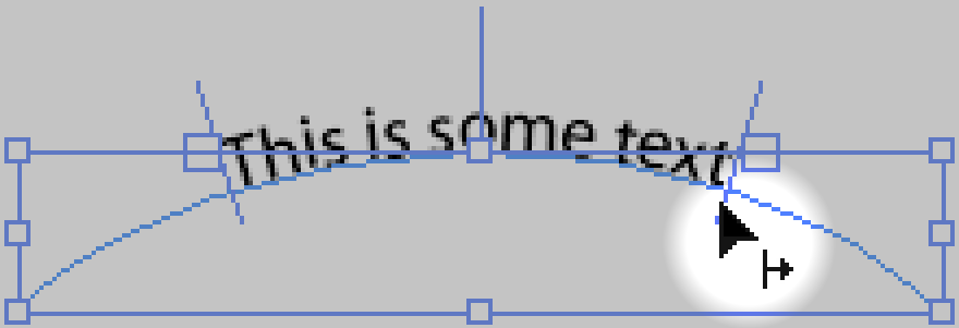
Adjust Type on Path: Right Margin
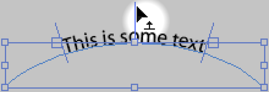
Adjust Type on Path: Center Align and Flip Sides
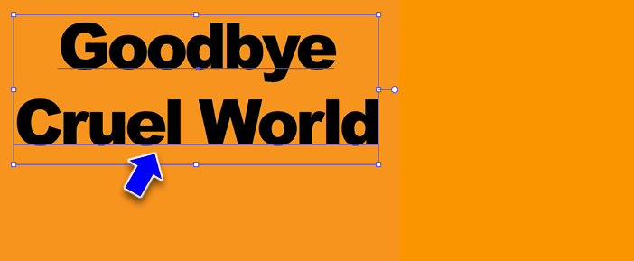
After youv'e created the text object, select it with the Selection tool.
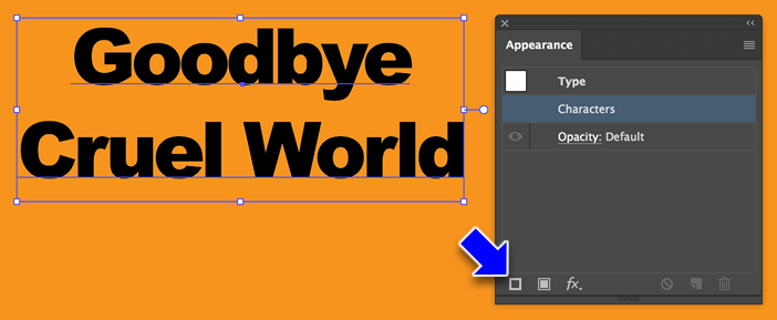
Open the Appearance Panel (Menu > Window > Appearance). Note that the layer 'Characters' is highlighted in the panel. Click on the Stroke icon in the lower left corner. (You may have to click on the Fill icon instead)
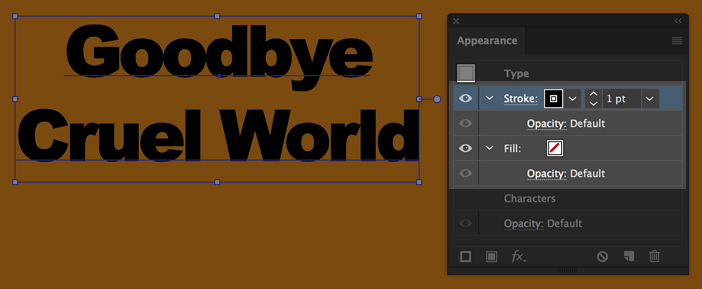
This will add a stroke (and an empty fill) above the Characters layer.
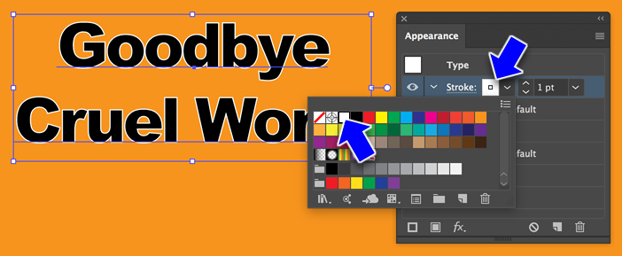
From the Stroke layer, pick a color...
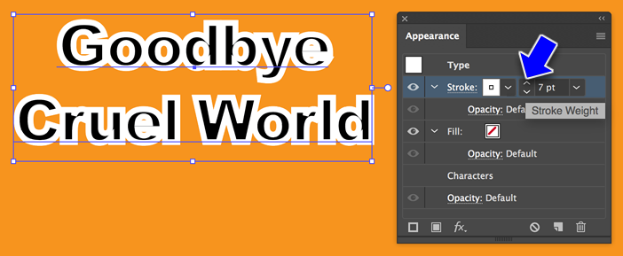
Then set the stroke to twice as wide as you want it to be.
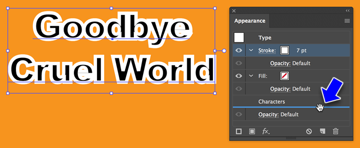
Click on the Stroke layer and drag it down to below the Characters layer.
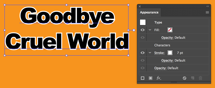
Release and the stroke is now behind the text. And, the text is still editable!
Jump to S curve gradient demo