Lines, Strokes, Fills & Paths Continued
And Shape Builder (vs. Pathfinder) JUMP TO
Gotcha: Stroke vs. Scale
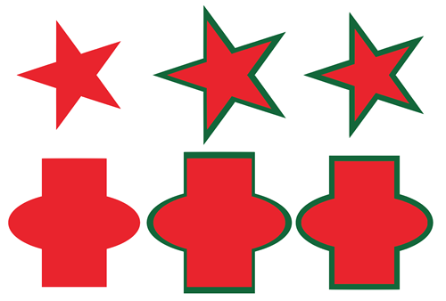
Why its better to stroke a shape than scale it (sometimes)
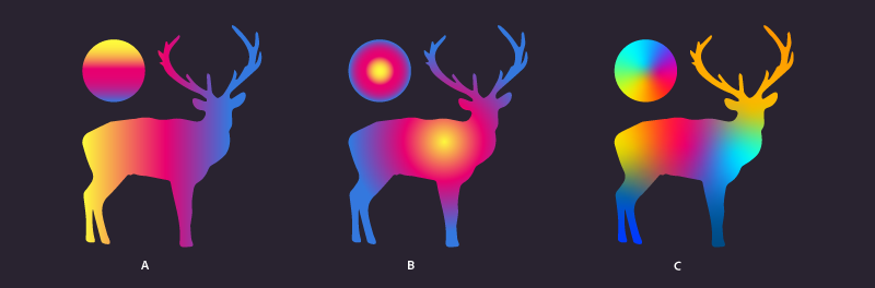
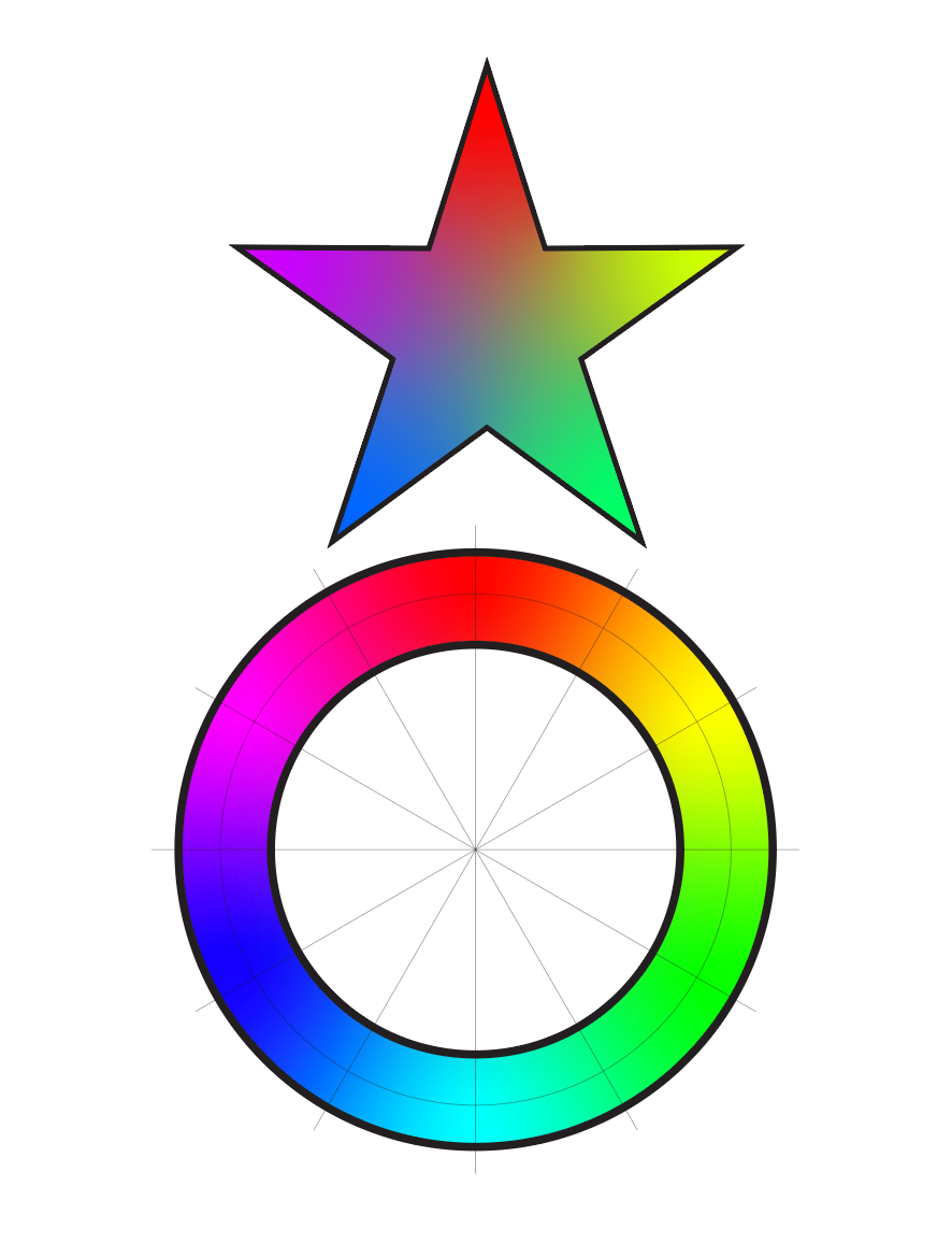
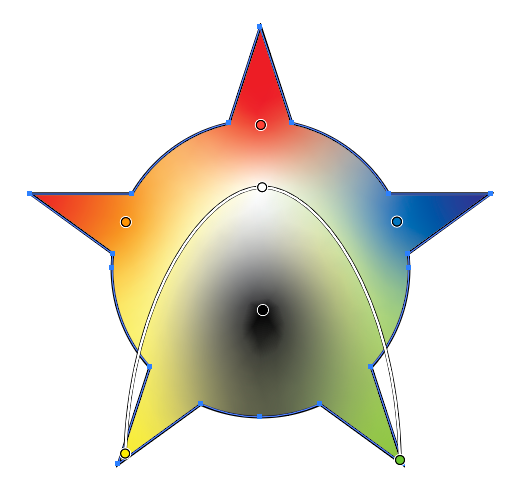
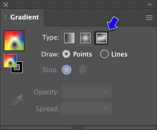
Cool Gradient S
Based on Satori Graphics YouTube Video

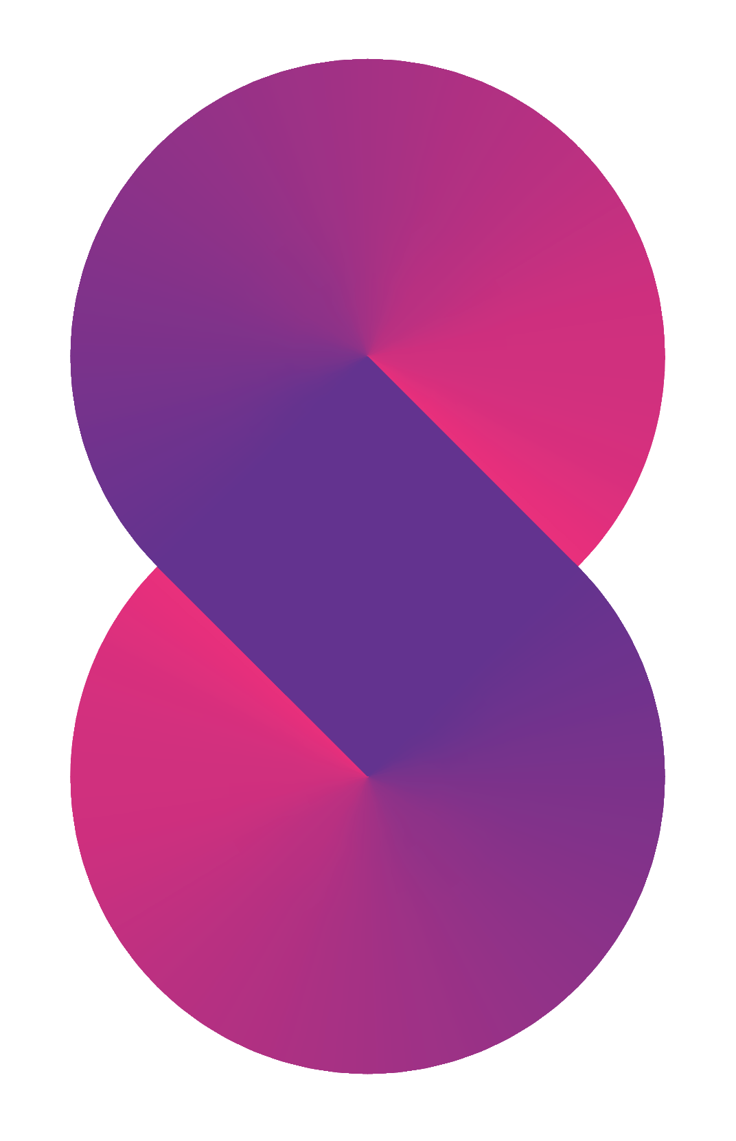
cool_gradient_S.ai
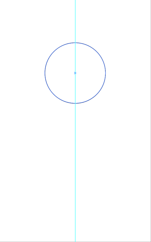
1. Draw a 2" circle (which is 144pts)
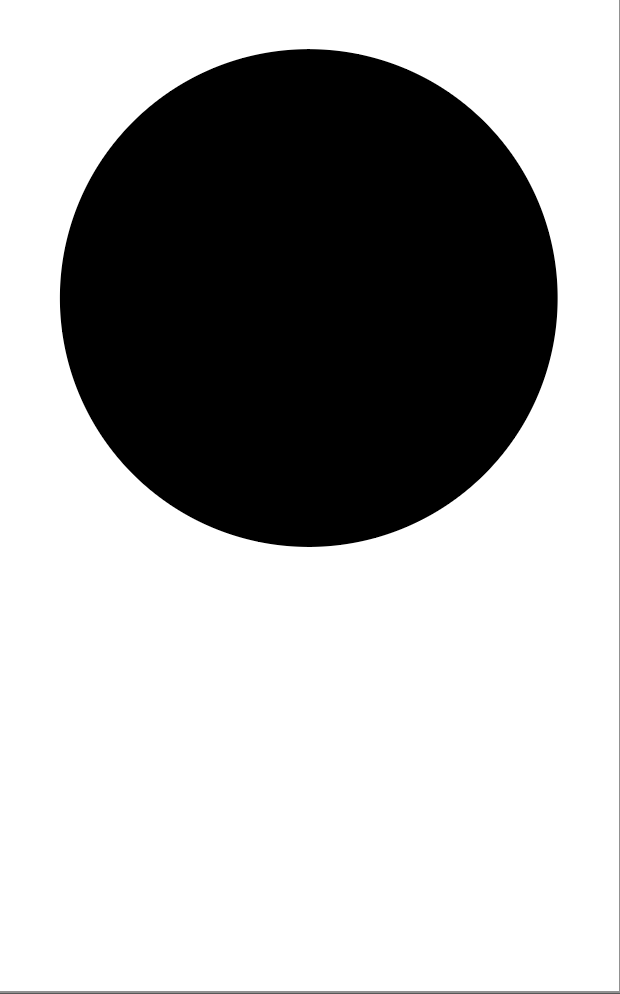
2. Give the circle a 144pt stroke. (Same as width of circle. You can also enter "2 in" and Illustrator will convert it)
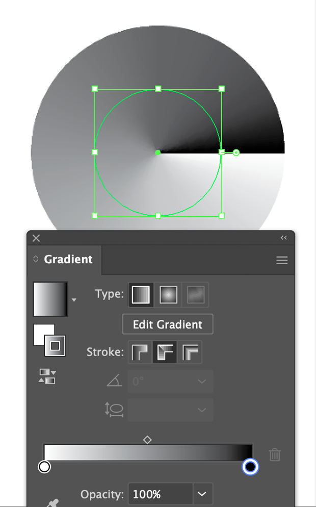
3. Apply a linear black to white gradient with the Stroke set to "Apply Gradient Along Stroke"

4. Change the color from black/white to something pleasing

5. Rotate the circle by draging on the corner. Hold shift key to lock it into 45°
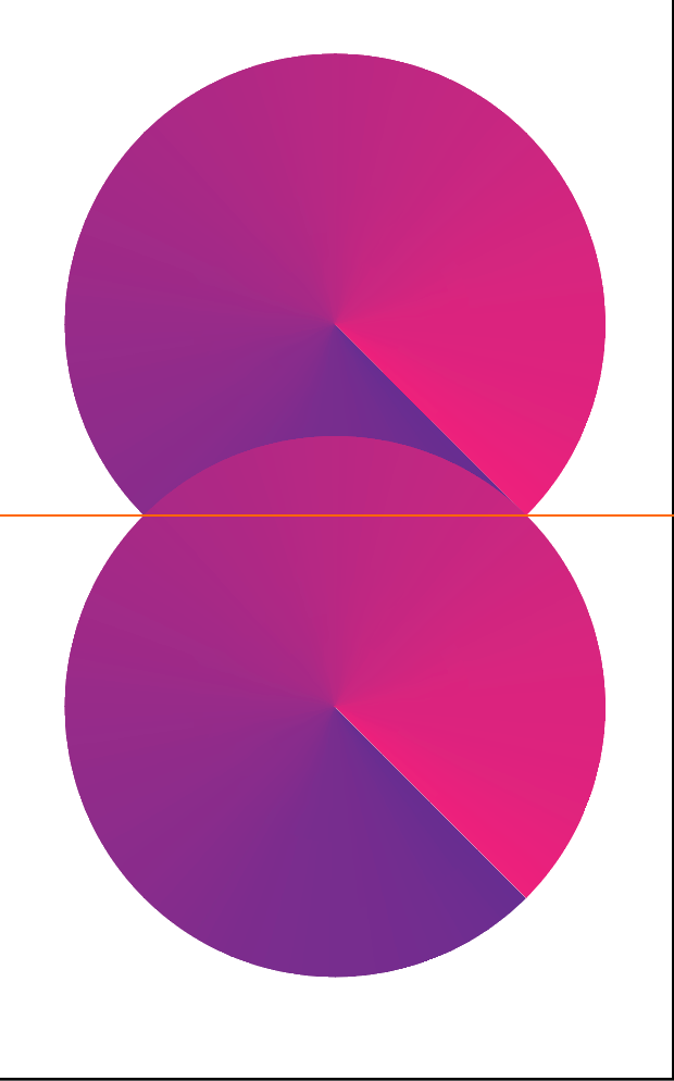
6. This bit is tricky. Duplicate the circle by option-shift clicking it and pull it down...

6a. ...until the edge of the gradient is tangent to the upper right edge
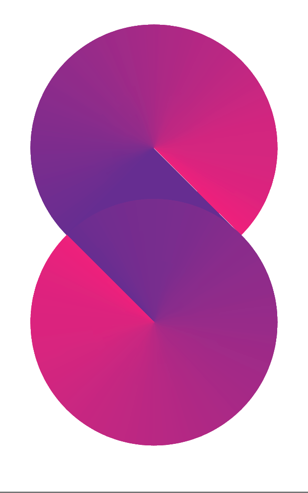
7. Rotate the bottom circle 90°
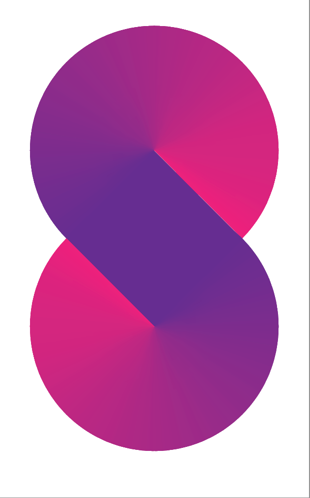
8. Another hard to see bit. You can faintly see the circle at the bottom in the previous image...
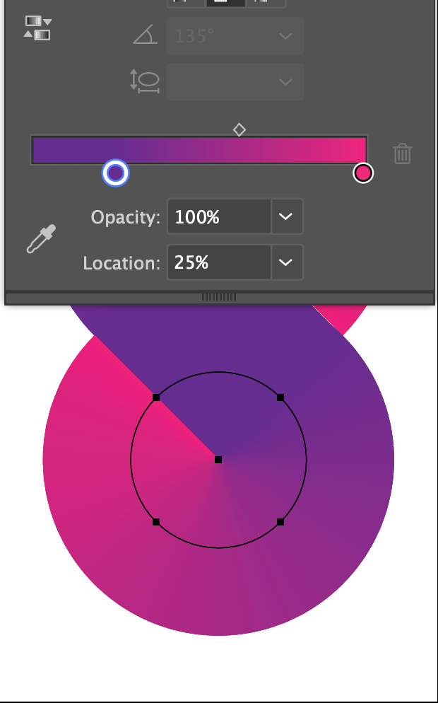
8a. ...edit the gradient so the start point of the gradient is at 25%
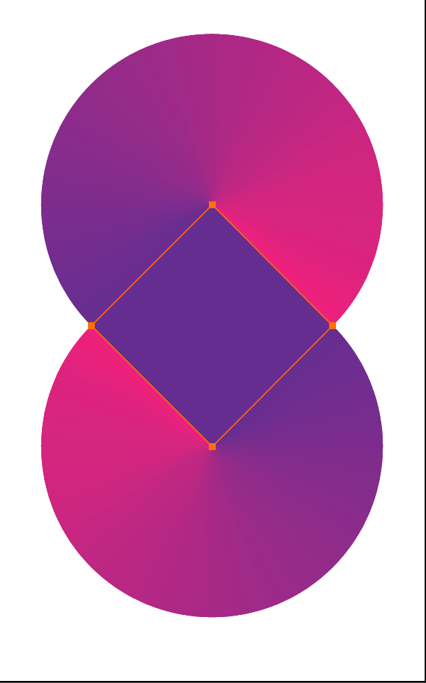
9. Finally, if you want to play around with different colors top and bottom, place a square at 45° at the intersection of the two circles...

10. ...then you can mess with different colors

Patterns
A big subject, perhaps another day...
If 2pm, jump to here
Working With The Paint Brush Tool
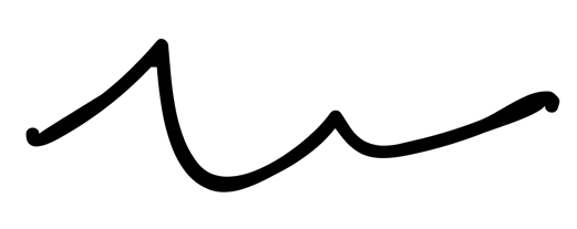
Makes editable paths similar to the Pen tool (demo)
The Paint Brush Vs The Pen Tool

vs.

Brushes
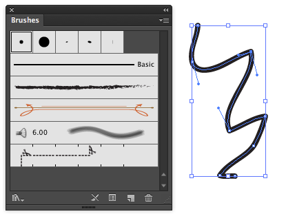
The Brushes Panel
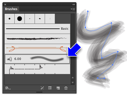
Same path, different brush
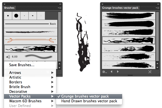
Load brushes from the popup menu in the lower left of the brushes panel
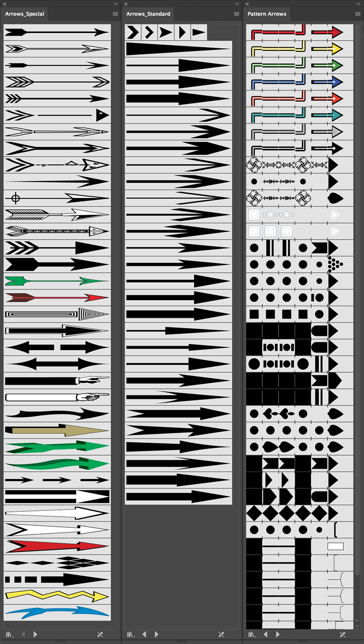
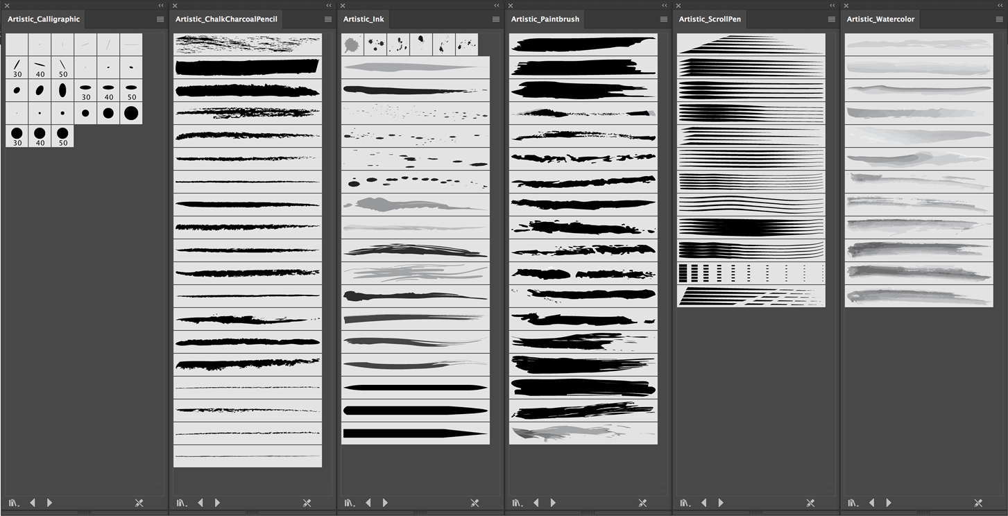
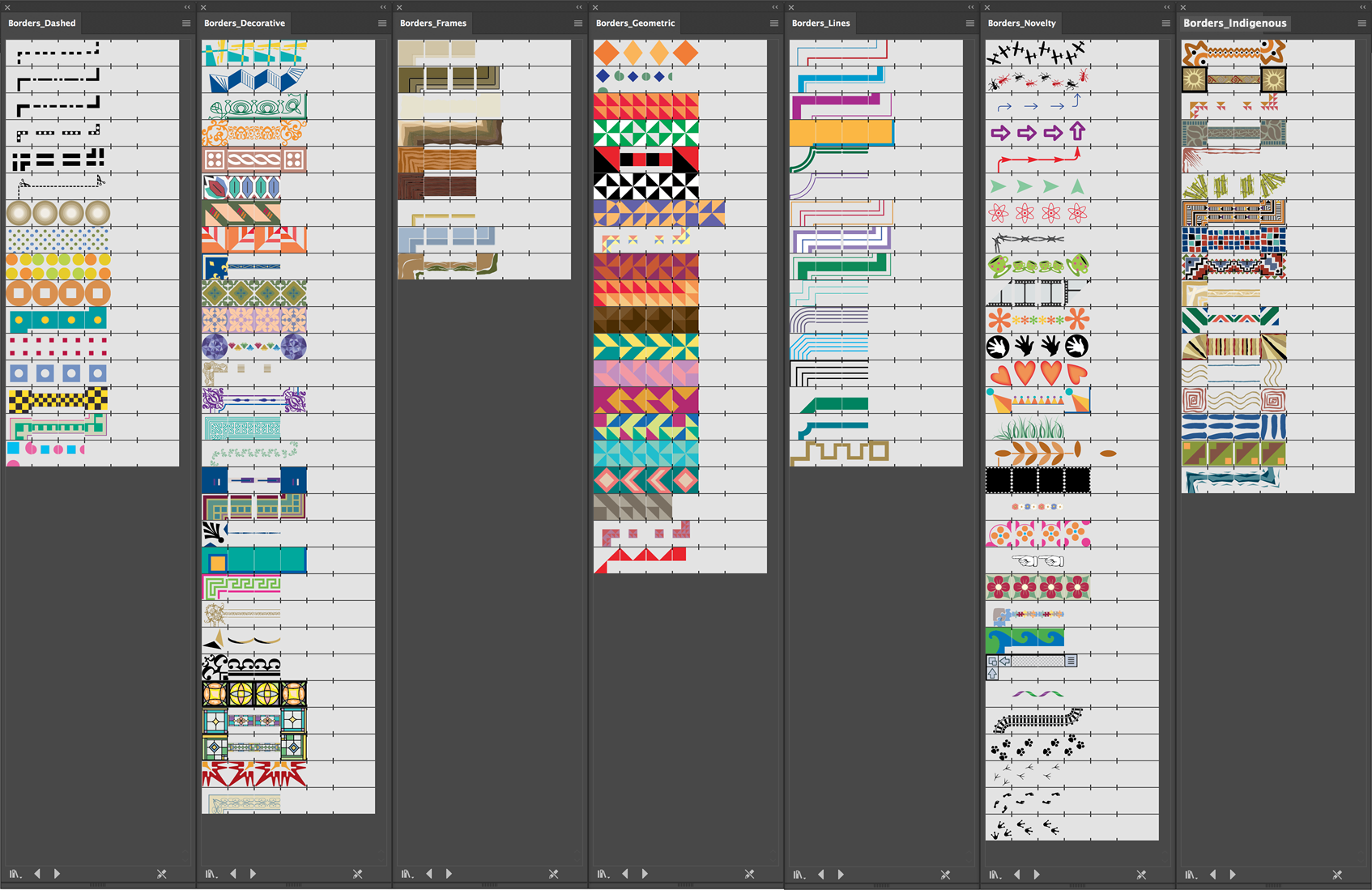
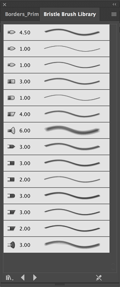
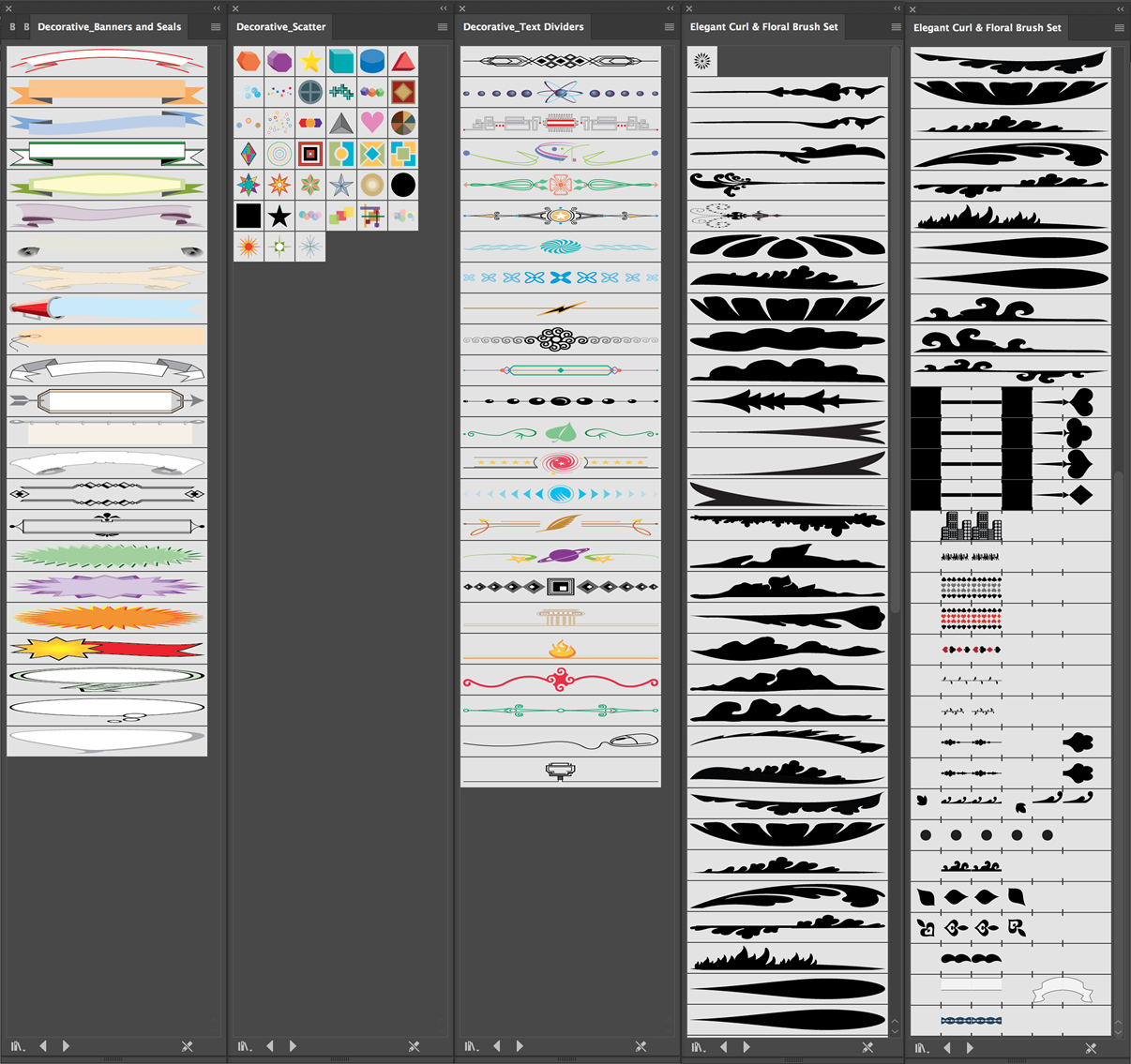
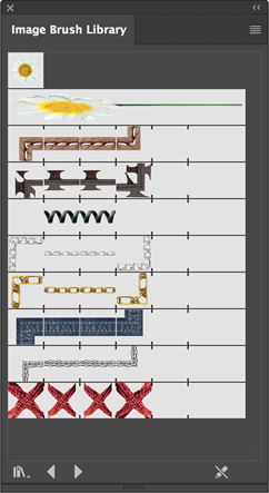
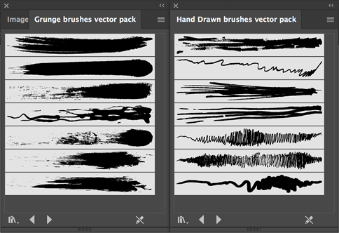
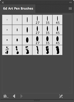
Click on the above to see at full size.
Brush Categories
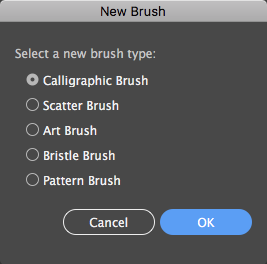
Illustrator has five categories of brushes, which you'll see when you choose Create New Brush
from the brush panel.
Each brush category has its own dialog to control its behavior.
Brush Options by Brush Type
Brush Options: Calligraphic
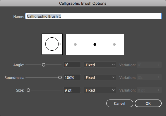
Calligraphic brushes are based on elliptical shapes of various sizes. You can use a graphics tablet to vary the Angle, Roundness, and/or Size of the brush based on
the pressure applied to the stylus (but don't forget to set the variability or it won't work).
Brush Options: Art Brushes
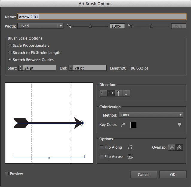
Art brushes are made from existing vector graphics. Setup is fairly complicated, we'll look at some examples later in the semester.
In fact, brush design is hard. We'll cover more on custom brushes later...
If 2pm, jump to here
Files For Part II's Demos:
Painting With Illustrator
Modifying Strokes
With the Width
tool
Expanding The Paint Brush Stroke
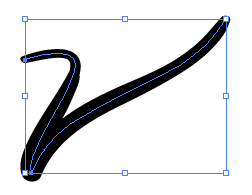
Since the Paint Brush tool makes only strokes/paths without fills, it's often useful to turn it into an object whose outer visual boundary is a stroke and interior is a fill.
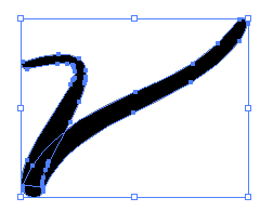
Use Menu>Object>Expand Appearance
- Why? Useful for creating Live Paint objects
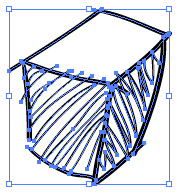
Hand-drawn thing from paintbrush tool
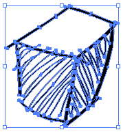
Thing expanded into filled objects with no stroke
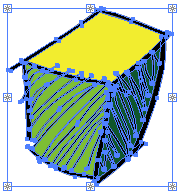
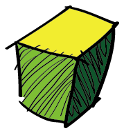
Thing filled with Live Paint after being converted to Live Paint object with Menu > Object > Live Paint > Make
If 2pm, jump to here
Fun With Brushes
The Scatter Brush
For interesting effects!
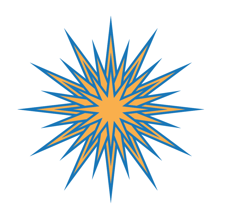
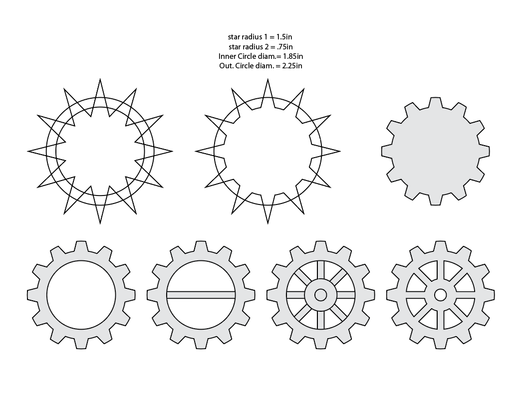
13point star, radius 1 .8 in, radius 2 .25 in. 2pt stroke. Rotate each about 18.85 degrees (13/360/2) and scale down
First, create an object, or group of objects (without gradients, brushes or other fancy stuff)
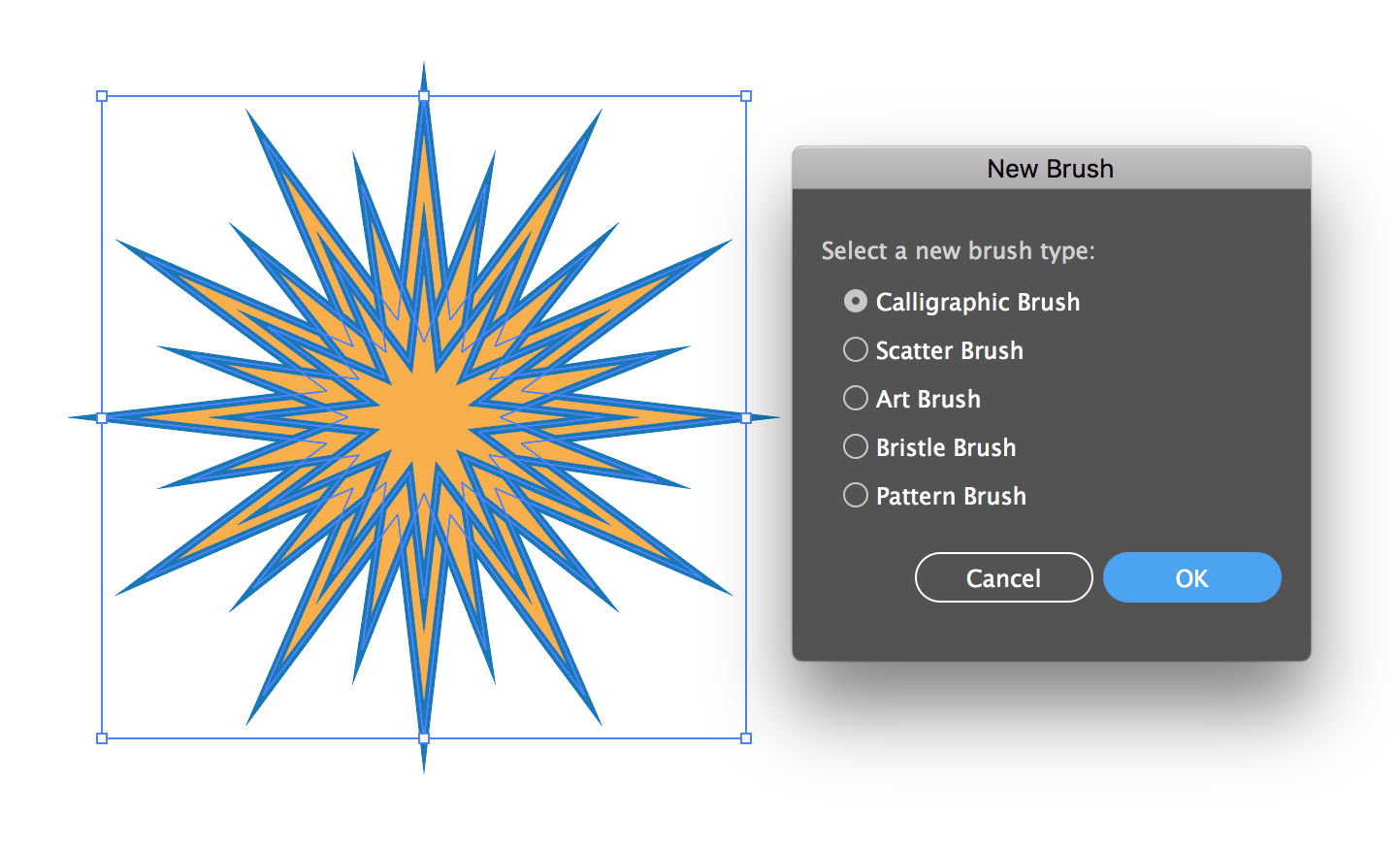
Choose New Brush from the bottom of the Brush Panel
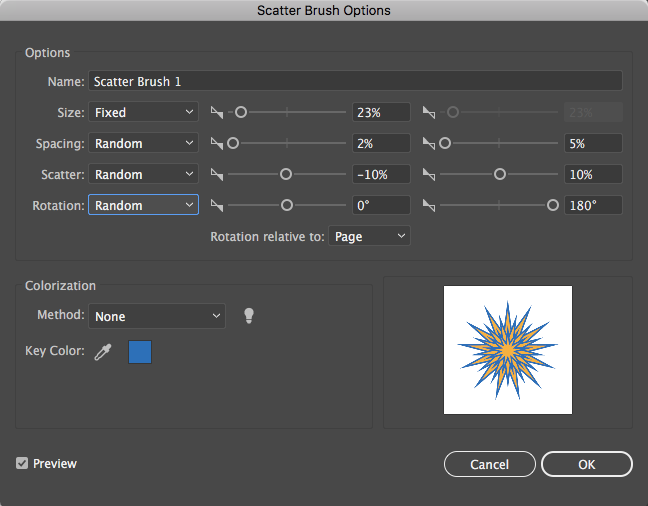
Set some settings, we can tweak latter...
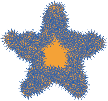
The Scatter Star brush applied to a star
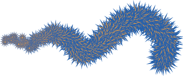
Scatter Star applied to a paintbrush path with pressure controlling size
If 2pm, jump to here
A Better Way To Paint
Illustrator is a terrible painting tool. Sure it has a paint brush, but that doesn't mean you should use it. This is a tedious way to paint and can make for buggy files that crash and take forever to save. And, if you don't use a graphics tablet, really hard to get the results you'd get with real paint on real paper.
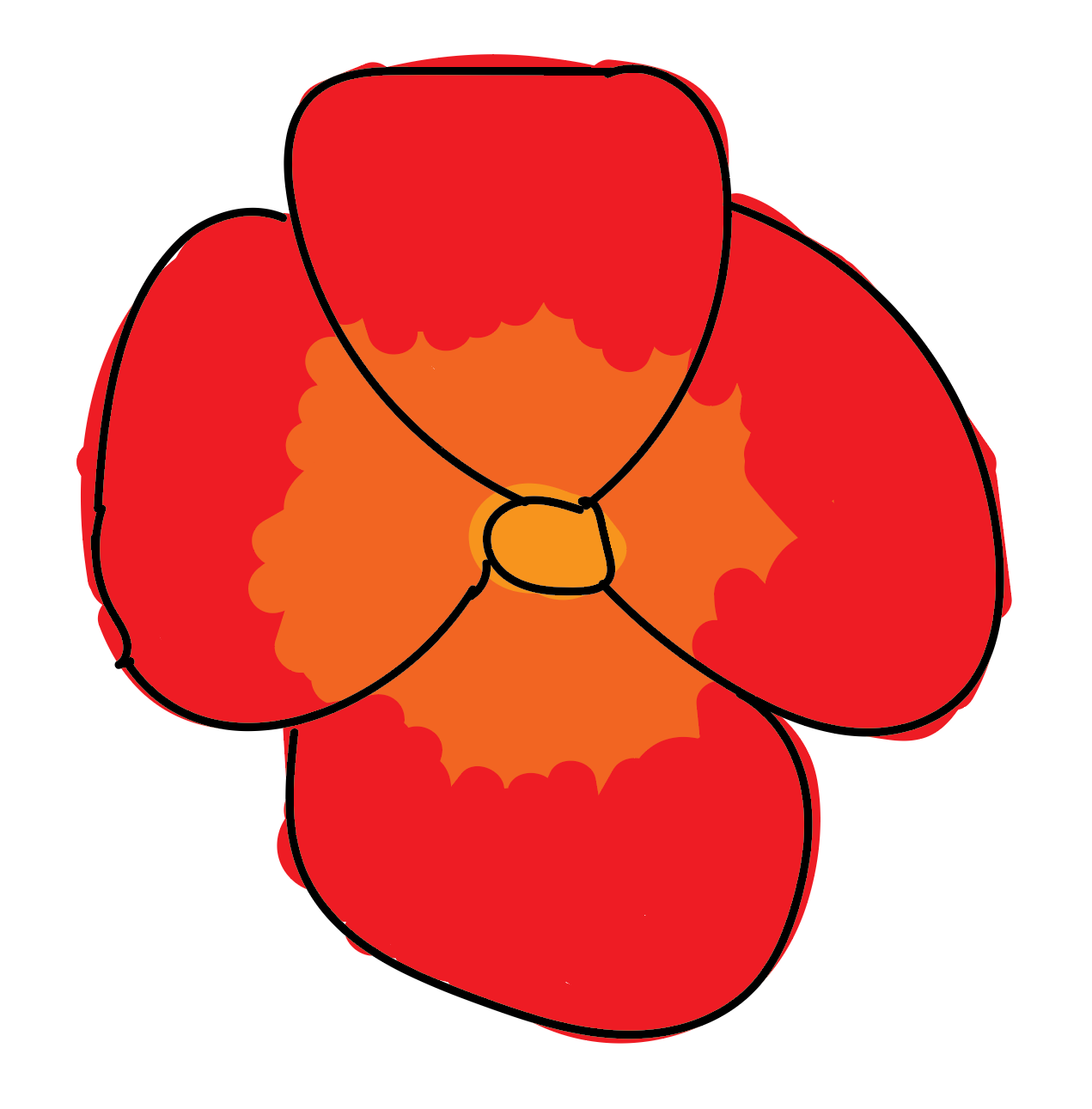
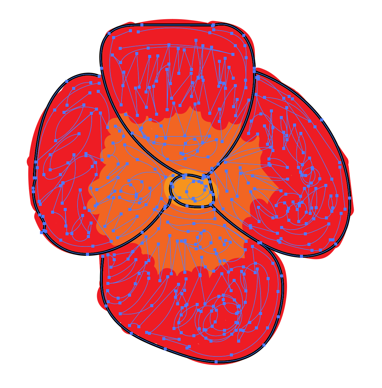
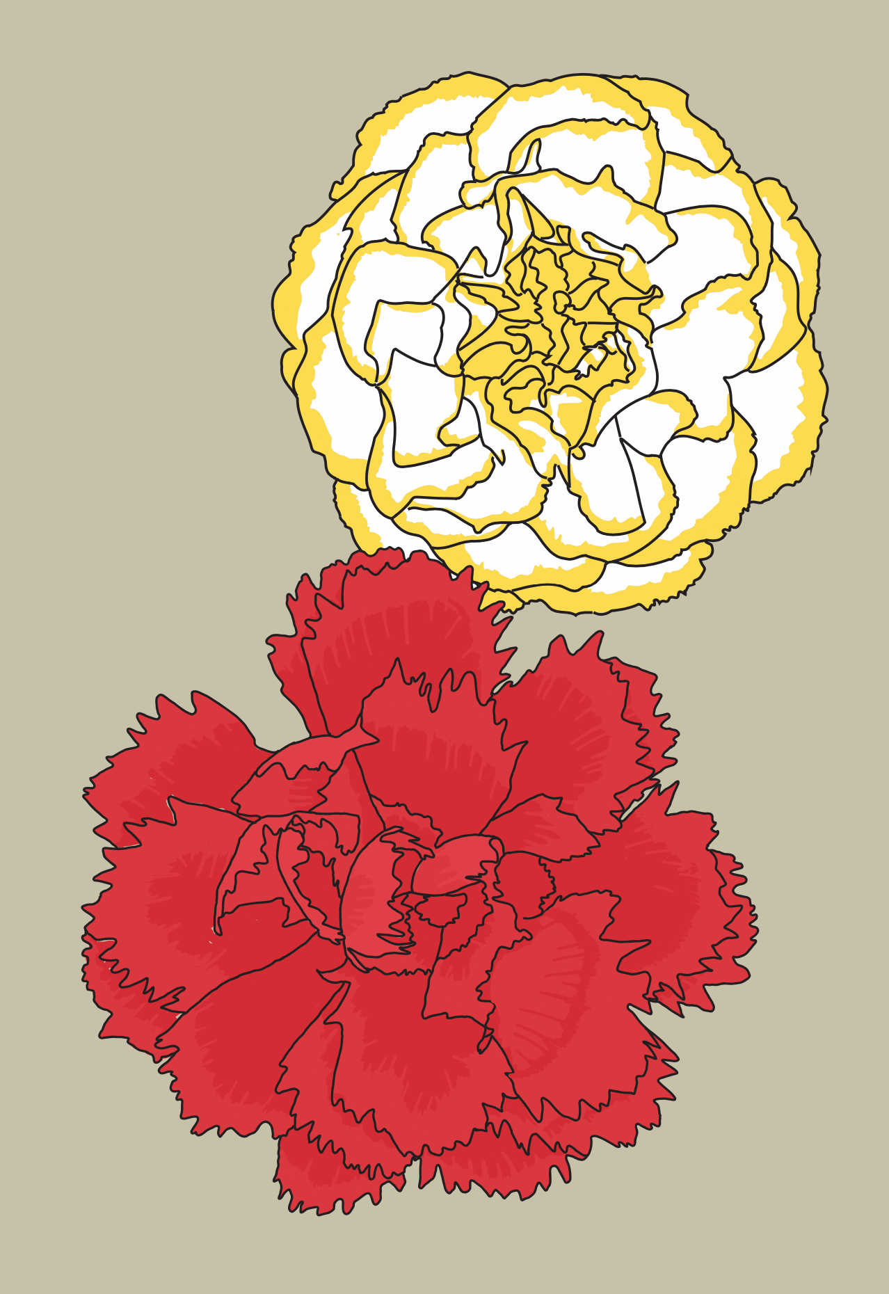
Here's a sample cases: flowerpainting01.ai.zip
START AT 2PM
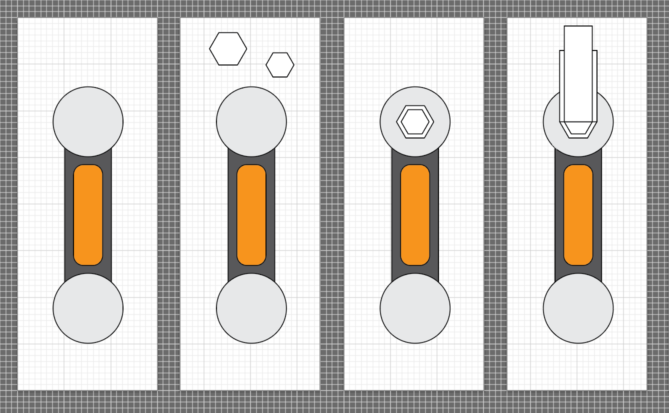
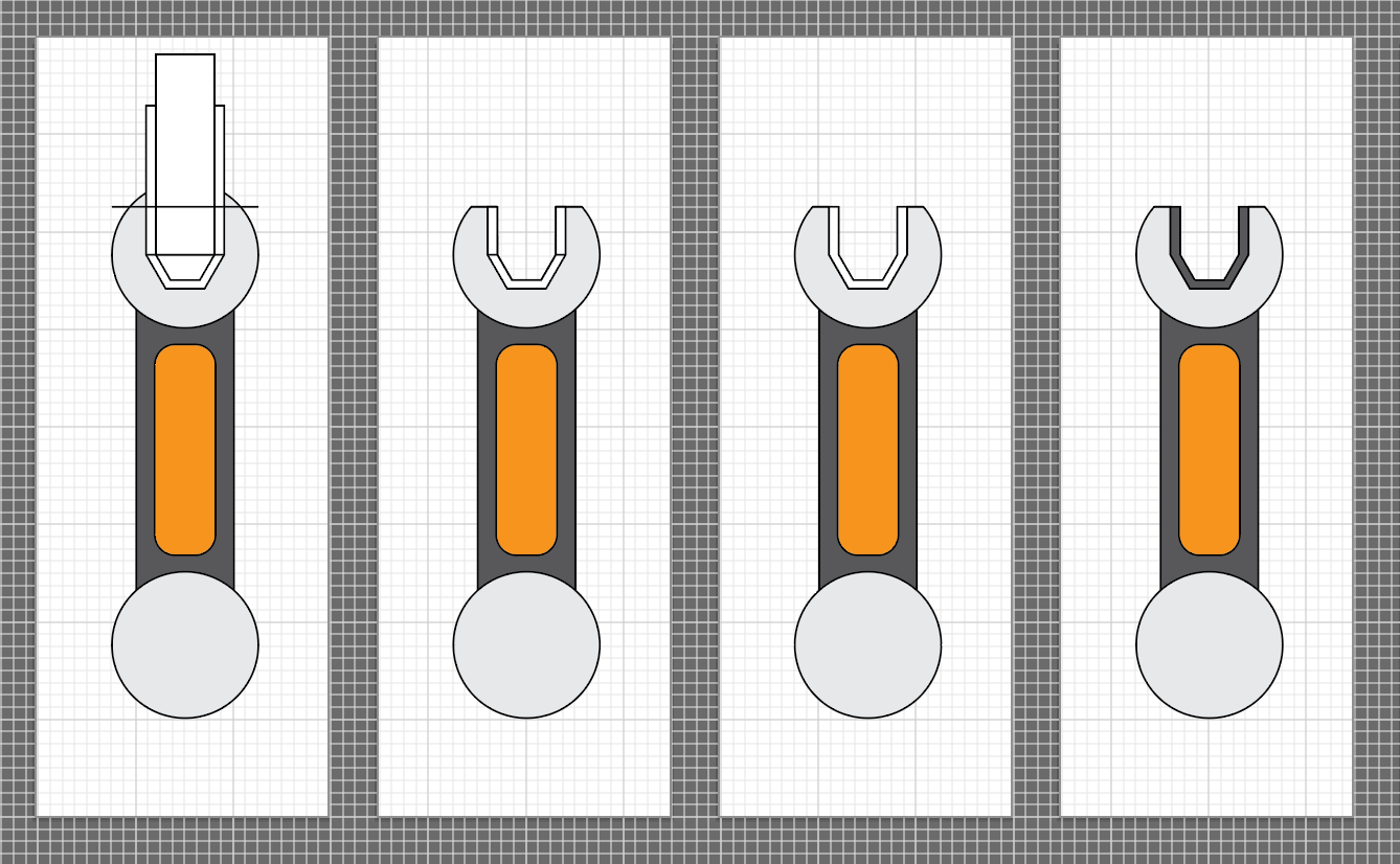
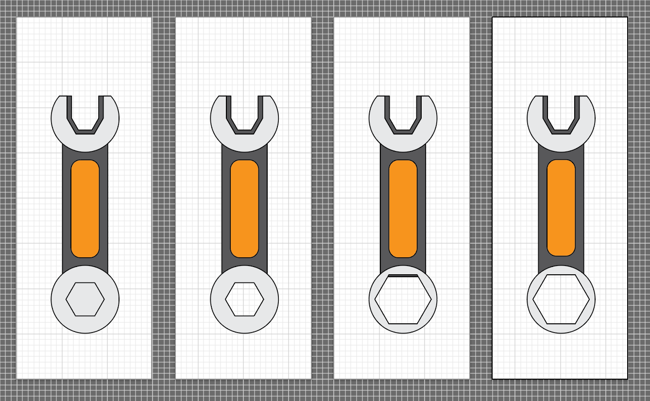
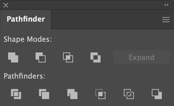
Creating Complex Shapes with the Shapebuilder Tool
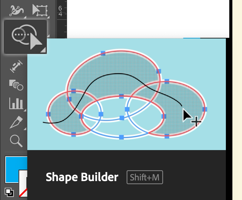
- Turn on Smart Guides
- Make hexagons
- Center them in top circle
- Make rects
- Use Smart Guides to center them and align bases them in top circle
- Use Shape Builder to create top of wrench
- Use Shape Builder to add hexagon to bottom wrench. Note it is editable
Demo Facebook Demo
Saw this on Facebook this AM
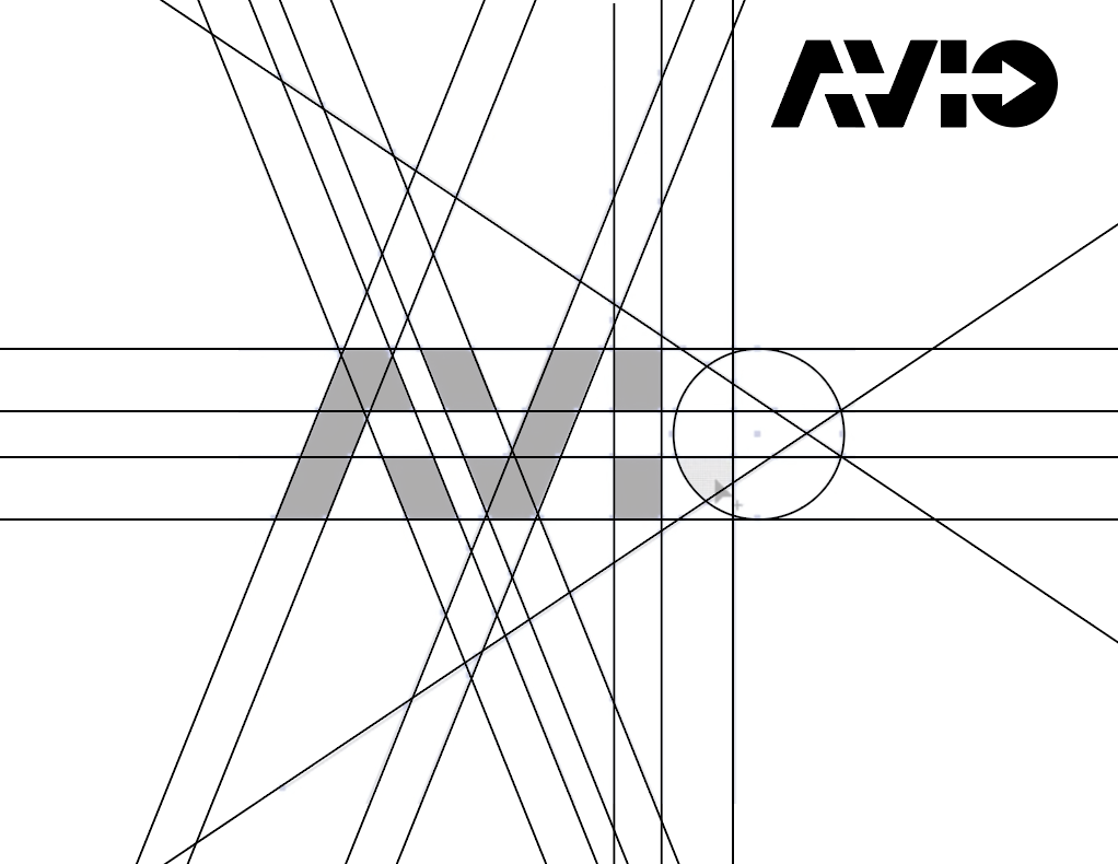
A nice simple case of when to use Shape Builder.
(Don't forget to set fill to black and stroke to none before you start)
avio.ai.zip
Demo Yin Yang Symbol
Alignment is the real challenge with the Shape Builder tool
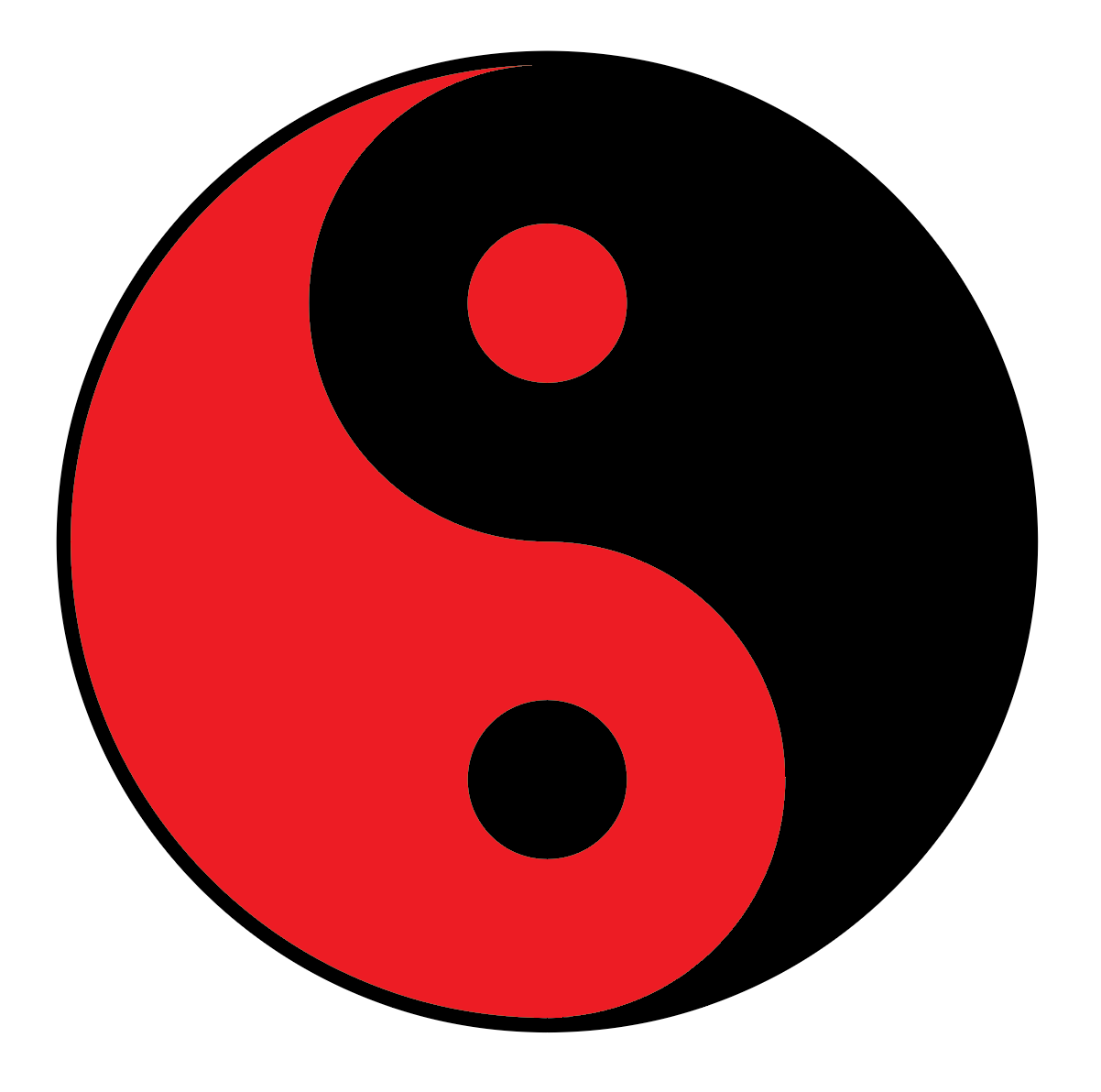
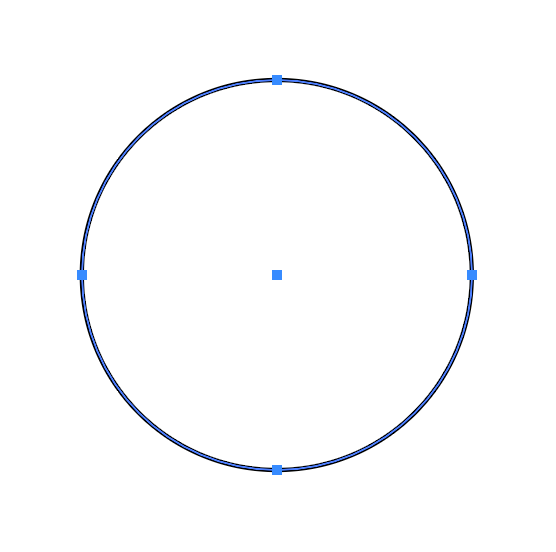
1. Create a circle with the Elipse tool (Shift-Drag)
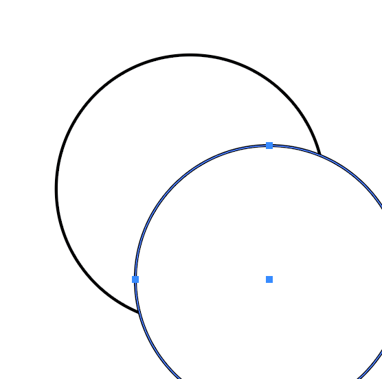
2. Duplicate the circle (Copy & Paste or Click-Option-Drag)
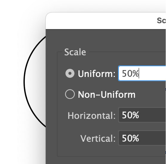
3. Scale the new circle to 50%
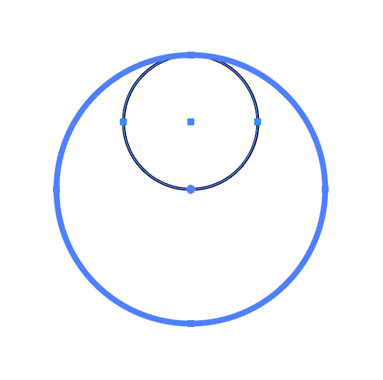
4. Choose both circles, make big circle the Key Object and align center + top
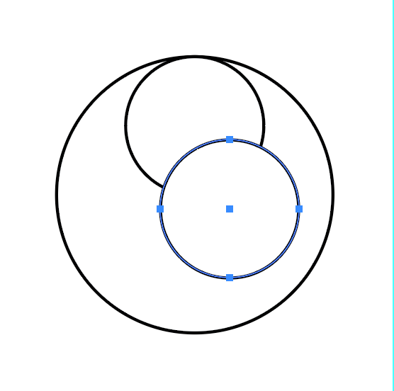
5. Duplicate small circle
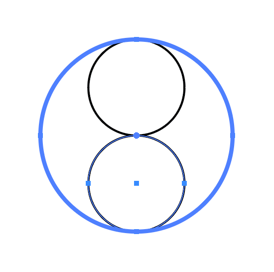
6. Choose both circles, make big circle the Key Object and align center + bottom
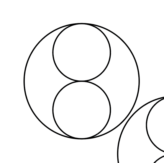
7. Duplicate the three circles and set aside
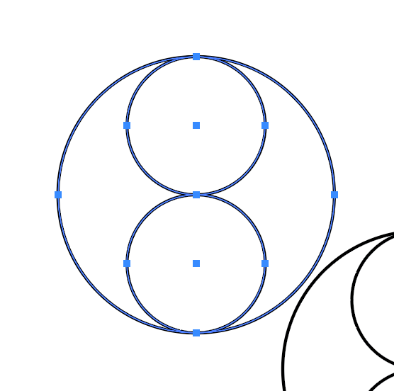
8. Choose the original three circles
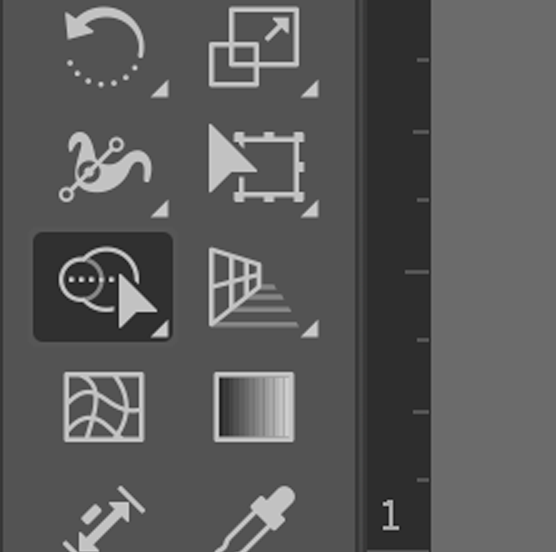
9. Choose the Shape Builder Tool
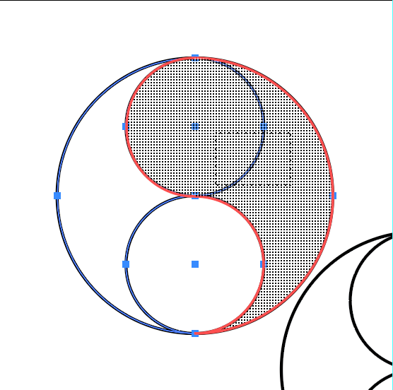
10. Drag from the top small circle to the right into the large circle to form the Yin of Yin Yang
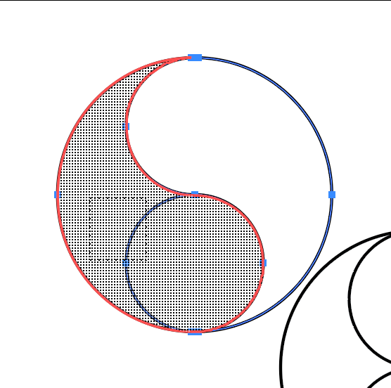
11. Drag cross the bottom two section to make the Yang
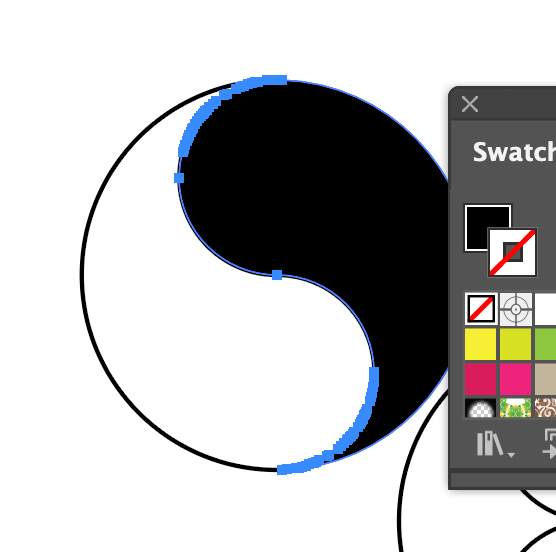
12. Switch to the selection tool, choose Yin and fill with black, but remove stroke
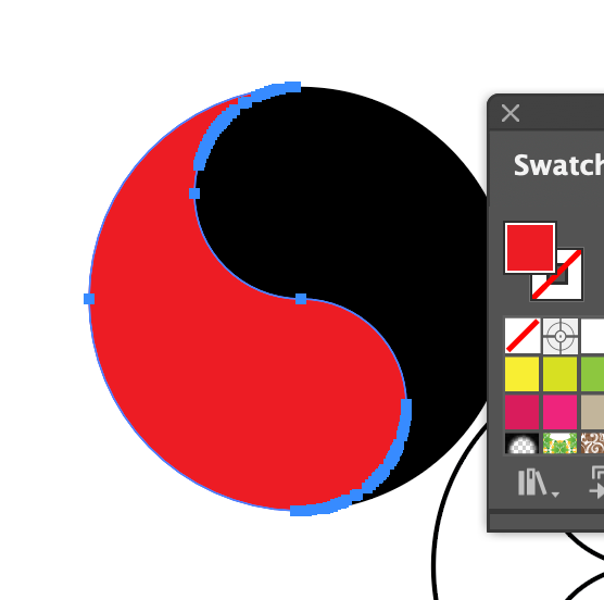
13. Same for the Yang
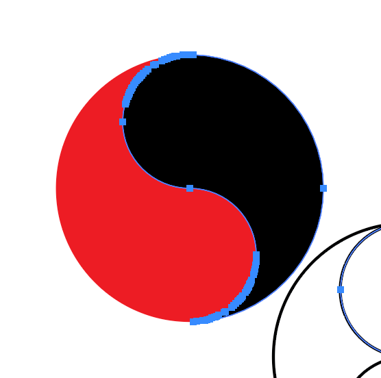
14. With the circles set off to the side, choose a 50% one
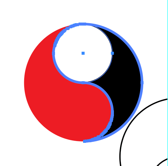
15. Using the Yin as the Key Object, align the smaller circle to top + left
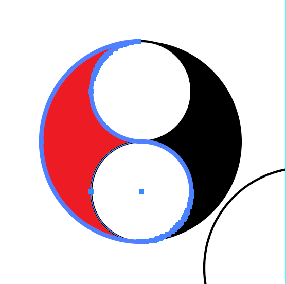
16. Same for the Yang, but align to bottom + right
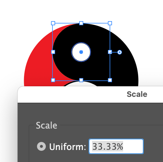
17. Select the Yin inner circle and scale to 33.33%, then do the Yang inner circle as well
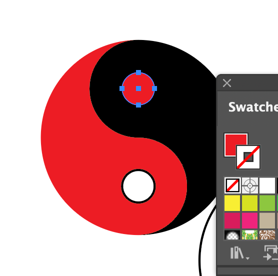
18. Set the color of the Yin inner circle to red, no stroke
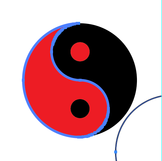
19. Set the color of the Yang inner circle to black, no stroke
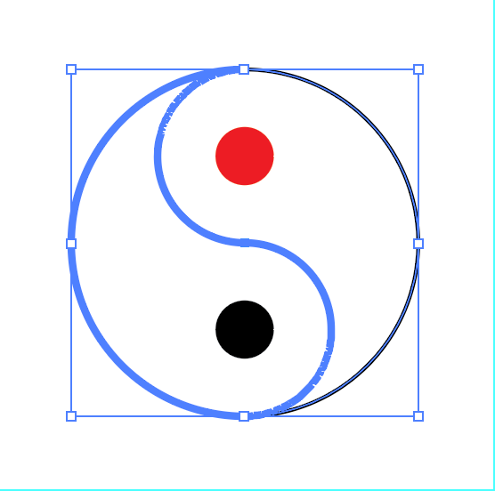
20. Take the full-size circle off to the side and align it top + left to Yang as key object
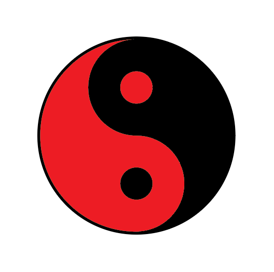
21. Move the circle to the back and make the stroke bigger