Class 6: Typography I
Adobe's Big Conference
Adobe Max Creativity Conference
In Los Angeles, students $299 (used to be free). October 18-20 Los Angeles and virtual. October 16-17 Preconference in Los Angeles. Register at max.adobe.com/education
Assignment 1 Assigned
Specs
What Is Typography?
Typography is the art and technique of arranging letter-forms (type) to make written language legible, readable and appealing when displayed. The arrangement of type involves selecting typefaces (fonts), point sizes, line lengths, line-spacing (leading), and letter-spacing (tracking), as well as adjusting the space between pairs of letters (kerning). The term typography is also applied to the style, arrangement, and appearance of the letters, numbers, and symbols created by the process.
What is a Font
A font is the collection of letter-forms (glyphs) that make up a unique style.
What is a Font on your computer
Font Properties
Family
A set of fonts with a common name and style

Example font: Helvetica Family

Size
The relative size of a given font. Note that 72pt (1 inch) fonts aren't actually 1 inch high. For example, Helvetica 72pt capital letter E is about 52pt hight. Another font might have a cap E at 56pt or 48pt height, but still be called a 72pt font. The only given is that a 72pt font will be taller than a 71pt font.
1pt
2pt
3pt
4pt
5pt
6pt
7pt
8pt
9pt
10pt
11pt
12pt
13pt
14pt
15pt
16pt
17pt
18pt
19pt
20pt
21pt
22pt
23pt
24pt
25pt
26pt
27pt
28pt
29pt
30pt
31pt
32pt
33pt
34pt
35pt
36pt
37pt
38pt
39pt
40pt
41pt
42pt
43pt
44pt
45pt
46pt
47pt
48pt
49pt
50pt
51pt
52pt
53pt
54pt
55pt
56pt
57pt
58pt
59pt
60pt
61pt
62pt
63pt
64pt
65pt
66pt
67pt
68pt
69pt
70pt
71pt
72pt
- Measured in points
- 72 points = 1 inch
- Fonts tend to come it sizes that match traditional metal type. Illustrator presents pre-set sizes at 6, 7, 8, 9, 10, 11, 12, 14, 18, 21, 24, 36, 48, 60, and 72 points.

Weight
Fonts come in different "thicknesses" or "weights". Lighter strokes are thinner, heavier strokes are thicker.

- In order from lightest weight to heaviest:
- Thin, Extra Light, LIght, Semi-light
- Normal, Book, Regular, Roman
- Semi-Bold, Bold, Extra Bold, Black


Width
Width is not the width of a stroke in a font, but the relative width of a letter-form (glyph).

- In order from narrowest to widest:
- Compressed Ultra, Compressed, Ultra Condensed, Condensed
- No modifier in name
- Extended
Style
A typographic style specifically refers to the angularity of the specific font, either normal (no angle) or Italic/Oblique (angled). Italic is often used incorrectly when referring to an Oblique style.
abcdefg
abcdefg
abcdefg
abcdefg
- Normal
- Italic (has custom 'glyph' shapes)
- Oblique (has no custom glyphs)
Spacing
AB - Two letters with no kerning
AB - Two letters with wide kerning
AB - Two letters with negative kerning
Sentence with no tracking
Sentence with wide tracking
Sentence with negative tracking
- The spacing between letters, aka kerning
- In Illustrator, you can kern individual spaces between letters or kern more than one space with 'tracking'

Leading
This is 12pt leading for a 12pt block of type. A little too tight, I think. Lorem ipsum dolor sit amet, consectetuer adipiscing elit. Suspendisse eget diam. Morbi in risus. Morbi nibh. Sed cursus urna. Nunc vitae nisl eu arcu vulputate pharetra. Nullam euismod.
This is default leading for a 12pt block of type, which is usually about 14.4pts. (1.2 x the font point size) Consectetuer adipiscing elit. Suspendisse eget diam. Morbi in risus. Morbi nibh. Sed cursus urna. Nunc vitae nisl eu arcu vulputate pharetra. Nullam euismod.
This is 16pt leading for a 12pt block of type. Lorem ipsum dolor sit amet, consectetuer adipiscing elit. Suspendisse eget diam. Morbi in risus. Morbi nibh. Sed cursus urna. Nunc vitae nisl eu arcu vulputate pharetra. Nullam euismod.
This is 18pt leading for a 12pt block of type. Lorem ipsum dolor sit amet, consectetuer adipiscing elit. Suspendisse eget diam. Morbi in risus. Morbi nibh. Sed cursus urna. Nunc vitae nisl eu arcu vulputate pharetra. Nullam euismod.
- The name comes from the thin pieces of lead which would be placed between lines of type in a metal type shop
- Get "lorem ipusm" here

Alignment
This paragraph is aligned left. Lorem ipsum dolor sit amet, consectetuer adipiscing elit. Suspendisse eget diam. Morbi in risus. Morbi nibh. Sed cursus urna. Nunc vitae nisl eu arcu vulputate pharetra. Nullam euismod. Fusce pharetra. Aliquam non ante. Ut porta, neque at porta viverra, eros nulla sollicitudin sapien, sed tempus tellus risus, vivamus sed.
This paragraph is aligned right. Lorem ipsum dolor sit amet, consectetuer adipiscing elit. Suspendisse eget diam. Morbi in risus. Morbi nibh. Sed cursus urna. Nunc vitae nisl eu arcu vulputate pharetra. Nullam euismod. Fusce pharetra. Aliquam non ante. Ut porta, neque at porta viverra, eros nulla sollicitudin sapien, sed tempus tellus risus, vivamus sed.
This paragraph is aligned center. Lorem ipsum dolor sit amet, consectetuer adipiscing elit. Suspendisse eget diam. Morbi in risus. Morbi nibh. Sed cursus urna. Nunc vitae nisl eu arcu vulputate pharetra. Nullam euismod. Fusce pharetra. Aliquam non ante. Ut porta, neque at porta viverra, eros nulla sollicitudin sapien, sed tempus tellus risus, vivamus sed.
This paragraph is aligned justified. Lorem ipsum dolor sit amet, consectetuer adipiscing elit. Suspendisse eget diam. Morbi in risus. Morbi nibh. Sed cursus urna. Nunc vitae nisl eu arcu vulputate pharetra. Nullam euismod. Fusce pharetra. Aliquam non ante. Ut porta, neque at porta viverra, eros nulla sollicitudin sapien, sed tempus tellus risus, vivamus sed.

Watch Out For...


Rivers

Orphans

Widows
Working with Type as Outlines
Menu > Type > Create Outlines
Creating Logo Ligatures

Developing the Digital Art & Animation logo

Sample files
Misc.
A bit more on Guides in Illustrator: demo...
- You can make any outline into a guide
- Drag guides from Rulers
- Hold shift to snap to ruler marks
- To drag to one artboard to use on only that artboard, switch to Artboard mode and drag and release on the target artboard
- Help reference
Making Sketches
Let's talk about Sketching for design and illustration!
Always sketch out the bounding rectangle of your design!
Scanning a Letterform
Create Source

- Create source artwork with whatever tools you want, but best results are with tools that give interesting lines
- Sharpies
- Wide Felt-tips
- Sumi Brushes
- Croquil pens
- Make sure you use black or a very dark ink
- You can also get interesting results on different surfaces
- Paper towels
- Newsprint
- Watercolor paper
- Rice paper
- You're trying to capture a "hand made" or "hand drawn" feel
Scan or Photograph It
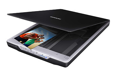
- Scan in Black & White or Grayscale between 150 and 600 dpi (the smaller the original, the higher the dpi should be)
- Save scan as .png
- Or photograph it in bright, even light
Photoshop It

- Bring the scan into Photoshop
- Cut out the bits you want and paste them into a new document and save them as .psd or .png
Place It In Illustrator

- Switch to Illustrator
- Menu > File > Place...
- Select scanned and edited letterform

- With the letterform selected, open the Image Trace window (Menu > Windows > Image Trace)
- Choose Preset: Black and White logo

- Open the Advanced section of the Image Trace window

- VERY IMPORTANT: Check Ignore White


- Threshold Sets the image contrast, or where it creates the edge between black and white. Extend it to 255 and the whole thing is likely to go black.


- Paths High paths = more detail, rougher and more complex shapes. Low Paths = less detail, smoother and simpler shapes .


- Corners Less = smoother overall appearance. More = more corners.


- Noise
Number reflects the size of objects in pixels that will be ignored. Smaller numbers reveal more bits and pieces
- Method
Abutting or Overlapping. Keep Abutting (default) - it's the only one that works with Ignore White.
- Create
Fills Strokes. Check only Fills. This is the same way fonts are set
- Options: Snape Curves to Lines
Off, creates bumpier edges
- Options: Ignore White
Very important setting (should be the default)
- Preview
Leave on
- Trace
Use it if it becomes available, or the first time you set an Image Trace on a placed bitmap
Turn the Image Trace object into an editable vector object

- Select the Image Trace object
- Choose Menu > Object > Image Trace > Expand
- Before

Creating Type on and in a Path or Shape
Two ways:

Type Tool with gesture:

Normal text cursor
- Click-release to create one continuous line of type
- Drag-release to create a rect to fill with text

Text cursor over a closed shape
- Hover near the edge of a shape
- Click when cursor changes to fill the shape with text

Text cursor over an open path
- Hover near edge of path
- Click when cursor changes to place text on the path from the location you clicked on on the path
Specialized Type Tools:


Area Type Tool

Path Type Tool
Type On Path Editing Gestures
Demo...
example file
Uses very small and hard to see cursors to indicate editing mode:

Adjust Type on Path: Left Margin

Adjust Type on Path: Right Margin

Adjust Type on Path: Center Align and Flip Sides
Adding Strokes To Type
Demo... example file
NOTE: There is a bug in Illustrator CC that will sometimes cause this to fail. I'm still working on figuring out how to reproduce this bug
reliably, and in the meantime if you run into it, convert your text to outlines instead of using this technique.

After youv'e created the text object, select it with the Selection tool.

Open the Appearance Panel (Menu > Window > Appearance). Note that the layer 'Characters' is highlightd in the panel.

This will add a stroke (and an empty fill) above the Characters layer.

From the Stroke layer, pick a color...

Then set the stroke to twice as wide as you want it to be.

Click on the Stroke layer and drag it down to below the Characters layer.

Release and the stroke is now behind the text. And, the text is still editable!

Here's some variations on what you can do with adding strokes to text through the appearance panel...(strokes02.ai)
Advanced Strokes
Stroke Help Link: http://help.adobe.com/en_US/illustrator/cs/using/WSA1E31D7D-13E6-41ac-AA8C-4AD129B9FC1Ca.html
Every non-bitmapped object in Illustrator has a path with some kind of "stroke" and "fill" (even if it's "no stroke" and "no fill")

An open path is any path with with a beginning and ending set of anchors that aren't connected to each other.

A closed path is any path in which all the anchors are connected to other anchors on both sides.

The stroke window gives control over the general aspects of a stroke, such as:
- Weight
- Cap
- Corner
- Alignment
- Dashed Line settings
- Arrowheads
- Profile
Stroke: Caps

No Cap

Round Cap

Square Cap
Stroke: Corners

Miter Join (default)

Round Join

Bevel Join
Corner Miter Limt
Corner miters control the appearance of to path segments coming together at a corner. The limit value ranges from 0 to 500, with 0 giving a chopped-off appearance
to the miter (technically know as a chamfered edge), and a high value giving a pointed connection, much like the miter made by a carpenter on a wooden frame.

1 will make any angle corner a bevel

2 will turn 90° into a miter (or round) join

3 will turn 45° into a miter (or round) join

Greater than 3 will set more acute angles to miter (or round) joins

Very acute angles may need numbers over 10

500 is an outrageously high number, mostly you're less then 10. Sometimes you need a big number for curves coming together into a point:

189 limit for this example
Stroke: Alignment

Centered (default)

Inside

Outside
Stroke: Dashed Lines

12pt dash (default). No value for the gap matches the dash size.

You can make up to 3 dash and gap sizes that repeat

Labeled Preserves exact dash and gap lengths
can lead to misaligned corners and sides. Useful mostly for open objects

Labeled Aligns dashes to corners and path ends, adjusting lengths to fit
keeps corners and side looking neat.
This used to be really hard to do by hand. Added in CS 4 or 5
Arrowheads

Handy for charts, graphics and technical illustrations.
Using A Graphics Tablet
Get one from the Library
- Kind of like writing with a pen - known on a tablet as a
stylus
- Illustrator can interpret pressure (how hard you push down with the stylus) as a control for things like brush width
- Some tablets can give information about the angle of the pen relative to the tablet's surface
- Most tablets are equivalent to each other. The two major players are:
- Wacom. The industry standard, but things like the Surface tablet and the Apple Pen are making serious inroads into the market.
- Huion
- Major competetior to Wacom. Cheaper, not as good, but not bad either. Lot's of YouTube reviews, Brad Colbow is quite good.
- Decent article here.
- Buying advice: Buy the largest format you can afford.
- Apple's iPad Pro and Microsoft Surface computers are kind of changing the game, but touch UI doesn't lend itself very well to vector drawing (I think).
Working With The Paint Brush Tool
Makes editable paths similar to the Pen tool (demo)
The Paint Brush Vs The Pen Tool

vs.

Brushes

The Brushes Panel

Same path, different brush

Load brushes from the popup menu in the lower left of the brushes panel


Click on the above to see at full size. NOTE: Even though they're listed here, you're not allowed to use them in this class! However, you're welcome to build your own.
Brush Categories

Illustrator has five categories of brushes, which you'll see when you choose Create New Brush
from the brush panel.
Each brush category has its own dialog to control its behavior.
Brush Options by Brush Type
Brush Options: Calligraphic

Calligraphic brushes are based on elliptical shapes of various sizes. You can use a graphics tablet to vary the Angle, Roundness, and/or Size of the brush based on
the pressure applied to the stylus (but don't forget to set the variability or it won't work).

Brush Options: Art Brushes

Art brushes are made from existing vector graphics. Setup is fairly complicated, we'll look at some examples later in the semester.
In fact, brush design is hard. We'll cover more on custom brushes later...
Working With The Blob Tool

Blob Vs. Paint Brush

Paint Brush makes editable paths without fills and strokes defined by Brushes

Blob makes contiguous areas of color with fills and invisible strokes
The Blob Options Dialog

Double-Click the tool icon to access
- Keep Selected
- Keeps blob gestures selected. Default is off.
- Merge Only With Selection
- Off by default. If Keep Selected is off, and Merge Only is on, then each blob gesture remains a separate entity
- This and Keep Selected are the most frequently modified settings of the blob tool
- Tolerances
- No vector tool can capture every nuance of input gestures - these setting adjust how closely the tool imitates the original gesture
- Fidelity
- Higher values have less detail
- Smoothness
- Higher values do more smoothing
- Default Brush Options
- Changes the shape and size of the brush, and allows stylus pressure from a graphics tablet to control things like the size of the brush
Files For Part II's Demos:
Painting With Illustrator Continued
Modifying Strokes

With the Width
tool
Expanding The Paint Brush Stroke

Since the Paint Brush tool makes only strokes/paths without fills, it's often useful to turn it into an object whose outer visual boundary is a stroke and interior is a fill.

Use Menu>Object>Expand Appearance
- Why? Useful for creating Live Paint objects

Hand-drawn thing from paintbrush tool

Thing expanded into filled objects with no stroke


Thing filled with Live Paint after being converted to Live Paint object with Menu > Object > Live Paint > Make
Fun With Brushes
The Scatter Brush
For interesting effects!

13point star, radius 1 .8 in, radius 2 .25 in. 2pt stroke. Rotate each about 18.85 degrees (13/360/2) and scale down
First, create an object, or group of objects (without gradients, brushes or other fancy stuff)

Choose New Brush from the bottom of the Brush Panel

Set some settings, we can tweak latter...

The Scatter Star brush applied to a star

Scatter Star applied to a paintbrush path with pressure controlling size
Working With The Blob Tool Part II

- Selections limits merge in Blob Options

- Graphic Styles Panel: Lower corner menu: Additive for Blob Brush

- Cool effects, which brings us to...
Working With The Appearance Panel


- Changing parameters
- Adding effects
- Adding Strokes & Fills (brief coverage-things to come)
Working With The Pencil/Smooth Tools