Modular Grid
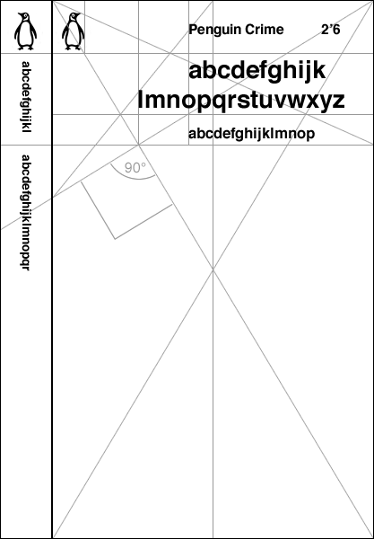
A modular grid is a technique frequently used in graphic design to provide continuity and recognition across a series or brand. It also makes create multiple versions of design a snap.
Here's Penguin Book's Crime Series grid
Noun: triss-kye-dek-uh-FOH-bee-uh
Definition: Fear of the number 13

The basic ways of structuring a cover
Here's a good web site on Book Cover Design that discusses these points.
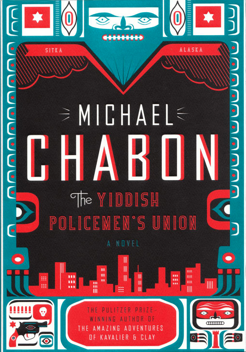
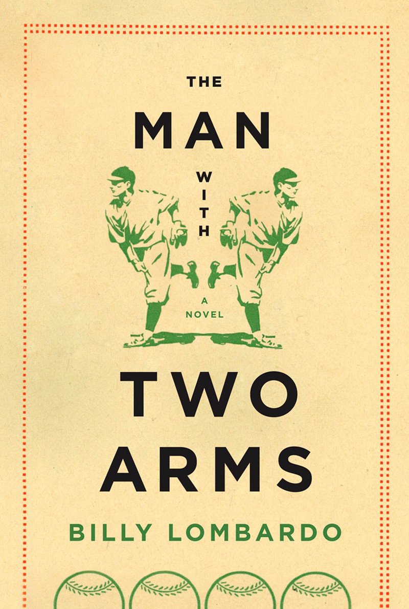
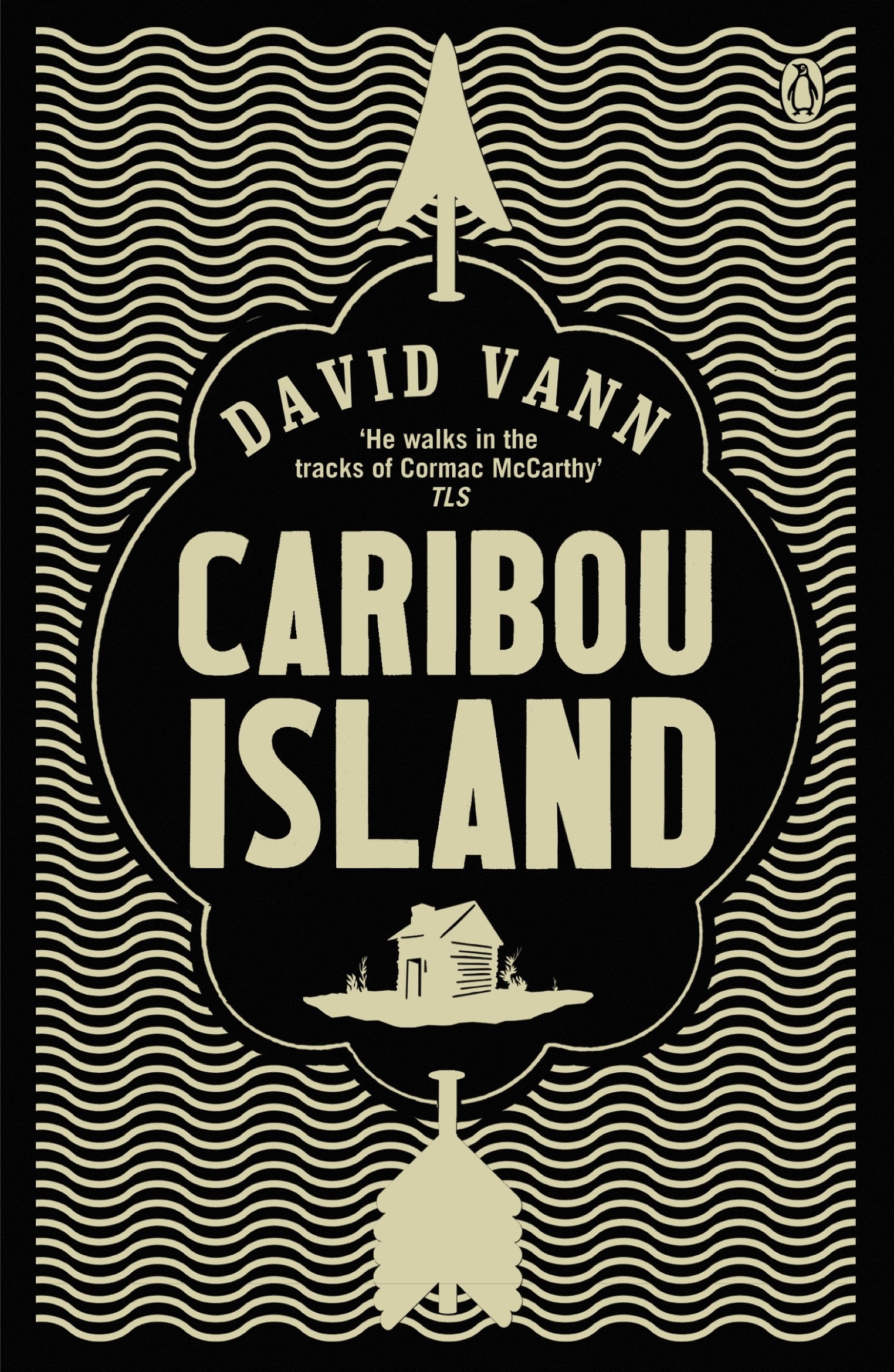
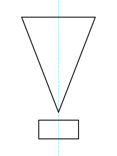
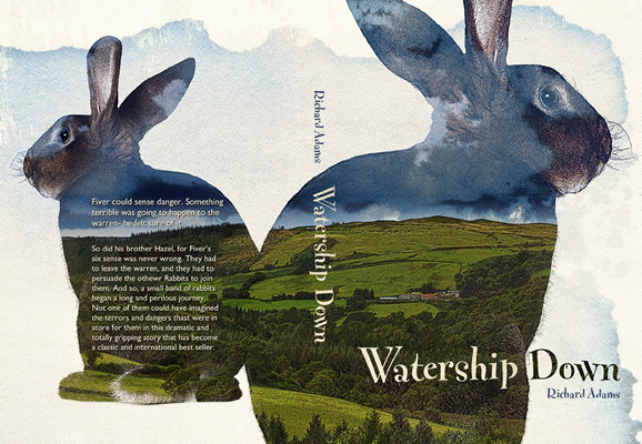
Symmetry across the vertical midline of the book. The awareness of the midline is a basic, commonly used, and potentially powerful compositional technique
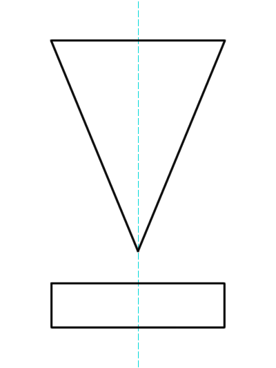
midline symmetry
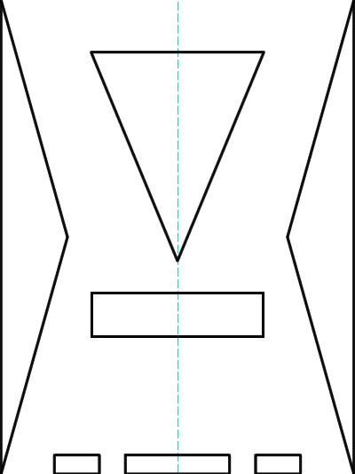
midline plus edge symmetry
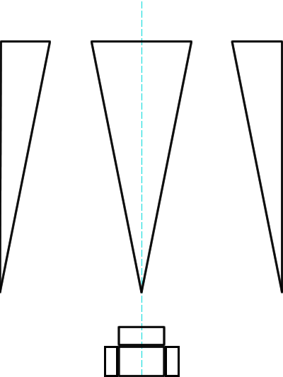
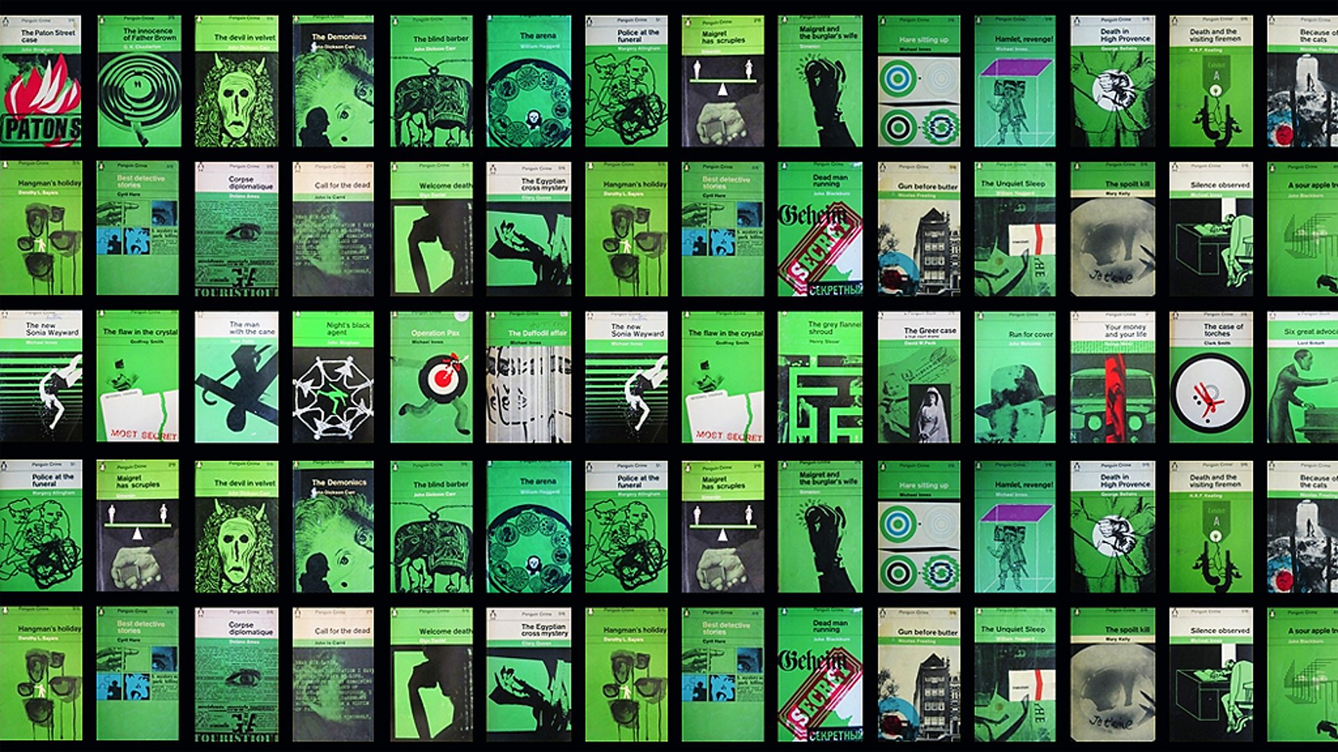
A modular grid is a technique frequently used in graphic design to provide continuity and recognition across a series or brand. It also makes create multiple versions of design a snap.
Here's Penguin Book's Crime Series grid
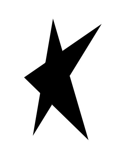
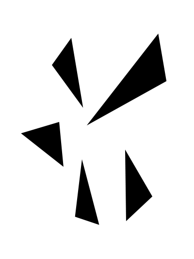
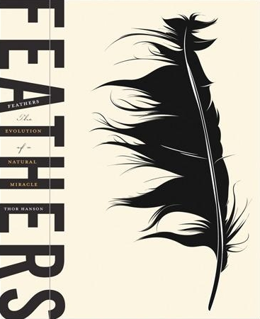
Establish emphasis in a visual hierarchy with a strong main focal point. Achieve an icon-like structure, like a monumental statue or painted icon
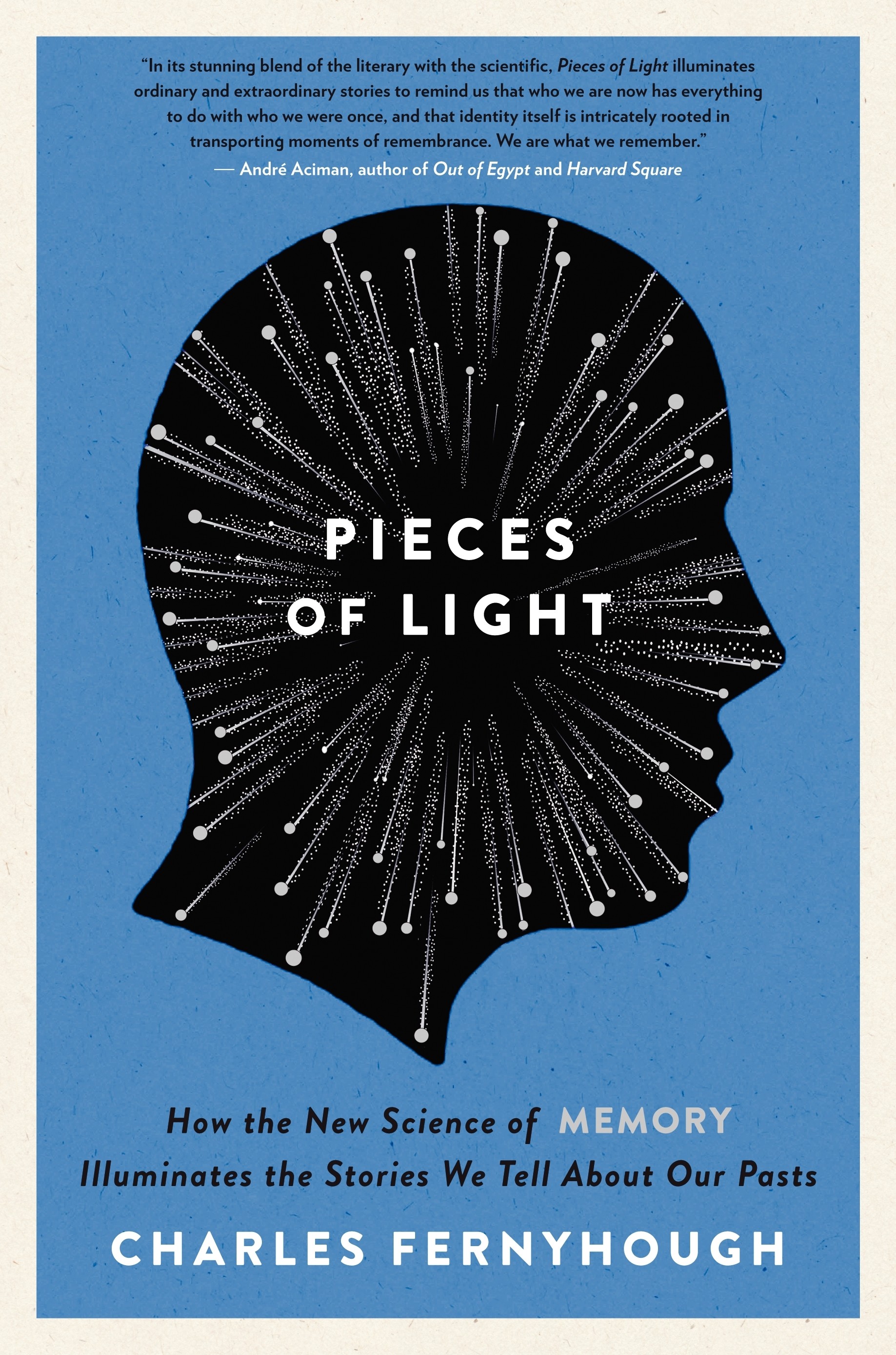
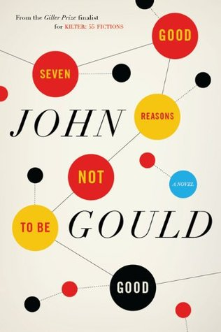
Establish a point of focus with subordinate focal points, where one graphic element depends on and leads to another. In other words, capture the viewer's gaze and lead it around inside the composition.



Create alignment through parallel (but not true verticals or horizontals) or corresponding arrangements of type, images, rules, and any or all graphic elements.
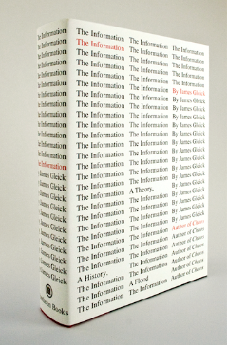
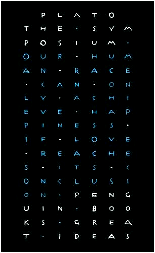
All over pattern and/or thoughtfully positioned repeats of color to create rhythm and visual connections
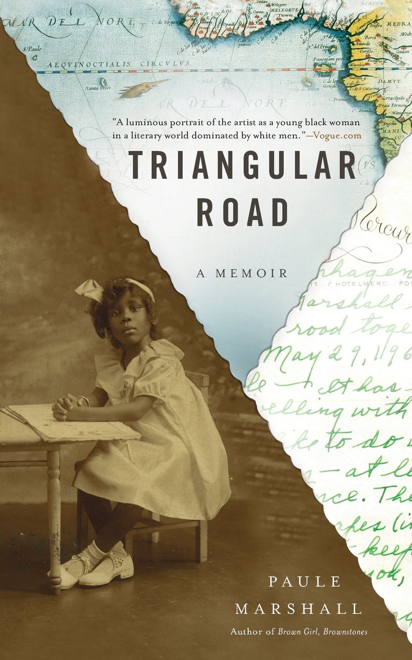
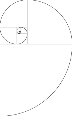
Golden Spiral
Create a composition that's clearly divided into parts. Our text refers to the Golden Section, one of my favorite design tools*. There's also design systems like Jan Tschichold's Secret Law of Page Harmony (more for pages than covers)
* The Golden Section is related to the irrational number Phi (ϕ:'fee':1.618033988749), which in turn is based on the mathematical Fibonacci Sequence. I even dig it so much I have a Fibonacci Calculator on my personal web site.
1, 1, 2, 3, 5, 8, 13, 21, 34, 55, 89, 144, 233, 377, 610, 987, 1597, 2584, 4181, 6765, 10946...
where each number subsequent number in the sequence is equal to the sum of the previous two numbers, and as those numbers grow larger, the proportion between any two numbers gets closer to Phi.
89/55 = 1.6181818...
144/89 = 1.61797752809
10946/6765 = 1.61803399852...
If this intrigues you, check out Numberphile on YouTube
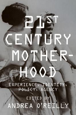
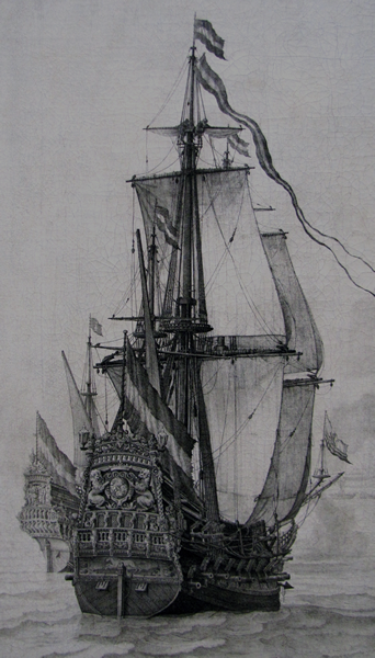
Type is positioned over a large image.
We read the type and see the image almost simultaneously.
Be careful with this one, as it's easy to make the type hard to read.
Try things like dropshadows and outlines to set the text apart from the image, and/or reduce the contrast in the image.


Arrange type and image into interesting juxtapositions, yet respect the principles of emphasis and visual hierarchy


Diagonally transverse the surface by a pulling-like action from opposite corners. Achieves active spacial tensions.


Other configurations are possible too, like this top-to-bottom/bottom-to-top example.

Open spaces are active players in a composition, as in figure & ground, foreground & background. The open space can create a kind of visual tension, and it always influences the composition.
Here, the orange space at the top draws the eye down to the bottle of poison, then the cloth, and continues on down to the last line of text.
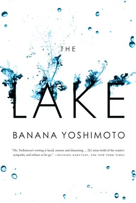
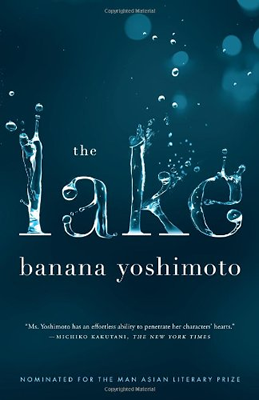
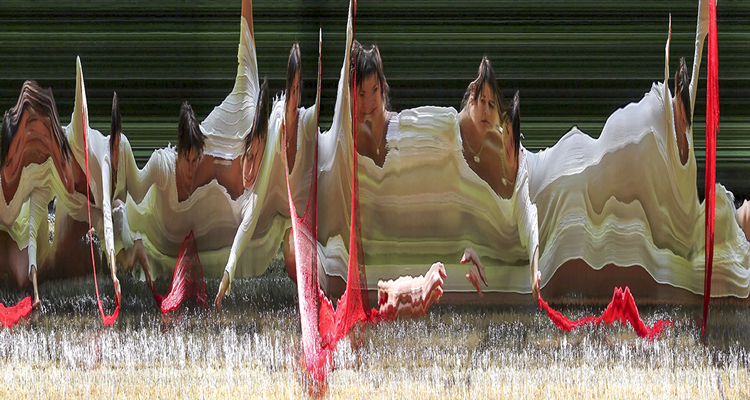
Create illusions of spatial depth or movement (spinning, splashing, rotation, lateral movement, etc.)
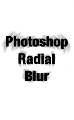
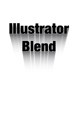
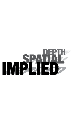
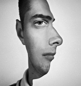
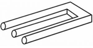
Graphic space that is fractured or ambiguous does not reflect how we see the natural world. Indeterminate spatial positions and ambiguous relationship within a composition become their own reality.
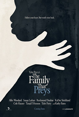

Our book doesn't mention it, but it's pretty much a standard rule of thumb in design. Divide the composition into thirds, vertically and horizontally.
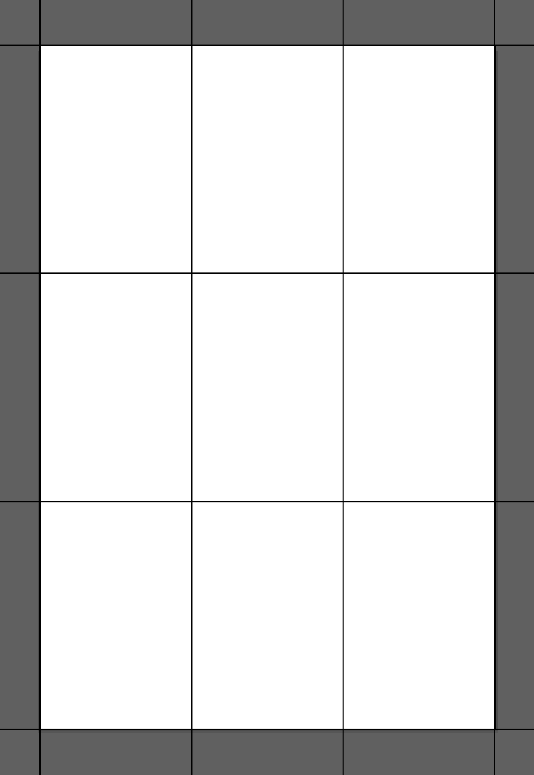


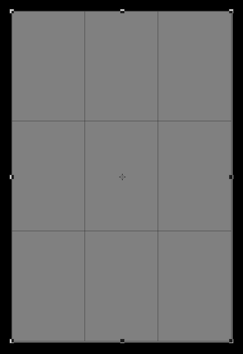
The practice is so standard that Photoshop even builds it into their Crop tool...
Ted Talk presented by him in 2012 (warning - adult content):