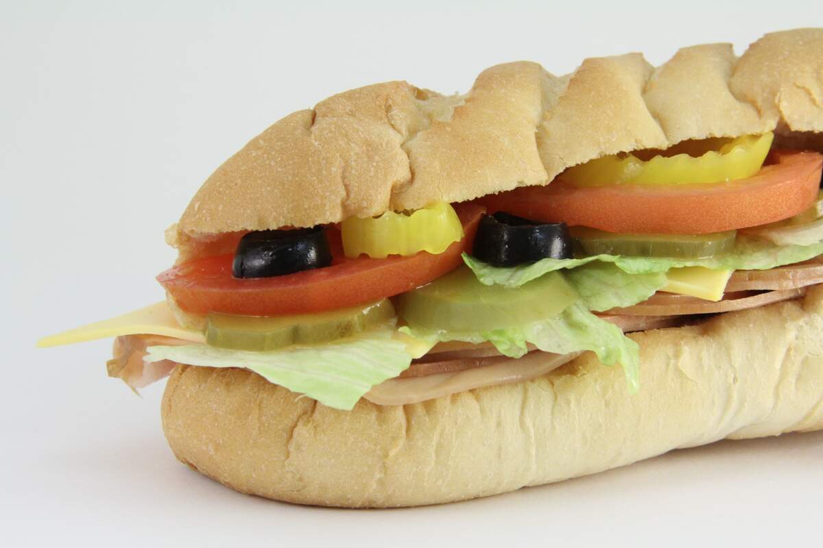
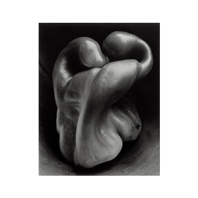
Image making also involves image manipulation. Acquiring an image is only the first step, it's almost always necessary to modify the image to get it to work at its best in the context of the design.
Image manipulation includes:
Alteration: a modification or change to the appearance of an image
Combination: merging two or more images into a unique whole
Cropping: cut out part of an image to focus on what's left or eliminate what's unnecessary
Drawing for Designers & Graphic Interpretations
Designers use different visualizing techniques when drawing out their ideas:
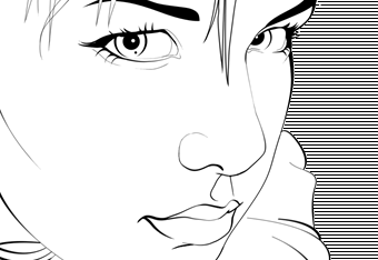
Line Drawing
An image created with line, using a tool such as a stylus, pen, or pencil, with no solid area or shading effects other than cross-hatching. Known as line art, it's easy to print as it doesn't require half-tones - although this is barely an issue anymore.
Contour Drawing
Emphasis is given to the outline of an object or figure to its specific contour, to render mass and form.
Elemental Flat Shape
Basic shape rendering of a form using flat fields of color.
Tonal Drawing
A form is depicted through varying tonal values (through shading rather than line).
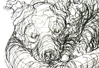
Sketches
A rapid visualization technique; a quick, rough drawing method used to communicate concepts and to present layouts and plans.
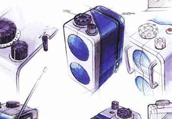
Rendering
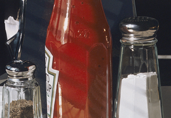
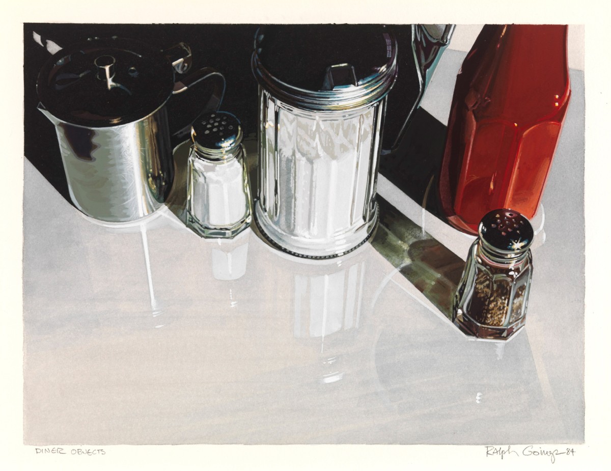
Drawing to define three-dimensional spaces or objects. Like Tonal Drawing, but probably more detailed and photo-realistic. Photo Realism artists like Nathan Walsh and Ralph Goings
Cartoon Drawing
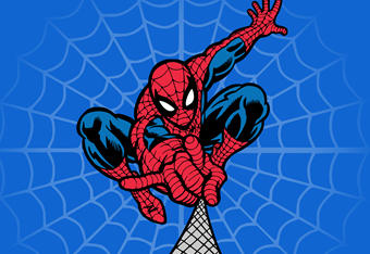
Simple Stylized rendering of figures and situations. Japanese Manga, the Marvel Universe, Roz Chast.
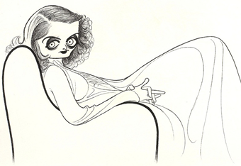
Drawing that emphasizes particular expressions and features. Like the late great Al Hirschfield.
Presentation: Margins, Rules, Borders, Cropping, and Bleeds
How an image is presented affects what it communicates. This is where thinking about the rectangle the design lives inside comes in. Considerations include:
Margins
The blank space surrounding the visual on the top, left, bottom, and/or right.
Rules
A thin stripe or line used to separate text elements.
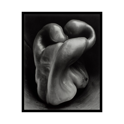
Borders
A band running along the edge of an image. Our text says "A border should never overwhelm or distract from what it frames". I say, never say never...
Cropping
The act of cutting an image to use only part of it. An artform in itself.
Bleed
A visual that extends off the edge or edges of a page.
Using Color
Colors are the mother tongue of the
subconscious.
Carl Jung
Color is subjective, cultural, and elusive. No one knows if the way you see blue is the same way I see blue. Yet there are ways of talking about color and the relationships between color.
It exists in both the physical world and in the digital. Let's start with the physical...
Color Properties
As we know, any single color has three distinct properties:
Hue
The 'color' of a color, like red, blue, orange, purple
Saturation
The intensity of a color
High Sat.
Low Sat.
Value (or Brightness)
The light or darkness of a color (also known as tints and shades)
Tints
Shades
How We See Color
We see color as light that hits the back of our eyes. Our eyes have three kind of receptors that are sensitive to three spectra of light: Red, Green and Blue
Increasing Energy
Increasing Wavelength
Each of the lines in the image represent the responsiveness of the associated cones in your retina.
If you look at the color wheel, do you find it odd that it goes around in a circle, yet the visible spectrum doesn't? I have no idea why...
But here's a good article on the phenomenology of it all: Color Wheels.
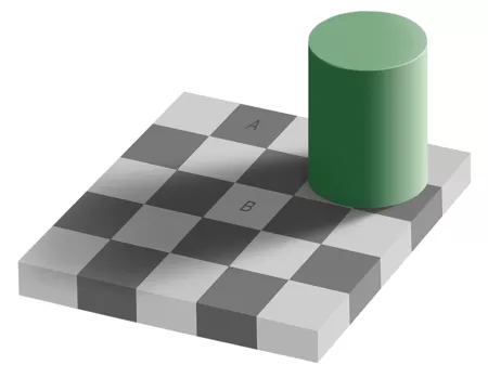
Here's and interesting perceptual trick.
Two Worlds of Color
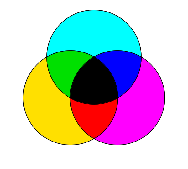
The World of Print CMYK
When light bounces off the paper and colors are absorbed out of the light to reflect back a color into our eyes. Thus it is known as Subtractive Color.
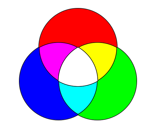
The World of Digital RGB
When light shines directly into the back of our eyes. Different colors of light add together to make a color, thus it is know as Additive Color.
Relationships On The Pigment Color Wheel
What we all learned in grade school
Primary Colors
The three primaries, colors that can't be mixed from other colors
Red
Blue
Yellow
Secondary Colors
The three secondaries, colors mixed from the primaries
Purple
Green
Orange
Tertiary Colors
The six tertiaries, colors mixed from adjacent primaries and secondaries:
Red Orange, Yellow Orange, Yellow Green, Blue Green, Blue Purple, Red Purple.
Or Vermillion, Amber, Chartreuse, Teal, Violet, Magenta.
Red Purple
Blue Purple
Blue Green
Yellow Green
Yellow Orange
Red Orange
Complementary
Colors on opposite sides of the color wheel
aka Magenta
aka Violet
aka Teal
aka Chartreuse
aka Amber
aka Vermillion
Analogous
Any set of hues next to each other on the color wheel
Monochromatic
Any set colors whose hue remains the same
Triadic
Any three colors whose hues are 60° apart
Compound
Complementary pairs of compound colors. In other words, two sets of two colors, each set of two is adjacent to each other while the sets themselves are on opposite sided of the color wheel
Shades & Tints
Different values of light and darkness of a single hue.
Color Temperature
Colors have an innate temperature. The colors of fire and glowing coals (red, orange, yellow) sit on the warm side. Colors of the daytime sky and water sit on the cool. They don't quite split 180° apart, but just a little off, between red-violet and violet, and between yellow-green and green. (In other words, there's more warm colors than cool).
Grays can come in warm and cool variations, which can be quite elegant when used thoughtfully
Our text makes the ridiculous statement that it's best practice to use a color palette that is either cool or warm. I don't agree, using a cool shadow in opposition to an object lit with warm light is an old trick used by many great painters. Take Wayne Thiebaud for example
Color Best Practices
Our text lists these concepts and approaches to color as the best practice, or what's considered in the design industry as the most professional approach:
Color always must be appropriate for a brand, group, or organization as well as for the target audience.
...Although I have no idea how to identify a color as inappropriate
Color is perceived depending on the target audience and the context and colors that surround it.
...True! Color is deeply cultural and context sensitive
Color is perceived in relation to the hues, values, and neutrals that surround it.
...True!
Color can be used to create a focal point.
...True!
Color can differentiate a graphic element from others in a composition.
...As witnessed by our Visual Hierarchy Exercise
Using color is the easiest way to establish connections among graphic elements in a single composition or across multiple pages.
...Well, it's easy way.
Color can be thematic
...True! It's why we included colors in the Visual Brief Exercise
Color can define a section of a website or publication.
...True!
Lab
Continue working on Exercise 6: Drawing for Designers