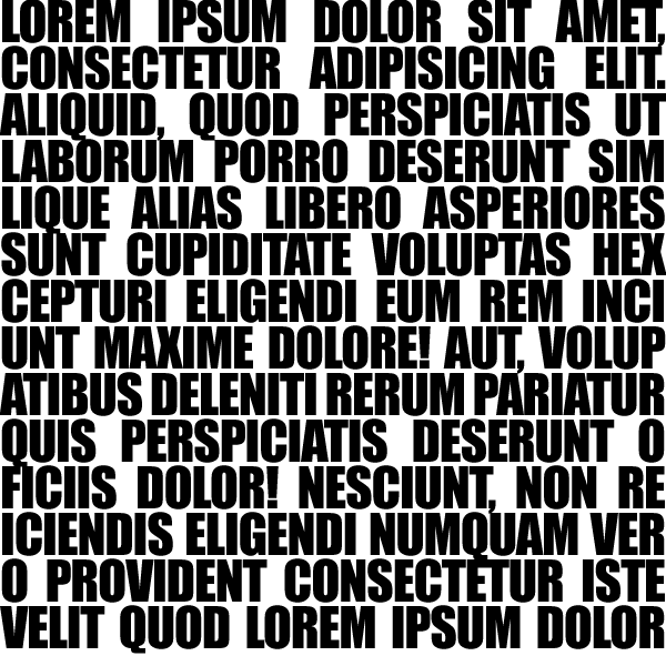
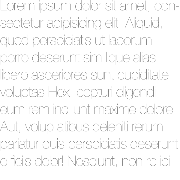
As we discussed before: Type always carries more meaning than the words, sentences, and paragraphs it spells out. The use of a font has significant semiotic value (our text calls it "connotative" levels). Also, type is always influenced by the context in which it is presented. Position, alignment, margins, and spacing within a composition — all influence the direct (denotative) and semiotic associations of a composition.
Type as Shapes
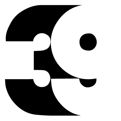
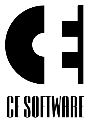
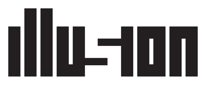
Each letter-form/glyph is made up of positive and negative shapes, or good old Figure and Ground. The negative space between glyphs is as important as the positive shapes of the letters. Just like figure and ground, this can be fun to play with:
Each typeface has distinguishing characteristics. Familiarizing yourself with these characteristics and differences between letter-forms is a life-long discipline for any designer.
Type Selection
How do you select the best typeface for a project?
“Before you choose a typeface, clearly define the audience, tone, personality and attitude of what you are trying to communicate and how you want to say it. This will help you strategically choose the right font to ensures successful communication.”
My takeaway key tip is this: When it comes to fonts, you get what you pay for. A really good fully developed classic font family will set you back a couple of hundred bucks.
(Palatino Family)
Design Concept
The Typeface you choose should match the design concept you're working with. For example, a rhetorical question:
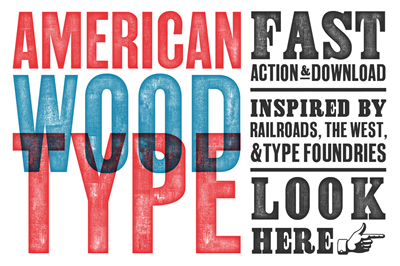
Would you use an American nineteenth-century wood type for a magazine article about the history of East Asia?
Would you use a Blackletter font for a feminine hygiene product?
Would you use a cursive script font for a steel fabrication company logo?
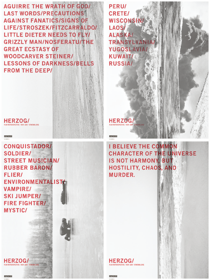
An example of thoughtful choosing:
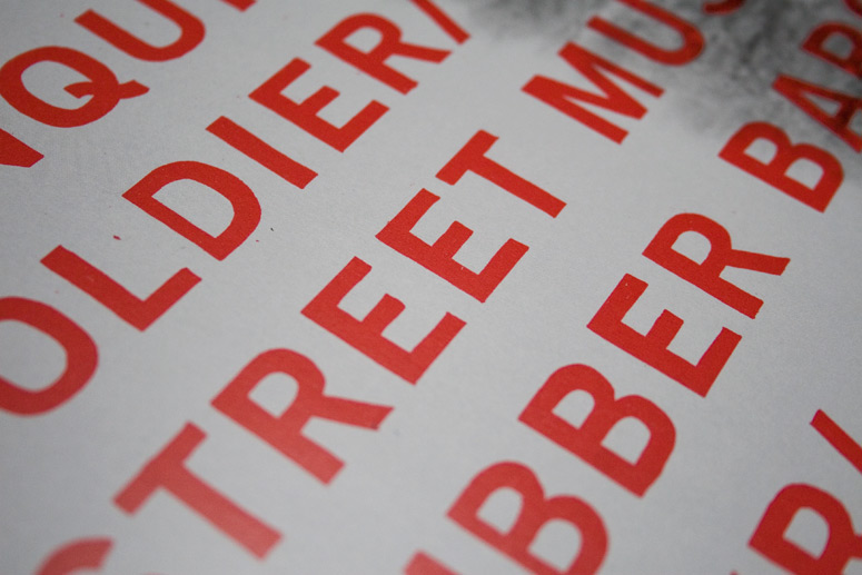
The lettering for this, while looking quite like Helvetica, isn't quite Helvetica. According to the designer, Jeremy Mende:
We chose the horizon to represent this vast, unyielding force and selected film stills that suggested the smallness of man against this backdrop. Over those images, list of adjectives were written — words such as conquistador, soldier, baron, and mystic — meant to purposefully confuse descriptions of Herzog's main characters with descriptions of Herzog himself. At first glance the typography appears to be digitally generated, and most people will assume that is it. But up close, idiosyncrasies of hand-drawn letter-forms become apparent, reveling an obsessive attempt to recreate 'the perfect' that Herzog likewise obsessively seeks to capture in his films
Jeremy Mende, MendeDesign
Readability vs. Legibility
Our text's attempt at drawing a distinction where there isn't really much difference.
Readability
The ease with which text can be read in a given composition.
Incorporates issues of size, spacing, margin, color, and any factor that affects the ability with which text can be read
Legibility
The readability of glyphs within a line of text
That said, if a font is illegible, it's also unreadable. Legibility can be seen as a subset of readability.