Class 11
Lessons Learned
Master/Parent Pages
- Placeholder rect frames for images in Master/Parent Pages (use placeholder.ai to make them more visible)
- What goes in the Master/Parent Page
- Using 2 and 3 column guides together along with multiple layout Master/Parent Pages
Styles
- Set up headline styles so next style is body copy
NEVER DO THIS:
- Multiple Paragraph marks for spacing
- Multiple spaces for spacing
Always do this:
- Proof your text! At least use the Spell Check
Remember that legibility is more important than good looks!
- Always have some method to distinguish paragraphs
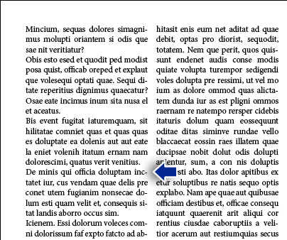
No separation can lead to incorrect reading
Use:
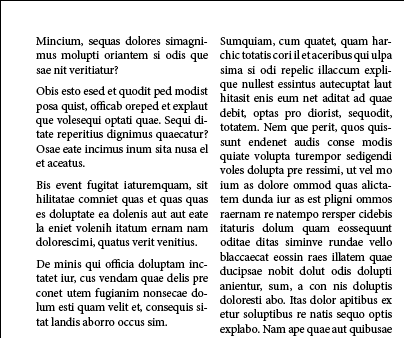
Space between
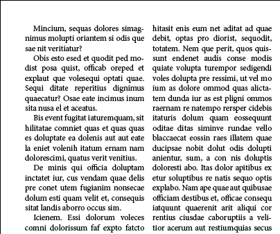
Indented or outdented first lines
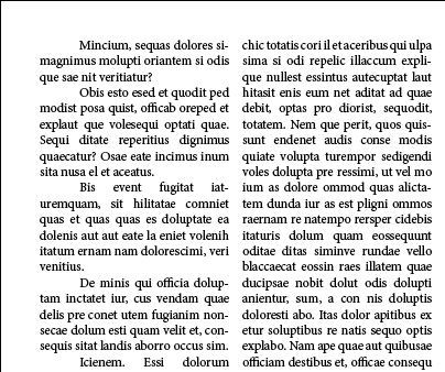
(avoid over-indenting paragrahs)
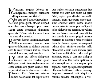
First initial caps (but this can often break up the text too much, and you read "MOBDI" when you shouldn't)
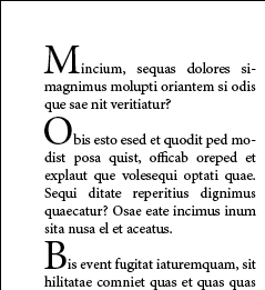
Here's a trick: Use first initial cap on two lines with a shift-return to create a large cap on the first line
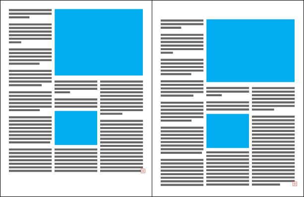
Rule of thumb: Margins at the bottom are usually larger than at the top
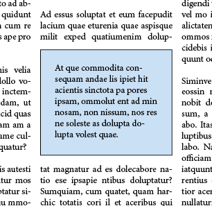
Make text boxes with inset options and strokes rather than putting a text box in front of a rectangle
Setting vertical align to center is helpful also, but sometimes doesn't quite do the centering it should. If it looks off-center, use Align: Top and Inset Top
Avoid This:
- Widows and orphans
- Type next to edges of text frames with backgrounds. Use Text Frame Options: Insets
- Hyphens in heads/headings
Good Ideas
- Measuring squares
- Measuring cube trick for find the difference between two distances
- Turn on View > Extras > Show Text Threads
- Even with threaded text, use column and page breaks
- How to do precise movements with addition/subtraction in fields
Pro Tips
- Right Indent tabs with leaders set in Tabs
- Matching leading to paragraph spacing:
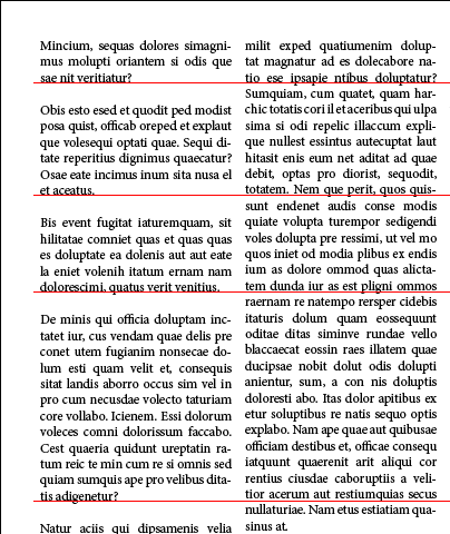
Unmatched spacing: 12/14 with 16pt spacing
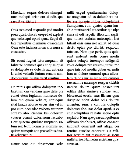
Matched spacing: 12/14 with 14pt spacing
So why not just use double-returns?
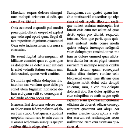
Flexibility! Sometimes you may want to use 1/2 the leading value to save vertical space. 12/14 with 7pt leading.
Matching baselines
is a good
thing!
Fundamental Concepts
- Why use a grid?
- Tweaking Typography for Mastheads
Bullets
Adjusting Bullets
- Default bullets look awful, too much space between bullet and text.
- The easiest way to reach the dialog is to option/alt click the Bullets button in the control panel
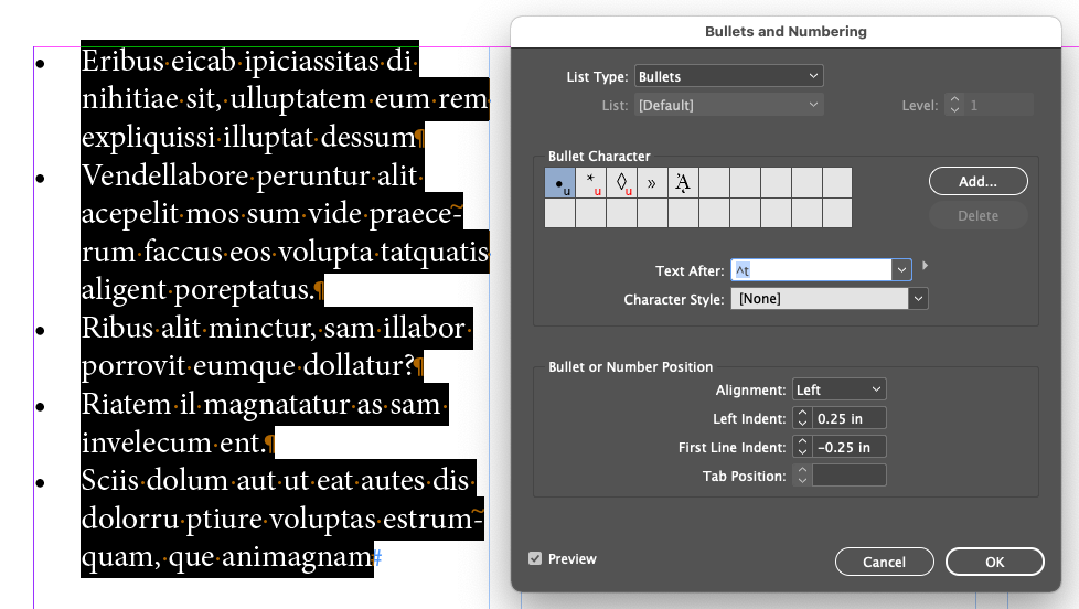
- The default Left Alignment and First Line indent (which control the position of the bullets) is 0.25 and -0.25 respectively. Useless. But if you try and set them you'll usually get an error:
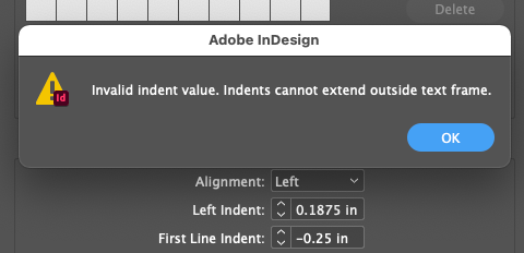
- So you have to avoid changing the Left Indent value to less than the First Line Indent value, but positive instead of negative. In other words, set First Line Indent to -0.125 first, then set Left Indent to 0.125.
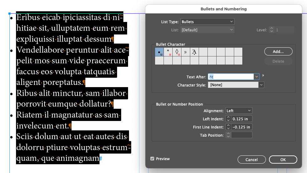
- Key point: Match the positive value of Left Indent to the negative value of First Line Indent.
The importance of using Zoom
Demo document
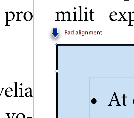
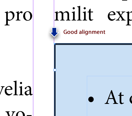
- Aligning to guides matters!
- Computer monitors gloss over errors that are easily seen in print
- Zoom in!
- A lot of design is just aligning things to each other and matching spacing
- Using spacer rects (demo)
- Set the stroke to "Inside" in the Stroke panel for the optimal alignment
- A Rule Of Thumb:
- Space around a text block should be at least as big as (and probably bigger than) the visual space between lines
- Bad:

- Better:
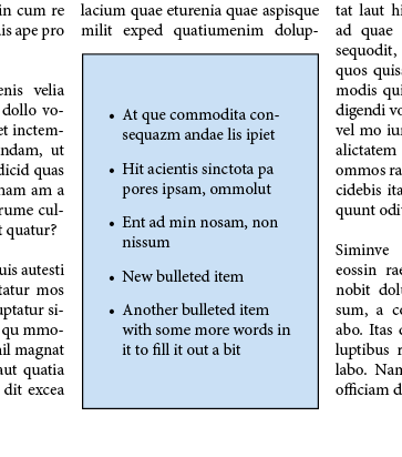
- Best:
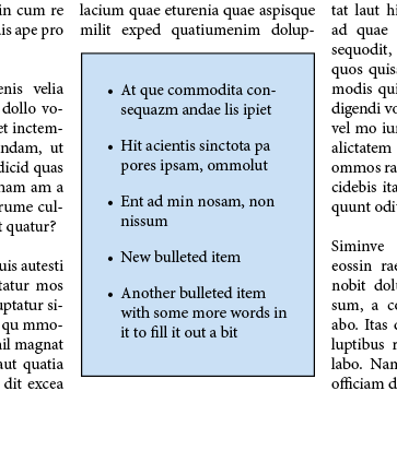
- Actually set to 1p9 top, 1p6 left and right and 0 bottom and bottom dragged to be visually pleasant
Chapter/Lesson 08: Working With Color

Background frame
filled with color
Line with color
applied to stroke
Text frame with
linear gradient
Graphics frame
with stroke
Text with PANTONE
color fill
Text with stroke
and fill
Lesson08.zip
Managing Color
The Need For Color Management
It's partly about how the eye sees color, whether it's through transmitted light or reflected light, and about the limits of a given system to reproduce a range of colors, also know as a gamut. Matching the color you see on screen to the one that is printed falls under the pervue of color management
.
Color management is a way of translating the colors from one gamut (RGB) to another (CMYK). Every print device, like an offset printing press, an inkjet printer or a color laser printer, has its own gamut. If you use a professional printer for your project, work with them to match what you see on your screen to what gets printed. What you don't want is to show a client a project on your screen and then give them a final printed product that doesn't look like it did on your screen. The problem is usually that RGB images never look as good in CMYK as they did in RGB.
Creating A Viewing Environment for Color Management

The work environment you develop a project in can influence how you perceive colors. The kind of light bulbs you use and the color you paint your walls matters. If you plan on doing print production work, you should create an appropriate workspace for it. Some things to think about:
- View docs in an environment that provides a consistent light level and color tempurature (the right 5k lighbulbs)
- NO FLORESCENT LIGHTS! They're too cold and have irregular spectrums (that is, some color wavelengths of light are weaker and/or stronger they are in daylight)
- View doc in a room with neutral-colored walls. Neutral gray is considered best.
- Remove colorful backgrounds from your desktop
- Vew document proofs* under real-world conditions which your audience is likely to face
- Pay attention to color proofs*
* Document, Pre-Press and Color proofs are provided by the printer you choose to do the printing work.
Here's a good YouTube video on Comprehensive Guide to Color Settings, Color Profiles and Proofing in Photoshop (17 minutes). Very detailed.
Displaying Images At Full Resolution
Make sure Menu View Display Performance High Quality Display is turned on.
Specifying Color Settings in InDesign
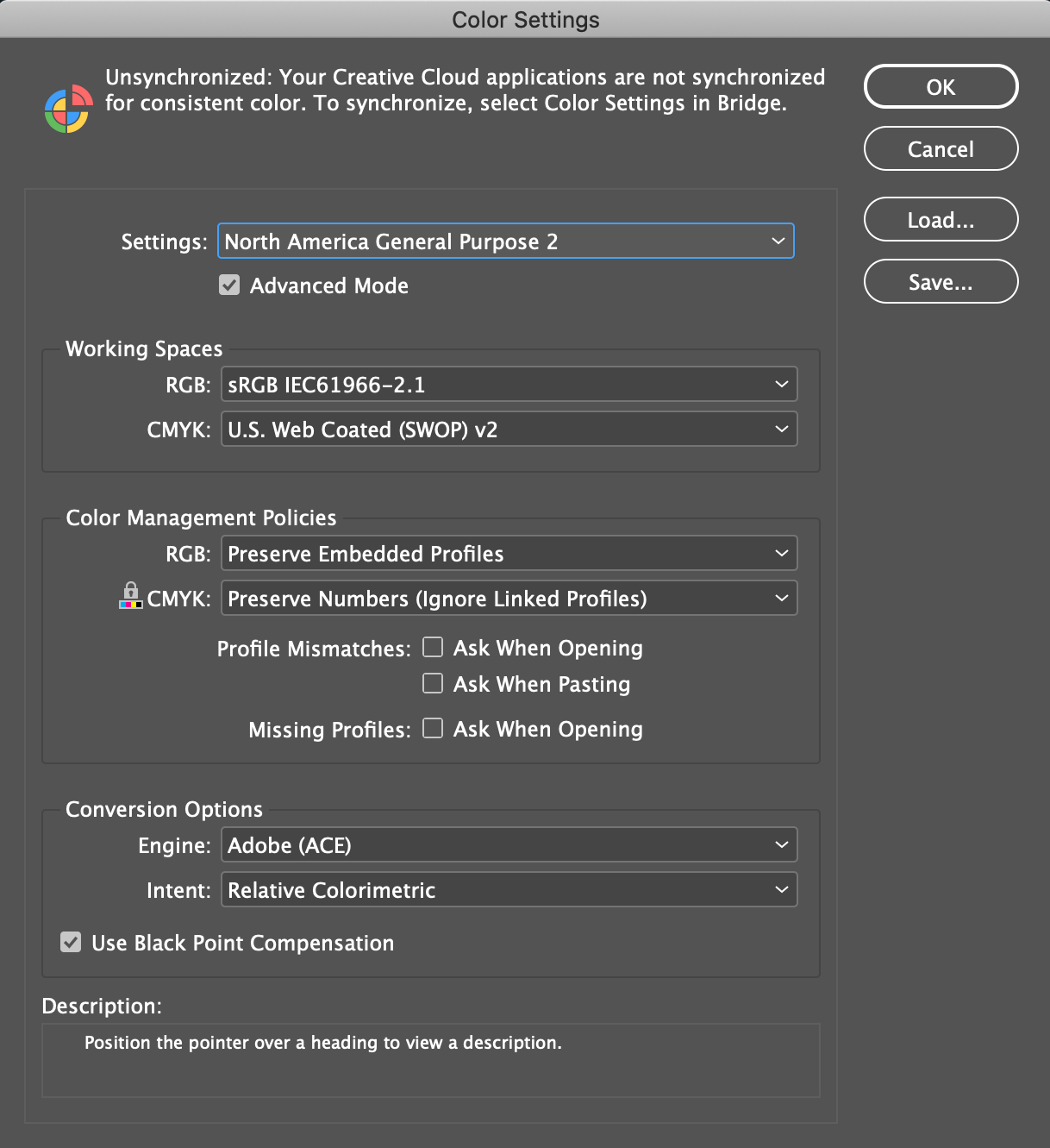
InDesign works with what's called a Color Setting File (CSF). It contains data about color management polices and profiles. The default CSF is North America General Purpose 2
, which the book says is the best for beginners.
This is huge, complex, and more detailed than we can possibly go into. To me, the net net is work with your printer to get these setting right.
- Put the mouse cursor over the various popups and checkboxes to find out more about them
Proofing Colors Onscreen
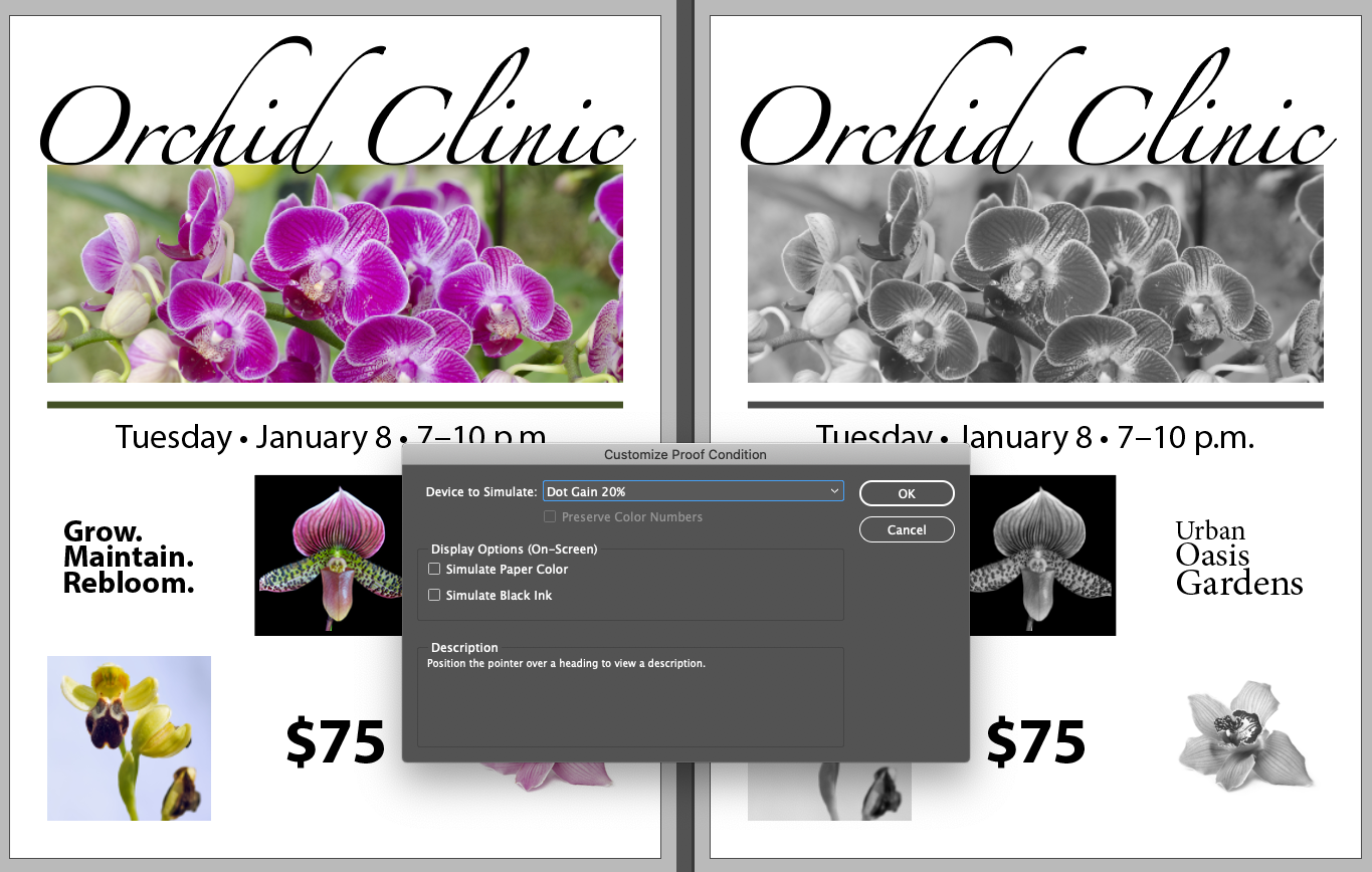
- Menu Window Arrange New Window for 08_Start.indd
- Menu View Proof Colors
- Menu View Proof Setup Custom
Device to Simulate: Dot Gain 20%
- Click OK
Dot Gain 20% lets you preview how the document would print in black and white
Defining Printing Requirements
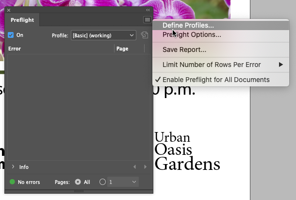
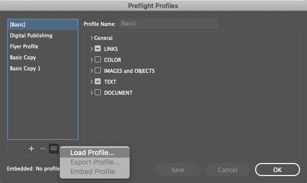
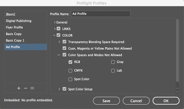
Work with your printer before you start designing, or have an existing relationship with one so you know the constraints and profile settings needed for the upcoming project. any printers will give youa Preflight file for InDesign.
Loading A Preflight Profile
Converting a Color Mode for a Swatch
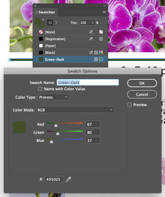
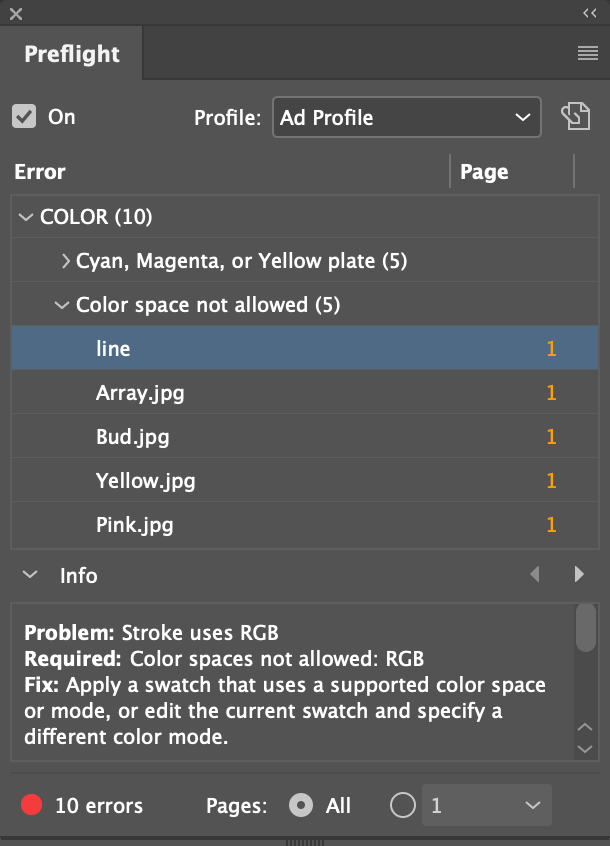
There was a preflight error for a line with an RGB color. Let's change the swatch it's colored with to CMYK.
- In the Swatches panel, double-click on the
Green-Dark
swatch
- Change it's color mode from RGB to CMYK
Creating Colors
There are about 100 ways to pick colors in InDesign...
- With the fly-out menu in the color panel
- With the "New Swatch" button in the Swatches panel
- Pick on up with the Eyedroper tool
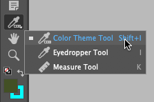
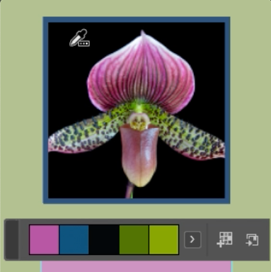
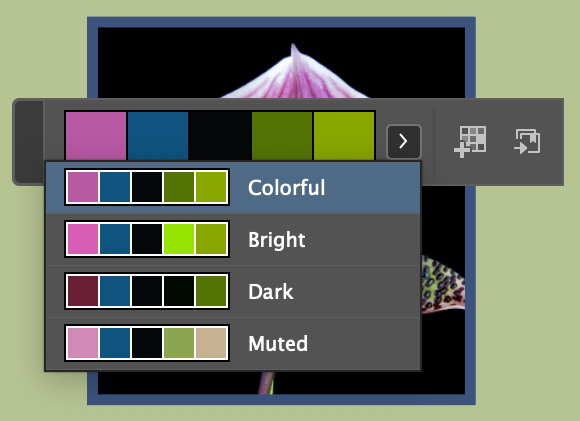
- With the Color Theme tool
- From the Adobe Color Themes panel
- From CC Libraries from Photoshop and Illustrator
Creating a PANTONE Color Swatch


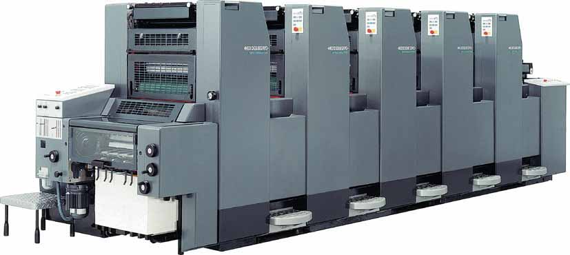
PANTONE is the leading manufacturer of specialty colored inks for the printing industry. When you print on an offest printing press, the standard is four colors, Cyan, Magenta, Yellow, and Black (CMYK). This has a limited color gamut, but you can extend it with PANTONE inks. Literally a can of ink you put in the printing press in addition to the four colors you've already got.
That ink goes on it's own station in the printer. Below is a 5 color offset printer, notice the 5 towers, one for Cyan, Magenta, Yellow, Black, and one more - usually a PMS color or varnish. That 5th color is often called a Spot
color or Spot Varnish.
- Deselect all
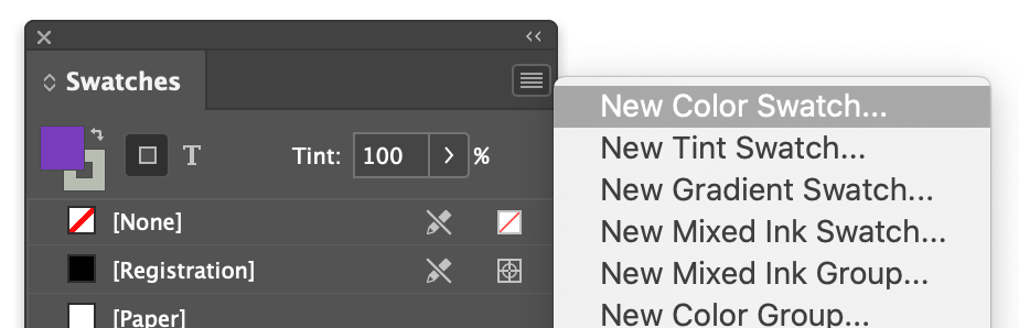
- Open the Swatches panel
- Flyout Menu New Color Swatch...
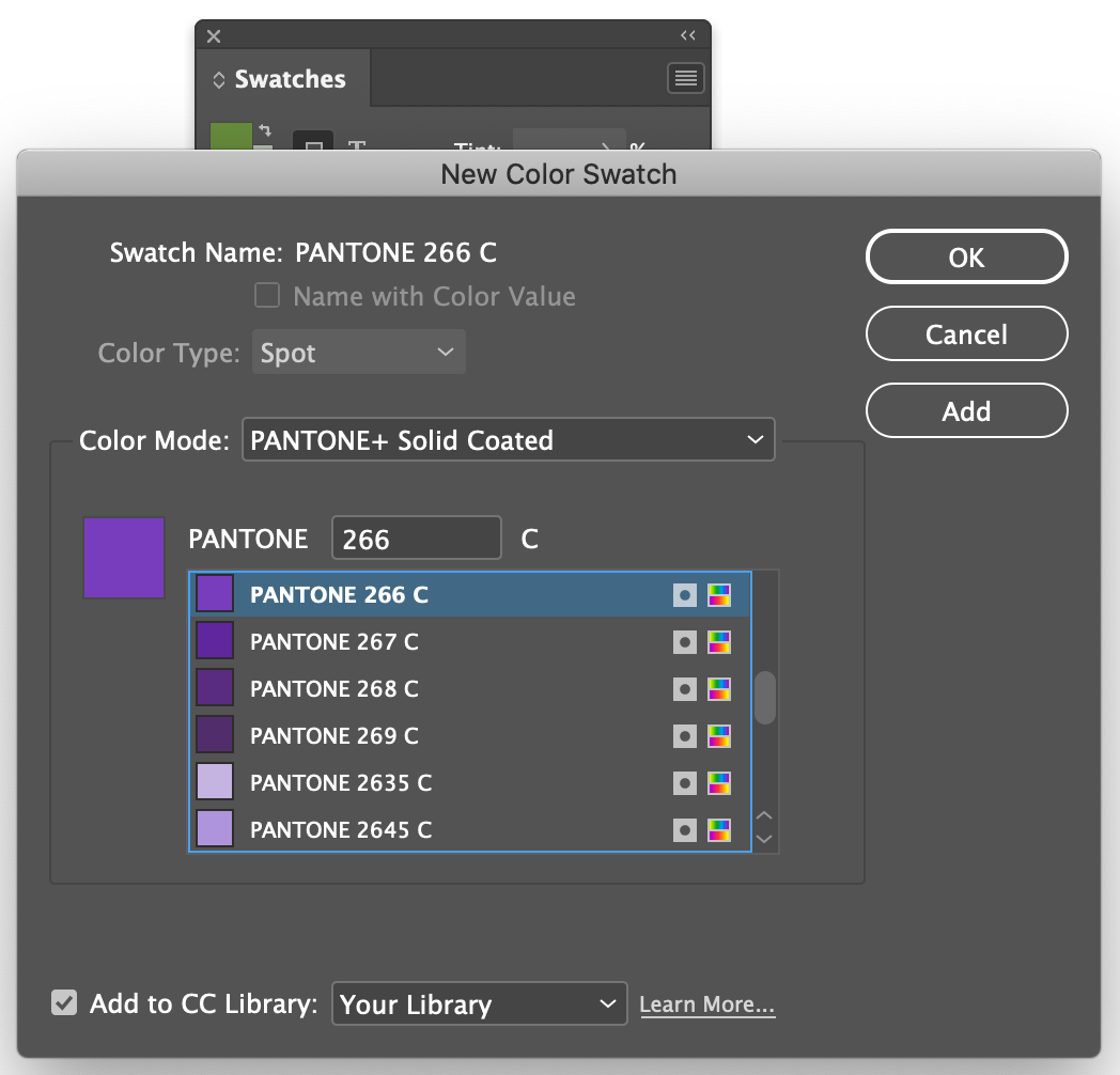
- Color Mode: PANTONE+ Solid Coated
- PANTONE 266 C
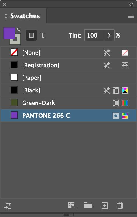
Result
Creating CMYK Color Swatches
CMYK is the normal color space for print. It's even more unintuitive that RGB, which is a no no is print.
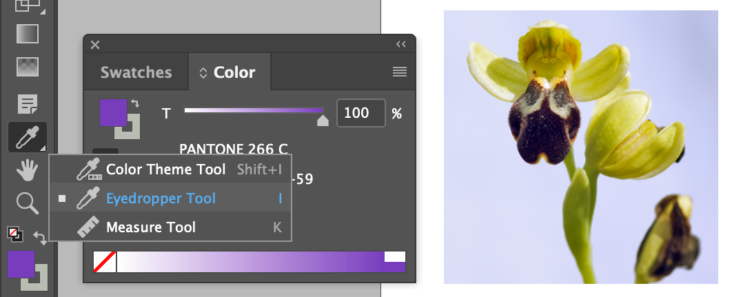
- Choose Eyedropper tool under the Color Theme tool in the toolbar
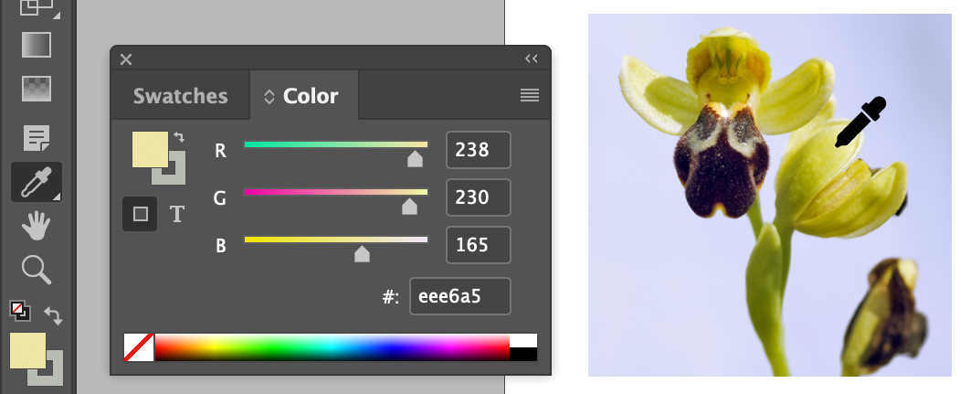
- Pick a color that's light yellow off the photo
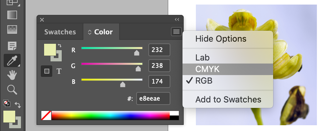
- Switch the CMYK color space if it's not already set
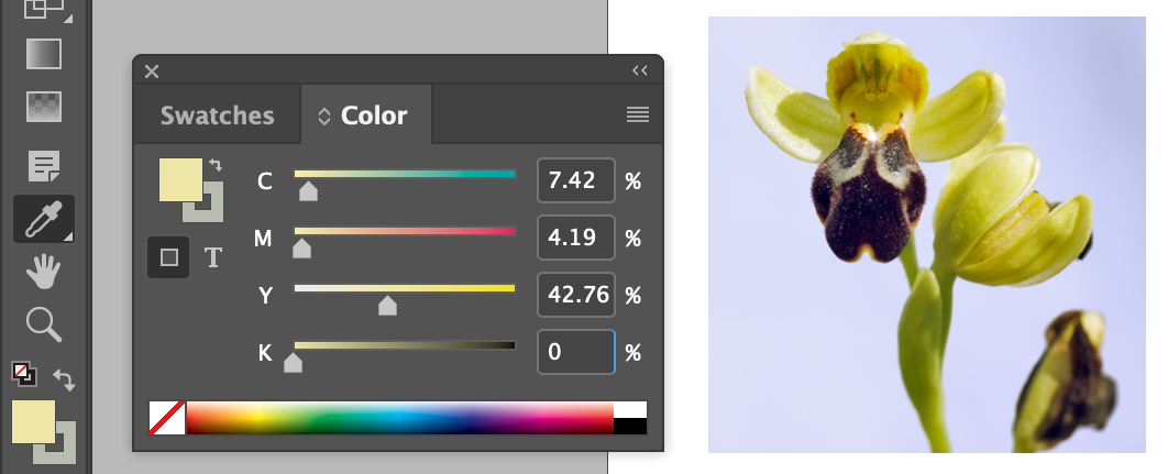
- Wacky, decimal included values, we'll tweak'm
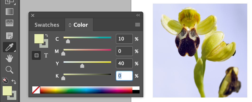
| Cyan (C) |
10 |
% |
|
| Magenta (M) |
0 |
% |
|
| Yellow (Y) |
40 |
% |
|
| Black (K) |
0 |
% |
|
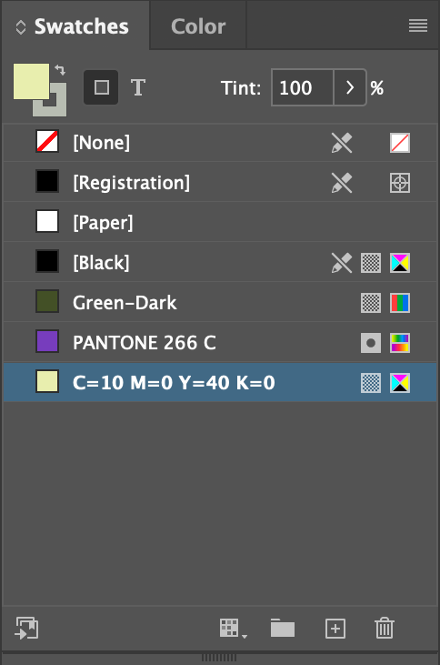
- Click on the Add Color button at the bottom of the Swatches panel
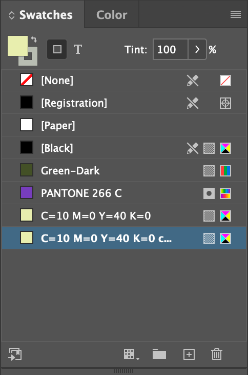
This duplicates the selected color.
- Double-click on the duplicated color
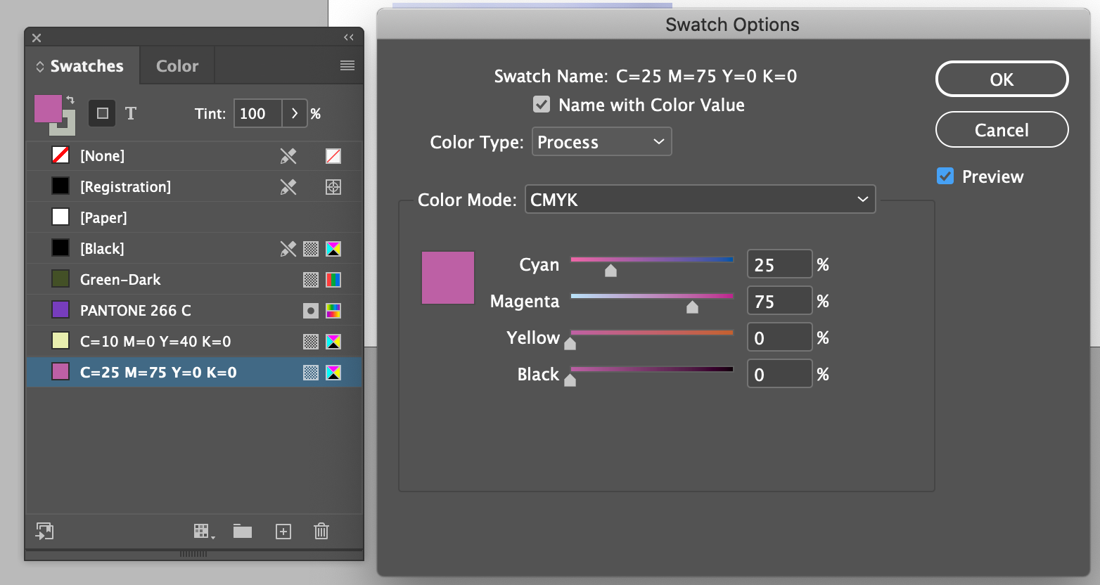
| Cyan (C) |
25 |
% |
|
| Magenta (M) |
75 |
% |
|
| Yellow (Y) |
0 |
% |
|
| Black (K) |
0 |
% |
|
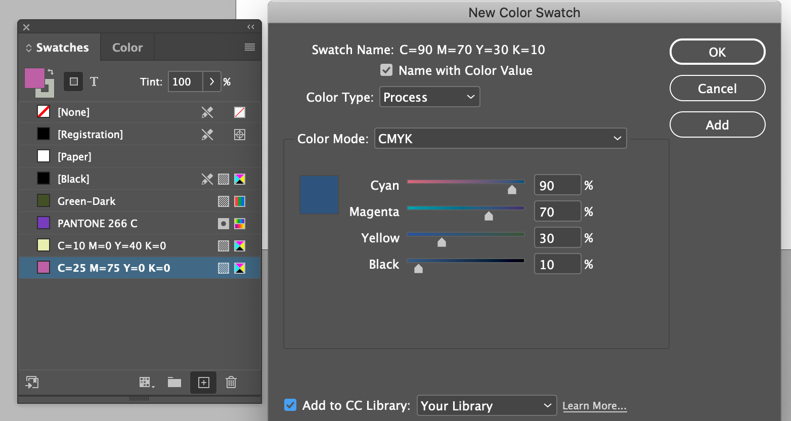
- Choose New Color Swatch from the flyout menu
- Set to:
| Cyan (C) |
90 |
% |
|
| Magenta (M) |
70 |
% |
|
| Yellow (Y) |
30 |
% |
|
| Black (K) |
10 |
% |
|
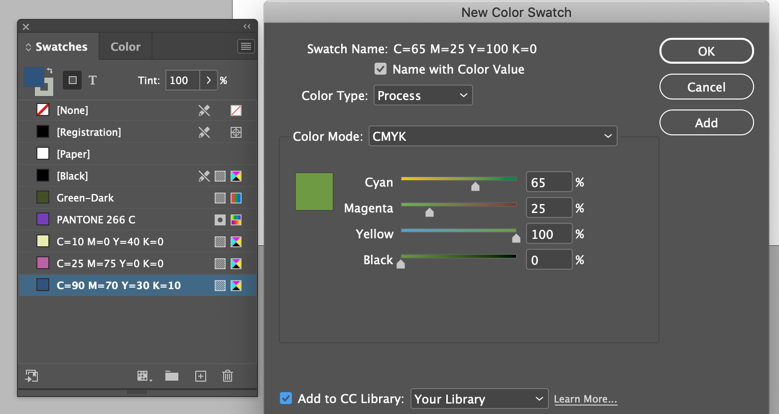
| Cyan (C) |
65 |
% |
|
| Magenta (M) |
25 |
% |
|
| Yellow (Y) |
100 |
% |
|
| Black (K) |
10 |
% |
|
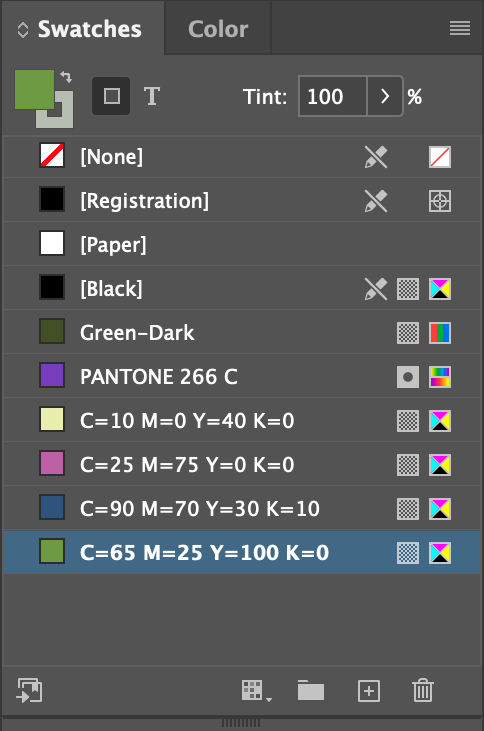
We now have a Swatches panel with 5 new colors in it for use in our document.
About Spot and Process Colors
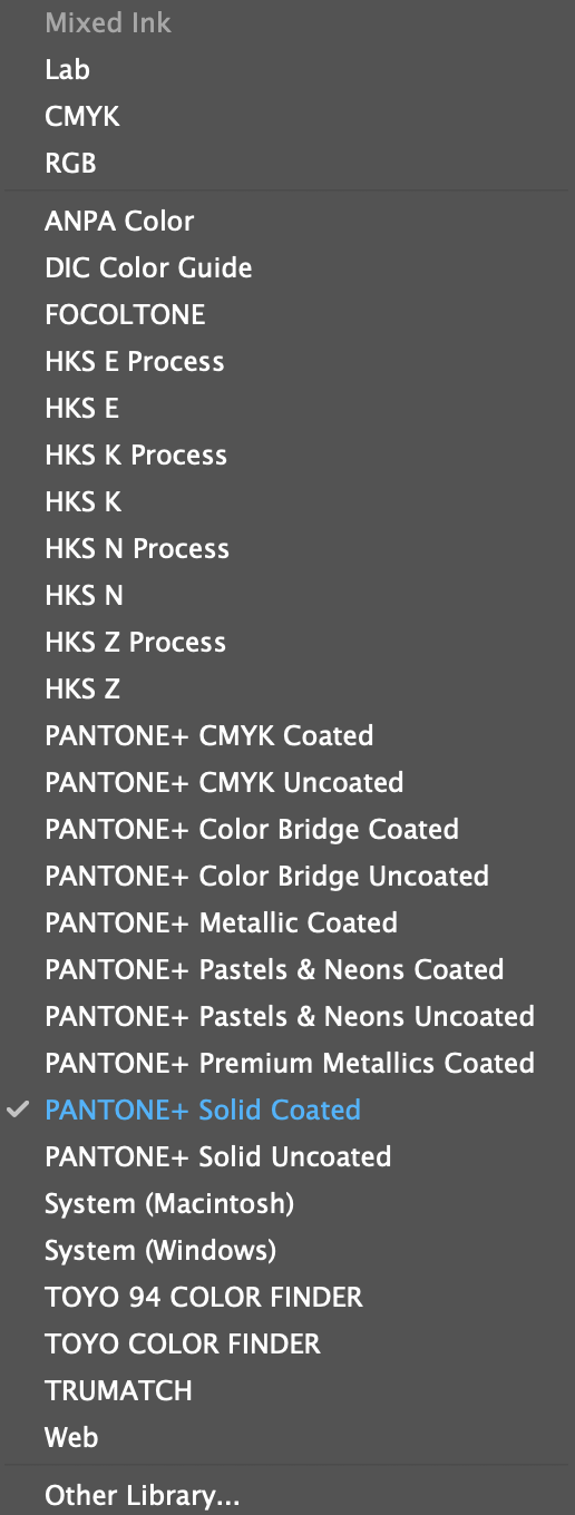
List of color spaces and spot color brands in the popup menu in the Color dialog
A spot color is a special premixed ink that is used instead of, or in addition to, CMYK process inks (or process color), and that requires its own printing plate on a printing press. Use spot color when few colors are specified and/or where color accuracy is critical. Spot color inks can accurately reproduce colors that are outside the gamut of process colors. The exact appearance of the printed spot color is determined by the combination of the ink as mixed by the commercial printer and the paper it’s printed on.
- For best results specify process colors using CMYK values printed in process color reference charts, such as those available from a commercial printer or online.
- The final color values of a process color are its values in CMYK, so if you specify a process color using RGB (or LAB, in InDesign), those color values are converted to CMYK when you print color separations. These conversions differ based on your color-management settings and document profile.
- Don’t specify a process color based on how it looks on your monitor, unless you are sure you have set up a color-management system properly and you understand its limitations for previewing color.
- Avoid using process colors in documents intended for digital devices, because CMYK has a smaller color gamut than that of a typical monitor.
Sometimes it’s practical to use process and spot inks in the same job. For example, you might use one spot ink to print the exact color of a company logo on the same pages of an annual report where photographs are reproduced using process color. You can also use a spot-color printing plate to apply a varnish over areas of a process color job. In both cases, your print job would use a total of five inks—four process inks and one spot ink or varnish.
Applying Colors
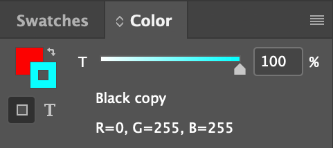
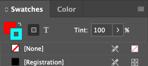
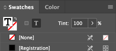
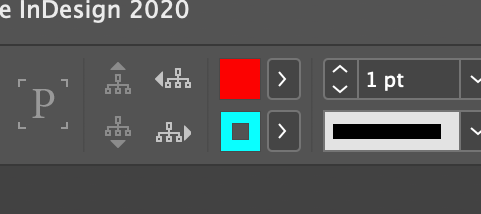
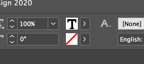
It's all about the fill/stroke or foreground/background tabs, with a bit of variation when it comes to type.
Object Color
Text Color
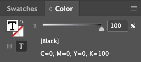
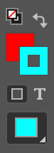
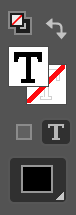
The solid square tab is the fill color, the square donut is the stroke color for objects, signified by the dark grey square with the light gray border. The capital T if the fill color for text, and the red diagonal slash behind it is the stroke color, signified by the little light gray capital T.
Applying Fill Colors To Objects
Basic poke and grunt technique.
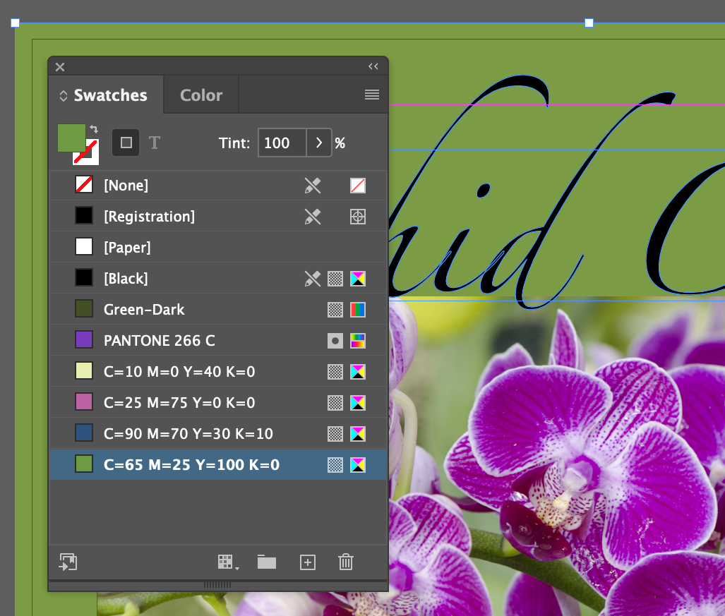
- Select the backing rectangle and fill color it C=65 M=25 Y=100 K=0
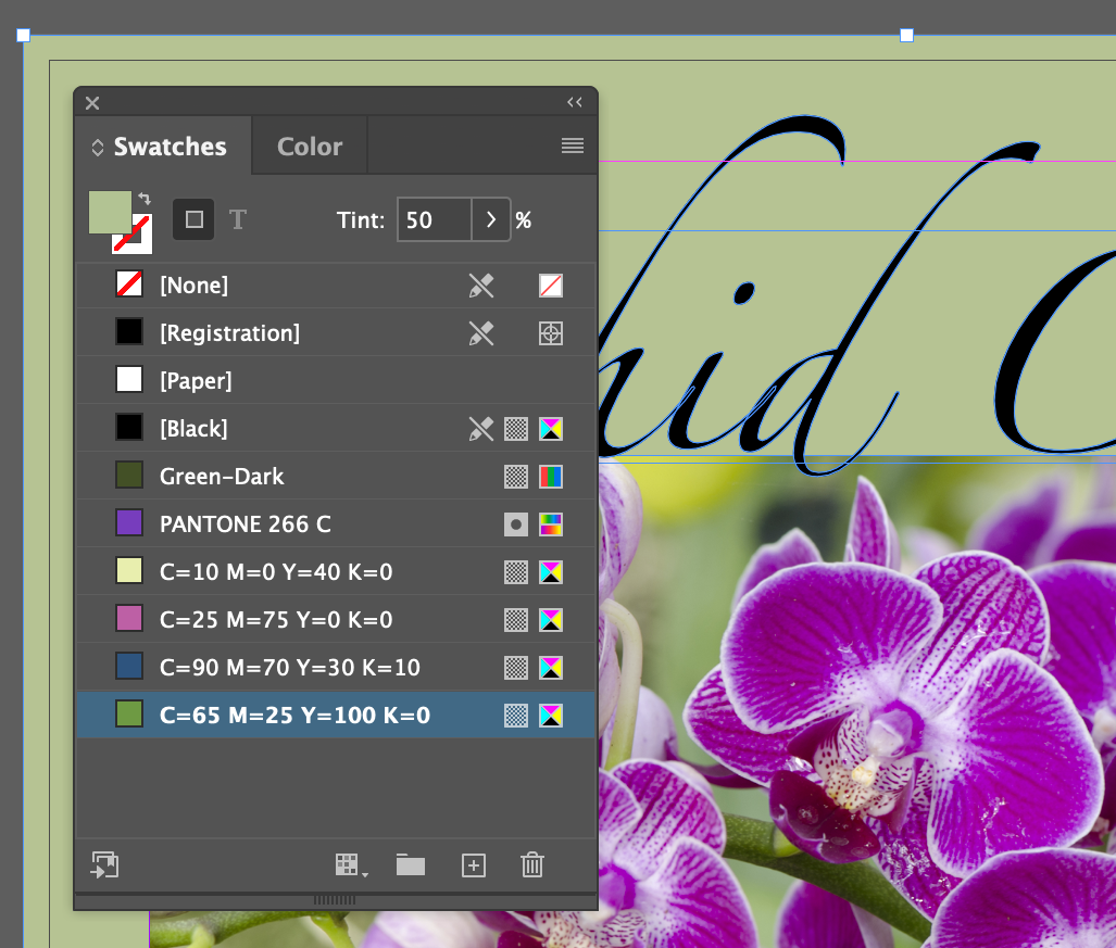
- Reduce the opacity, or set the tint, to 50%
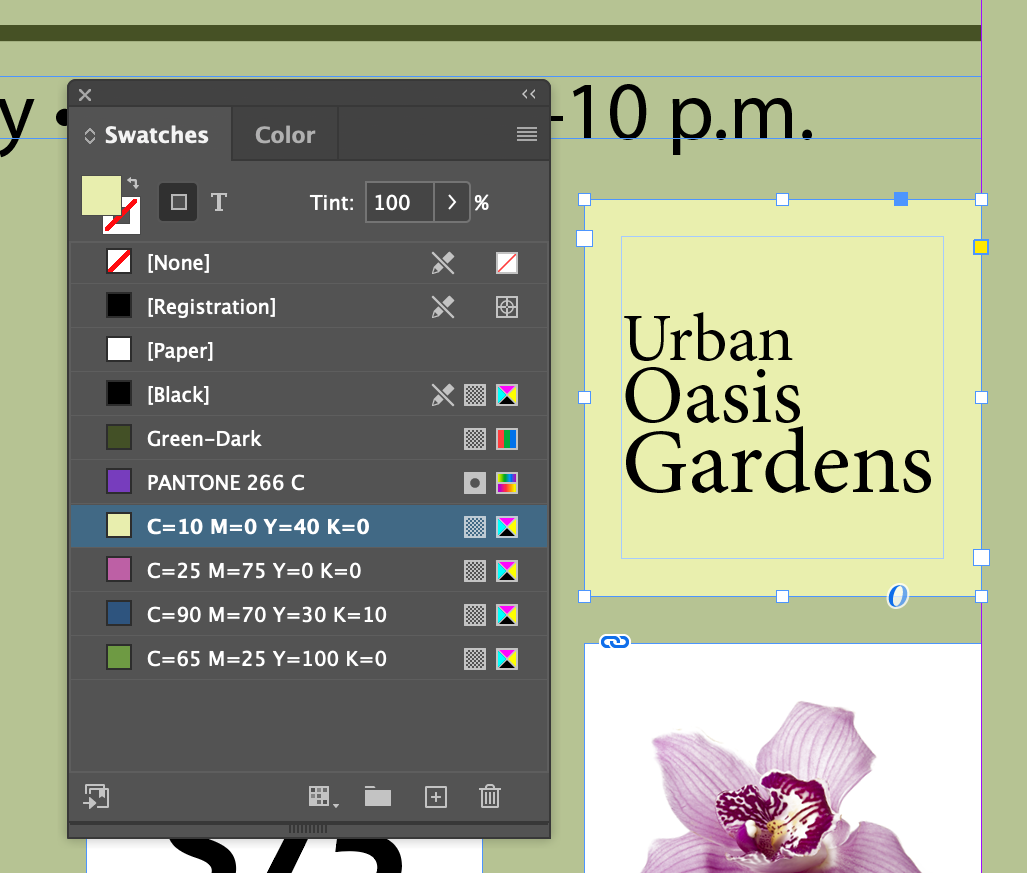
- Select the text frame for
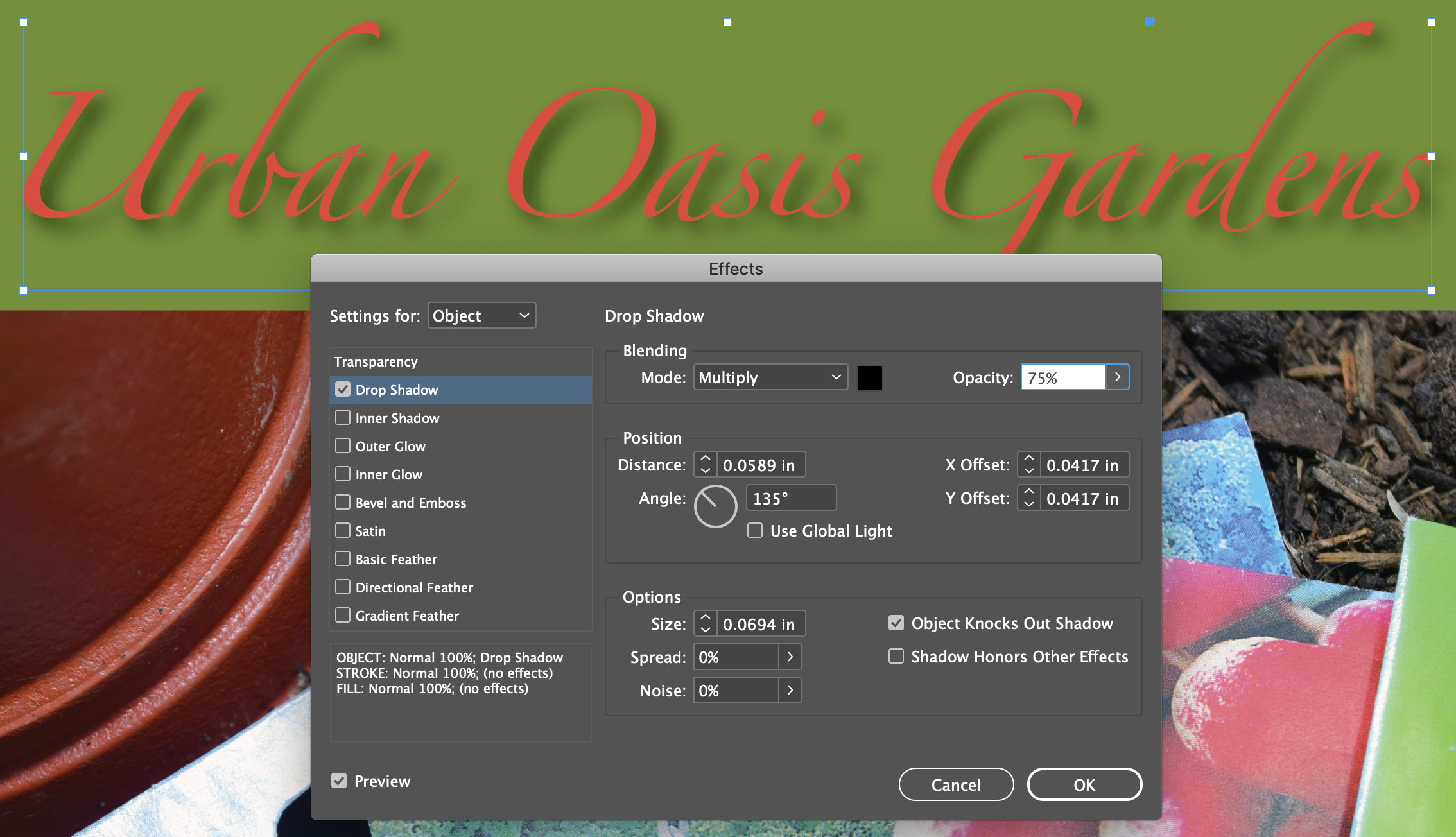
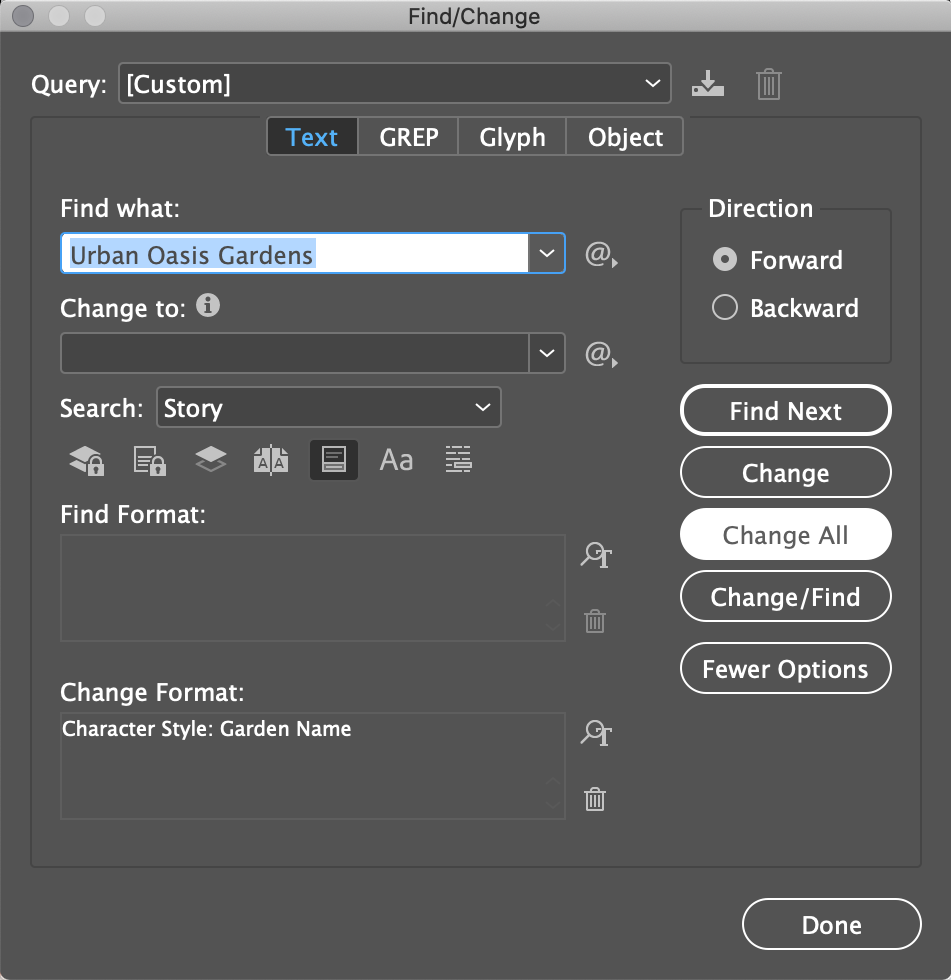
Urban Oasis Gardens
and fill color it C=0 M=0 Y=40 K=0
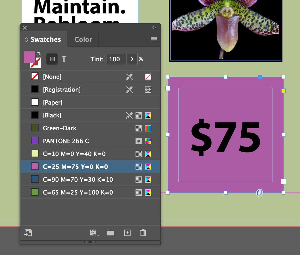
- Select the text frame for
$75
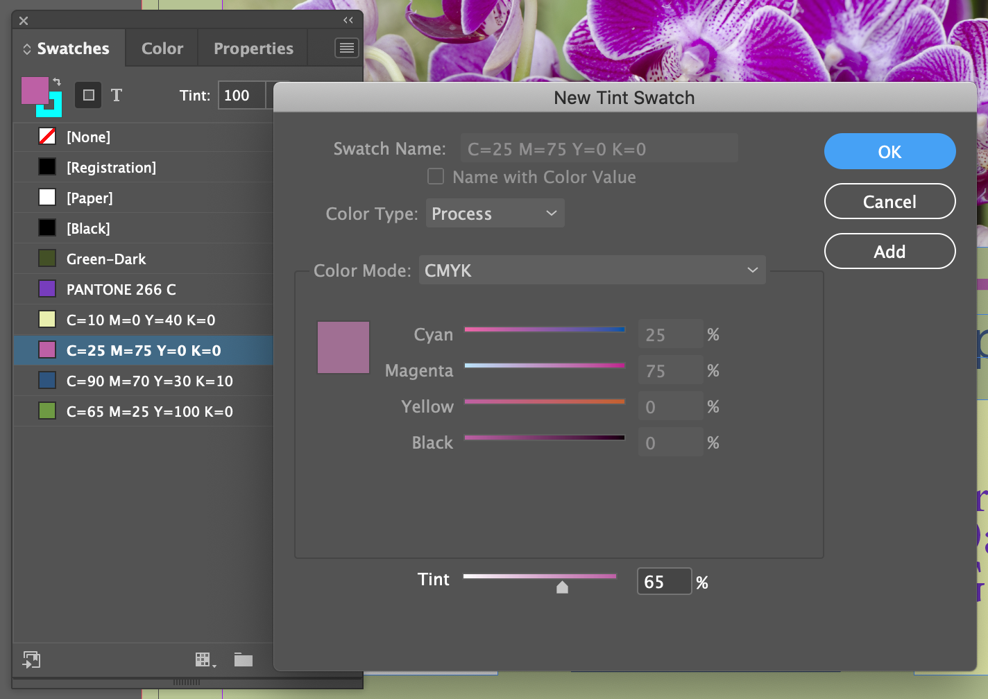
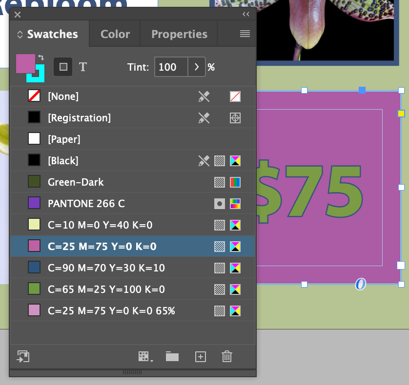
and fill color it C=25 M=75 Y=0 K=0
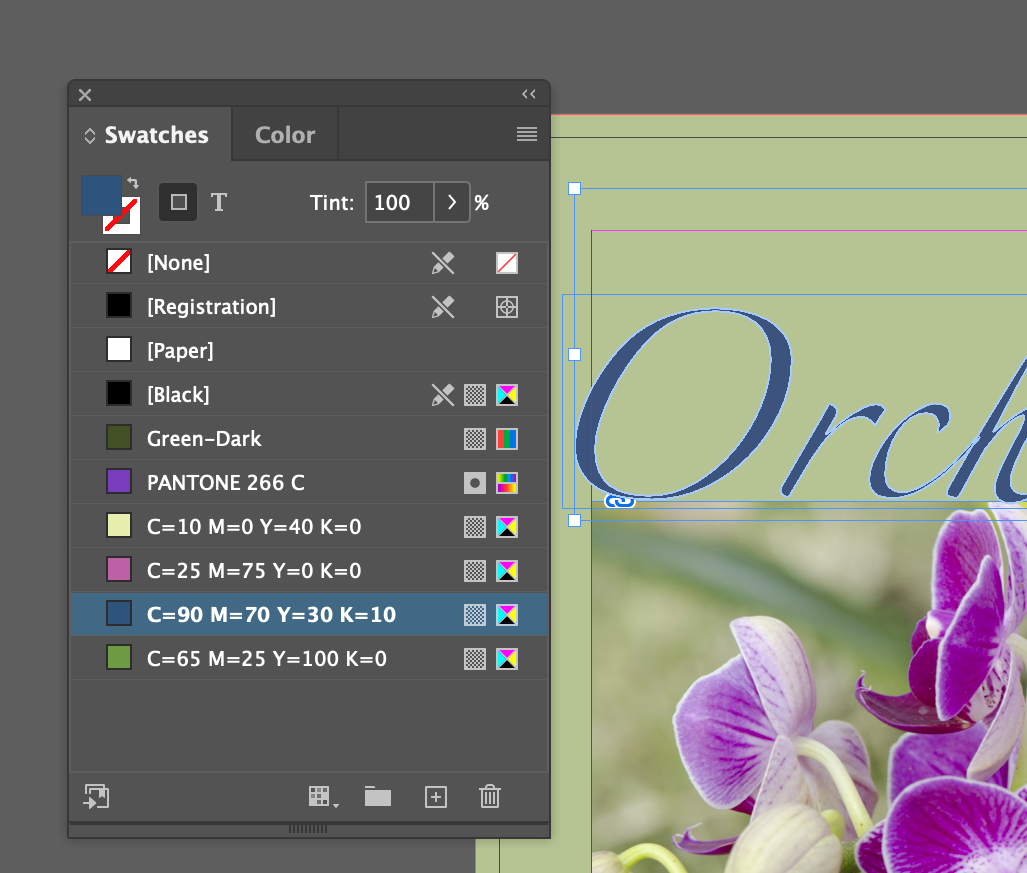
- Select the text frame for
Orchid Clinic
and fill color it C=90 M=70 Y=30 K=0
This bit may have you wondering, why didn't this color the background like it did for the $75
and Urban Oasis Gardens
frames? It's because, despite appearances to the contrary, the words Orchid Clinic
are not acutally text, it has been converted to a vector object with Menu Type Create Outlines applied to some editable text. Because it's in outlines, it can't be edited anymore. I actually think this is needlessly confusing...
Applying Colors to Strokes
More poke and grunt.
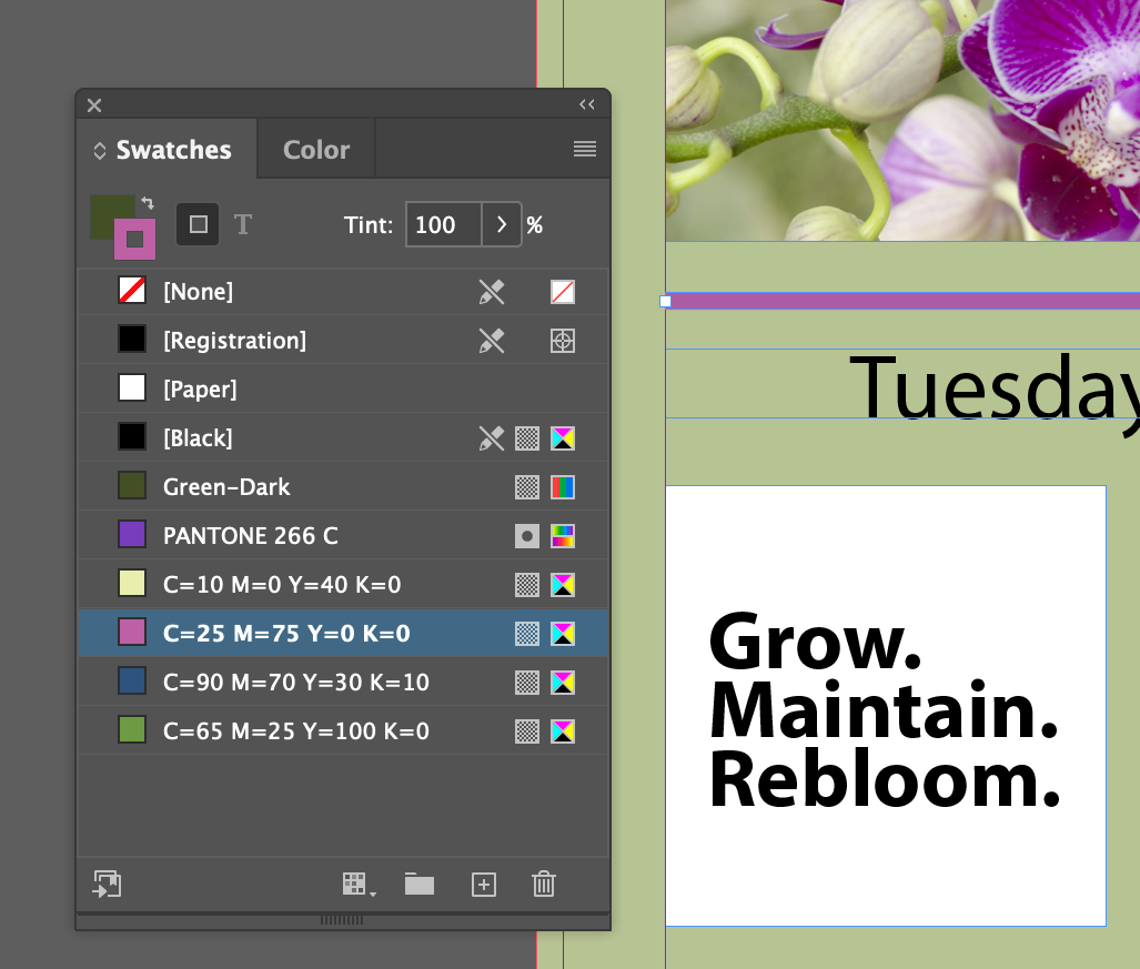
- Select the rule below the large photo and apply the stroke color C=25 M=75 Y=0 K=0. Be sure to use the stroke color tab and not the fill.
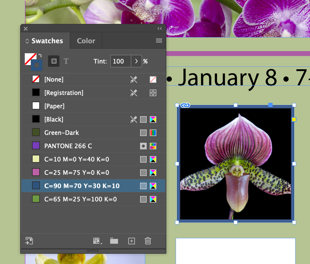
- Select the square photo of the orchid and apply the stroke color C=90 M=70 Y=30 K=10
Applying Color to text
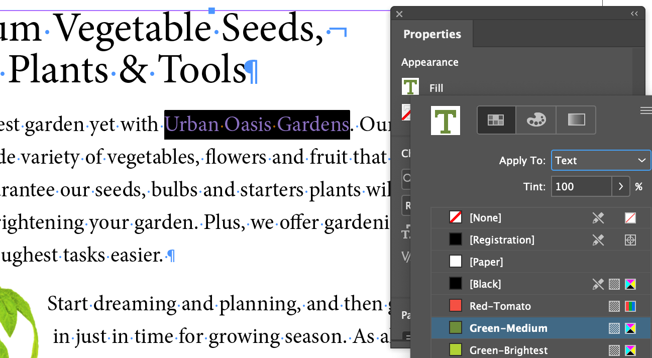
If you are in the text tool, the color choice tabs reflect it with the capital T in the squares, or you can force the application of color to the text by clicking on the little T icon near the color squares
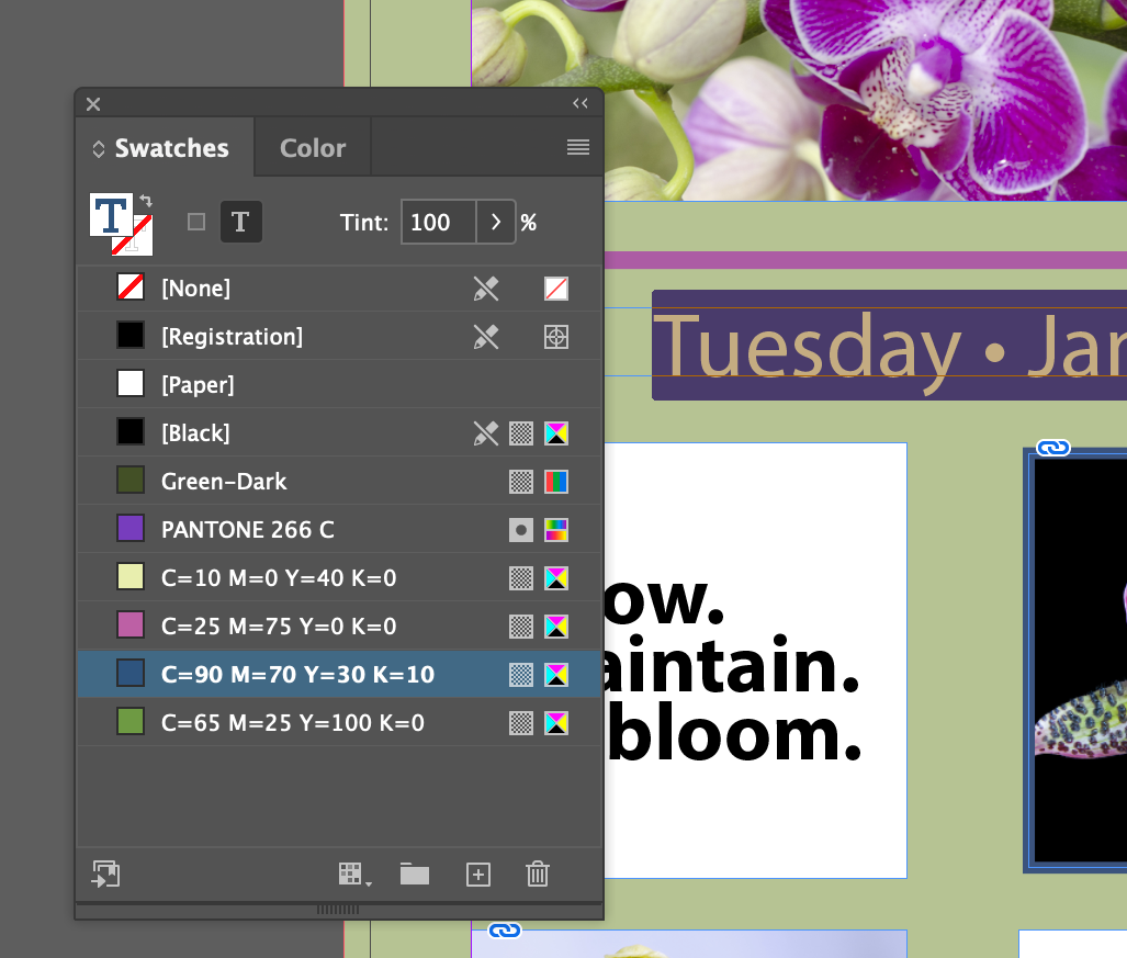
- With the text tool, or by double clicking into the text rect, select the whole line of text
Tuesday • January 8 • 7—10 p.m.
The Text form of the fill in the Swatchs panel should be showing. Set the fill color to C=90 M=70 Y=30 K=10
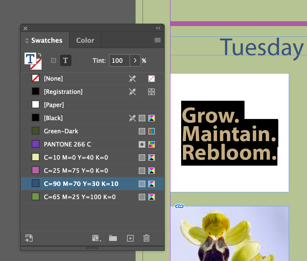
- Select the text
Grow. Maintain. Bloom.
and set its fill color to C=90 M=70 Y=30 K=10
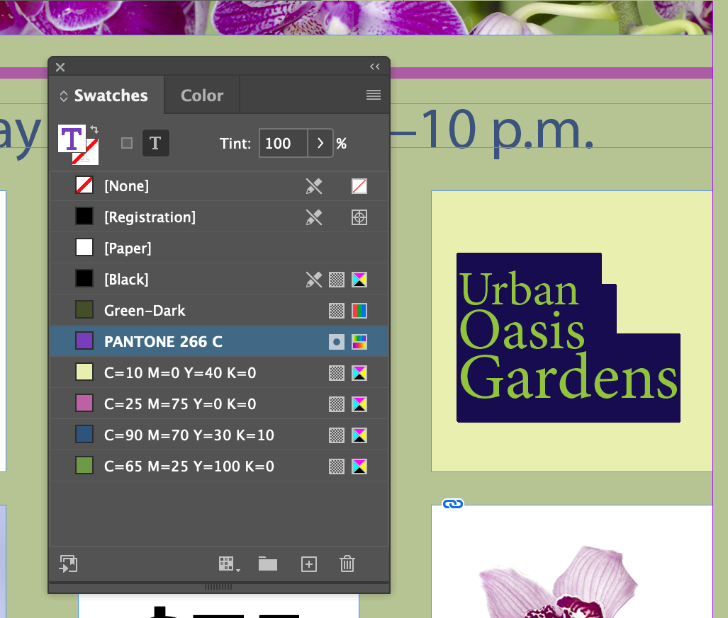
- Select the text
Urban Oasis Gardens
and set its fill color to PANTONE 266 C
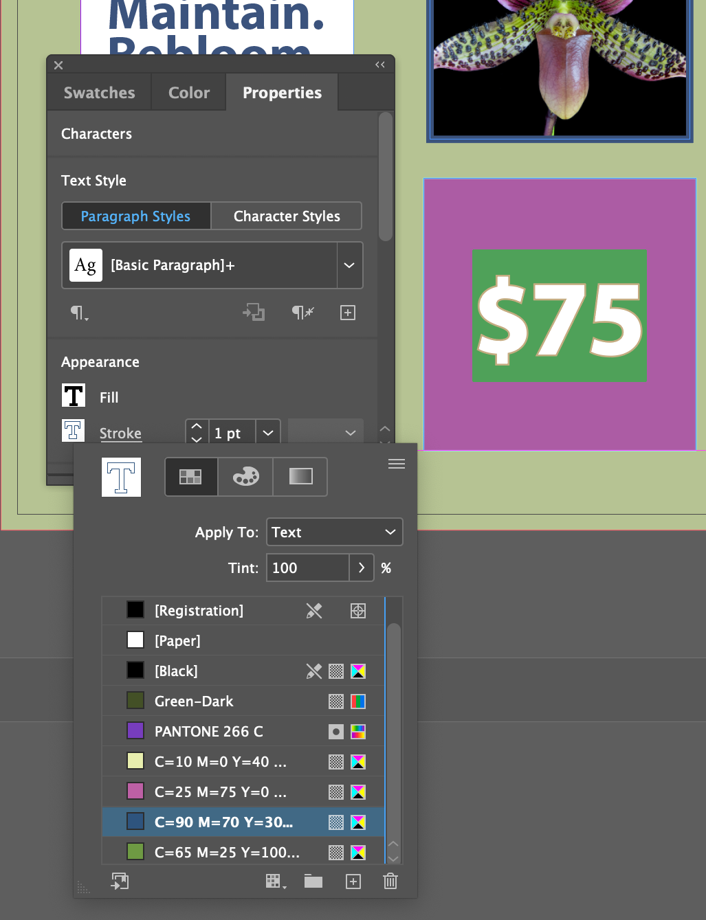
- Using the Properties panel, which also has color set tabs in it, to set
$75
and give it a 1 Point stroke with a stroke color (the other tab) of of C=90 M=70 Y=30 K=10 and a fill color of C=65 M=25 Y=100 K=10 AND also
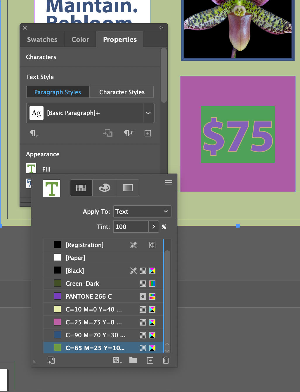
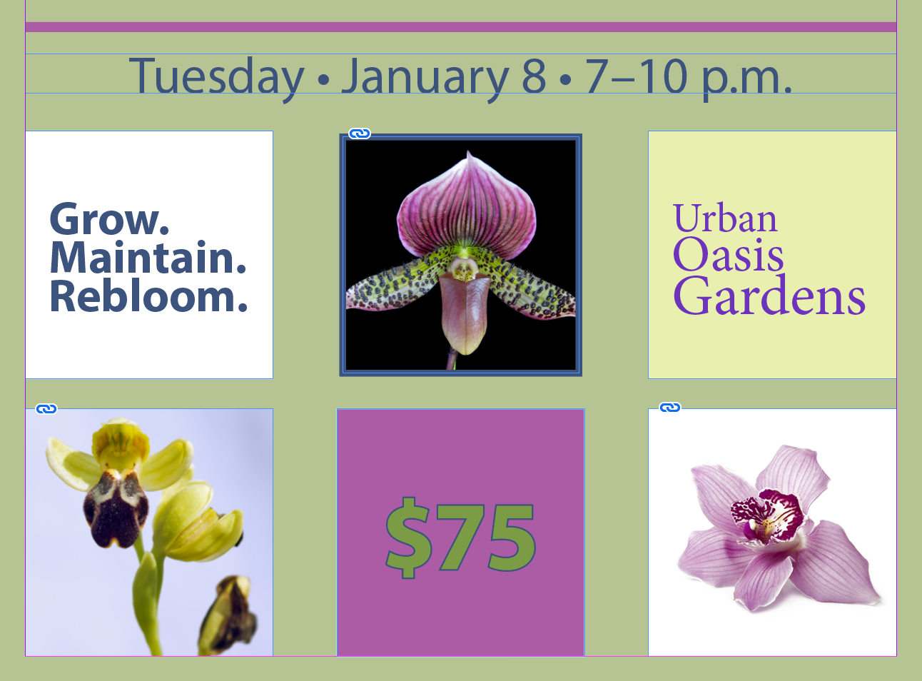
- Should look like this when we're done!
Working With Gradients
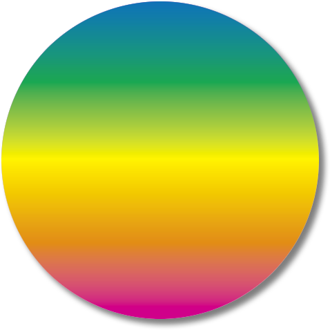
A gradient is a transition from one or more colors to another over a distance. In the case of InDesign, it's a linear change from one color to the next, or a radial (circular) change from one color to the next. Thusly:
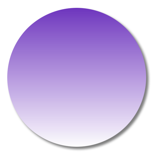
Linear
Gradient

Radial
Gradient
And, a gradient can be between more that just two colors:

A Note of Caution: Gradients are notoriously hard to print. Ask your printer about how well a gradient you used will print with their printing system, or test it yourself if your printing on a laser or inkjet printer. They tend to have a problem with what's called banding,
where gradients show distinct steps between colors instead of smooth transitions.
Creating A Gradient Swatch
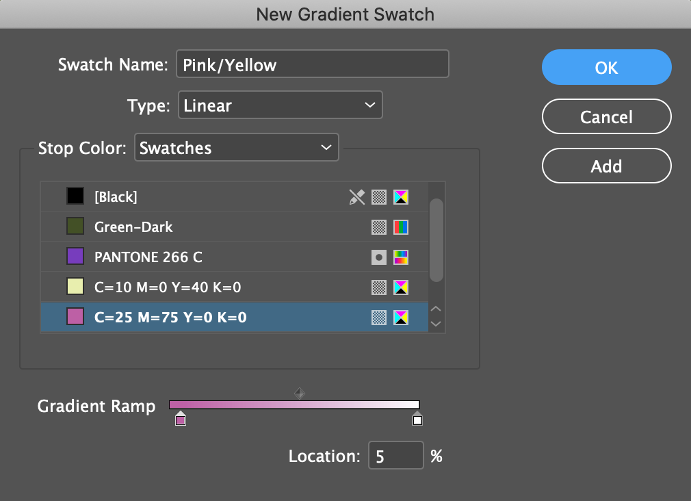
- In the Swatches panel, choose
Flyout Menu New Gradient Swatch...
- Name the Swatch Name: Pink/Yellow
- Click on the little square below the left side of the Gradient Ramp
- If it's not set, choose Stop Color:
- Choose the color C=25 M=75 Y=0 K=0
- Set Location: 5 %
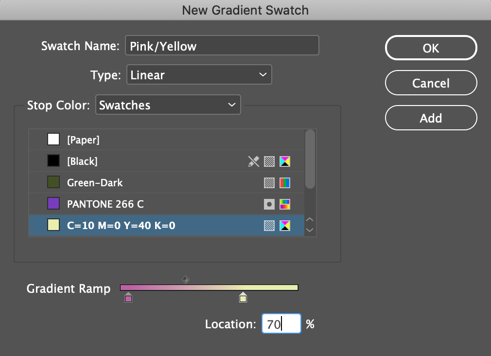
- Click on the other square on the right side of the Gradient Ramp
- Choose the color C=10 M=0 Y=40 K=0
- Set Location: 70 %
Applying A Gradient Swatch
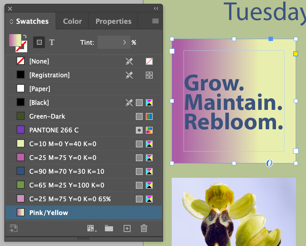
- Select the text frame with
Grow. Maintain. Rebloom.
- Set it to the
Pink/Yellow
gradient we just made tp the text frame
Adjusting the Direction of a Gradient Blend
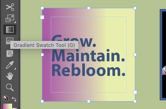
- With the
Grow. Maintain. Rebloom.
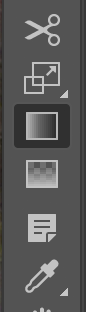
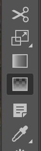
text frame still selected, choose the Gradient Swatch tool or type G
- Make sure to choose the Gradient Swatch tool, and not the very similar looking Gradient Feather tool
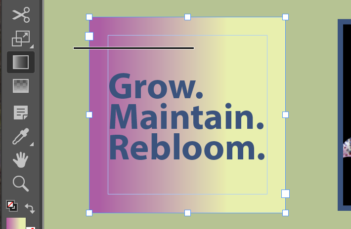
- Click and drag from just outside and to the left of the text frame...
- With the shift key held down to constrain the span
- ...To just past the center
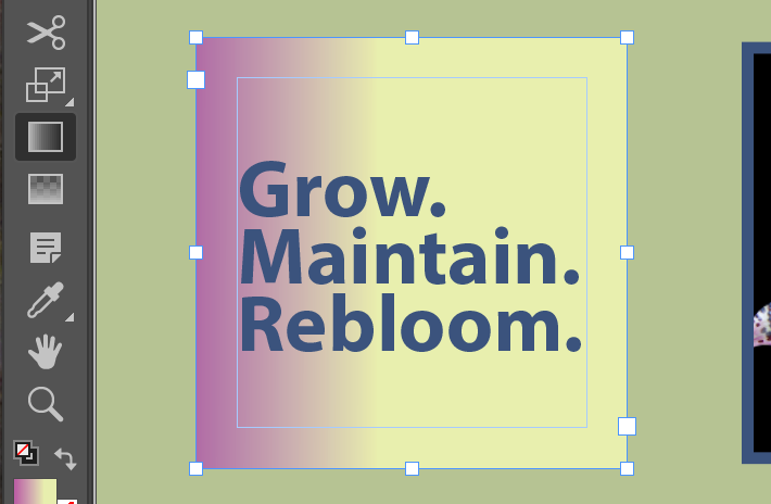
Result. Let's play with this for a while...
Working With Color Groups
Sometime you need to organize. I like being organized.
Adding Colors to a Color Group
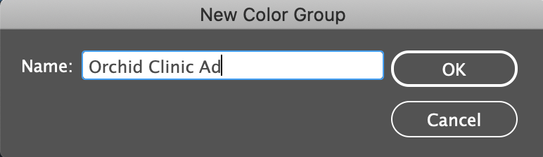
- From the Swatch panel
Flyout Menu New Color Group...
- Name: Orchid Clinic Ad
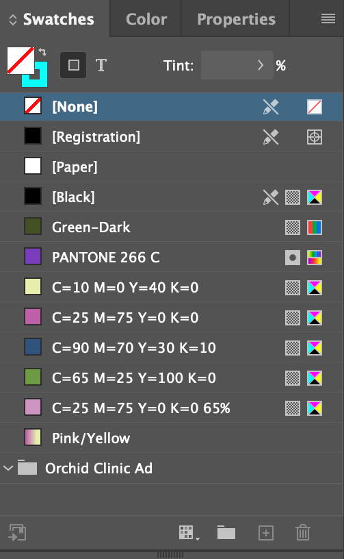
Result
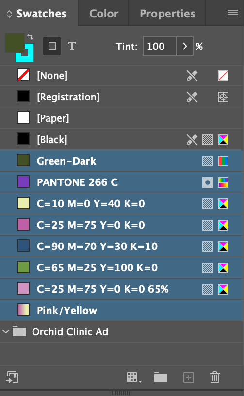
Select all the colors after [Black]

Drag them down into the Orchid Clinic Ad
Group. You'll know when by the line that appears below the folder icon
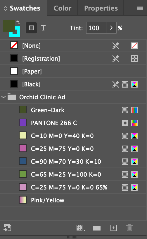
Release. The deed is done...
Previewing the Final Document
So far. Still a bit more to play with with Color Themes...

CHAPTER 8
Review Questions
- What is the advantage of creating colors in the Swatches panel instead of the Color panel?
- What are the three general steps involved in applying a swatch of color?
- What are the pros and cons of using spot colors versus process colors?
- After you create a gradient and apply it to an object, how do you adjust the direction of the gradient blend?
Chapter/Lesson 09: Working With Styles
Lesson 9 Download
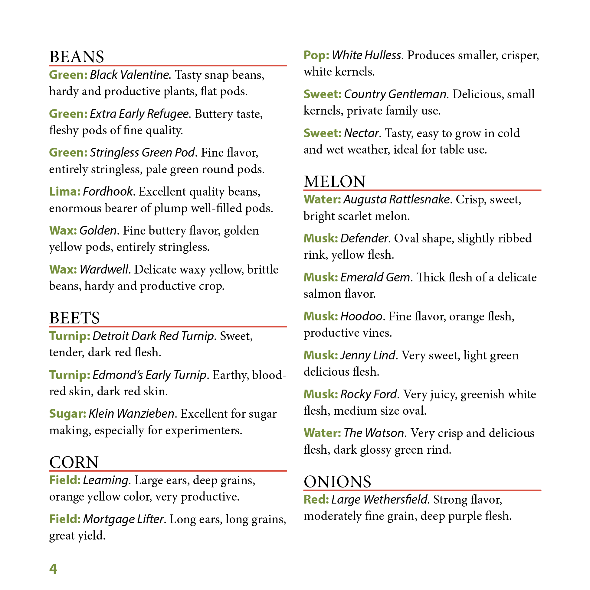

Styles are probably the most important and powerful feature set in InDesign. They are why it is a professional tool. They are not simple, but it's their inate complexity that makes them powerful.
Remember, digital publishing is all about saving time, meeting deadlines, and producing consistant, high-quality designs.
Understanding Styles
Styles store information about the formatting of a category of object that pretty much align with the settings you'll find in a given object's Panel, like:
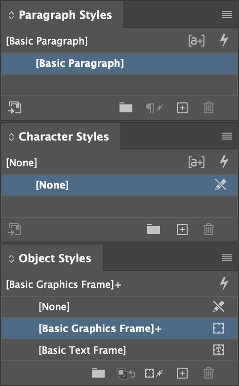
Characters: Fonts, weights, sizes, kerning, leading, tracking, glyphs, etc.
Paragraphs: Alignment, spacing between, indents, character styles, etc.
(Graphic) Objects: Fill, stroke, text-wrap, corners, etc.
Tables & Cells: Horrid drugery and to be avoided at all costs.
Basic Styles
AKA Default Styles. The ones in the Styles panels that are in square brackets, like [Basic Paragraph]. What a given object has applied to it when you don't do any styling of your own. When you apply attributes to an object, like set a word to italic and red, you modify the default style and rename it to create a new style. Whenever you find yourself repeating a formatting task, stop and think about whether it makes sense to modify the relevant basic style or creat a new style.
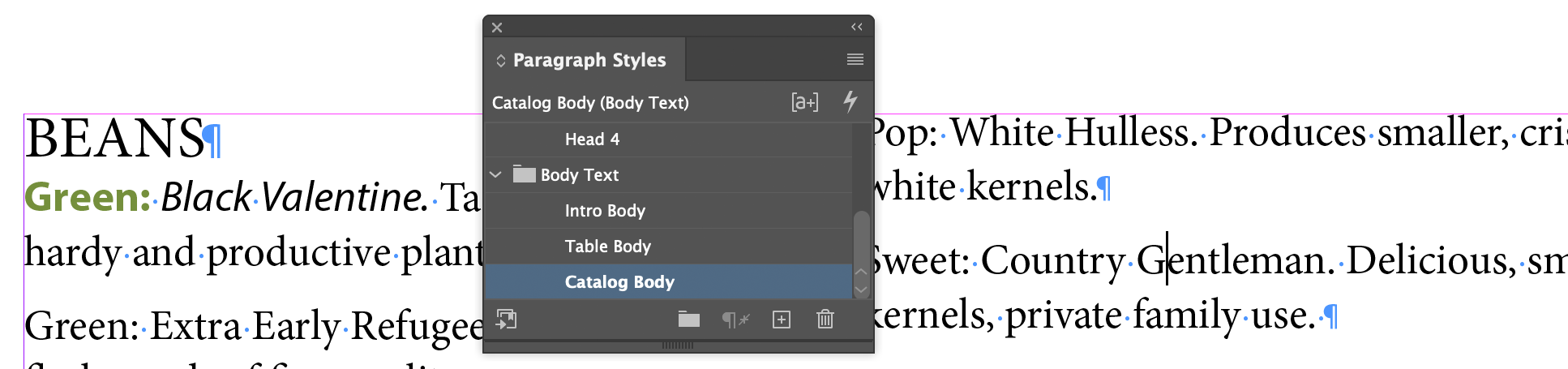
Creating and Applying Paragraph Styles
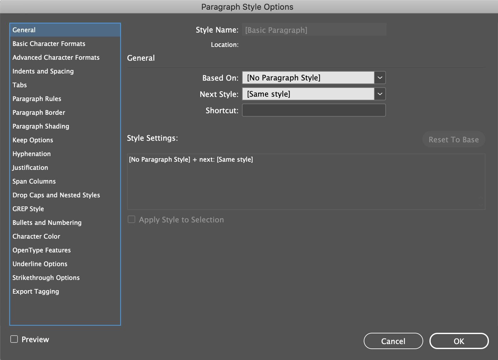
The Paragraph Styles dialog has more than 230 different buttons, checkboxes, and menus in it to set the various parameters of a paragraph style. From as simple as Indent Spacing, to as complex and precise as the HTML tag format for the style when it gets output for the Web.
Creating A Paragraph Style
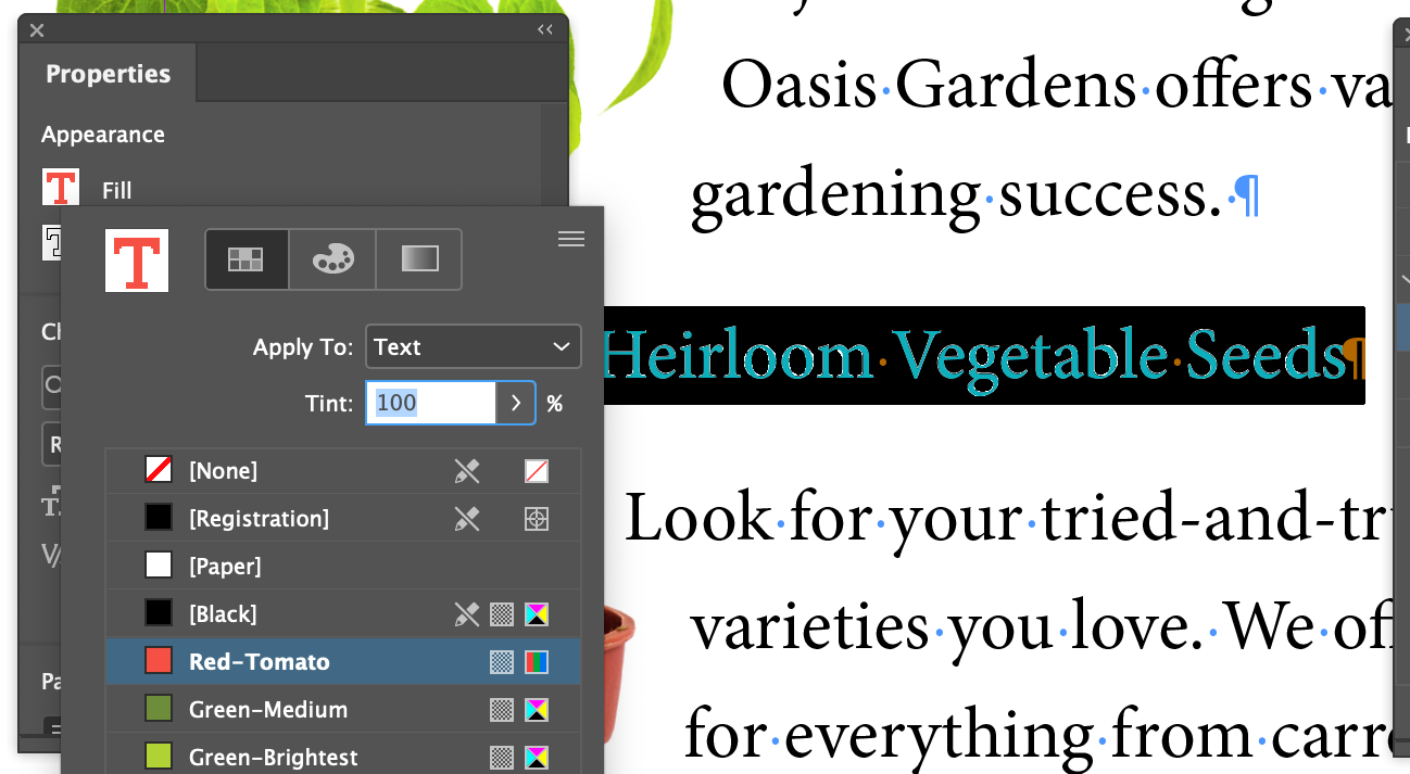
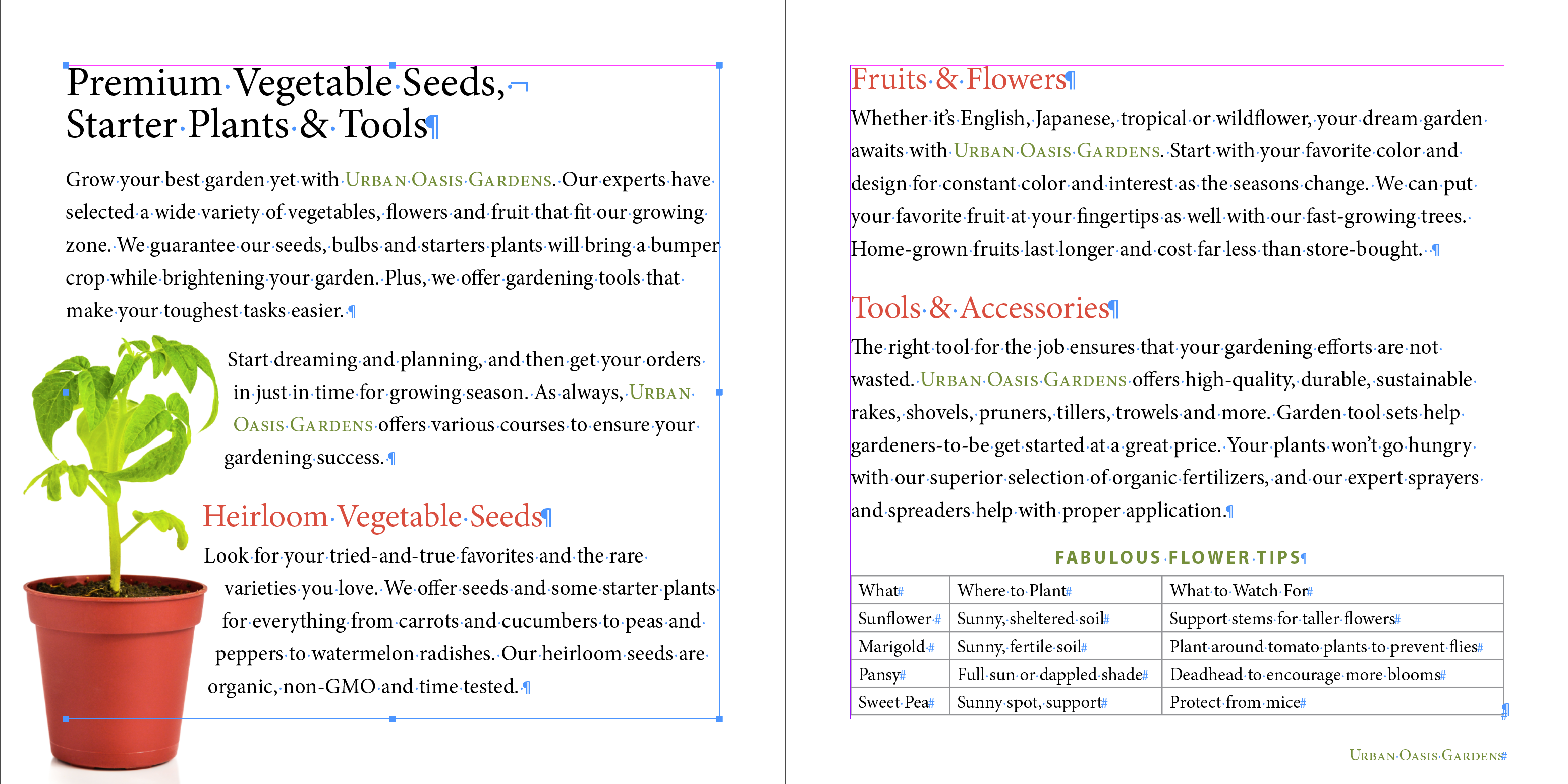
- Focus on the heading on page 2
Heirloom Vegetable Seed
and select the whole line (out to the paragraph mark)
- Open the Properies panel and scroll (but not with the scroll wheel!) to the Appearance section
- Set the fill of the text to
Red-Tomato
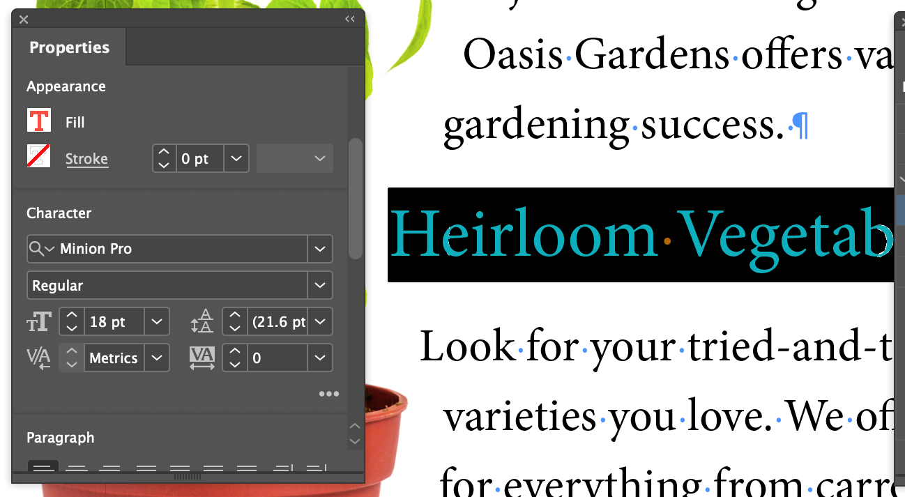
- Move down in the panel to the Character section and set the font size to 18pt on Auto leading (something they left out in the book)
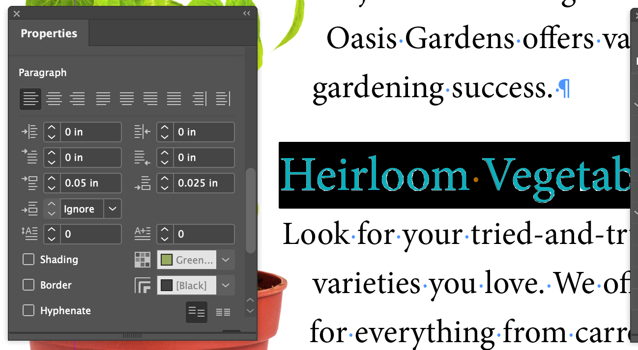
- Move down in the panel to the Paragraph section and expand it with the little dot-dot-dot button

- Set the Above Paragraph Spacing to .05in and the Below Paragraph Spacing to .025in
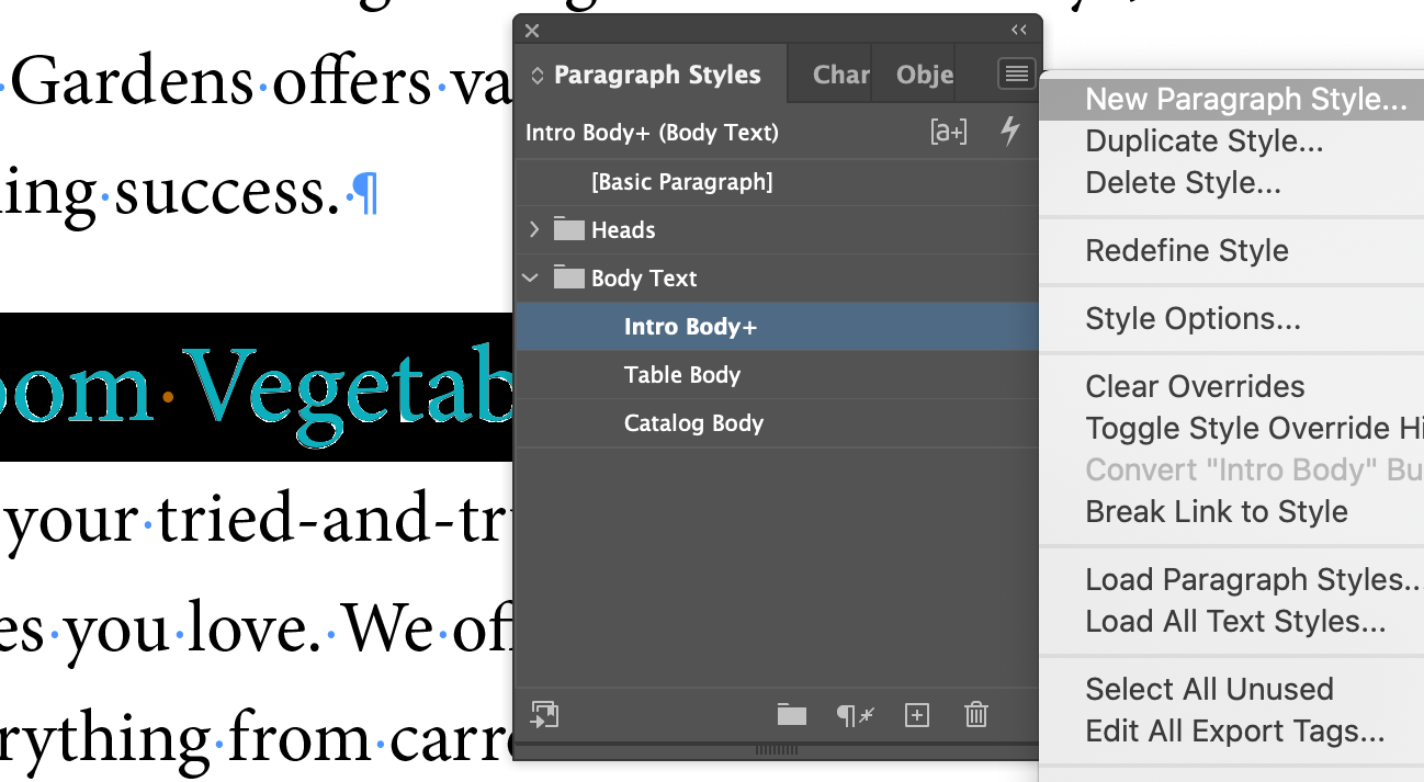
- In the Paragraph Styles panel, use the flyout menu to choose New Paragraph Style...
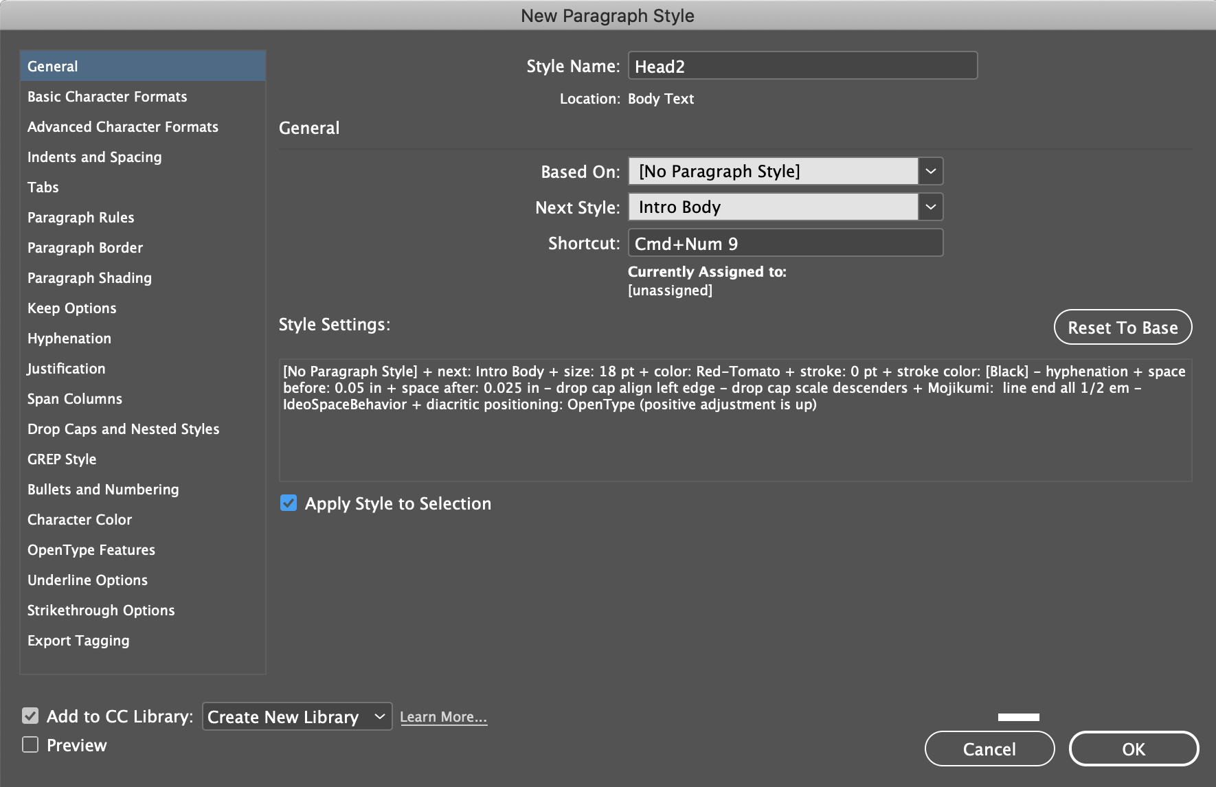
- Set as shown above
Style Name: Head2
Based On: [No Paragraph Style]
Change from the default, which was Intro Body Style, because it isn't actually based on that, it was changed from that into a Headline style, which shouldn't be related.
Next Style: Intro Body
Changed from default [Same Style] to Intro Body because it's highly likely that you won't have another Heading style, but you likely will have a block of body copy, or in this case, Intro Body, coming up next.
- And lastly, set up a keyboard shortcut, check off the
Apply Style to Selection
and Add to CC Library
options and hit OK
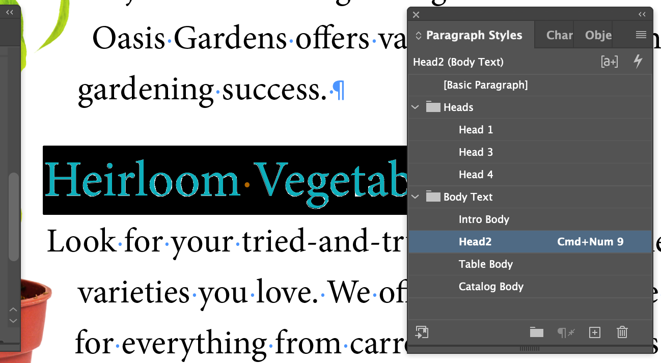
This creates a new style called Head2
in the Paragraph Styles panel.
- Open the
Heads
folder in the panel and drag the new style up into the folder
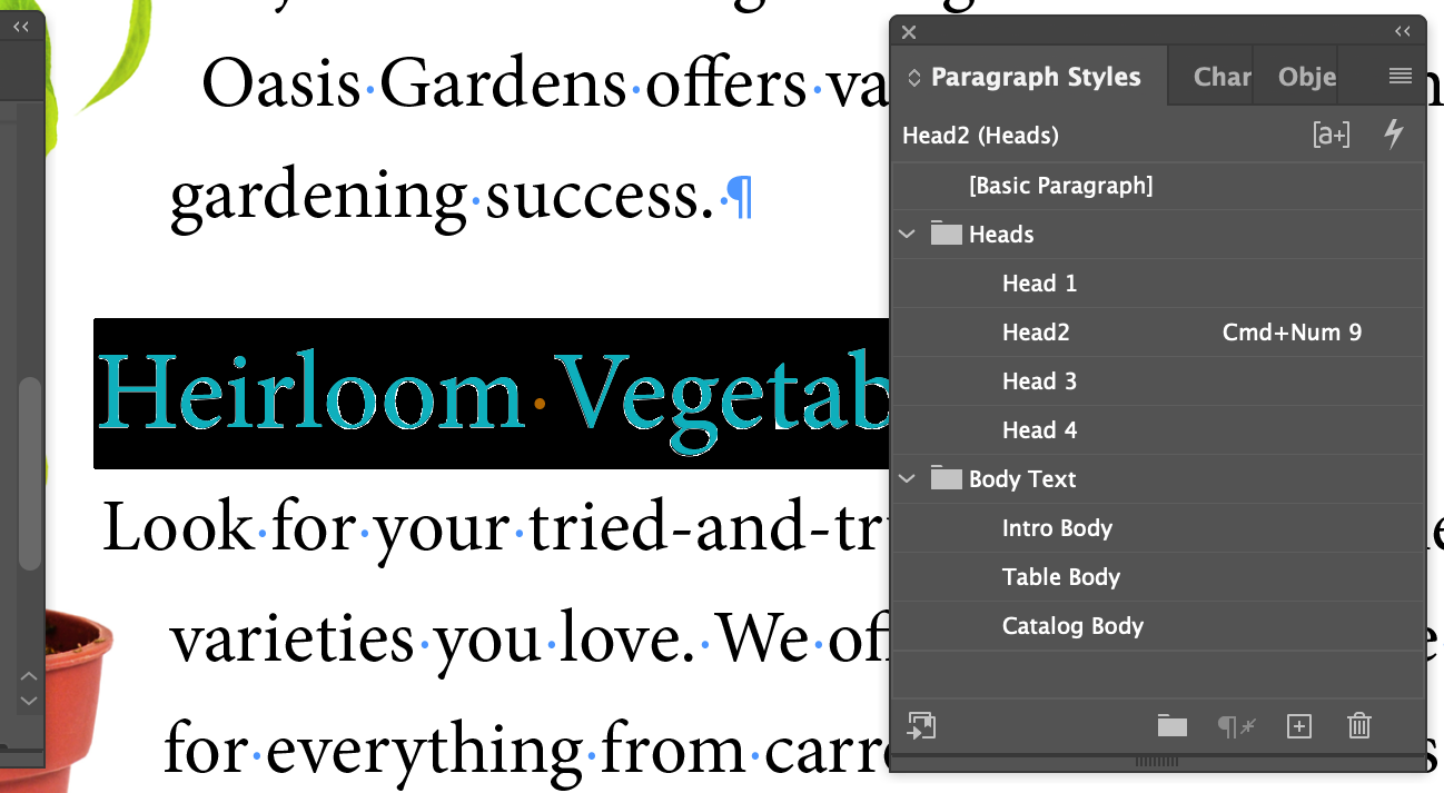
Result
Applying A Paragraph Style
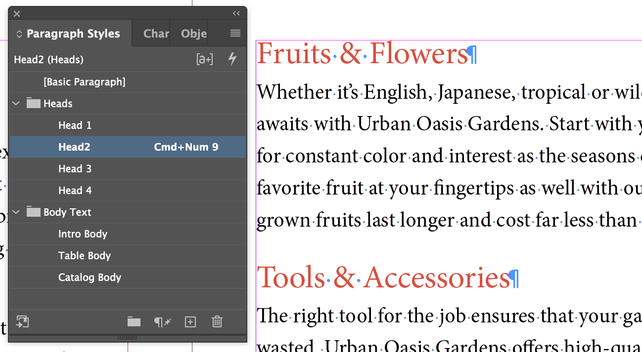
- Focus on page 3 and click anywhere in
Fruits & Flowers
and click on the Head2 style in the Styles panel
- Then do the same with
Tools & Accessories
Creating And Applying Character Styles
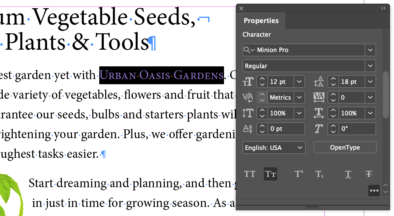
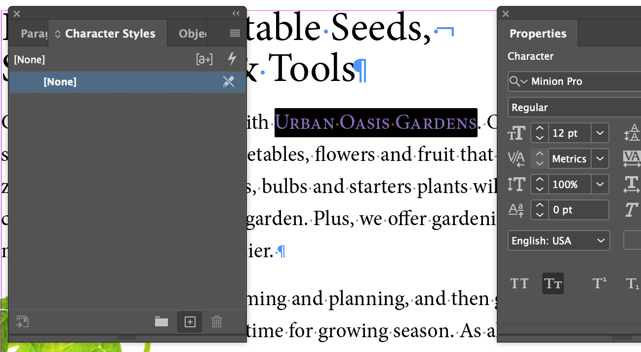
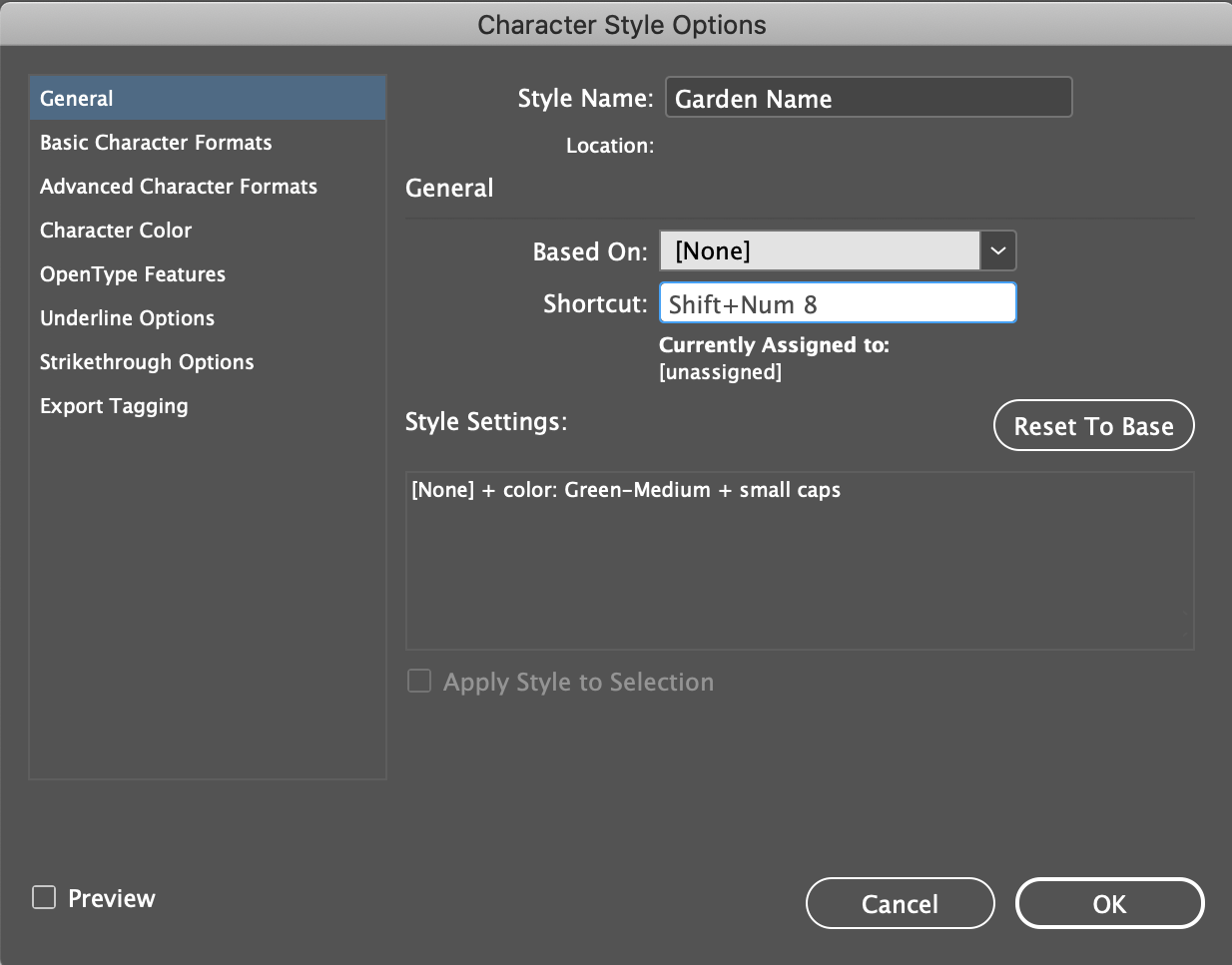
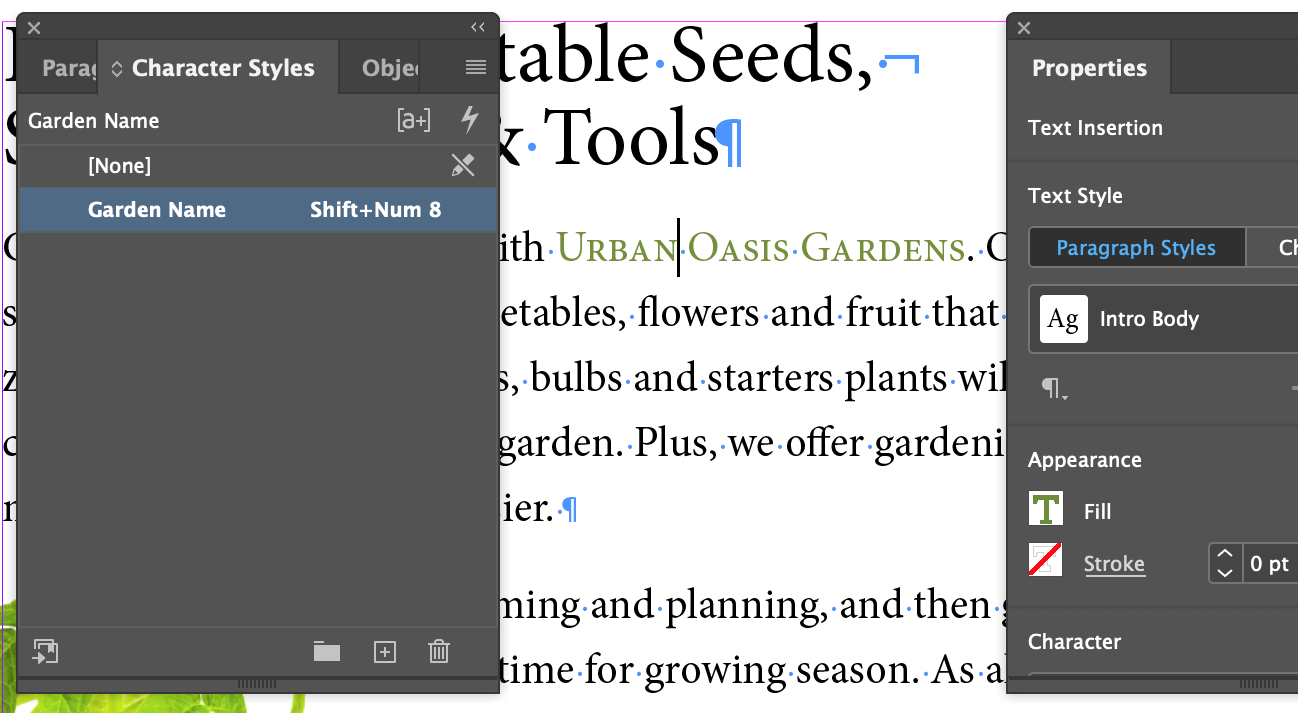
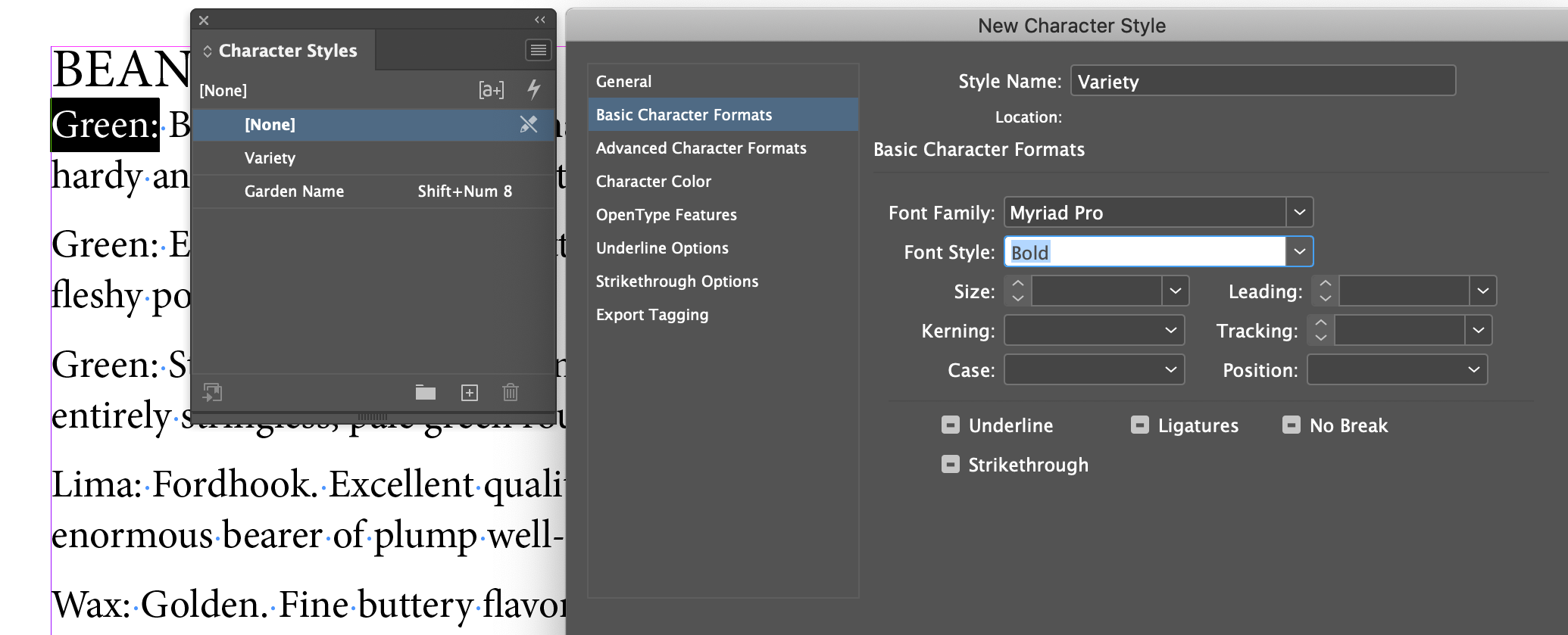
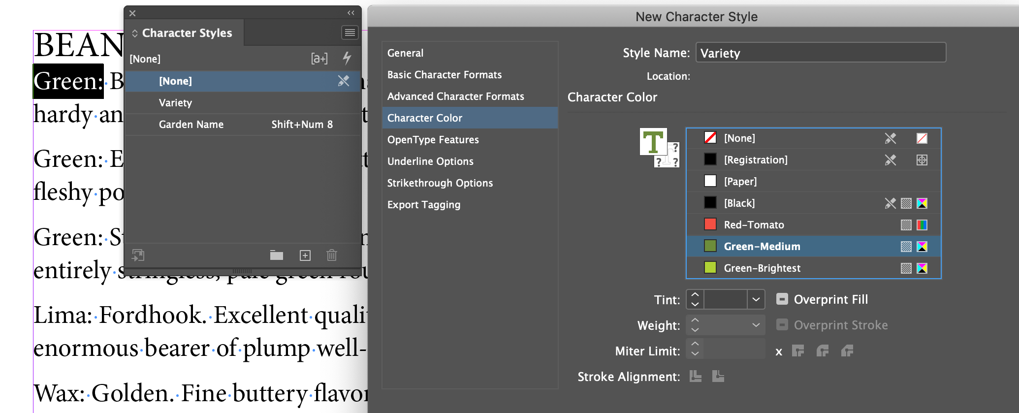
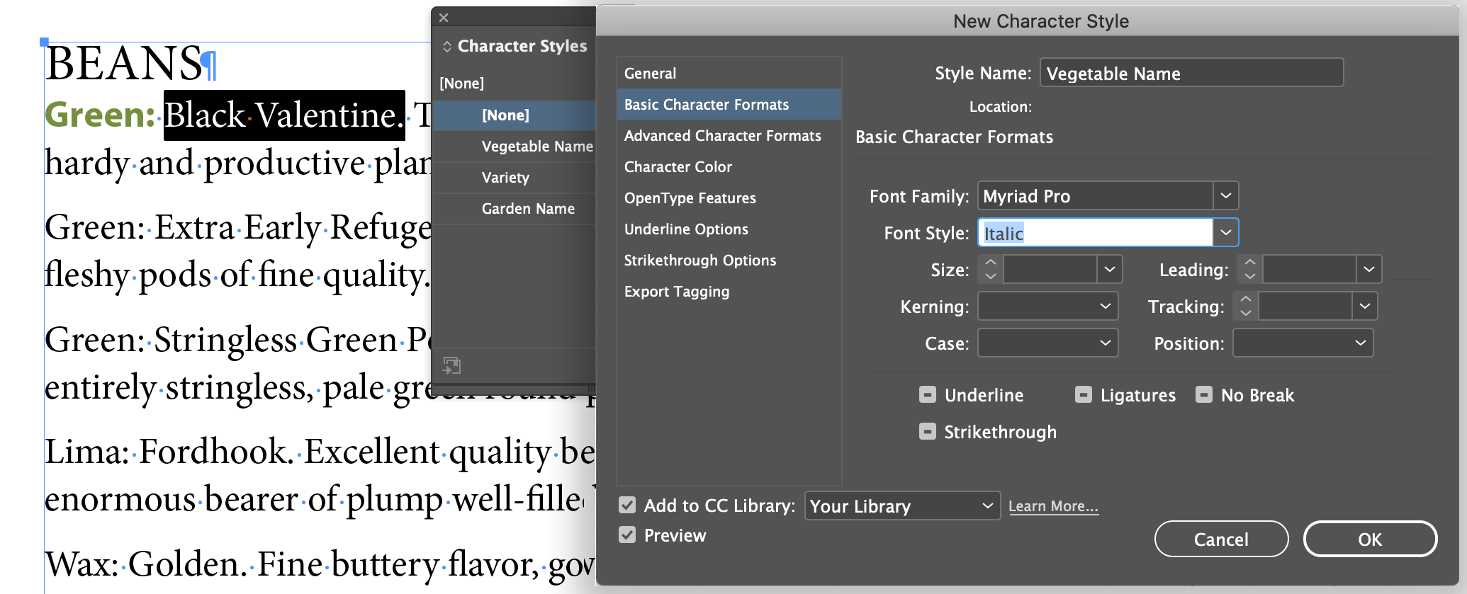
The big concept with Character Styles as opposed to Paragraph styles, is that a Paragraph Style will apply to the entire paragraph that the text cursor is positioned within, you don't have to select the whole paragraph to apply it. Character Styles will only apply to the set of characters you have selected (and shows as inverted in the UI).
Creating a Character Style
Applying a Character Style
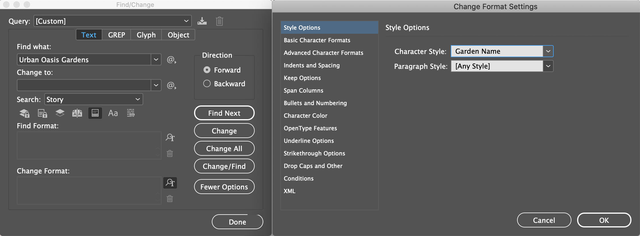
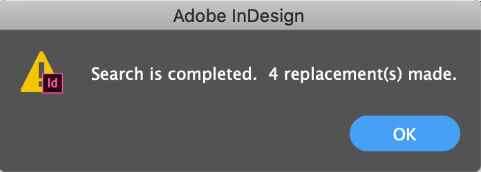
It's really just a matter of selecting a block of characters and clicking on the Character style you want in the Character Style panel. However, since we're styling the name of the company wherever it is in the we could use the Find/Change feature in InDesign (even though there are only three other instances of the name - it could be a big document with dozens of repitition of the name).
Apply Styles with Quick Apply
In a production environment, speed and efficiency are everything. Use Command-Return/Ctrl+Enter to invoke a popup menu of styles (of all applicable types) and start typing the name of the style. As soon as the one you want is at the top of the list, hit Return/Enter to apply it.
Creating and Applying Table and Cell Style
Ugh. Rarely used and damned confusing. Something that if we learn it now, it will be so long until we have to use it again, that we'll never remember how it works, at least I cant. I just review the help docs or our textbook when it comes up. Let's pass it by...
Globally Updating Styles
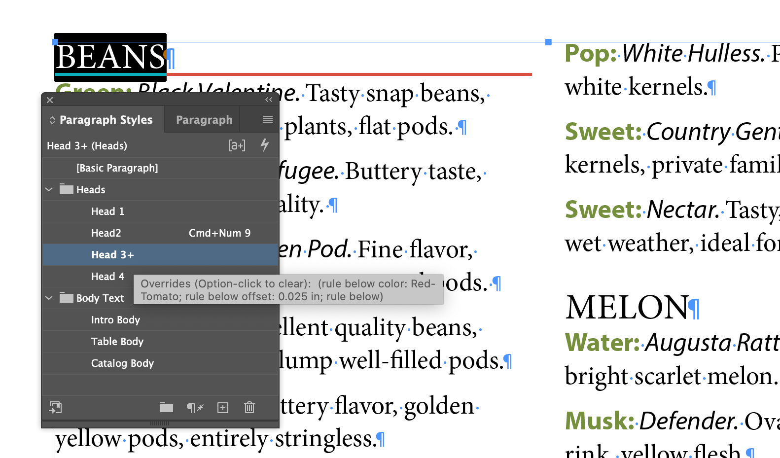
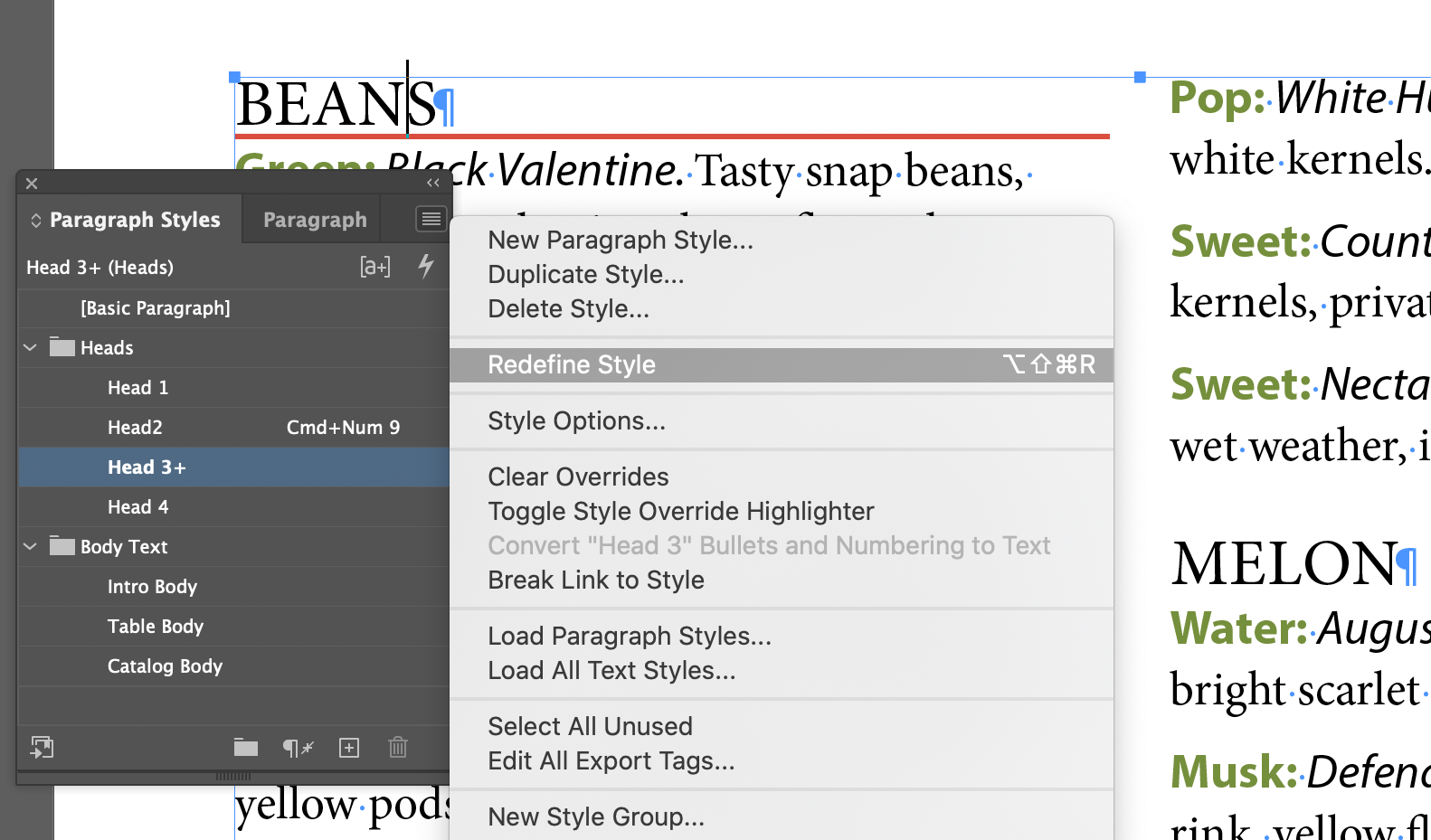
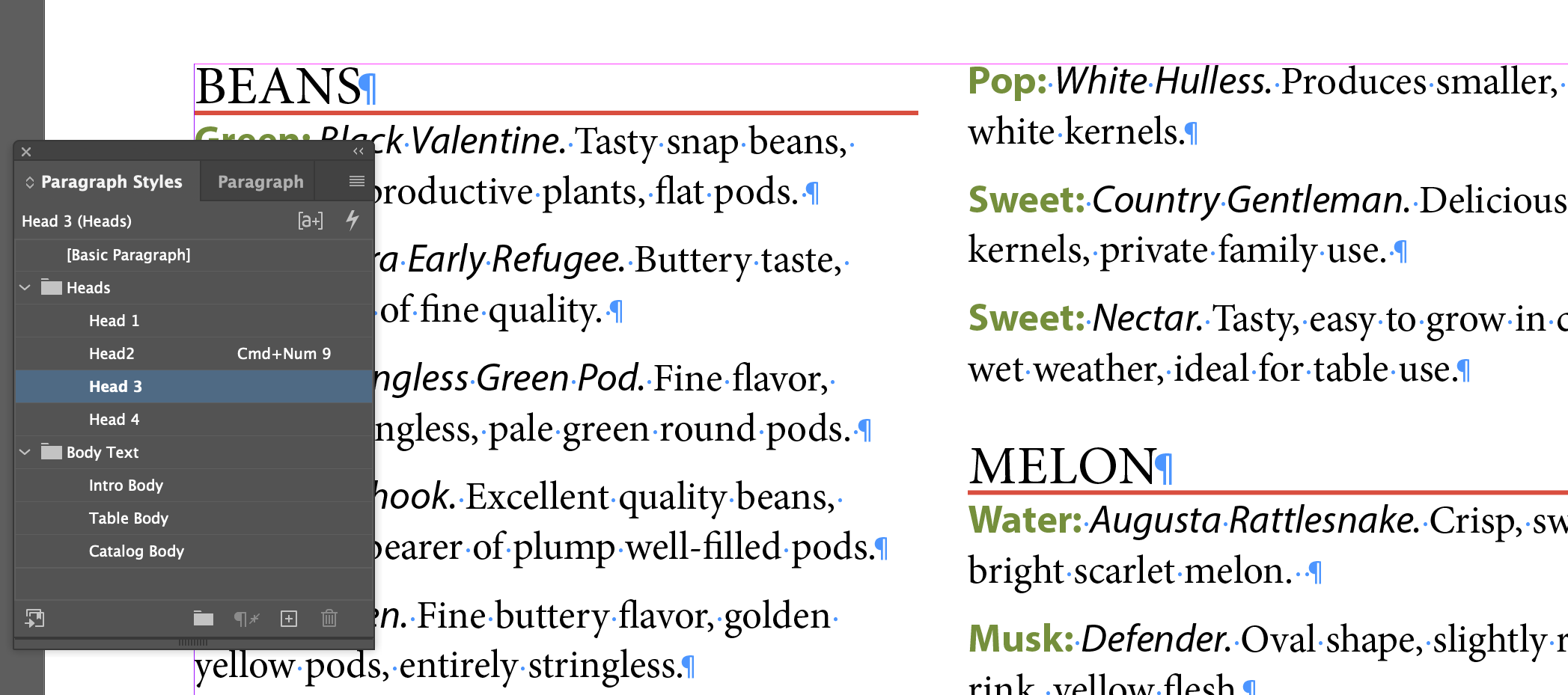
This is actually really important. Every time you format something, it will effect the style of that thing. A little plus mark [+] will appear next to the style in the Style panel. Paragraphs have a default [Basic Paragraph] style applied to them, so if you do any paragraph formatting, it will show [Basic Paragraph] +. It's a good sign that you should probably make a new style to handle the modified styling.
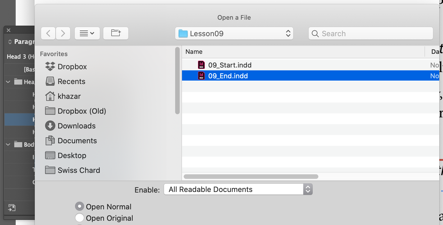
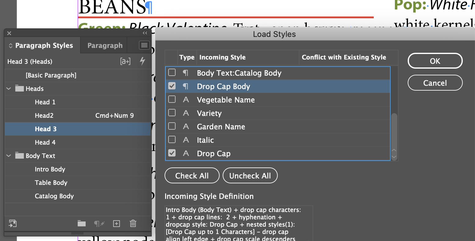
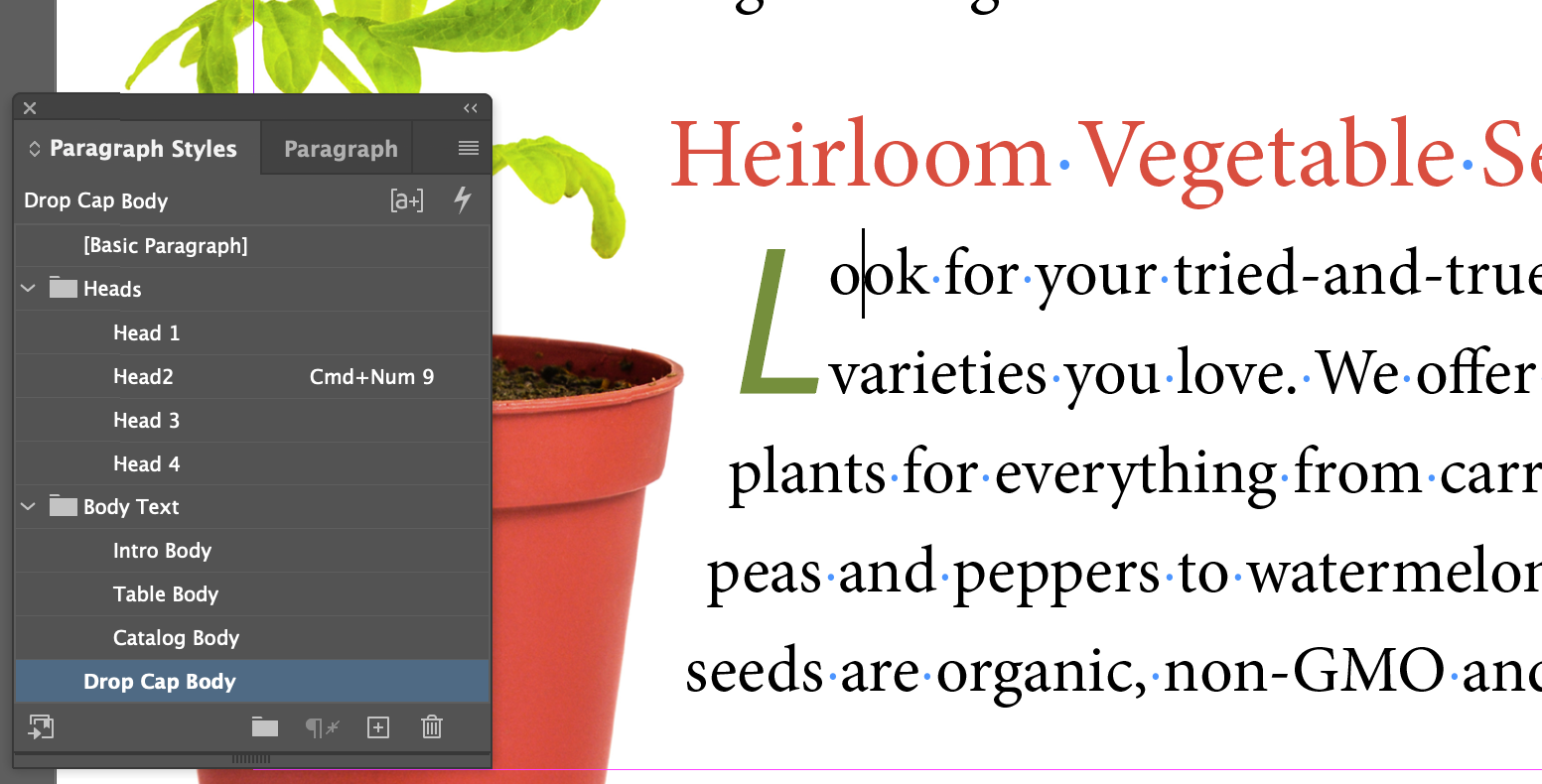
Loading Styles From Another Document
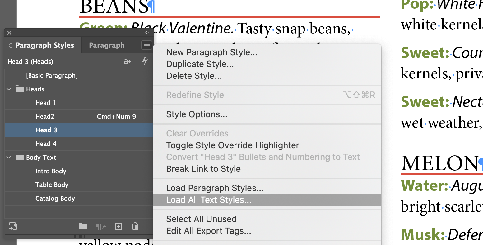
You can load styles from another document, and even select which styles you load, without actually openingthe other document.
Review Questions
- How can using object styles speed up your workflow?
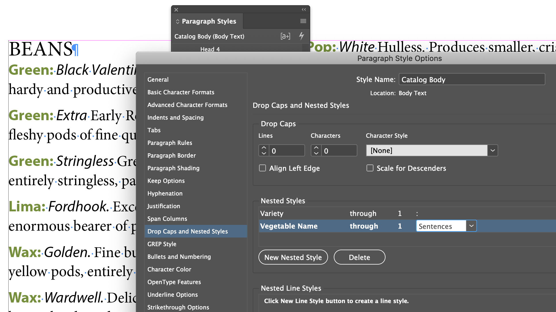
- What must you have created previously in order to create a nested style?
- What are the two ways to globally update a style you’ve applied in an InDesign document?
- How would you import styles from another InDesign document?

 or C=90 M=50 Y=50 K=0
  or Black
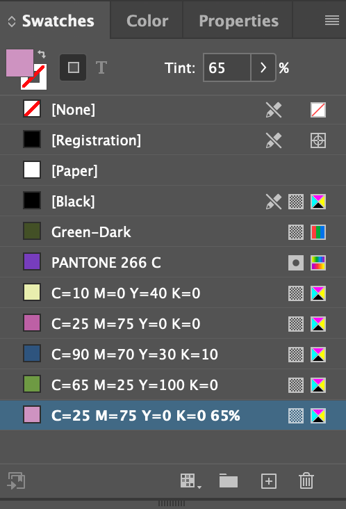
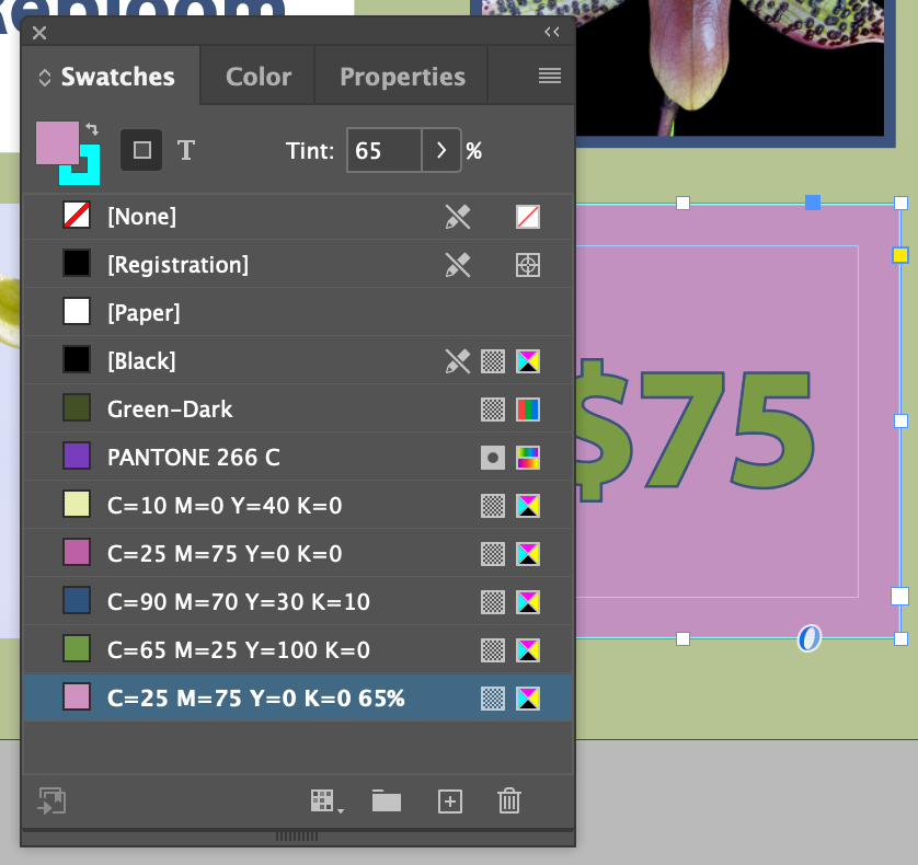
  can be expressed as a tint of itself.