Class 09
Review Master/Parent Pages
Chapter/Lesson 3
Lesson03.zip
Master/Parent Pages vs Pages
- Master/Parent Pages are one of InDesign's most powerful and useful features.
- They are essentially templates for page layouts
- A well designed Master/Parent Page and cut development time by orders of magnitude
- Pages are often generated from Master/Parent Pages, but Pages never generate Master/Parent Pages
- Any content added to a Master/Parent Page will automatically be added to any Page that uses the Master/Parent Page
- You apply a Master/Parent Page to a Page by clicking on the Master/Parent Page icon and dragging it to a Page in the Page Panel
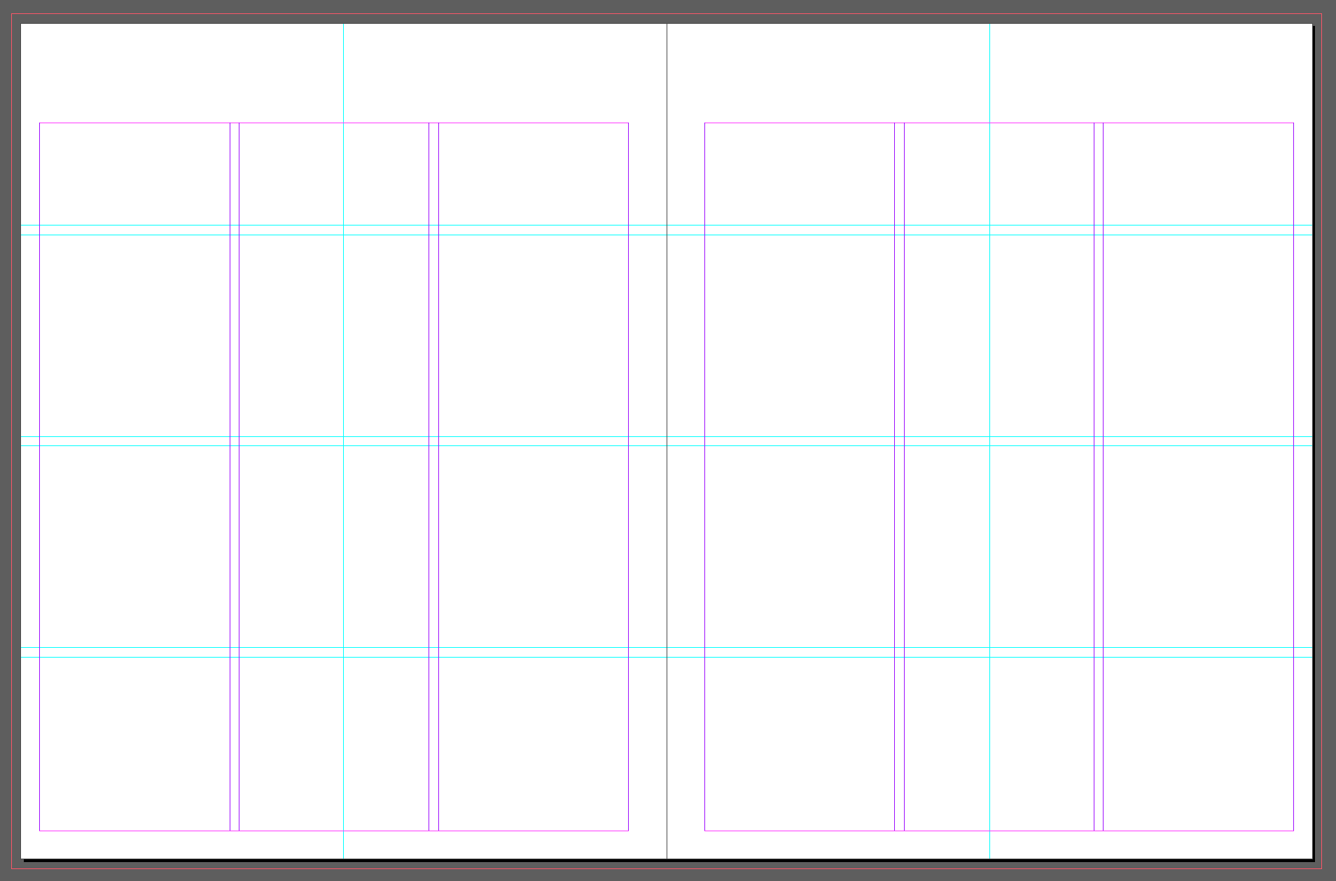
Adding guides to the Master/Parent Page
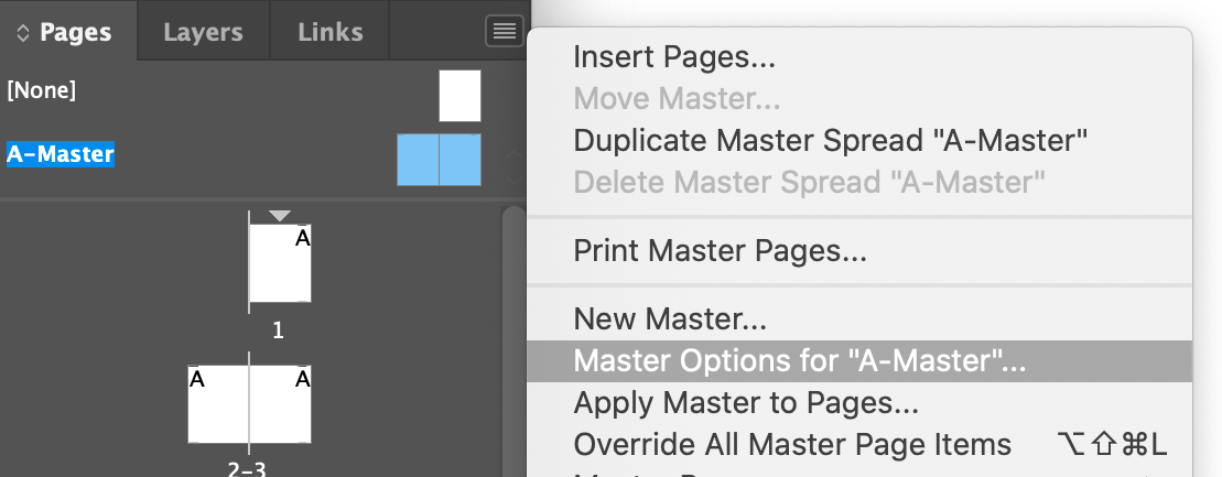
- Double click on the A-Master/Parent Page in the Pages Panel. This will set the document window to the Master/Parent Page.
- Menu > Layout > Create Guides
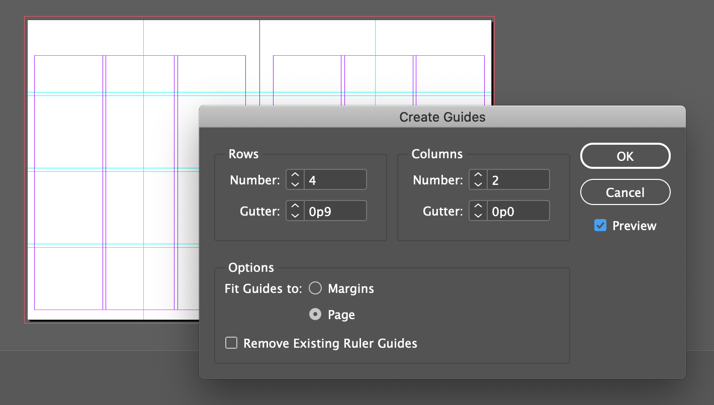
Rows
Number: 4
Gutter: 0.125 in or 0p9
Columns
Number: 2
Gutter: 0 in
Preview
Options
Fit Guide to: Page •
Dragging Guides from rulers
- With Control/Command key held down, drag from ruler to .375 in (2p3)
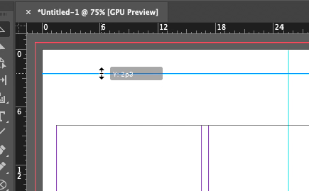
If you don't hold down command/control then the guide will only be on one of the two pages. If you hold down the shift key while you drag, the guide will snap to 1/8 increments, making it easy to hit .5 inches.
- Tweak it if necessary with the Y input box in the control panel.
- Also add two vertical guides @ .5in (3p0) and 16.5in (99p0)
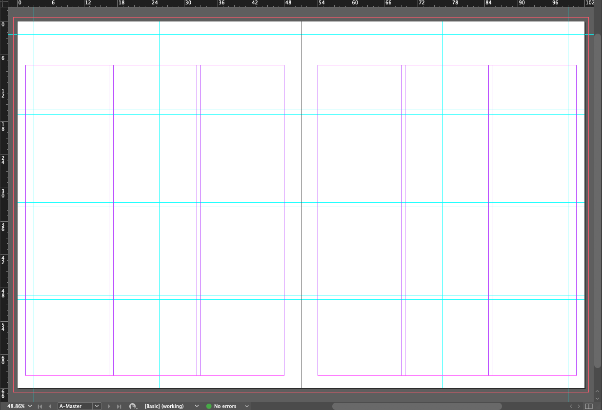
Also tweak with the X input box in the control panel if necessary
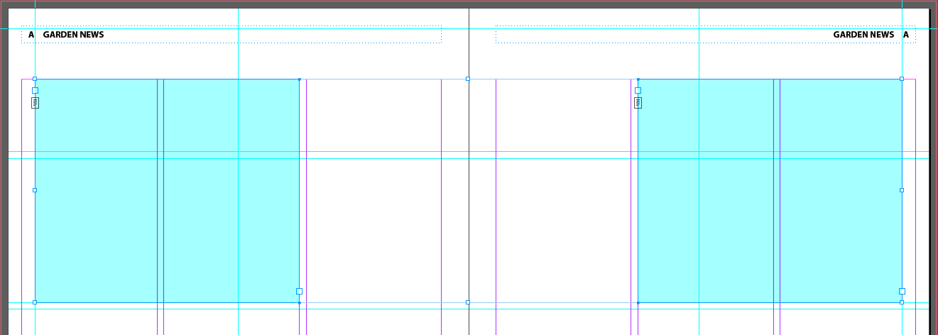
Creating a text frame on the Master/Parent Page
- With the Text tool (T), add a text frame to the left (verso) page
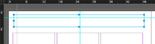
A long standing tradition names the right and left pages of a spread with latin “recto” and “ verso.” It goes back to medieval times when monks in monasteries penned bibles by hand.
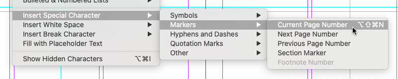
- Menu > Type > Insert Special Character > Markers > Current Page Number
- Right-click and choose > Type > Insert White Space> Em Space
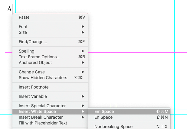
“Em Space” and “En Space” comes from the metal slug spacers used in hand-set typography. They are theoretically the width of the letters “M” and “N” in that particular font at that particular size. In actuality, an Em space is the same width as the font size, so a 72 point font will have an Em space that's 72 points wide. An En space is half the width of an Em space, 36pt.
- Type "Garden News"
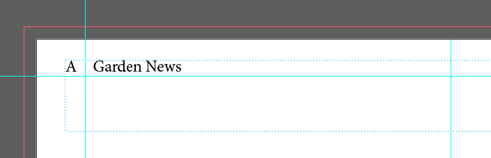
- While you still have the Text tool, hit the escape key, then select the Text tool again. This will set the current text frame to being active.
- Then choose Myriad Pro for the font, Bold for the style, and use Menu > Type > Change Cast > UPPERCASE.
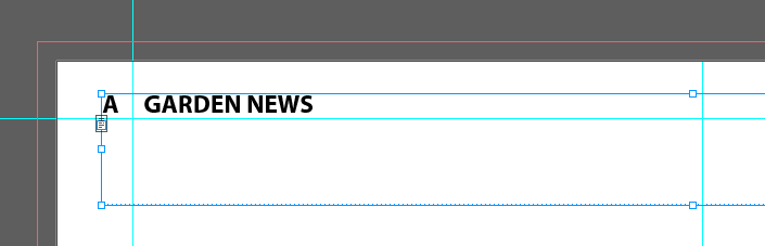
- Then choose Menu > Object > Text Frame Options
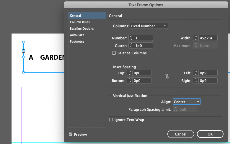
Inset Spacing
(Turn off link)
Left: 0p9 (.125in)
Right 0p9 (.125in)
Vertical Justification
Align: Center
- Select the Text Frame with the Selection Tool (V)
- Go to the positioning controls in the Control Panel

Control point set to Center-Left
X: 0.25
Y: 0.625
W: 7.75
H: 0.3125
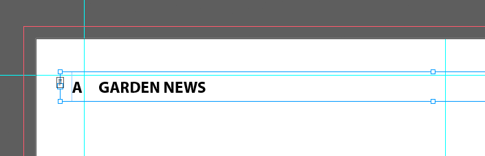
- Hold down the Option/Alt key, then click on the header text frame, then hold down the shift key, and drag the text frame to the right A-Master/Parent Page. This should make a copy of the original and move straight/parallel to the orignal. The sequence of holding/shifting/dragging matters.


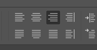
Set the Paragraph alignment to Right Aligned in the Control Panel

- Switch the word order so the page number and em space are at the right edge

This is not the way I would do it. What happens when you have a two digit page number? The heading "GARDEN NEWS" will move, when it should stay in the same place. I'd use tabs to keep the page number and heading in consistent positions, but we haven't gotten into tabs yet, so maybe later.
Next, let's add a footer by drag-duplicating the header down to the bottom. Weird, but that's what the book wants us to do.
SEQUENCE MATTERS
- Switch to Selection Tool (V)
- Click-release on left text frame
- Shift-Click-release on right text frame (this selects both text frames)
- Option-Click-hold on the selected frames
- Hold down the shift key and drag the frames to the bottom
- Let the frames snap to the center of the bottom margin guide
- Release
 With the Select tool set the vertical alignment to Bottom in the Control Panel
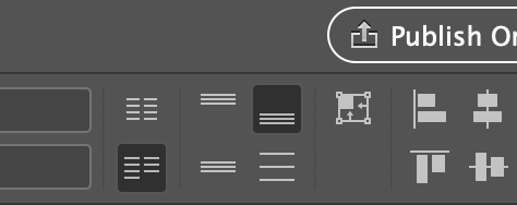
 Set the font to Myriad Pro, Regular, 10pt, and use Menu > Type > Change Cast > Title Case
 Then change the text from
 Garden News
to Urban Garden Oasis

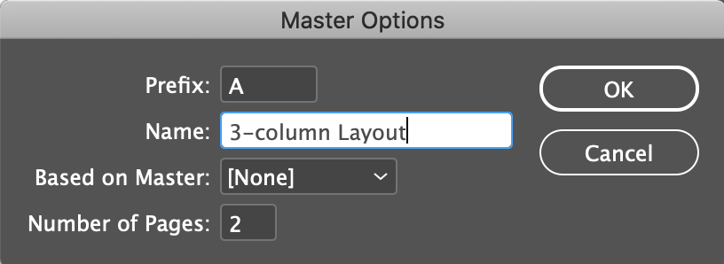
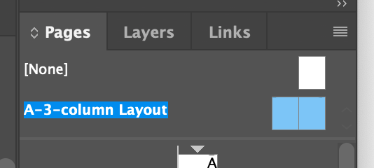
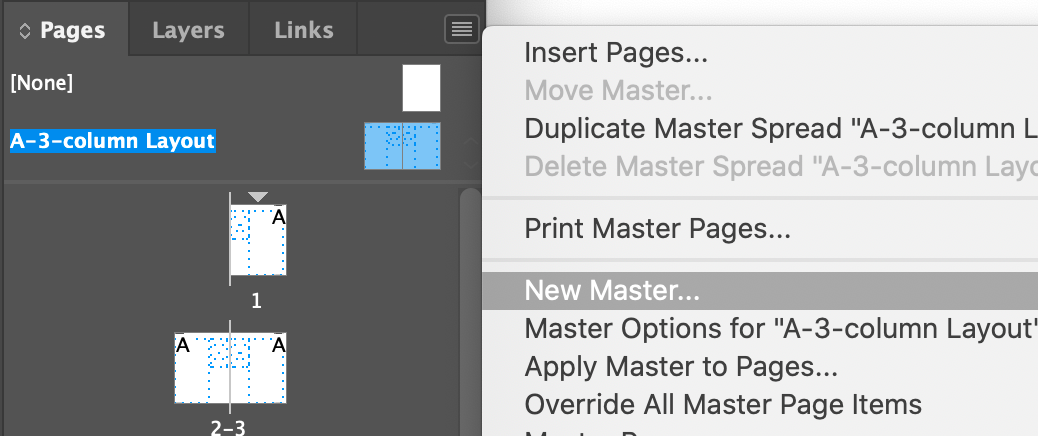
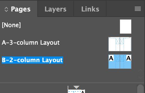
Renaming the Master/Parent Page
Good labeling is a really useful skill. It will save you time later on when the inevitable changes come in at the last minute. And it's just a Best Practice*
technique.
* A best practice is a method or technique that has been generally accepted as superior to any alternatives because it produces results that are superior to those achieved by other means or because it has become a standard way of doing things
Adding Placeholder Frames for Text
Adding placeholder frames for graphics
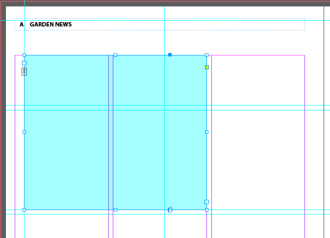
- Select the Rectangle Frame tool (F)
- Draw a rect at the top of the first column in the right page down to the guide. Ends up the height of the rect at 4.125 in.
- Make another one in column three of the left page
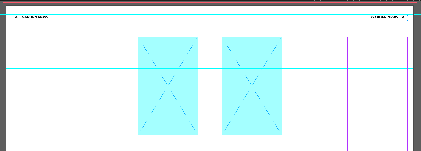
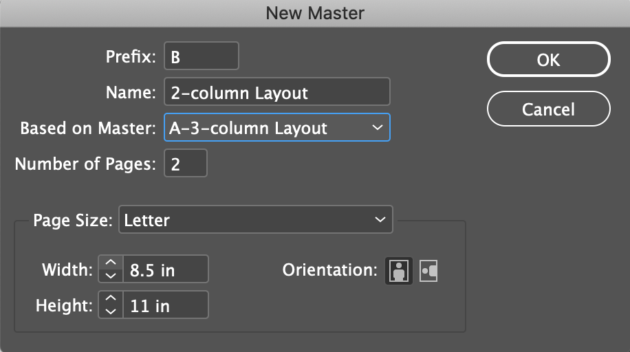
Creating an additional Master/Parent Page
You can create multiple Master/Parent Pages within a document (in fact, that's kind of the whole point to a Master/Parent Page). You can build them independently or base one Master/Parent Page on another Master/Parent Page. If you base a Master/Parent Page on another master, it's called a parent/child relationship, with the first Master/Parent Page as the parent and the subsequent Master/Parent Page the child. Any change made to the parent master is automatically applied to the child master.
Overriding Master Items
The document pages that will use the two-column layout do not require placeholder frame, which means that only the footer text frames and ruler guides from the A parent Master/Parent Page are needed. Overriding a Master Frame object requires a special UI gesture to unlock it.
- The magic gesture: Shift-Control/Command-Click
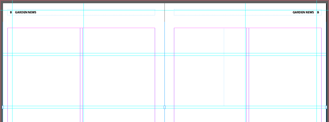
- Select and delete the two graphics frames and two text frames. Keep the footer and header frames
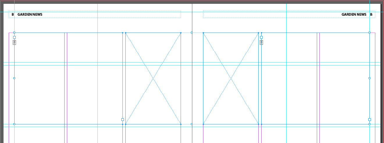
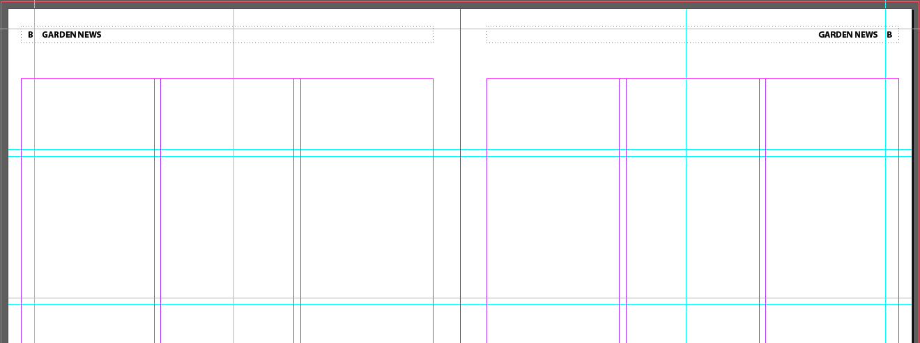
- And don't forget this tiny little detail: Menu > Layout > Margins and Columns to set the B Master to two instead of 3 columns
Modifying a Parent Master
We'll add some stuff to the header of A-3-column Layout and see what it does to B-2-column Layout. We'll also take advantage of InDesign's snippets, which allow you to create a group of objects that can be quickly imported to several masters or documents
- Go to A-3-column Layout
- Menu > File > Place...
- Choose HeaderSpippet.idms in the Links folder
- Line it up with the upper left corner of the document bleed lines and click and release


- Check out the B-2-column Layout Master/Parent Page!

- Go back to A Master and change the color of the left page's blue rect to
Green-Brighest
from the Swatches panel

- And note the change in B Master

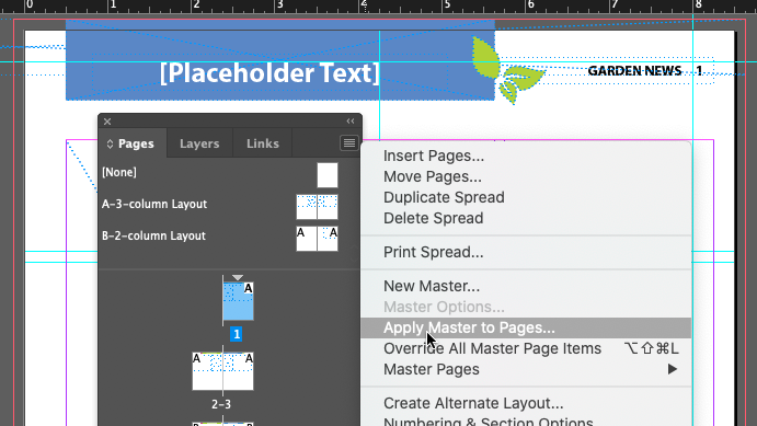
Applying Master/Parent Pages To Document Pages
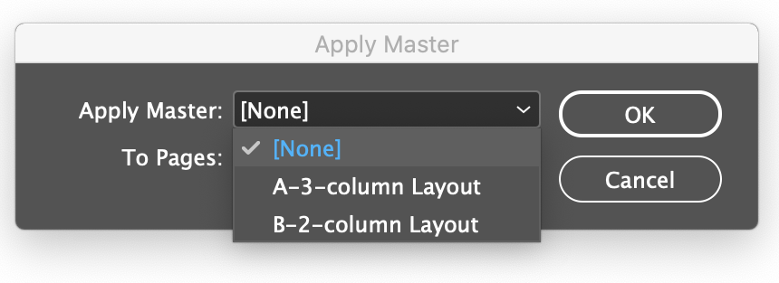
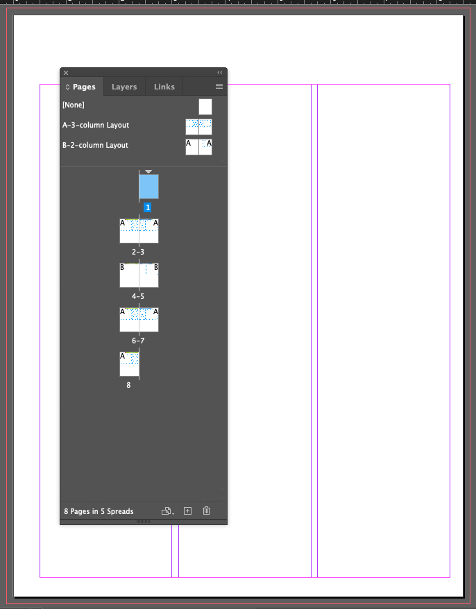
By default, the A Master/Parent Page was been applied to all the pages in the document when you specified the number of pages. You can apply any Master/Parent Page to a Page page by drag and dropping it onto the page in the Page panel. You can also apply a no Master or [none] Master type to a page the same way.
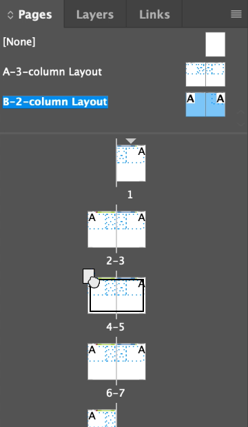
- Click on the B-2-column Layout Master (the Name on the left, not the Icons on the left), then drag either the name or the icons to the icon of page 4 in the Pages panel
Notice the way the cursor changes when you are over the 4-5 page icon. It's quite tricky to get the right gesture. Getting it wrong drops the Master/Parent Page onto only one of the two pages in the spread.
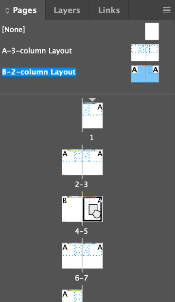
- If you didn't get the gesture, do the same for other page in the spread that didn't get the Master/Parent Page set
You'll know when it's been properly applied with you see the B in the outside upper corners of both pages
- Double-click on the spread to check it
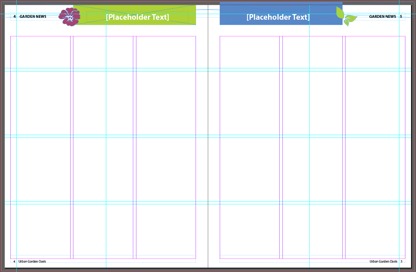
Notice the page numbers are correctly displayed!
Chapter/Lesson 7: Working With Typography
Adjusting Vertical Spacing
Vertical spacing as referenced in our text isn't just about leading, but it's also about spacing between blocks of type - usually in the form of paragraphs - and things like keeping blocks of text together when they flow across pages and columns.
Changing the Spacing Between Paragraphs
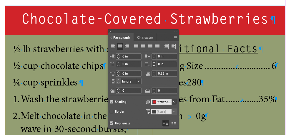
You can set spacing before, after, or before and after paragraphs. Before and after spacing is accumulative, that is, they get added together if they're both there, so it's best to use only one.
- Set the view to Normal and turn on Hidden Characters
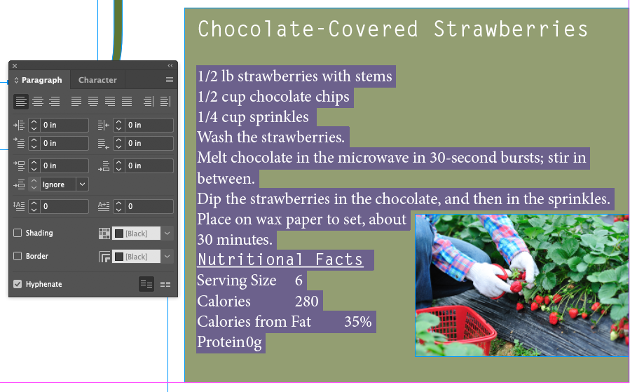
- Focus on the recipe and put the cursor in front of
1/2 lb strawberries with stems
- Select the text from
1/2 lb strawberries
to Protein 0g
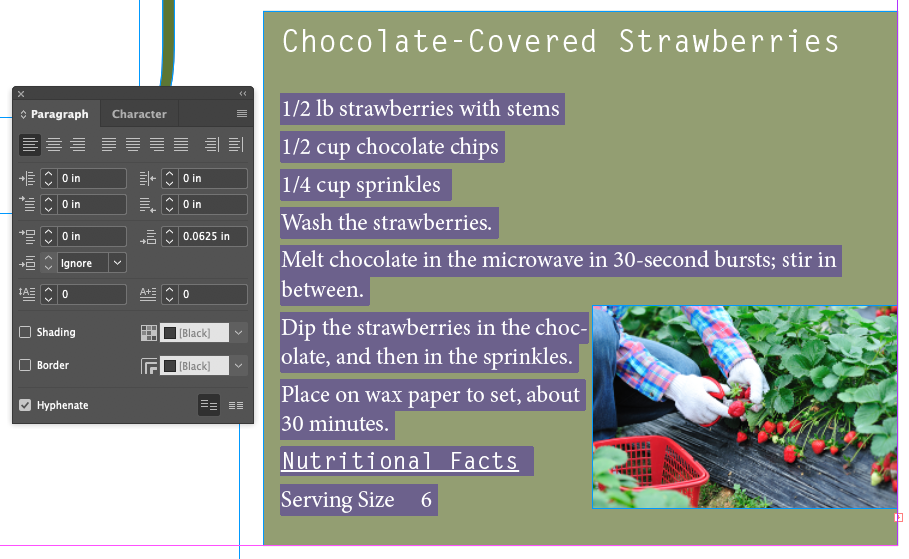
- Set the Space After field up by one click:
0.0625 in
For some reason, a single click in this example defaults to .0625 inches, or 4.5 points. I can't find any way to change this, even though there are settings for default increments in the Preferences, this one isn't part of the set. The usual default is 1pt.
Spacing Between Paragraphs

Space Before A caveat about Space Before paragraphs: It won't add space before a paragraph at the top of text frame. To add space before a paragraph at the top of a text frame (or any text for that matter) use Text Frame Options, Inset Top.

Space After Probably a better and more reliable choice for spacing between paragraphs, unless you use the next one.

Space Between Puts a consistent amount of space between paragraphs of the same style. Overrides any Space Before or Space After settings. Combining this, you could have consistent spacing between paragraphs of the same style, but add more space (or less) between blocks of paragraphs with different styles. This is a new feature, and I think it's meant to reproduce the behavior of spacing between paragraphs in HTML.
There's a good Adobe Support article on formatting paragraphs here.
Working With Fonts, Type Styles, and Glyphs
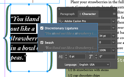
Fonts are kept by the operating system except Adobe Cloud fonts. A font is usually more than just a font, it's usually part of a Font Family, which includes different flavors of a given font name. We can think of the different properties of a Font as what we can manipulate in InDesign with the various panels. These include:

- Font Family
- Font Style (Regular, Bold, Italic, Condensed, Medium, Semibold)
- Font Size (in points)
- Font Leading (in points)
- Font Variant: All Caps
- Font Variant: Small Caps
- Font Variant: Superscript
- Font Variant: Subscript
- Font Variant: Underline
- Font Variant: Strikethrough
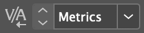
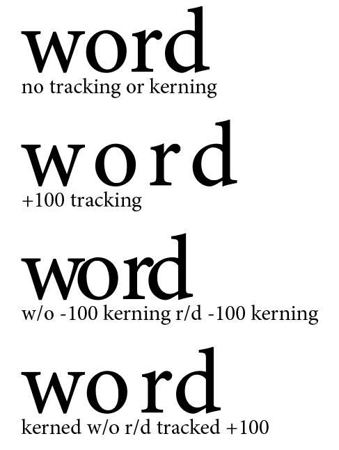
- Kerning
- Tracking
- Vertical Scale (% of Font Size)
- Horizontal Scale (% of Font Size)
- Baseline Shift
- Skew (False Italic)
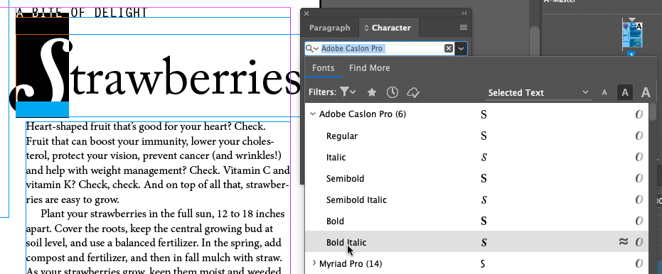
Adding A Font from Adobe Fonts
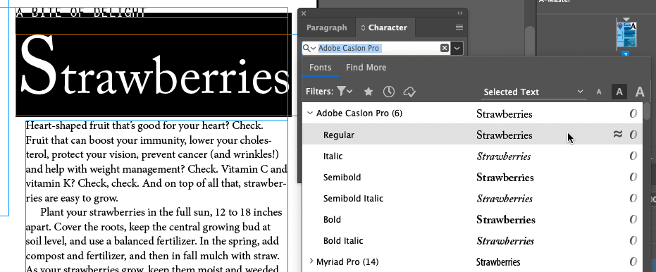
Since, as students, you're not entitled to Adobe Fonts, I'll demo this without your needing to follow along
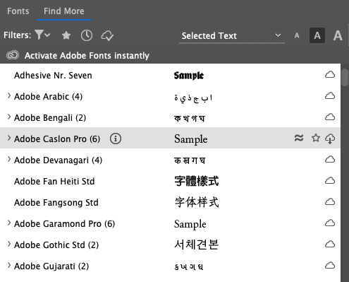
- With either the Control Panel at the top of the screen, or the Character panel, click on the Font Family menu
- Choose the Find More tab
- Find
Adboe Caslon Pro (6)
- Click on the Download from Cloud button
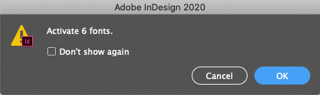
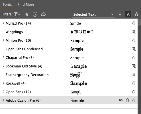
- Check that it's now in the Font tab
Font Formats
TRUETYPE (.TTF)

TrueType is a font format that was developed by Apple and was eventually licensed to Microsoft. They only require one file, but a separate file needs to be added for each member of the font family (regular, italic, bold, condensed, etc). TrueType fonts can be unreliable for publishing.
OPENTYPE (.OTF & .TTF)

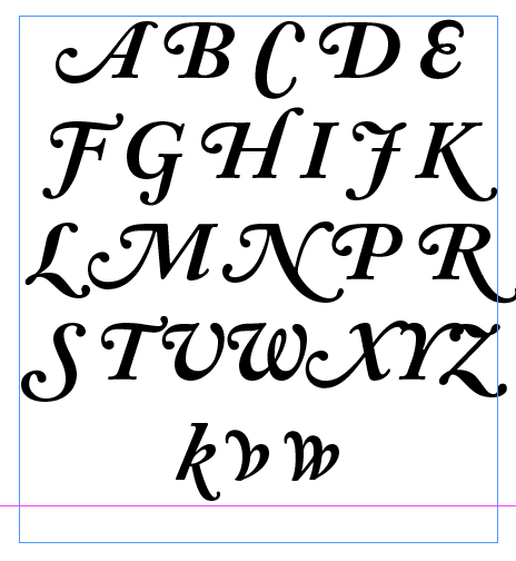
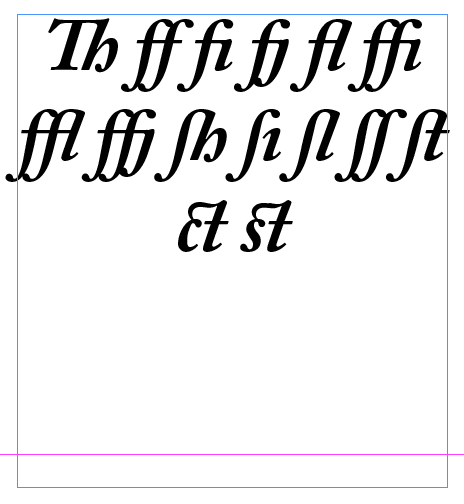
OpenType is a newer font type built on the TrueType format that supports an expanded charater set (smallcaps, ligatures, glyphs, and alternative gylphs). OpenType fonts were created by Adobe and Microsoft, and offer cross-compatibility. They are ideal for graphic designers and desktop publishing software like InDesign, offering outline and bitmap data for the font in one file. It's recommended to use OpenType whenever possible.
EMBEDDED OPENTYPE (EOT) / WEB OPEN FONT FORMAT (WOFF) / SCALABLE VECTOR GRAPHICS (SVG)
EOT and WOFF, are formats strickly for web browsers and mobile devices and not particularly relevant to our use of InDesign. SVG is a relatively new format that's not well supported yet, but it's cool because it supports color, gradients and textures in letterforms.
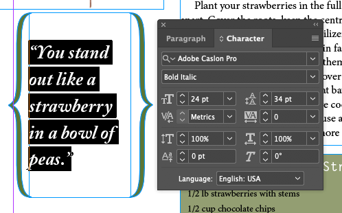
Applying a Font, Style, Size, and Leading
Adding A Special Character
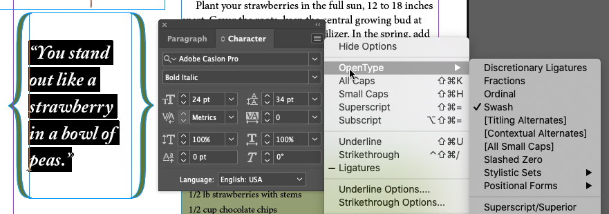
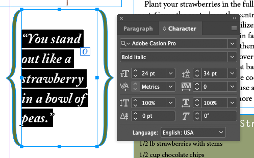
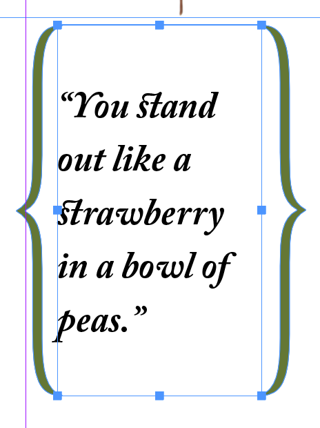
Robust OpenType files can also contain special non-character based forms, or glyphs
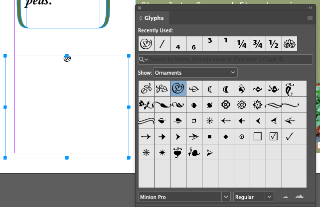
- Insert cursor into text box below
...bowl of peas.
- Menu Type Gylphs...
- Show:
- Double-click on the heart glyph
Finding Fonts in the Type Menu
Name Search: Just start typing in the search field in the Font Family field
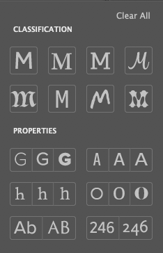
Filter By Class: Nice visual interface for Sans Serif, Serif, Slab Serif, Script, Blackletter, Monospaced, Hand Written, Decorative, Weight, Width, Contrast (between thin horizontals and thick verticals), Upper & Lower Case or All Upper Case, Lining Figures (numbers all between baseline and cap height) and Oldstyle Figures (numbers with descenders and variable x-heights)
Favorites: You can pick'm with the UI so they're easy to find
Font Similarity: Sets the list below to similar fonts. New feature since 2017, kind of nice. Might be part of Adobe's new AI engine, Sensei.
Applying A Stroke And Fill To Text
Unlike Illustrator, this actually does it the right way and applies the stroke to the outside of the glyph, and not centered on the path. Those of you who've had my Illustration class will know how much this bugs me.
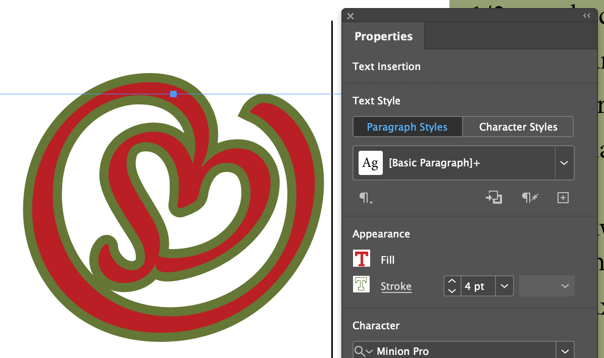
- Set to 122 pt, fill with red and stroke with green...
Inserting Fraction Characters
The recipe in our sample file uses a number, a diagonal slash, and another number to make a fraction. Not usually good form. Minion Pro has fraction glyphs for common fractions which look much better. It also has all the glyphs needed to make any fraction, like 1234/5678.
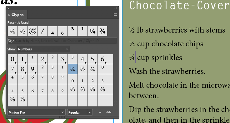
- Focus on the recipe text, open the Glyphs panel, show Numbers and set the correct fractions
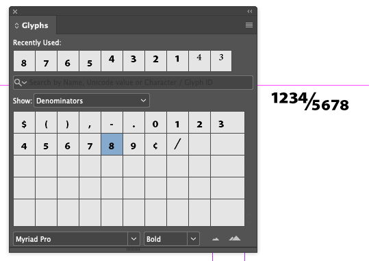
You can also create just about any fraction possible with Numerators and Denominators in the Minion (and Caslon) Pro fonts
Changing Paragraph Alignment
Let's align a bunch of stuff with the Paragraph Panel's buttons, shortcut keys, and the Control Panel's buttons
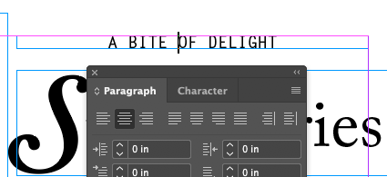
- Center with Paragraph panel
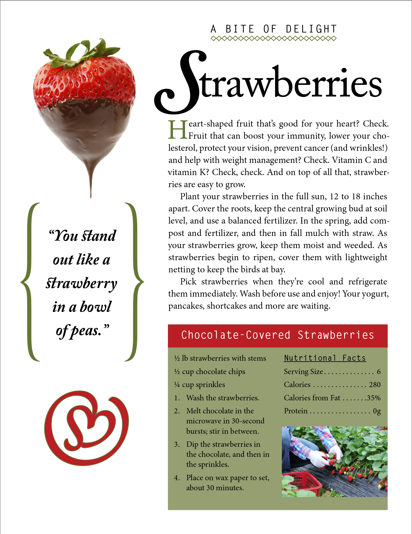
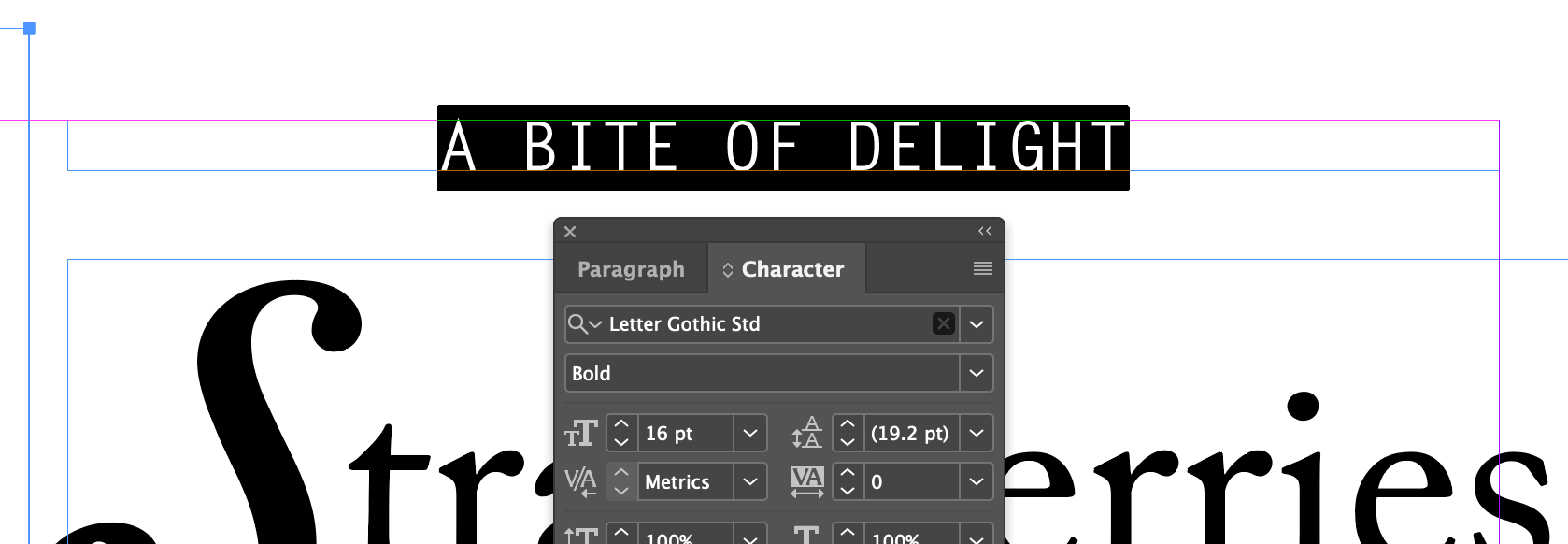
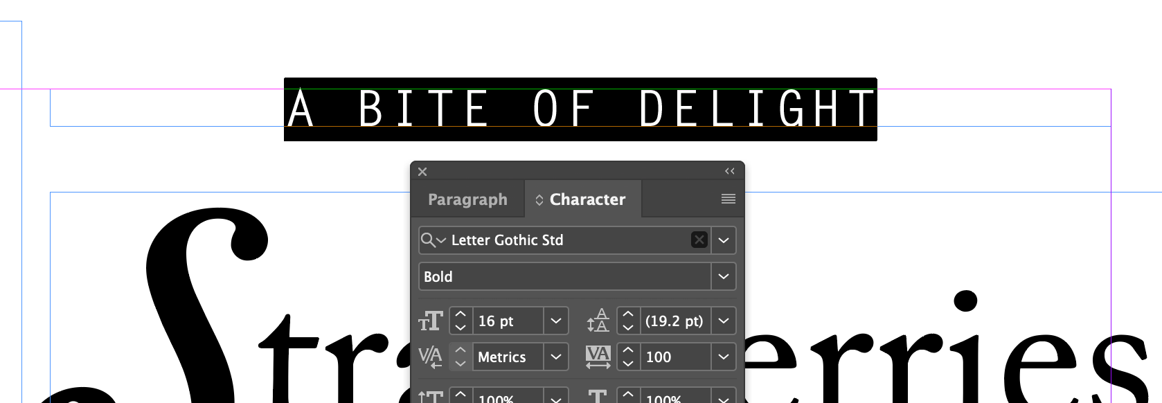
A BITE OF DELIGHT
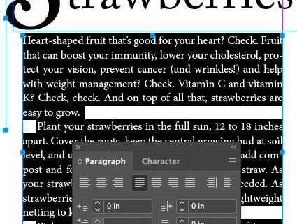
- Justify With Last Line Aligned Left
Heart-shaped fruit...
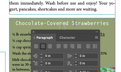
- Center with Command/Control-C
Chocolate-Covered Strawberries
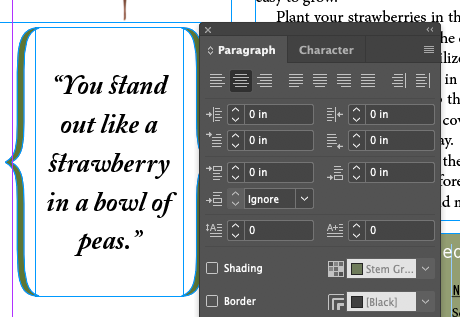
- Center with Control panel
You stand out...
Icons Defined
 |
Align Left
(Most common) |
 |
Align Center
(Somewhat less common) |
 |
Align Right
(Unusual. Usually for callouts on the left side and very short phrases) |
 |
Justify With Last Line Aligned Left
(Common) |
 |
Justify With Last Line Aligned Center
(Unusual) |
 |
Justify With Last Line Aligned Right
(Very rare) |
 |
Justify All Lines
(Very rare) |
 |
Align Toward Spine
(Sometimes useful for 2 page spread layouts) |
 |
Align Away From Spine
(Sometimes useful for 2 page spread layouts) |
Hanging Punctuation Outside The Margin
For as long as I have been a designer, there's been battles waged over Hanging Punctuation, To Use or Not To Use? Basically it means when you set a block of type to justified, should the hyphens, commas, periods, and other puncutation marks hang past the edge of the bounding box or stick inside.
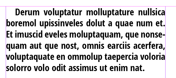
Basically this, normal punctuation:
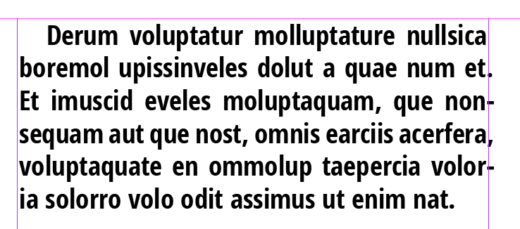
Versus this, hanging punctuation:
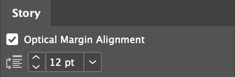
The function is burried in the Story panel! I suppose because you want it to affect the entire Story, and not just a text frame. Me, I would have put it in Text Frame Options...
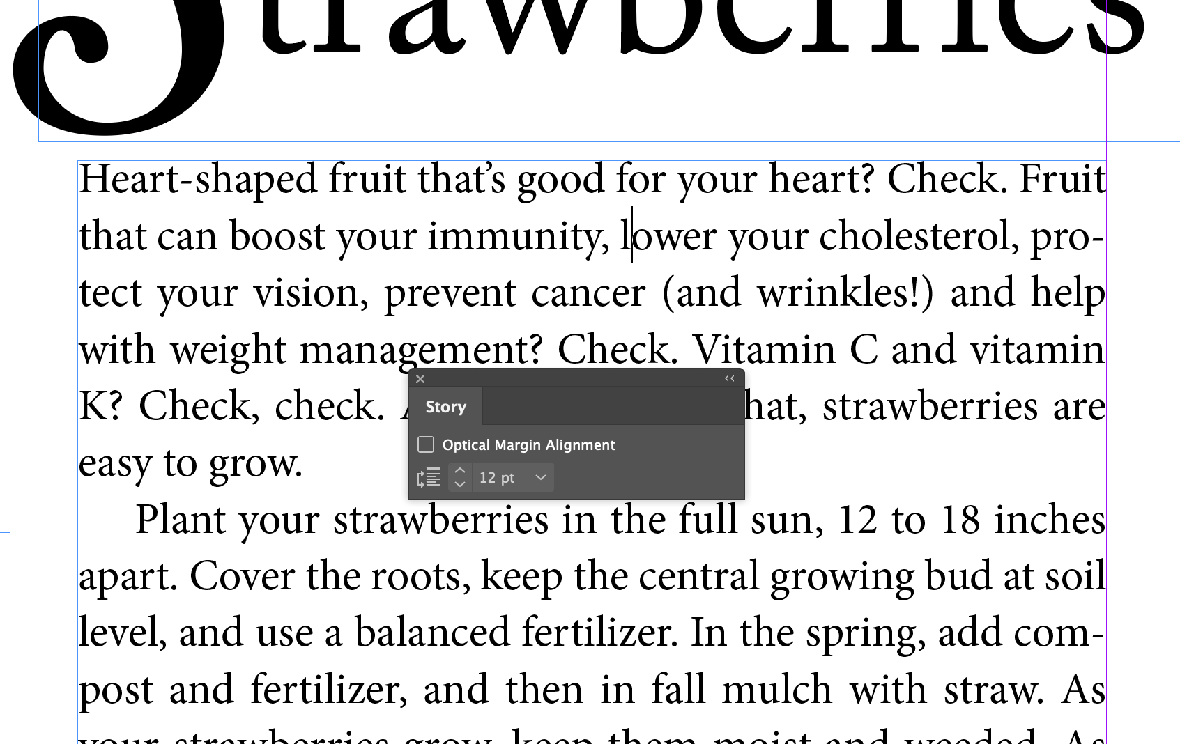
- Put cursor in the
Heart-shaped fruit...
paragraph
- Menu Type Story
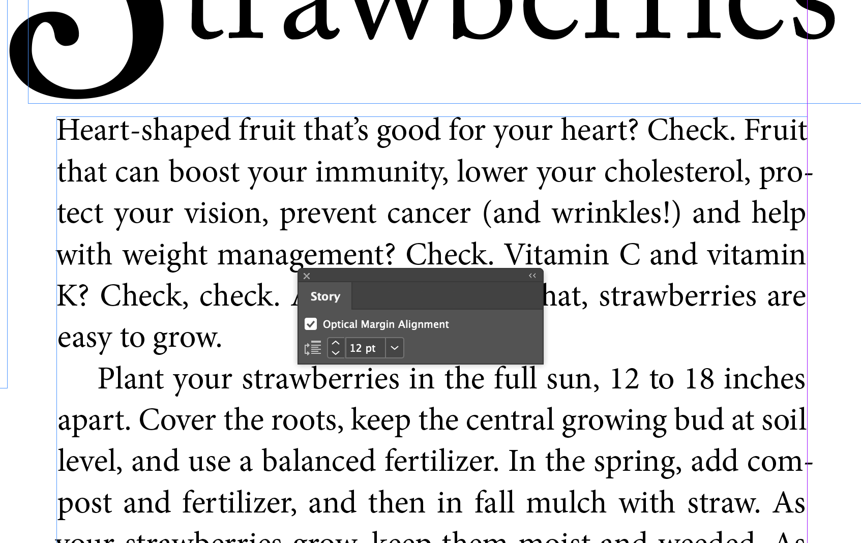
- Check Optical Margin Alignment
Creating A Drop Cap
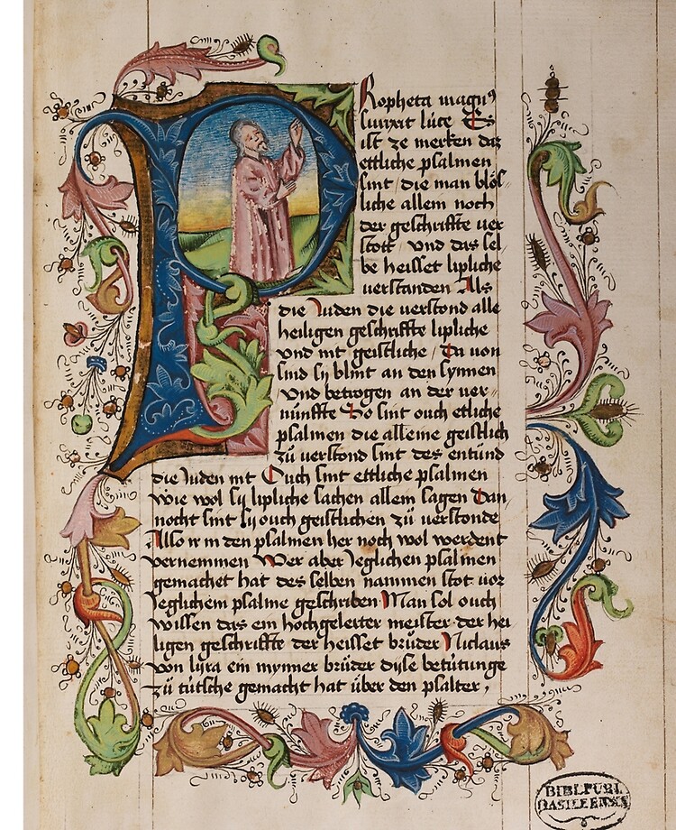
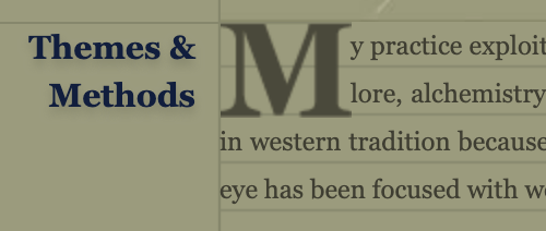
Slick trick! Very old-timey feeling, harkens to the middle ages and illuminated manuscripts, where the first letter on a page was oversized and lavishly illustrated. Some books and magazines still use the idea, greatly simplified, where the first letter of a paragraph is larger then the paragraph text and spans 2 or more lines. I use it on my website just to show off my HTML chops (it's hard to code)
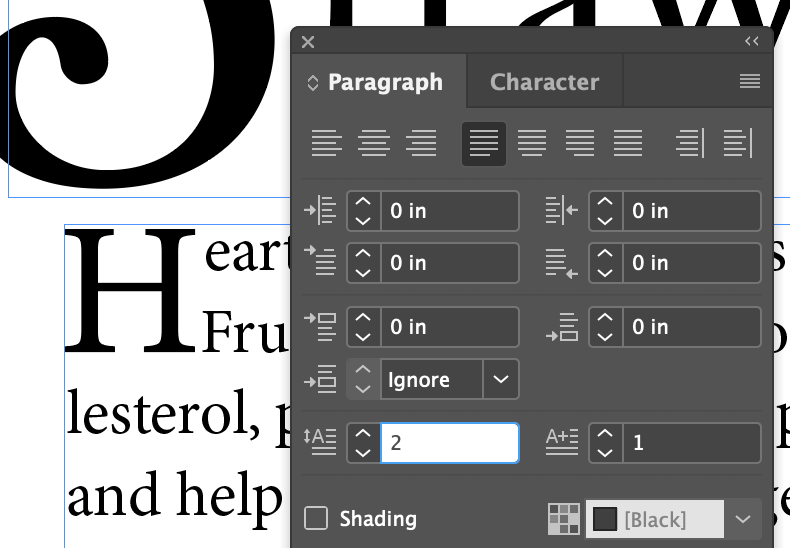
- Insert the cursor in the first paragraph of the story
- In the Paragraph panel set Drop Cap Number of Lines to
2
Note that the next button, Drop Cap One Or More Characters, jumps to 1. You can extend the number of characters to cover the whole word if you want.
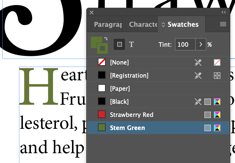
- Might as well set the drop cap to green while we're at it...
Dropcap Hack
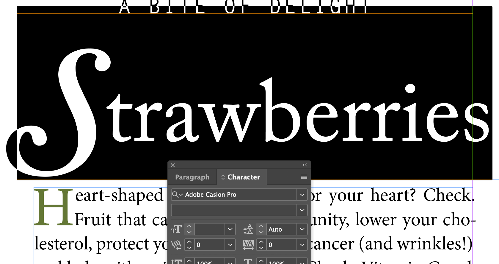
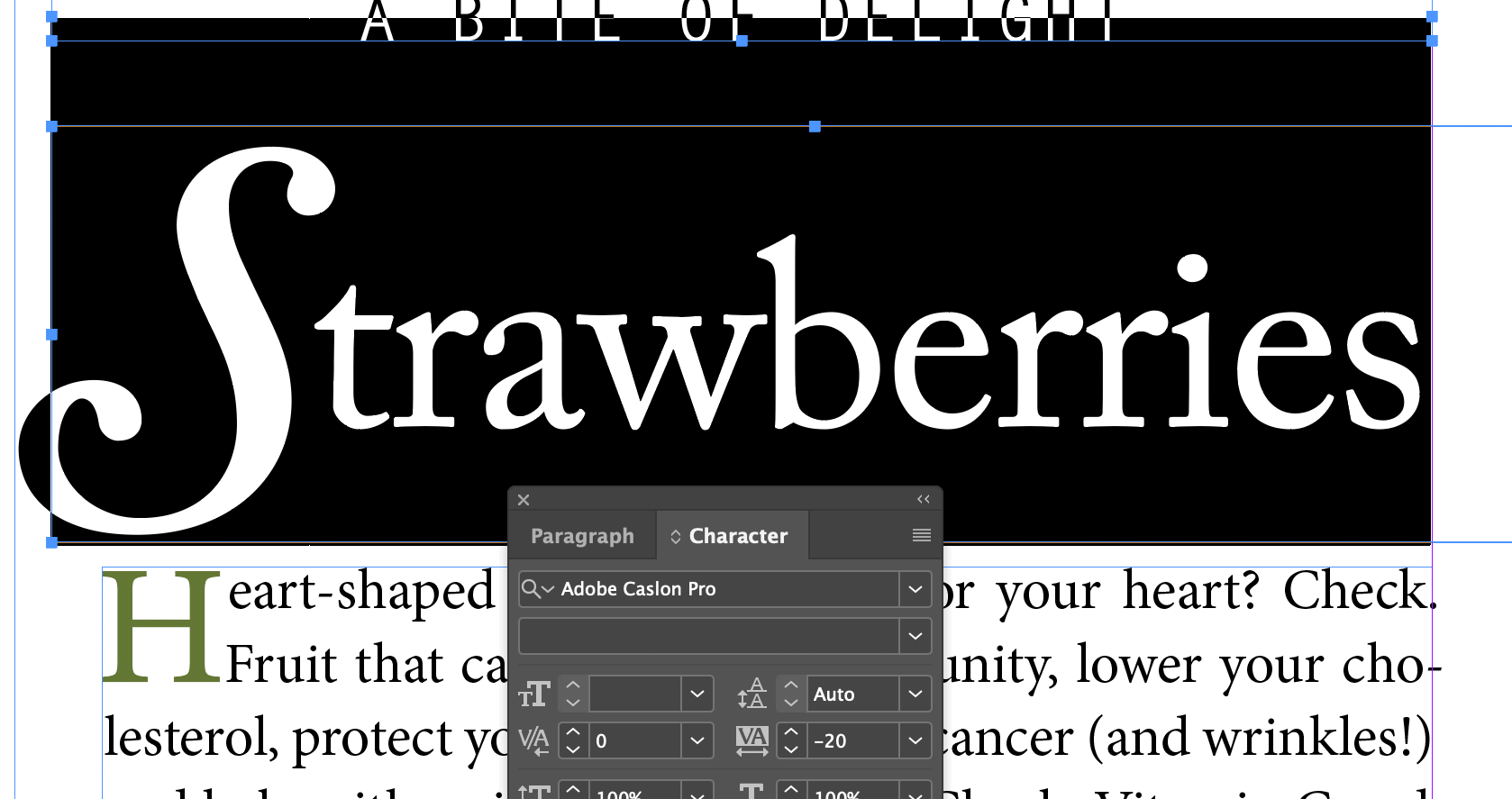
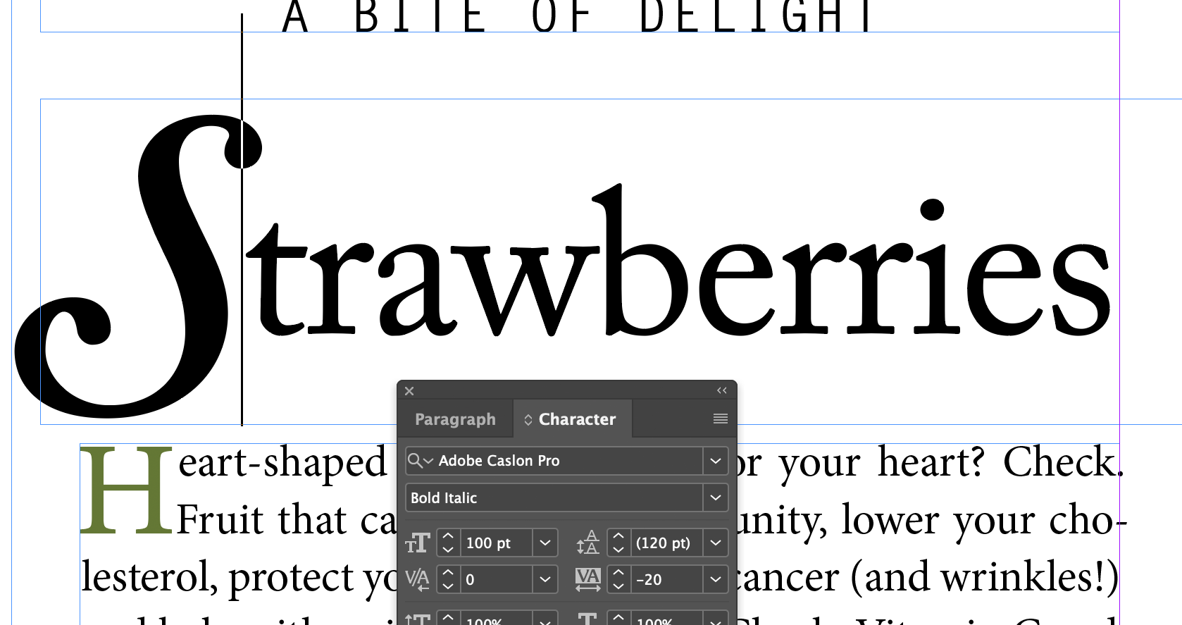
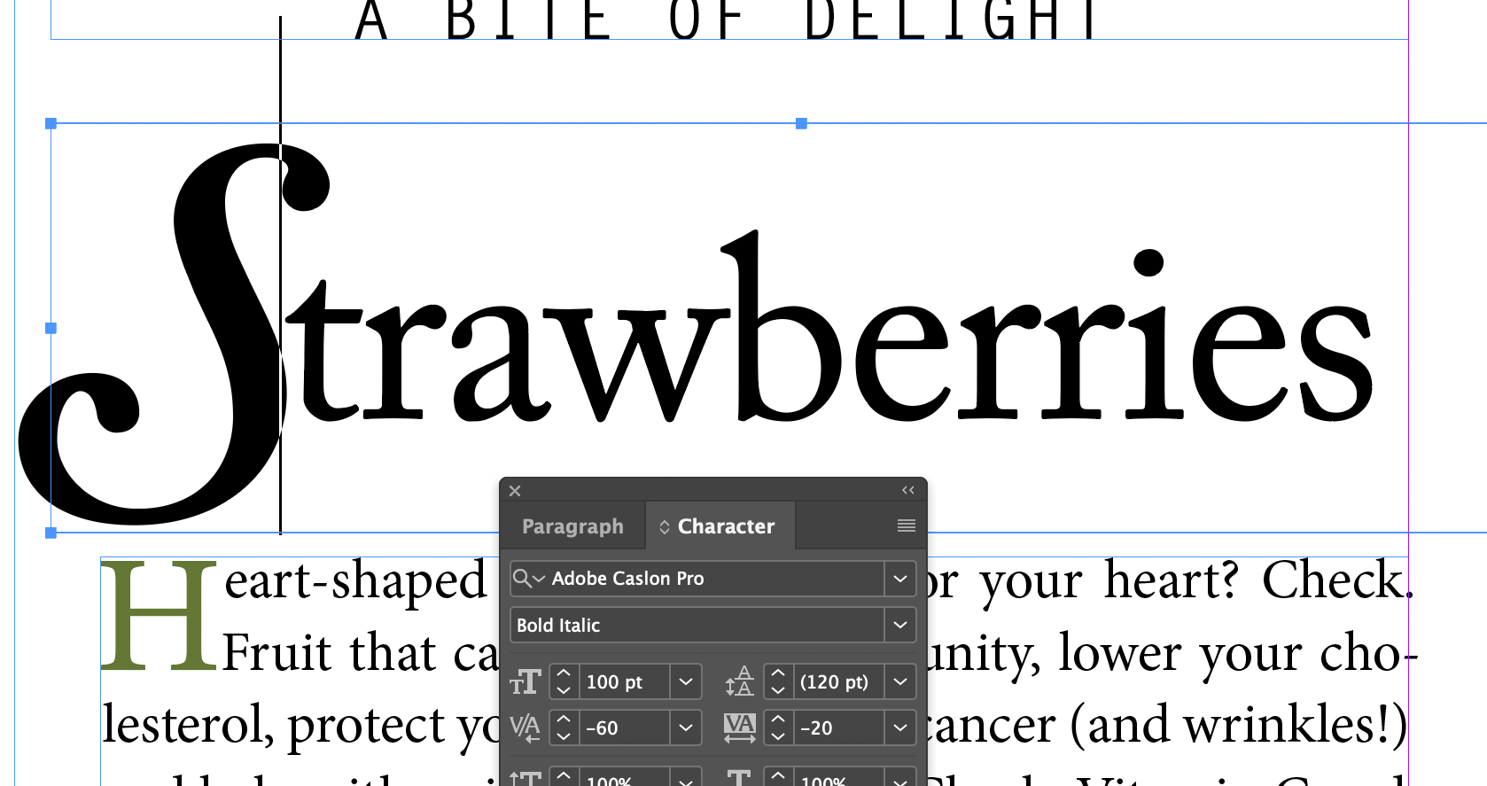
Sometimes you want the spacing between the first letter and first word to be tighter, but is seems like you can't kern the first line of the drop cap without also affecting the other lines, but there is a hack:
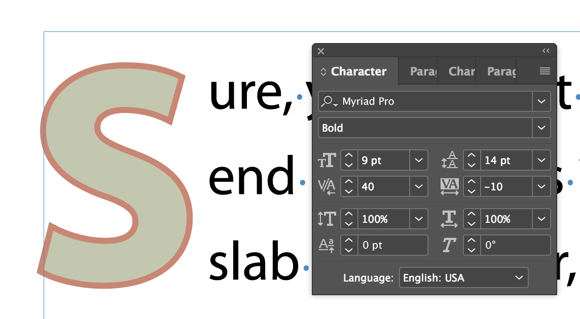
First, set extra kerning between the "S" and "ure"...
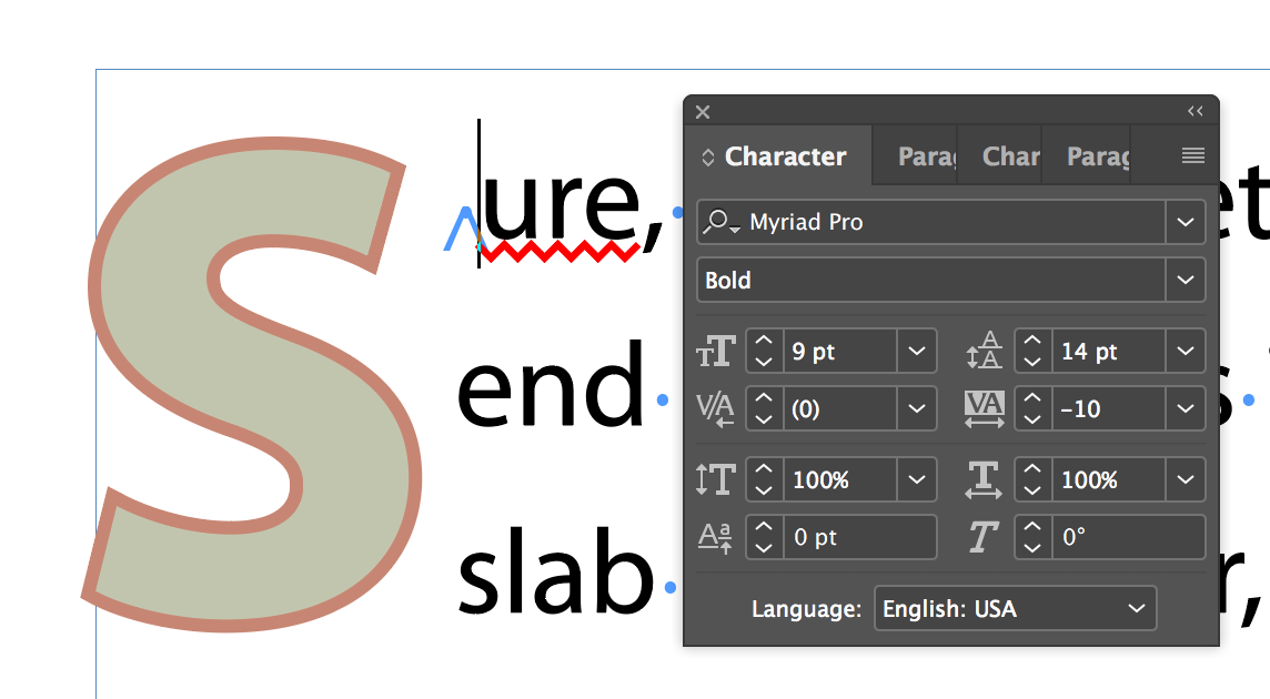
...then insert a white space character with Menu Type Insert White Space Nonbreaking Space...
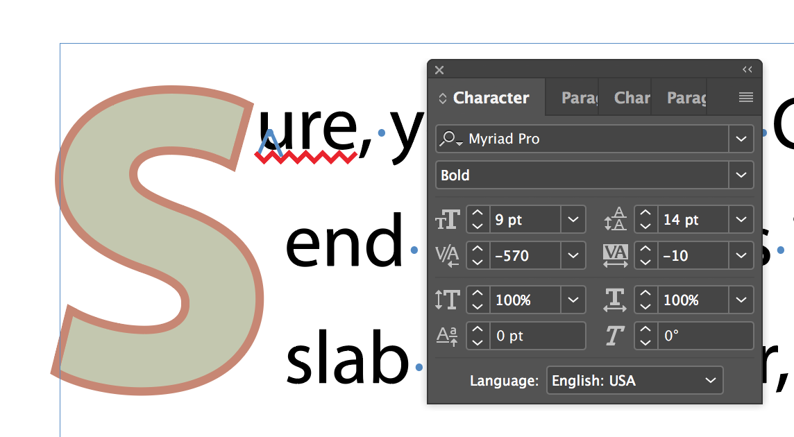
...then set the kerning to a large negative value.
Adjusting Line Breaks
Hyphenation and line breaks at the end of each line of text in a paragraph affects readability and impact. InDesign has three ways to affect line breaks:
- The Adobe Single-Line Composer and Adobe Paragraph Composer
- Hyphenation settings (under...)
- The Balance Ragged Lines feature
So, in theory, these three samples below should look different:
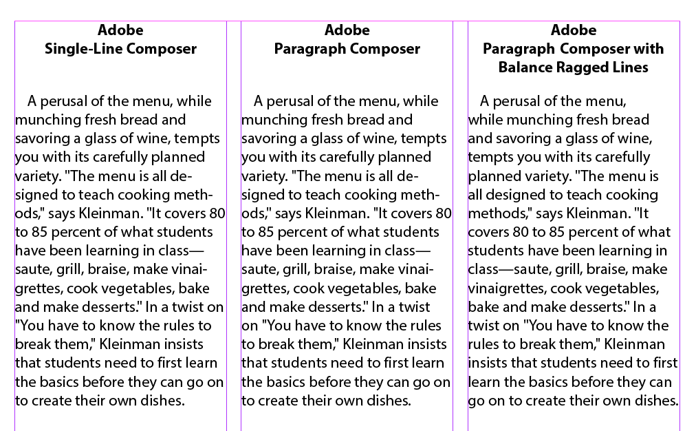
But, they don't. Or they often don't. Seems to work at 13pt. The Balanced Ragged lines seems to have an effect, but Single-line and Paragraph Composer look the same to me. And it makes no visible difference in our Strawberries example either. Too subtle for me. Download this file to check it out.
Hyphenation Settings
You can control the way words hyphenate (or not) thru the Paragraph panel, and control the number of letters that need to be together before a word will hyphenate. 'Nuff said, I think. Let's skip the settings bit.
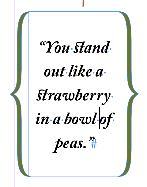
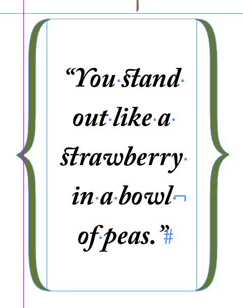
Inserting A Manual Line Break
Not the same as a Paragraph mark, (the Return or Enter key). Easy Peazy Lemon Squeezy, just hold the shift key when you press the Return or Enter key.
Setting Tabs
Tabs are weird, but useful. They don't exist in HTML, and it's a real drag that they don't.
Aligning Text to Tabs and Adding Tab Leaders
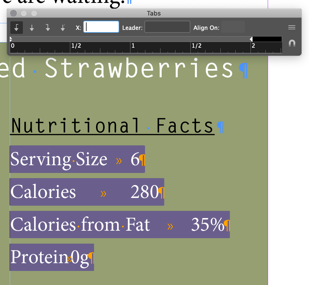
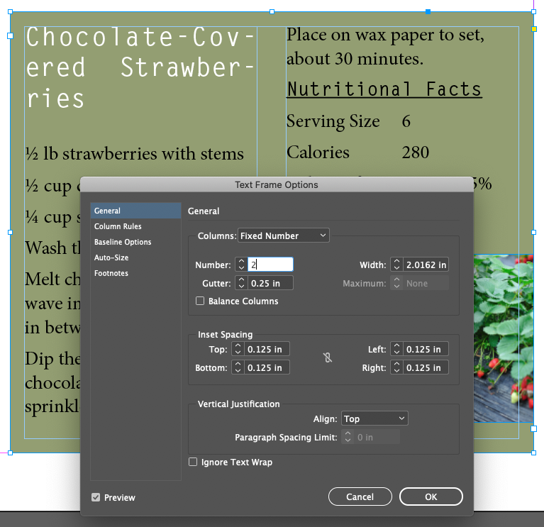
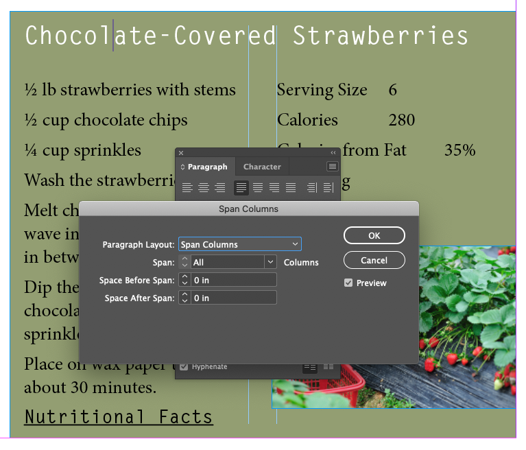
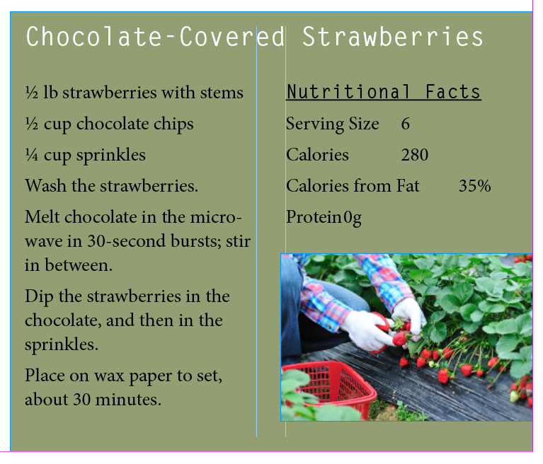
- Focus on the 2nd column of the recipe and select Serving Size to Protein 0g
- Look for the tab marks with the Show Hidden Character setting on
- Menu Type Tabs
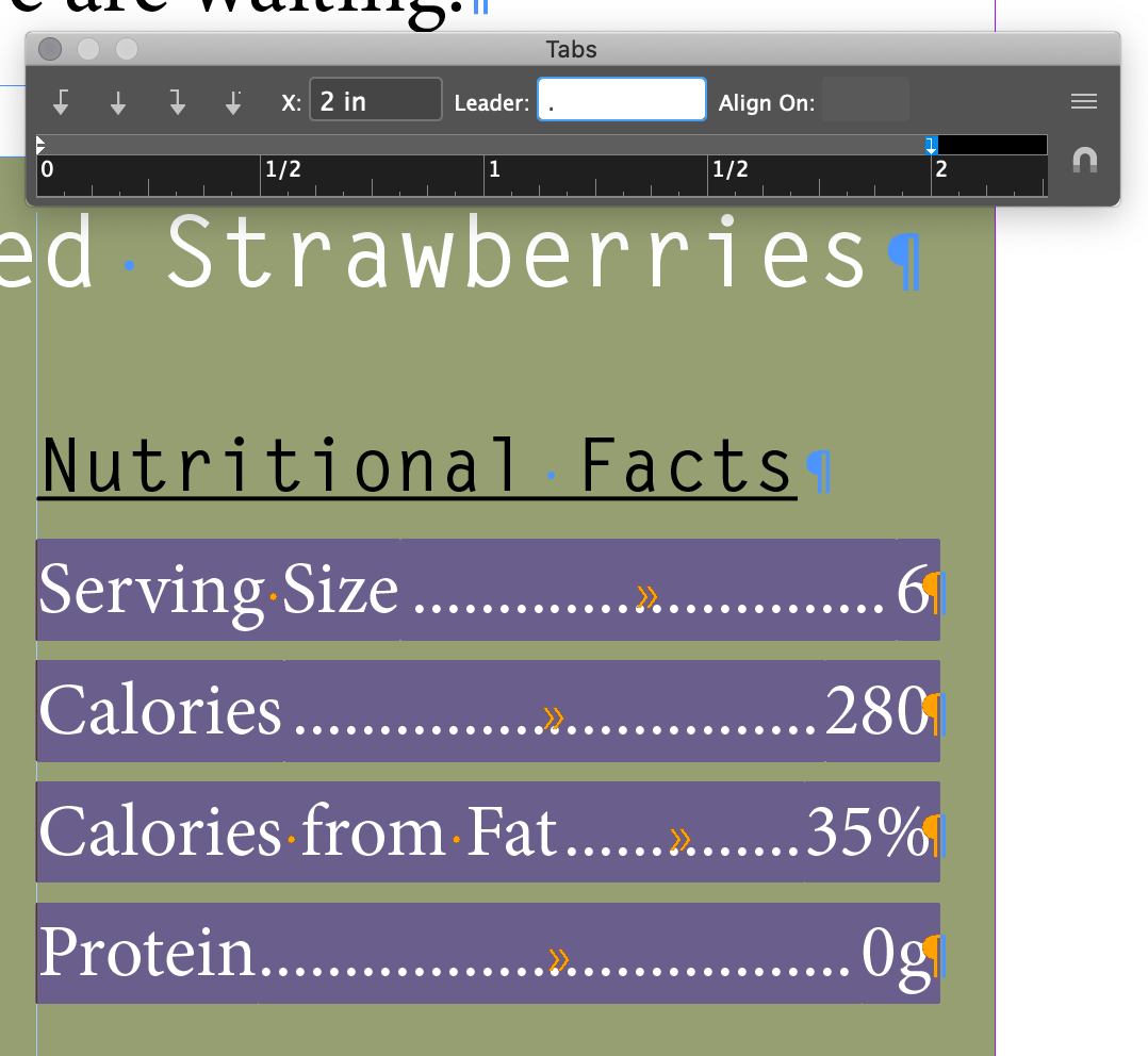
- Select the Right Justify Tab

- Set the X to 2 in and the Loader character to
.
Working With Tabs
Demo:
- Entering
- How they affect the current paragraph
- Specifying type
- Dragging or entering value for X
- Changing the type
- Repeating from flyout menu
- Reset to default
- Align on for decimal tabs
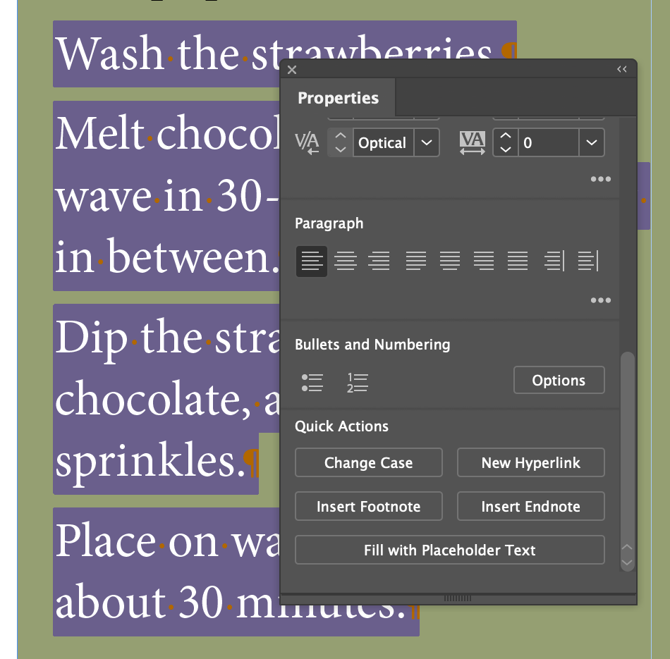
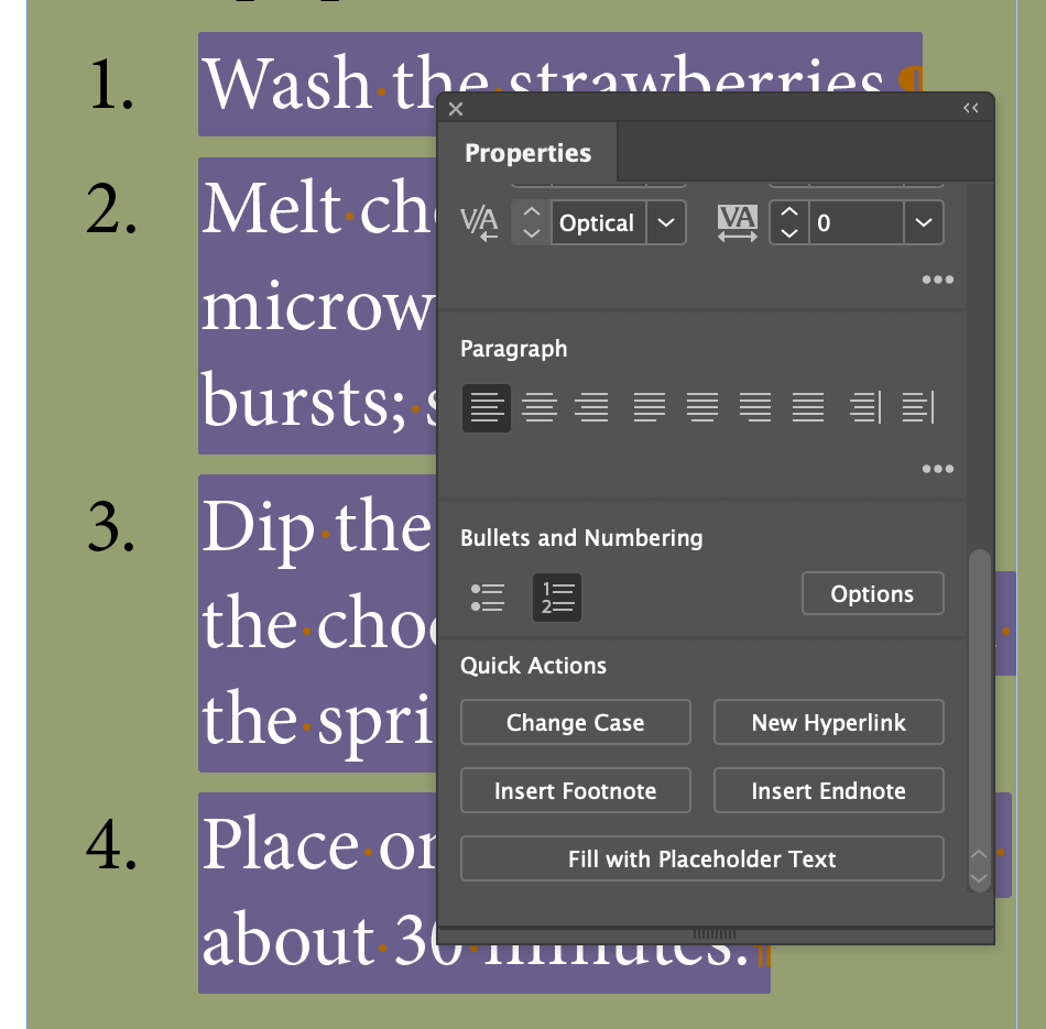
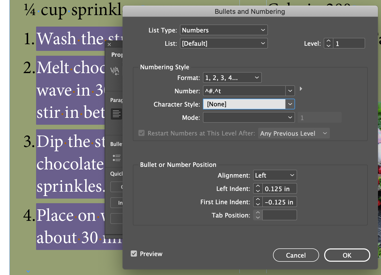
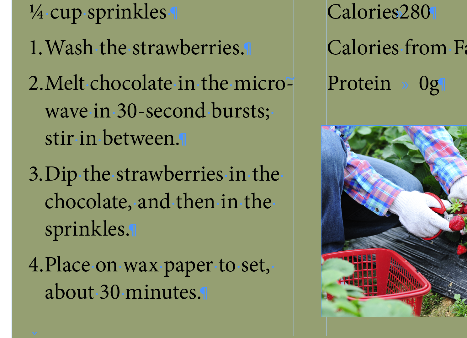
Creating a Numbered List With A Hanging Indent
Easy until you want to control the hanging indent distance...
Hanging Indents and Bulleted Lists
The UI is confusing and sometimes hard to manipulate, but there's two other ways to affect the hanging bullets and numbers.
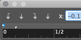
With the little triangles in the Tab UI
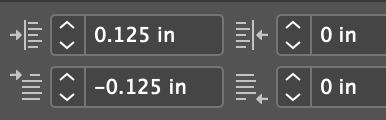
With the values in the Control Panel (and Paragraph Panel) for Indent and Tab Inset. These have to be set in the correct sequence as well, or you'll get an error message.
Working With Paragraph Shading/Coloring and Rules
Applying Shading/Color To A Paragraph
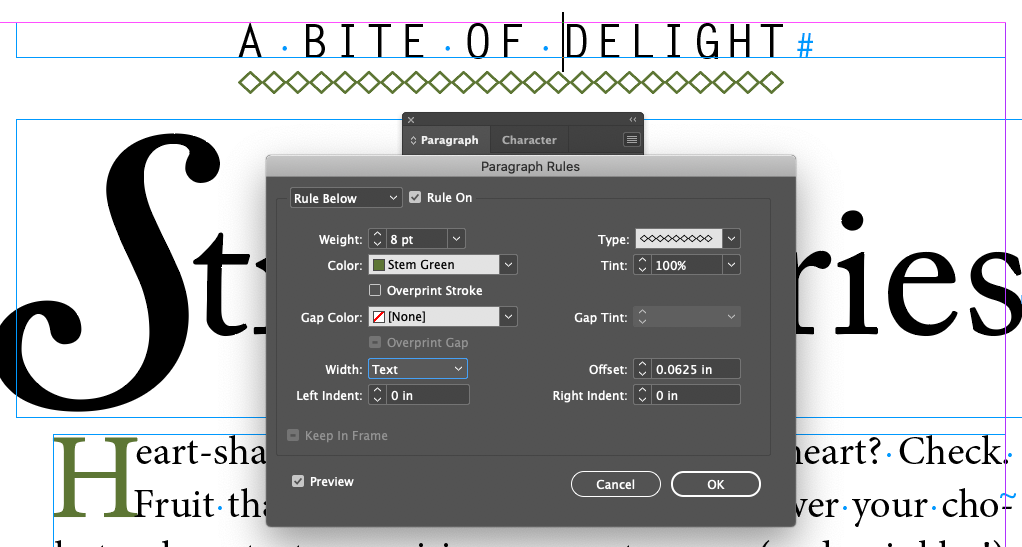
Applying A Rule To A Paragraph
CHAPTER 07
Review Questions
- What is the advantage of specifying a space before/after value for paragraphs rather than entering extra paragraph returns to add space?
- What is a glyph and how do you insert them into text?
- A drop cap affects a character, so why is it specified as a paragraph format?
- What is a tab leader?
- What is the difference between kerning and tracking?
- What is the difference between the Adobe Paragraph Composer and the Adobe Single-Line Composer?