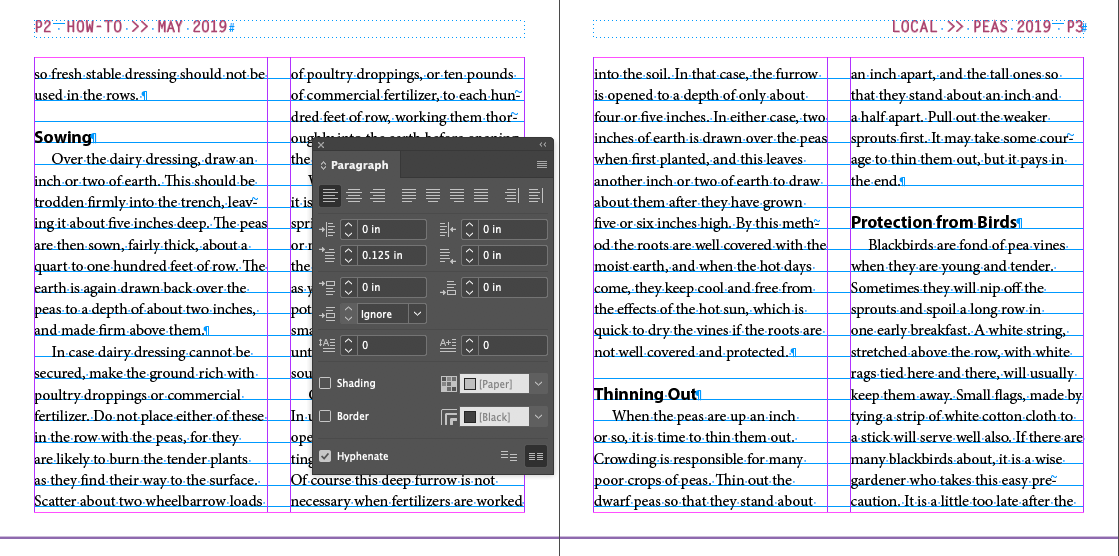
Viewing the Baseline Grid
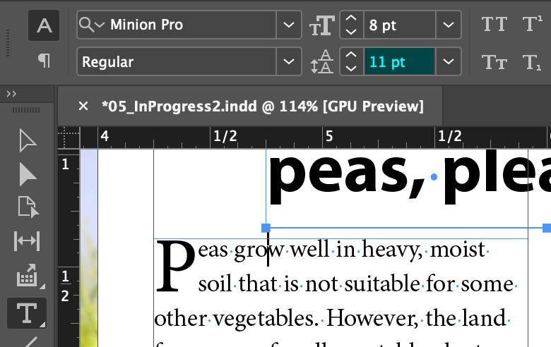
- Menu > View > Grids & Guides > Show Baseline Grid
- Menu > View > Actual Size
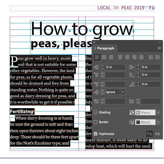
- Insert the cursor in the first paragraph
- Select all
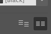
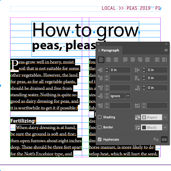
- Click on the
Align to Baseline
button in the Paragraph panel
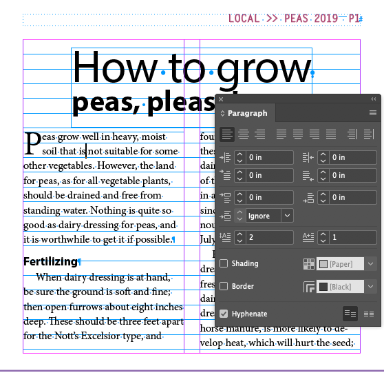
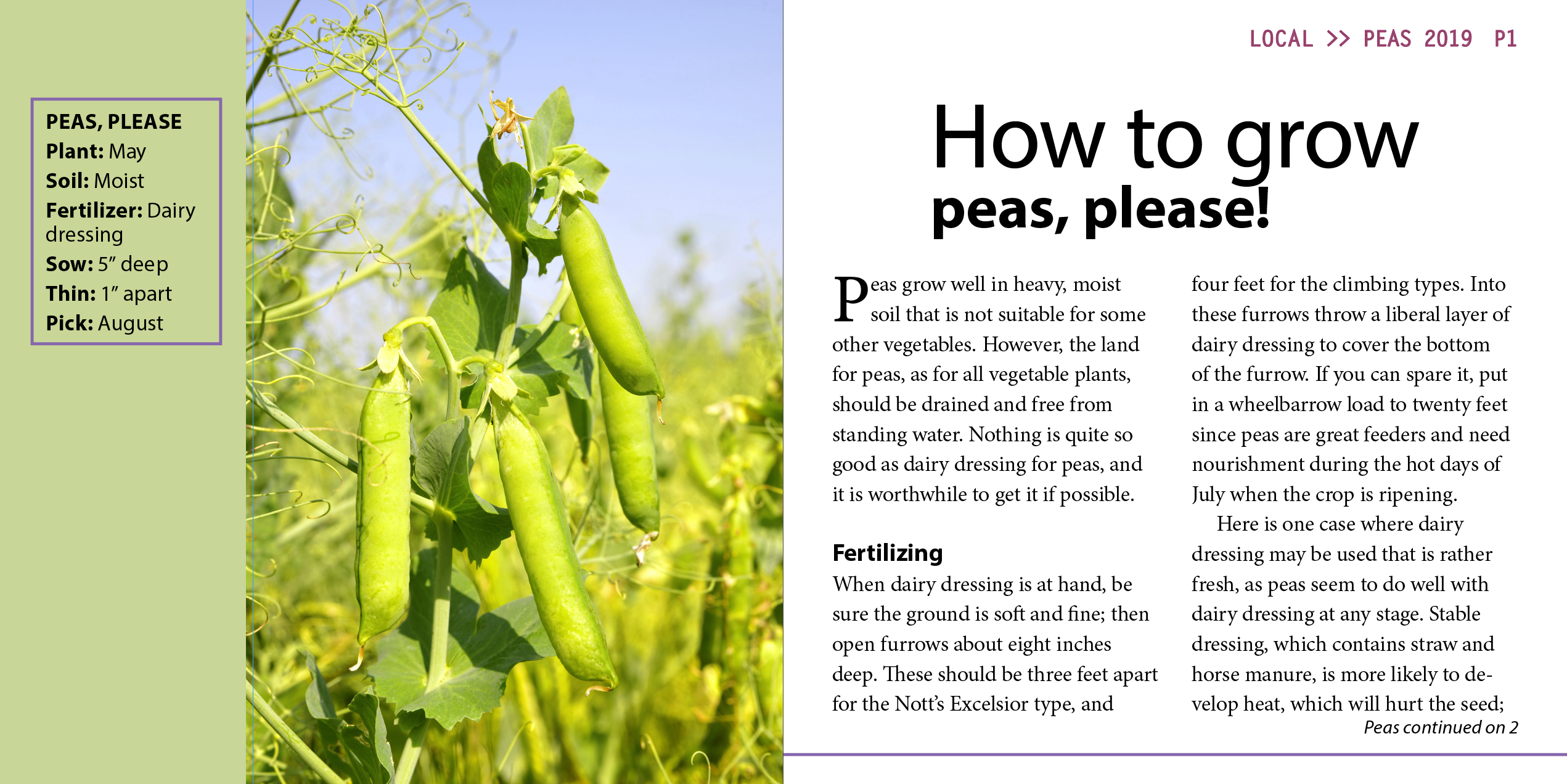
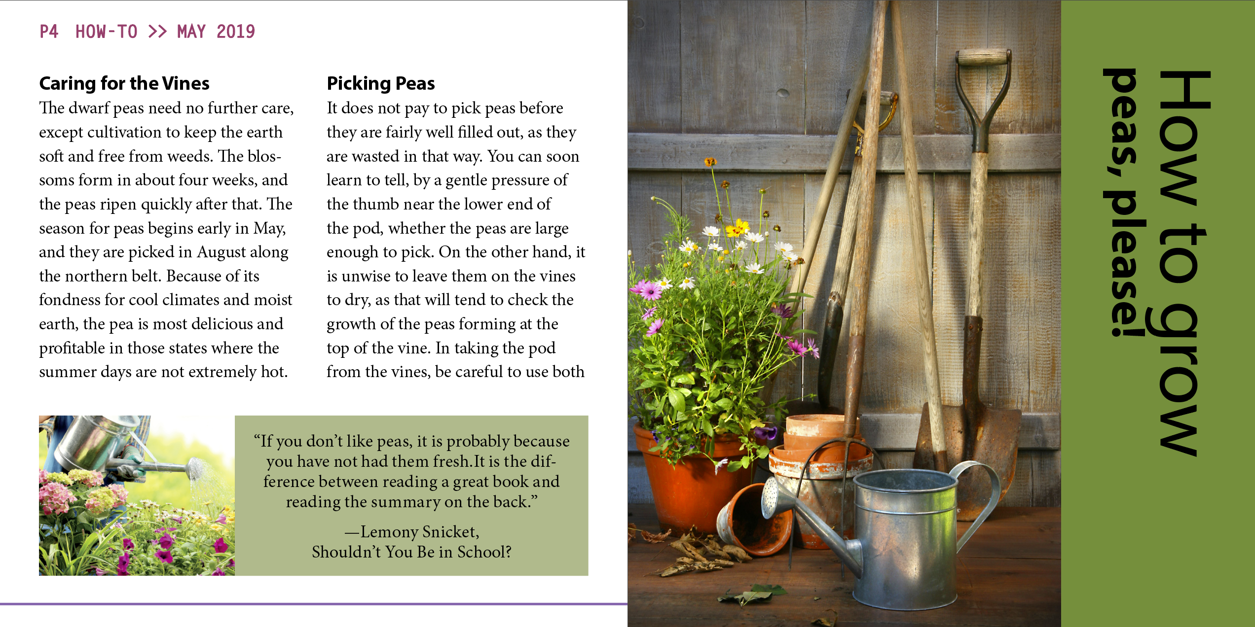
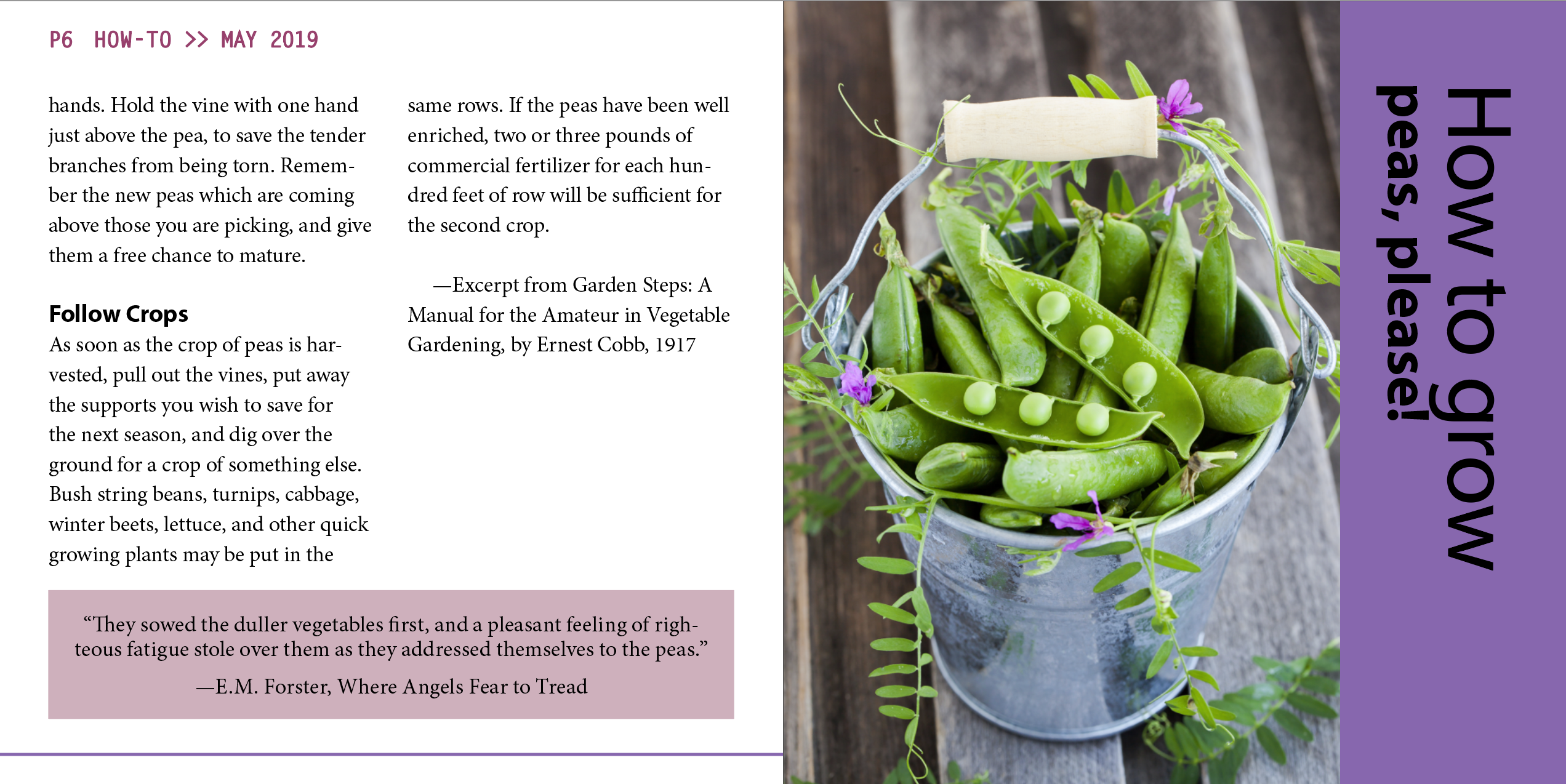
Already done: Place text "PEAS, PLEASE" and apply style
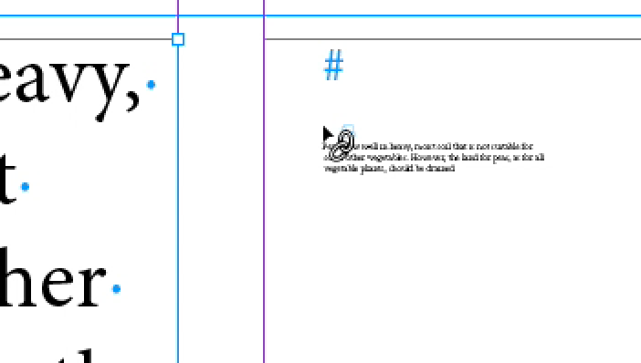
The process of taking an imported text file and flowing across several connected text frames is called threading text.
How to grow peas, please!
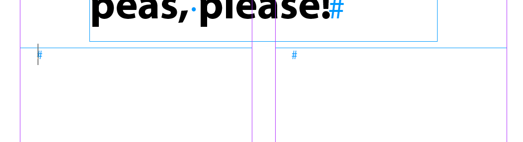
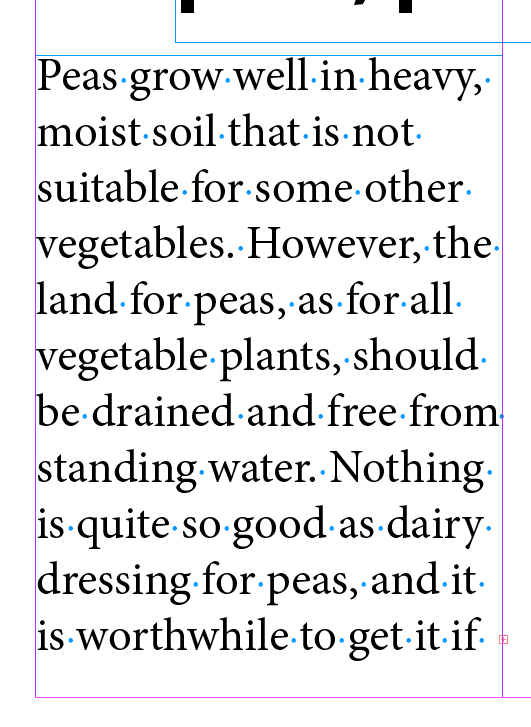
05_Peas.docx
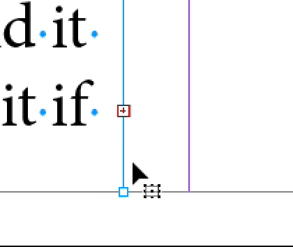
Note the little + sign indicating
overset text
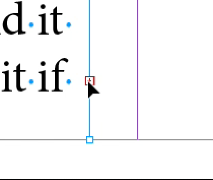
Note the cursor change when over the + sign
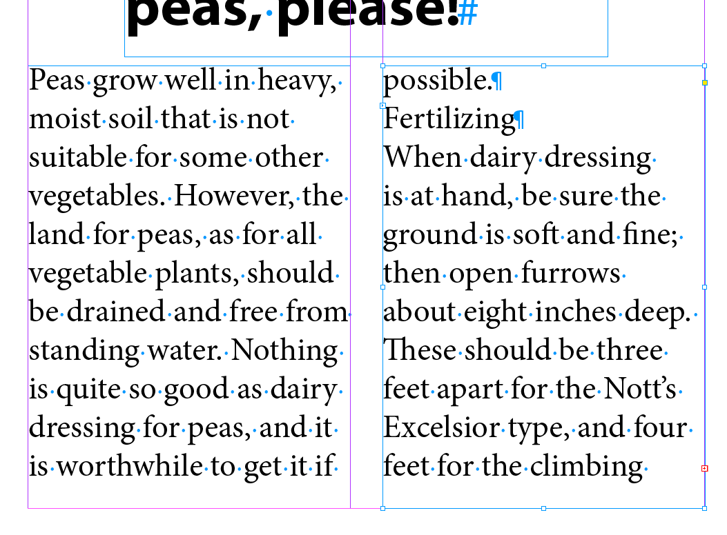
Result
Loading the Type tool with Multiple text files
Advanced power user move. Let's skip it.
Two new ideas here. One is that if you click with a loaded cursor into a column the text will fill that column. No need to click and drag to create a text frame. It's what makes it worthwhile to set up columns and margins when you set up your doc. The second idea is that if you hold down a modifier key while you drop the text, the cursor will stay loaded with text, ready to be placed in another column.
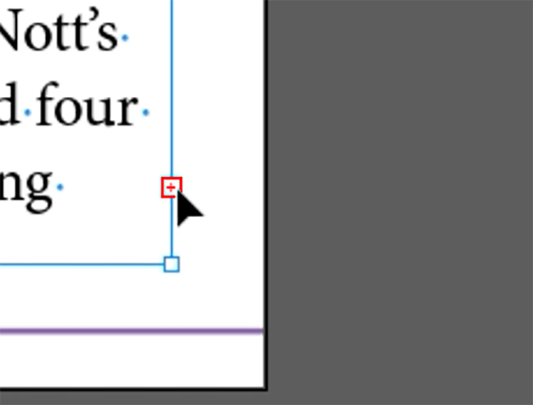
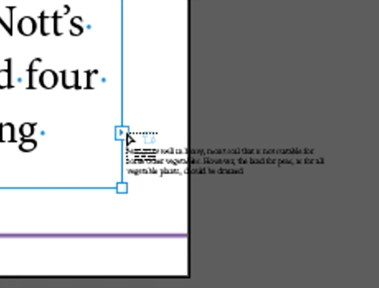
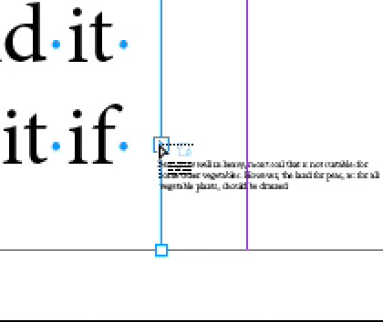
The gesture to load the cursor can be tricky. The text frame must be selected first, then you've got to hit the red + sign when the cursor changes to a solid arrowhead with no extra doodads.
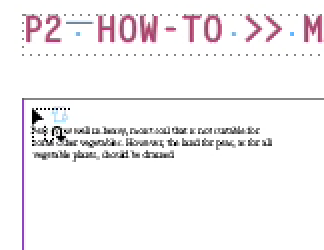
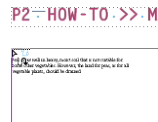
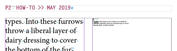
The gesture here is subtle as well. When the tiny arrow is solid that means it will drop the text into the column from the cursor tip down. When the arrow is filled with white, then it will drop the text down from the top of the column.
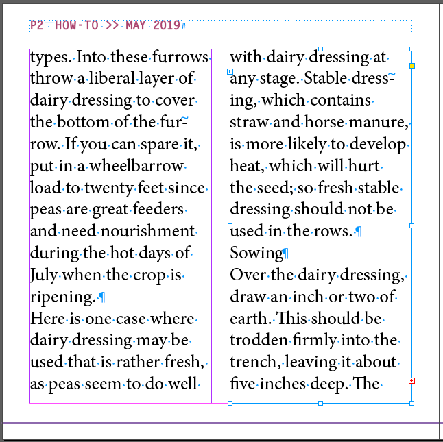
There's a shortcut for adding multiple threaded/linked frames, or more accruately for creating text frames with multiple columns.
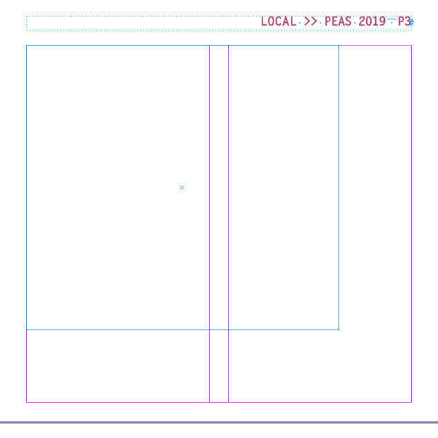
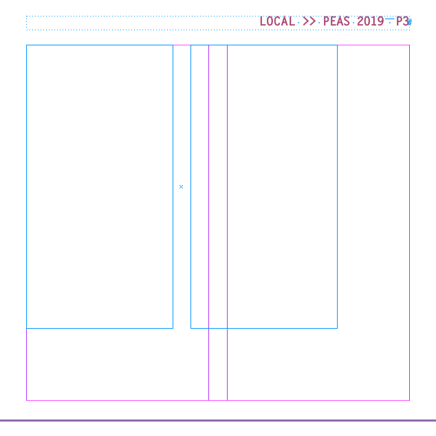
A new column will be added for each right-arrow press, and reduced by on for each left-arrow press
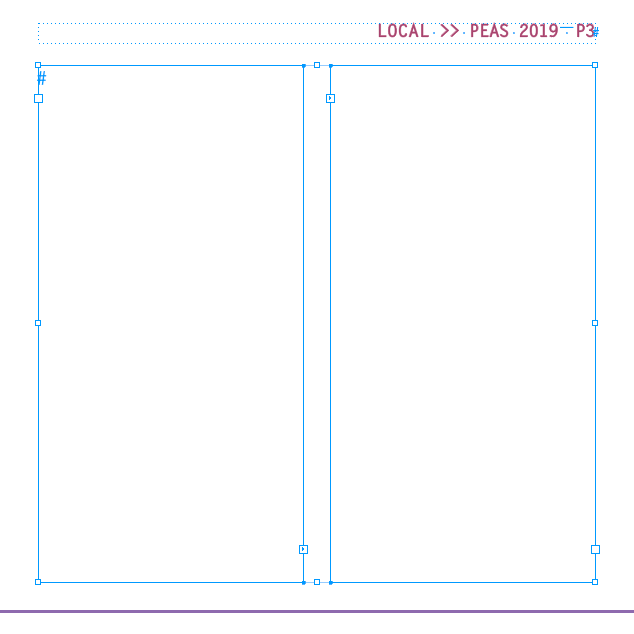
There are now two text frames, but most important, they are already threaded/linked with each other.
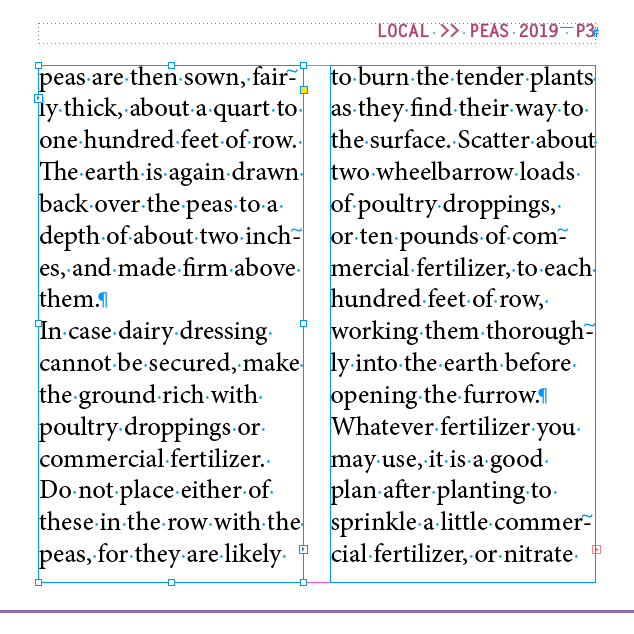
Result
The preferred way for creating long documents, like books...
Look for the cursor to change and show the snakey arrow. Also check that the arrow is white-filled indicating the drop will happen from the top of the column.
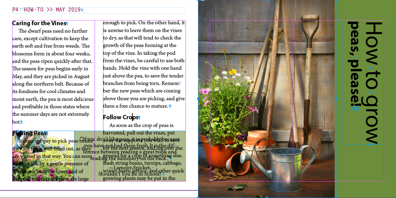
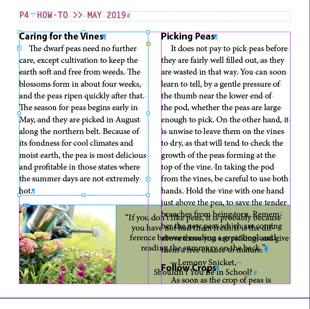
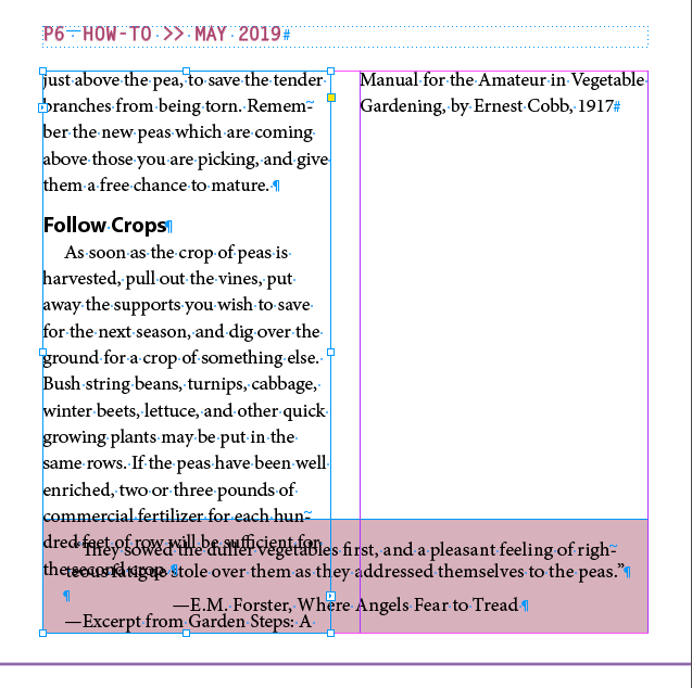
The result is terrible. The auto flow overflowed on top of the photos on pages 5 and 7
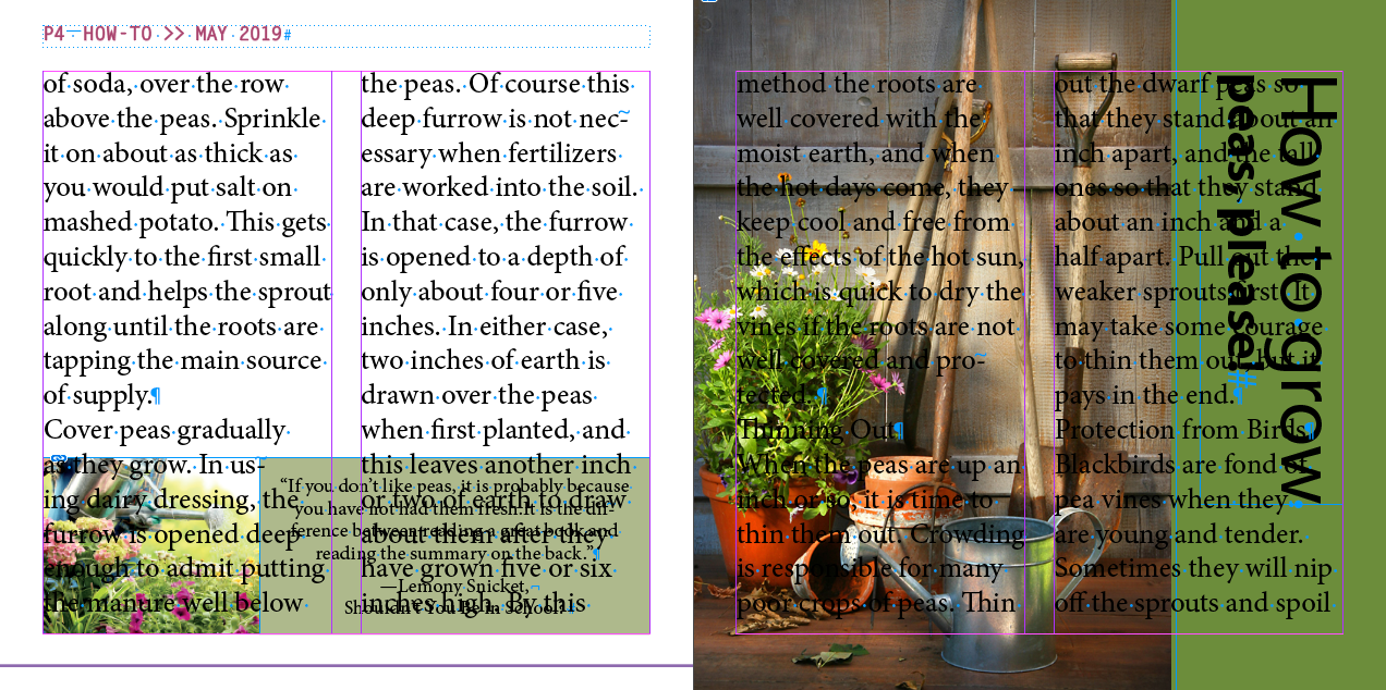
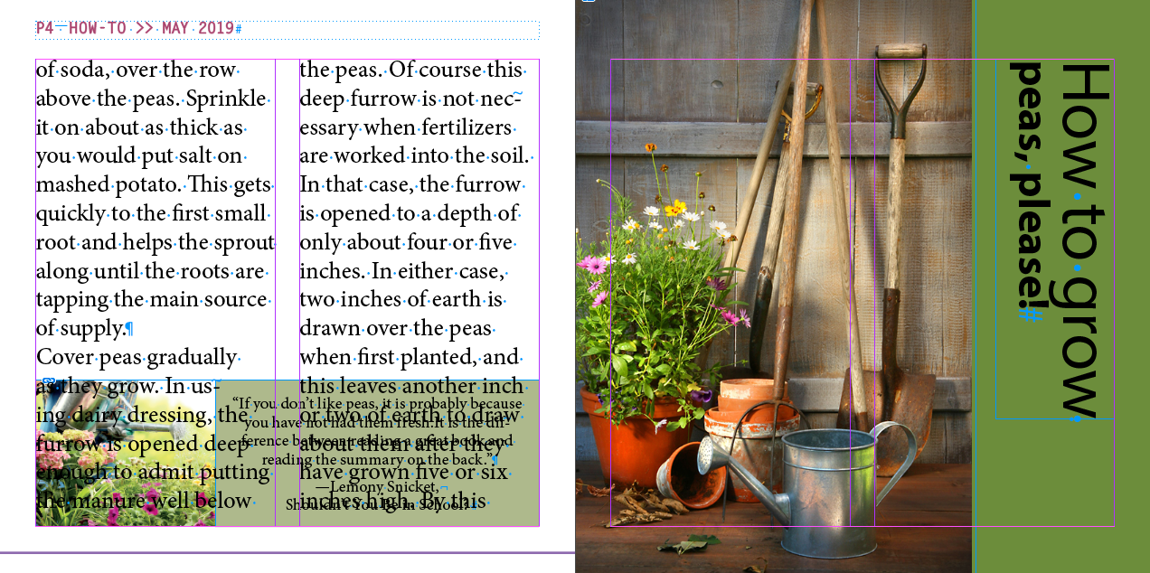
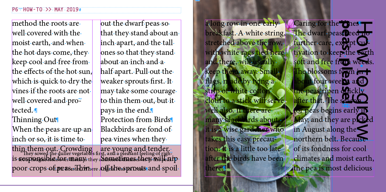
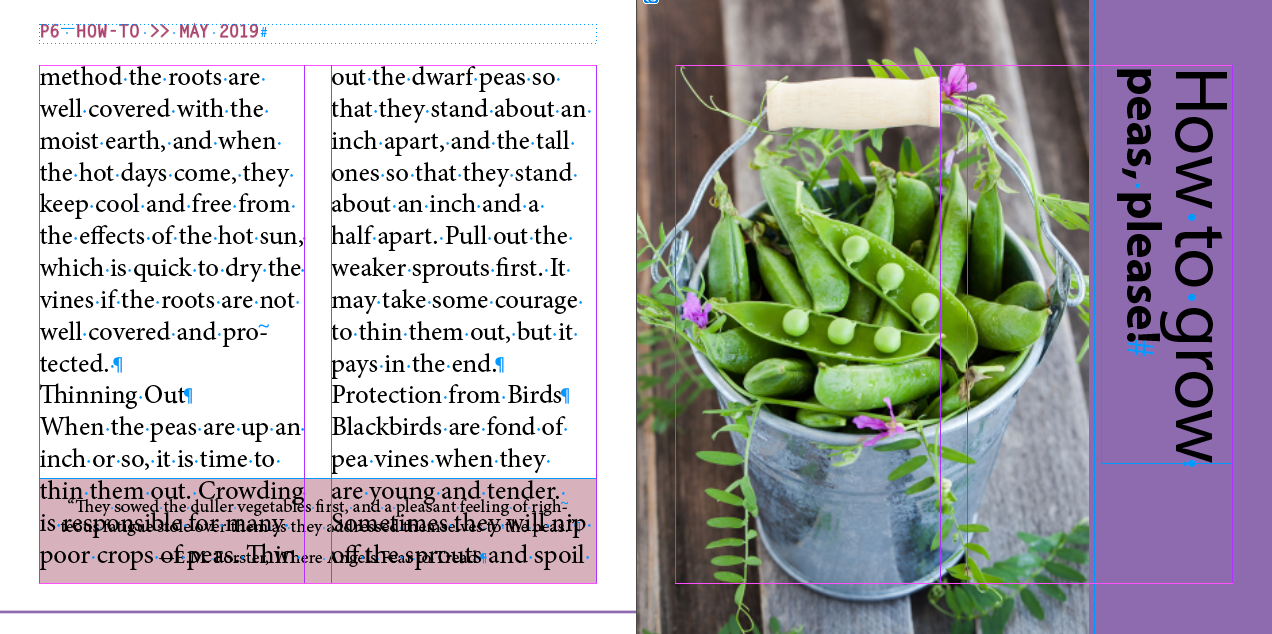
Still terrible, but we'll fix it soon.
Adding Pages While Flowing Text
A demo of InDesign adding pages as needed for a large document
- New doc
- Print tab, View All Presets +, Letter - Half, Landscape
- Make sure "Primary Text Frame" is on
- Preferences > Type
- Confirm
Smart Text Reflowis on- Place 05_Peas.docx
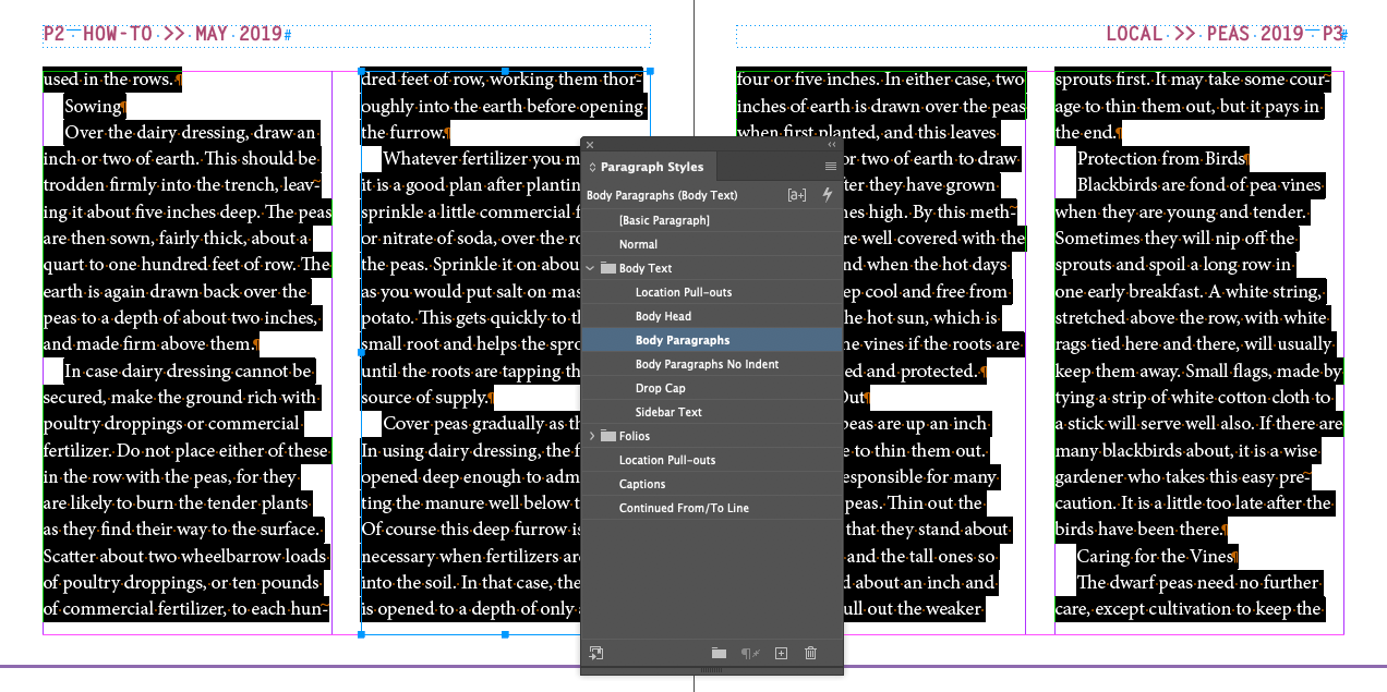
We'll apply the Body Paragraphs style to all the text we just threaded out
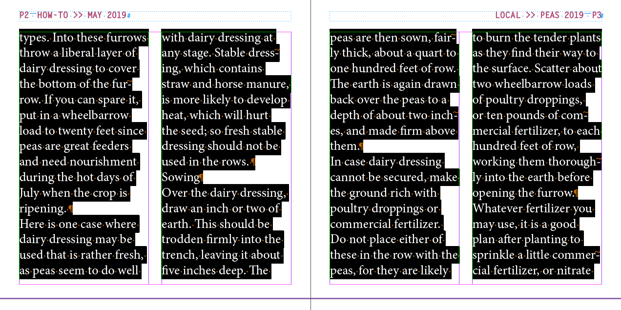
Body Textfolder and choose
Body Paragraphs
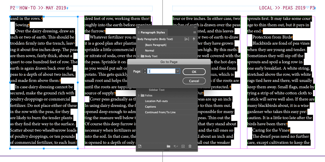
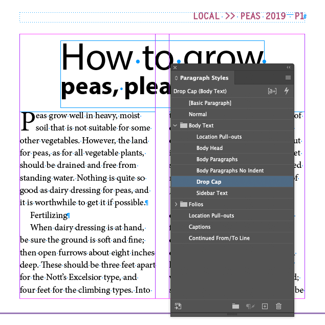
Drop Capparagraph style
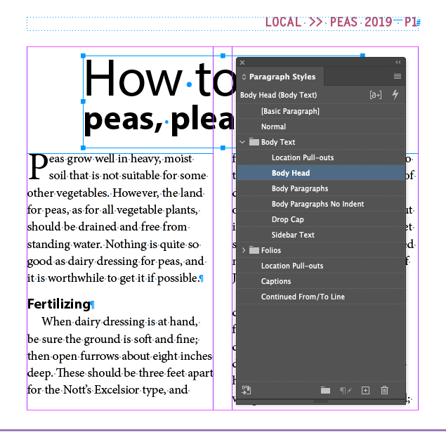
Fertilizingand choose the
Body Headparagraph style
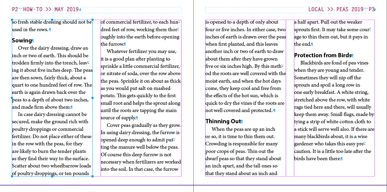
*The reason the subhead jumps to another page is because the style contains a setting called Keep With Next
, found under the Keep Options dialog box in the flyout menu of the Paragraph panel
Text Style Categories
The world of type and layout has categories for how a style might be used. Generally, they are considered as:
- Heading
Or Head, or Headline. Large and bold and meant to be read first on a given page. Usually a line or two long. Usually not a sentence.
- Subhead
Or Subheading. Smaller than the head, bigger then Body Copy. Often bold.
- Body Copy
Or Body Text, or Body. The meat of the article. Smaller, not bold. Multi-lined, usually in paragraphs.
- Callout
Text used to identify parts of an illustration. Usually around the same size as body copy.
- Caption
Text under images/photos/illustrations describing the image or identifying the creator of the image. Usually around the same size as body copy, but distiguished from body copy by font family or style (like italic).
- Footnote
Or Endnote when at the end of the chapter. Text at the bottom of the page or end of the chapter. Usually a little smaller than body copy, but distiguished from body copy by font family or style (like italic).
- Pull Quote
Or Sidebar. A block of text, larger and usually bolder, that takes a section of text from the body copy and sets it out in a box near the source text.
- Mouse Type
That tiny type you see at the bottom of an add with legal gibberish
Heading
Subhead
Body Copy, paragraph one, lorem ipsum dolor sit amet, consectetur adipiscing elit. Curabitur malesuada tellus id arcu molestie, vitae porttitor turpis faucibus. Mauris tincidunt ut sem congue aliquam. Nam at dignissim risus. Mauris convallis est vitae dolor sagittis, non vehicula eros molestie.
Pull QuoteBody Copy, paragraph two, suspendisse fringilla suscipit dapibus. Vestibulum ante ipsum primis in faucibus orci luctus et ultrices posuere cubilia Curae; Duis vitae sem consectetur, dignissim elit sit amet, consequat risus.*

Callout
Caption
* Footnote at bottom of page.Mouse type, squeek squeek! The use of this product will probably kill you. Do not take if you are allergic to this product. May cause sudden blindness. Product not refundable or returnable. Not legal in states where it is not legal, which is most of them.
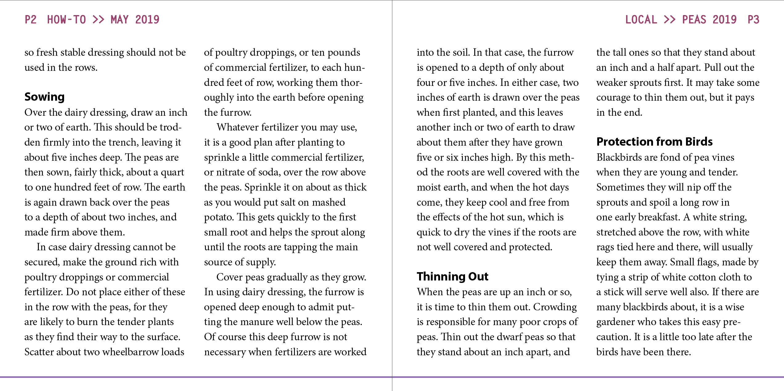
Finally, we get to edit those pesky columns on page 4!
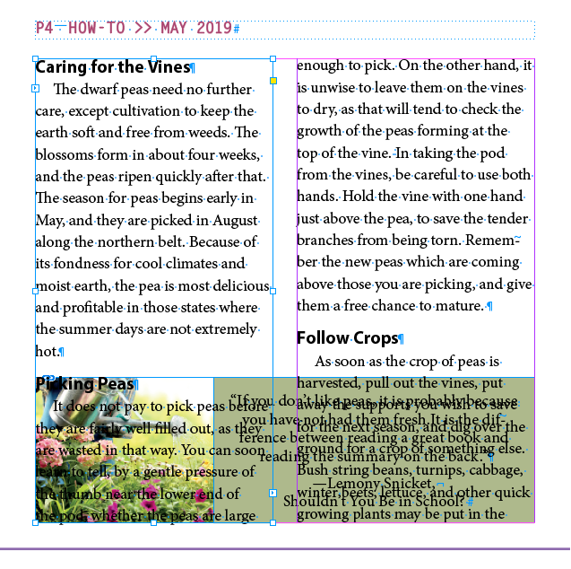
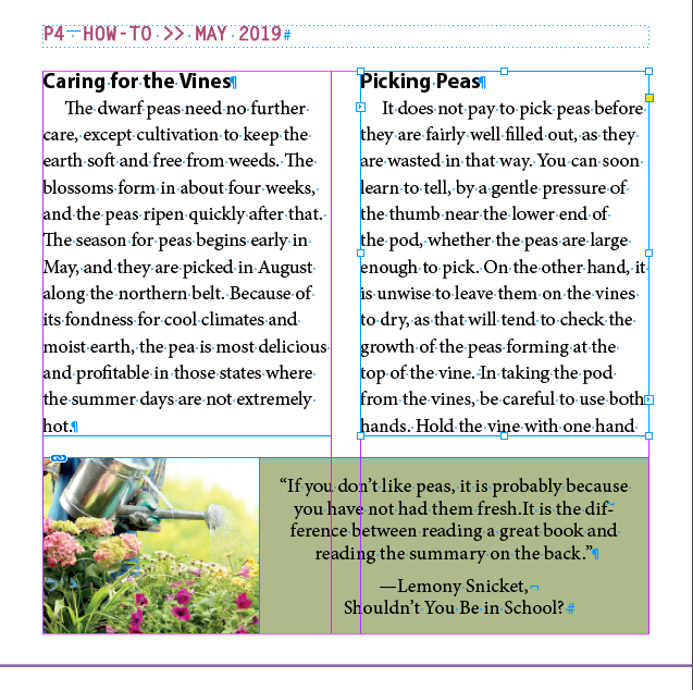
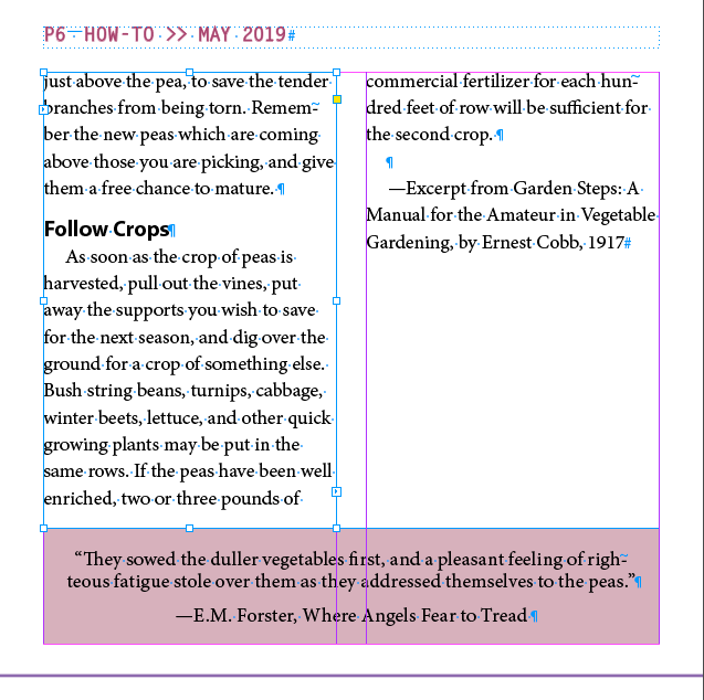
This is the setting that can make your head explode if you don't remember where it is. It is in the Paragraph panel, a tiny little button on the lower right
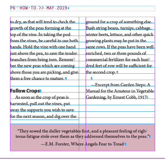
This can be a nice, if somewhat limiting, feature. It makes the baseline of everything line up across the page. To make it work, you first have to set up the grid and a paragraph format that aligns to the grid.
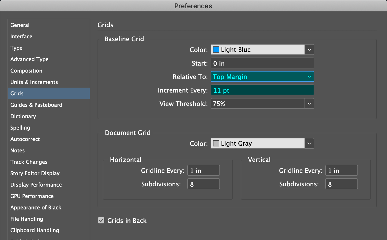
Relative to:
Top Margin
Increment
Every:
11 pt
Align to Baselinebutton in the Paragraph panel
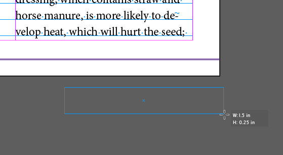
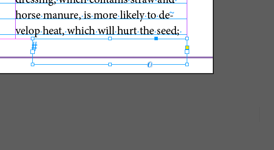
You can add a hint for the reader on where the story is continued, or where the story came from with jump line numbers. The magic gesture is that the Next Page Number
marker has to be in a text frame that touches the text frame of the story to be continued.
Result
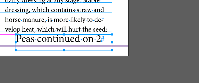
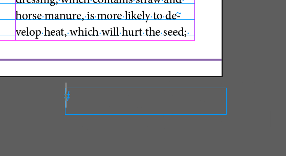
Peas continued on, then insert the Jump Line number with Right-Click-Context-Menu > Insert Special Characters > Markers > Next Page Number at the end of the line
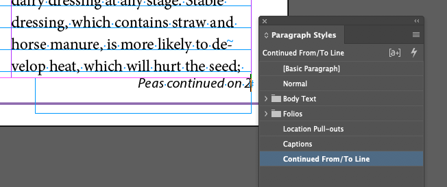
Continued From/To Linestyle in the Folios folder
Note that the paragraph style includes an Align Away From Spine
setting

Fonts live in a special location in the operating system. They are a very specific kind of data file that holds information about how a set of characters is drawn by the operating system. They are not part of the application, but part of the operating system, that's why if you have a font installed, you can use it withe any app.
Most fonts cost money. Good ones usually do (you get what you pay for with free fonts). Adobe pretty much owns the digital font world. With the Adobe Cloud, you get a lot of fonts as part of the subscription. I've put together a page of useful font sites here, that's also linked to on our home page.
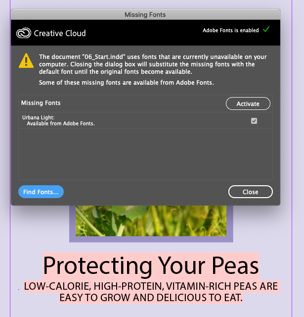
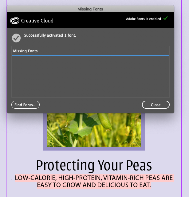
This (or a similar) error message will appear telling us that Urbana Light (and possibly Goudy Old Style Italic) are missing from the fonts installed on our system.
In theory, we shouldn't have Goudy Old Style Italic installed, but we don't need to install it for this demo. Instead, we'll replace its use with Myriad Pro (the font Adobe ships, along with Minion Pro, with it's products for just this demoing purpose).
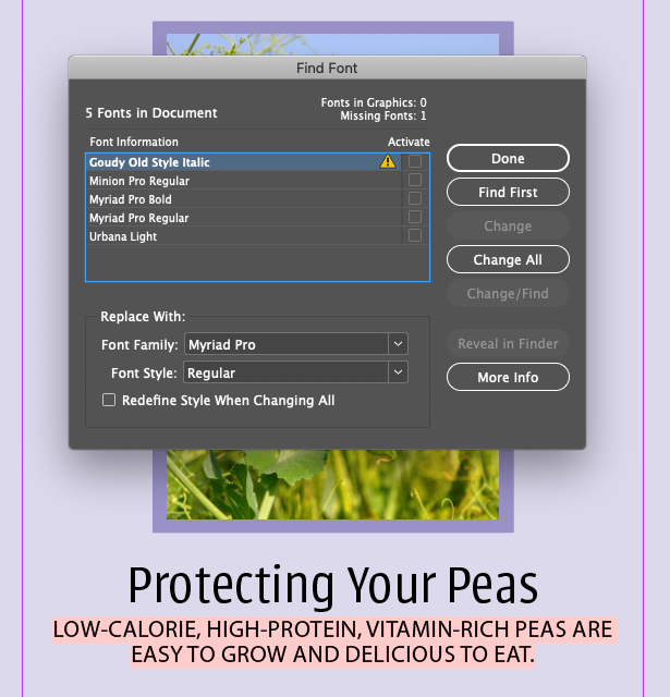
appears next to Goudy Old Style Italic, showing it's missing.
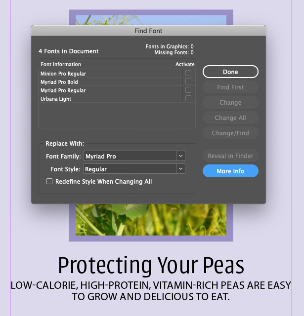
Result
InDesign is a mediocre terrible text editor, it's better to use Word or something like it. However, it does have all the bells and whistles, it's just that there's so much more in it that can be distracting when you're writing. Usually, you import the text into InDesign, then do some editing and extensive styling to the pre-fabricated text. Stories (the text from Word or whatever) should have minimal formatting. You should remove double-spaces after periods if they're there, and two paragraphs for separating paragraphs.

I think this should be on by default!
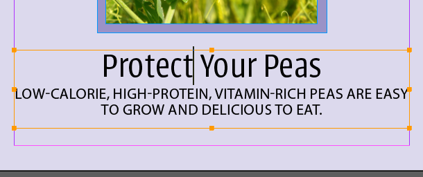
Protectingto
Protect
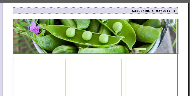
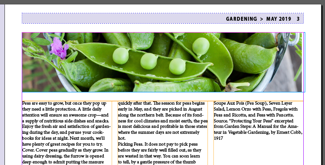
Text imported
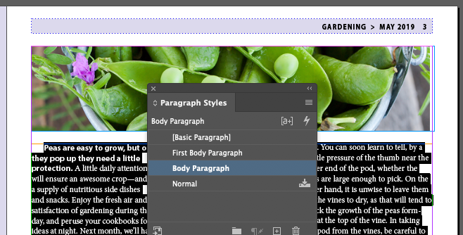
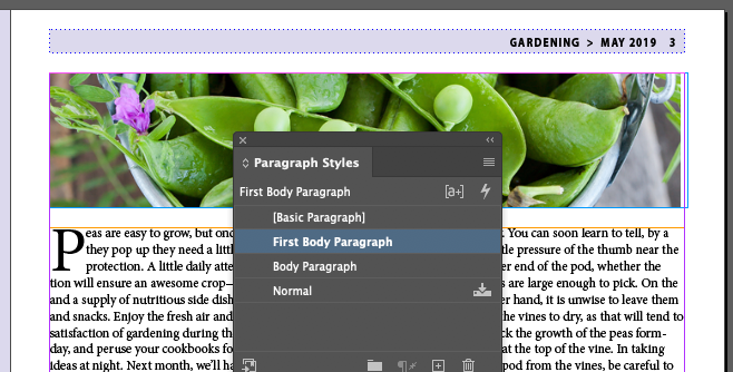
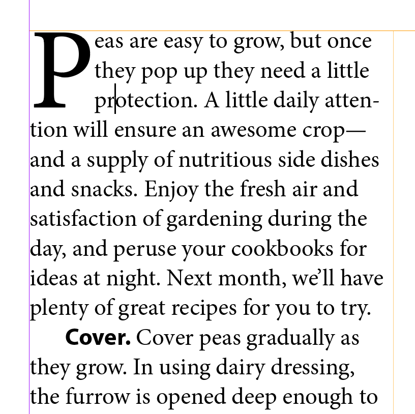
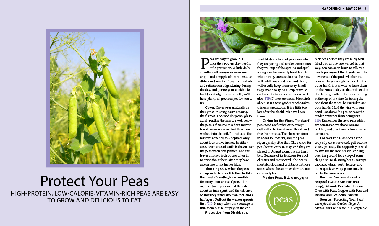
We've applied two paragraph styles that hold some interesting effects. The capital P in the first paragraph is fairly obvious that something special is going on. Namely, the first initial of the first word in the paragraph spans three lines of text and is larger and bolder than the other characters in the paragraph
The second is a bit harder to see. Notice that Cover
is bold. And if you check other paragraphs, you'll see that all the characters in the first sentence of the paragraph are bold. This is cool stuff, more soon...
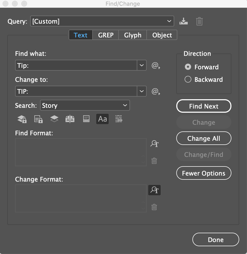
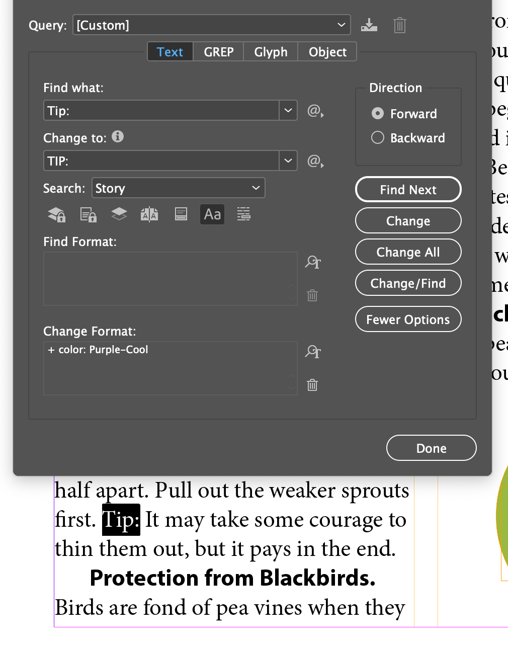
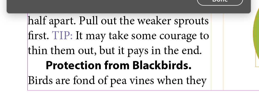
A very robust version of Find/Replace (Change) is available in InDesign
Menu > Edit > Find/Change
We'll changes all occurances of bird
to blackbird
...
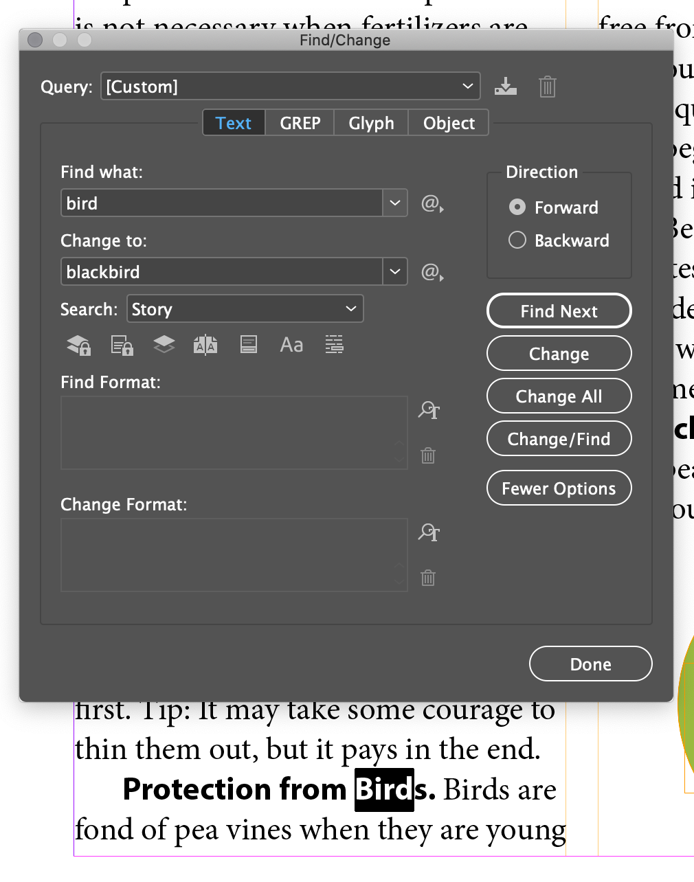
This dialog is has more features than you can shake a stick at. We'll cover some, but there's a ton of stuff, even GREP, which is a special language used in Unix coding that is super powerful.
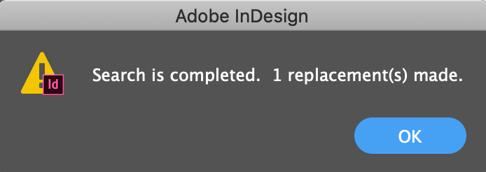
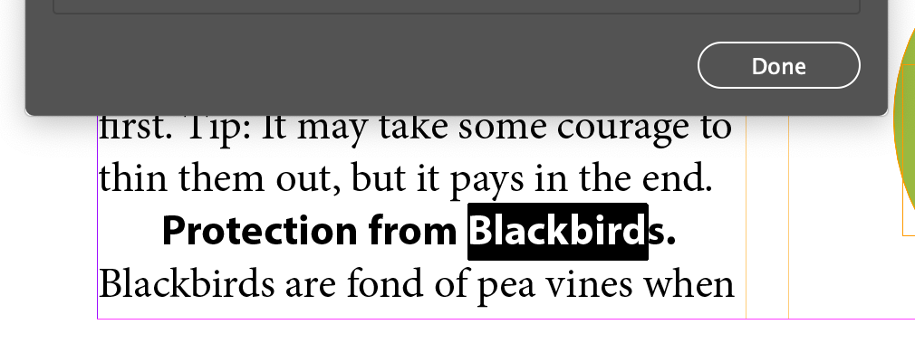
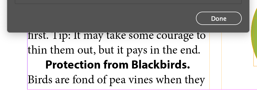
Birds changed to Blackbirds. Note that its capitalization hasn't changed
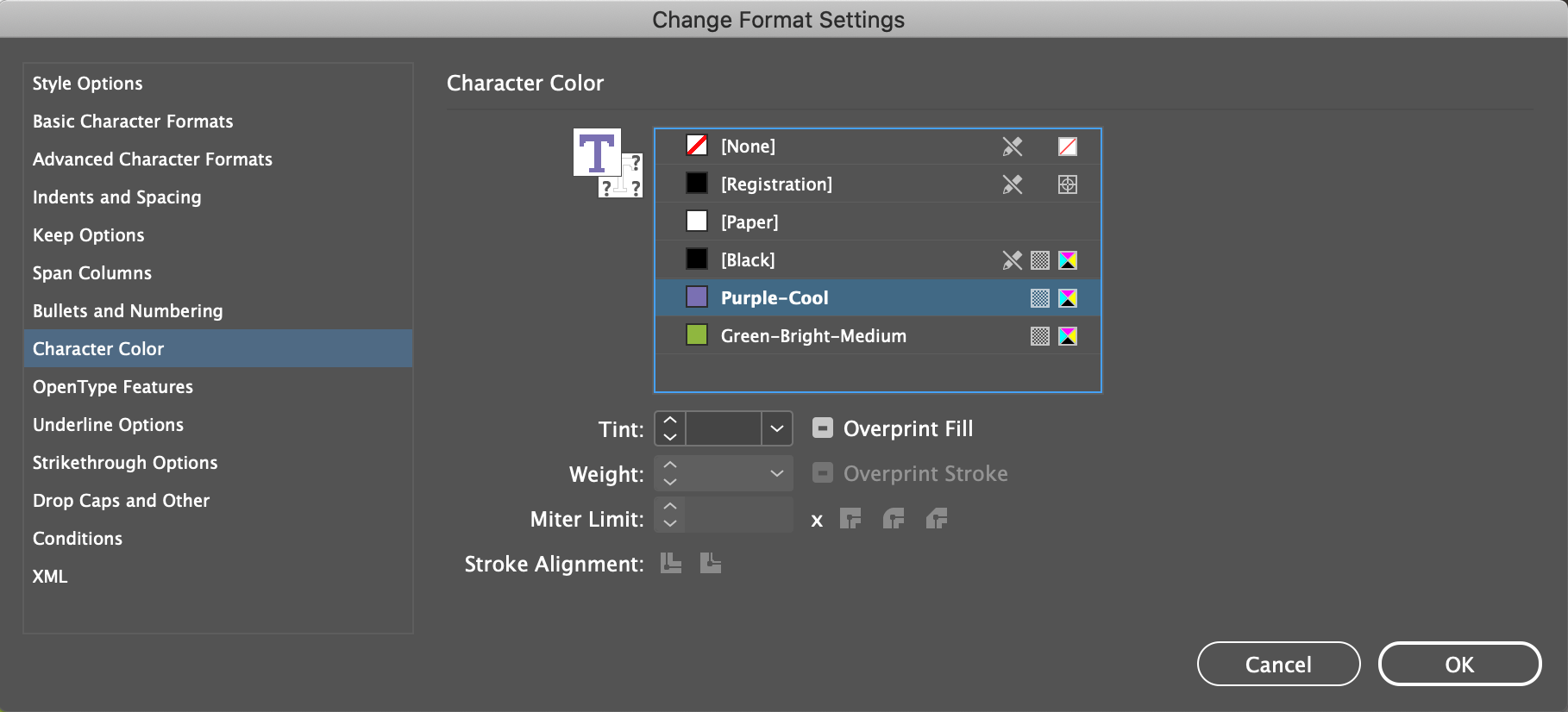
Leave the Find/Change dialog open. Unlike many dialogs, called Modal dialogs, this window is more like a Panel than a dialog. You can keep it open while you work on your document.
What could be more boring? It works, it's powerful. Use it when you need it. Best thing is making specialized dictionaries for things like medical and science journals, which have very specialized language. For now, let's skip it...
Meh. Hard to control. Easier just to cut and paste.