Getting Help
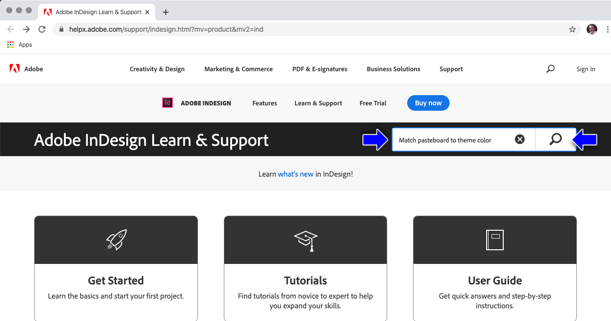
- Use Menu > Help > InDesign Help... (This will launch the default browser to Adobe's web page)
- Enter Search
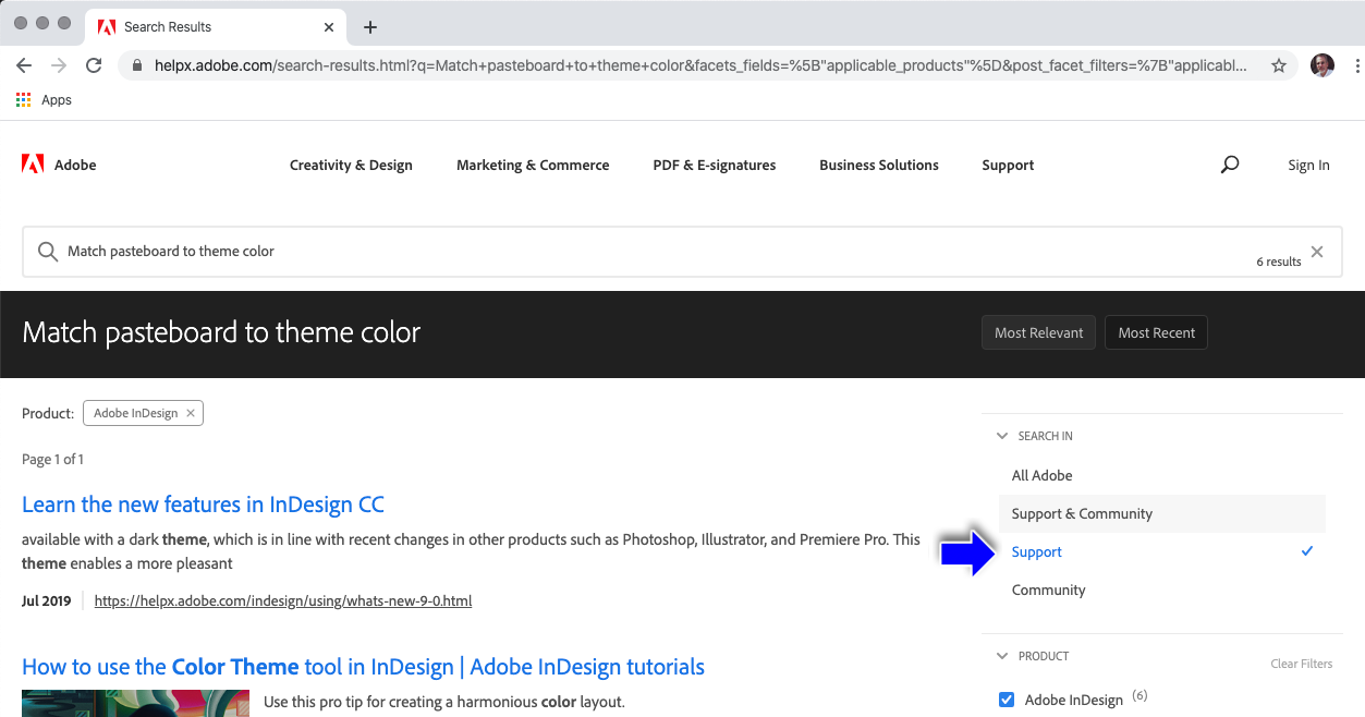
- Then limit the search to "Support"
First, let's all reset our InDesign App:
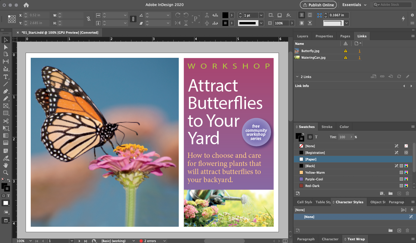

Pasteboard and Artboard/Page
Selection (V) vs. Direct Selection tool (A)
Shift-constrain

Click on existing type to edit
Click and drag on a blank area to add type
Unlike Photoshop and Illustrator, click-release doesn't create a line of type (Point vs. Paragraph text in Photoshop and Point vs. Area in illustrator)
Essentially the same as Illustrator and Photoshop
Line Tool
Hand Tool (Hold down the space bar for temporary access to the Hand tool except when in the Text tool)
So far, the tools we've selected can be gotten directly by a click in the tools panel or by using a quick-key or modifier key like Space for the Hand tool. But some tools are nested underneath each other in the Tool panel, like the Frame tools.
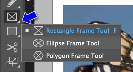
Click on the tiny gtriangle in the lower right corner of the tool icon to see the tools nested beneath the primary tool
The Control Panel at the top of the work space is a context-sensitive interface to the properties of the tool or object you current have selected.

Control panel with rectangle object selected

Control panel with Text object selected
You can have more than one document open at a time in InDesign (pretty much like every app in the 21st century). Just open them thru the File menu's Open command.
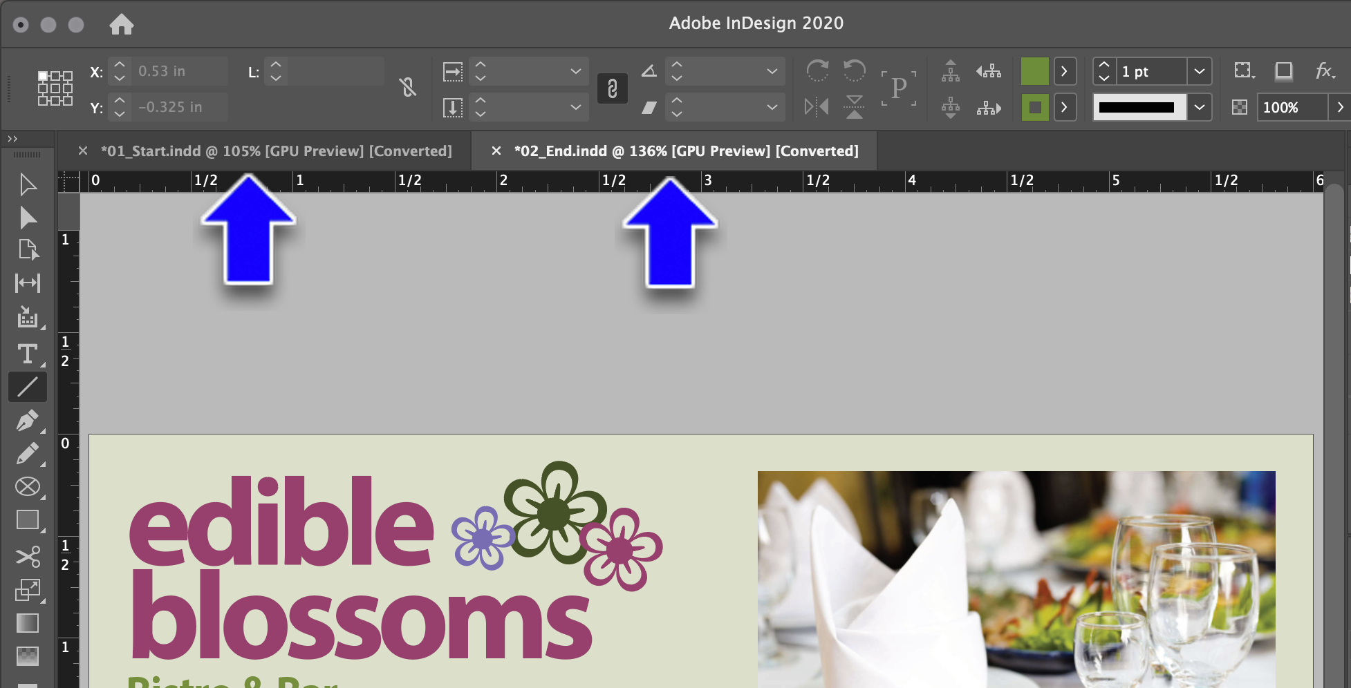
They'll appear as tabs by default
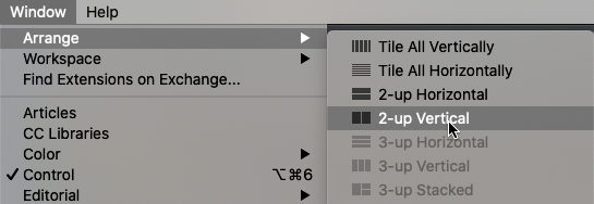
But you can go to Menu > Window > Arrange and have multiple documents visible at the same time...
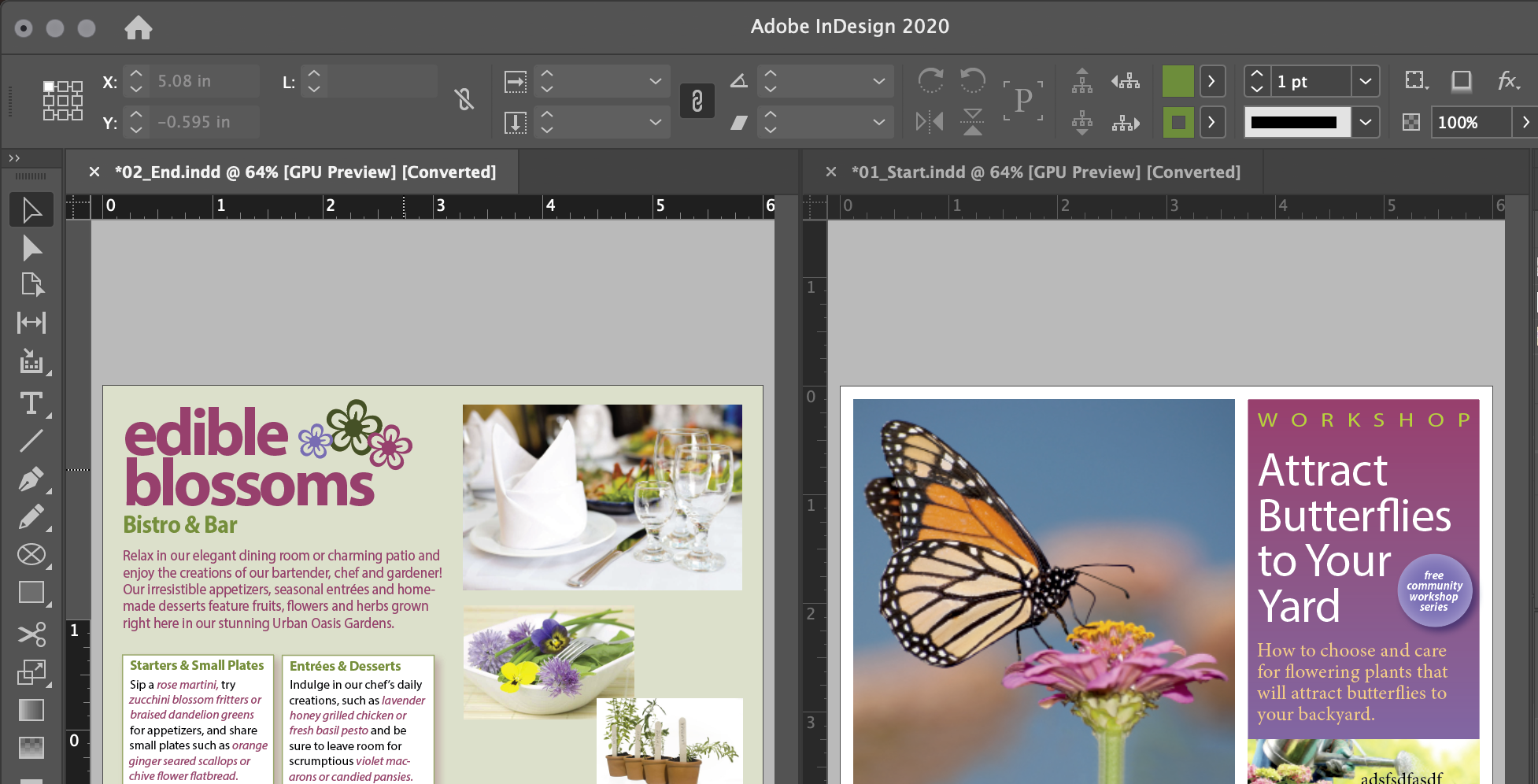
...making it easy to drag and drop objects from one doc to another.
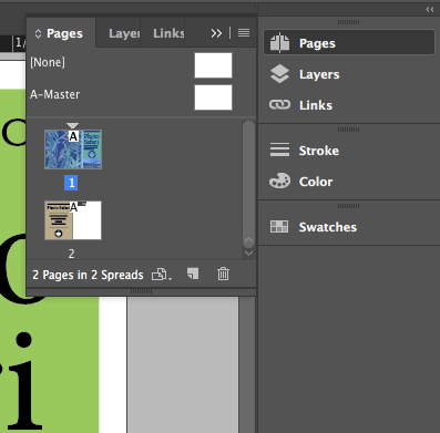
Clicking on a panel button opens it off to the side
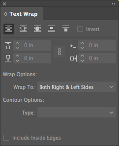
You can also open a panel from the Window menu.
Try Menu > Window > Text Wrap
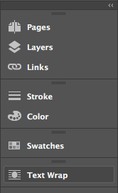
You can add the Text Wrap panel to the set of panels on the right by dragging it into the Character Styles section of the panel

You can change the width of the panel set by dragging the left edge
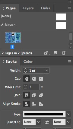
But the most useful view of panels (if you have the screen real estate -get two monitors if you can!) is expanded with the little double arrows in the upper right of the panel set
It's all about the previewing blue line that appears when you get close to a docking possiblity, which can't be screen-captured
Drag from the sides or bottom
Most panels have a little popup menu in the upper left:
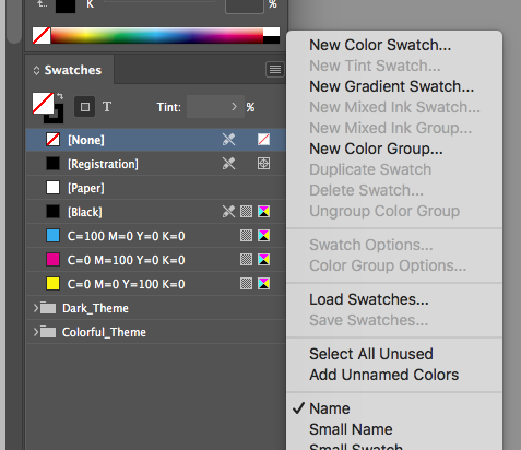
There is ton of stuff buried under these menus.
Way more than any other Adobe product.
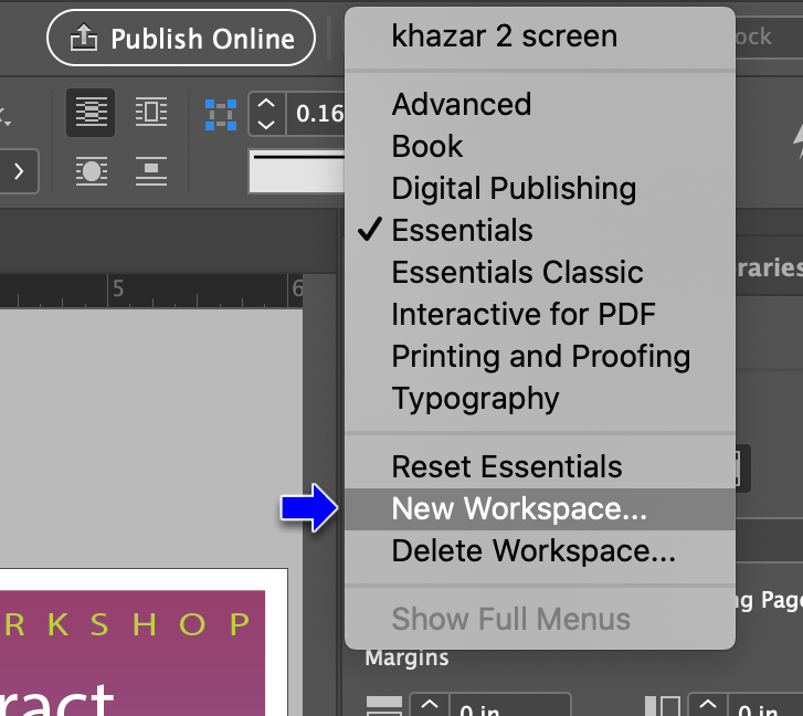
You can do tons of workspace customizing and save it thru the popup menu above the control panel
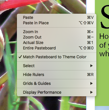
Menu > View > Zoom In or Menu > View > Zoom Out
Command/Control + to zoom in or Command/Control - to zoom out
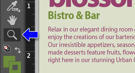

You can modify the zoom in/zoom out of the zoom tool by holding the Option/Alt key to toggle it. Click and release the tool to zoom in/out centered around the point you clicked on
Using Animated Zoom
Apparently, this only works on Mac OSX machines, and only those with GPUs (Graphic Processing Units, found on most Macs). This adds the following capabilities:
- Press and hold: Zoom in to the mouse cursor
- Press Option and hold: Zoom out from the mouse cursor
- Press and drag to the right: Zoom in
- Press and drag to the left: Zoom out
- Press Shift while dragging: Behave the old way and draw a region to zoom to
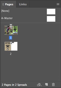
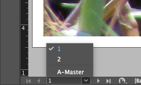
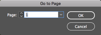
Either with the Hand Tool itself
Or by holding down the spacebar (except when editing text)
New Feature: With the Hand Tool selected, click and hold and the doc will zoom out and show a red rectangle indicating the area the hand tool is focusing on. Release it and that area will expand to fill the document window. Nice new gesture!
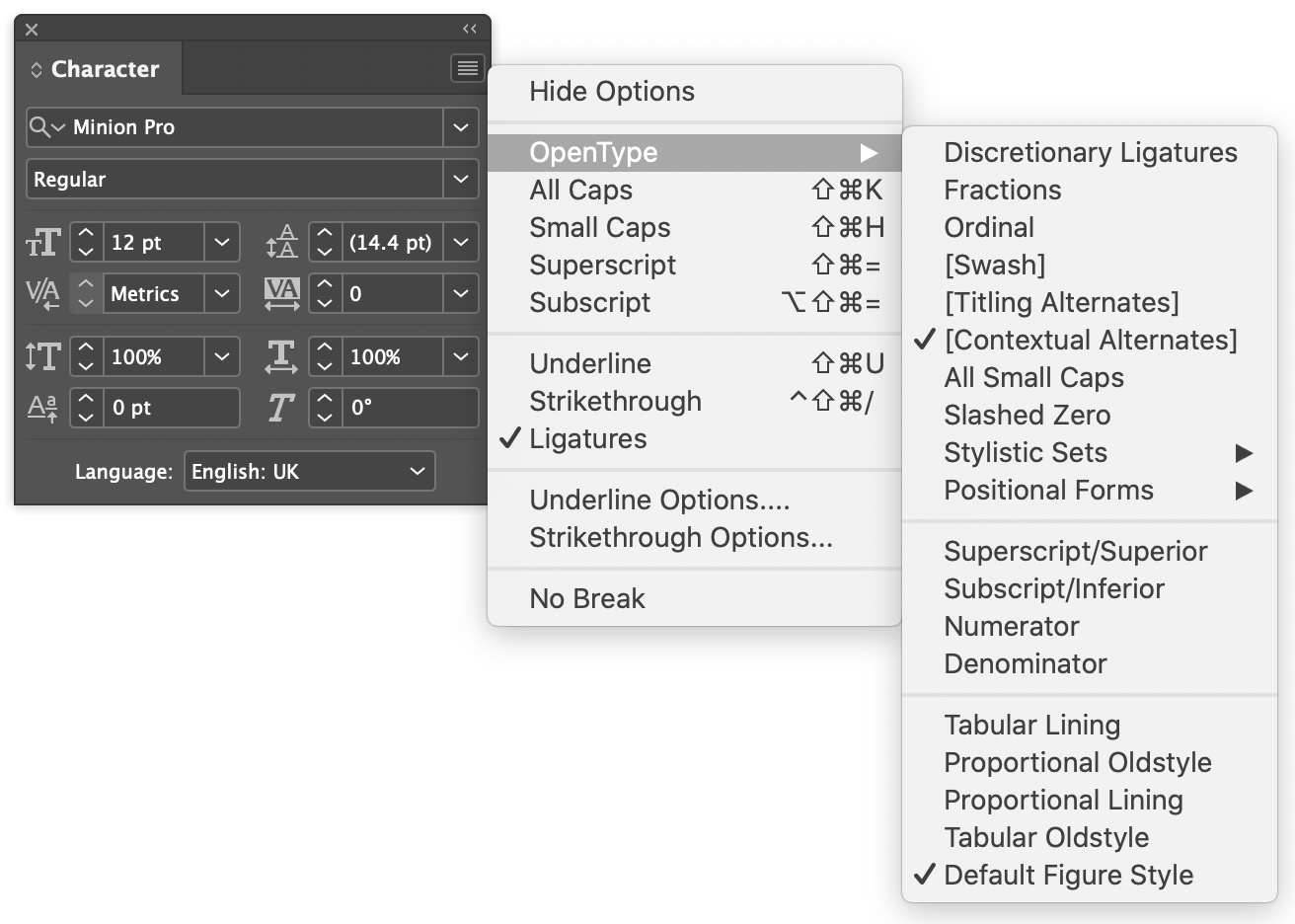
Click on the Hamburger Menu icon in the upper right corner of any panel to see the vast multitude of options within any given panel
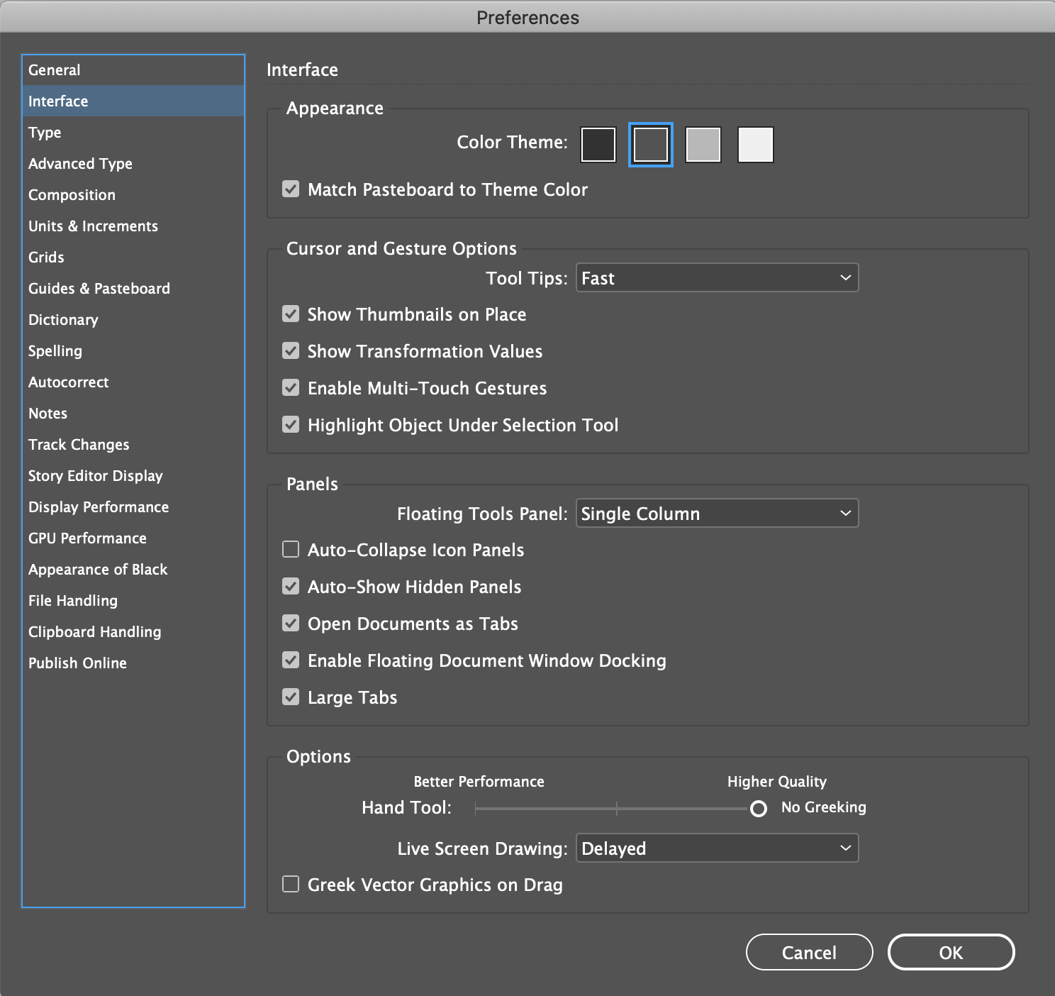
Under Interface in Preferences, which can be found under the Edit menu on Windows and under the Application menu in OSX.
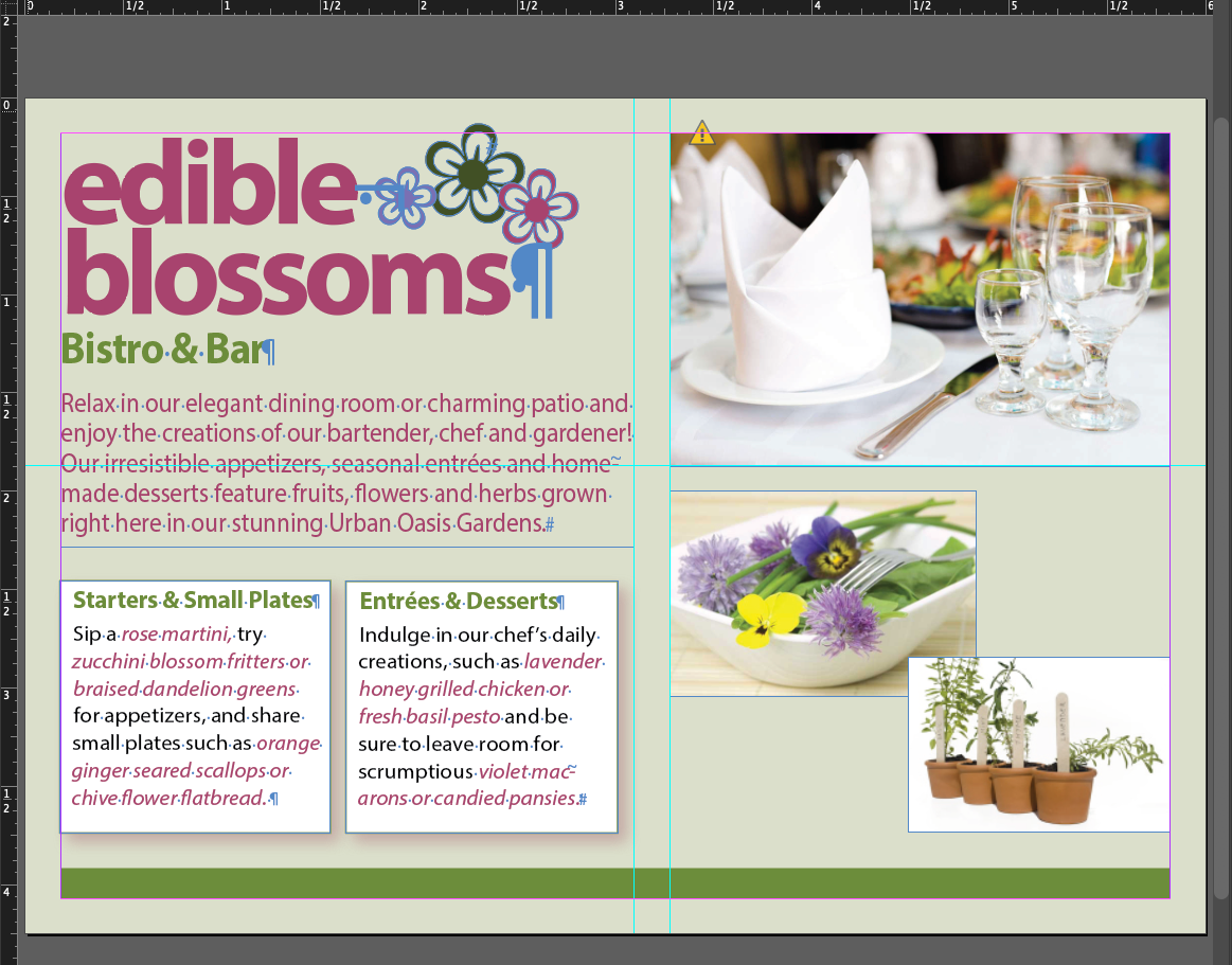
This will reveal the user interface cues for the page's layout
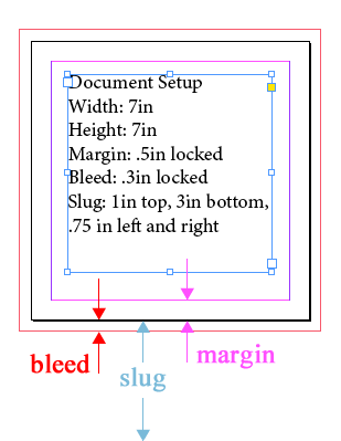
8 1/2 x 11 inch paper 'slug'
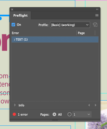
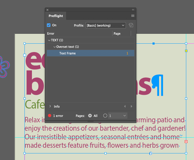
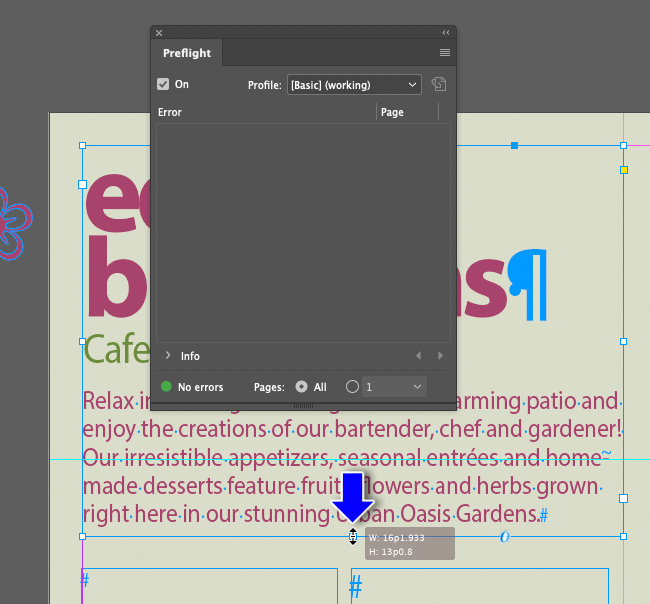
Preflighting is a way to check a document's preparedness for print. Originates from WWII Pilot's checklist concept for preparing to fly a plane.
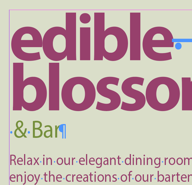
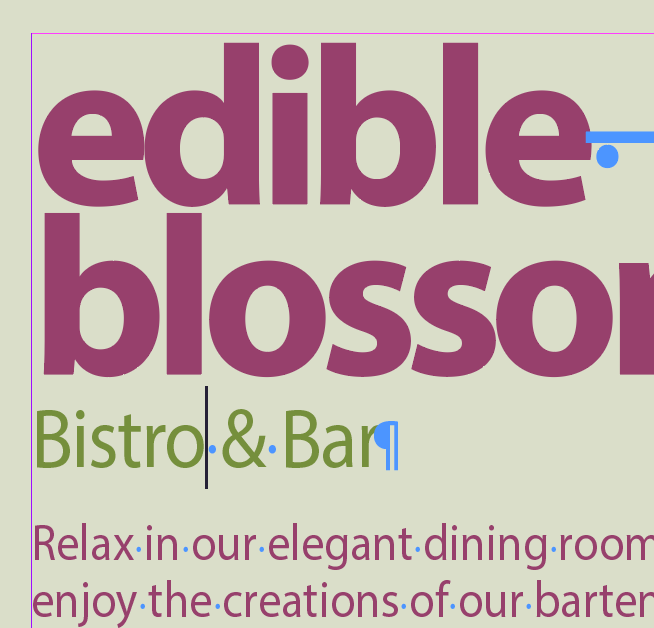
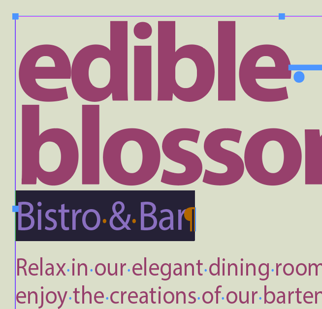
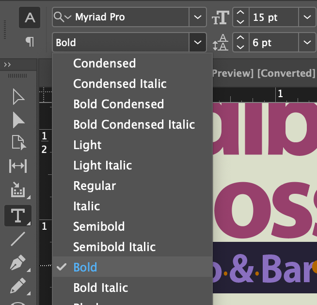
Options for styling and placing text
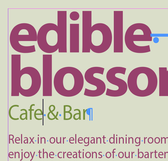
InDesign has tons of options for styling text, pretty much controlled within these bounds:
- Character Formats: Font, Style, Leading/Line Spacing, Letter Spacing, Caps
- Paragraph Formats: Alignment, Inset Spacing, Indent Spacing, Space Before & After Paragraph, Hyphenation
- Text Frame Options: Columns, Inset Spacing, Vertical Justification, Background Color, Border Width & Color
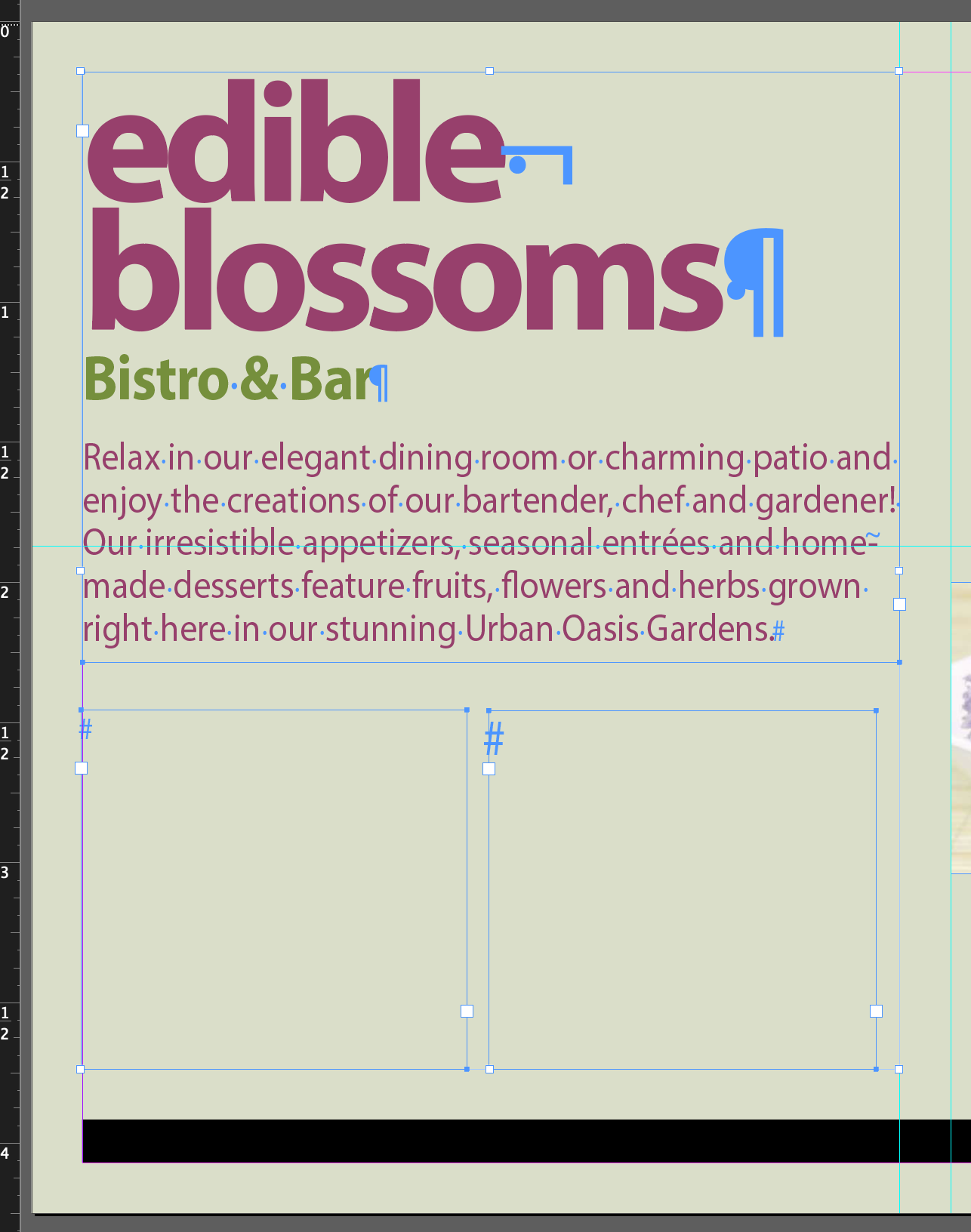
"Place" is the method for importing all content into InDesign. You can all sorts of media, including directly importing MS Word .docx files. Here, we'll place some text into one of the text frames on the left side of the page.
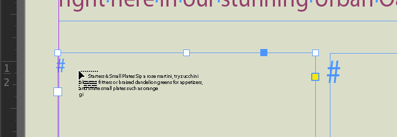
This loads the cursor with the text from the .docx file. You can see a preview of the text in the cursor as you hover over the text frame
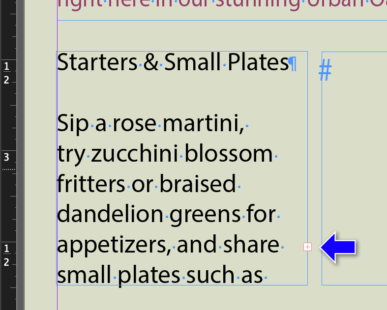
There’s more text than will fit. Note the little red + sign in the lower right. We need to connect the adjacent text frame to this one so the text will flow into it.
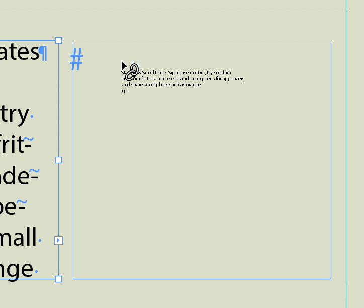
This fills the cursor with the overflow text.
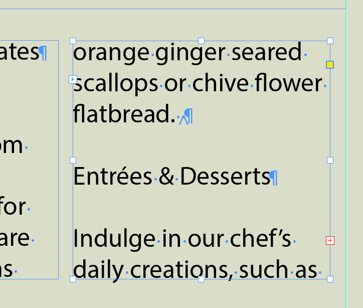
But it's still too big for the two connected frames. Next we'll reformat the text to make if fit.
A Word about Microsoft Word
Many writers like to include two returns between paragraphs and two spaces between sentences. You should remove these in Word before you import your Word file. You can do a search in word for ^p^p and replace it with ^pp , and a search for . and replace it with .
Styles are one of the most powerful features in InDesign. You can use them for styling characters, paragraphs, objects, and (ugh) tables and cells. They provide a method of making a document consistent in its design and layout. The great thing about them is if you change the definition of a style once in a document, you change every item that uses that style. You can also re-use styles in more than one document, which is how Publishers get their magazines and books and other printed material to be on-brand.
Paragraph Styles include formatting information about alignment/justification, indentation, spacing between paragraphs, init caps, shading and borders. Most of the stuff on the left side of the control panel when the text tool is active:

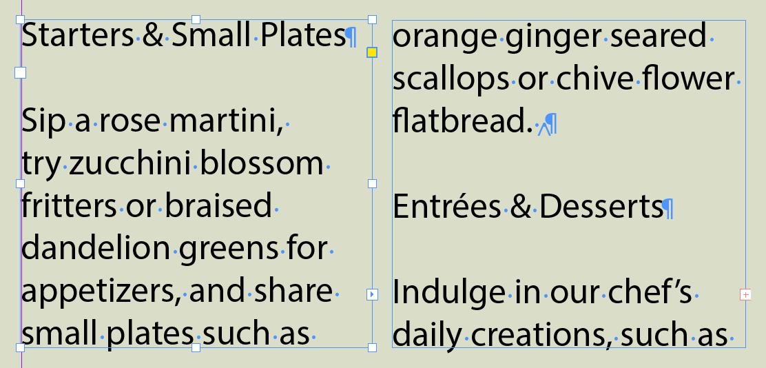
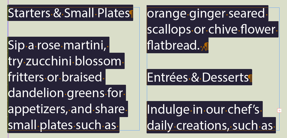
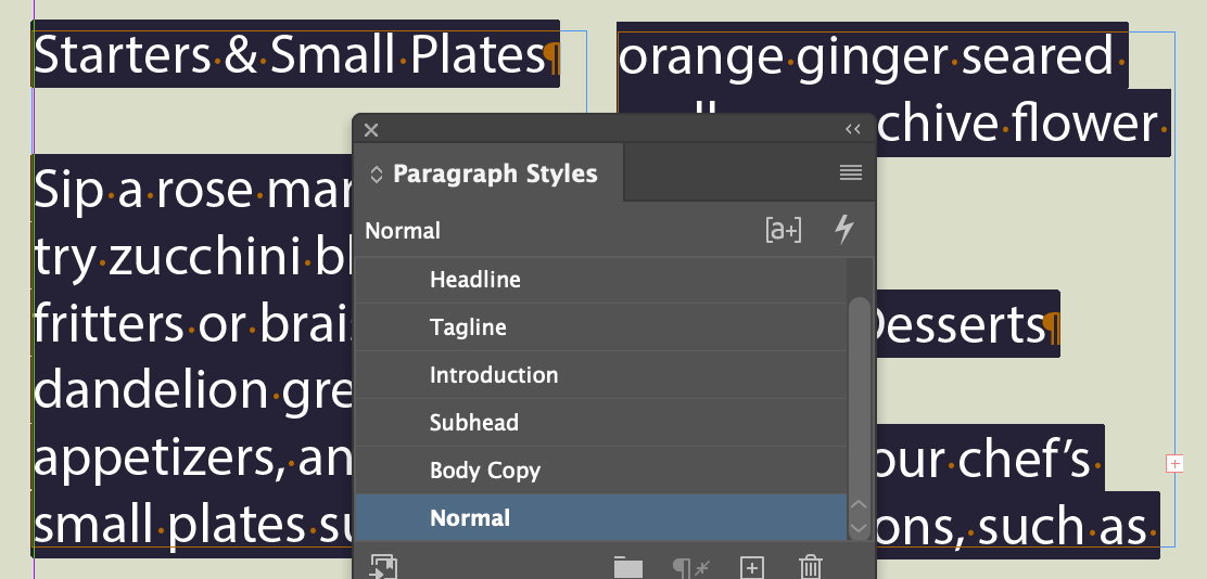
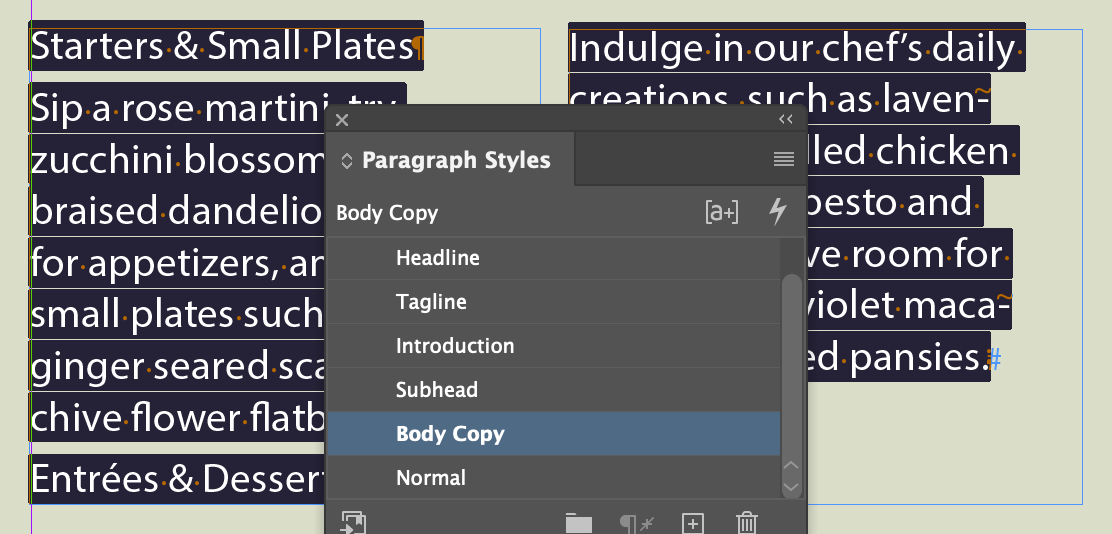
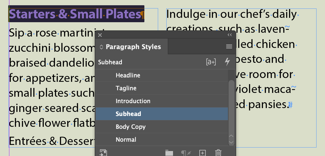
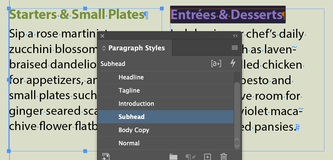
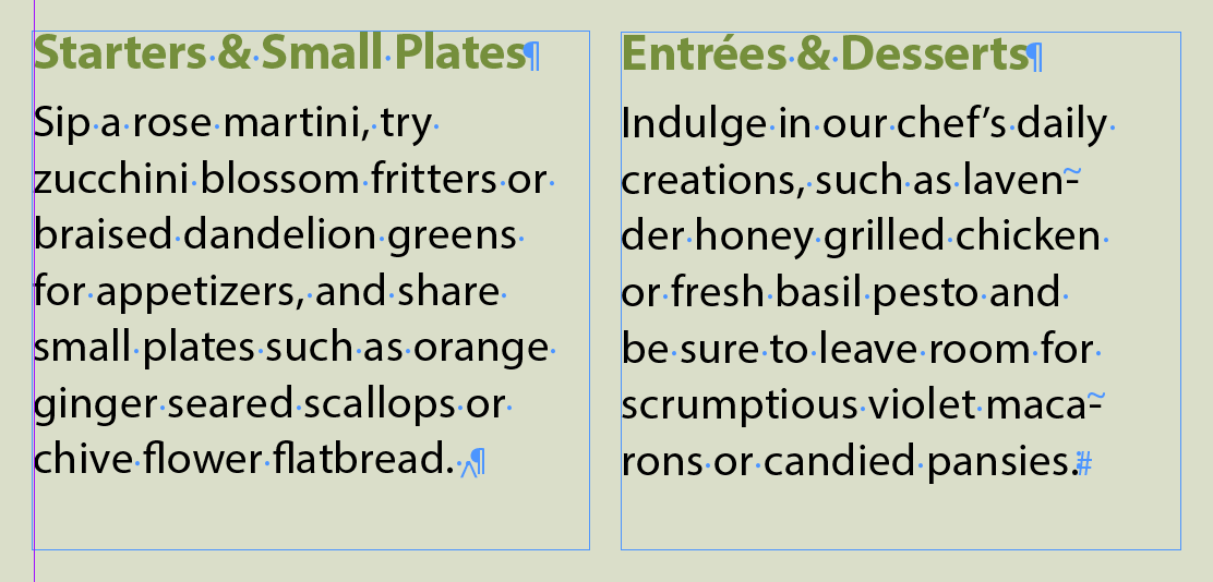
Note: This ain't how the pros do it
Anyone in there right mind would create two separate text boxes and place the text separately in each or insert a break character between them. Linking them creates too much room for error. This is a common problem with our text-book, they do things to demo features and not demo how it's done in the real world.
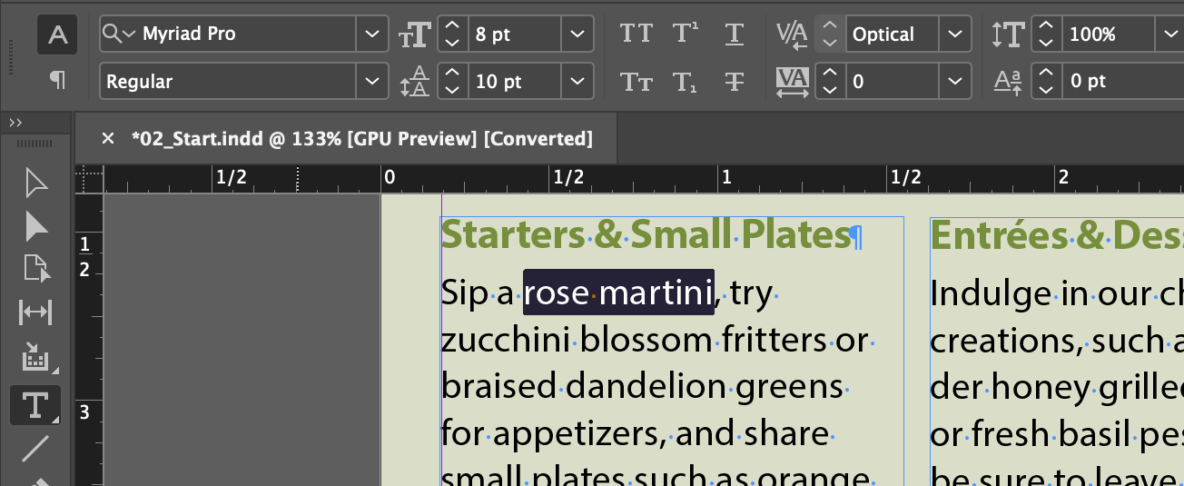
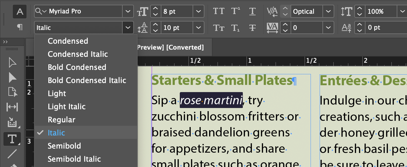
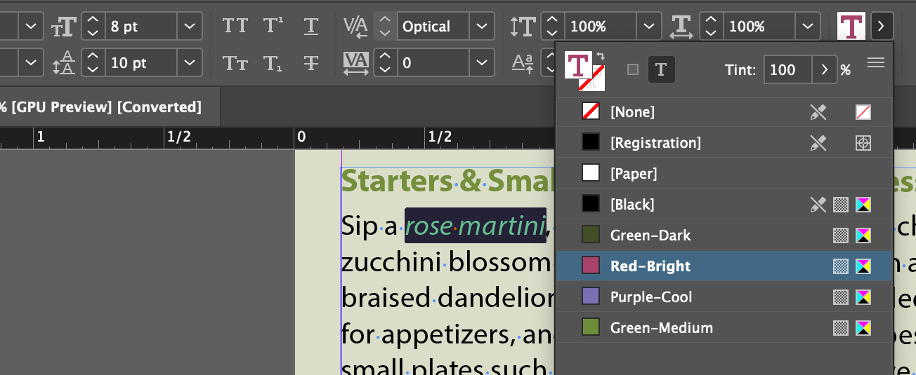
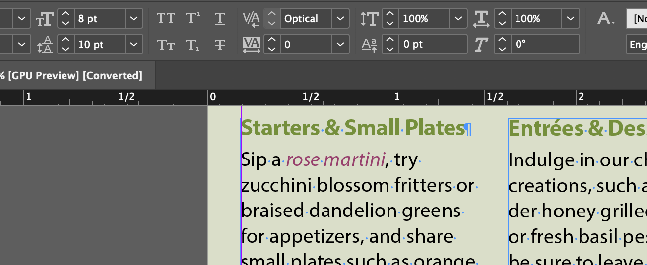
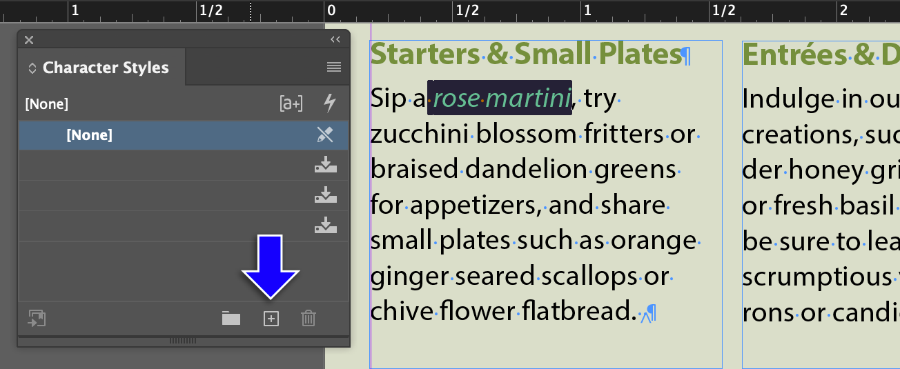
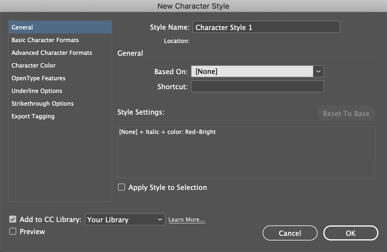
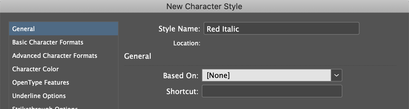
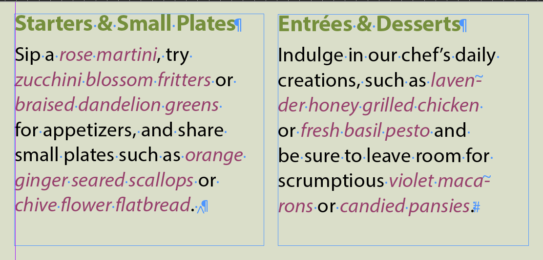
Character Styles include formatting information about font size, kerning, tracking, width, weight, italics, underlined, super/sub script, skew, color. Most of the stuff on the right side of the control panel when the text tool is active:

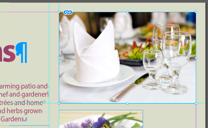
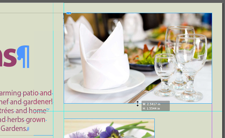
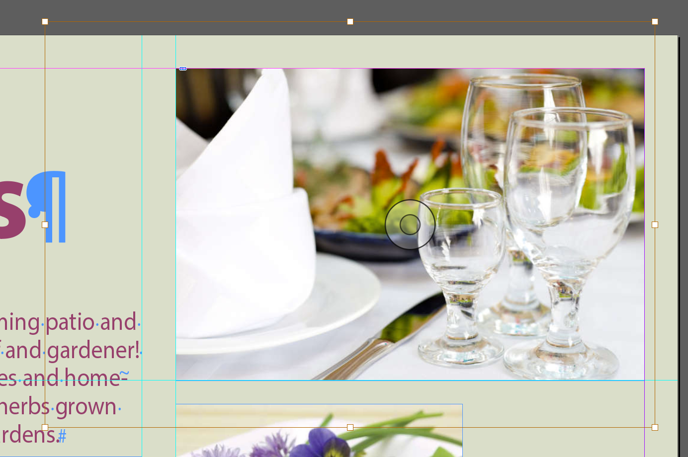
Placing graphics in a matter of placing previously created graphics (with few exceptions) generated by another application thru the Place facility under the File menu.
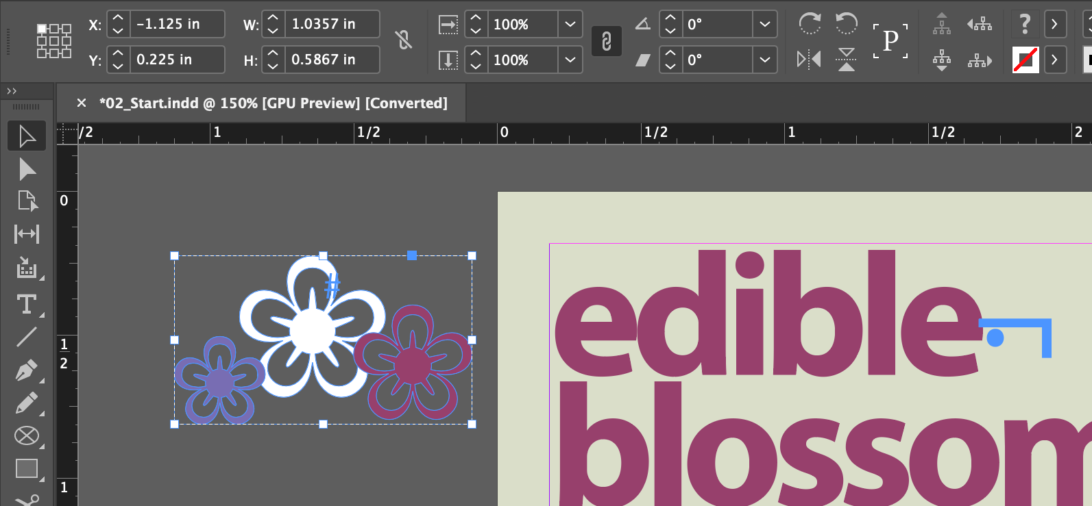
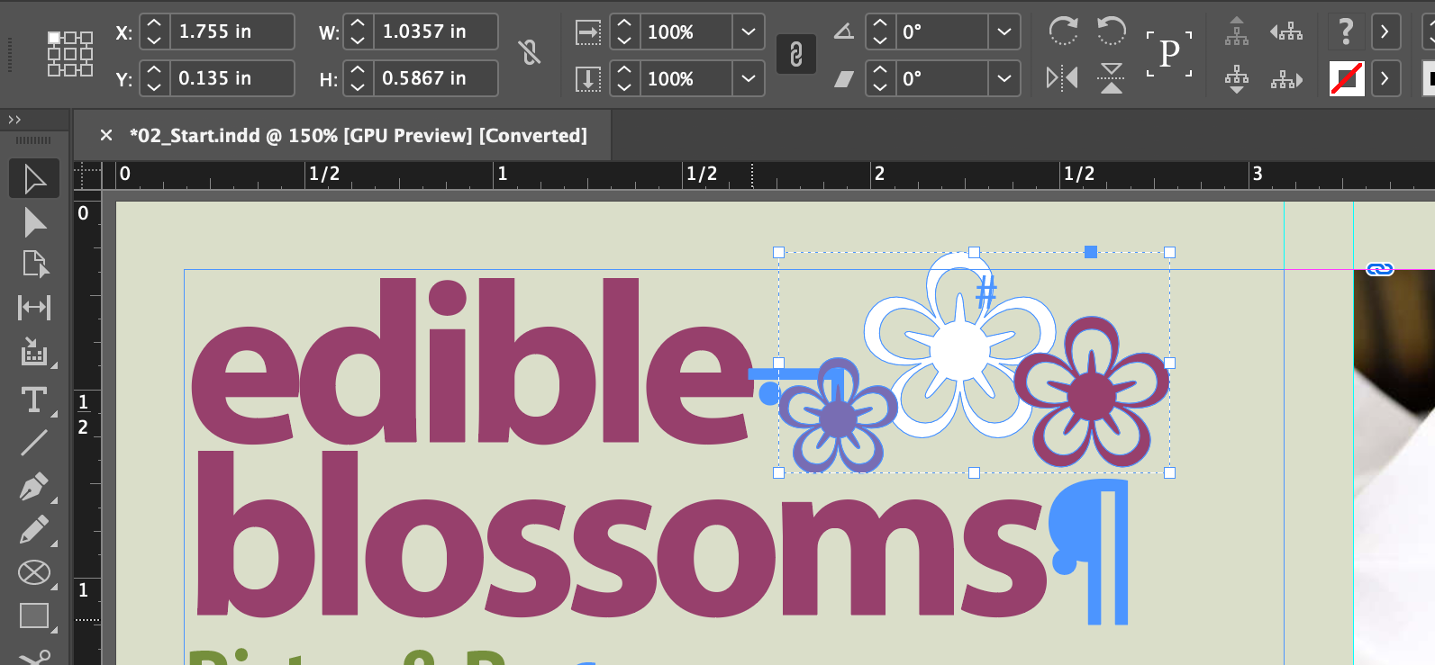
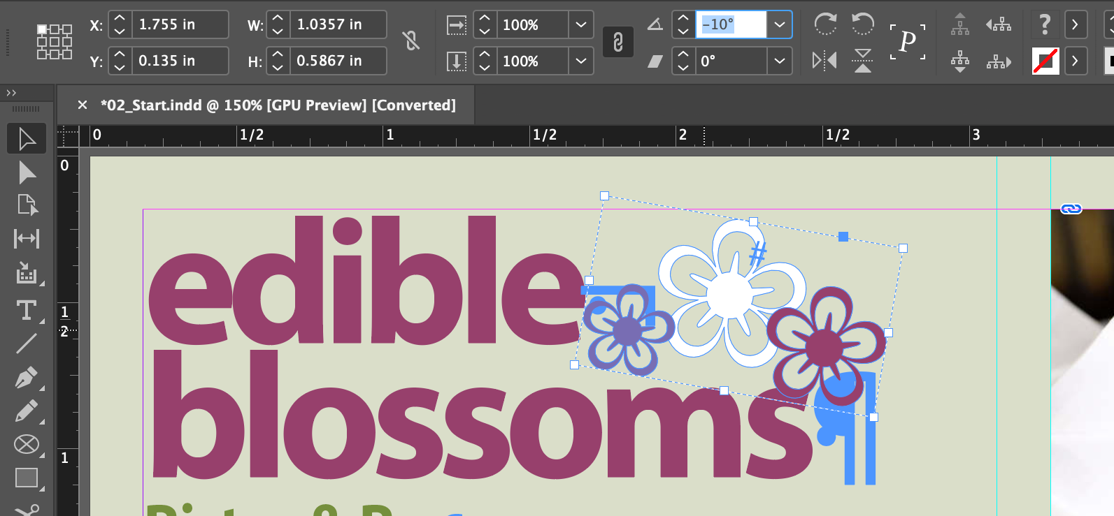
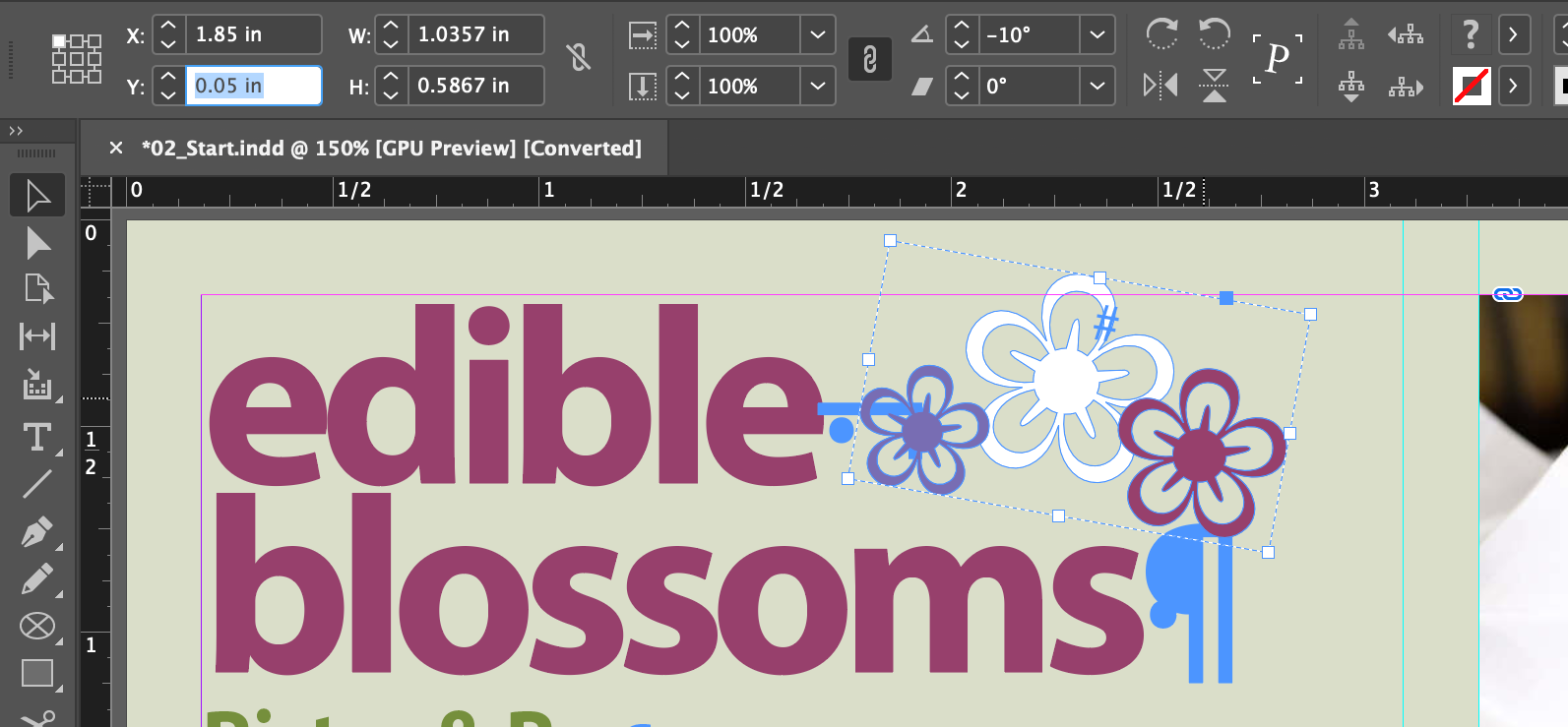

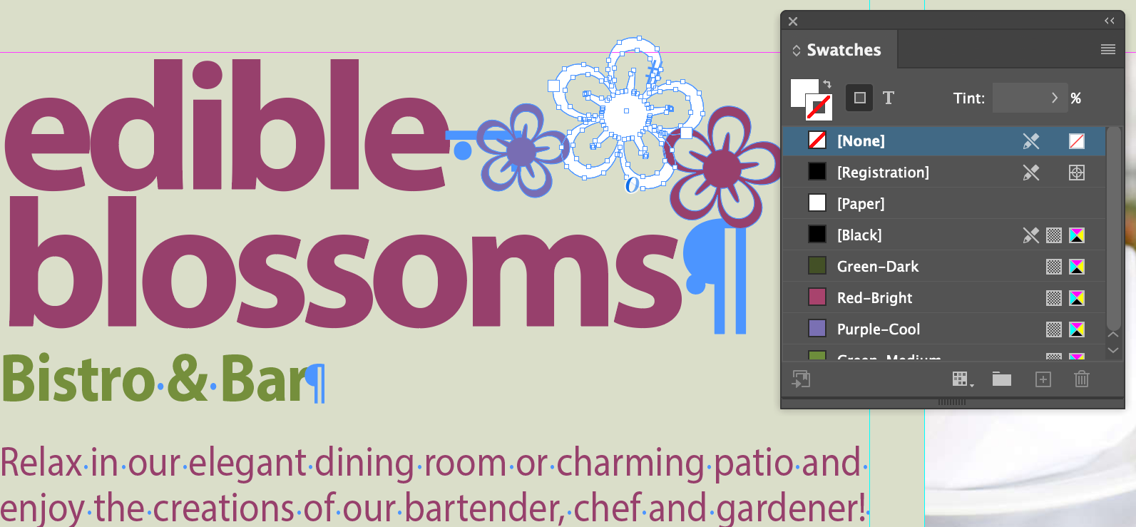
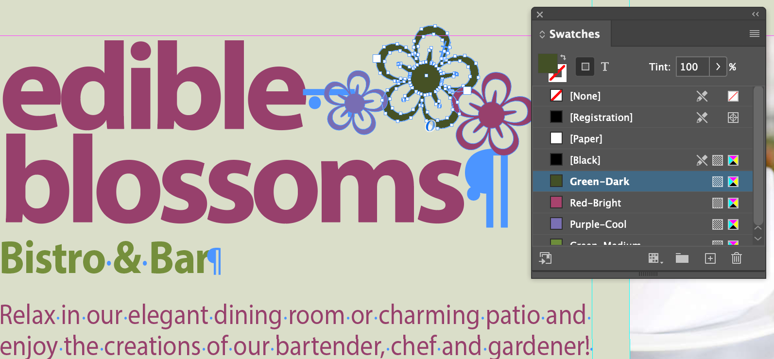

As with paragraph and character styles, you can create and apply object styles
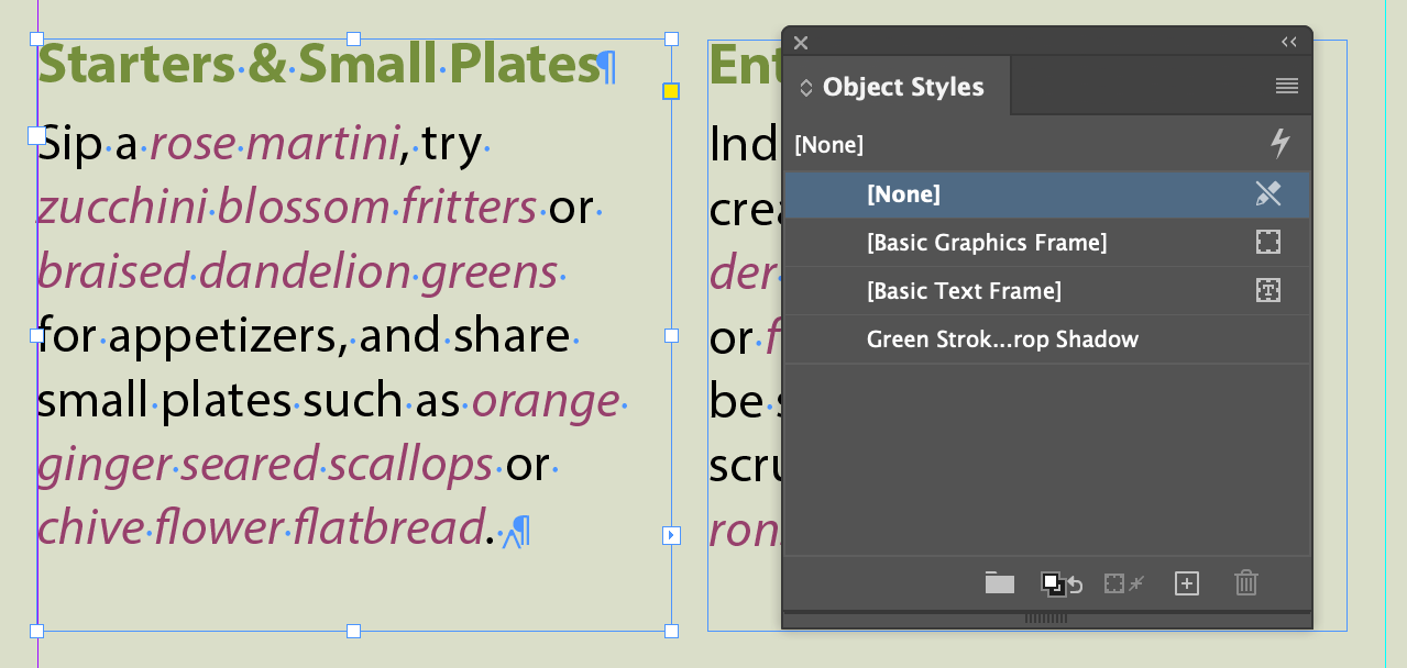
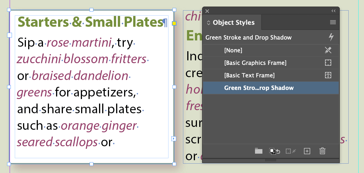
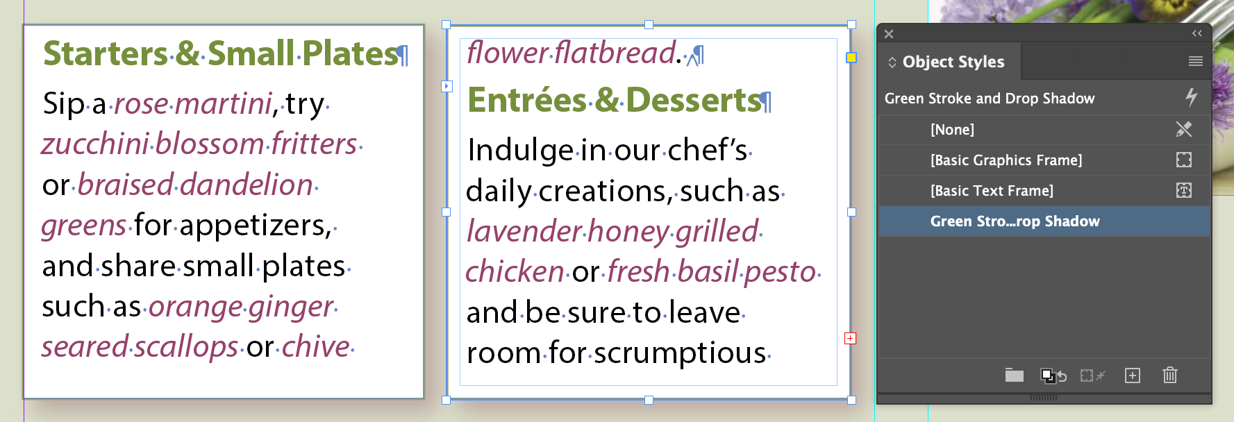
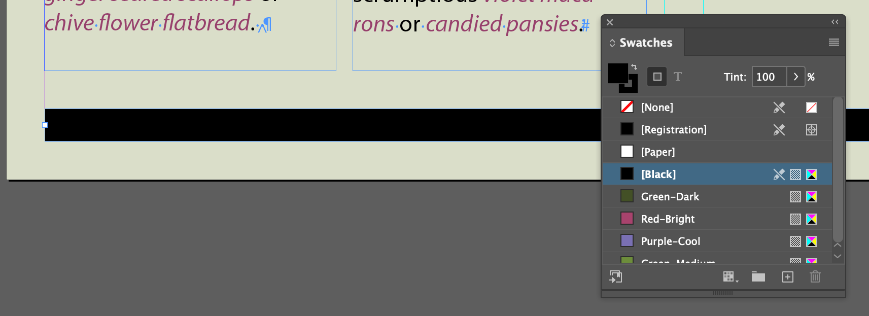
And this is why you shouldn't do like the book says and have two linked text frames...
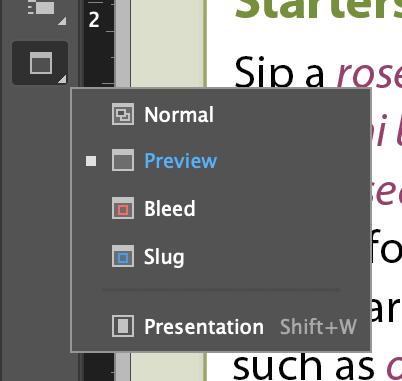
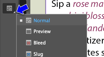
InDesign has several screen modes to review your work with:
InDesign Best Practices
We'll be covering these throughout the semester, but the book has a good list
- Start with Preflight
- Avoid stacking objects
- Thread text frames
- Use styles for all formatting
Work on Chapter 3