Typography, or the art of type, is a fundamental element of graphic design. All fonts carry meaning. Choosing the right typeface for the job is as important as choosing the right image. Beyond the integral choice of which font, there are also the basics of what to do with the font once you've chosen it. Things like which member of the font family to use where (italic, oblique, bold, condensed, extended, thin, heavy etc). Then things like alignment, size, kearning, tracking, leading, glyphs, hyphenation, hanging indents, hanging punctuation. InDesign is a very robust tool for manipulating all these elements and settings.
But first: What Is Typography?
Typography is the art and technique of arranging letter-forms (type) to make written language legible, readable and appealing when displayed. The arrangement of type involves selecting typefaces (fonts), point sizes, line lengths, line-spacing (leading), and letter-spacing (tracking), as well as adjusting the space between pairs of letters (kerning). The term typography is also applied to the style, arrangement, and appearance of the letters, numbers, and symbols created by the process.
What is a Font?
A font is the collection of letter-forms (glyphs) that make up a unique style.
What is a Font on your computer
A font is a collection of descriptions of how to draw a vectors to create letterforms (glyphs) on your screen or on a printer/printing press. It's really a set of anchors and handles saved as relative positions that draw the glyph of a letter.
They live as special data files in your Fonts folder (~Library/Fonts on Mac, Window\Fonts on Windows).
You can see them on Mac with the Font Book application.
You can see them on Windows with the Control Panel.
The come in several flavors, the most common of which are:
.OTF
OpenType
The most common and useful
.TTF
TrueType
A predecessor to OTF, depricated in InDesign
.SVG
Scalable Vector Graphic
Hot new kid on the block. Let's you include color and gradients in a font. OTF and TTF are strickly monochrome (one color). Not widely accepted, yet. So far, it's not supported in InDesign, but is supported on Photoshop and Illustrator.
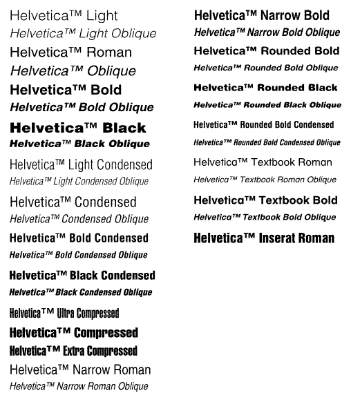
A set of fonts with a common name, Helvetica, and different styles
Example font: Helvetica Family
The complete Helvetica Family can be purchased from Fonts.com for $438.99
Size
The relative size of a given font. Note that 72pt (1 inch) fonts aren't actually 1 inch high. For example, Helvetica 72pt capital letter E is about 52pt height. Another font might have a cap E at 56pt or 48pt height, but still be called a 72pt font. The only given is that a 72pt font will be taller than a 71pt font.
Fonts tend to come in sizes that match traditional metal type. InDesign presents pre-set sizes at 6, 8, 9, 10, 11, 12, 14, 18, 24, 30, 36, 48, 60, and 72 points.
Weight
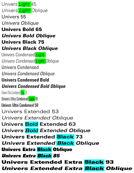
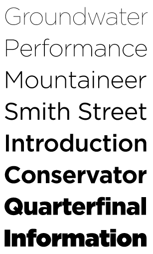
Fonts come in different "thicknesses" or "weights". Lighter strokes are thinner, heavier strokes are thicker.
In order from lightest weight to heaviest:
Thin, Extra Light, LIght, Semi-light
Normal, Book, Regular, Roman
Semi-Bold, Bold, Extra Bold, Black
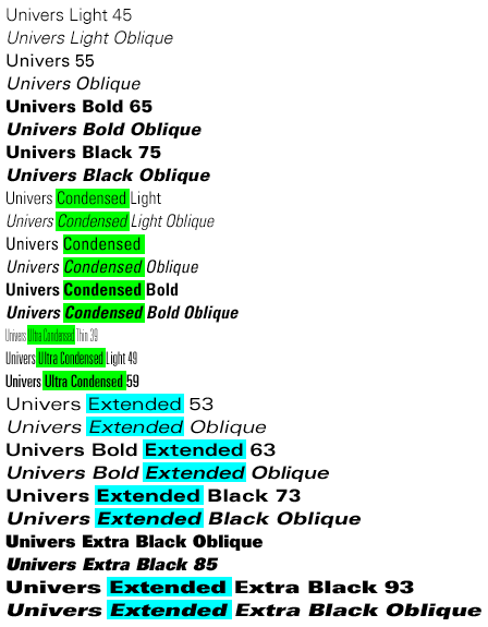
Width
Width is not the width of a stroke in a font, but the relative width of a letter-form (glyph).
A typographic style specifically refers to the angularity of the specific font, either normal (no angle) or Italic/Oblique (angled). Italic is often used incorrectly when referring to an Oblique style.
abcdefg abcdefg abcdefg abcdefg
Normal
Italic (has custom 'glyph' shapes)
Oblique (has no custom glyphs)
Spacing
AB - Two letters with no kerning
AB - Two letters with wide kerning
AB - Two letters with negative kerning
Sentence with no tracking
Sentence with wide tracking
Sentence with negative tracking
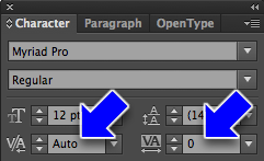
The spacing between letters known as kerning
In InDesign, you can kern individual spaces between letters or kern more than one space with 'tracking'
Kerning
Tracking
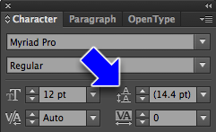
Leading
This is 12pt leading for a 12pt block of type. A little too tight, I think. Lorem ipsum dolor sit amet, consectetuer adipiscing elit. Suspendisse eget diam. Morbi in risus. Morbi nibh. Sed cursus urna. Nunc vitae nisl eu arcu vulputate pharetra. Nullam euismod.
This is default leading for a 12pt block of type, which is usually about 14.4pts. (1.2 x the font point size) Consectetuer adipiscing elit. Suspendisse eget diam. Morbi in risus. Morbi nibh. Sed cursus urna. Nunc vitae nisl eu arcu vulputate pharetra. Nullam euismod.
This is 16pt leading for a 12pt block of type. Lorem ipsum dolor sit amet, consectetuer adipiscing elit. Suspendisse eget diam. Morbi in risus. Morbi nibh. Sed cursus urna. Nunc vitae nisl eu arcu vulputate pharetra. Nullam euismod.
This is 18pt leading for a 12pt block of type. Lorem ipsum dolor sit amet, consectetuer adipiscing elit. Suspendisse eget diam. Morbi in risus. Morbi nibh. Sed cursus urna. Nunc vitae nisl eu arcu vulputate pharetra. Nullam euismod.
The name comes from the thin pieces of lead which would be placed between lines of type in a metal type shop
This paragraph is aligned left. It's easily legible and the most common form of paragraph alignment. Lorem ipsum dolor sit amet, consectetuer adipiscing elit. Suspendisse eget diam. Morbi in risus. Morbi nibh. Sed cursus urna. Nunc vitae nisl eu arcu vulputate pharetra. Nullam euismod. Fusce pharetra. Aliquam non ante. Ut porta, neque at porta viverra, eros nulla sollicitudin sapien, sed tempus tellus risus, vivamus sed.
This paragraph is aligned right. It can be hard to read unless it's only a few lines and not too wide. Good for callouts on the left side of an image. Lorem ipsum dolor sit amet, consectetuer adipiscing elit. Suspendisse eget diam. Morbi in risus. Morbi nibh. Sed cursus urna. Nunc vitae nisl eu arcu vulputate pharetra. Nullam euismod. Fusce pharetra. Aliquam non ante. Ut porta, neque at porta viverra, eros nulla sollicitudin sapien, sed tempus tellus risus, vivamus sed.
This paragraph is aligned center. It can be hard to read when there's more than two lines. Used mostly for Headlines Lorem ipsum dolor sit amet, consectetuer adipiscing elit. Suspendisse eget diam. Morbi in risus. Morbi nibh. Sed cursus urna. Nunc vitae nisl eu arcu vulputate pharetra. Nullam euismod. Fusce pharetra. Aliquam non ante. Ut porta, neque at porta viverra, eros nulla sollicitudin sapien, sed tempus tellus risus, vivamus sed.
This paragraph is aligned justified. This is a very traditional form of alignment, often used in books. Lorem ipsum dolor sit amet, consectetuer adipiscing elit. Suspendisse eget diam. Morbi in risus. Morbi nibh. Sed cursus urna. Nunc vitae nisl eu arcu vulputate pharetra. Nullam euismod. Fusce pharetra. Aliquam non ante. Ut porta, neque at porta viverra, eros nulla sollicitudin sapien, sed tempus tellus risus, vivamus sed.
Vertical spacing as referenced in our text isn't just about leading, but it's also about spacing between blocks of type - usually in the form of paragraphs - and things like keeping blocks of text together when they flow across pages and columns. Remember that it's bad practice to put two returns between paragraphs!
Changing the Spacing Between Paragraphs
You can set spacing before, after, or before and after paragraphs. Before and after spacing is accumulative, that is, they get added together if they're both there, so it's best to use only one.
Set the view to Normal and turn on Hidden Characters
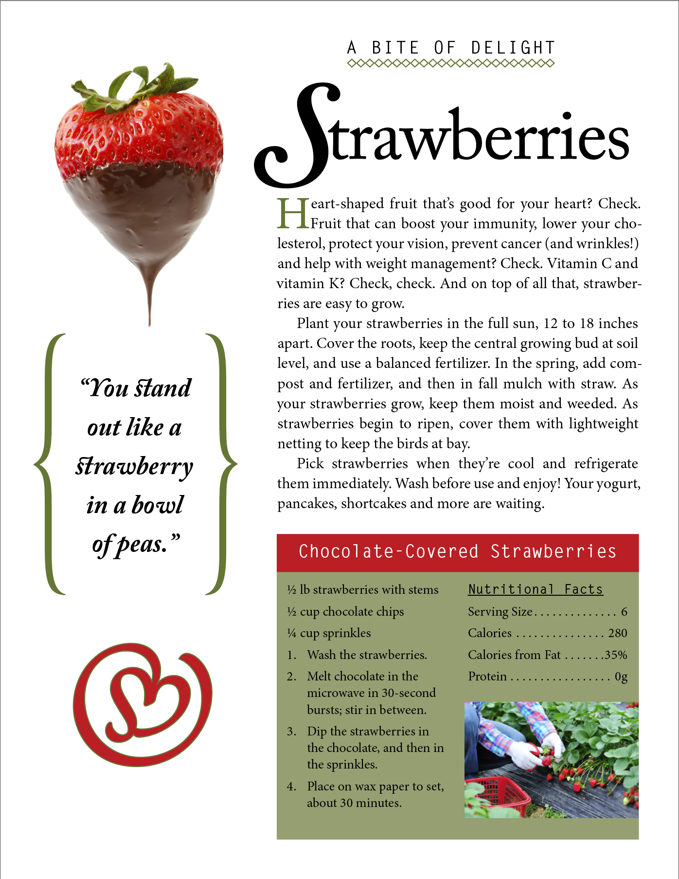
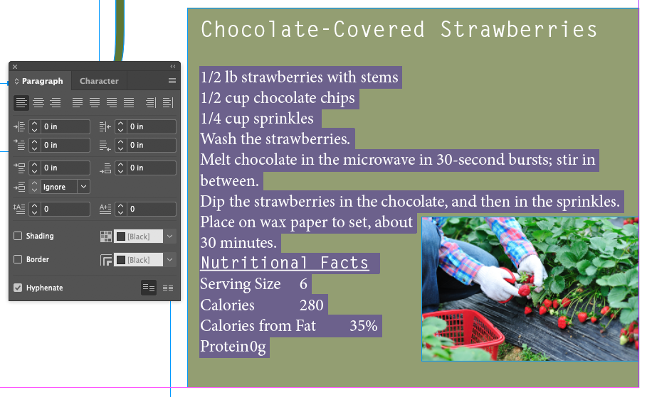
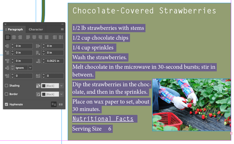
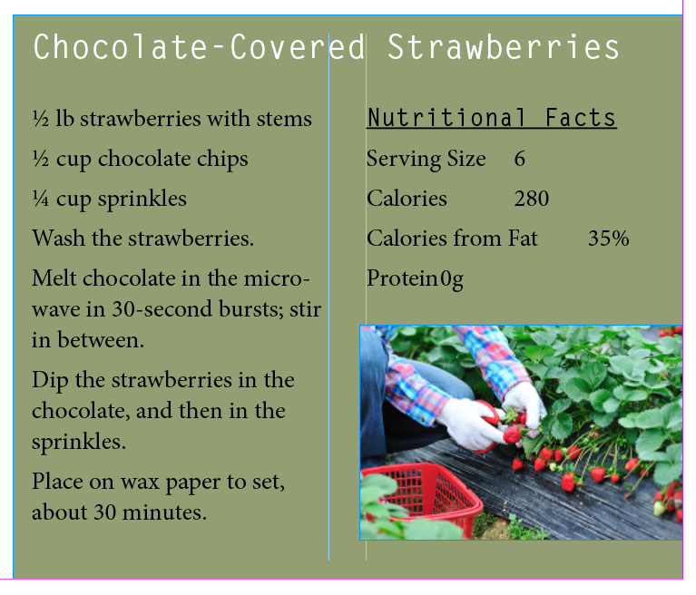
Focus on the recipe and put the cursor in front of 1/2 lb strawberries with stems
Select the text from 1/2 lb strawberries to Protein 0g
Set the Space After field up by one click: 0.0625 in
For some reason, a single click in this example defaults to .0625 inches, or 4.5 points. I can't find any way to change this, even though there are settings for default increments in the Preferences, this one isn't part of the set. The usual default is 1pt.
Spacing Between Paragraphs
Space Before A caveat about Space Before paragraphs: It won't add space before a paragraph at the top of text frame. To add space before a paragraph at the top of a text frame (or any text for that matter) use Text Frame Options, Inset Top.
Space After Probably a better and more reliable choice for spacing between paragraphs, unless you use the next one.
Space Between Puts a consistent amount of space between paragraphs of the same style. Overrides any Space Before or Space After settings. Combining this, you could have consistent spacing between paragraphs of the same style, but add more space (or less) between blocks of paragraphs with different styles. This is a new feature, and I think it's meant to reproduce the behavior of spacing between paragraphs in HTML.
There's a good Adobe Support article on formatting paragraphs here.
Working With Fonts, Type Styles, and Glyphs
Fonts are kept by the operating system except Adobe Cloud fonts. A font is usually more than just a font, it's usually part of a Font Family, which includes different flavors of a given font name. We can think of the different properties of a Font as what we can manipulate in InDesign with the various panels. These include:
Font Family
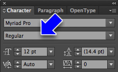
Font Style (Regular, Bold, Italic, Condensed, Medium, Semibold)
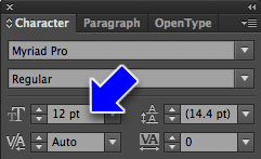
Font Size (in points)
Font Leading (in points)
Font Variant: All Caps
Font Variant: Small Caps
Font Variant: Superscript
Font Variant: Subscript
Font Variant: Underline
Font Variant: Strikethrough
Kerning
Tracking
Vertical Scale (% of Font Size)
Horizontal Scale (% of Font Size)
Baseline Shift
Skew (False Italic)
Adding A Font from Adobe Fonts
Since, as students, you're not entitled to Adobe Fonts, I'll demo this without your needing to follow along
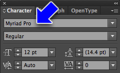
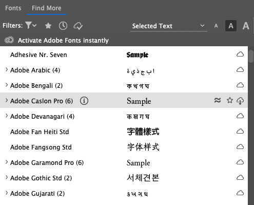
With either the Control Panel at the top of the screen, or the Character panel, click on the Font Family menu
Choose the Find More tab
Find Adobe Caslon Pro (6)This is no longer available, download all 6 seperately
Click on the Download from Cloud button
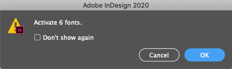
Click OK
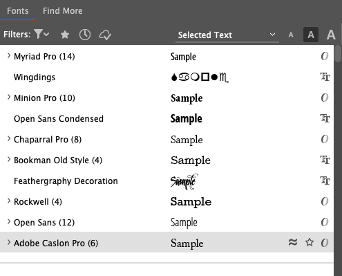
Check that it's now in the Font tab
Applying a Font, Style, Size, and Leading
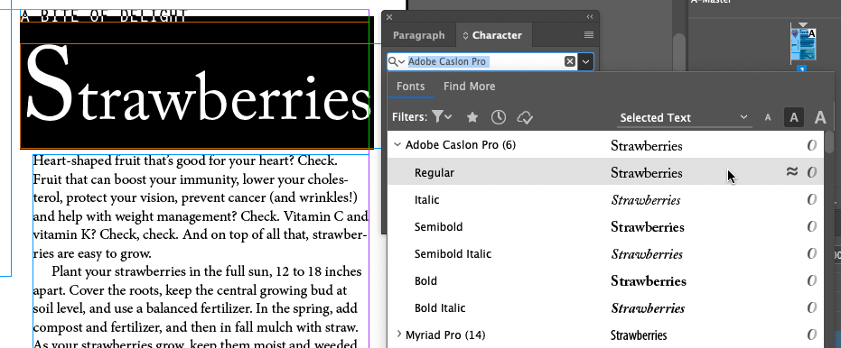
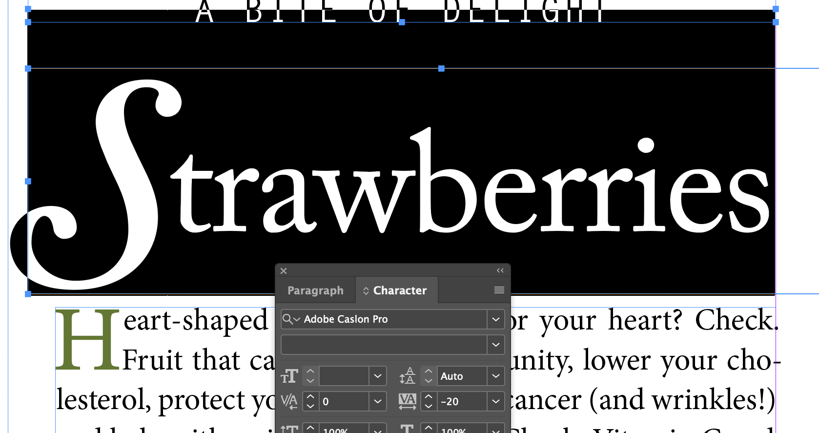
Select Strawberries
Open the Character panel
Choose Adobe Caslon Pro: Regular
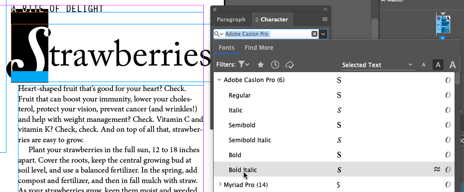
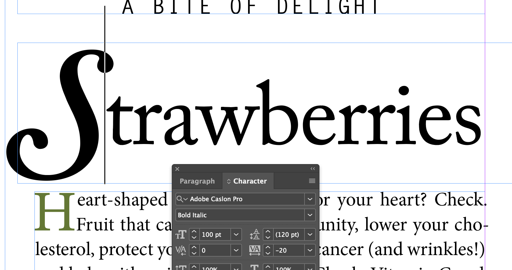
Select just the S
Set it to Adobe Caslon Pro: Bold Italic
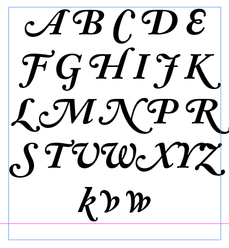
Note the letterform. It's a special swash form of the capital S character
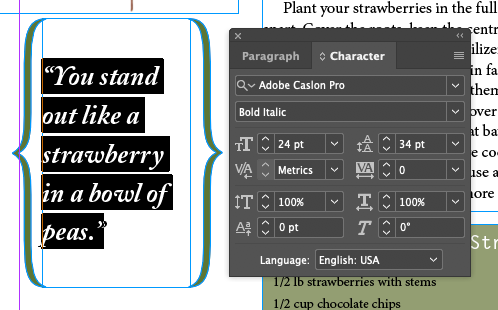
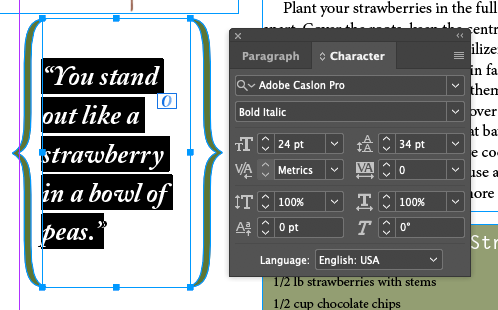
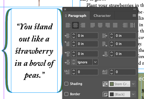
Move over to the You stand out... text and select it
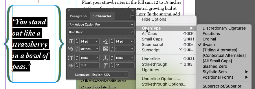
From the flyout menu, check out the settings under OpenType
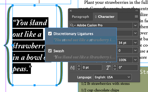
Quadruple-click the text. This will cause a little OpenType icon to appear
Click on the OpenType icon and a menu pops up showing options for the OpenType font
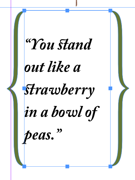
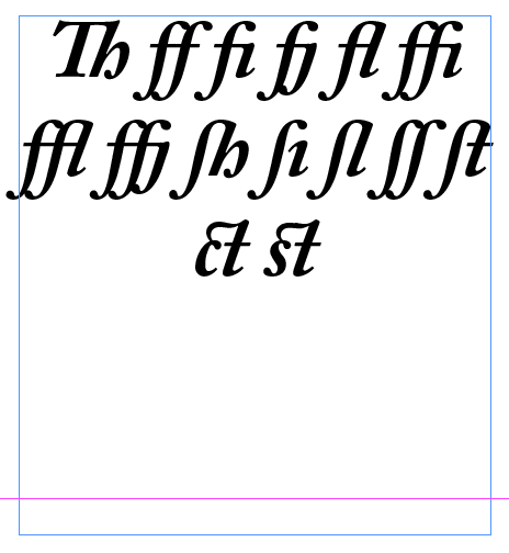
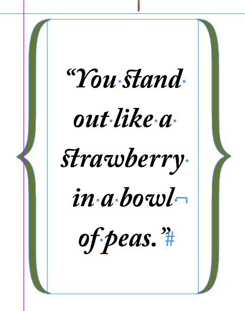
Swash is already on. Pick Distretionary Ligatures as well.
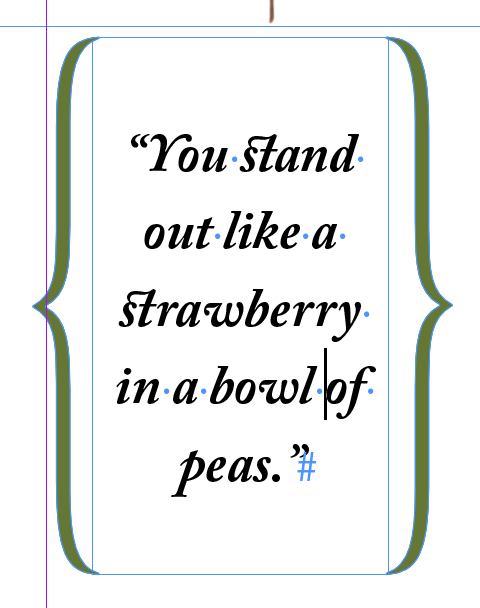
This displays the swash cap Y, a swash off of the lower case w, and discretionary ligatures for st. Caslon has a bunch of ligatures - special designs for pairs and trios of certain letter combinations that are included in the OpenType font character set.
Adding A Special Character
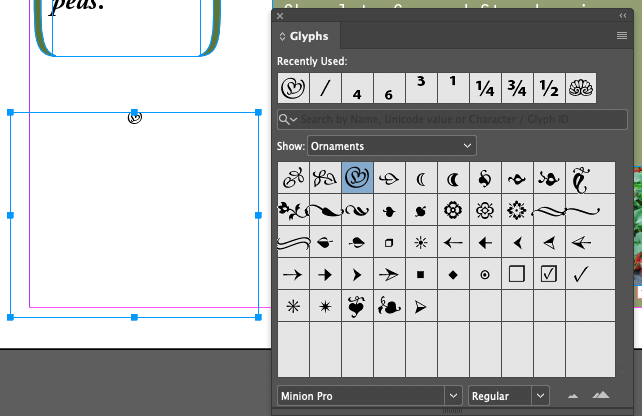
Robust OpenType files can also contain special non-character based forms, or glyphs
Insert cursor into text box below ...bowl of peas.
Menu Type Gylphs...
Show: Ornaments
Double-click on the heart glyph
Finding Fonts in the Type Menu
Name Search: Just start typing in the search field in the Font Family field
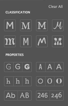
Filter By Class: Nice visual interface for Sans Serif, Serif, Slab Serif, Script, Blackletter, Monospaced, Hand Written, Decorative, Weight, Width, Contrast (between thin horizontals and thick verticals), Upper & Lower Case or All Upper Case, Lining Figures (numbers all between baseline and cap height) and Oldstyle Figures (numbers with descenders and variable x-heights)
Favorites: You can pick'm with the UI so they're easy to find
Font Similarity: Sets the list below to similar fonts. New feature since 2017, kind of nice. Might be part of Adobe's new AI engine, Sensei.
Applying A Stroke And Fill To Text
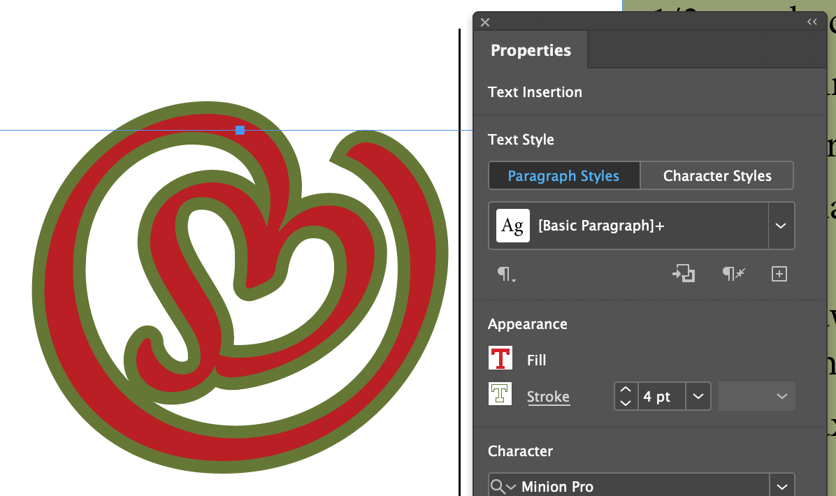
Unlike Illustrator, this actually does it the right way and applies the stroke to the outside of the glyph, and not centered on the path. Those of you who've had my Illustration class will know how much this bugs me.
Set to 122 pt, fill with red and stroke with green...
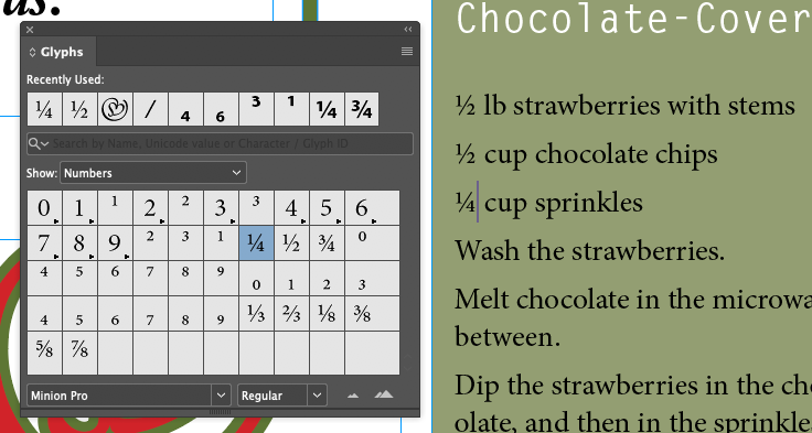
Inserting Fraction Characters
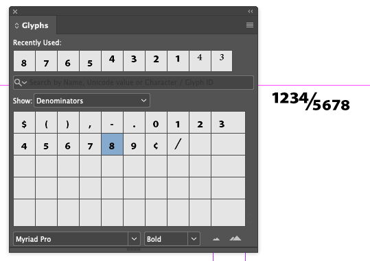
The recipe in our sample file uses a number, a diagonal slash, and another number to make a fraction. Not usually good form. Minion Pro has fraction glyphs for common fractions which look much better. It also has all the glyphs needed to make any fraction, like 1234/5678.
Focus on the recipe text, open the Glyphs panel, show Numbers and set the correct fractions
You can also create just about any fraction possible with Numerators and Denominators in the Minion (and Caslon) Pro fonts
Working With Columns
It's all in the magic of Text Frame Options...
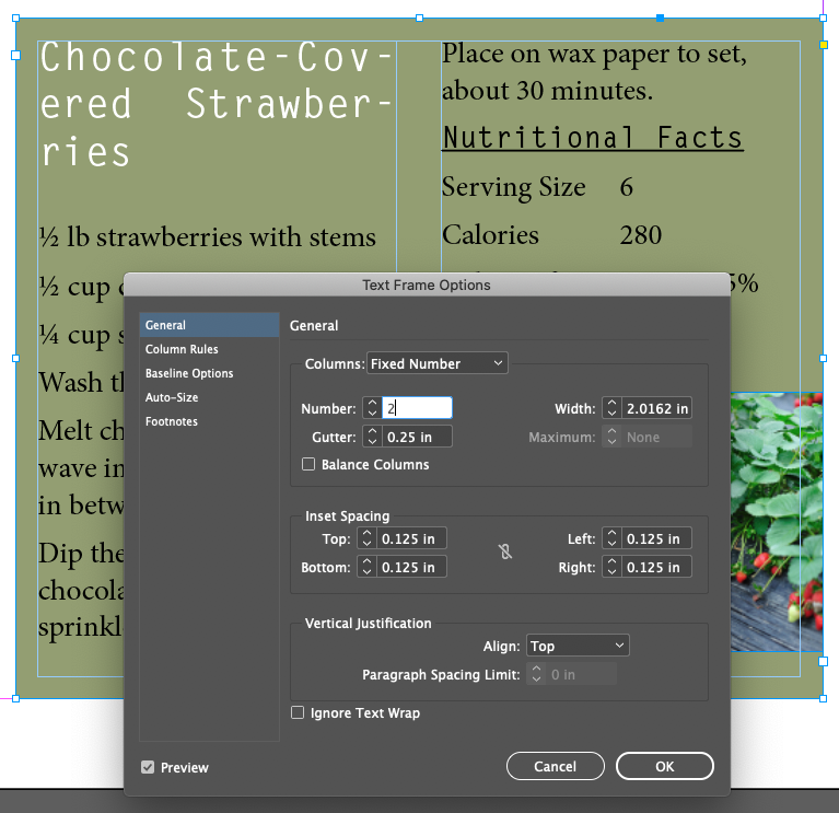
Specifying Columns For A Text Frame
Focus on the recipe
Choose Menu Object Text Frame Options
Number: 2
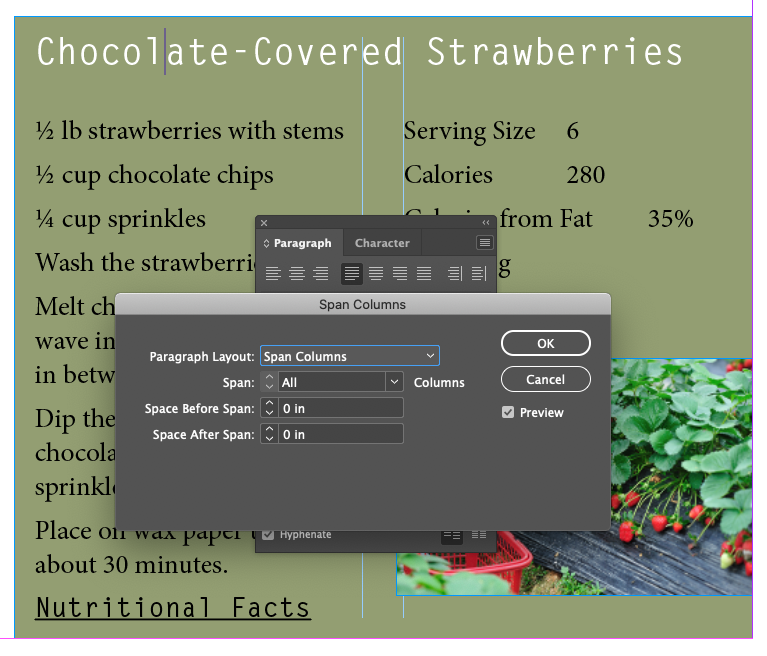
Creating A Straddle Head
Focus on the headline of the recipe
Choose Paragraph Flyout Menu Span Columns
Paragraph Layout: Span Columns
Span: All
Adjusting Columns
Put cursor in front of Nutritional Facts
Choose Menu Type Insert Break Character Column Break
Changing Paragraph Alignment
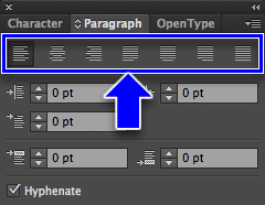
Let's align a bunch of stuff with the Paragraph Panel's buttons, shortcut keys, and the Control Panel's buttons
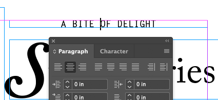
Center with Paragraph panelA BITE OF DELIGHT
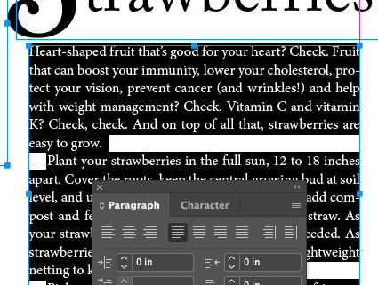
Justify With Last Line Aligned Left Heart-shaped fruit...
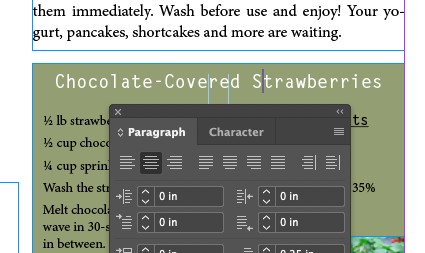
Center with Paragraph panel Chocolate-Covered Strawberries
Center with Control panel You stand out...
Icons Defined
Align Left
Align Center
Align Right
Justify With Last Line Aligned Left
Justify With Last Line Aligned Center
Justify With Last Line Aligned Right
Justify All Lines
Align Toward Spine
Align Away From Spine
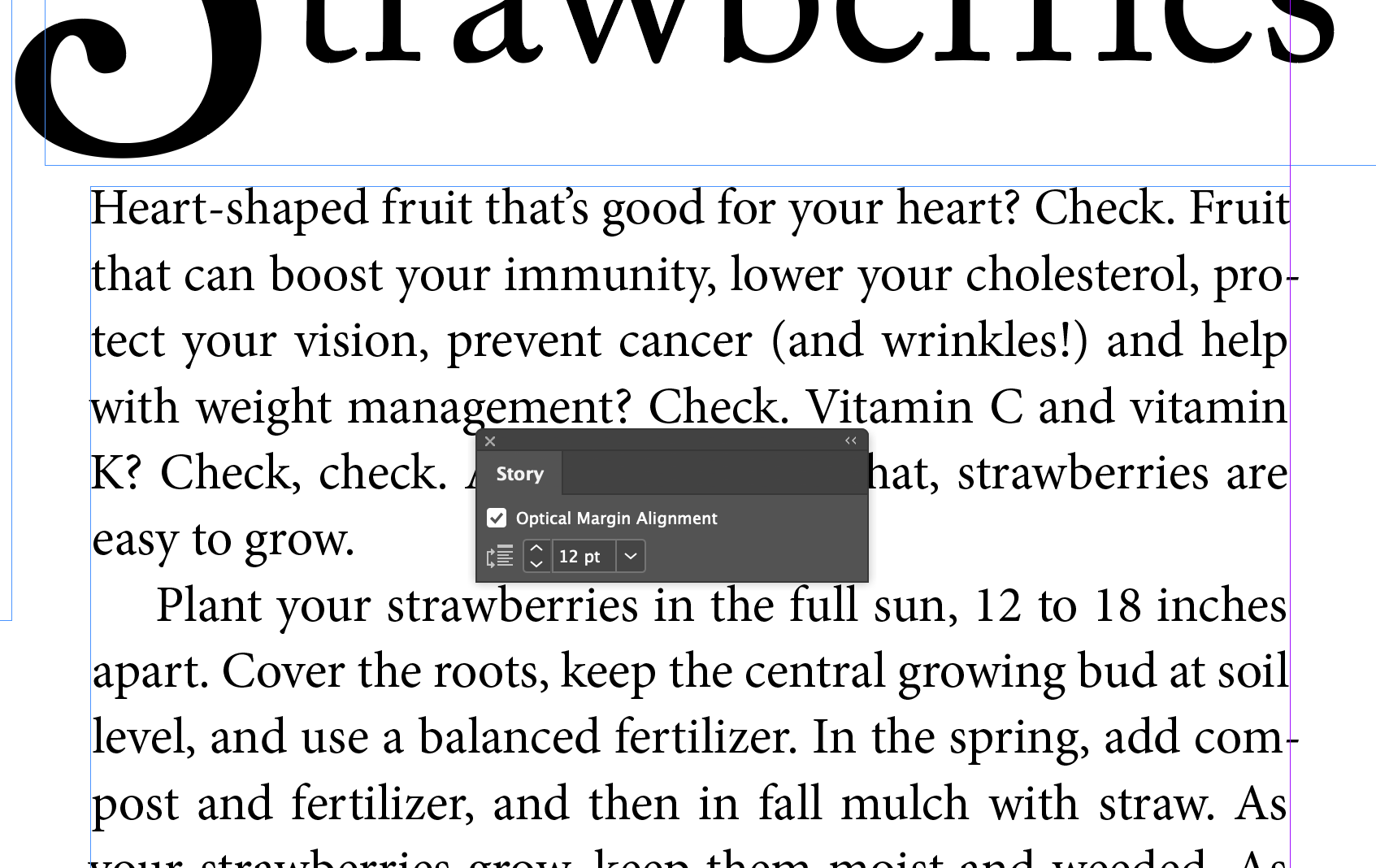
Hanging Punctuation Outside The Margin
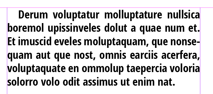
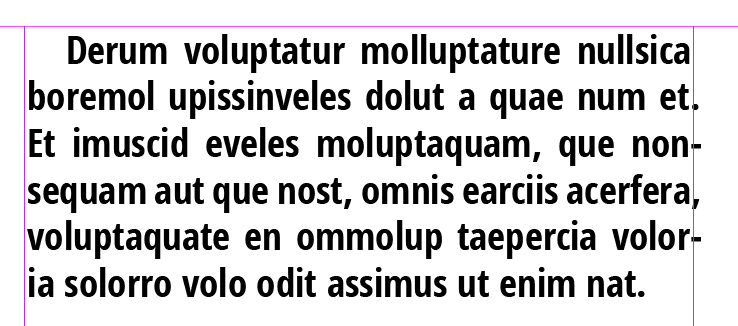
For as long as I have been a designer, there's been battles waged over Hanging Punctuation, To Use or Not To Use? Basically it means when you set a block of type to justified, should the hyphens, commas, periods, and other puncutation marks hang past the edge of the bounding box or stick inside.
Basically this, normal punctuation:
Versus this, hanging punctuation:
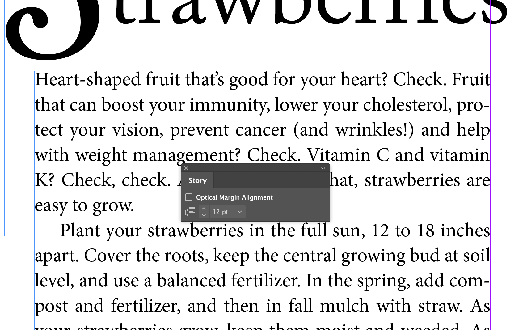
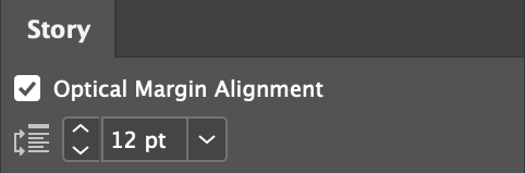
The function is burried in the Story panel! I suppose because you want it to affect the entire Story, and not just a text frame. Me, I would have put it in Text Frame Options...
Put cursor in the Heart-shaped fruit... paragraph
Menu Type Story
Check Optical Margin Alignment
Creating A Drop Cap
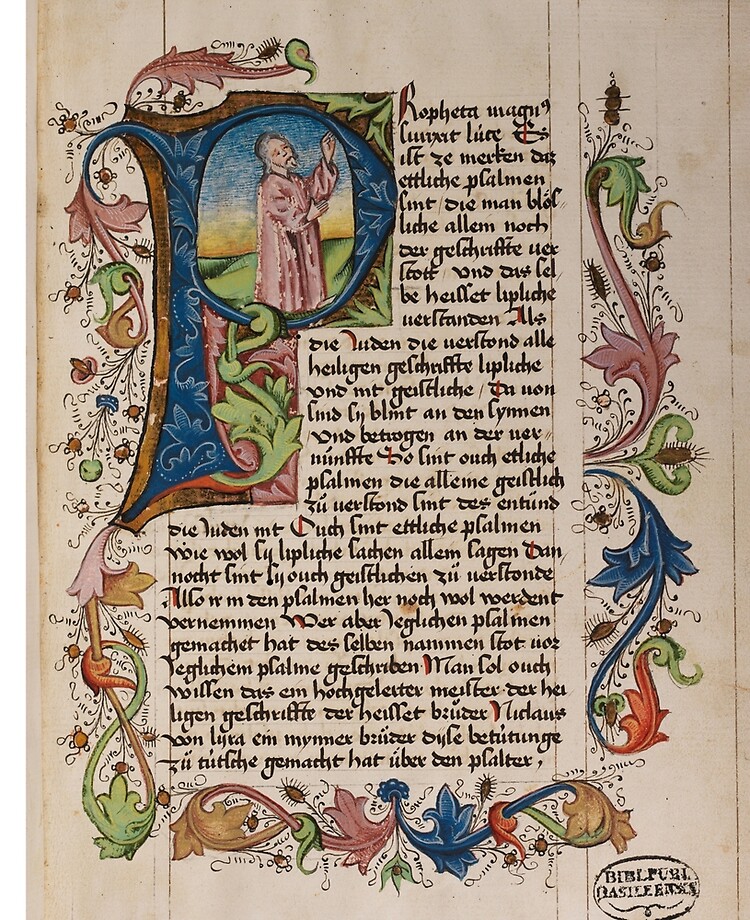
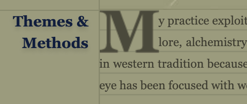
Slick trick! Very old-timey feeling, harkens to the middle ages and illuminated manuscripts, where the first letter on a page was oversized and lavishly illustrated. Some books and magazines still use the idea, greatly simplified, where the first letter of a paragraph is larger then the paragraph text and spans 2 or more lines. I use it on my website just to show off my HTML chops (it's hard to code)
Insert the cursor in the first paragraph of the story
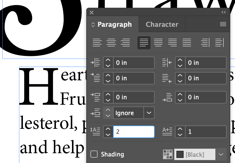
In the Paragraph panel set Drop Cap Number of Lines to 2
Note that the next button, Drop Cap One Or More Characters, jumps to 1. You can extend the number of characters to cover the whole word if you want.
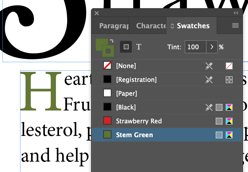
Might as well set the drop cap to green while we're at it...
Adjusting Letter And Word Spacing
Well-designed fonts have a lot of data in them about how far apart any two pairs of letters are from each other. These are called Kerning Pairs, and they're a part of the font file that contains the font outlines. It's a tricky business, with no set rules about how to adjust these distances. It's done by the trained eye of the typeface designer(s). There's even a cool game online about guessing the best spacing.
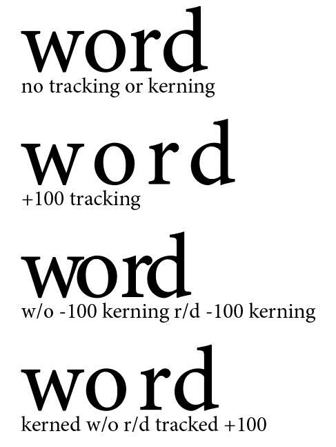
InDesign, Illustrator, and most other applications that allow changing the distance between letters use two modes to do so. One is kerning, which give spacing control over any pair of two letters, and tracking, which gives spacing control over two or more letters.
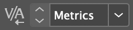
Kerning UI
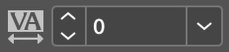
Tracking UI
This separation between kerning and tracking allows you to set custom kerning between several letter pairs in a single word, then apply tracking to the entire word and maintain the distince kerning relationships between letter pairs even though their pair spacing has changed from the non-tracked word.
Adjusting the Tracking and Kerning
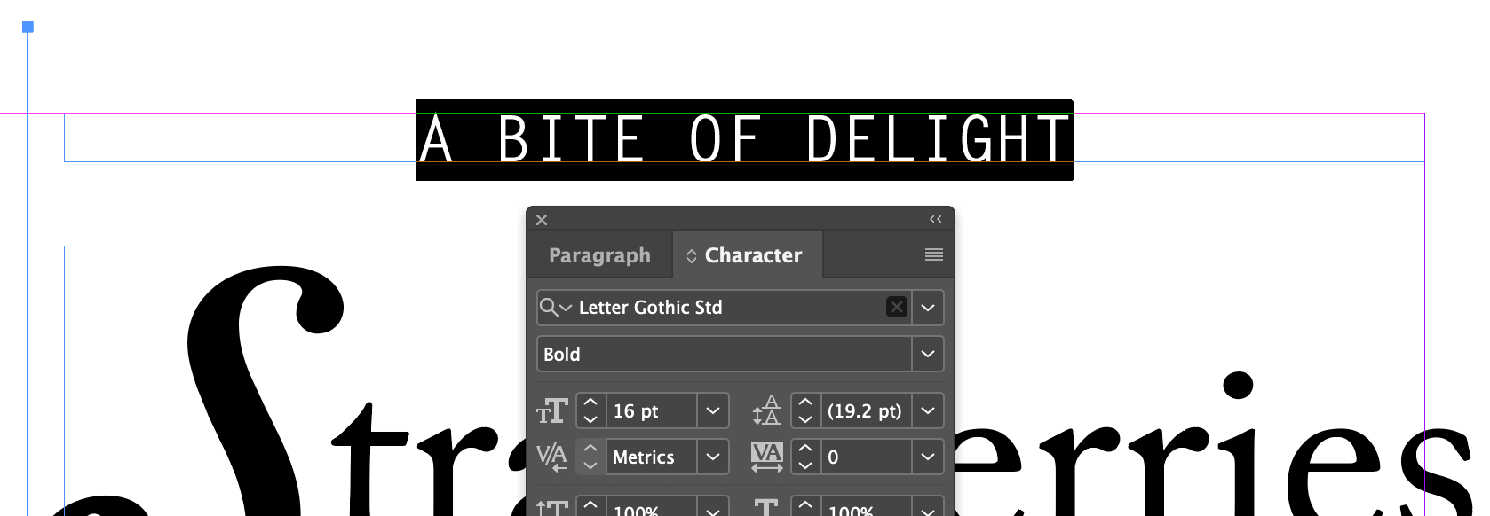
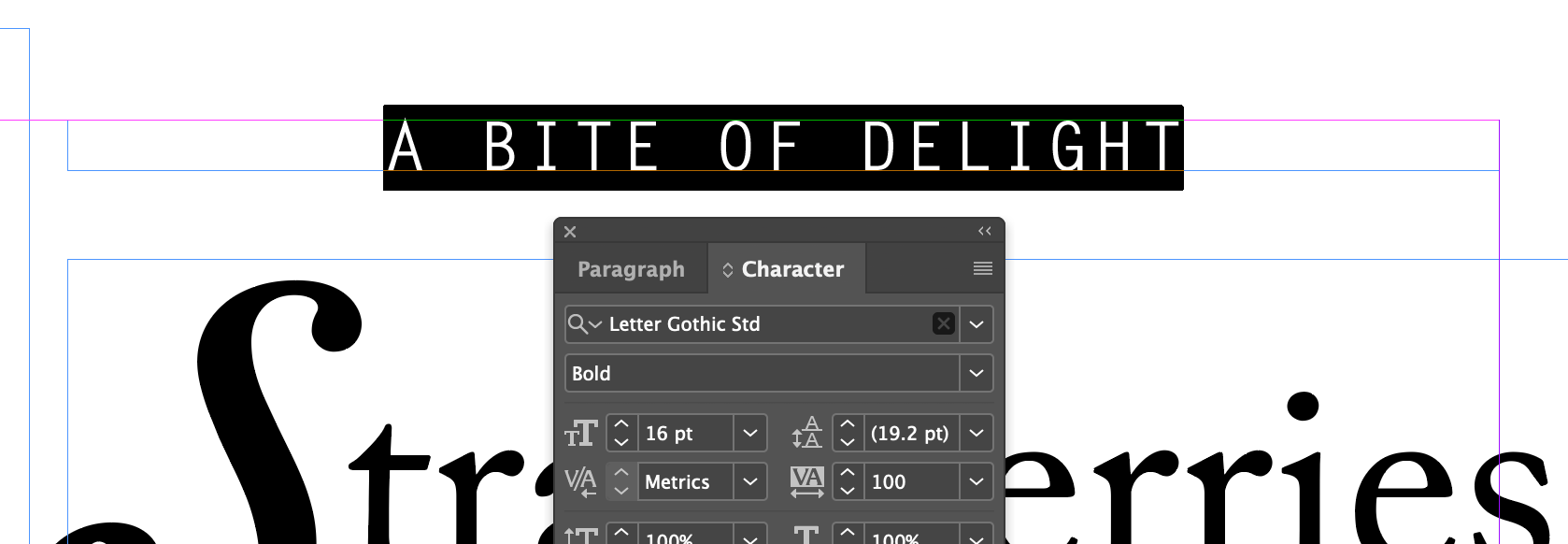
Select A BITE OF DELIGHT
Set the Tracking to 100
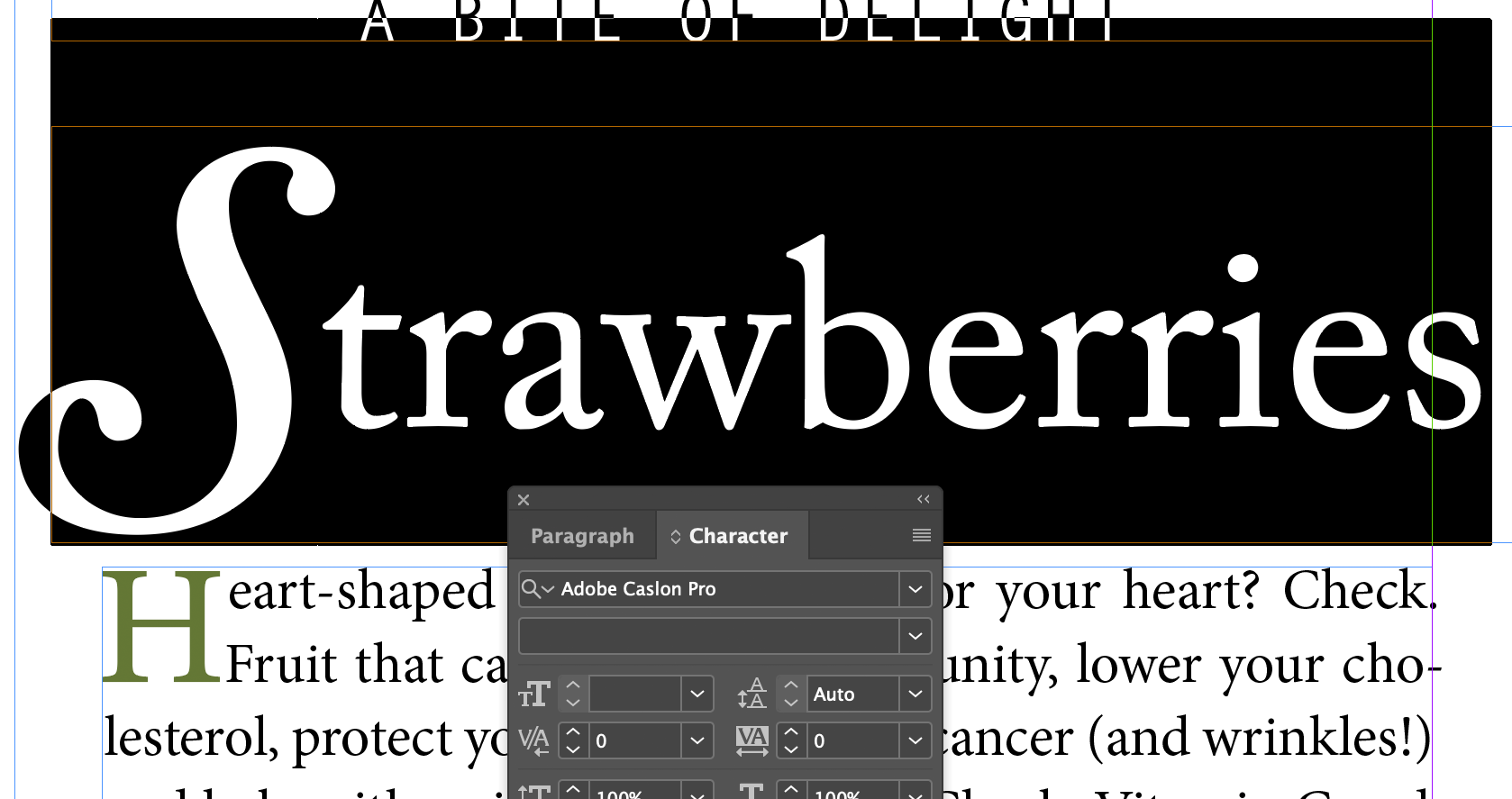
Select Strawberries
Set the Tracking to 20
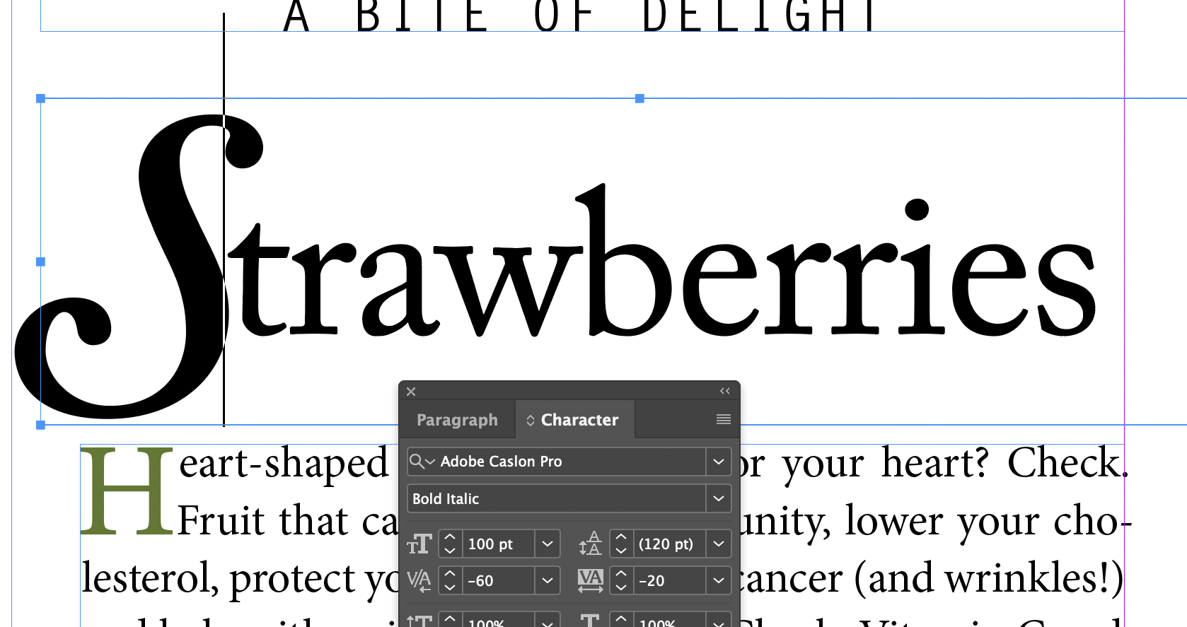
Put the cursor between the S and t
Press option/alt + 3 times, which effectively set the kerning to -60
Adjusting Line Breaks
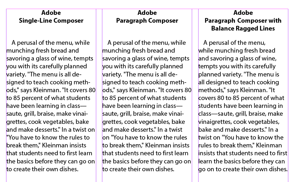
Hyphenation and line breaks at the end of each line of text in a paragraph affects readability and impact. InDesign has three ways to affect line breaks:
The Adobe Single-Line Composer and Adobe Paragraph Composer
Hyphenation settings (under...)
The Balance Ragged Lines feature
So, in theory, these three samples below should look different:
But, they don't. Or they often don't. Seems to work at 13pt. The Balanced Ragged lines seems to have an effect, but Single-line and Paragraph Composer look the same to me. And it makes no visible difference in our Strawberries example either. Too subtle for me. Download this file to check it out.
Hyphenation Settings
You can control the way words hyphenate (or not) thru the Paragraph panel, and control the number of letters that need to be together before a word will hyphenate. 'Nuff said, I think. Let's skip the settings bit.
Inserting A Manual Line Break
Easy Peazy Lemon Squeezy, just hold the shift key when you press the Return or Enter key.
Setting Tabs
Tabs are weird, but useful. They don't exist in HTML, and it's a real drag that they don't.
Aligning Text to Tabs and Adding Tab Leaders
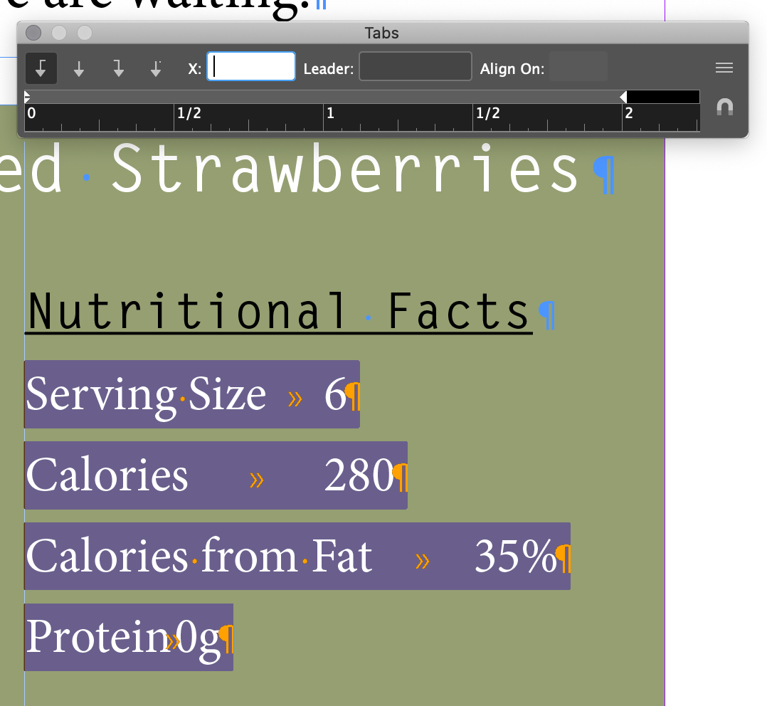
Focus on the 2nd column of the recipe and select Serving Size to Protein 0g
Look for the tab marks with the Show Hidden Character setting on
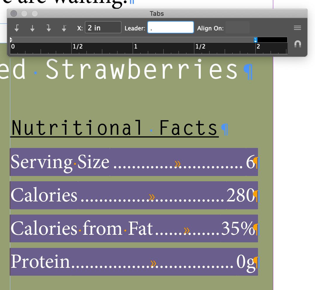
Menu Type Tabs
Select the Right Justify Tab
Set the X to 2 in and the Loader character to .
Working With Tabs
Don't use tabs to indent the first line of a paragraph!
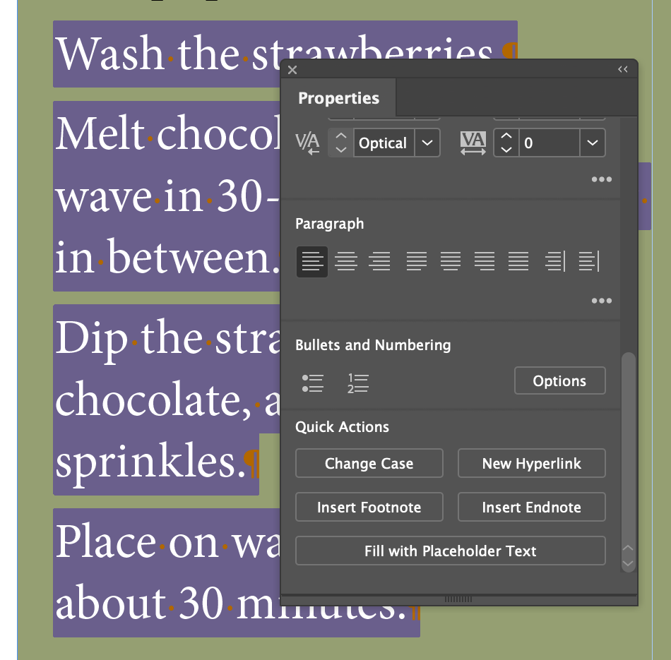
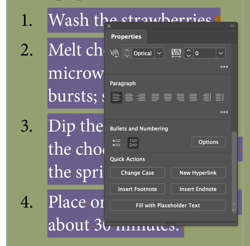
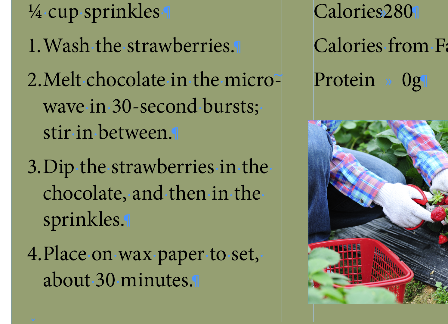
Creating a Numbered List With A Hanging Indent
Easy until you want to control the hanging indent distance...
Open the Properties panel (new one for us)
Click on the Numbered List button
Probably have to scroll thru the panel to find it. It's big.
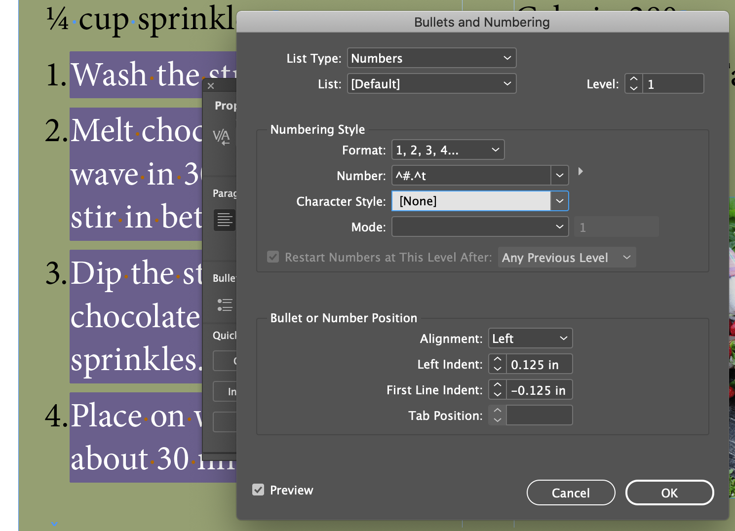
Open the Bullets and Numbering dialog with the Options button
Set the First Line Indent value to -0.125 in
Set the Left Indent value to 0.125 in
This is always annoying. You have to set the First Line Indent to a smaller negative value than than Left Indents positive value before you can set the Left Indent value to a smaller value. They should be the same number, but opposite signs (Left Indent postive, First Line Indent negative)
Close the dialog and deselect to see the result
Hanging Indents and Bulleted Lists
The UI is confusing and sometimes hard to manipulate, but there's two other ways to affect the hanging bullets and numbers.
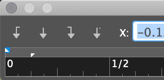
With the little triangles in the Tab UI
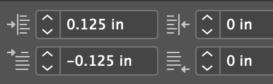
With the values in the Control Panel (and Paragraph Panel) for Indent and Tab Inset. These have to be set in the correct sequence as well, or you'll get an error message.
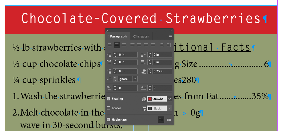
Working With Paragraph Shading and Rules
Applying Shading To A Paragraph
Check Shading
Strawberry swatch
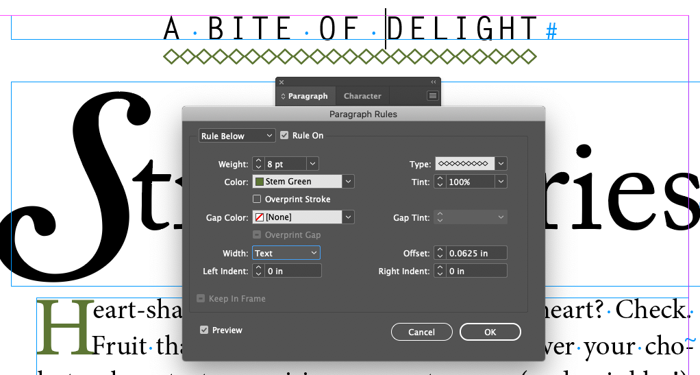
Applying A Rule To A Paragraph
CHAPTER 07
Review Questions
What is the advantage of specifying a space before/after value for paragraphs rather than entering extra paragraph returns to add space?
What is a glyph and how do you insert them into text?
What is a tab leader?
What is the difference between kerning and tracking?
Some useful Typography Websites
Commercial Foundries
Adobe Fonts - Adobe has a vast range of fonts. It purchased and closed down typeKit.com
Linotype - Largest commerical type foundry in the world
Major Font Resellers (the amazon.com's of the type world)
fonts.com - Monotype's outlet. Monotype, by the way, owns most major font outlets.
Minor Font Resellers/Design Houses
I've edited out the recent dead links. Many have moved to myFonts.com. Adobe has also absorbed more than it's share. And there's probably a lot of new ones I don't list here. It is a very volatile market...