Displaying Images At Full Resolution
Make sure Menu View Display Performance High Quality Display is turned on.

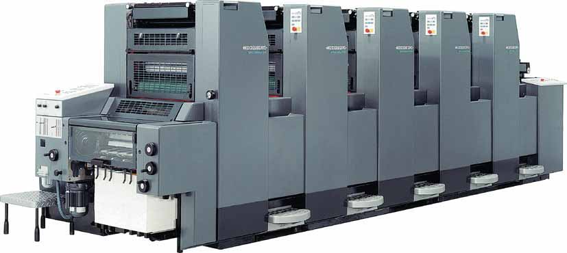
All color printing is done on a color printing press, which has at least 4 stations that print colored or black ink on top of other layers of ink, for a full color CMYK print jog.
Using the 08_Setup.indd file, check out what each of the color look like with Menu Window Output Separations Preview

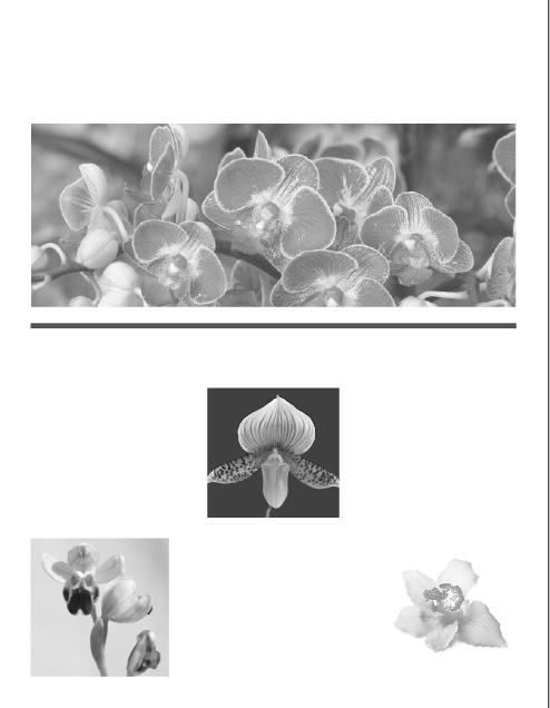
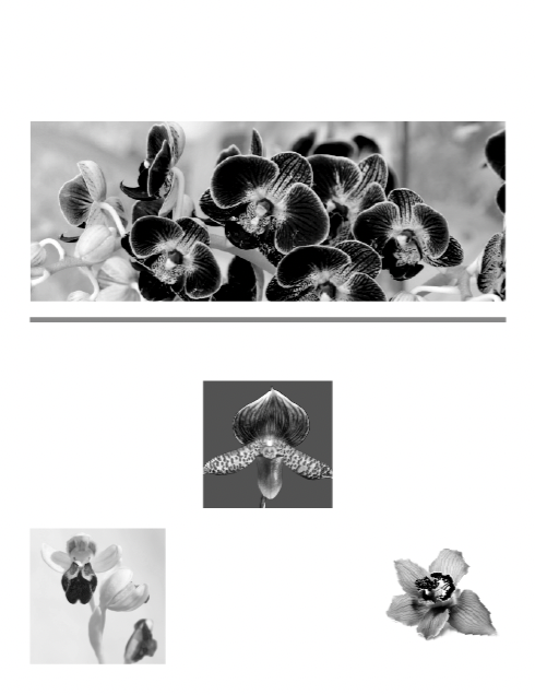
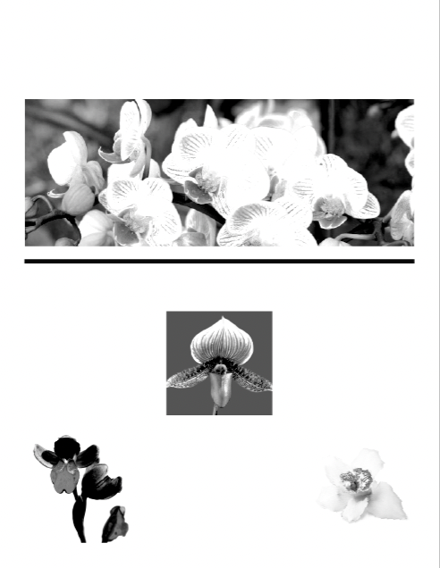


It's partly about how the eye sees color, whether it's through transmitted light or reflected light, and about the limits of a given system to reproduce a range of colors, also know as a gamut. Matching the color you see on screen to the one that is printed falls under the pervue of color management
.
Color management is a way of translating the colors from one gamut (RGB) to another (CMYK). Every print device, like an offset printing press, an inkjet printer or a color laser printer, has its own gamut. If you use a professional printer for your project, work with them to match what you see on your screen to what gets printed. What you don't want is to show a client a project on your screen and then give them a final printed product that doesn't look like it did on your screen. The problem is usually that RGB images never look as good in CMYK as they did in RGB.
Creating A Viewing Environment for Color Management

The work environment you develop a project in can influence how you perceive colors. The kind of light bulbs you use and the color you paint your walls matters. If you plan on doing print production work, you should create an appropriate workspace for it. Some things to think about:
- View docs in an environment that provides a consistent light level and color tempurature (the right 5k lighbulbs)
- NO FLORESCENT LIGHTS! They're too cold and have irregular spectrums (that is, some color wavelengths of light are weaker and/or stronger than they are in daylight)
- View doc in a room with neutral-colored walls. Neutral gray is considered best.
- Remove colorful backgrounds from your desktop
- Vew document proofs* under real-world conditions which your audience is likely to face
- Pay attention to color proofs*
* Document, Pre-Press and Color proofs are provided by the printer you choose to do the printing work.
Here's a good YouTube video on Comprehensive Guide to Color Settings, Color Profiles and Proofing in Photoshop (17 minutes). Very detailed.
Make sure Menu View Display Performance High Quality Display is turned on.
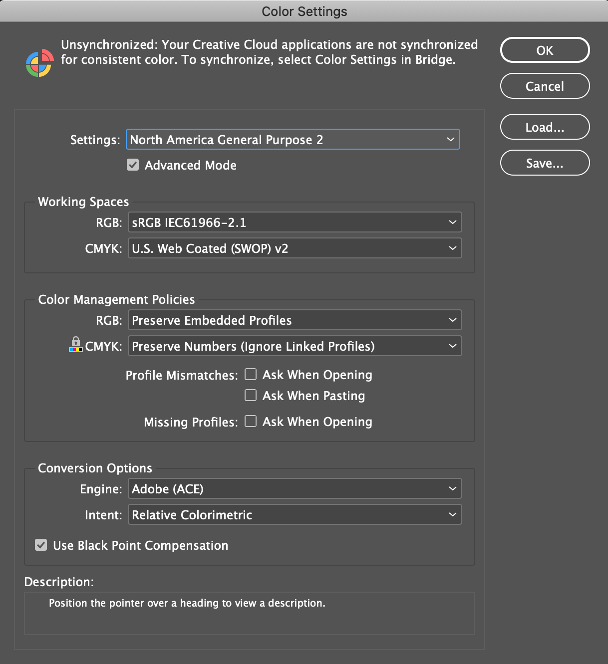
Menu Edit Color Settings...
InDesign works with what's called a Color Setting File (CSF). It contains data about color management polices and profiles. The default CSF is North America General Purpose 2
, which the book says is the best for beginners.
This is huge, complex, and more detailed than we can possibly go into. To me, the net net is work with your printer to get these setting right.
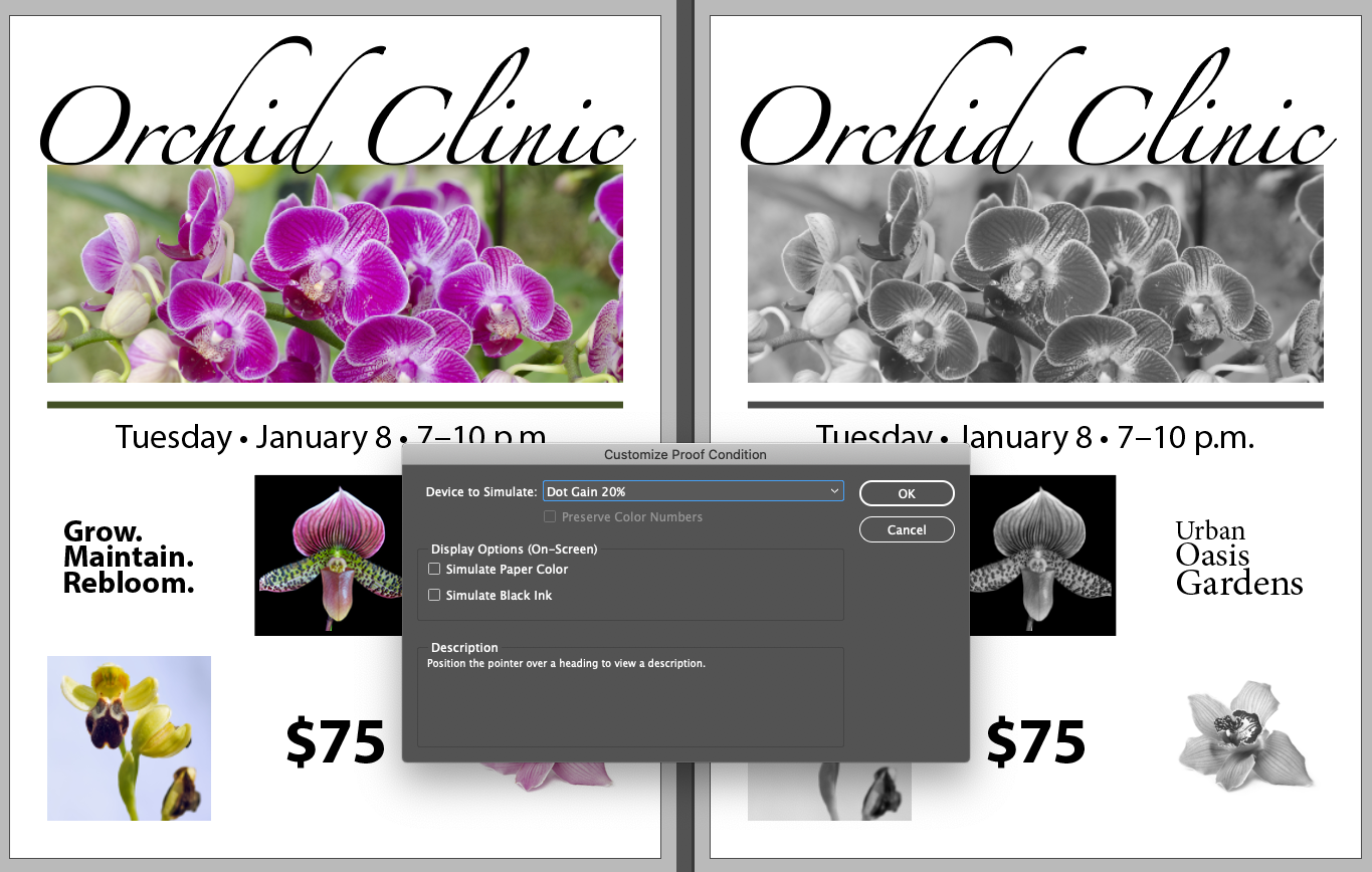
Device to Simulate: Dot Gain 20%
Dot Gain 20% lets you preview how the document would print in black and white
Work with your printer before you start designing, or have an existing relationship with one so you know the constraints and profile settings needed for the upcoming project. Many printers will give you a Preflight file for InDesign.
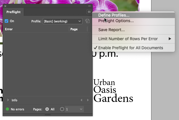
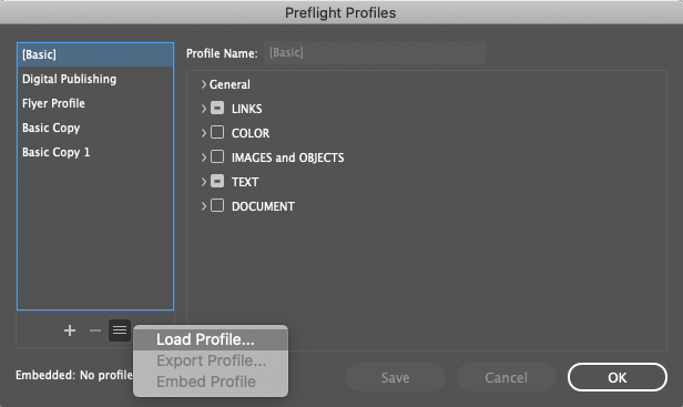
Ad Profile.idpp
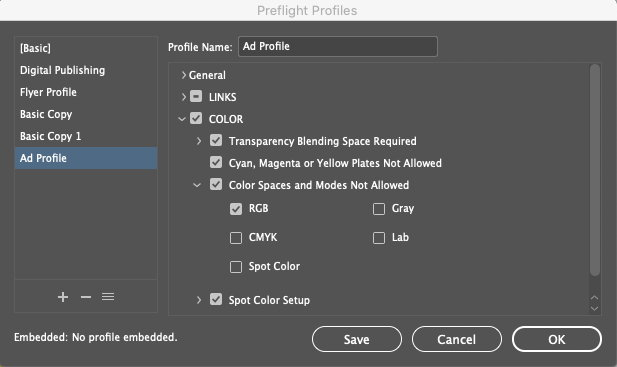
These setting will trigger warnings in InDesign when you do a preflight, and also place
icons in the UI. One of the more common setting is Color Spaces and Modes Not Allowed
where you can explicitly call out any images that might be set to RGB, which can lead to trouble.
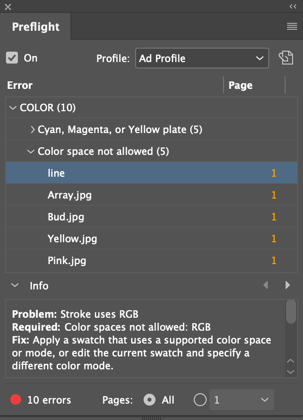
Color space not allowedline and highlight the
lineerror
The problem is with RGB color. There's a swatch of color for the line that isn't in CMYK colorspace, but RGB. Next, we'll convert it to a legal CMYK color.
There was a preflight error for a line with an RGB color. Let's change the swatch it's colored with to CMYK.
Green-Darkswatch
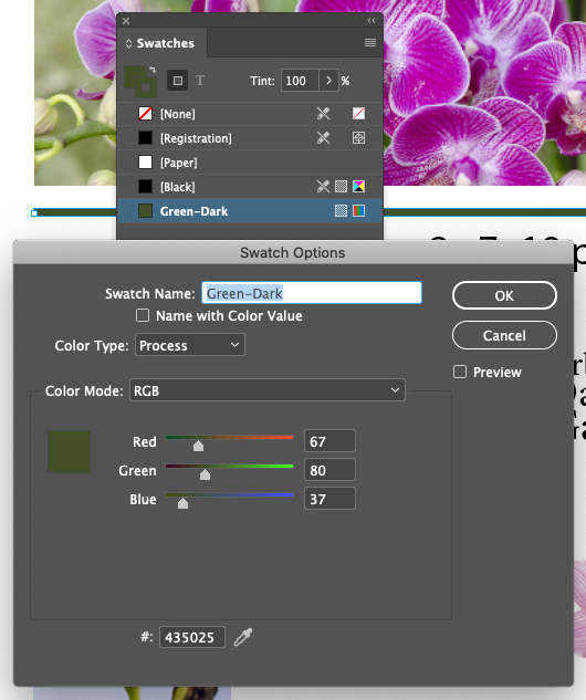
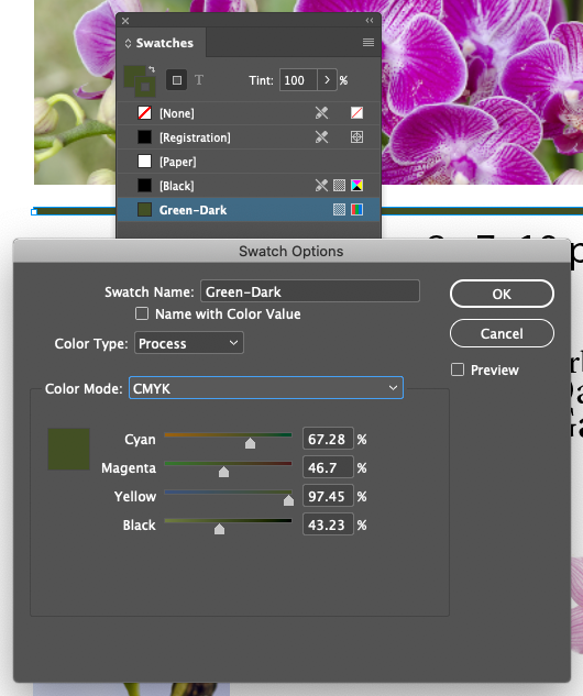
There are at least 6 ways to pick colors in InDesign...
And there's more kinds of color available than those created with CMYK combintations, namely, Pantone PMS


PANTONE is the leading manufacturer of specialty colored inks for the printing industry. When you print on an offest printing press, the standard is four colors, Cyan, Magenta, Yellow, and Black (CMYK). This has a limited color gamut, but you can extend it with PANTONE inks. Literally a can of ink you put in the printing press in addition to the four colors you've already got.
NOTE: Adobe recently refused to negotiate with Pantone for a license to include their Color Libraries in any of their products. This terrible, and can only hurt the industry. We will substitute with Focoltone for now, using FOCOLTONE #3376.
That ink goes on it's own station in the printer. Below is a 5 color offset printer, notice the 5 towers, one for Cyan, Magenta, Yellow, Black, and one more - usually a PMS color or varnish. That 5th color is often called a Spot
color or Spot Varnish.
Result
CMYK is the normal color space for print. It's even more unintuitive that RGB, which is a no no is print.
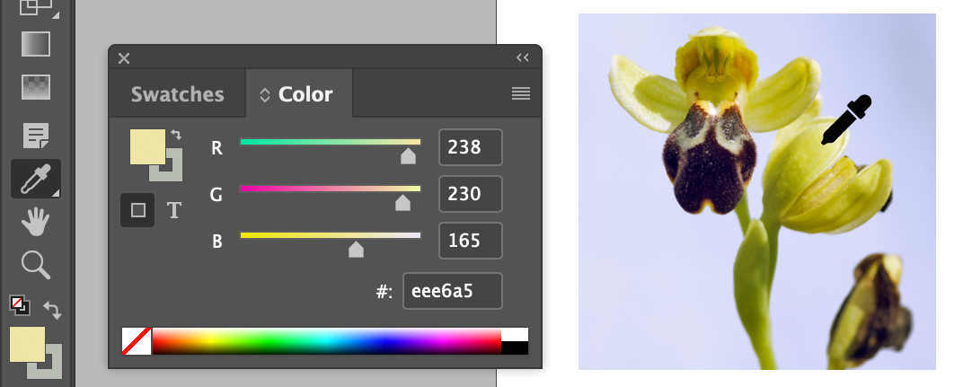
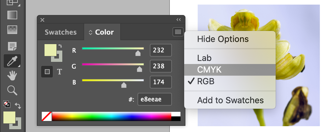
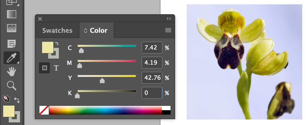
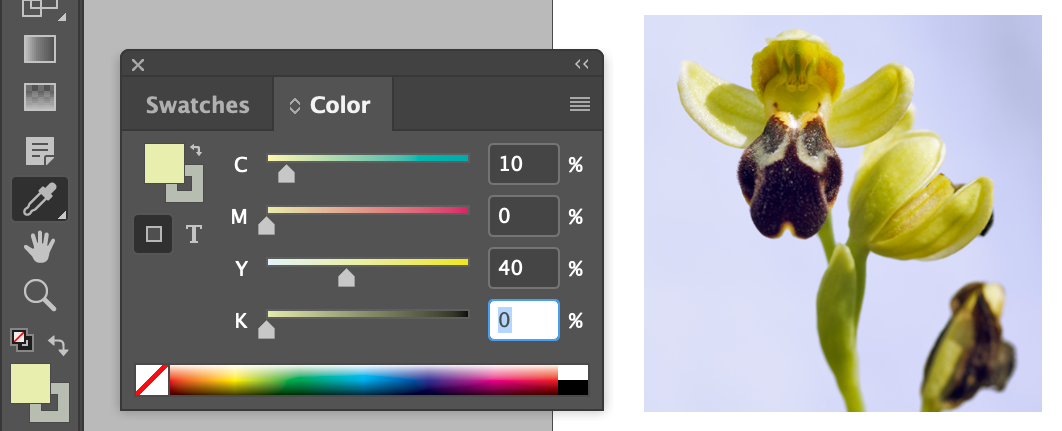
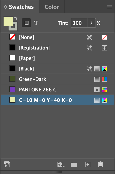
| Cyan (C) | 10 | % |
| Magenta (M) | 0 | % |
| Yellow (Y) | 40 | % |
| Black (K) | 0 | % |
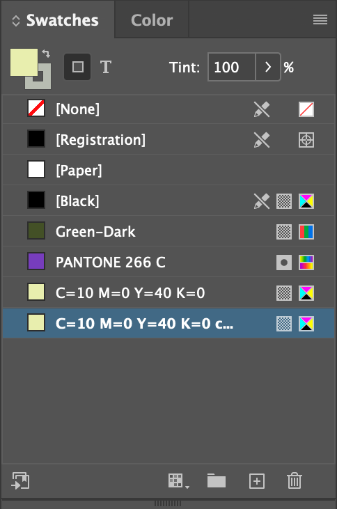
This duplicates the selected color.
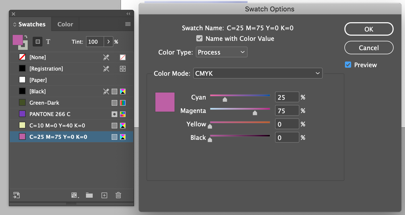
| Cyan (C) | 25 | % |
| Magenta (M) | 75 | % |
| Yellow (Y) | 0 | % |
| Black (K) | 0 | % |
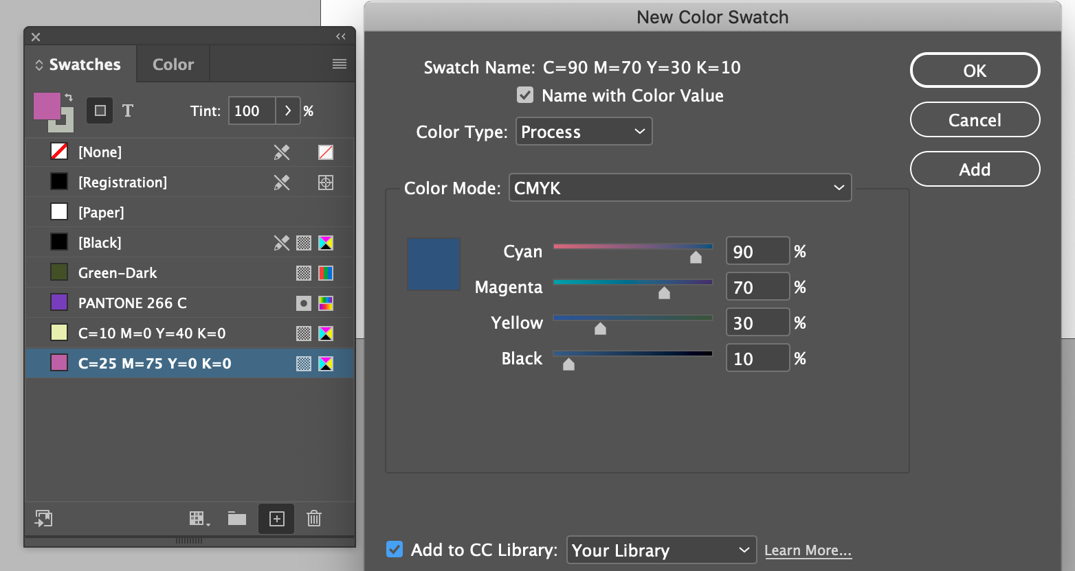
| Cyan (C) | 90 | % |
| Magenta (M) | 70 | % |
| Yellow (Y) | 30 | % |
| Black (K) | 10 | % |
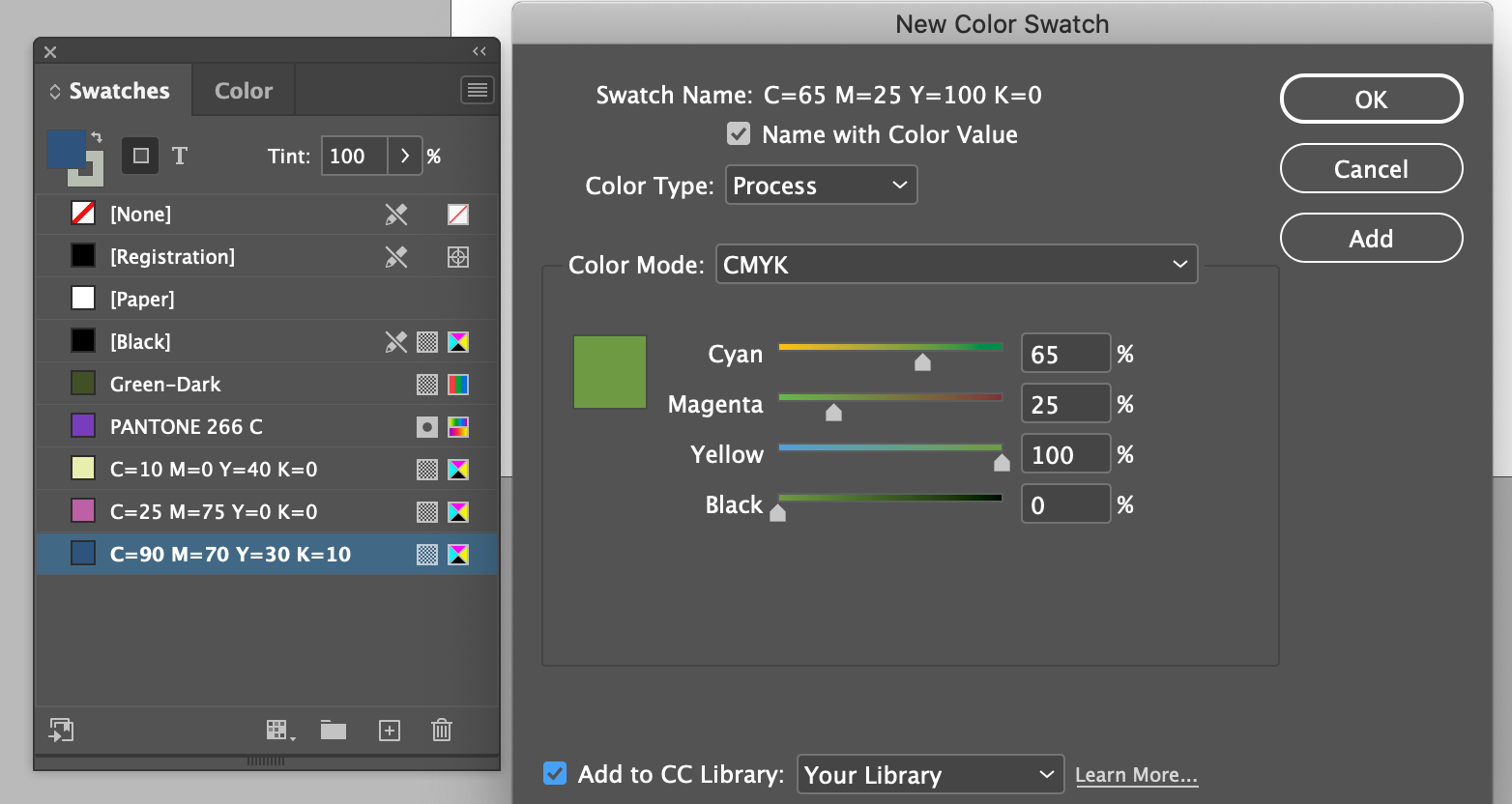
| Cyan (C) | 65 | % |
| Magenta (M) | 25 | % |
| Yellow (Y) | 100 | % |
| Black (K) | 10 | % |
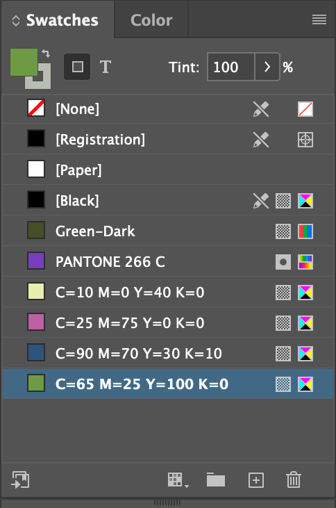
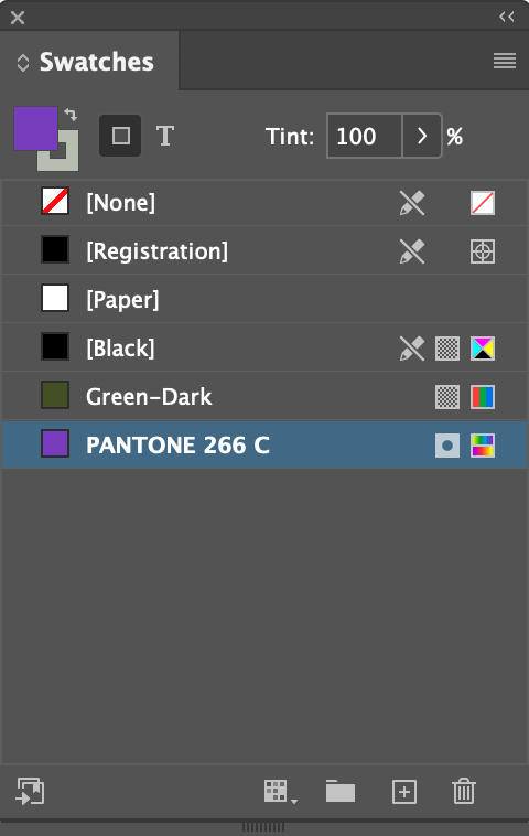
We now have a Swatches panel with 5 new colors in it for use in our document.
About Spot and Process Colors
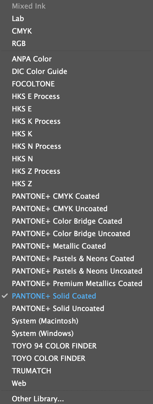
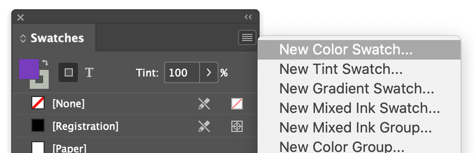
List of color spaces and spot color brands in the popup menu in the Color dialog
A spot color is a special premixed ink that is used instead of, or in addition to, CMYK process inks (or process color), and that requires its own printing plate on a printing press. Use spot color when few colors are specified and/or where color accuracy is critical. Spot color inks can accurately reproduce colors that are outside the gamut of process colors. The exact appearance of the printed spot color is determined by the combination of the ink as mixed by the commercial printer and the paper it’s printed on.
- For best results specify process colors using CMYK values printed in process color reference charts, such as those available from a commercial printer or online.
- The final color values of a process color are its values in CMYK, so if you specify a process color using RGB (or LAB, in InDesign), those color values are converted to CMYK when you print color separations. These conversions differ based on your color-management settings and document profile.
- Don’t specify a process color based on how it looks on your monitor, unless you are sure you have set up a color-management system properly and you understand its limitations for previewing color.
- Avoid using process colors in documents intended for digital devices, because CMYK has a smaller color gamut than that of a typical monitor.
Sometimes it’s practical to use process and spot inks in the same job. For example, you might use one spot ink to print the exact color of a company logo on the same pages of an annual report where photographs are reproduced using process color. You can also use a spot-color printing plate to apply a varnish over areas of a process color job. In both cases, your print job would use a total of five inks—four process inks and one spot ink or varnish.
It's all about the fill/stroke or foreground/background tabs, with a bit of variation when it comes to type.
Object Color
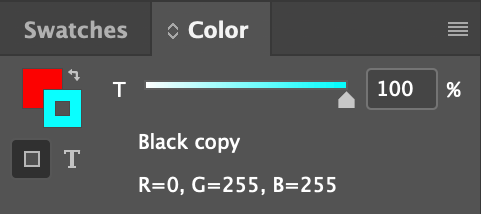
Text Color
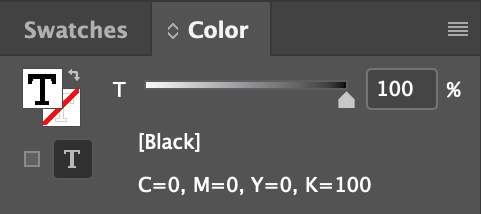
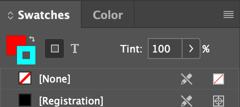
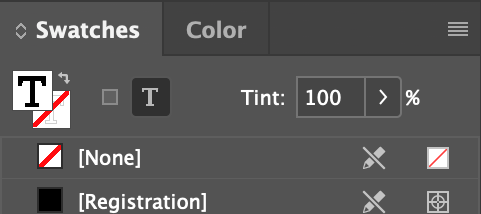
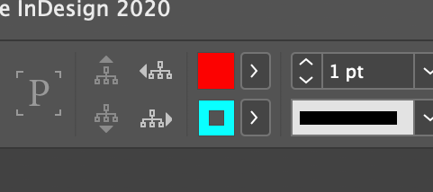
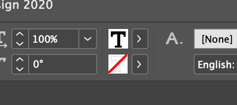


The solid square tab is the fill color, the square donut is the stroke color for objects, signified by the dark grey square with the light gray border. The capital T if the fill color for text, and the red diagonal slash behind it is the stroke color, signified by the little light gray capital T.
Basic poke and grunt technique.
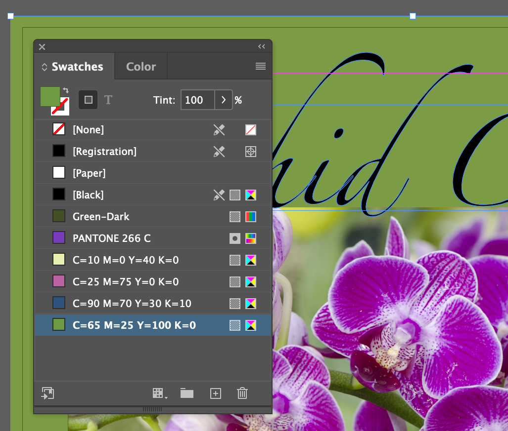
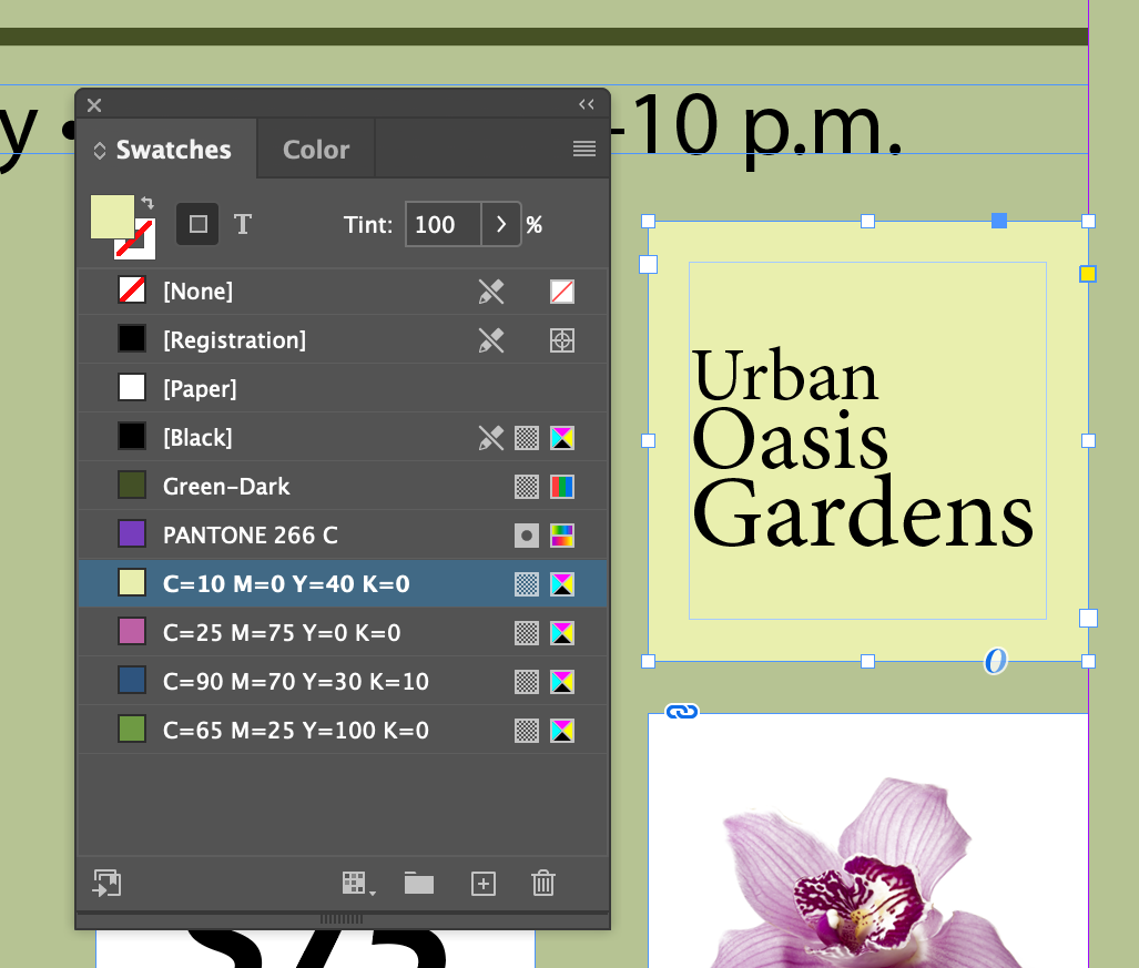
Urban Oasis Gardensand fill color it C=0 M=0 Y=40 K=0
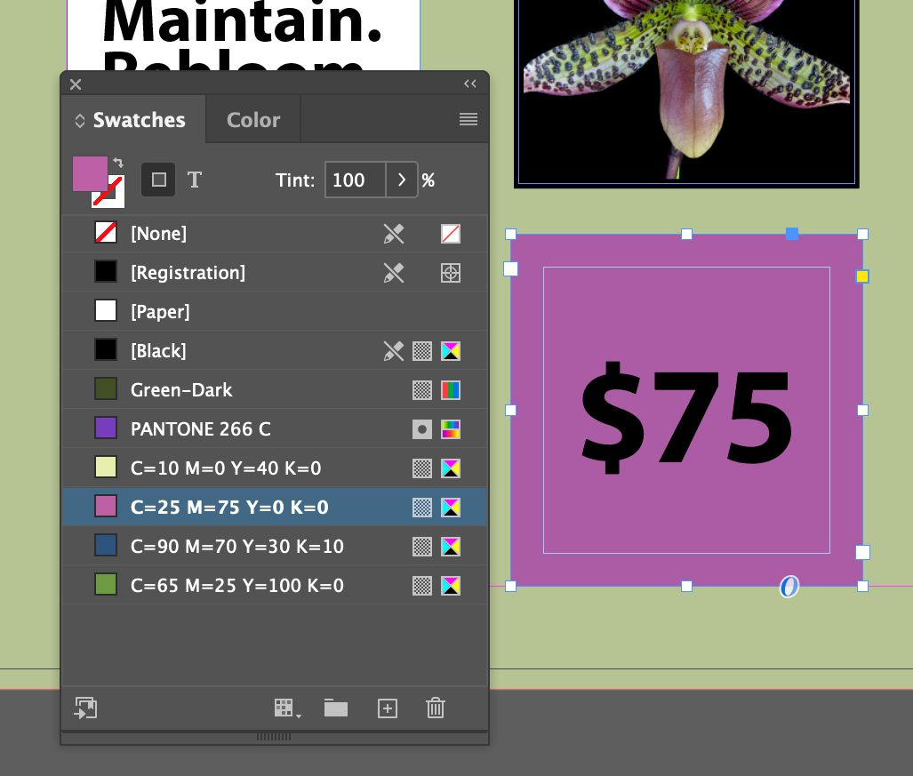
$75and fill color it C=25 M=75 Y=0 K=0
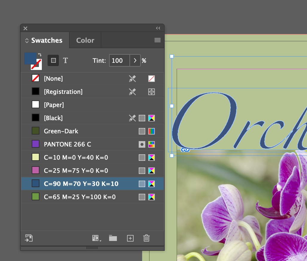
Orchid Clinicand fill color it C=90 M=70 Y=30 K=0
This bit may have you wondering, why didn't this color the background like it did for the $75
and Urban Oasis Gardens
frames? It's because, despite appearances to the contrary, the words Orchid Clinic
are not acutally text, it has been converted to a vector object with Menu Type Create Outlines applied to some editable text. Because it's in outlines, it can't be edited anymore. I actually think this is needlessly confusing...
More poke and grunt.
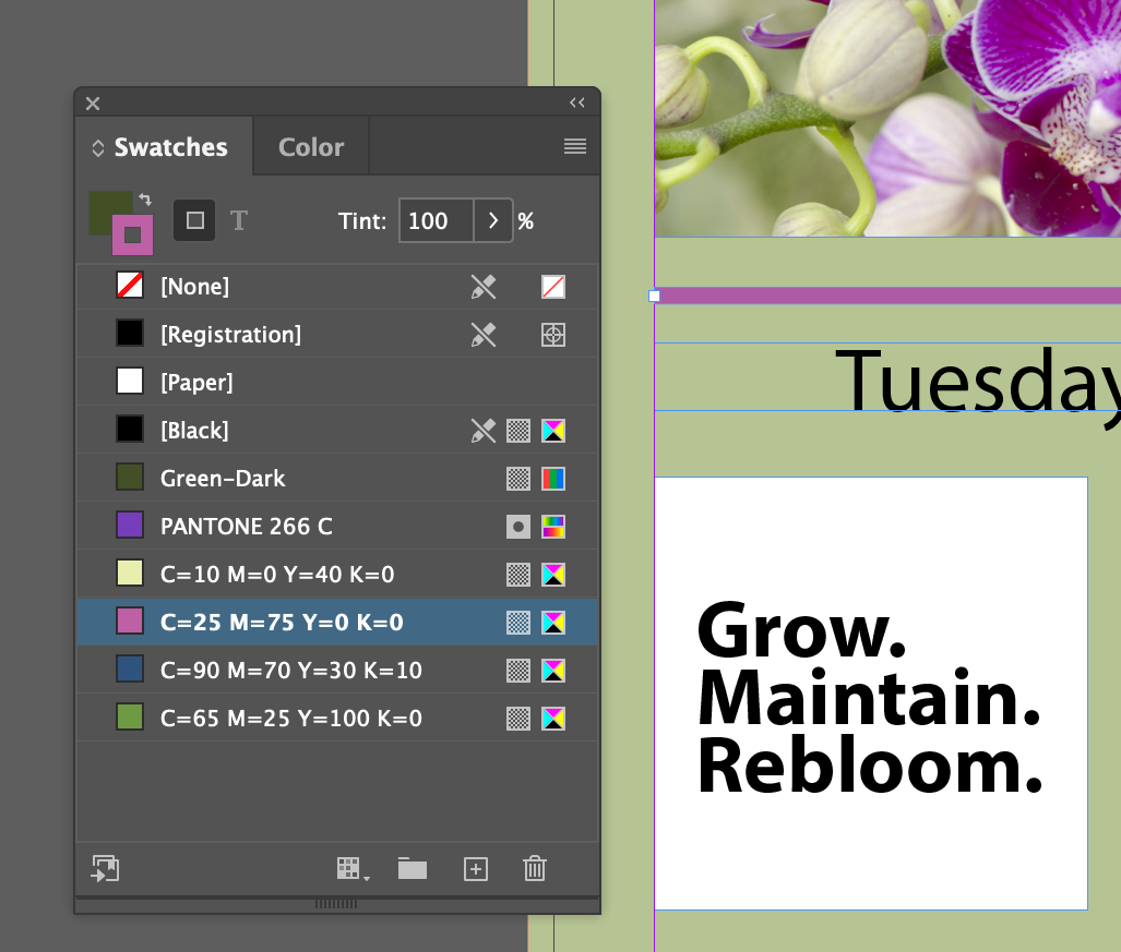
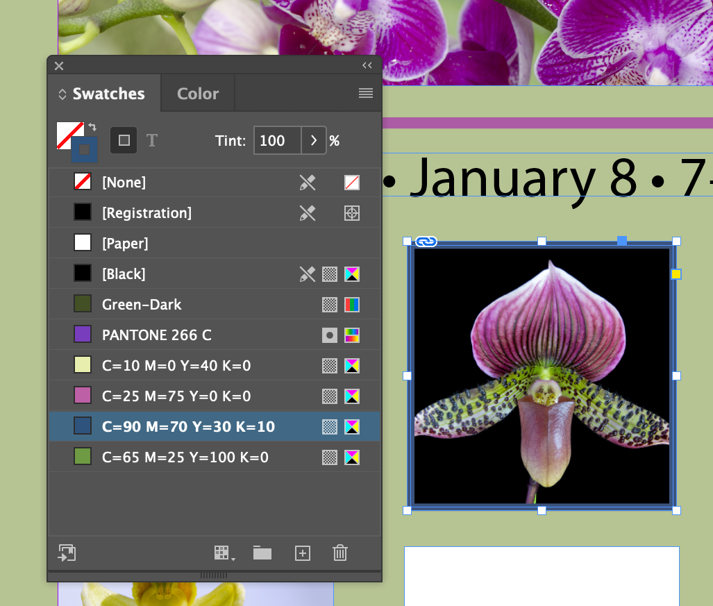
If you are in the text tool, the color choice tabs reflect it with the capital T in the squares, or you can force the application of color to the text by clicking on the little T icon near the color squares
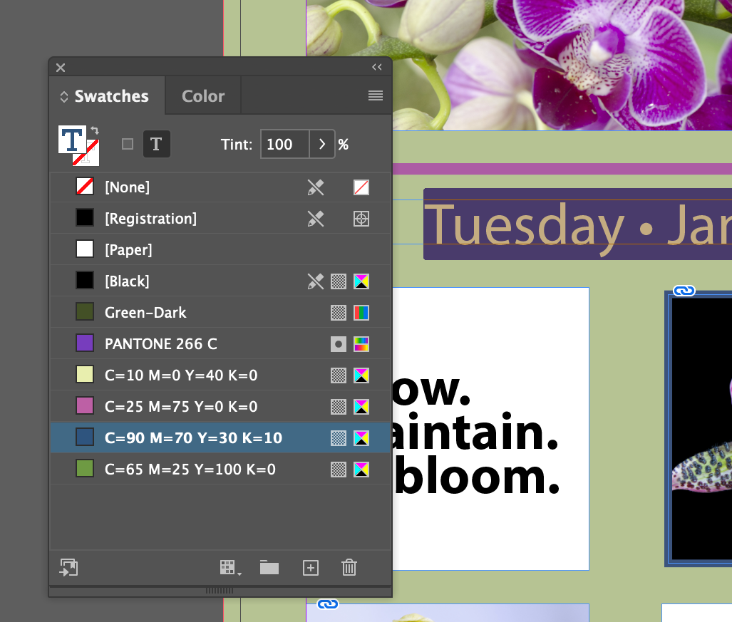
Tuesday • January 8 • 7—10 p.m.The Text form of the fill in the Swatchs panel should be showing. Set the fill color to C=90 M=70 Y=30 K=10
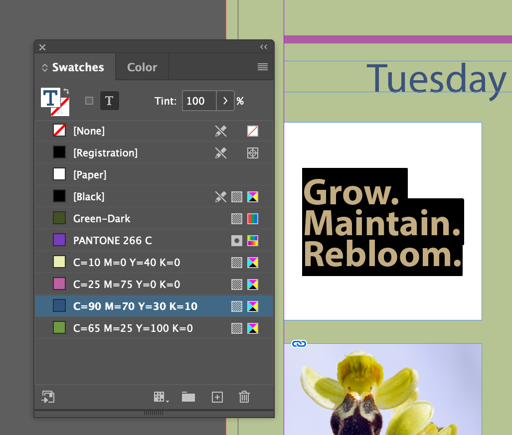
Grow. Maintain. Bloom.and set its fill color to C=90 M=70 Y=30 K=10
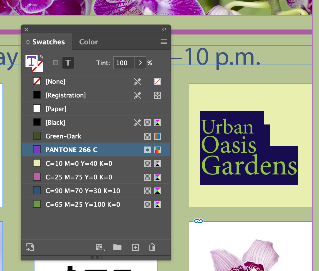
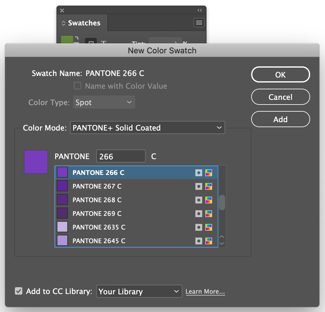
Urban Oasis Gardensand set its fill color to PANTONE 266 C
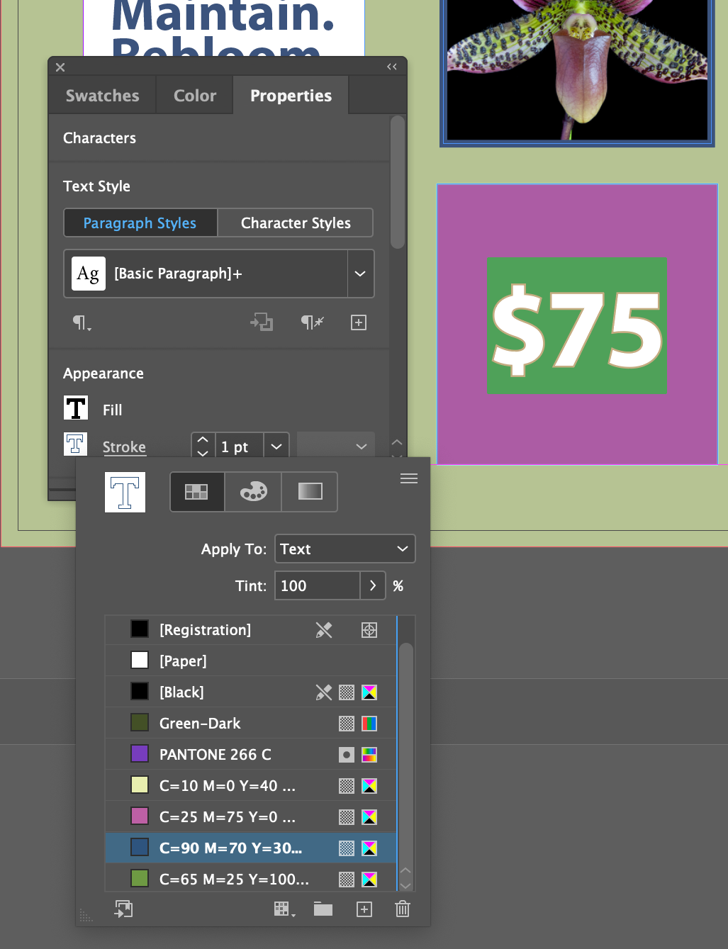
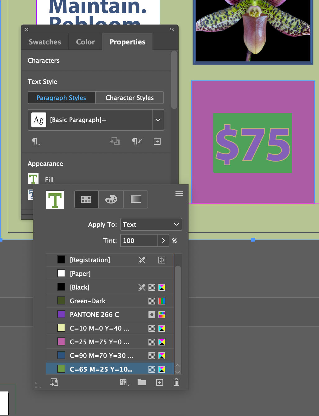
$75and give it a 1 Point stroke with a stroke color (the other tab) of of C=90 M=70 Y=30 K=10 and a fill color of C=65 M=25 Y=100 K=10 AND also

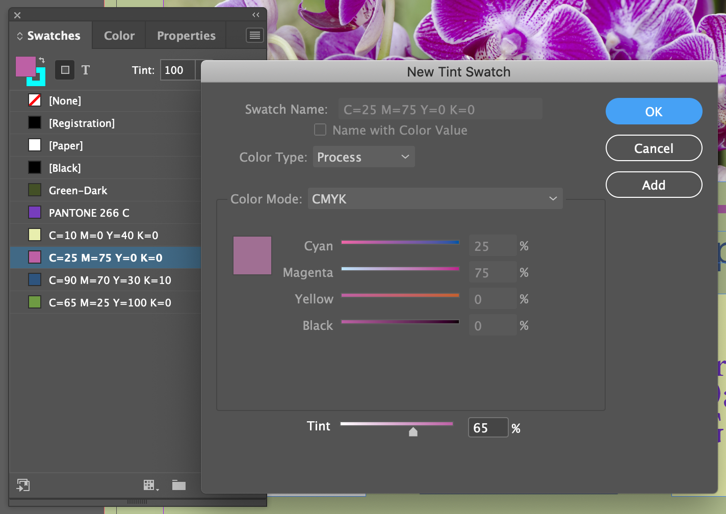
Any given color, like solid Cyan  or C=90 M=50 Y=50 K=0
  or Black
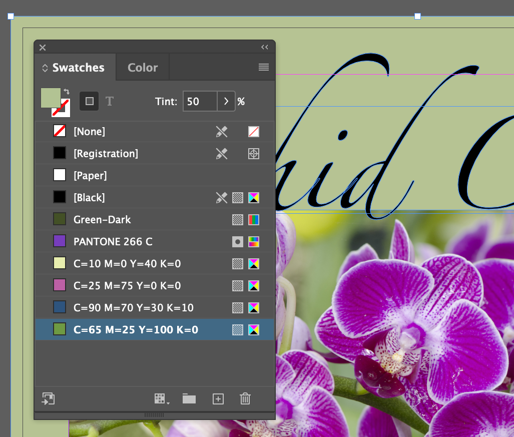
  can be expressed as a tint of itself.
Tint's are expressed as a percentage of the original color, so you might end up with a set of colors something like this:




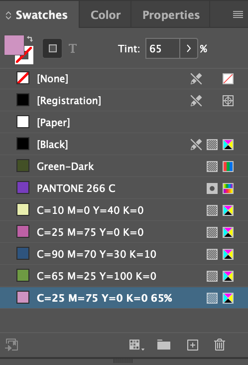
Resulting color swatch added. Note the 65% mark at the right of the C=25 M=75 Y=0 K=0
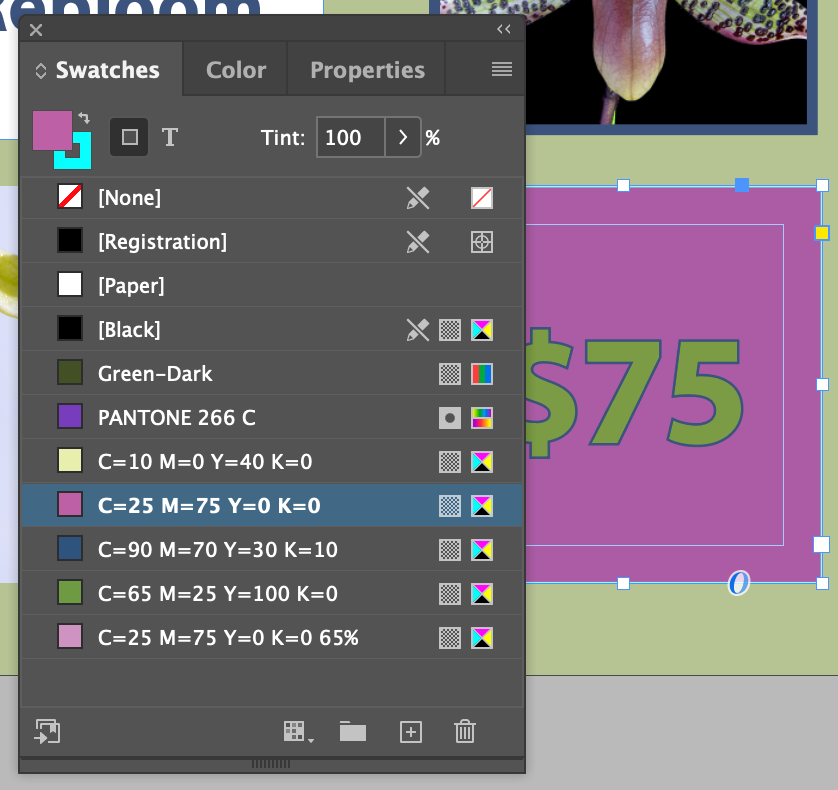
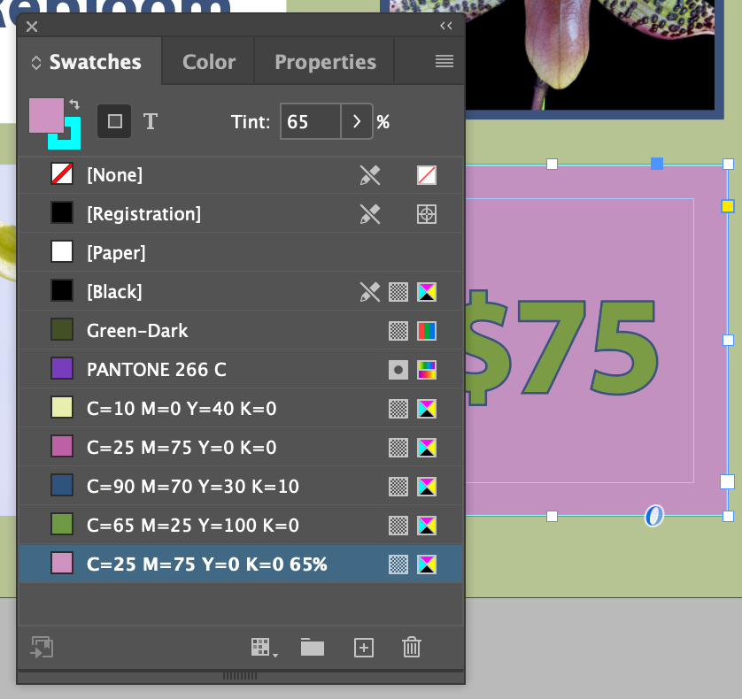
$75in it
A gradient is a transition from one or more colors to another over a distance. In the case of InDesign, it's a linear change from one color to the next, or a radial (circular) change from one color to the next. Thusly:
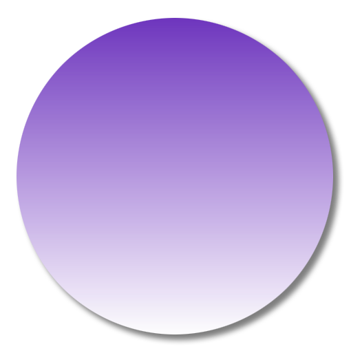
Linear
Gradient

Radial
Gradient
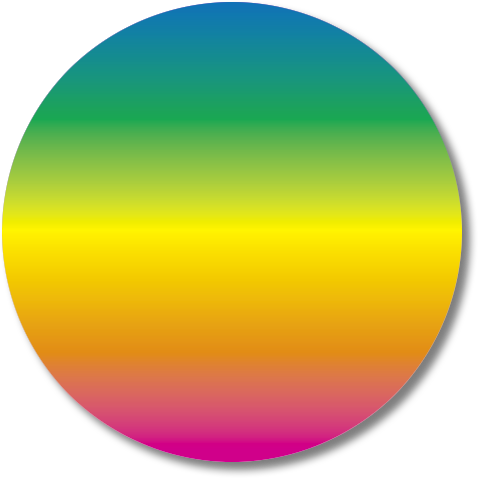
And, a gradient can be between more that just two colors:


A Note of Caution: Gradients are notoriously hard to print. Ask your printer about how well a gradient you used will print with their printing system, or test it yourself if your printing on a laser or inkjet printer. They tend to have a problem with what's called banding,
where gradients show distinct steps between colors instead of smooth transitions.
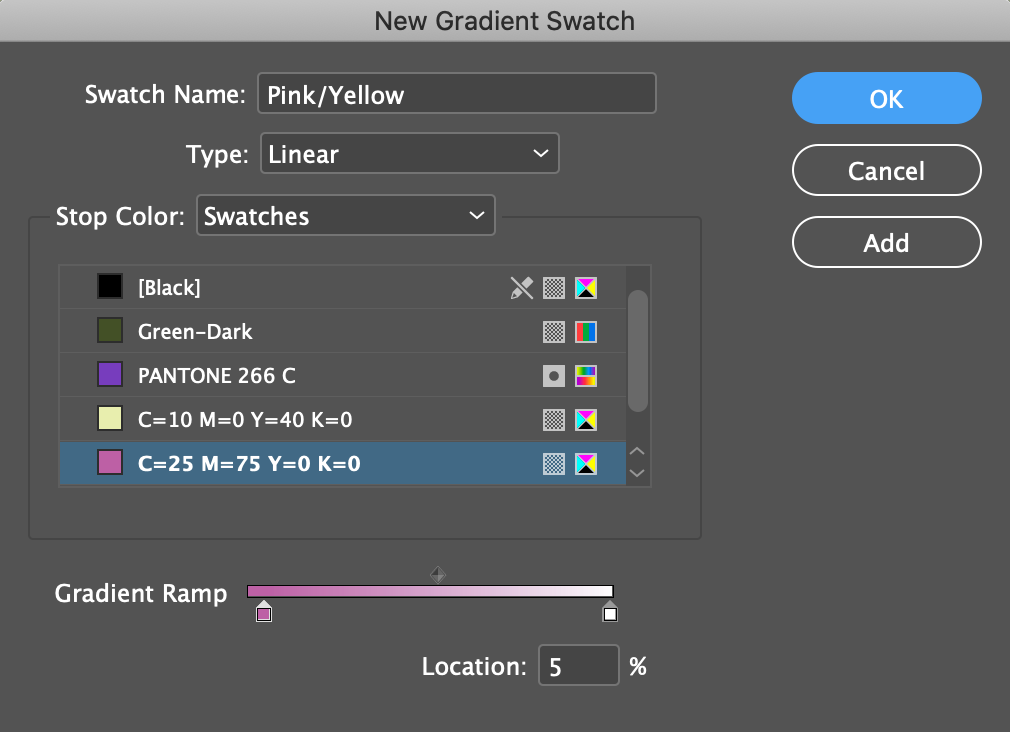
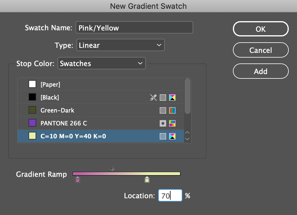
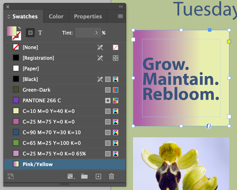
Grow. Maintain. Rebloom.
Pink/Yellowgradient we just made tp the text frame
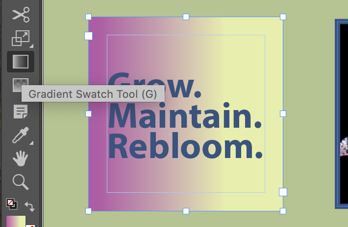
Grow. Maintain. Rebloom.text frame still selected, choose the Gradient Swatch tool or type G


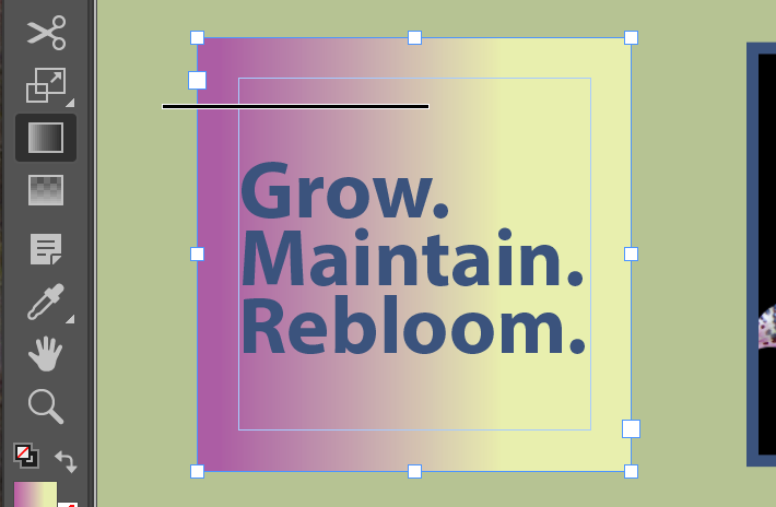

Result. Let's play with this for a while...






Sometime you need to organize. I like being organized.
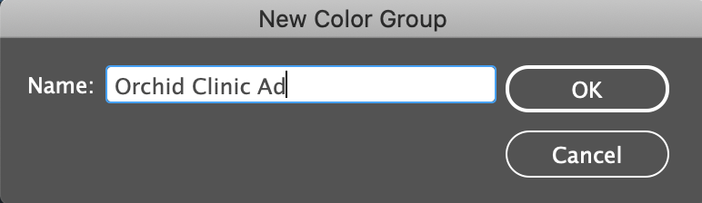
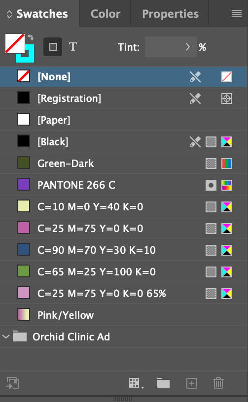
Result
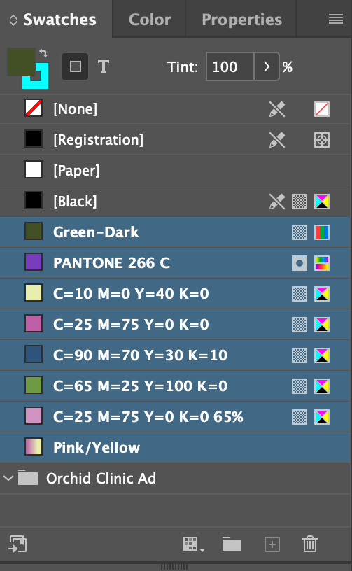
Select all the colors after [Black]

Drag them down into the Orchid Clinic Ad
Group. You'll know when by the line that appears below the folder icon
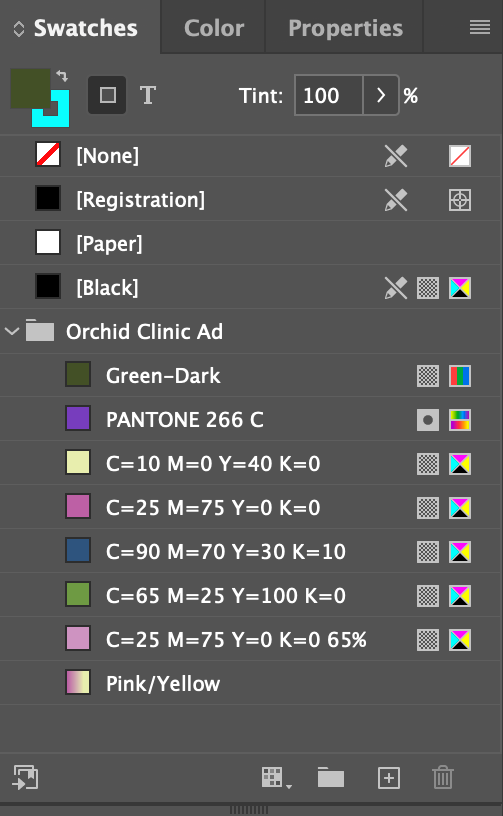
Release. The deed is done...

Peruse at your leisure. An interesting take on color theory by an English designer