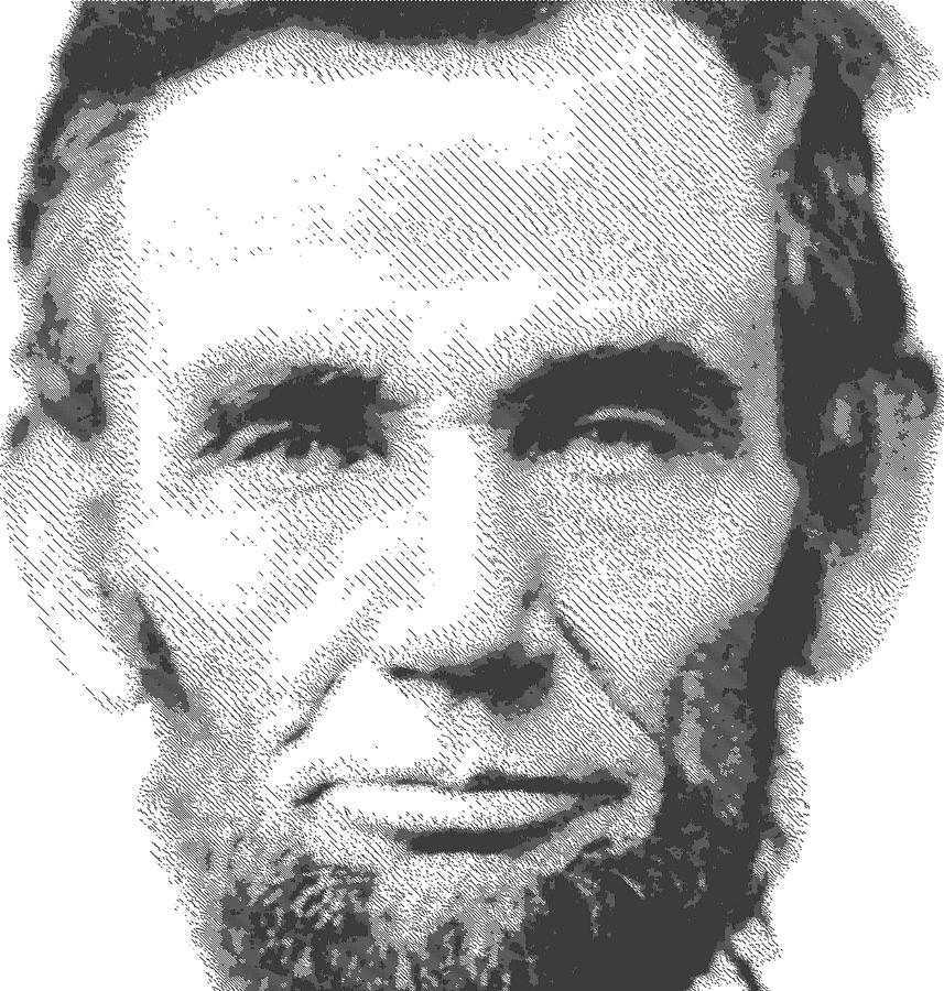
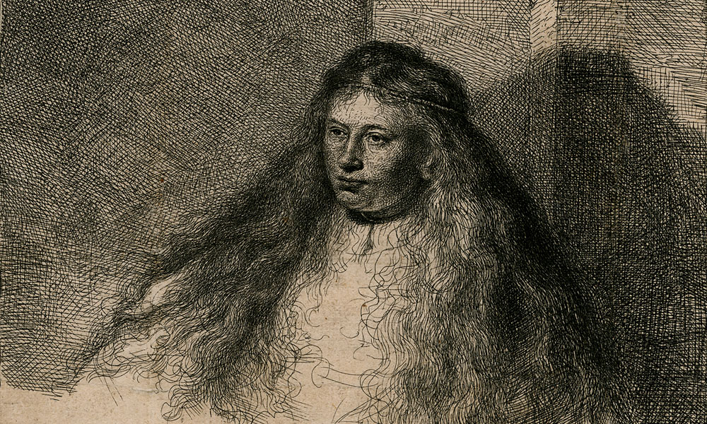
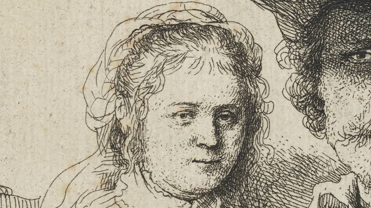
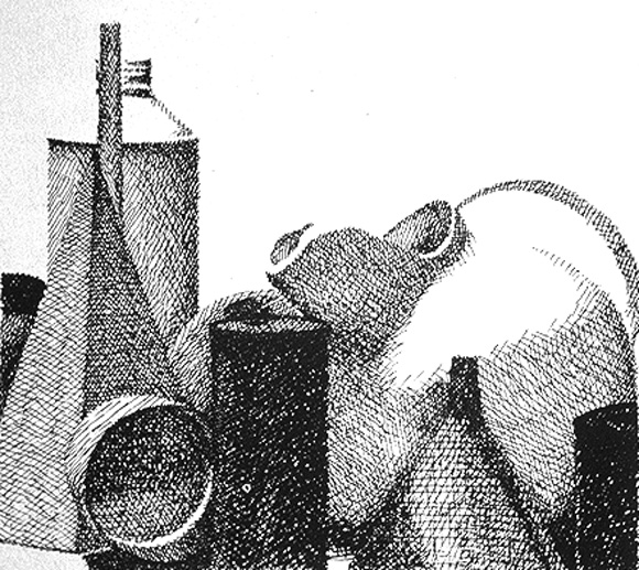
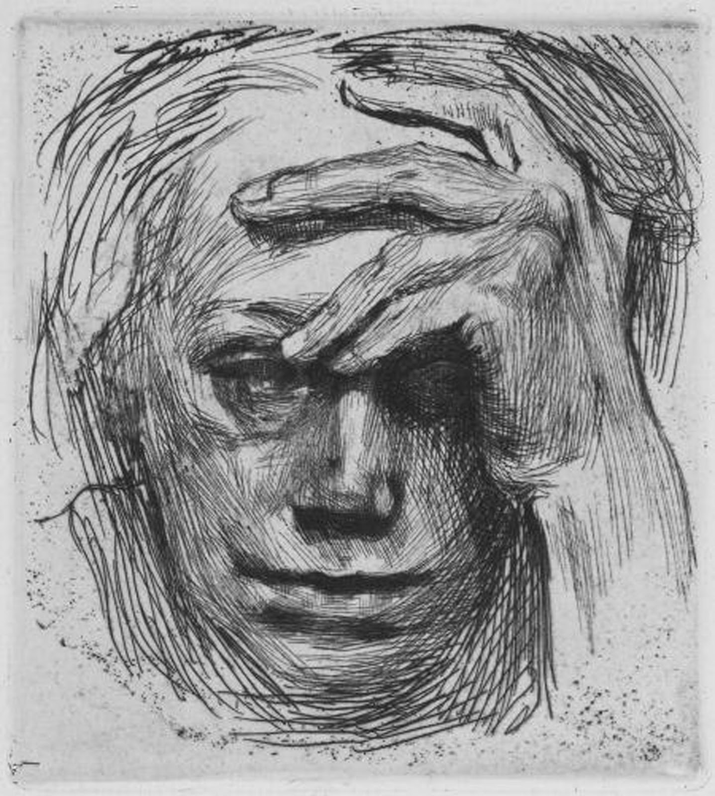
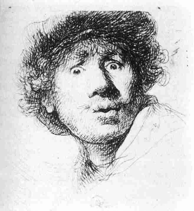
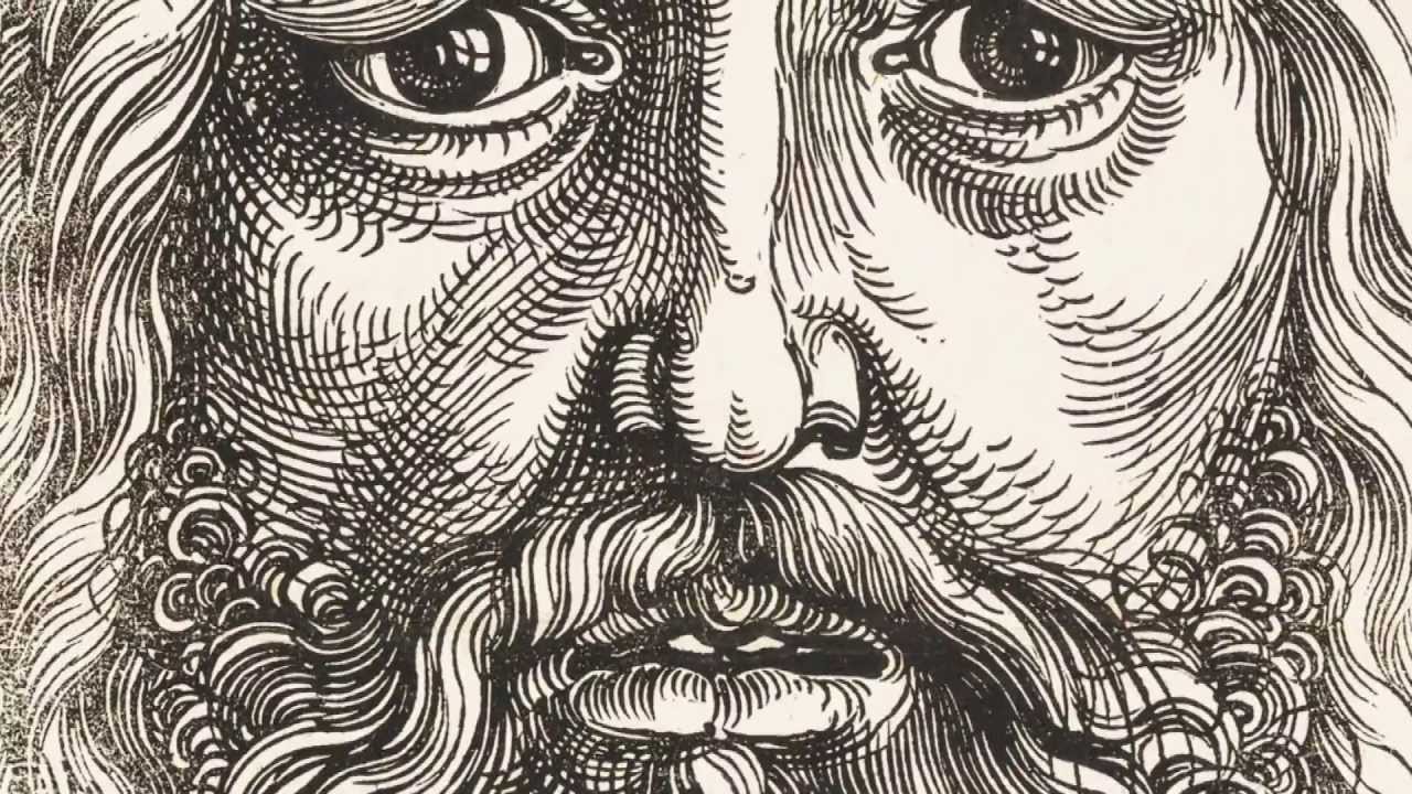
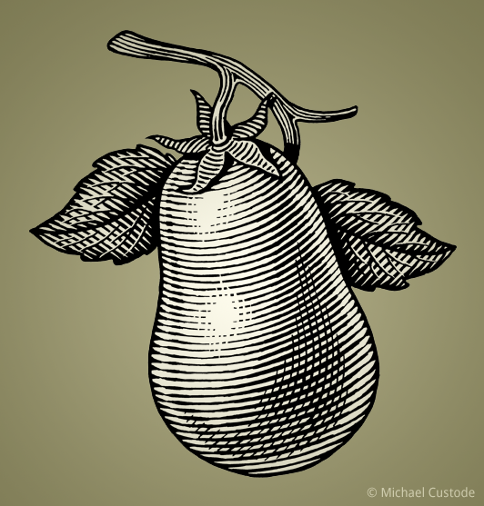
In the last project I asked that you avoid using lines to create tonal values; that is, to create light and dark areas that give an object a sense of 3-Dimensions. Now I want you to exploit the use of lines to actually do just that: create tonal values to add dimensionality to your image.
There is a long standing tradition of doing this that goes back at least to 220 AD, when woodblock printing techniques were developed in China for printing cloth. The challenge of the technique that led to its use for creating tonal values (values of gray) was that a wood block could only be printed with a solid color, and that the image on the wood block was laid out with a feather quill pen.
By mixing areas of printed black with the white of the paper, artists could create the illusion of gray tones. This technique of creating tonal values through lines is called hatching. It's still in wide use today, especially in comix and manga.
Hatching comes in many flavors. Here are some of the standards:
Parallel Hatching
The use of parallel lines spaced at different distances apart or thicknesses create tone.
Cross Hatching
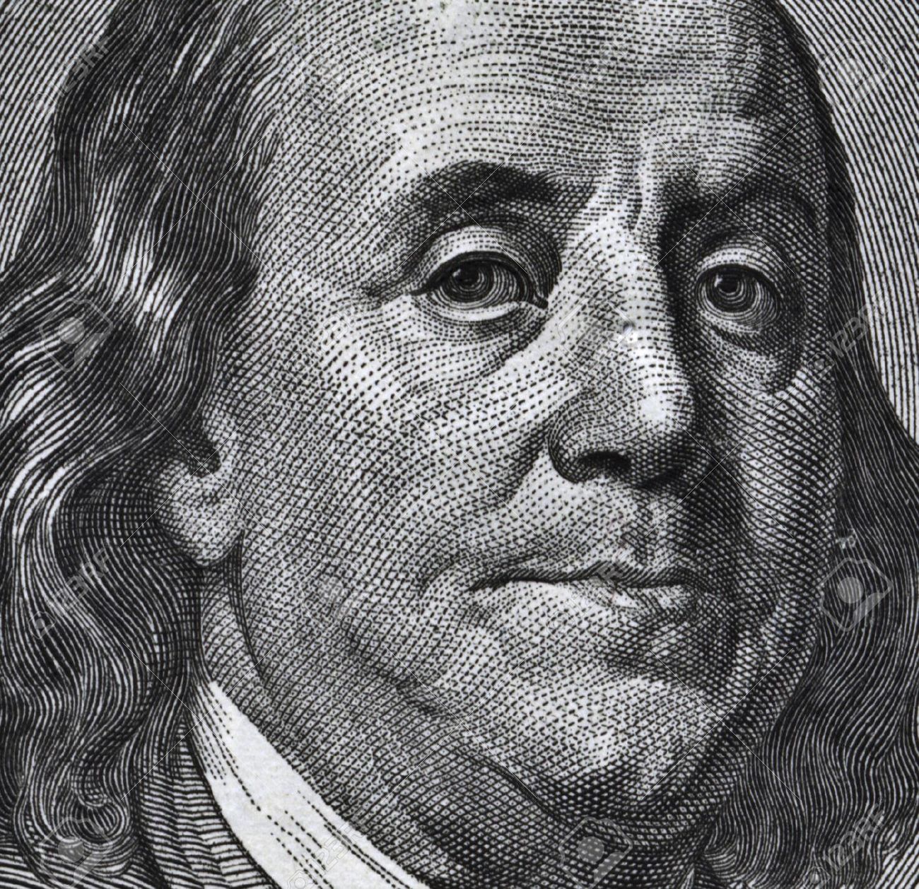
The most common type of hatching. Tonal values are built up by crossing lines over each other at different angles.
Contour Hatching
Lines not only add tone, but follow the three-dimensional shape of the object they are toning. Adds a lot of depth to an image. Can be combined with Cross-Hatching for a technique called Cross-Contour.
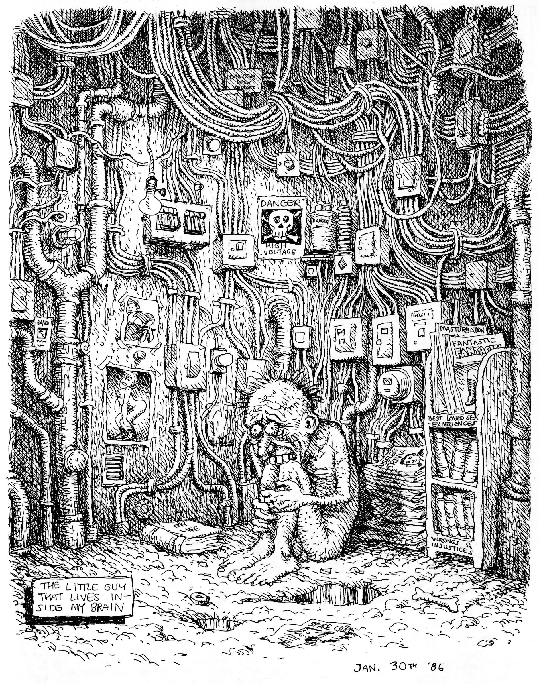
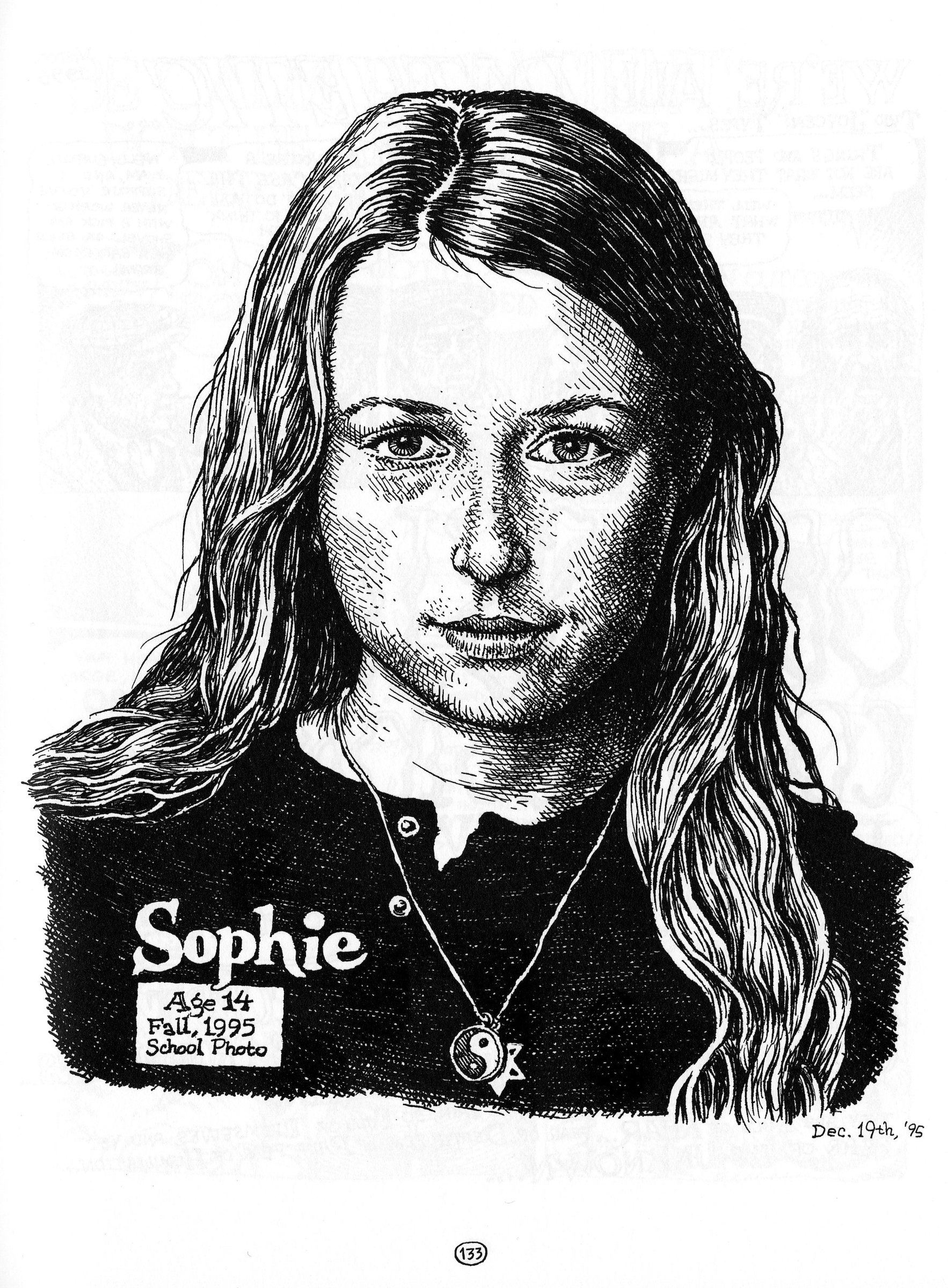
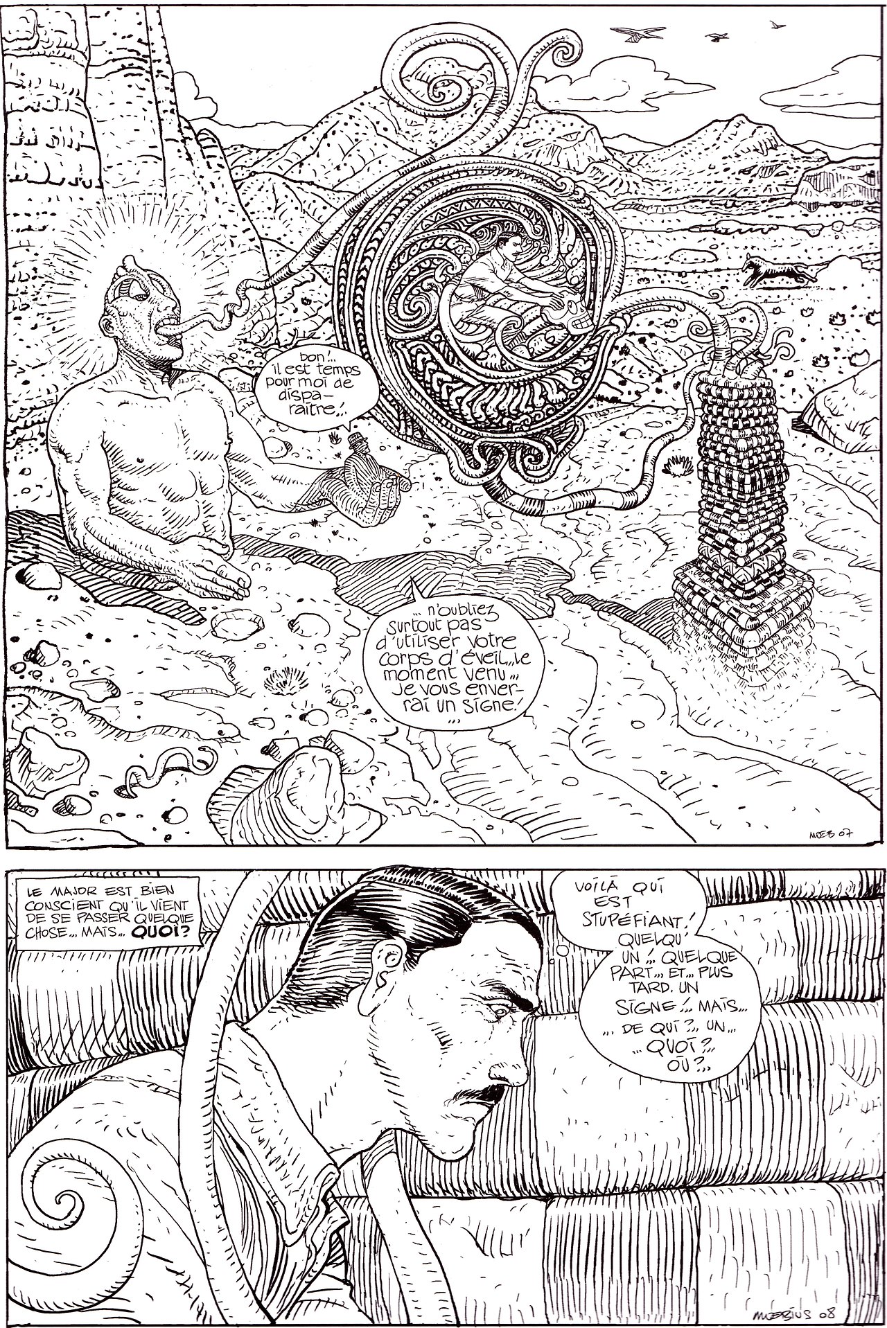
Often mixed with cross-hatching and contour hatching, but on its own uses short strokes to create tonal values. Probably the greatest user of the technique is the prodigious Robert Crumb, underground comix artist.
Great Tick Hatching Practioner, Robert Crumb
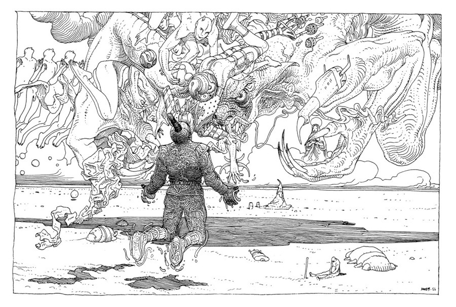
Another Great Tick Hatching Practioner, Moebius
Other Pen & Ink Tonal Techniques
Basket or Woven Hatching
Adding tone with sets of lines that don't cross each other, but are at angles to each other.
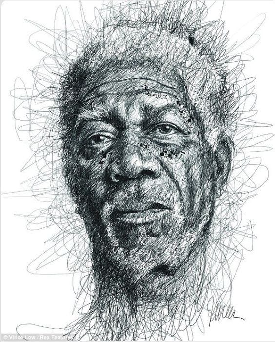
Scumbling
Kind of like cross-hatching, but you don't lift the pen up when you go back and forth.
Stippling
A mind bending time killer. Just lots and lots of dots. Very cool, but you can end up spending hours and hours and hours at it.
While I started this pen and ink drawing in Corel Painter, it's essentially the same thing I would have done in Photoshop. Still not complete, but getting there. Here are the steps...
I designed the project to be 1856px by 3000px, 200ppi (different than yours). I wanted a cube with things flying out of it, so I first created a cube with three point perspective in Adobe Illustrator (here's the things_cube.ai file).
The trick with this is creating a circle bigger than the artboard and positioning vanishing points on it. Then you create lines from the vanishing points that you move with the Direct Selection tool, keeping the source anchor point stable at the vanishing point and only moving the anchor at the opposite end. This creates perspective lines for the edges of the cube.
This is the area of the artboard in Illustrator with the completed cube. I printed this out so I could draw my things on paper...
This is a scan of the hand-drawn things drawn on the printout.
This is a correctly size Photoshop doc (1856x3000) with the scan placed in the doc and sized appropriately.
The Scan is at the bottom of the layers, then there's a white filled layer above it that's set to 50% opacity to tint back the scan.
Finally, a new layer is made to hold the outline trace with a fine brush of the things
This is the things outline layer on its own (over a white background).
Then I created several layers to create the occlusion of the cube and things.
On a new layer, Shade Things, I did the cross-hatching for the cube and things.
I found two source images on the web. One for a cloudy sky, another for an ocean surface. I put them together and sized them appropriately for the doc, and turned the sky to the right gray value with a trick layer of a black to white gradient set to Screened overlay at 42%.